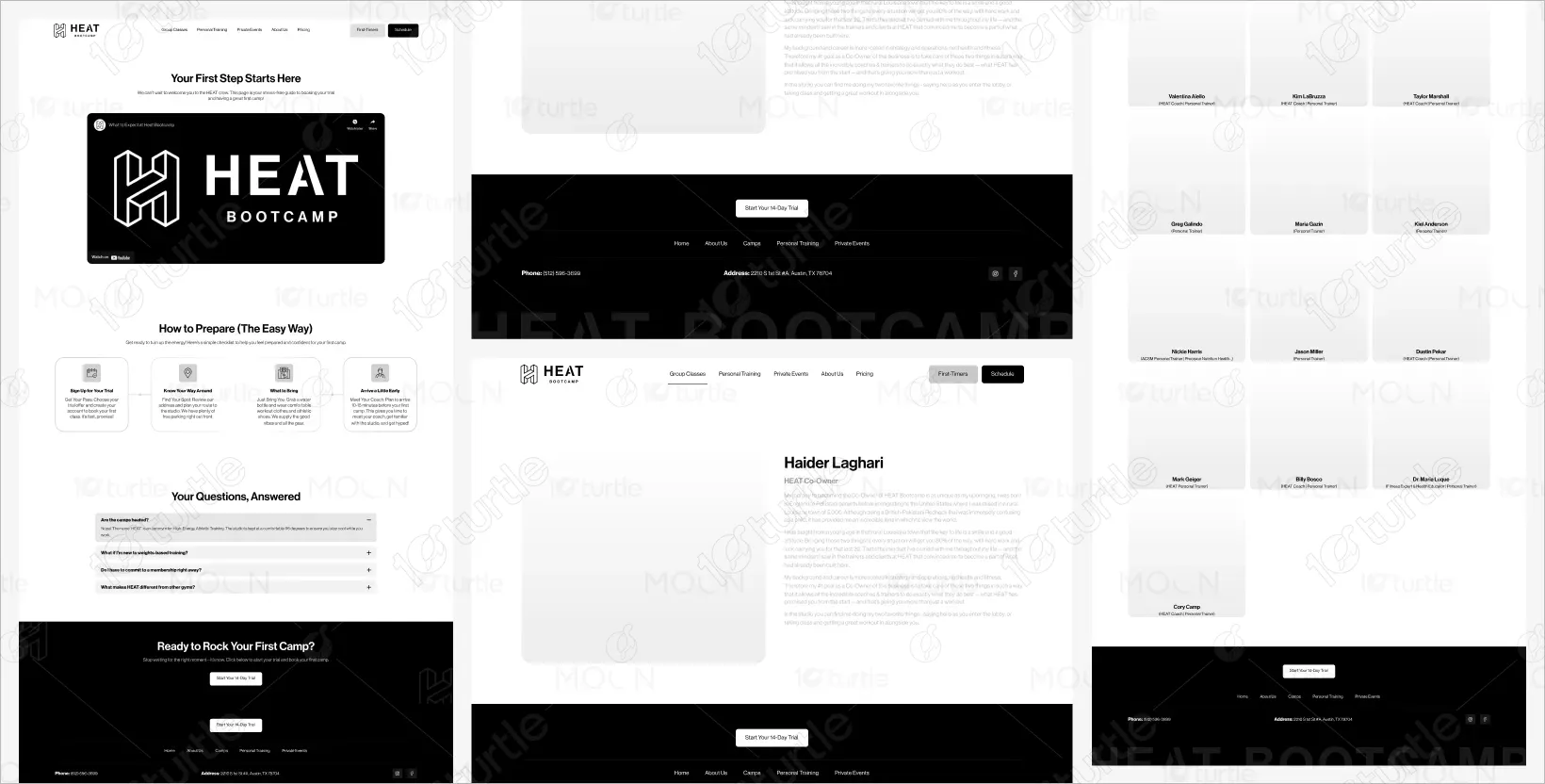
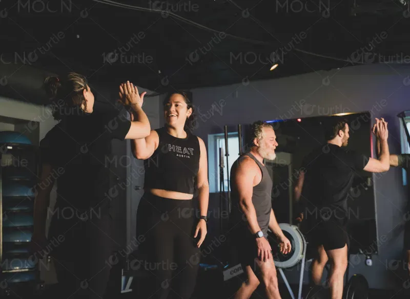
The HEAT Bootcamp website emphasizes a dynamic, vibrant fitness environment that captures the essence of community, energy, and personal growth. With a bold, high-energy design, it showcases their services, programs, and team in an engaging way that motivates users to take their first step toward fitness.
UX/UI Design
Market Research
Website design
Industry
Health & Wellness
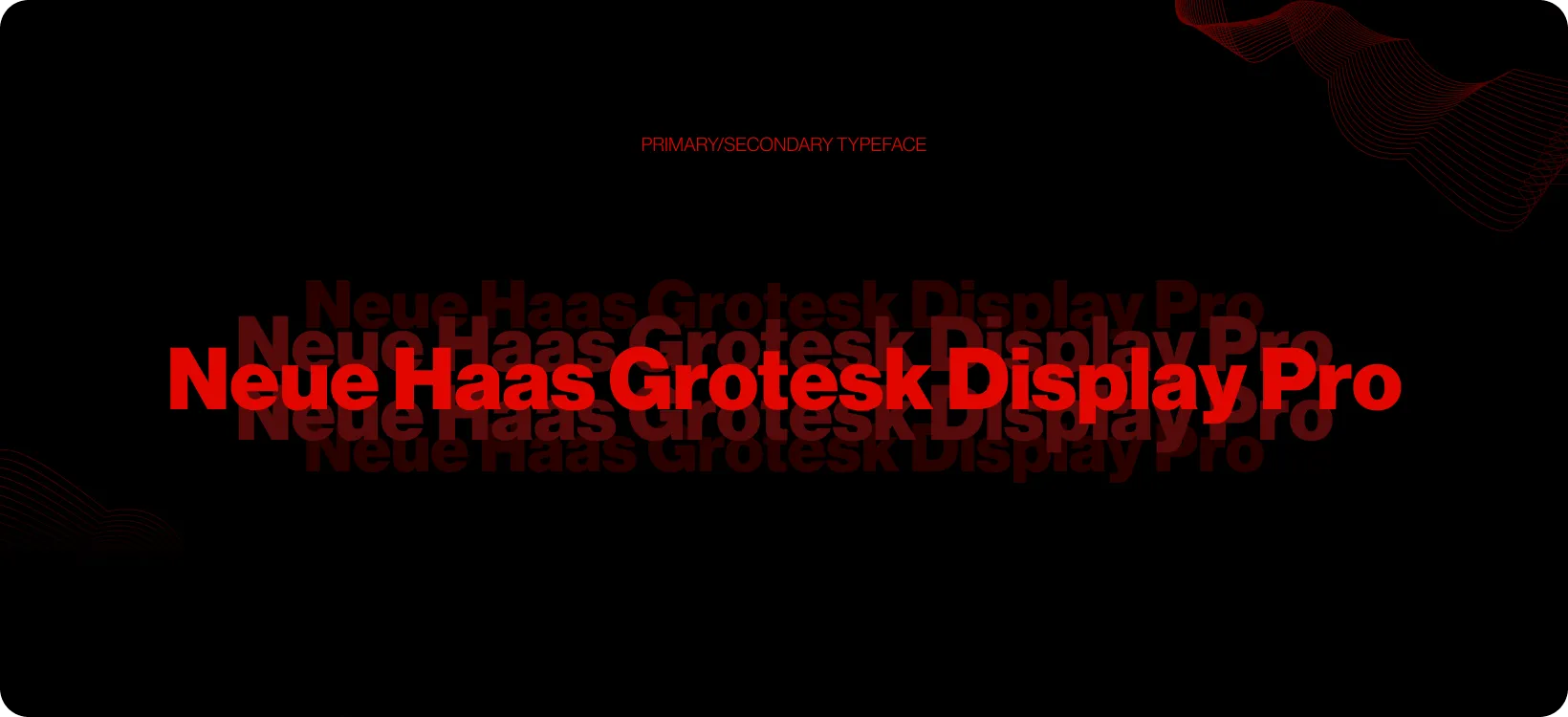
Tools we used

Project Completion
2025
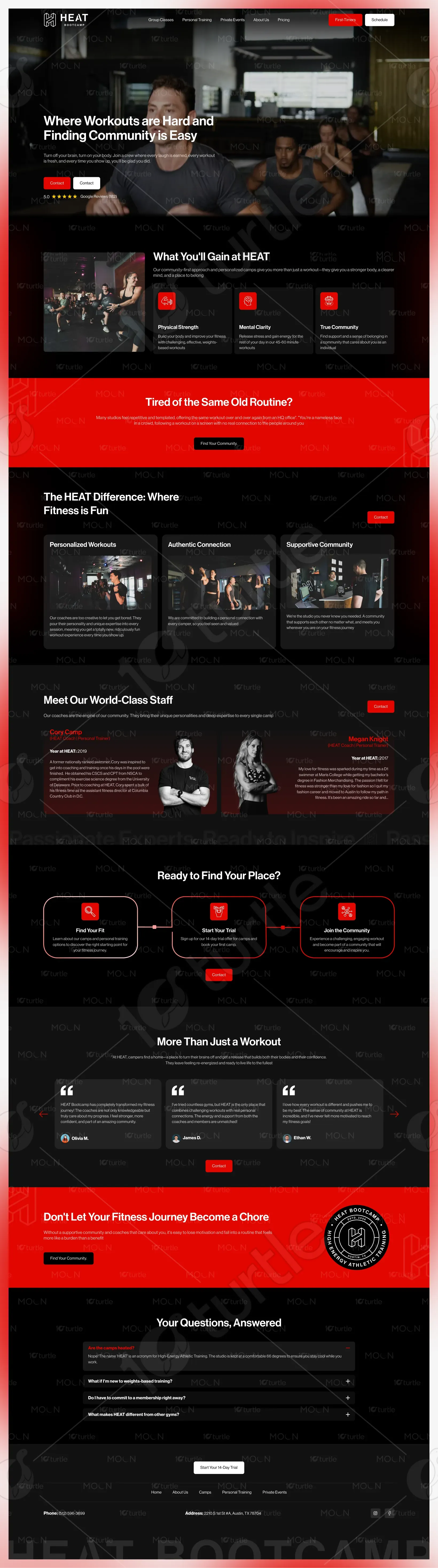
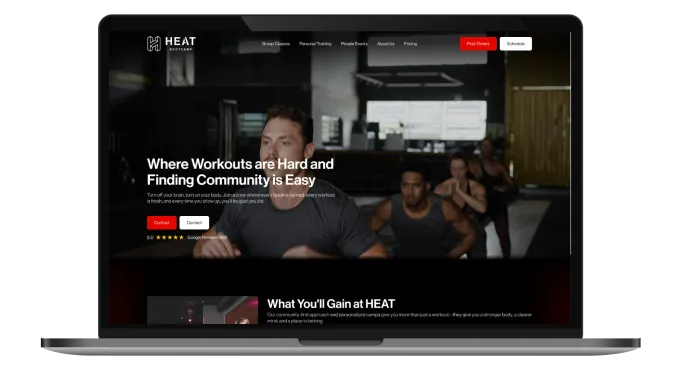
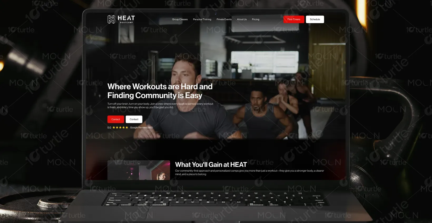
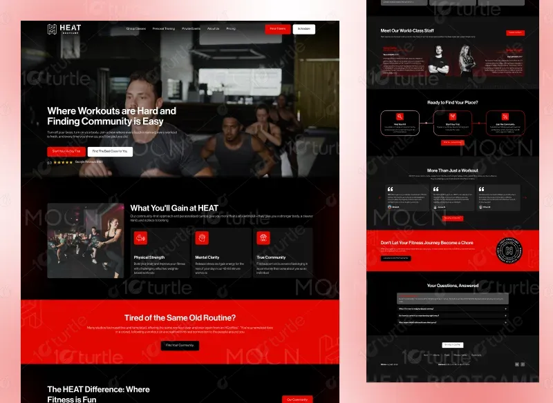
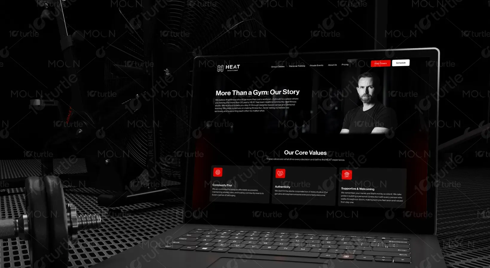
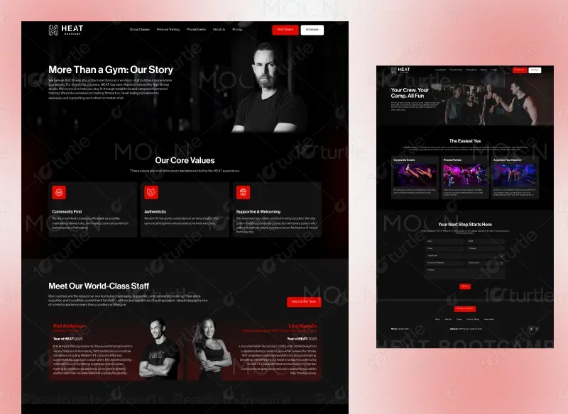
The design combines dark tones with high-impact imagery, evoking energy and intensity. The layout is user-centric, providing seamless navigation between services, pricing, team introductions, and the blog. The red accents create excitement and clarity, while detailed sections enhance user interaction, encouraging trial sign-ups and inquiries.
Industry
Health & WellnessWhat we did
User ResearchUI UX DesigningPlatform
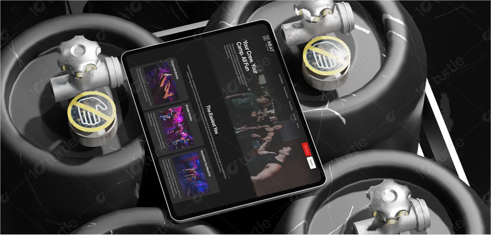
WebsiteThe client needed a website that reflected the high-energy, community-driven atmosphere of their boot camp while facilitating easy navigation and conversion for new users.
A bold color scheme, impactful typography, and dynamic imagery were integrated. Key sections like “Start Your Trial,” “Meet the Team,” and “Our Core Values” were strategically placed to enhance user interaction and ease conversion.
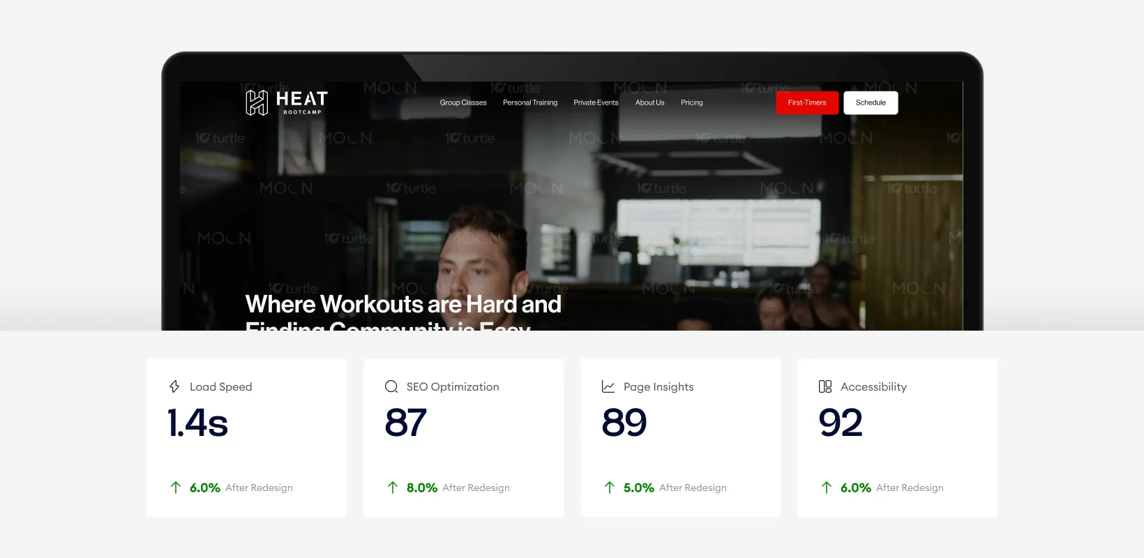
The design showcases luxury and refined aesthetics with enhanced performance across key metrics. With a load speed of 1.3 seconds, the site ensures quick access, while the SEO score of 91 boosts visibility. Improved accessibility and page insights contribute to a more engaging, smoother user experience, enhancing overall performance.
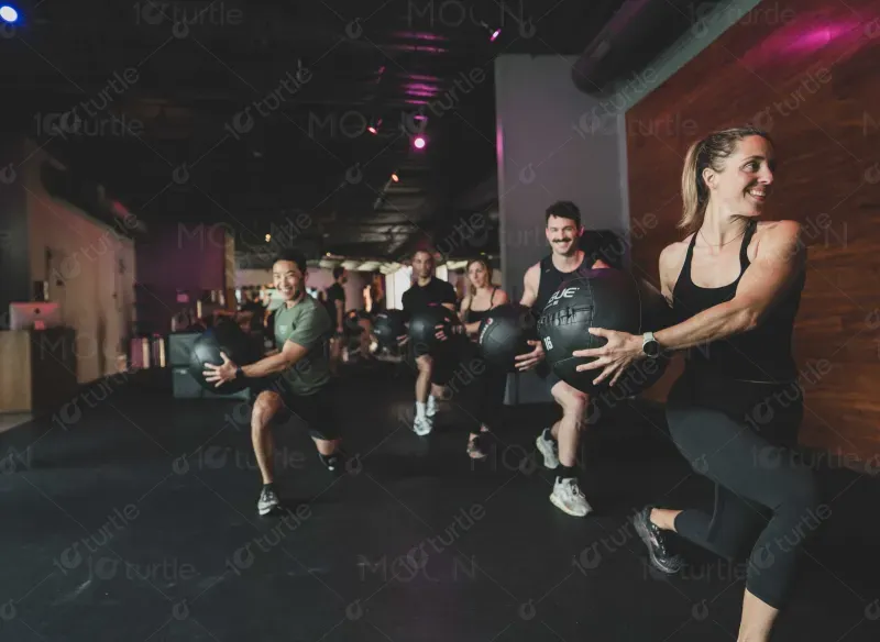
The design incorporates high-energy visuals of workouts, vibrant colors, and motivational content. Sections like “Meet Our World-Class Staff” and “Join the Fun Online” foster a sense of community, while the straightforward design ensures visitors feel welcomed and excited to begin their fitness journey.
The HEAT Bootcamp logo embodies strength and energy with its bold typography and simple, geometric design. The use of black and red highlights the intensity and passion associated with the brand. The logo is modern and powerful, symbolizing the high-energy, results-driven environment that HEAT represents.
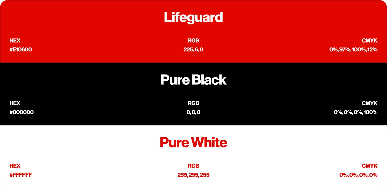
The color palette is bold, featuring deep blacks and vibrant reds, emphasizing energy and passion. Red evokes action and excitement, while black serves to ground the design, allowing the colors to pop and maintain a professional, clean aesthetic while reinforcing the energetic vibe of the brand.
The wireframe focuses on a user-friendly layout with clear paths to conversion. Sections are clearly divided, from service offerings and team details to pricing and blog updates. Strong call-to-action buttons like “Start Your 14-Day Trial” are strategically placed to lead users smoothly through the website, ensuring easy access to the most important information.