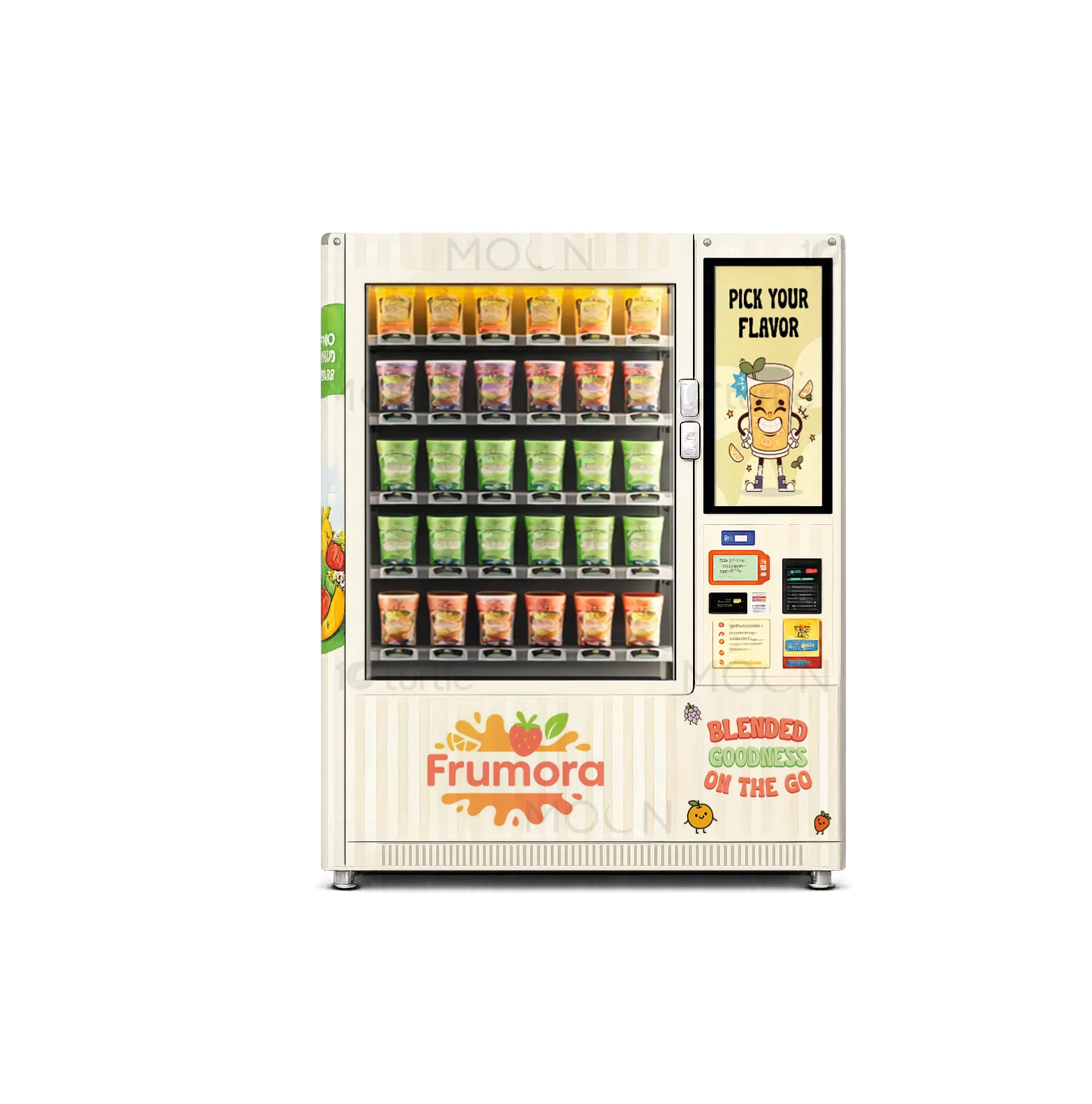
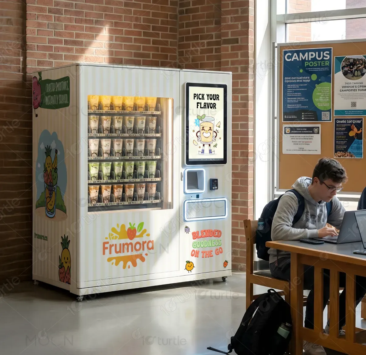
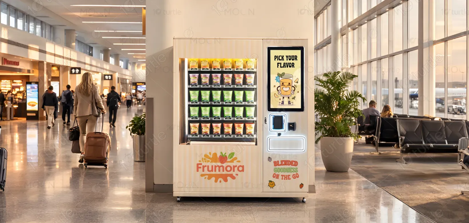
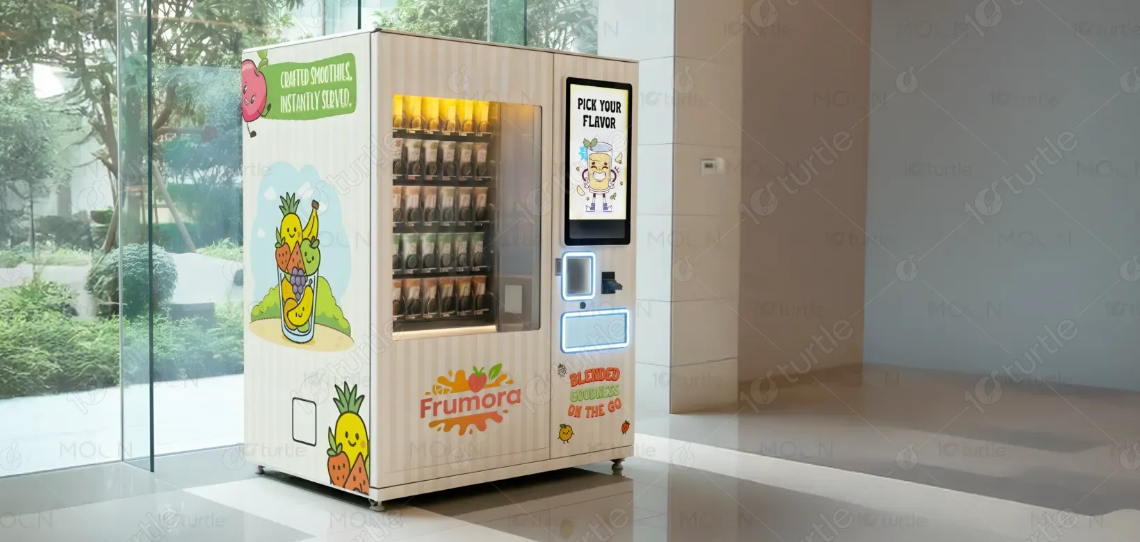
The design follows a bright, approachable, and clarity-driven visual system tailored for high-traffic public environments. A clean white base ensures strong visibility, while playful fruit illustrations humanize the product and instantly communicate freshness. Typography is friendly yet legible, designed for quick scanning at a distance. The layout prioritizes functional zones—product display, interaction screen, payment, and pickup—creating a clear visual hierarchy that guides users intuitively. Color accents and illustrations are used sparingly to maintain balance, consistency, and visual appeal without overwhelming the user.
Wrap Design
Graphic Design
Industry
Consumer Goods & Retail
Tools we used


Project Completion
2025
Key Market
Global
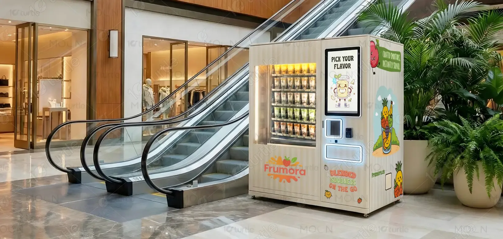
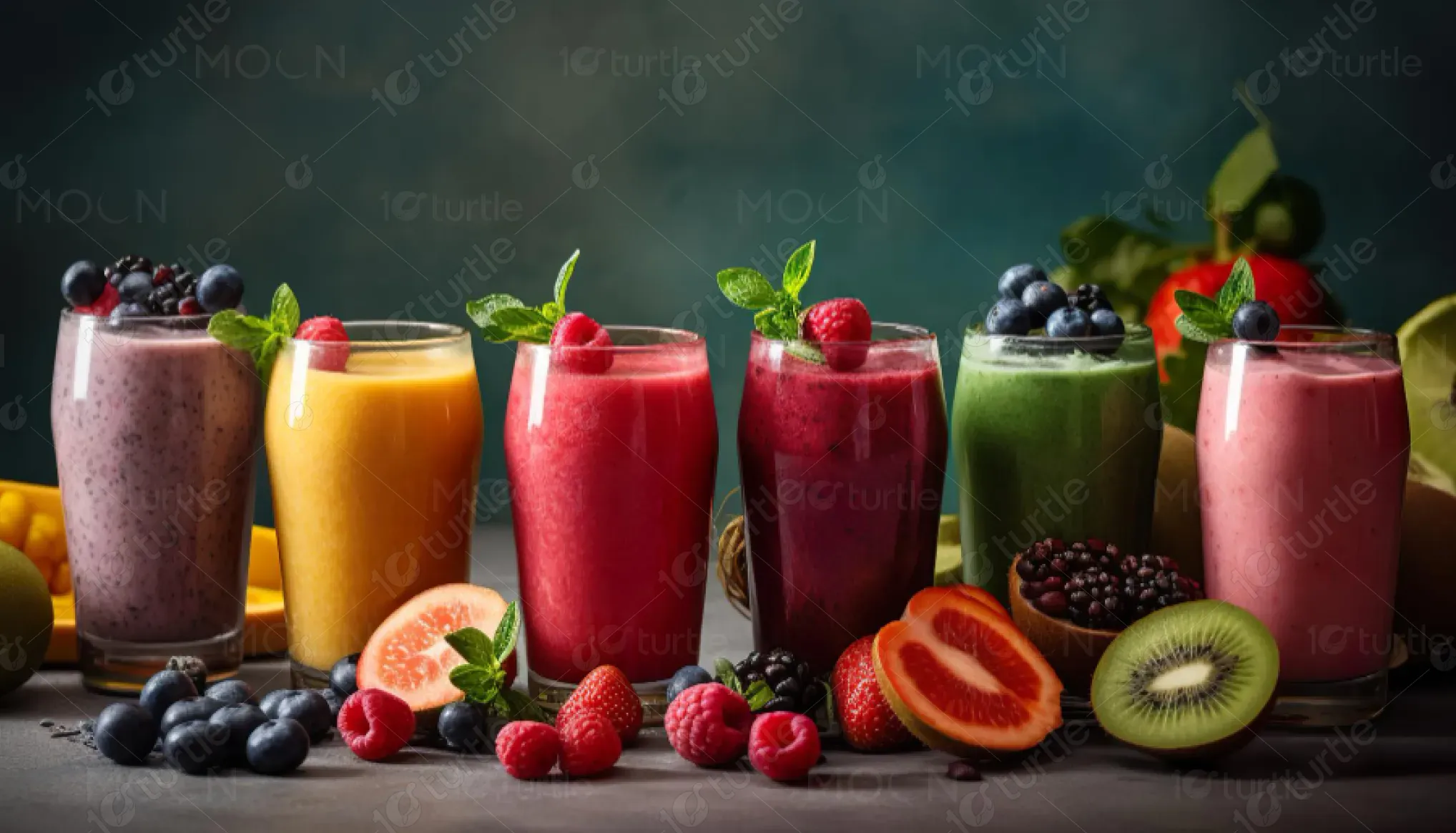
This design represents a self-serve smoothie vending experience that brings freshly blended fruit beverages into everyday public spaces such as malls, universities, offices, and transit hubs. The primary purpose is to position Frumora as a healthy, trustworthy, and convenient alternative to traditional vending options. Within the food and beverage vending market, the design bridges the gap between freshness and automation—making real fruit smoothies feel accessible, hygienic, and reliable through thoughtful visual communication.

Industry
Consumer Goods & RetailWhat we did
Wrap DesignGraphic DesignPlatform
-Traditional vending machines often struggle with low trust, poor differentiation, and unclear value propositions—especially in the health food category. Users are skeptical of freshness, quality, and nutritional value, while crowded public environments demand fast comprehension and strong visual recall. Without clear messaging and engaging design, healthy vending solutions risk blending into the background or being overlooked entirely.
The design solves these challenges by adopting a user-first, transparency-led approach. The visible product display reinforces authenticity, while fruit-centric illustrations immediately signal natural ingredients. Clear messaging such as “Blended Goodness On The Go” removes ambiguity and sets expectations instantly. The interface area is visually isolated to reduce cognitive load during interaction, and the overall modular design ensures consistency across multiple locations. Together, these choices improve usability, reinforce trust, and encourage quick engagement.
The design's bright, playful aesthetics and easy-to-navigate layout improve user experience and drive engagement. The clear functional zones ensure a smooth transaction process, increasing repeat purchases and overall conversions. As the vending machine design improves user interaction, it directly boosts sales and customer retention, leading to a more memorable and reliable brand experience.
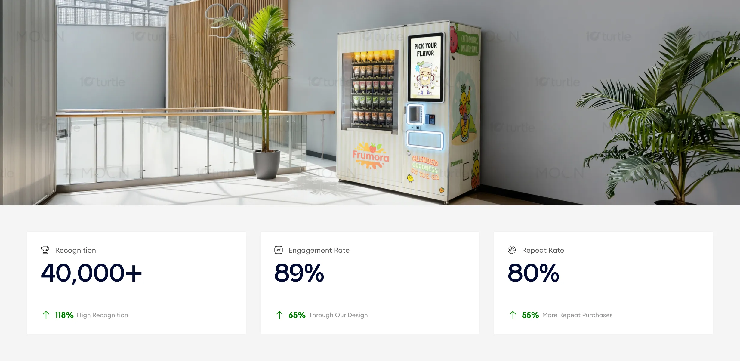
The long-term vision is to establish Frumora as a recognized leader in automated healthy beverages, scalable across geographies and use cases. The design system is built to adapt seamlessly across future machine models, new product lines, and additional brand touchpoints such as packaging, digital interfaces, and outdoor installations. By balancing friendliness with professionalism, the design supports sustained brand growth while remaining relevant in evolving retail environments.

This color palette reinforces authority, urgency, and clarity. Elegant blue conveys trust, professionalism, and stability, which are essential in real estate decisions. Glossy red highlights urgency and financial impact, drawing attention to guarantees and calls to action. Full white ensures readability and visual balance, while black adds contrast, strength, and sophistication, supporting a premium and confident brand presence.