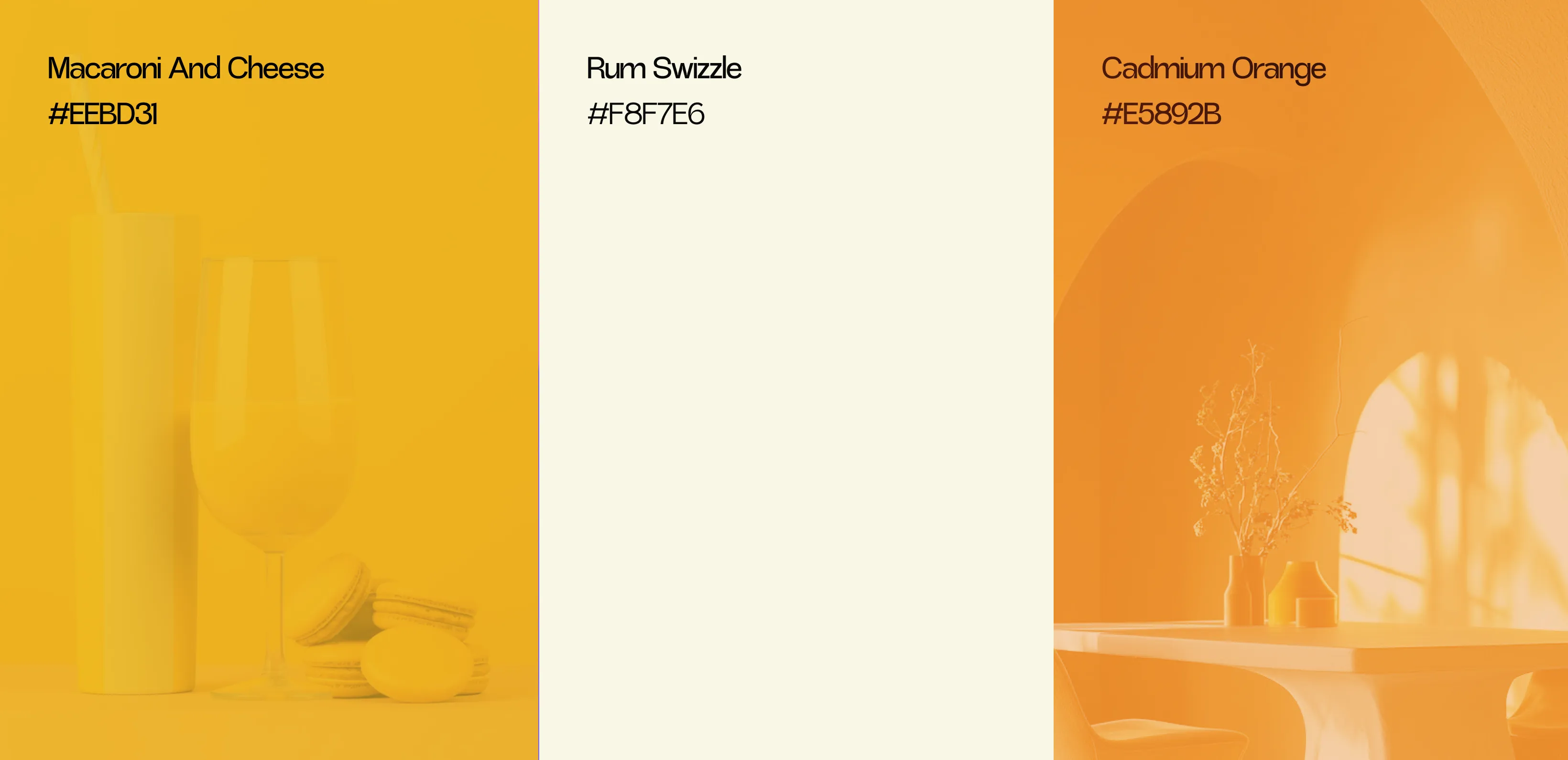
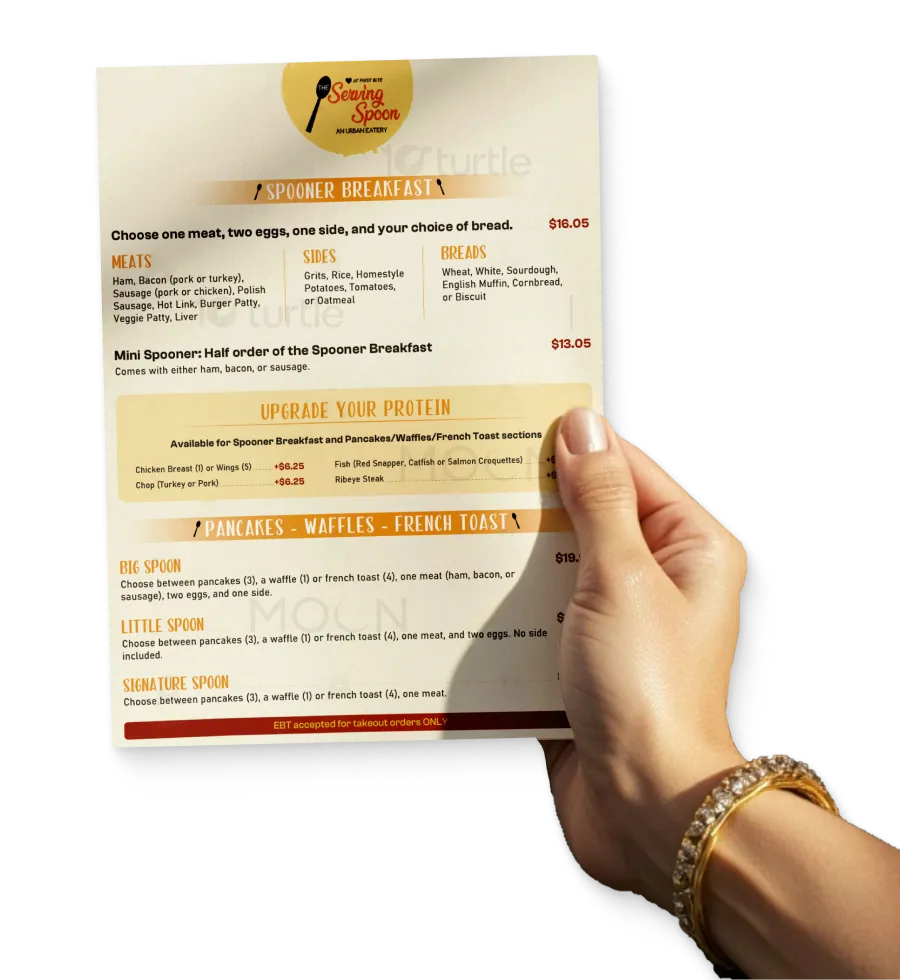
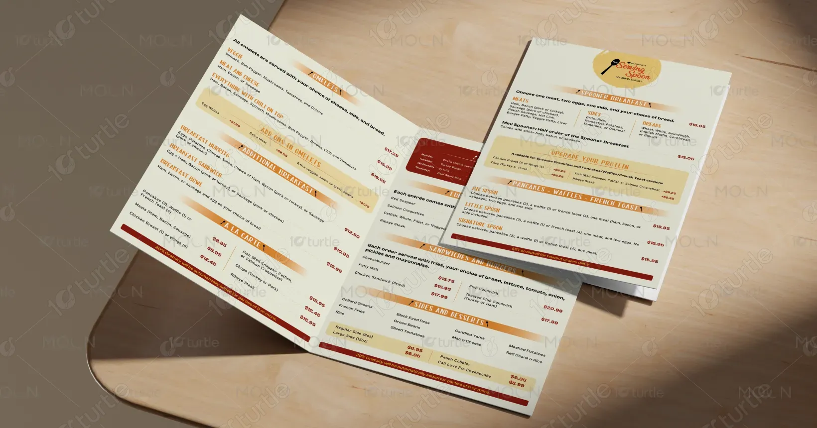
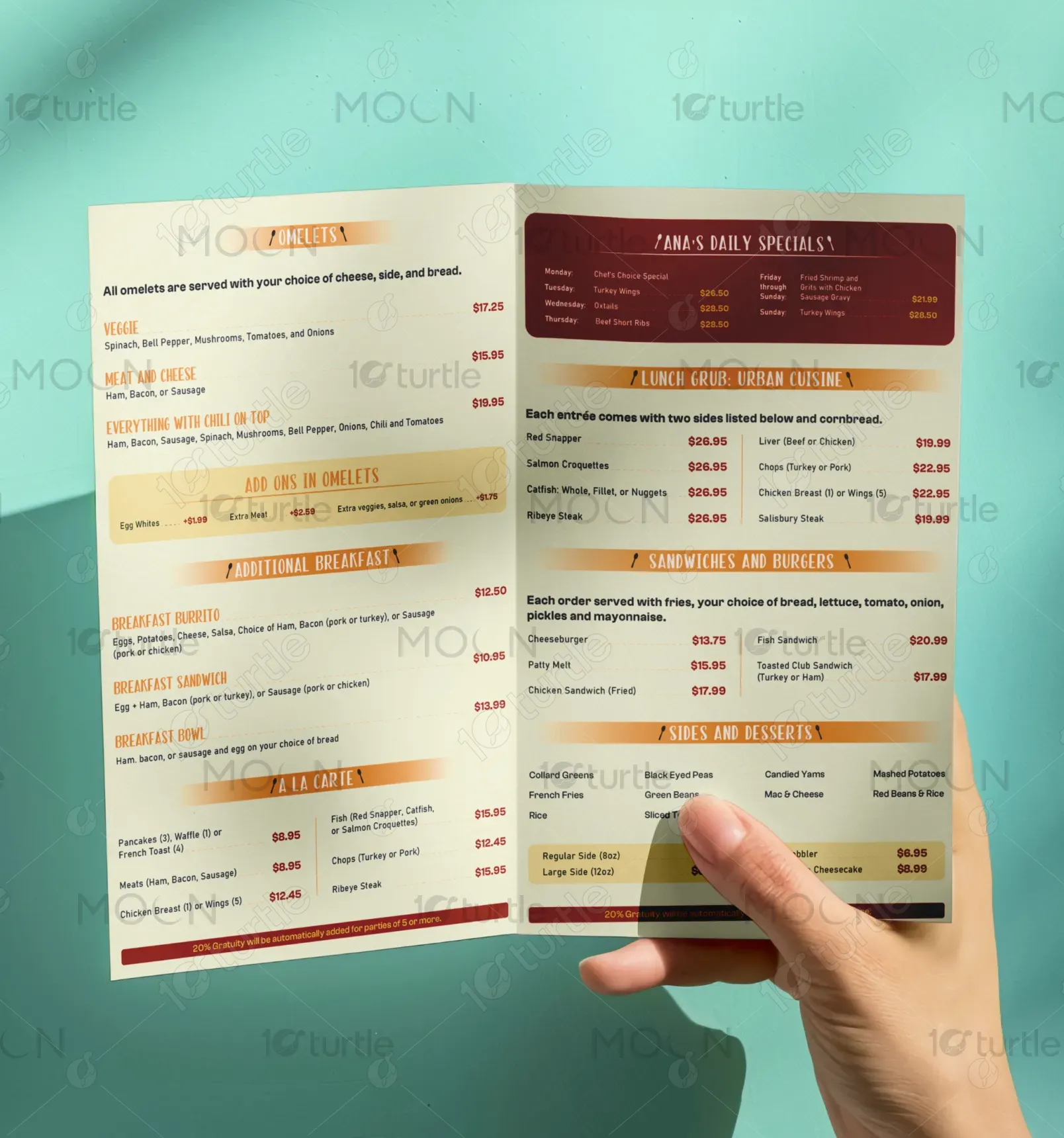
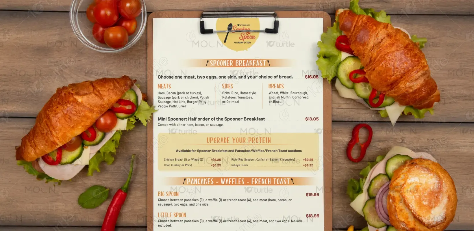
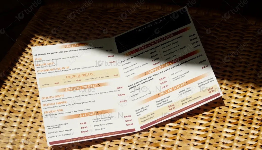
This restaurant menu design embraces a modern minimalist aesthetic, blending clean typography with vibrant food imagery to enhance user experience. A strategic use of white space and a well-structured layout ensures easy readability, while textured backgrounds and hand-drawn accents give it a warm, artisanal feel. The creative direction balances sophistication with approachability, making it suitable for both upscale dining and casual eateries. Overall, the design aims to complement the dining experience by making menu navigation intuitive and visually delightful.
Menu Card Design
Graphic Design
Industry
Food, Beverage & Hospitality
Tools we used


Project Completion
2025
Key Market
Global
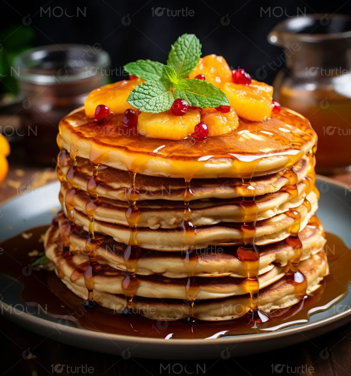
The menu design is a refined, user-friendly visual tool created to elevate the dining experience. It showcases dishes through high-quality images and organized sections, helping customers make quick, confident choices. Unlike generic templates, this design is customized to reflect the restaurant's brand identity, whether rustic, contemporary, or fusion-themed. Its unique selling point lies in its blend of aesthetics and function—captivating customers visually while streamlining the ordering process.
Industry
Food, Beverage & HospitalityWhat we did
Menu Card DesignGraphic DesignPlatform
-Many restaurant menus overwhelm customers with cluttered layouts, inconsistent fonts, or poor image quality, leading to confusion and decision fatigue. In an era where visual appeal influences dining choices, especially among digitally savvy consumers, outdated or poorly designed menus can deter customers. For instance, fast-casual spots often rely on laminated text-heavy lists that lack visual hierarchy, failing to entice or guide customers effectively.
This menu design addresses those pain points with a clean, responsive layout that prioritizes readability and aesthetic harmony. Innovative use of icons, consistent typography, and well-placed images enhances navigation and appetite appeal. The modular grid design allows for easy updates, accommodating seasonal menus or dietary icons without disrupting the flow. It’s also optimized for both print and digital formats, ensuring versatility across platforms.
The long-term vision is to set a new standard for menu presentation across diverse dining formats—from food trucks to fine dining. By prioritizing design thinking and customer psychology, this approach seeks to transform menus into brand ambassadors. The goal is to continuously evolve with trends in digital integration, accessibility, and sustainability, ultimately enhancing customer satisfaction and brand loyalty.
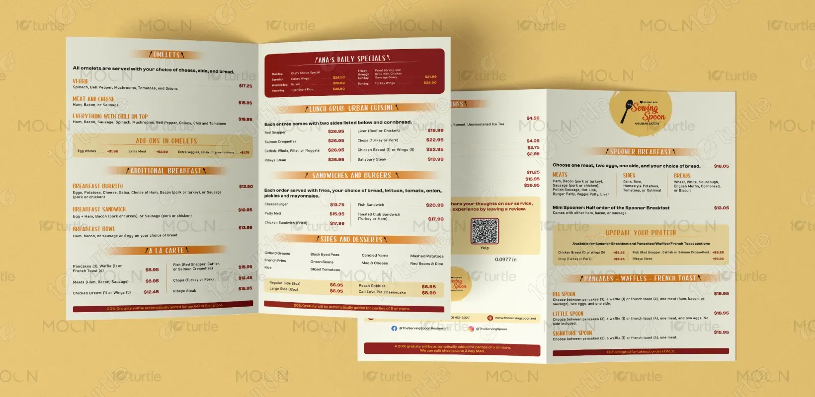
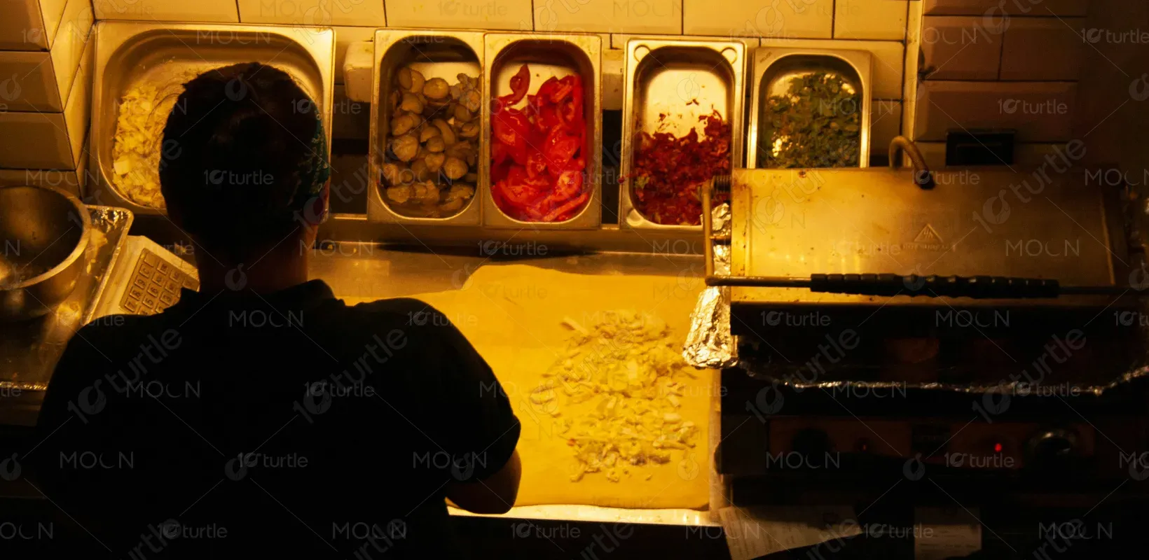
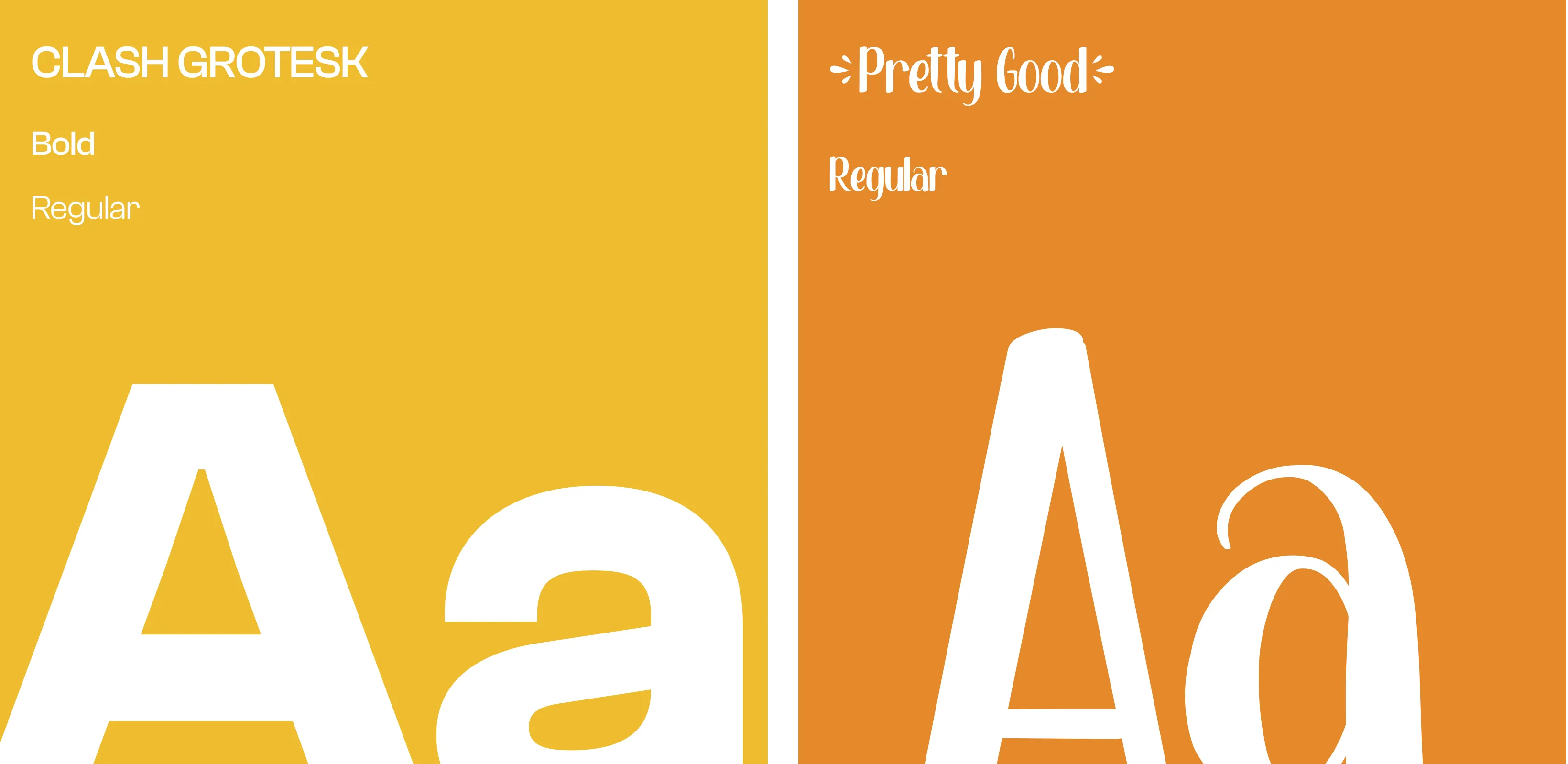
The chosen color palette includes warm earth tones (terracotta, olive green) paired with neutrals (ivory, slate gray) to evoke a sense of comfort, freshness, and authenticity. These colors reflect the organic and handmade essence of the cuisine, aligning with the brand’s commitment to quality and transparency. The muted scheme creates a calm, inviting atmosphere, while subtle accent colors (such as saffron or teal) highlight signature dishes and special offers without overwhelming the eye.
