Home / Blog / Beyond the Pixel: Crafting App Icons That Click, Convert, and Captivate!
An app icon is more than just a tiny graphic; it's your digital handshake, your brand's miniature billboard on a crowded screen. This blog dives into the art and science of creating app icons that don't just look good, but also command attention, convey purpose, and drive downloads. Discover how a small square can unlock immense growth, blending creativity with strategy to make your app unforgettable. Get ready to transform your app's first impression into a lasting connection and stand out in the bustling app marketplaces.
3 Oct, 2025
1. The Mighty Mini-Masterpiece: Why Your App Icon Matters More Than Ever
Imagine walking down a digital Connaught Place, scrolling past hundreds of storefronts (apps) on your phone. What makes you stop and peek inside one? Often, it’s that tiny, tantalizing app icon! This miniature masterpiece is your app's first impression, a silent salesperson, and a critical branding element. Did you know that a well-designed app icon can increase download rates by up to 30%? It's not just about looking pretty; it's about communicating instantly, building trust, and sparking curiosity. A bland or confusing icon is like a missed opportunity – a closed door in the bustling app market. Don't let your amazing app get lost in the shuffle because of a forgettable square! It’s the visual cue that makes users think, “Hey, this looks interesting!” and then, “Click.”
• First Impressions Count – A compelling icon grabs attention in less than a second.
• Brand Identity in a Nutshell – It encapsulates your brand's essence and personality.
• Conversion Catalyst – Directly influences a user's decision to download or ignore.
2. Beyond Aesthetics: The Psychology of an Icon That Connects
Ever wonder why some icons just feel right? It's not magic, it's psychology! Effective app icons tap into human emotions and cognitive biases. For instance, studies show that icons with familiar shapes or warm colors tend to evoke positive feelings, increasing engagement. Users often associate certain visual cues with specific functions, making clarity paramount. Think about it: a play button is universally understood. Ignoring this can lead to user frustration. This is where expert Graphics & Design and UI/UX services become indispensable, ensuring your icon speaks the right language without uttering a single word. A great icon makes a user feel, 'This app gets me!'
• Emotional Resonance – Colors and shapes trigger specific user feelings.
• Cognitive Ease – Instantly recognizable symbols reduce mental effort for users.
• Brand Storytelling – Conveys your app's purpose and value proposition visually.
3. The Anatomy of a Winner: Key Elements for App Icon Success
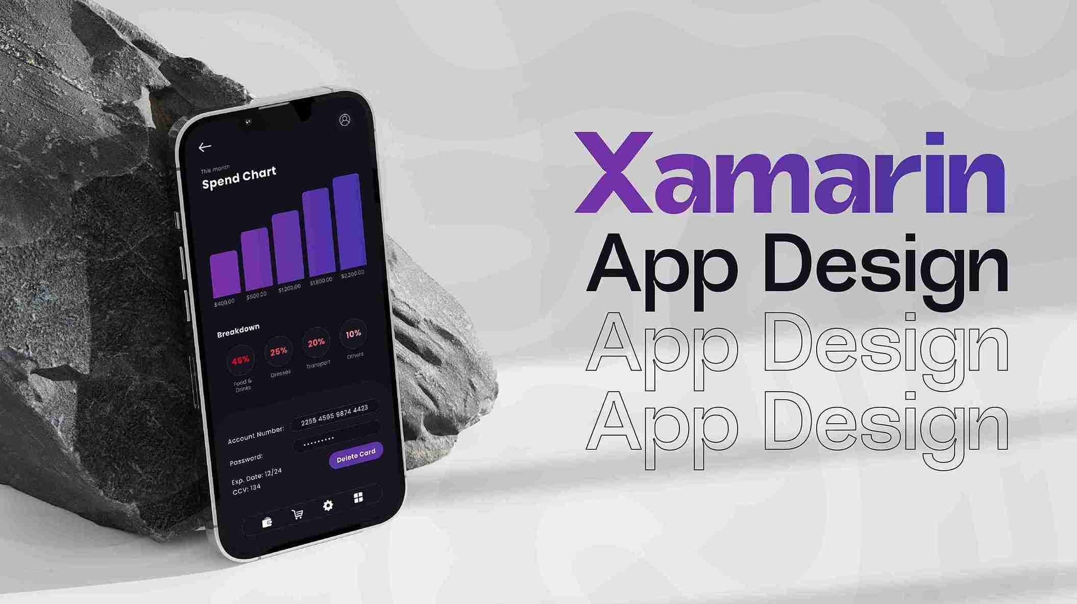
So, what makes an icon truly 'pop'? It starts with simplicity. Over-cluttering an icon with too many details makes it illegible at small sizes. Uniqueness is another must; you don't want to be mistaken for a competitor. Scalability is crucial – your icon must look great on everything from a smartwatch to a billboard, and in both light and dark modes. Did you know over 80% of users expect icons to be visually consistent across platforms? Utilizing modern design tools and even AI Services for concept generation can provide a significant edge. Imagine you're designing for a new Mobile App – will it shine at 180x180 pixels and 20x20 pixels? If not, back to the drawing board!
• Simplicity is Key – Avoid complex details that get lost at small scales.
• Distinctive Identity – Create a unique visual signature that stands out.
• Cross-Platform Scalability – Ensure clear and crisp display on all devices and sizes.
4. From Concept to Click: Demystifying the Icon Design Process
Creating an impactful app icon isn't a shot in the dark; it's a strategic journey. It begins with deep brainstorming – understanding your app's core function, target audience, and brand personality. Next comes sketching and rapid prototyping, exploring various visual metaphors and compositions. Tools like Canva can be great for quick mock-ups, but for custom, high-fidelity designs, leveraging dedicated Custom Software solutions or professional designers is key. Iteration is vital; gather feedback, test different versions with real users, and refine until you hit that sweet spot. Remember, the average app undergoes 3-5 icon iterations before final launch. Don’t settle for 'good enough' when 'iconic' is within reach!
• Thorough Research & Brainstorming – Define core concepts and target audience.
• Prototyping & Iteration – Sketch multiple ideas, test, and refine designs.
• User Feedback Integration – Incorporate insights for optimal user appeal.
5. Standing Out in the Crowd: App Store Optimization (ASO) for Icons
The app stores are digital jungles, teeming with millions of apps vying for attention. Your icon is your most powerful ASO (App Store Optimization) tool! A compelling icon, combined with strategic keywords and descriptions, can significantly boost your app's visibility and conversion rates. Think about how major brands use vibrant, clear icons that instantly convey their value. Leveraging Digital Marketing strategies for ASO, including A/B testing different icon designs, can reveal what truly resonates with your audience. Furthermore, a striking icon can be highlighted in Video & Animation previews, drawing even more eyes. Apps with optimized icons see up to a 20% increase in discoverability.
• ASO Powerhouse – Your icon is a key factor in app store visibility and click-throughs.
• A/B Testing – Experiment with different icon designs to optimize performance.
• Cultural Relevance – Ensure your icon's imagery is appropriate and appealing globally.
6. Future-Proofing Your Pixel: Trends, Evolution, and Innovation
The digital landscape is constantly evolving, and so too should your app icon strategy. What’s trending today might be passé tomorrow. Embracing adaptive and responsive design principles ensures your icon remains fresh and relevant. Consider the rise of Web3 and decentralized applications; icons for these platforms often require a blend of futuristic and familiar aesthetics. Integrating icons into Web Development for companion sites or dashboards is equally important. Even projects in the Blockchain & Web3 space require distinctive visual identities. Keeping an eye on industry shifts and being ready to refresh your icon every 2-3 years, as many leading apps do, keeps you ahead of the curve. Your icon isn't static; it's a living brand element!
• Adaptive Design – Icons should evolve with platform updates and design trends.
• Emerging Technologies – Design for new interfaces like AR/VR and dApps.
• Regular Refresh – Periodically update your icon to maintain relevance and appeal.
Conclusion
In a world saturated with digital choices, your app icon isn't just a tiny graphic; it's a colossal opportunity. It’s the visual handshake that beckons users, the miniature billboard that broadcasts your brand, and the silent storyteller that captures attention. From the initial spark of an idea to its polished pixel form, the journey of app icon design is an intricate blend of creativity, psychology, and strategic foresight. Just like Apple's iconic bitten apple, a great app icon transcends mere imagery – it becomes a symbol of innovation, reliability, and user delight. Invest wisely in your icon, and watch your app flourish. "A picture is worth a thousand words, and an app icon, a thousand downloads!"
1. How important is an app icon for user acquisition?
An app icon is incredibly important for user acquisition, acting as the first visual touchpoint. It can significantly influence click-through rates and downloads, as users often judge an app by its icon before reading descriptions.
2. Should my app icon be a literal representation of my app's function?
Not necessarily. While clarity is important, an icon can also be abstract or symbolic, as long as it conveys the app's essence and brand personality effectively. Sometimes, a unique metaphor works better than a literal depiction.
3. How often should I consider redesigning my app icon?
It's a good practice to review and potentially refresh your app icon every 2-3 years, or when there's a significant brand change or new industry trends. This ensures your icon stays modern, relevant, and visually appealing to new users.
4. What's the biggest mistake to avoid in app icon design?
The biggest mistake is over-complication or poor legibility. An icon that is too busy, has too much text, or doesn't scale well will appear cluttered and fail to make a clear, positive impression at small sizes.
5. Can an app icon truly impact my app's overall success?
Absolutely. A well-designed, memorable app icon can enhance brand recognition, improve app store optimization (ASO), drive higher download conversions, and ultimately contribute significantly to your app's long-term success and user engagement.
Browse
Resources