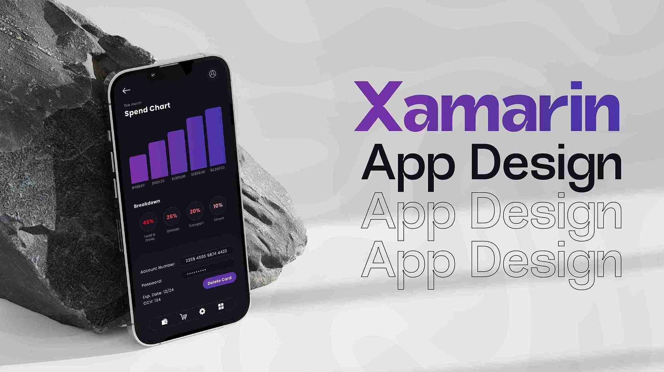
Home / Blog / The Tiny Titan: Why App Icon Design is Your Brand's Biggest Bet
Ever wondered why some apps instantly catch your eye, while others fade into the digital background? It all boils down to that tiny square: the app icon. This often-underestimated design element is a powerhouse for first impressions, brand recognition, and even user engagement. It's the silent ambassador for your digital product, communicating its essence, purpose, and personality in a mere glance. Discover why investing in professional app icon design isn't just an aesthetic choice, but a strategic imperative that can significantly impact your app's success in the crowded marketplace. Let's unlock the secrets to creating icons that truly resonate.
25 Oct, 2025
1. The First Impression: A Digital Handshake
Imagine walking down Connaught Place and seeing a new store. What draws you in? Often, it's the storefront, the logo, the immediate visual appeal. Your app icon is precisely that for the digital world. In a blink—literally, users spend on average less than 3 seconds scanning app store listings—your icon needs to make a statement. It's the first 'hello,' the digital handshake that invites users to learn more or scroll past. A poorly designed icon suggests a poorly designed app, regardless of its functionality. Think of Snapchat's ghost or Instagram's retro camera; these icons are instantly recognizable and evoke trust and familiarity. Studies show that a compelling app icon can increase app store conversion rates by up to 20%. This initial visual magnet is crucial for attracting users in a marketplace overflowing with options, making it a critical component of your overall Digital Marketing strategy. Don't let your app be a hidden gem with a dull exterior; let its icon sparkle and entice.
2. Brand Identity in a Tiny Canvas
An app icon isn't just a picture; it's a condensed brand story, a micro-masterpiece of identity. It encapsulates your app's core values, functionality, and personality into a single, scalable graphic. A well-crafted icon becomes synonymous with your brand, building recognition and loyalty over time. Consider how the WhatsApp icon, a simple chat bubble, clearly communicates its messaging purpose, or the Netflix 'N' instantly signals entertainment. These icons are not just functional but are powerful branding tools that reinforce their identity across various platforms. Integrating this tiny visual element requires a deep understanding of your brand's essence and its target audience, often a key deliverable in professional Graphics & Design services. A consistent and memorable icon ensures that even at a glance, users instantly connect with your brand. Brands with strong visual identities are 3.5 times more likely to have excellent brand visibility.
3. Enhancing User Experience (UX) and Usability
Beyond aesthetics, a thoughtfully designed app icon significantly contributes to the overall UI/UX. It acts as a visual shortcut, helping users quickly identify and access the app on their crowded home screens. A clear, intuitive icon reduces cognitive load, meaning users don't have to think twice about what the app does. For instance, a calendar app icon typically features a date or a calendar grid, making its function immediately obvious. Problems arise when icons are overly complex, abstract, or use obscure symbolism, forcing users to pause and decipher. This friction, however small, can lead to frustration and decreased engagement. Research indicates that clean, simple icons are 40% more likely to be remembered than cluttered ones. A good icon is a functional icon, streamlining the user journey from the moment they unlock their phone to the moment they launch your Mobile App.
4. The Art of Simplicity and Scalability
Creating an effective app icon is an exercise in elegant simplicity. The challenge lies in conveying maximum meaning with minimum elements, making it legible and impactful across various sizes, from a tiny notification dot to a large app store banner. Think of the Facebook 'f' or Twitter's bird: simple, distinct, and instantly recognizable at any scale. An icon that looks fantastic on a large canvas might become an unreadable blur when scaled down to 18x18 pixels. This requires designers to focus on a single, strong focal point and avoid intricate details that get lost. Many designers leverage tools like Canva for quick mockups, but professional scalability demands expert insight, ensuring your icon shines whether it's on an iPhone, Android, or even in a Web Development context for a PWA. Over 70% of top-performing app icons utilize a single, dominant graphic element, underscoring the power of simplicity.
5. Standing Out in a Sea of Apps
With millions of apps vying for attention in app stores, standing out is no longer a luxury but a necessity. Your app icon is your digital billboard in a crowded urban landscape. It needs to be unique, memorable, and visually distinctive enough to cut through the noise. This means avoiding generic stock imagery or overly trendy designs that quickly become dated. A great app icon often incorporates unique color palettes, interesting shapes, or clever metaphors that capture attention. It's about finding that sweet spot between familiarity and originality. Utilizing insights from AI Services can even help analyze competitor icons and identify visual gaps in the market. A distinct icon can lead to a 15% higher recall rate among users, giving your app a significant edge in discovery. Remember, a unique icon isn't just about looking pretty; it's about being seen and chosen.
6. Beyond the Static: Animation and Evolution
While static icons remain the standard, the future of app design is hinting at more dynamic elements. Imagine an icon that subtly animates to signal a new notification, or one that changes its appearance based on time of day. This evolution pushes the boundaries of traditional app icon design, demanding innovative approaches to capture user attention in new ways. Though not yet mainstream, some platforms allow for micro-animations or contextual changes. This opens up opportunities for services like Video & Animation to explore new frontiers in interactive icon design. Even in its current static form, an icon isn't set in stone. Popular apps frequently refresh their icons to align with new branding, features, or seasonal campaigns. This iterative design process, often supported by Custom Software tools for versioning and A/B testing, ensures your icon stays relevant and fresh. Apps that refresh their icons report an average increase of 10% in re-engagement.
7. Technical Considerations: Pixels, Platforms, and Performance
Designing an app icon isn't purely an artistic endeavor; it’s heavily influenced by technical specifications and platform guidelines. Each operating system (iOS, Android, Windows) has its own unique requirements for icon size, shape, padding, and even color profiles. Ignoring these can lead to distorted, pixelated, or simply non-compliant icons. For example, iOS icons are typically rounded rectangles, while Android icons are more flexible with adaptive shapes. Ensuring your icon renders perfectly across all devices and resolutions—from retina displays to older screens—is crucial for a polished look. This meticulous attention to detail is often a hallmark of expert Mobile App development teams. Furthermore, icon files need to be optimized for size to avoid bloating the app bundle, an aspect that touches upon broader considerations of Cloud Computing & Security in deployment. Apps with optimized icons often download 5% faster, a small but significant detail for user retention.
Conclusion
The app icon, that tiny square on your screen, is far more than just a pretty picture. It's a strategic asset, a silent salesperson, and a critical component of your app's success. From making that all-important first impression to reinforcing brand identity and enhancing user experience, its impact is undeniable. Just as a well-designed storefront invites customers, a captivating app icon beckons users to explore your digital offering. Remember, in the bustling app economy, your icon is often the first and last thing a potential user sees. So, invest wisely, think creatively, and let your app icon be the tiny titan that champions your brand. Need help? Services from 10turtle can help bring your vision to life, ensuring your app stands out from the crowd.
1. Why is app icon design so important?
It’s the first impression users get, significantly impacting download rates and brand recognition in crowded app stores. A strong icon acts as a visual hook.
2. How often should an app icon be updated?
While not frequent, icons can be refreshed to align with major updates, rebrands, or seasonal campaigns to maintain freshness and engagement.
3. What makes an app icon effective?
Simplicity, uniqueness, scalability, and relevance to the app's function are key. It should be easily recognizable at various sizes.
4. Can AI assist in app icon design?
Yes, AI Services can help with trend analysis, generating initial concepts, or optimizing designs based on user feedback and market data.
5. Where can I get professional app icon design?
Specialized agencies and freelance designers, often found through platforms offering Graphics & Design or UI/UX services, provide expert solutions for app icon creation.
Browse
Resources