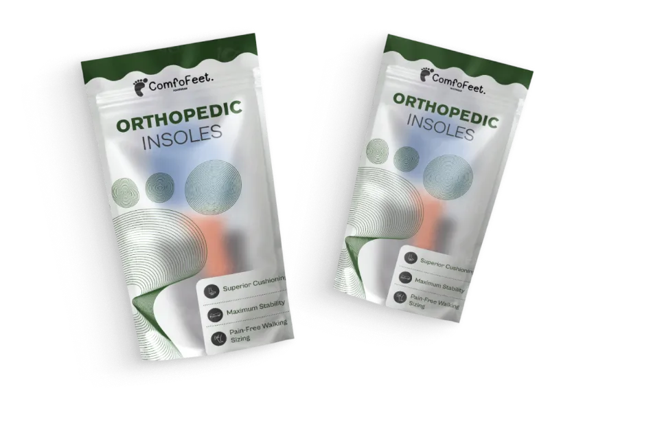
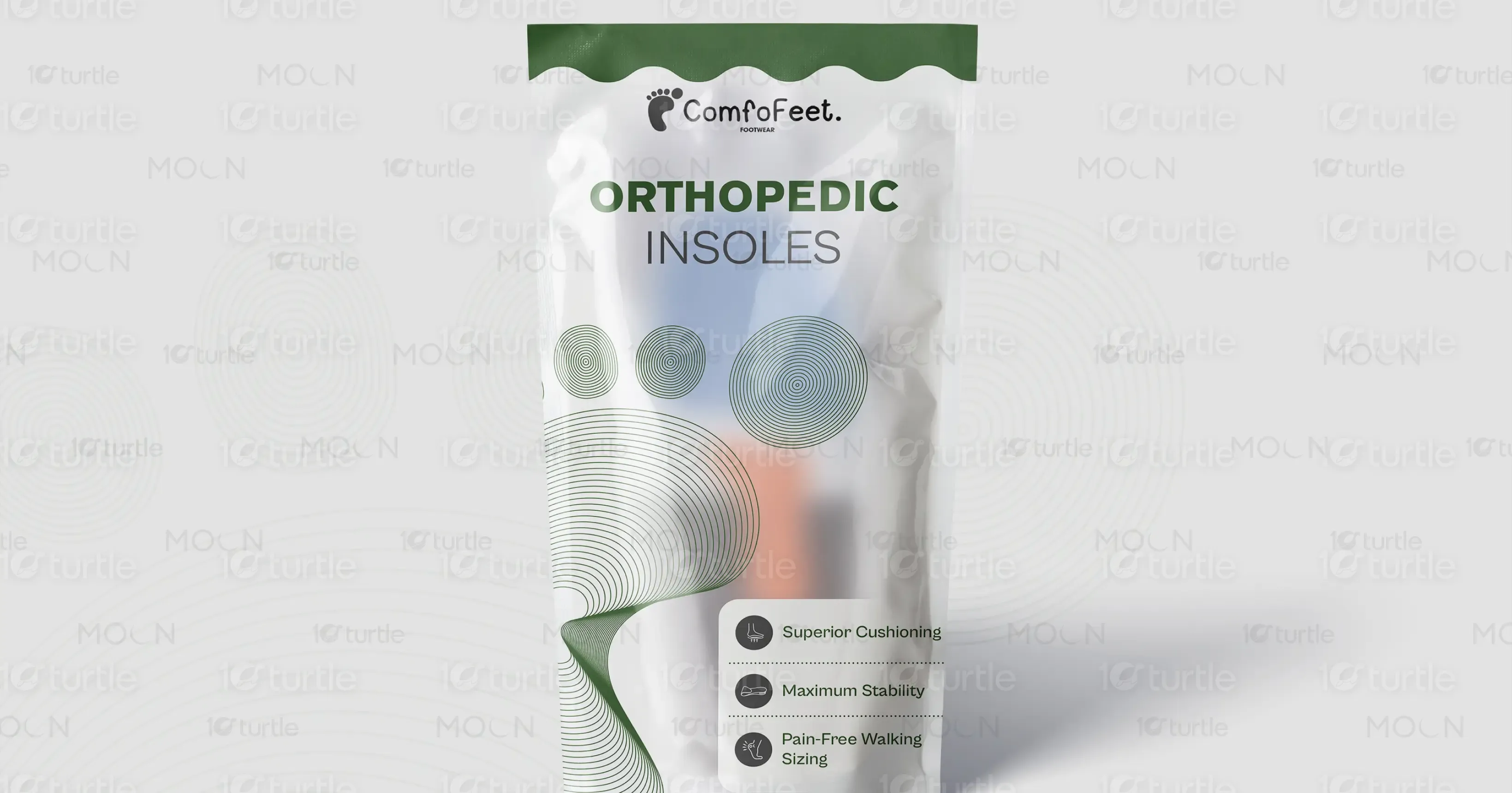
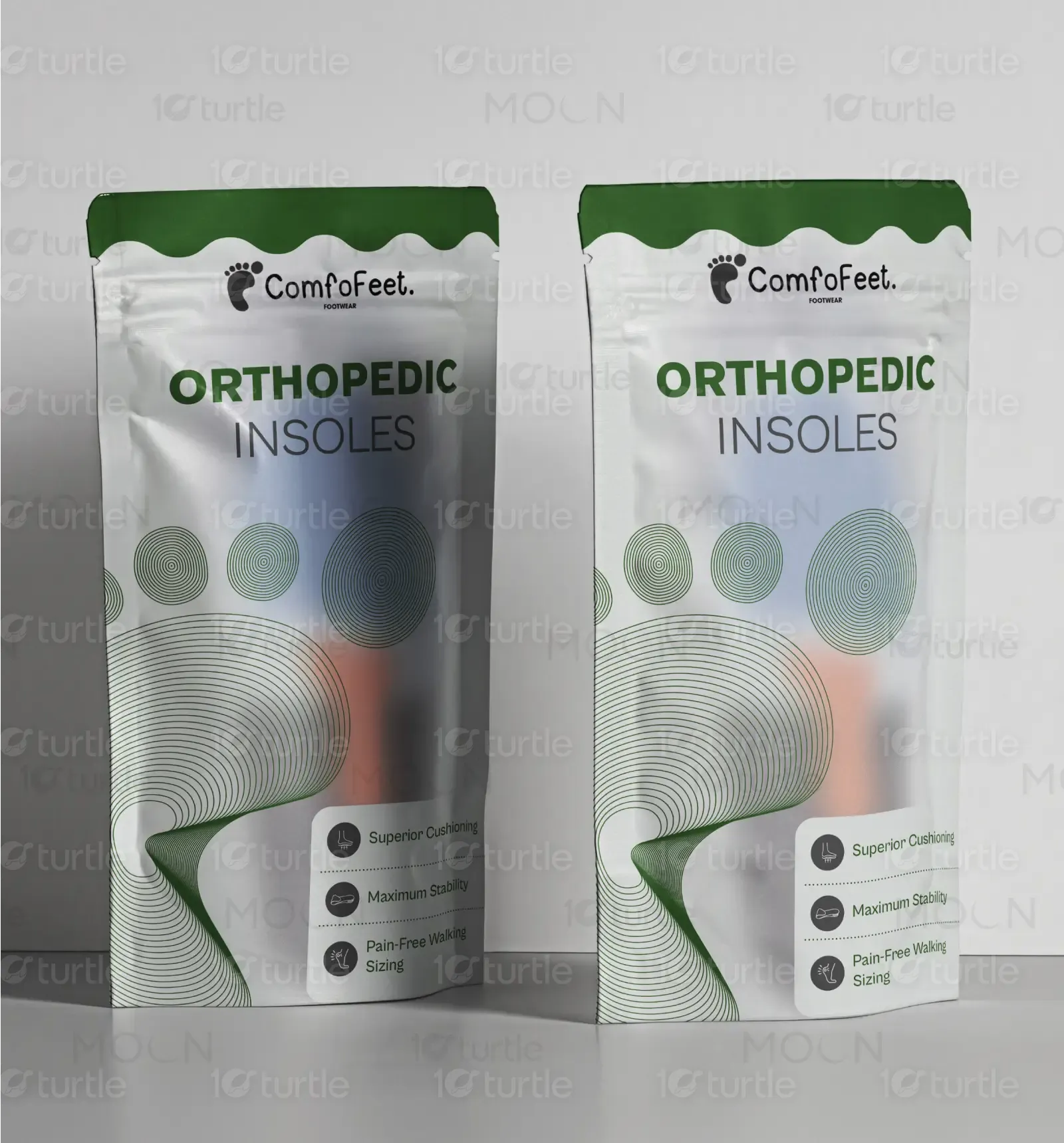
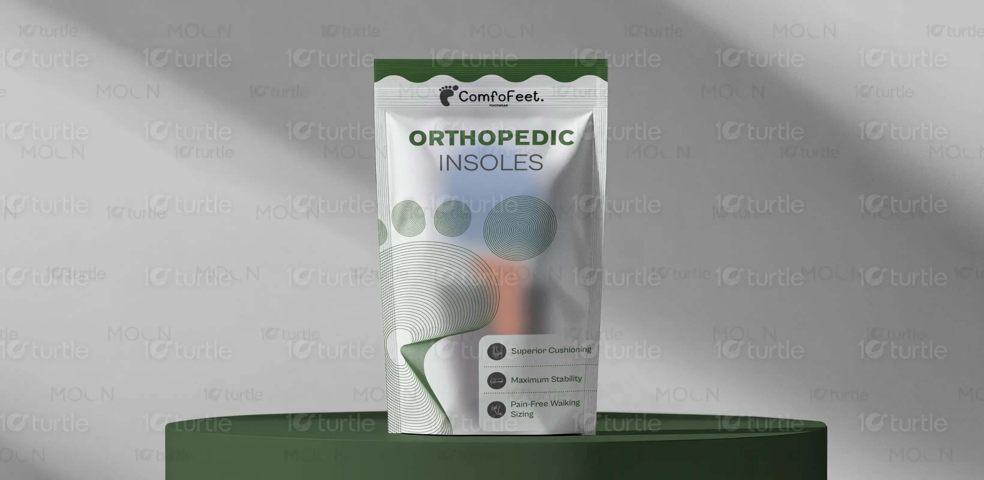
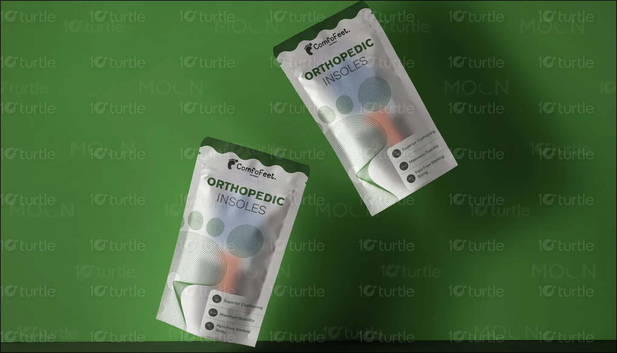
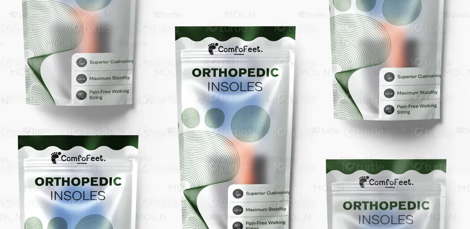
The packaging design for ComfoFeet Orthopedic Insoles embodies a blend of modern minimalism and ergonomic aesthetics, emphasizing comfort, stability, and functionality. The design features fluid circular patterns inspired by the natural contours of the foot, symbolizing motion and relief. A clean, white background evokes purity and trust, while the deep green accents reinforce the brand’s focus on health and wellness. The resealable pouch format enhances convenience, maintaining product hygiene while ensuring a premium unboxing experience. The typography is bold and readable, instantly conveying the product’s orthopedic benefits.
Packaging Design
Graphic Design
Branding
Industry
Healthcare & Wellness
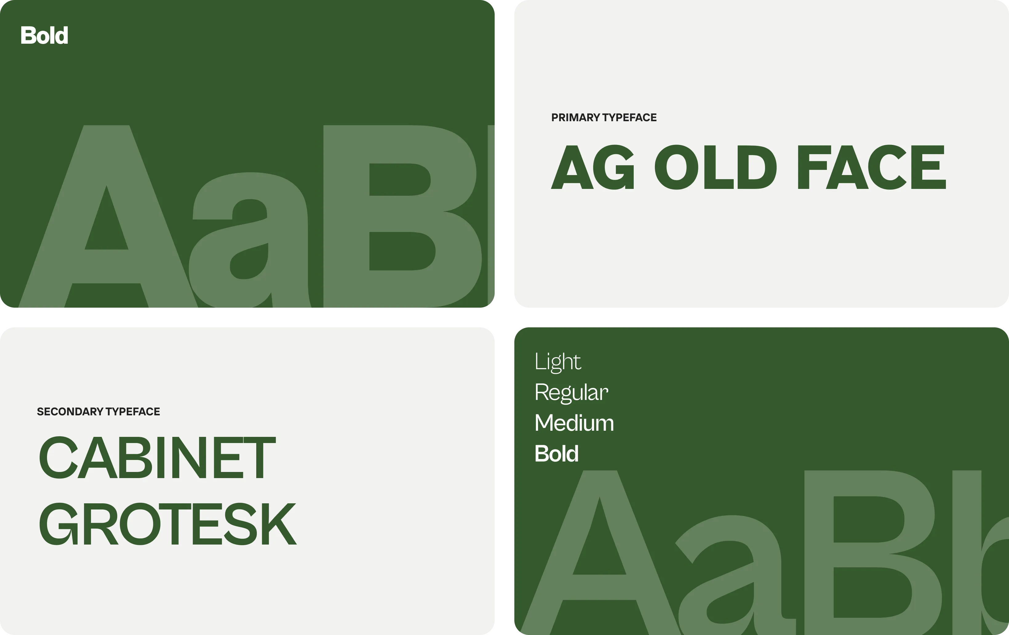
Tools we used


Project Completion
2025
Key Market
Global
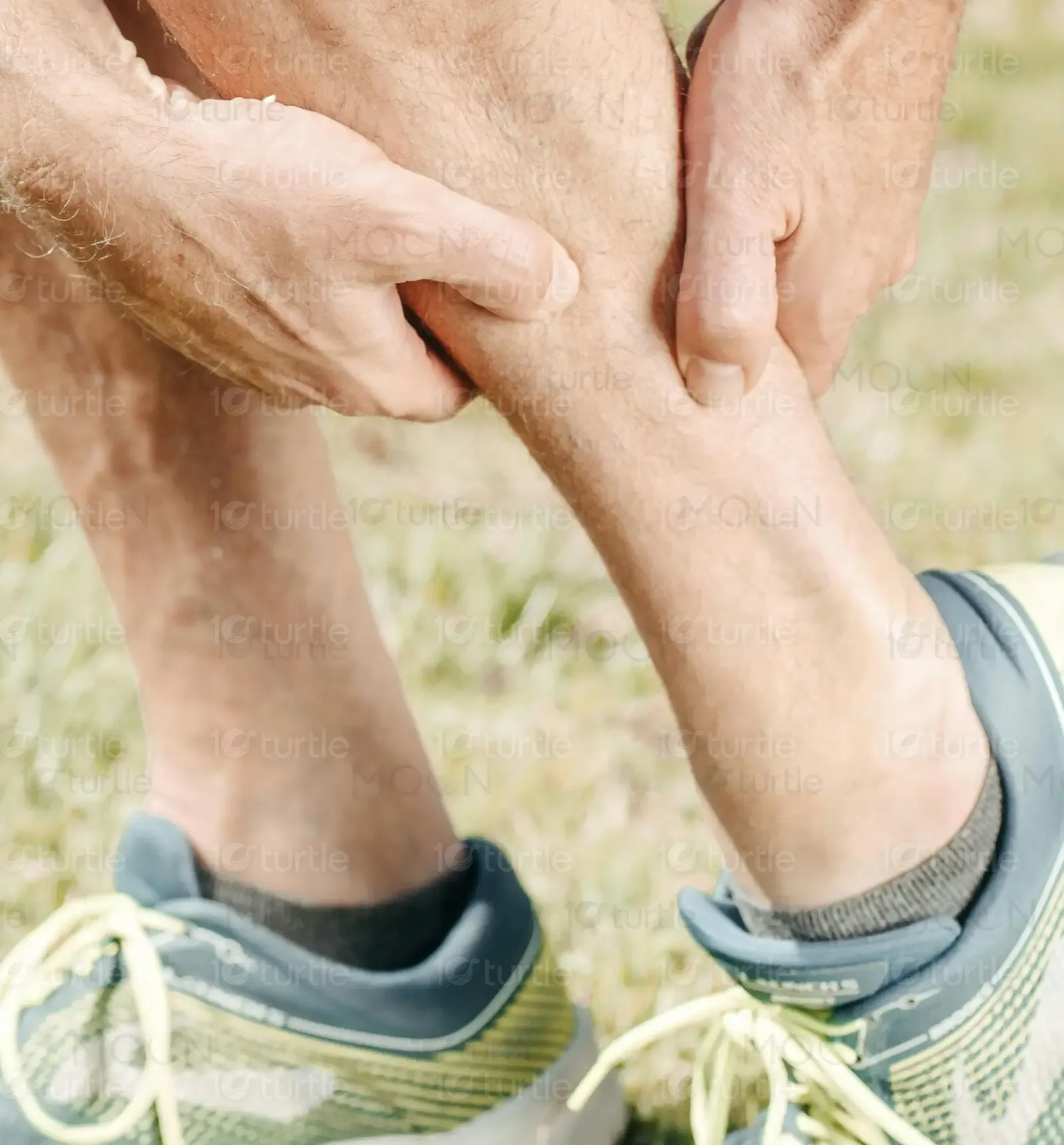
ComfoFeet Orthopedic Insoles are engineered to provide superior cushioning, maximum stability, and pain-free walking. Designed for individuals suffering from foot fatigue, plantar fasciitis, and arch discomfort, these insoles enhance comfort by reducing strain on joints and muscles. The sleek, resealable packaging not only ensures hygiene but also delivers a premium and professional appeal. As part of the footcare and wellness market, ComfoFeet stands out with its ergonomic support, durable materials, and medical-grade quality, catering to individuals seeking reliable foot relief for daily use.
Industry
Healthcare & WellnessWhat we did
Packaging designGraphic DesignBrandingPlatform
Retail supplyThe key challenge in designing this packaging was striking the right balance between medical credibility and consumer-friendly aesthetics. Many orthopedic insole packages appear either too clinical (lacking visual appeal) or overly generic (failing to convey their functional benefits). The market lacks packaging that is both informative and visually engaging, leading to consumer confusion or lack of trust. Additionally, incorporating a clean, premium look while ensuring clarity in messaging posed a design challenge. The goal was to create packaging that communicates both relief and sophistication at a glance.
To overcome these challenges, the design integrates a sleek, structured layout with organic circular patterns, symbolizing motion, balance, and comfort. The clear product benefits section on the packaging helps consumers make informed decisions quickly. The resealable pouch ensures hygiene and reusability, enhancing practicality. A combination of high-contrast typography and soothing color tones makes the design both professional and approachable. By merging scientific credibility with modern aesthetics, the packaging achieves a visually compelling and functionally effective solution.
The long-term vision for this packaging design is to establish ComfoFeet as a leading brand in orthopedic wellness, offering a seamless blend of medical efficiency and stylish presentation. Future iterations of the packaging may introduce color-coded variants for different foot conditions (e.g., arch support, diabetic-friendly insoles) and eco-friendly materials to align with sustainable consumer trends. The design aims to set a new benchmark in orthopedic packaging, making functional footcare solutions more accessible, engaging, and trustworthy for a wide audience.
The green and white color scheme reflects the brand’s core values—health, stability, and relief. Green symbolizes balance, comfort, and wellness, reinforcing the orthopedic benefits of the product. White conveys cleanliness, trust, and medical-grade quality, ensuring a professional appearance. The subtle gradient transitions add depth, making the packaging visually appealing without overwhelming the user. The choice of dark green typography enhances readability and sophistication, ensuring the product’s premium positioning. Together, these colors create a calm, credible, and effective brand identity that resonates with health-conscious consumers.