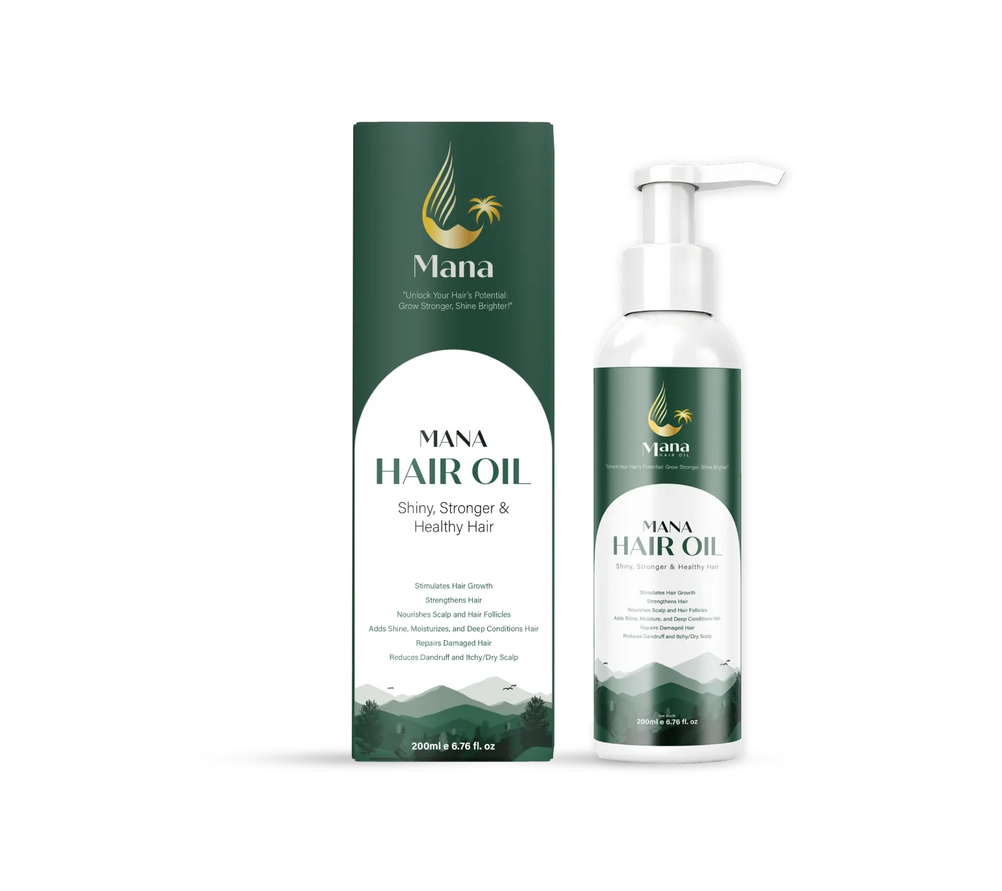
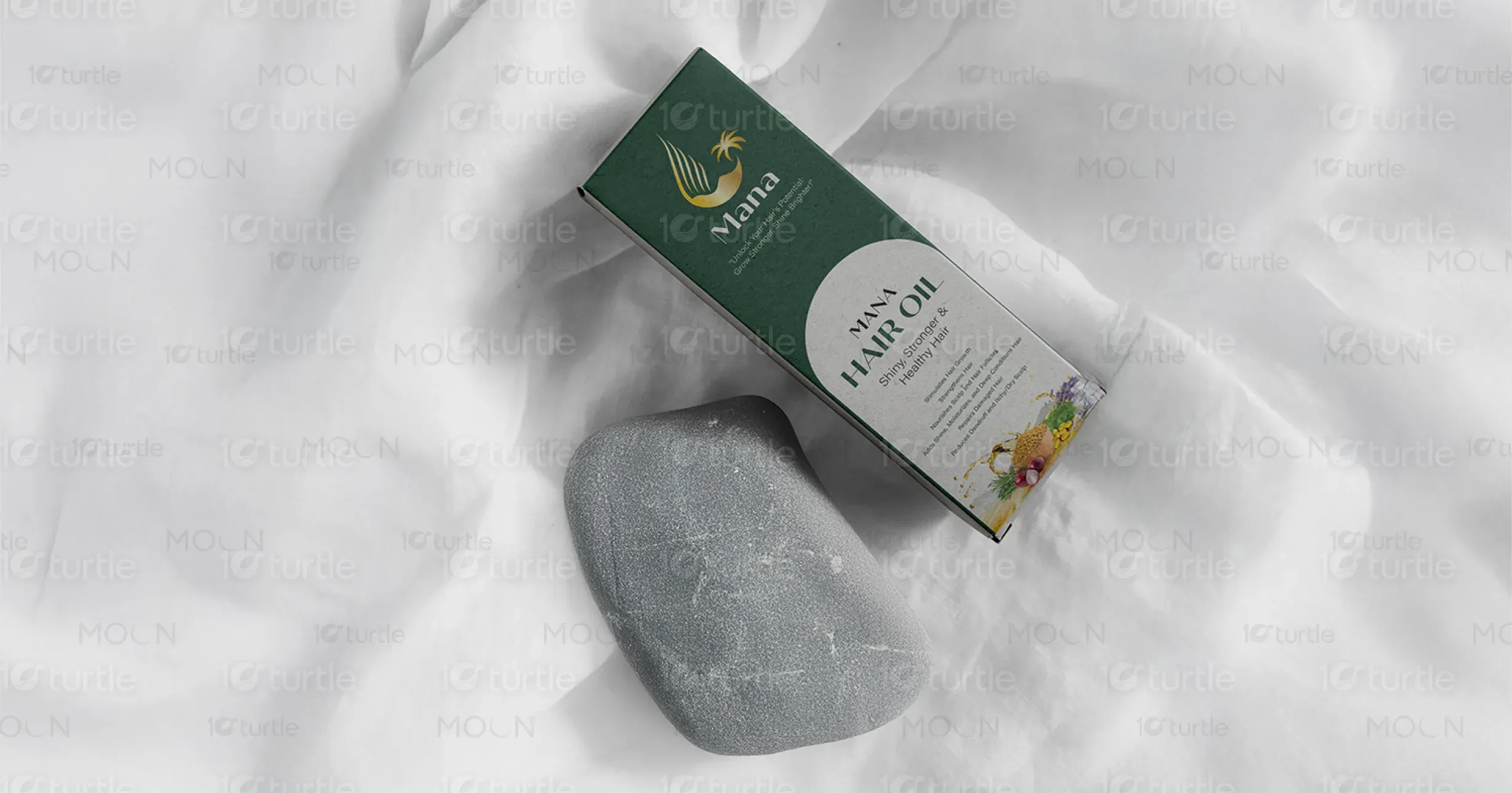
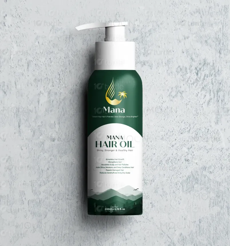
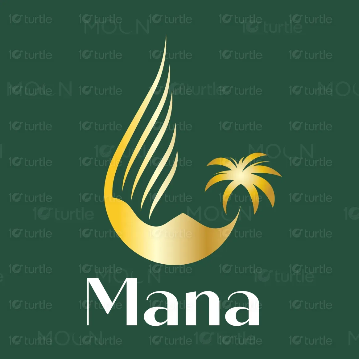
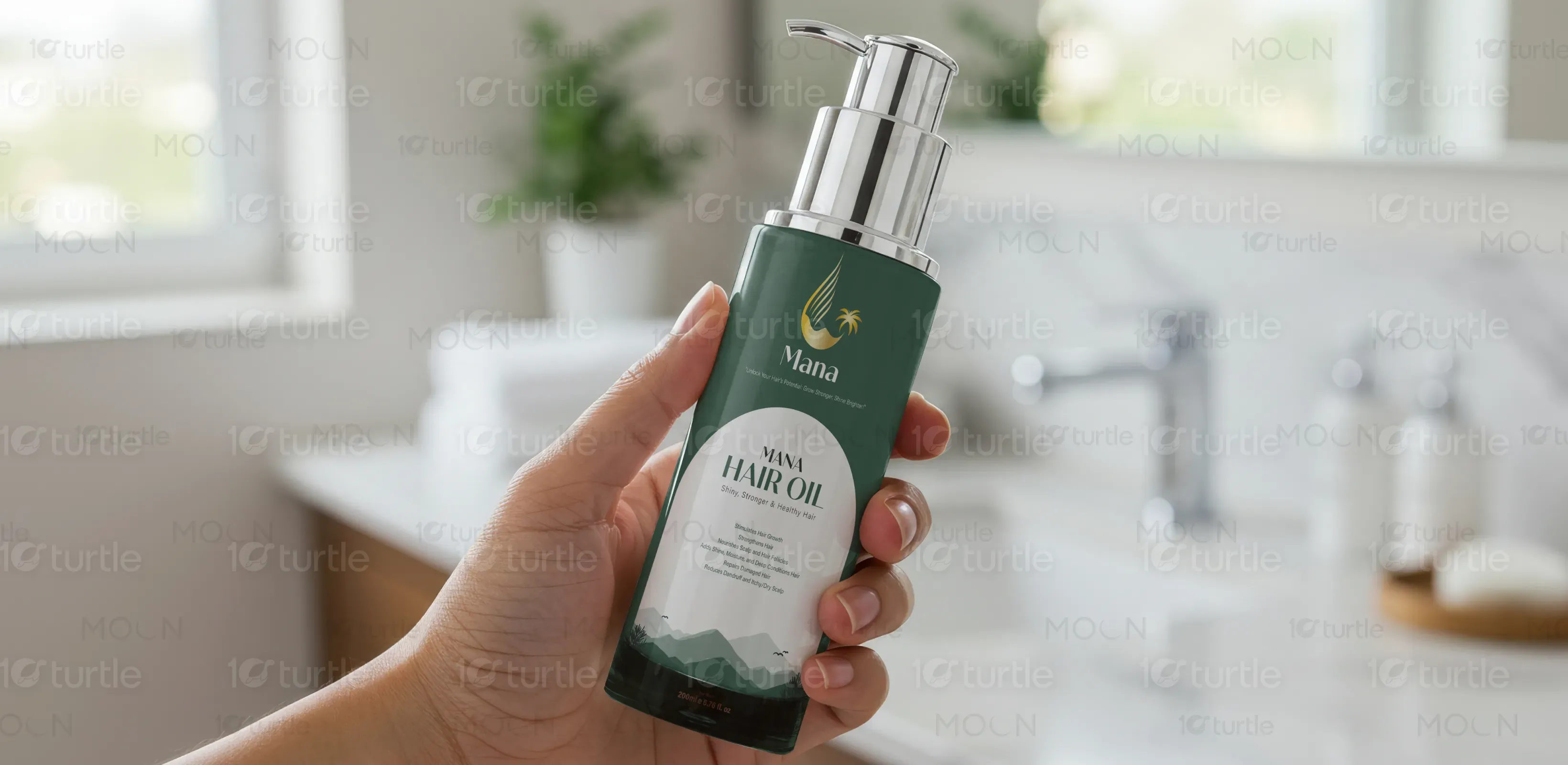
The design embraces a minimalist yet premium aesthetic, combining deep forest green with gold to evoke natural richness and luxury. The sleek typography, clean circular label section, and iconography symbolize nourishment and growth, aligning with the hair oil's benefits. The mountainous base graphic reflects organic purity and strength. The pump bottle design enhances convenience while reinforcing a clean, modern appeal. Overall, the visual identity balances trust, efficacy, and elegance—perfectly suited for a premium haircare brand.
Graphic Design
Packaging Design
Label Design
Industry
Healthcare & Wellness
Tools we used


Project Completion
2025
Key Market
Global
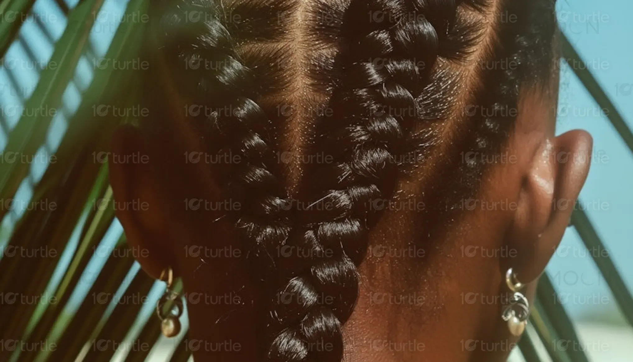
Mana Hair Oil is a premium haircare product designed to promote shiny, stronger, and healthier hair. Enriched with natural oils and botanicals, it supports hair growth, strengthens follicles, and nourishes the scalp. The design and branding reflect its organic roots and therapeutic benefits, appealing to consumers seeking both beauty and wellness. With its clean, luxurious packaging and botanical-driven formula, Mana positions itself as a holistic solution in a saturated market—standing out through quality, elegance, and efficacy.

Industry
Healthcare & WellnessWhat we did
Graphic DesignPackaging DesignLabel DesignPlatform
-Most hair oils in the market either look overly medicinal or excessively flashy, often failing to inspire trust or convey natural effectiveness. Additionally, cluttered labels and poor packaging usability reduce product appeal and user experience. In a market driven by visual aesthetics and quick purchasing decisions, lack of premium yet natural branding often causes potential customers to overlook quality products. This gap is especially evident among consumers seeking effective yet beautifully packaged self-care items.
Mana bridges the gap by merging therapeutic credibility with a premium, nature-inspired aesthetic. The rich green palette evokes botanical strength, while the gold logo and clean typography create an upscale look. The pump dispenser adds functional sophistication, making the experience clean and efficient. The mountain motif on the label grounds the product in purity and nature. Clear, concise labeling enhances readability and trust—ensuring it catches attention on shelves while delivering a sensory and functional experience.

Mana aspires to become a leading force in botanical haircare, trusted for its integrity, effectiveness, and elegant simplicity. The brand envisions expanding into a full line of nature-based wellness and haircare solutions—each with a design rooted in calm confidence and premium care. With growing emphasis on clean beauty and holistic health, Mana aims to influence the industry toward authenticity, sustainability, and self-care sophistication—leaving a lasting impression in both the market and consumers’ routines.
.webp)
.webp)
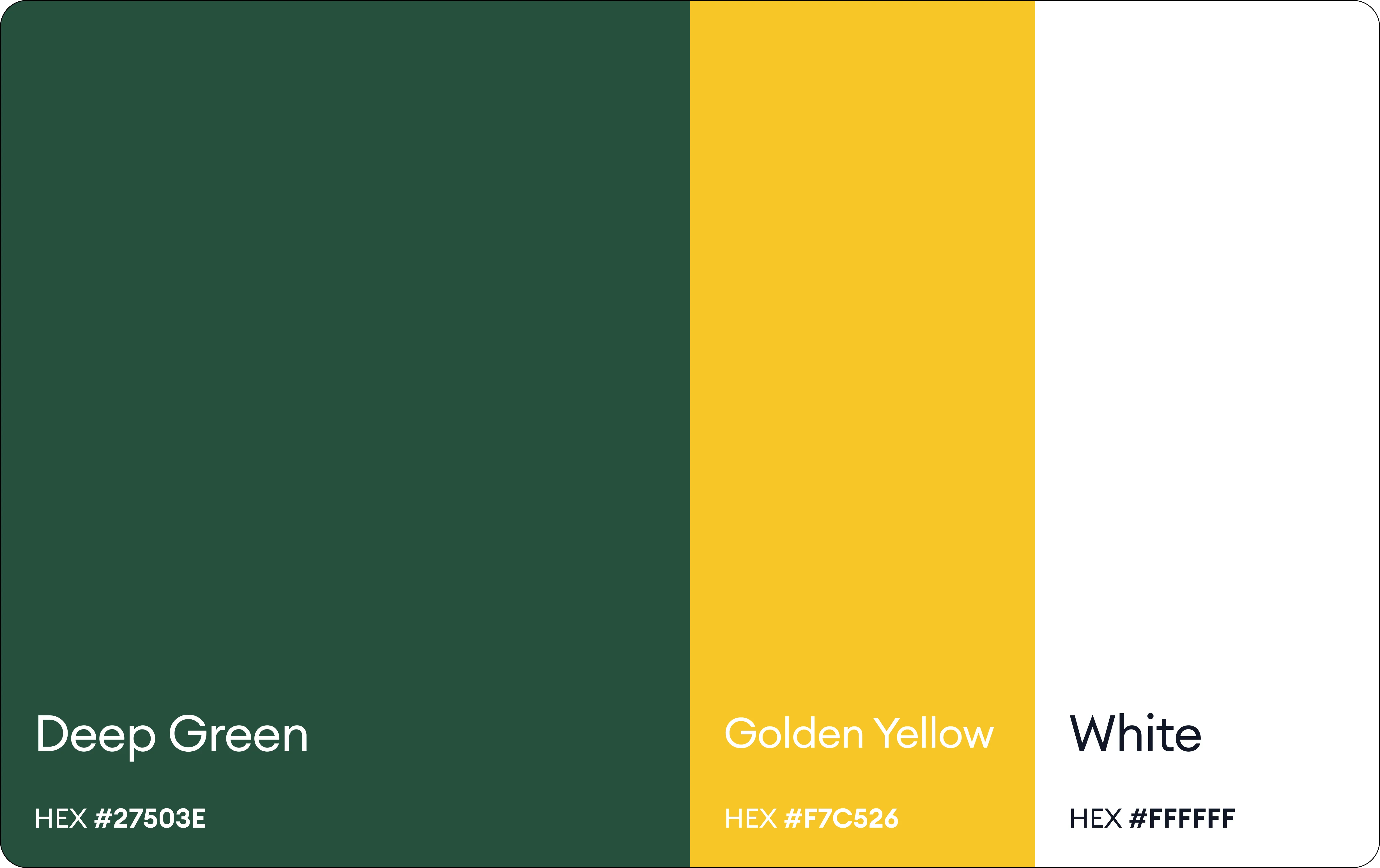
The color palette of the Mana Hair Oil label and packaging features a rich forest green as the dominant hue, symbolizing nature, vitality, and the herbal essence of the product. Accented with gold, it conveys a sense of luxury, quality, and trustworthiness, appealing to premium-conscious consumers. White is used for the central label area, ensuring readability and a clean, modern aesthetic. Complementary ingredient imagery introduces subtle tones like yellow, red, and green, adding vibrancy and reinforcing the natural, wholesome appeal of the formulation. Together, these colors create a balanced, elegant, and impactful visual identity.