This booklet combines narrative storytelling with a structured editorial layout to guide readers through Andrea’s transformation journey. The design relies on a strong typographic hierarchy, bold pull quotes, and minimalist layouts that reflect clarity and focus. Strategic use of whitespace, accent icons, and infographic-style elements help break down complex ideas into digestible visuals. The tone is human-centered, approachable, and professional, designed to keep the reader engaged while highlighting the product’s strategic framework in an emotionally compelling way.
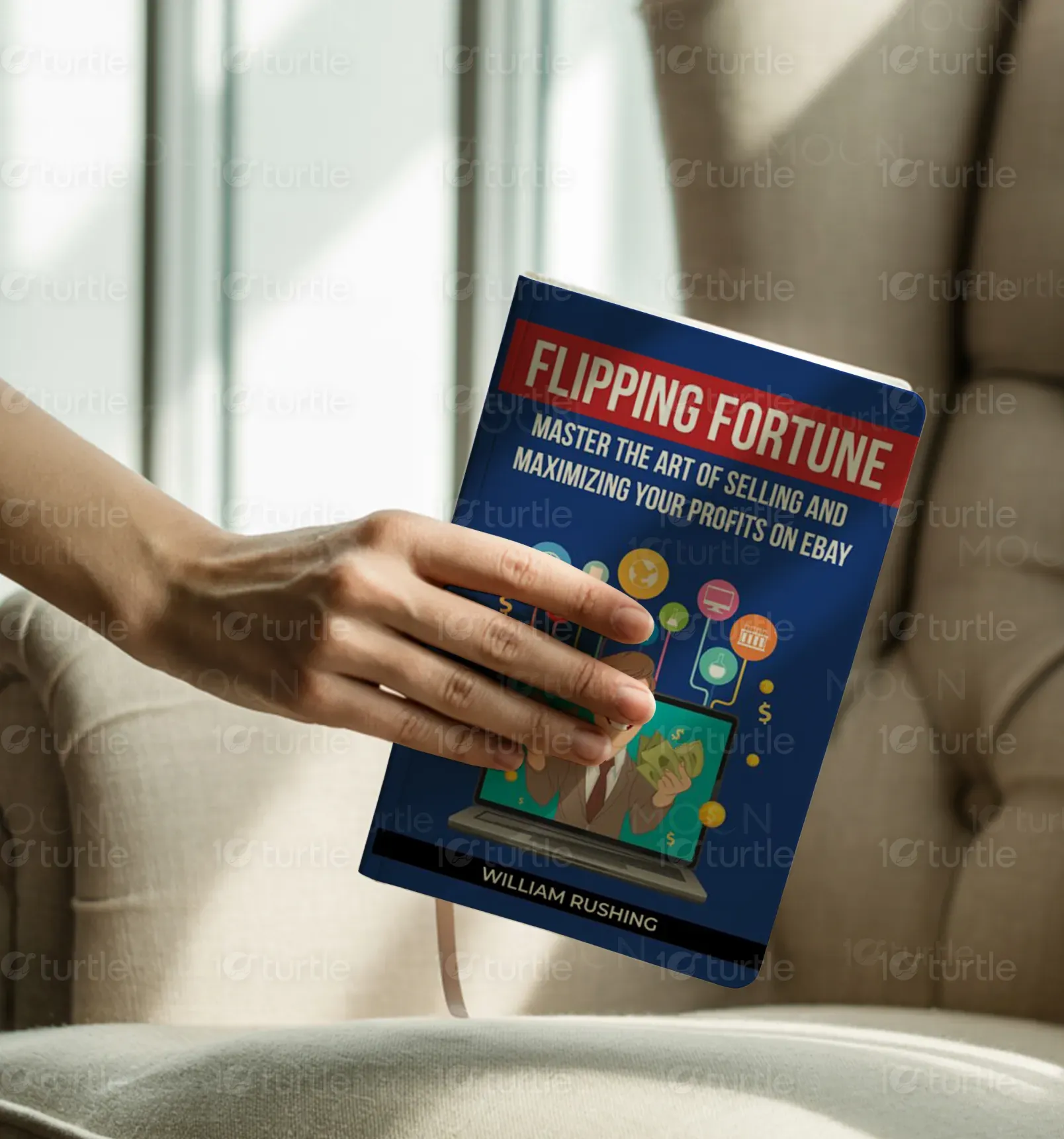
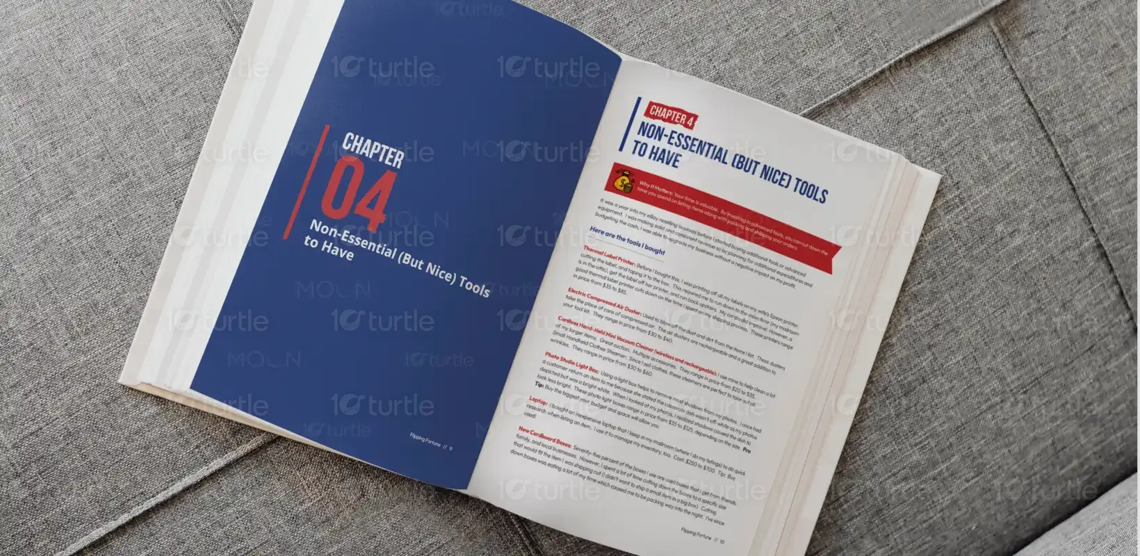
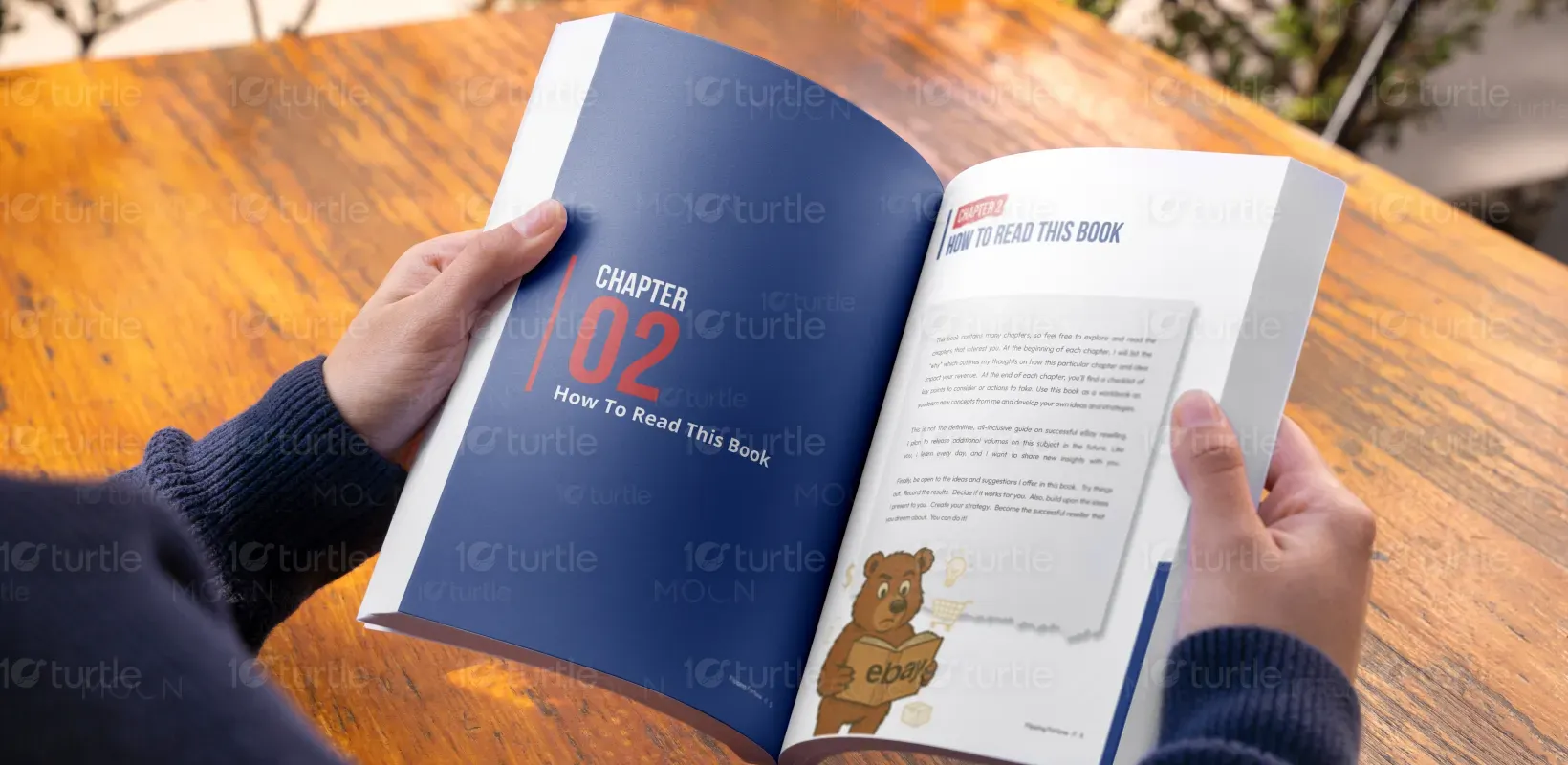
Booklet Design
Graphic Design
Industry
Consumer Goods & Retail
Tools we used


Project Completion
2025
Key Market
Global
This booklet serves as both a storytelling tool and a strategic framework explainer for the AI2030 model, positioning itself as a guide for overwhelmed agency professionals—like Andrea—looking for structure amidst complexity. It stands out in the market by blending narrative with system thinking, using visual language to simplify transformation. Its clean, editorial aesthetic supports clarity and engagement, while its content provides tactical, non-software-based tools that resonate with real-world agents struggling with fragmented workflows and unclear next steps.

Industry
Consumer Goods & RetailWhat we did
Booklet DesignGraphics DesignPlatform
-The key design challenge was translating an abstract transformation journey into a compelling, relatable visual narrative. Many business frameworks tend to be overly technical or visually dense, losing the reader’s interest. Additionally, target users—insurance agents and agency leaders—often face decision fatigue and are bombarded with salesy, software-heavy content. This created a need for a non-intimidating, human-focused design that conveys structure and clarity without overwhelming or overcomplicating the message.
The booklet solves this challenge through a linear, story-driven layout that mirrors Andrea’s real-life journey. It uses modular page structures, clear section dividers, and engaging quotes to maintain interest. Infographic elements like task buckets and metric charts translate dense concepts into visual snapshots. The exclusion of jargon and the “Not Software. Not Fluff.” messaging disarm skeptical readers. Together, these elements build credibility while providing a clean user experience that reflects the product’s core promise: tactical clarity.
The long-term vision is to set a standard for transformation-focused content in the insurance industry and beyond—where business storytelling and structural thinking merge. This booklet is not just a deliverable but a blueprint for how educational, tactical content can feel inspiring and digestible. Future iterations may evolve into interactive digital formats, training modules, or even franchised versions tailored for other verticals. Its impact lies in its ability to resonate with professionals and guide real behavioral change.


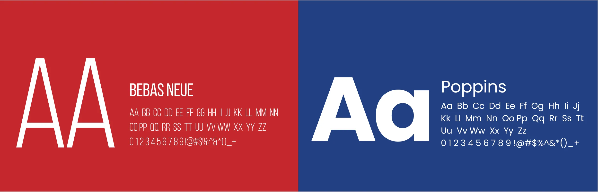
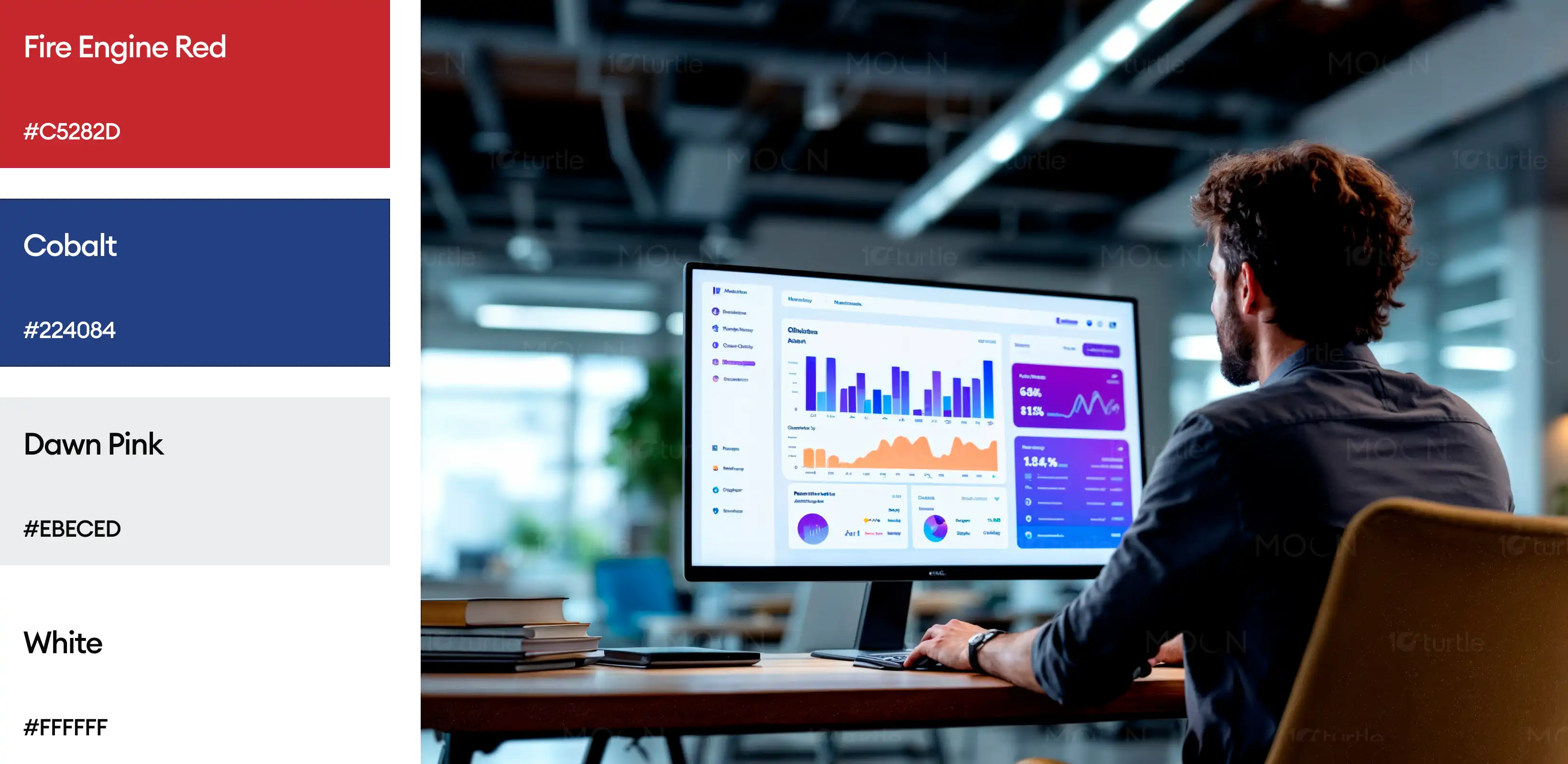
The color palette centers around a grounded monochrome base—white and charcoal grey—for maximum readability and minimal distraction. Strategic pops of electric blue and bold red-orange are used for emphasis in quotes, icons, and directional cues. This not only aligns with the brand's modern and structured identity but also invokes trust, clarity, and urgency. The overall tone feels mature and tech-savvy, reinforcing the idea of structure without noise.