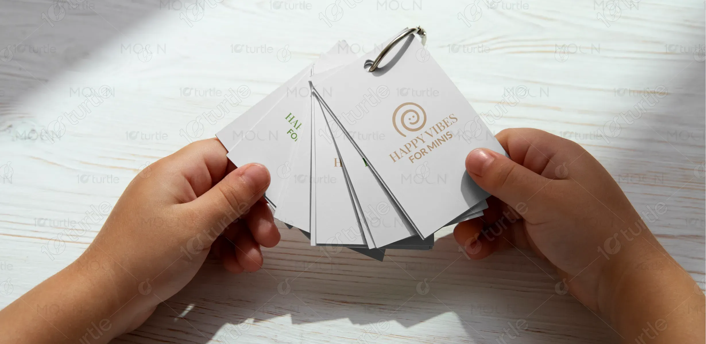
The logo embraces a playful yet elegant design, featuring a stylized spiral that cleverly forms a smiling face—symbolizing joy, warmth, and positive energy. The swirl reflects motion and growth, ideal for a child-focused brand. The pairing of serif and sans-serif typography creates a refined yet approachable contrast, reinforcing both sophistication and fun. The minimalist style ensures versatility across applications, while the earthy green and soft beige color options support organic, nurturing, and joyful brand values.
Logo Design
Graphic Design
Industry
Fashion, Beauty & Lifestyle
Tools we used


Project Completion
2025
Key Market
Global
Happy Vibes for Minis is a premium lifestyle brand curated especially for young children and their caregivers. It offers products and experiences that blend joy, creativity, and well-being—ranging from eco-friendly toys and apparel to wellness essentials. Designed with both emotional and visual charm, it stands out by offering quality, safety, and a unique aesthetic that appeals to modern parents. Its refined, cheerful design bridges playful delight with mindful living, making it both memorable and meaningful.
Industry
Fashion, Beauty & LifestyleWhat we did
Logo DesignGraphic DesignPlatform
-Children’s product branding often falls into two extremes: overly childish with loud, clashing visuals, or bland and generic. This creates a disconnect for modern parents seeking products that reflect both playfulness and style. Moreover, many brands ignore the emotional appeal for both children and adults, resulting in a lack of personal connection or brand loyalty. The gap lies in creating a cohesive identity that feels joyful, high-quality, and emotionally engaging for both generations.
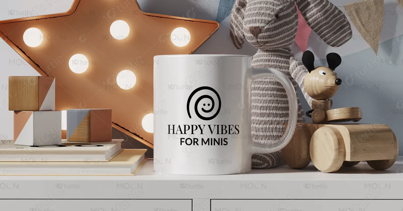
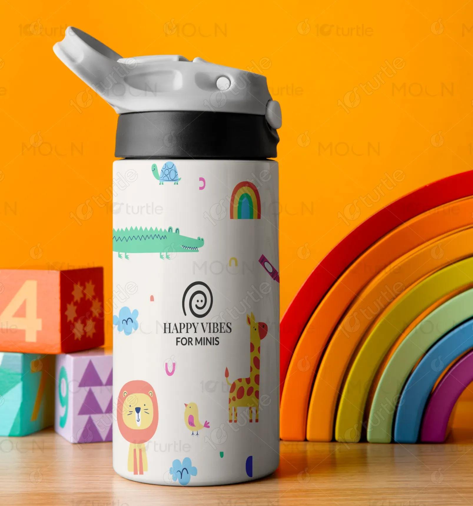
Happy Vibes for Minis addresses this gap by combining emotional resonance with elegant design. The smiling swirl icon engages children visually while giving adults a sense of minimalist refinement. The calming yet vibrant color palette promotes warmth and trust. Typography blends luxury and friendliness, ensuring the brand feels premium but never unapproachable. Every visual element is intentionally crafted to balance fun with mindfulness—allowing it to stand out on shelves and in hearts alike.
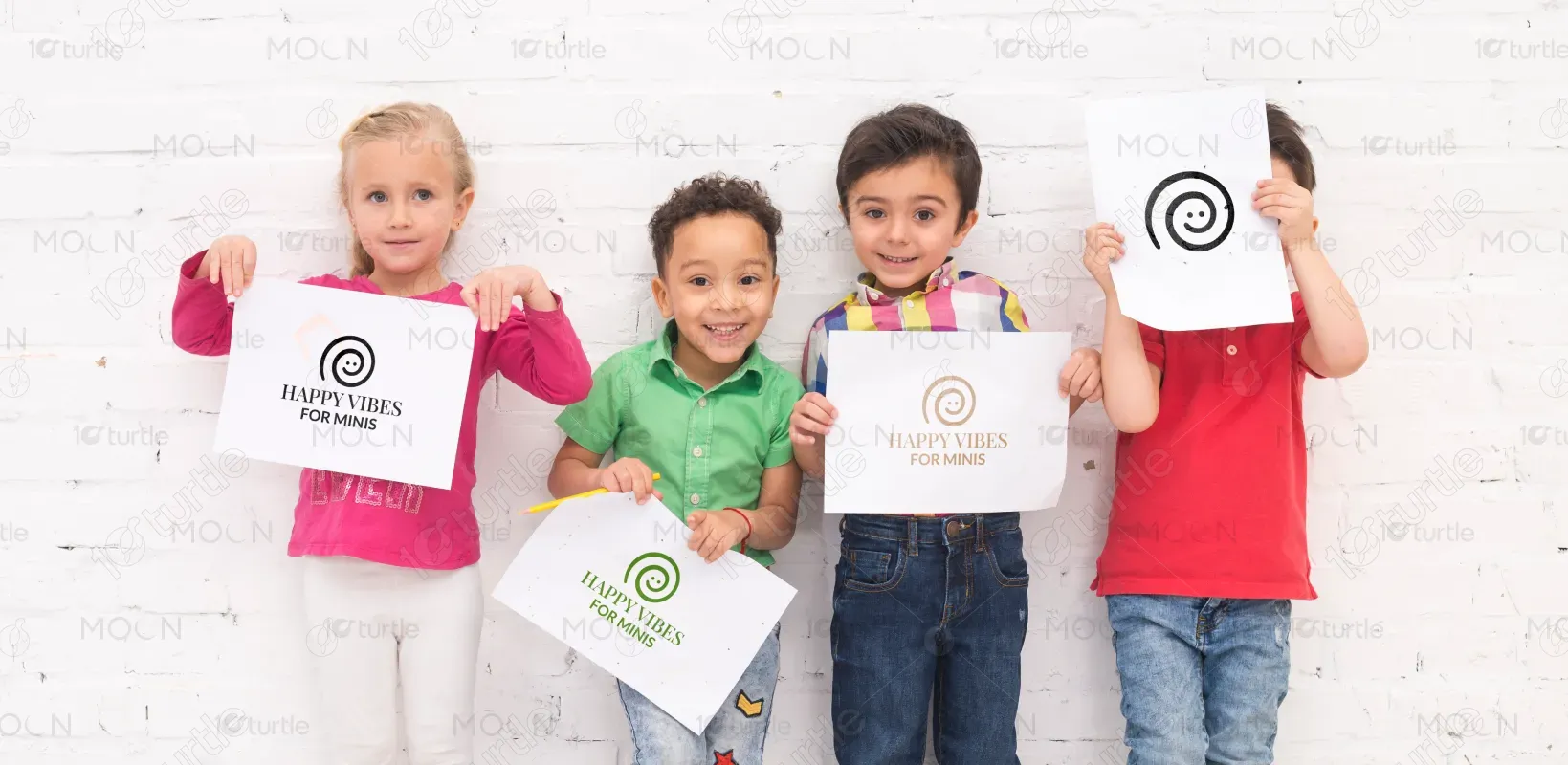
The long-term vision for Happy Vibes for Minis is to grow into a global lifestyle brand that inspires happy, healthy childhoods. It aims to set a new standard for aesthetics in children’s products—combining playfulness, purpose, and sustainability. Through thoughtful design, community-driven initiatives, and continuous innovation, the brand seeks to create a lasting emotional imprint while fostering conscious parenting and joyful discovery across generations.
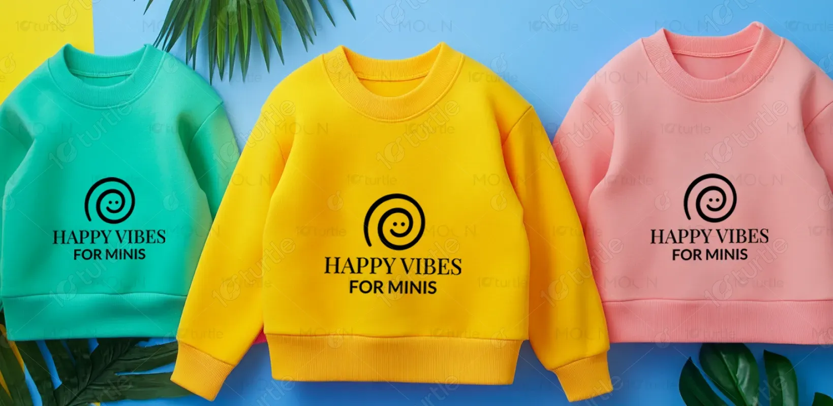
This logo for “Happy Vibes for Minis” combines a playful and friendly feel with simplicity. The green spiral forming a smiling face represents joy, growth, and positivity—perfectly aligning with the idea of spreading happy energy to little ones. The bold yet clean typography balances professionalism with warmth, making it approachable while maintaining a modern appeal. Overall, it conveys happiness, nurturing, and care in a minimal yet memorable way.
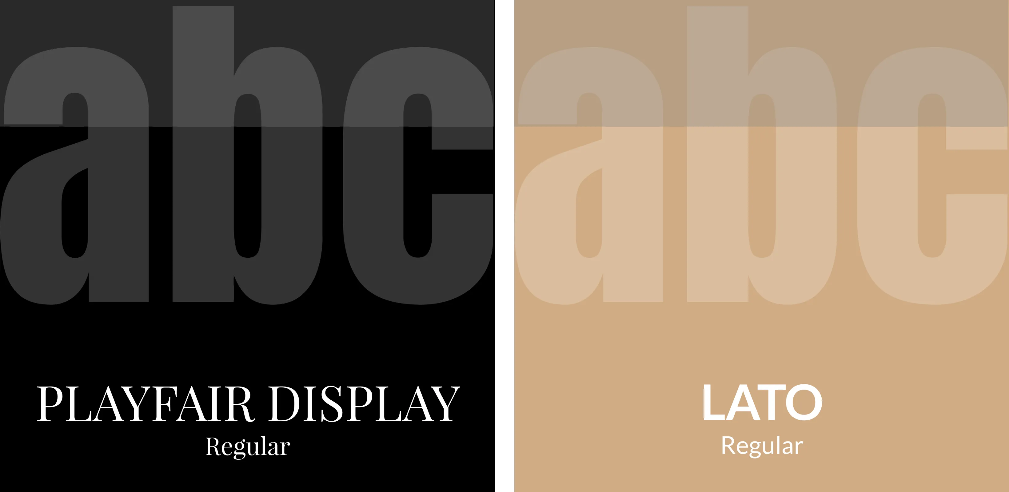
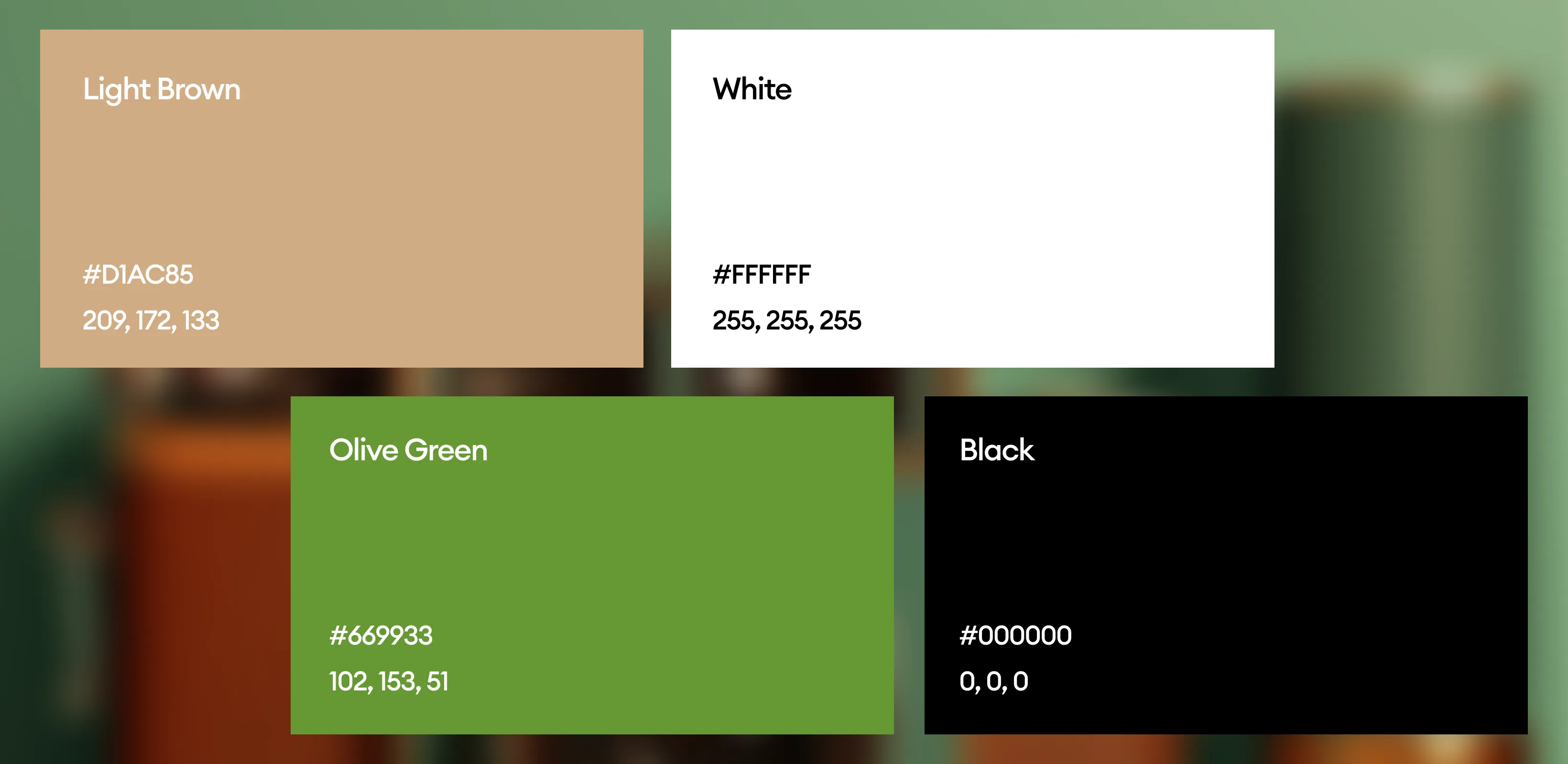
The color palette for Happy Vibes for Minis blends warmth, nature, and elegance to create an emotionally resonant and visually appealing identity. The earthy green symbolizes growth, health, and natural living—perfectly aligning with a child-focused, conscious brand. The soft copper beige adds a gentle touch of sophistication and warmth, making the brand feel both premium and nurturing. When paired with a matte black background, these colors offer strong contrast, enhancing clarity and giving the logo a timeless, versatile presence across packaging, digital, and print media.
