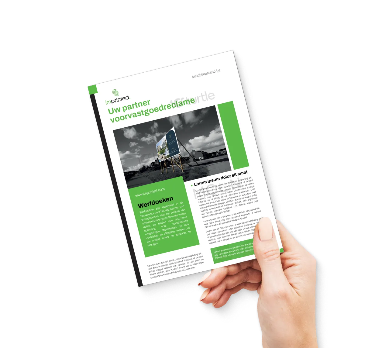
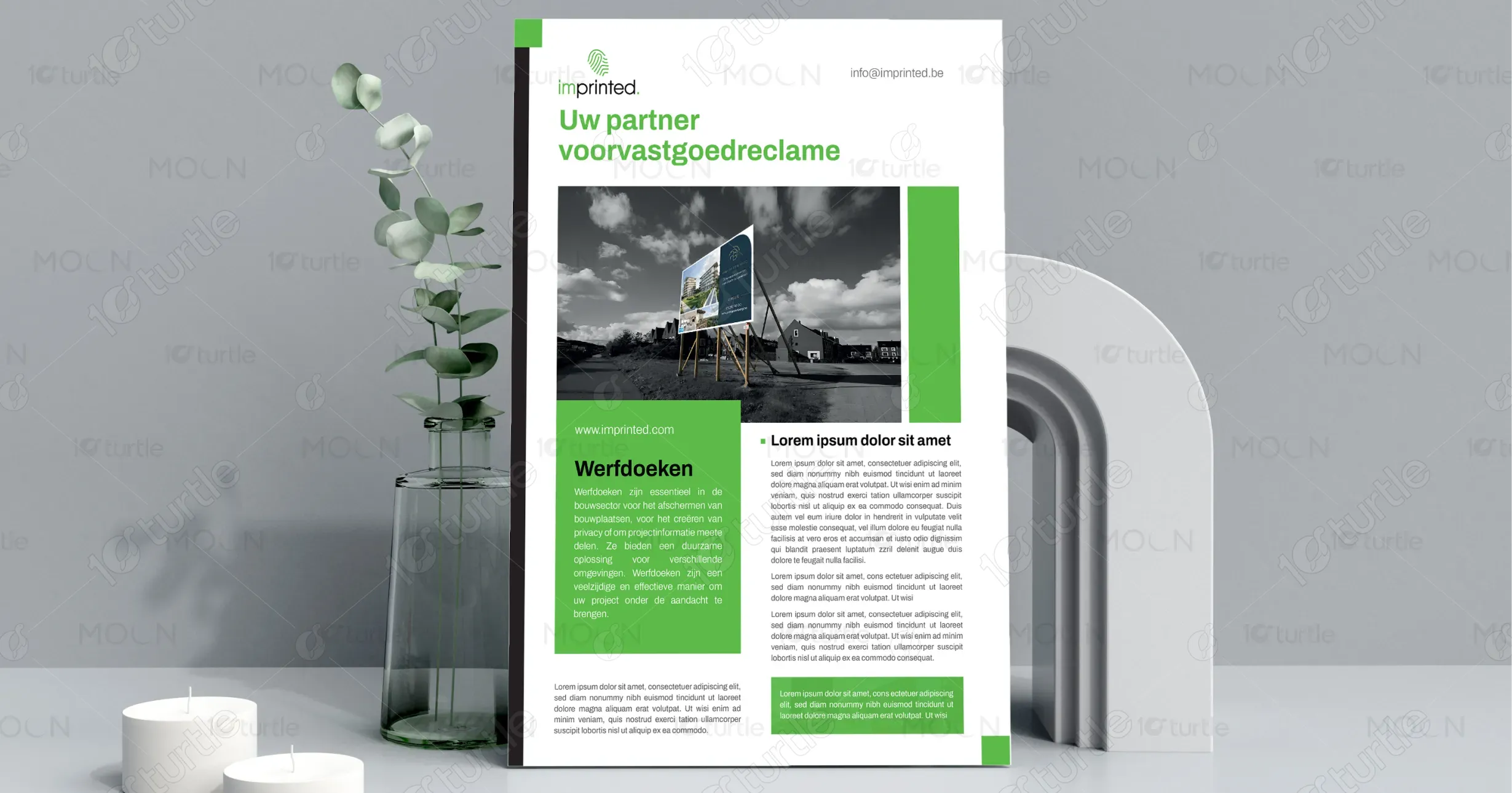
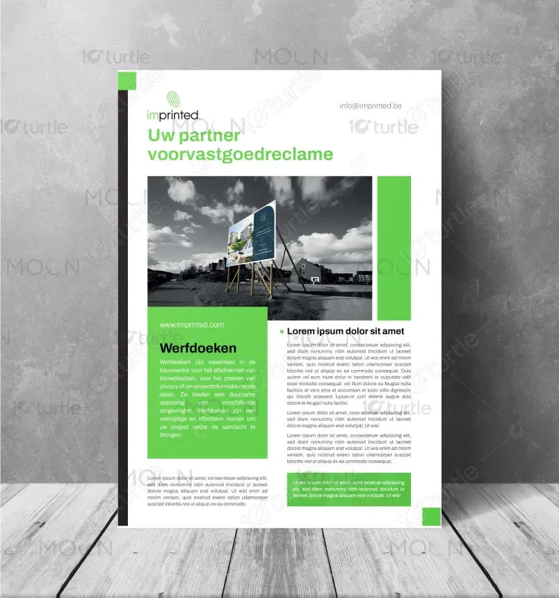
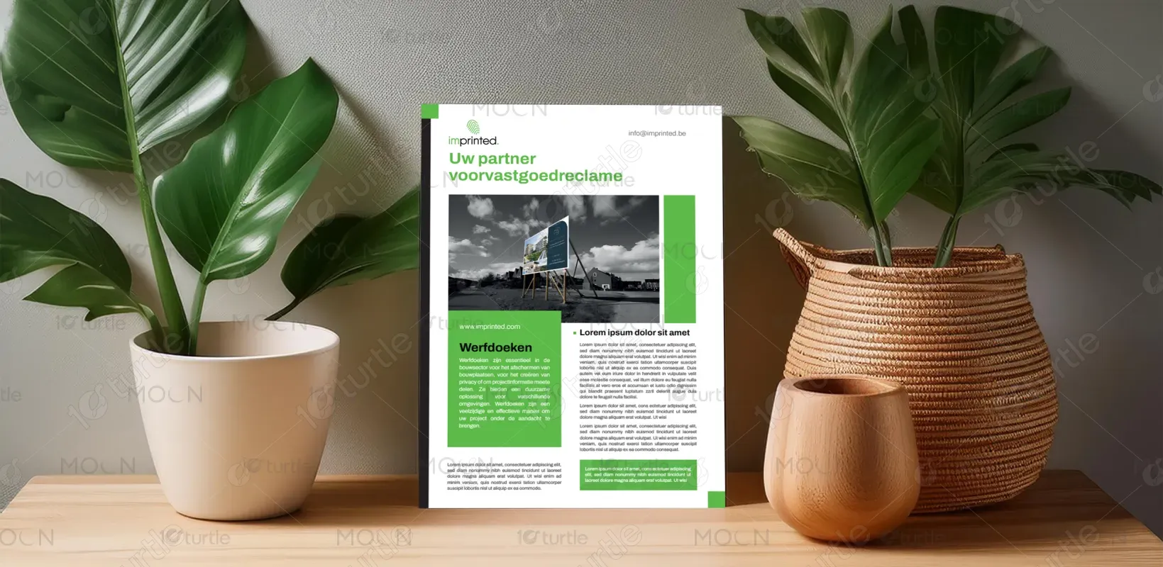
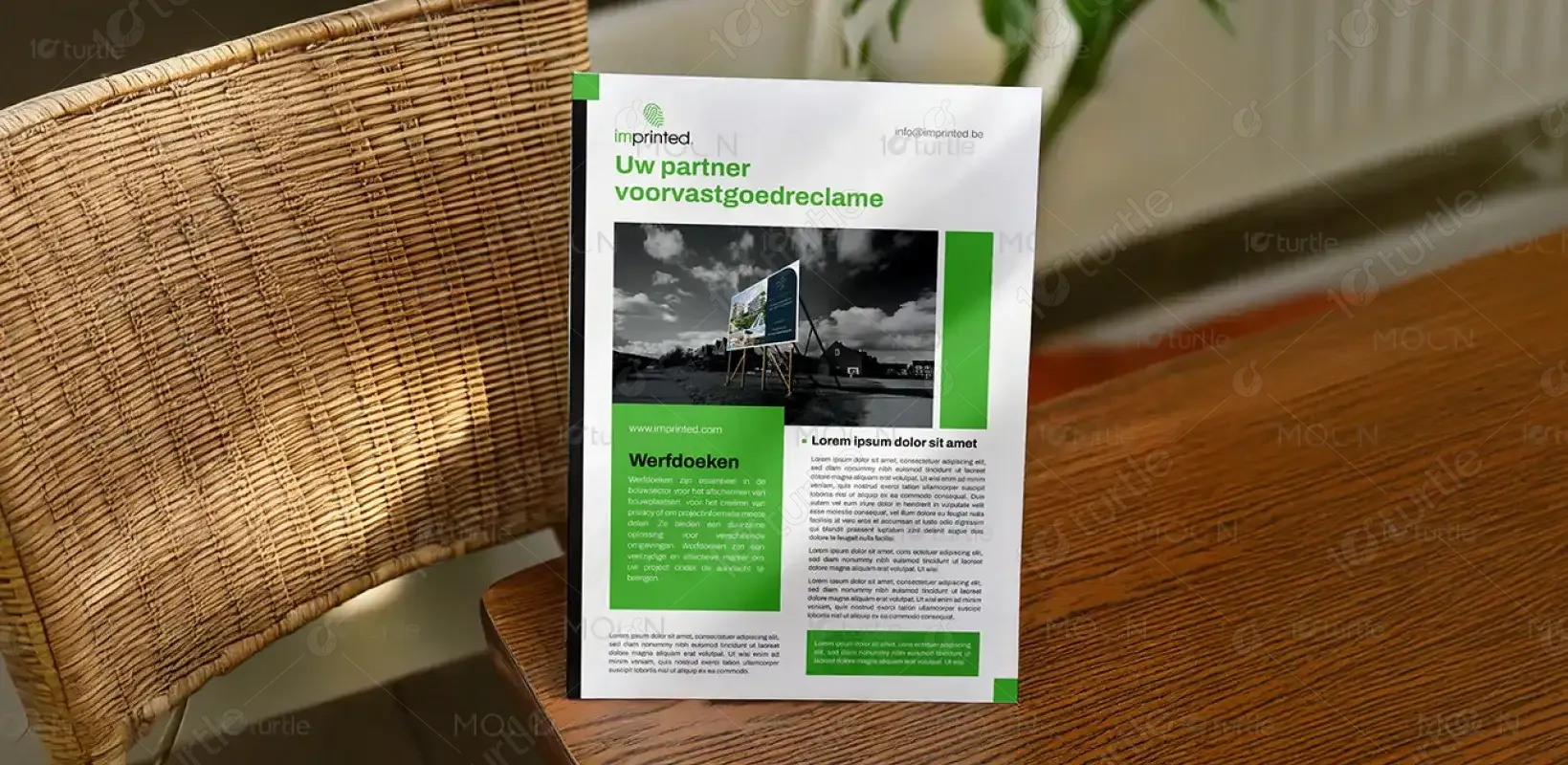
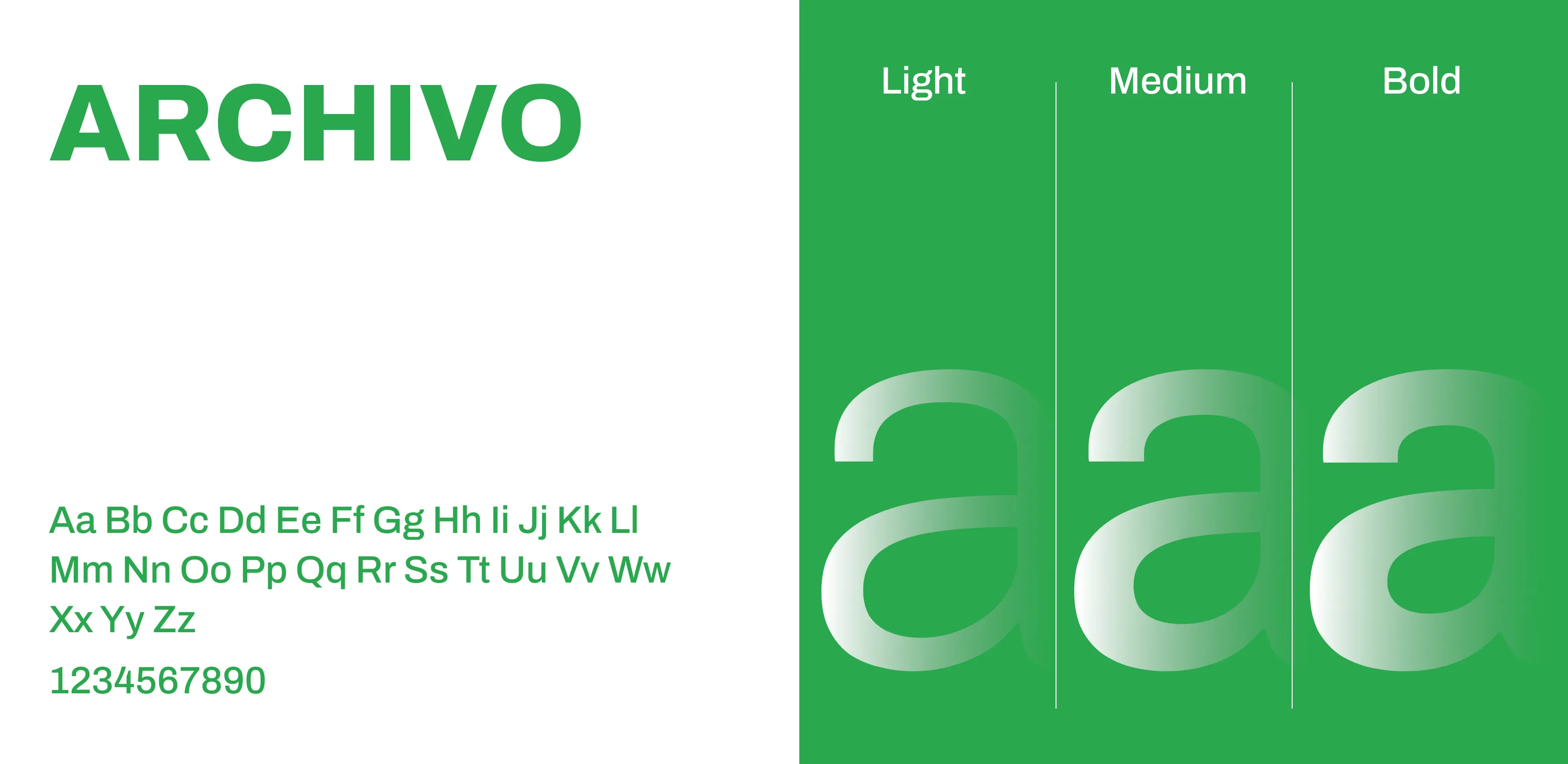
The design embraces a clean, professional aesthetic with a modern corporate tone. It uses a strong visual hierarchy: a monochromatic image with a pop of green emphasizes the brand’s eco-conscious identity. The structured layout and ample white space enhance readability, while vibrant green elements guide the viewer’s attention. The font pairing is bold yet minimal, balancing corporate credibility with visual clarity. This layout is ideal for print, designed to leave a strong visual impression while keeping the content structured and accessible.
One Pager Design
Graphic Design
Industry
Consumer Goods & Retail
Tools we used


Project Completion
2025
Key Market
Global
This is a single-page brochure for imprinted, a company offering outdoor advertising solutions like "werfborden" (construction site banners). These banners are essential for real estate developers and construction firms to maintain privacy, communicate branding, and create visibility at project locations. The design aims to support sales communication with a compelling layout that quickly communicates the brand’s value. The combination of striking visuals, concise text, and brand-aligned colors enhances appeal and professionalism.
Industry
Consumer Goods & RetailWhat we did
One Pager DesignGraphic DesignPlatform
-Real estate advertising at construction sites is often overlooked or poorly executed, with banners that fade, tear, or lack visual impact. Brands miss out on crucial visibility due to outdated or generic signage, which fails to represent the project’s value or quality. Additionally, complex messaging or unclear layouts often fail to attract the attention of potential clients or investors in fast-paced environments like roadsides or busy construction zones.
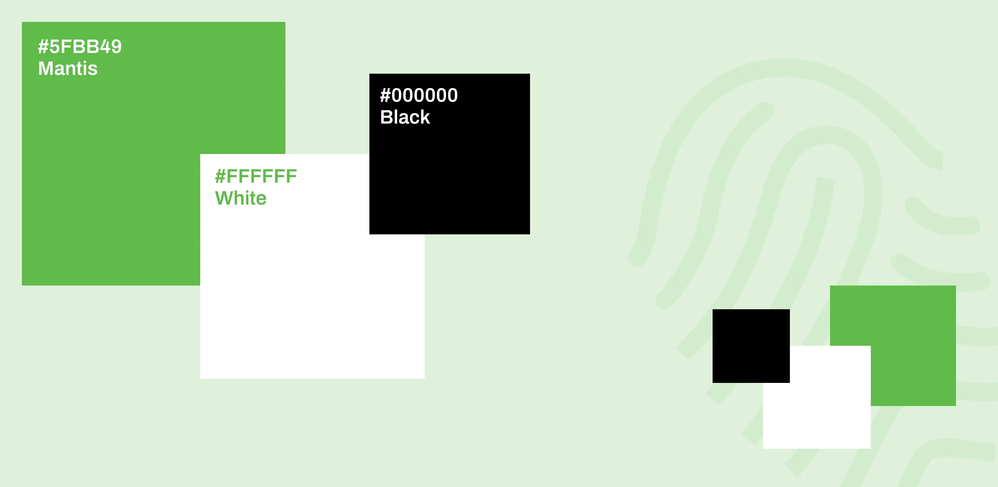
The brochure’s design solves these problems by combining a high-impact, image-forward layout with clean typography and branding blocks. The vibrant green elements not only create brand recall but also highlight key content areas. The monochrome-to-color transition in visuals draws immediate attention to the product in context. A modular text structure ensures quick reading and comprehension, ideal for busy professionals. It effectively communicates professionalism, eco-conscious branding, and clear service offerings at a glance.

imprinted aims to become the go-to provider of sustainable, visually effective real estate advertising in Belgium and beyond. The long-term goal is to revolutionize outdoor branding at construction and real estate sites by merging environmental consciousness with strong design principles. As urban development grows, imprinted wants to lead with smart visual communication, ensuring every banner or board speaks volumes about the brand it represents—visually impactful, durable, and unforgettable.
The palette includes electric teals, royal blues, magentas, burnt oranges, and metallic golds—each chosen to evoke vibrancy, luxury, and a sense of the fantastical. These colors mirror the iridescence of tropical bird plumage while complementing both neutral and bold furnishings. Gold accents add opulence and warmth, while the contrast between dark backgrounds and vivid forms ensures visual clarity. This palette not only aligns with modern décor trends but also elevates brand identity by signaling creativity, boldness, and uniqueness.
