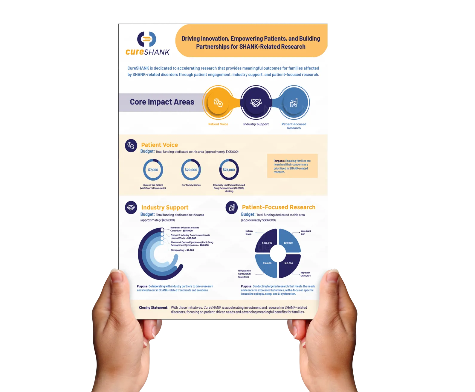
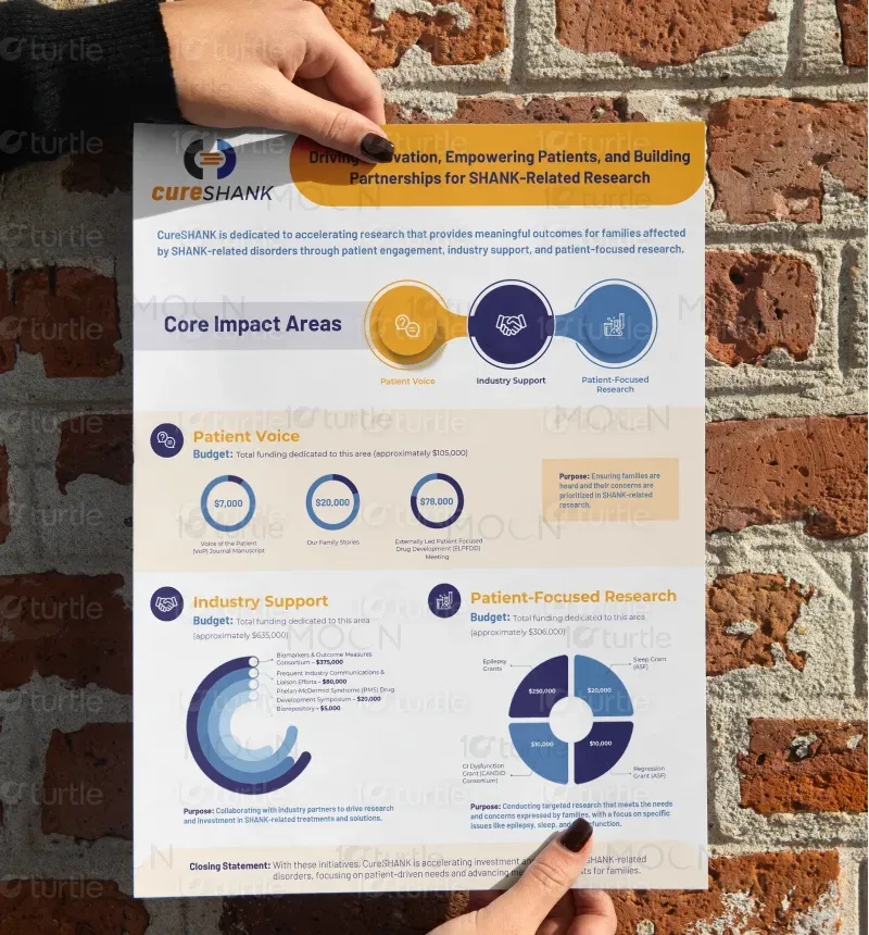
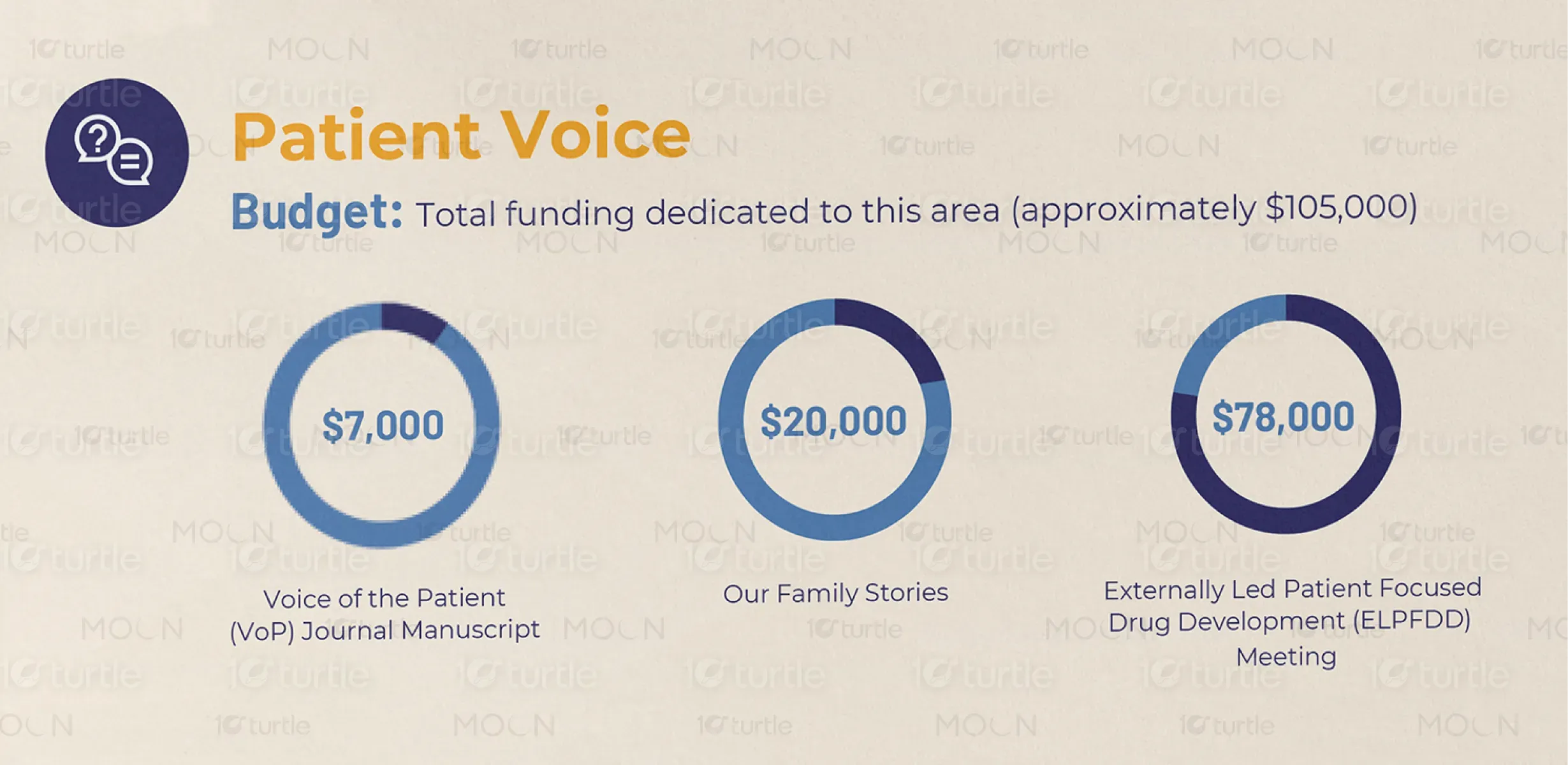
The design adopts a clean, modern layout with bold icons and color blocks to clearly delineate each core impact area. Circular graphs and infographics simplify data visualization, making complex research funding information more accessible. The use of bright yet professional colors—orange, navy, and light blue—creates an engaging and trustworthy aesthetic. The design effectively balances data-heavy content with visual clarity, guiding the viewer's eye through key messages and financial breakdowns in a concise, visually appealing format.
Infographic Design
Graphic Design

Industry
Healthcare & Wellness
Tools we used


Project Completion
2025
Key Market
Global
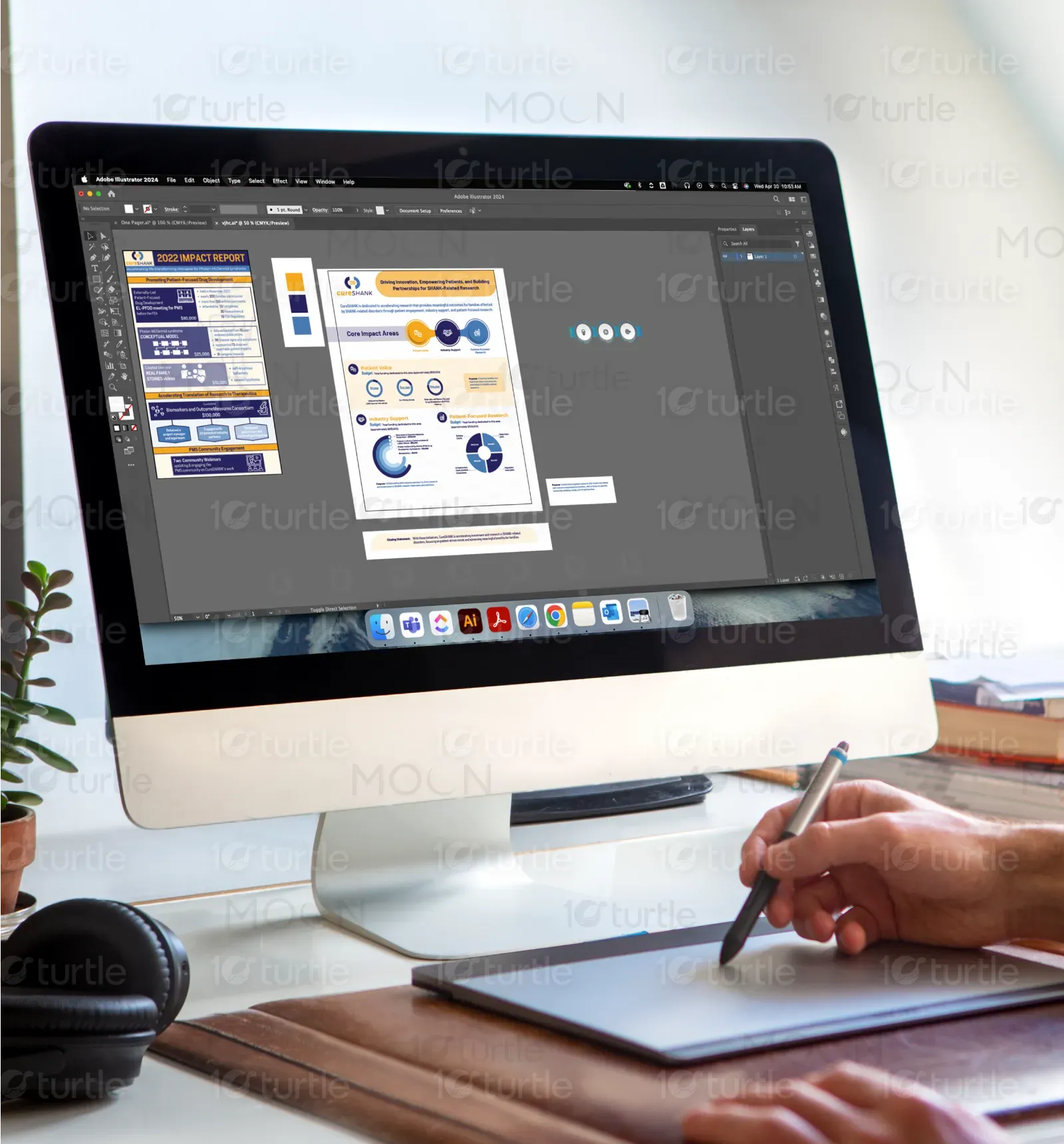
This one-pager by CureSHANK serves as an impactful communication tool that outlines the organization's three core impact areas: Patient Voice, Industry Support, and Patient-Focused Research. It highlights how funds are allocated to each initiative, underscoring transparency and purpose-driven investment. The product is designed for stakeholders, donors, and research partners, presenting complex funding strategies in a clear and visually compelling way. Its unique value lies in its data-driven storytelling and human-centric design.
Industry
Healthcare & WellnessWhat we did
Infographic DesignGraphic DesignPlatform
-In the rare disease research space, organizations often struggle to communicate complex scientific data and funding allocations in a way that is understandable and engaging for non-scientific audiences. Traditional reports tend to be text-heavy, overly technical, and inaccessible to families, donors, or partners without medical backgrounds, leading to reduced engagement and missed opportunities for support and collaboration.
This design bridges that communication gap through strategic visual storytelling. It uses simplified infographics, intuitive iconography, and clearly structured sections to break down data into digestible components. Each visual element, from the pie charts to the bold headings, is crafted to quickly convey purpose, impact, and transparency—making it easy for all stakeholders to understand the value of their involvement and funding. This approach fosters trust, increases awareness, and improves stakeholder engagement.
CureSHANK aims to become a global leader in SHANK-related disorder advocacy and research by continuing to prioritize patient needs, build strong industry collaborations, and advance targeted scientific studies. The long-term vision is to fuel medical breakthroughs that improve quality of life for affected families while setting a new standard for how nonprofits communicate impact and research transparency in the rare disease sector.


The palette features deep navy (trust, professionalism), vibrant orange (energy, optimism), and cool blue tones (calm, clarity). This combination reflects the brand’s dual identity—scientific integrity and compassionate advocacy. The consistent use of these colors across icons and sections ensures visual cohesion, guides reader attention, and evokes confidence in the organization’s mission and transparency.