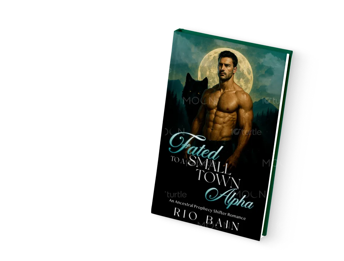
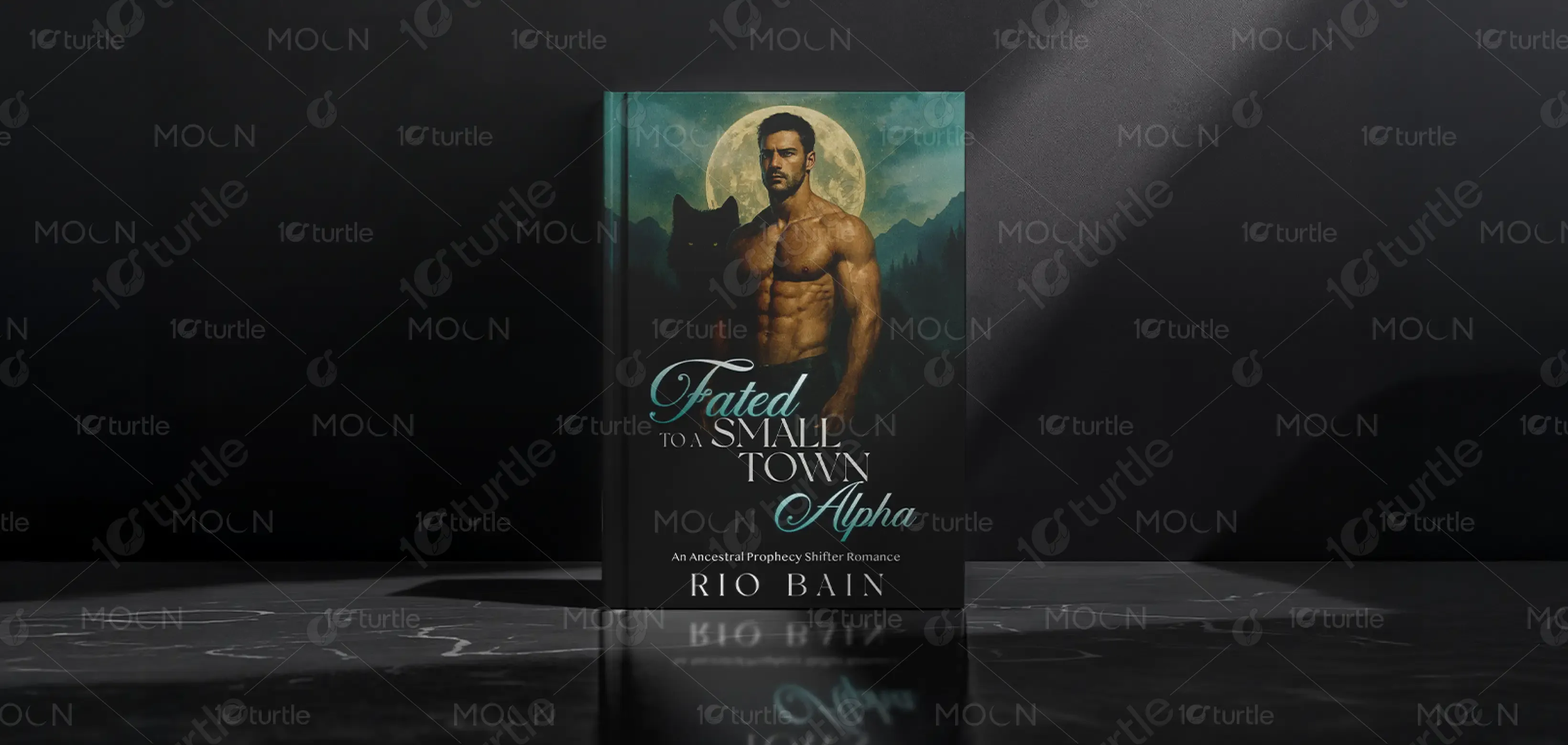
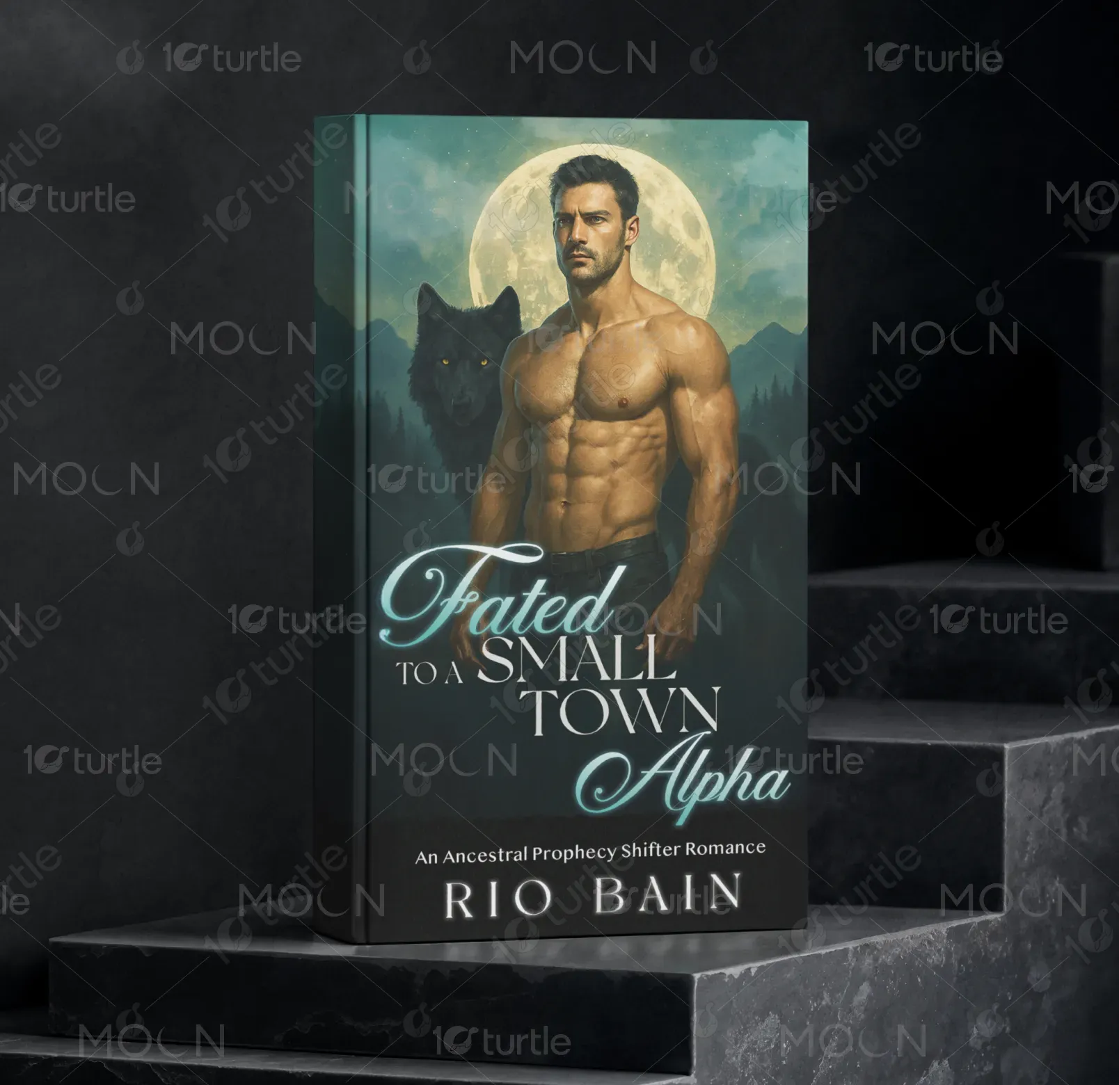
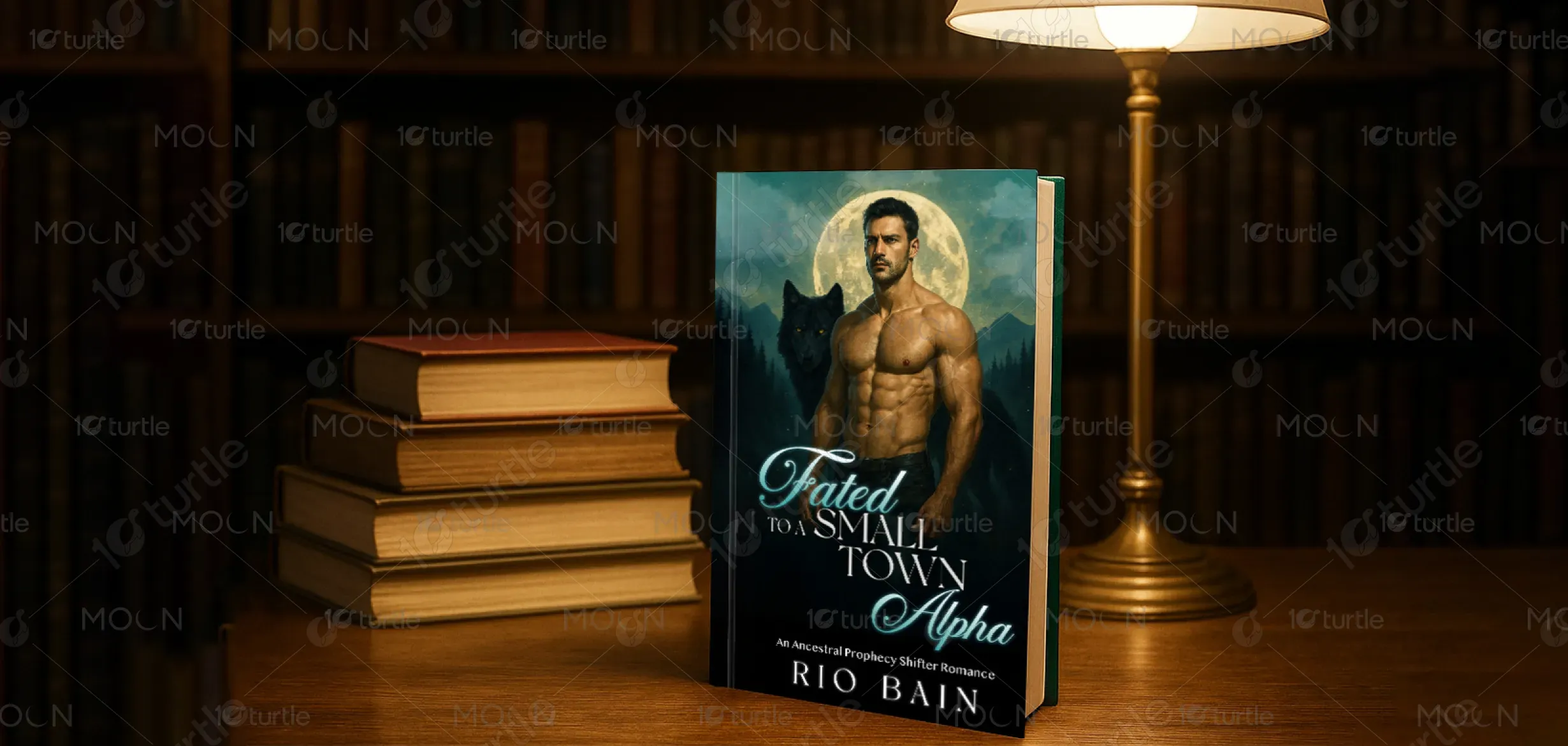
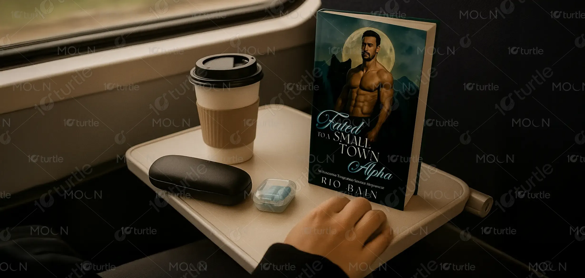
The design for Fated to a Small Town Alpha embraces a bold, atmospheric aesthetic, blending fantasy and romance elements. A striking male figure set against a luminous full moon conveys dominance, mystery, and allure, while the shadowy wolf reinforces the shifter romance theme. The typography combines elegant cursive with sharp serif fonts, balancing romance and strength. Deep greens, blues, and moonlit tones create an evocative atmosphere, immersing readers in the supernatural world and instantly signaling the genre’s passionate, mysterious essence.
Book Cover Design
Graphic Design
Industry
Arts, Culture & Entertainment
Tools we used


Project Completion
2025
Key Market
Global
This cover design represents a paranormal romance novel that centers on shifter dynamics, small-town intimacy, and ancestral prophecy. Its purpose is to captivate the target romance audience by visually communicating passion, strength, and supernatural allure. Unlike generic romance covers, it highlights both the Alpha’s dominance and the mystical moonlit setting, making it stand out in the saturated shifter-romance market. With its cinematic design, the cover appeals to readers seeking an immersive, emotional, and fantasy-driven love story.
Industry
Arts, Culture & EntertainmentWhat we did
Book Cover DesignGraphic DesignPlatform
-The primary challenge in designing for the shifter-romance genre is standing out in a market flooded with similar visual tropes—muscular male protagonists, wolves, and moons. Many covers risk becoming cliché, blending into competitors without offering a fresh identity. Readers expect both romance and supernatural cues, but balancing these without overwhelming the design can be difficult. The gap lies in creating a unique, premium look that delivers instant genre recognition while still feeling sophisticated and memorable to loyal romance readers.
This design solves the challenge by elevating genre tropes with refined execution. The use of a realistic illustration-style male figure under a glowing full moon enhances intensity without appearing overdone. The inclusion of the wolf adds narrative context, while subtle background details create depth and atmosphere. Typography choices balance elegance and strength, signaling both romance and Alpha dominance. This combination makes the cover both recognizable and distinct, offering visual appeal that resonates with readers while reinforcing the book’s unique identity.
The long-term vision is to establish a consistent, recognizable style for Rio Bain’s novels that blends fantasy allure with sophistication. This cover sets the groundwork for a visual series identity, where each installment carries its own atmospheric color theme while maintaining cohesive branding. The goal is to strengthen audience loyalty, elevate genre standards, and create designs that are collectible in their own right. Over time, this aesthetic aims to influence shifter-romance visuals toward higher-quality, narrative-driven design.
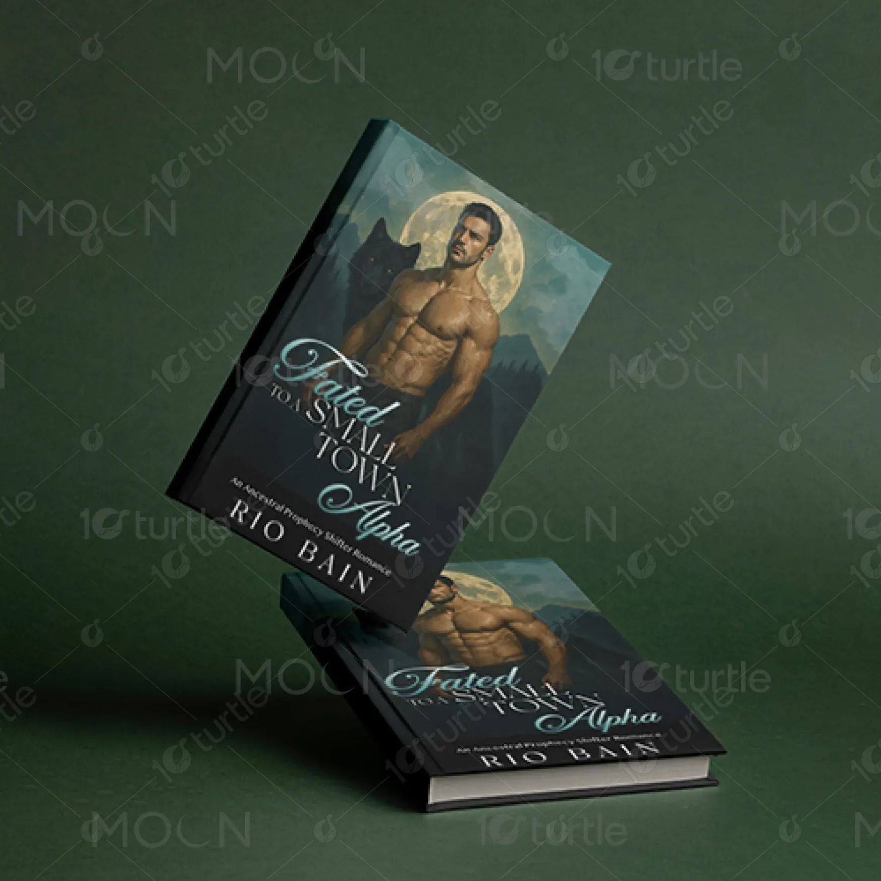

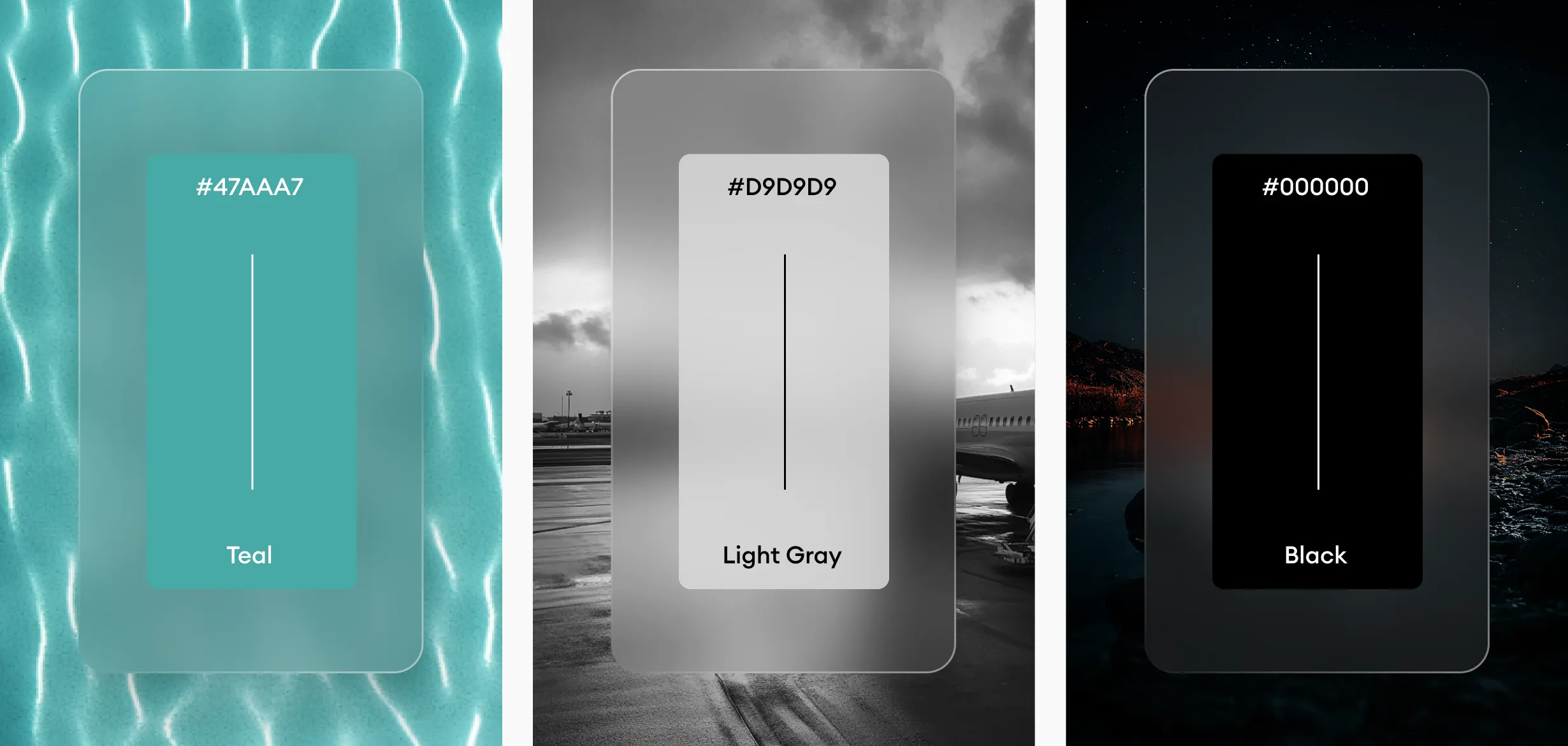
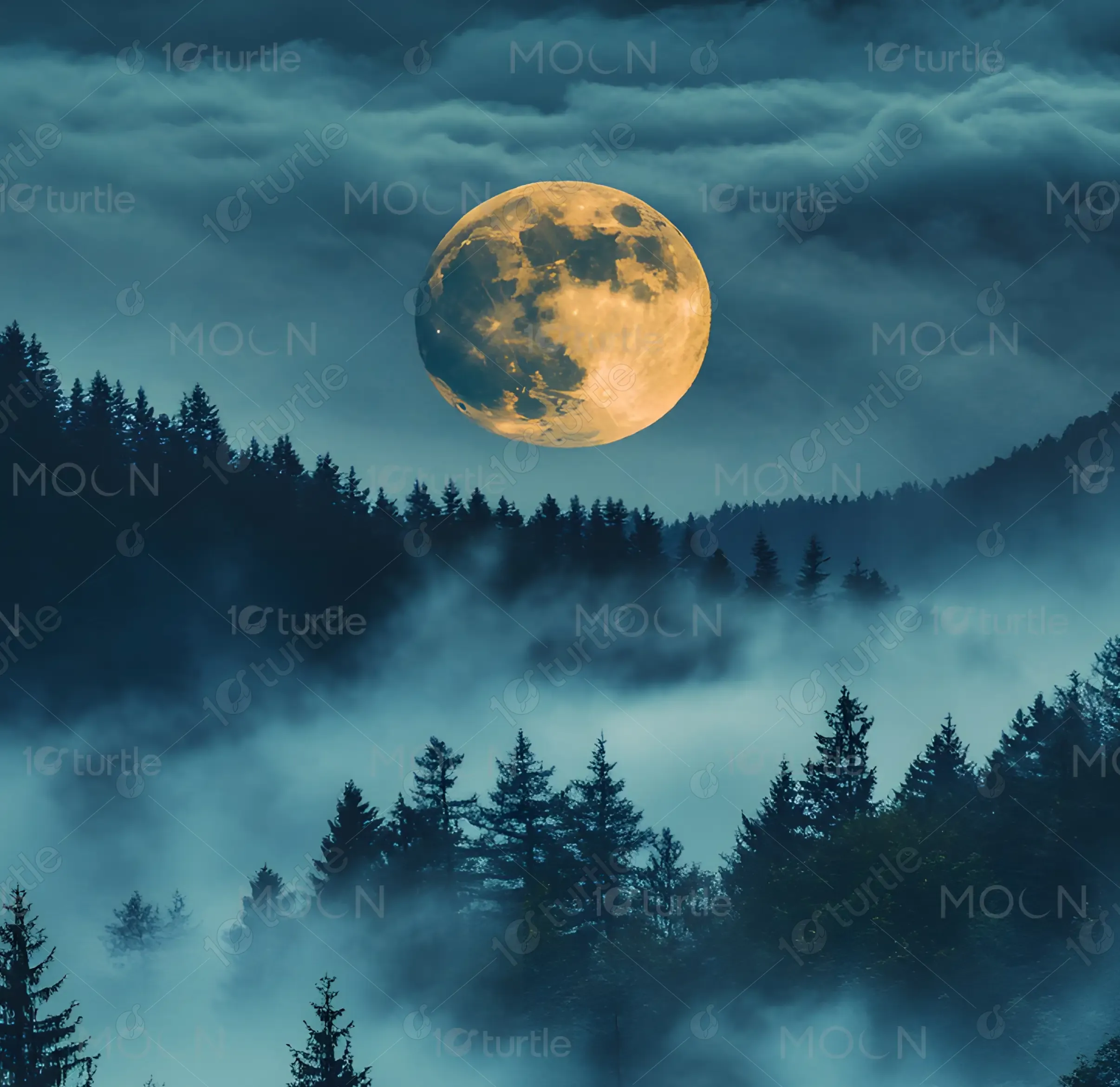
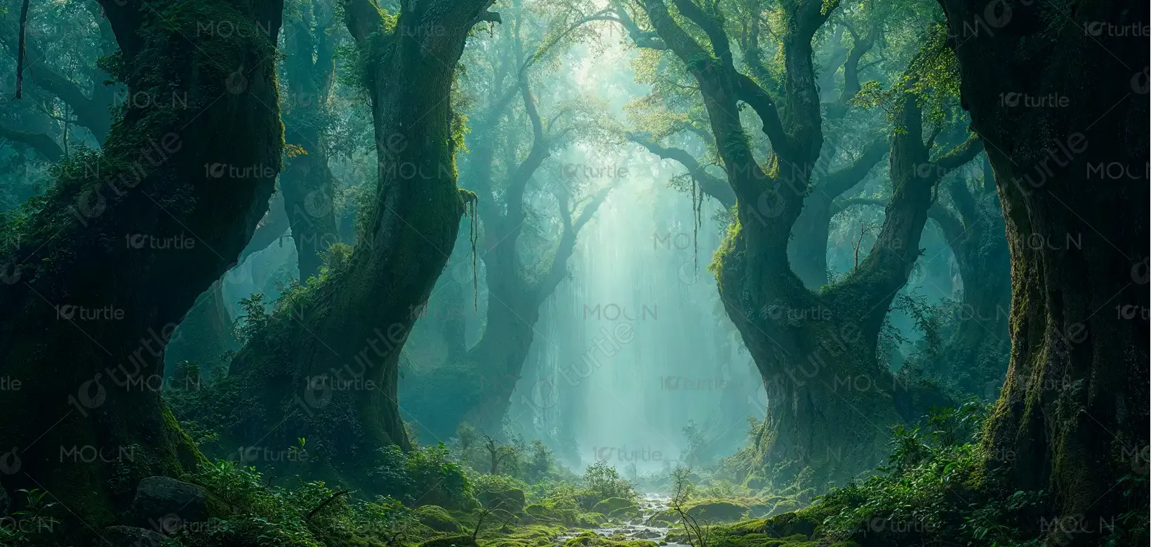
The palette features deep forest greens, midnight blues, and moonlit silvers, accented by the warmth of skin tones. These colors symbolize nature, mystery, and passion, aligning with the shifter theme while evoking intrigue and sensuality. The glowing yellow-white moon creates contrast and focal drama, symbolizing destiny and supernatural power. Together, the palette strengthens the emotional impact—seductive yet enigmatic—perfectly aligning with the brand’s identity as a bold, immersive, and fantasy-forward romance series.