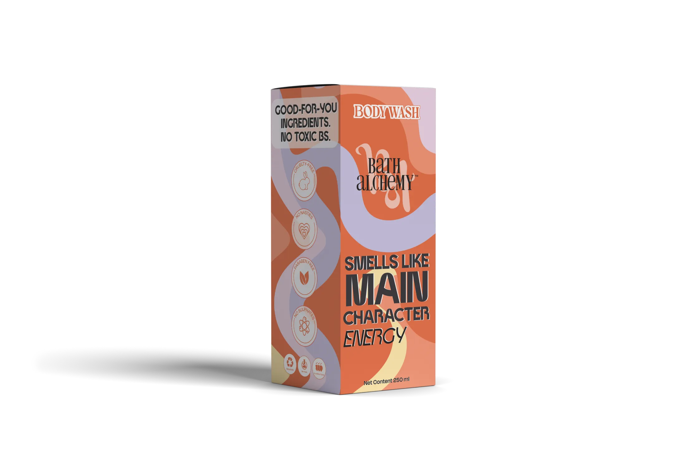
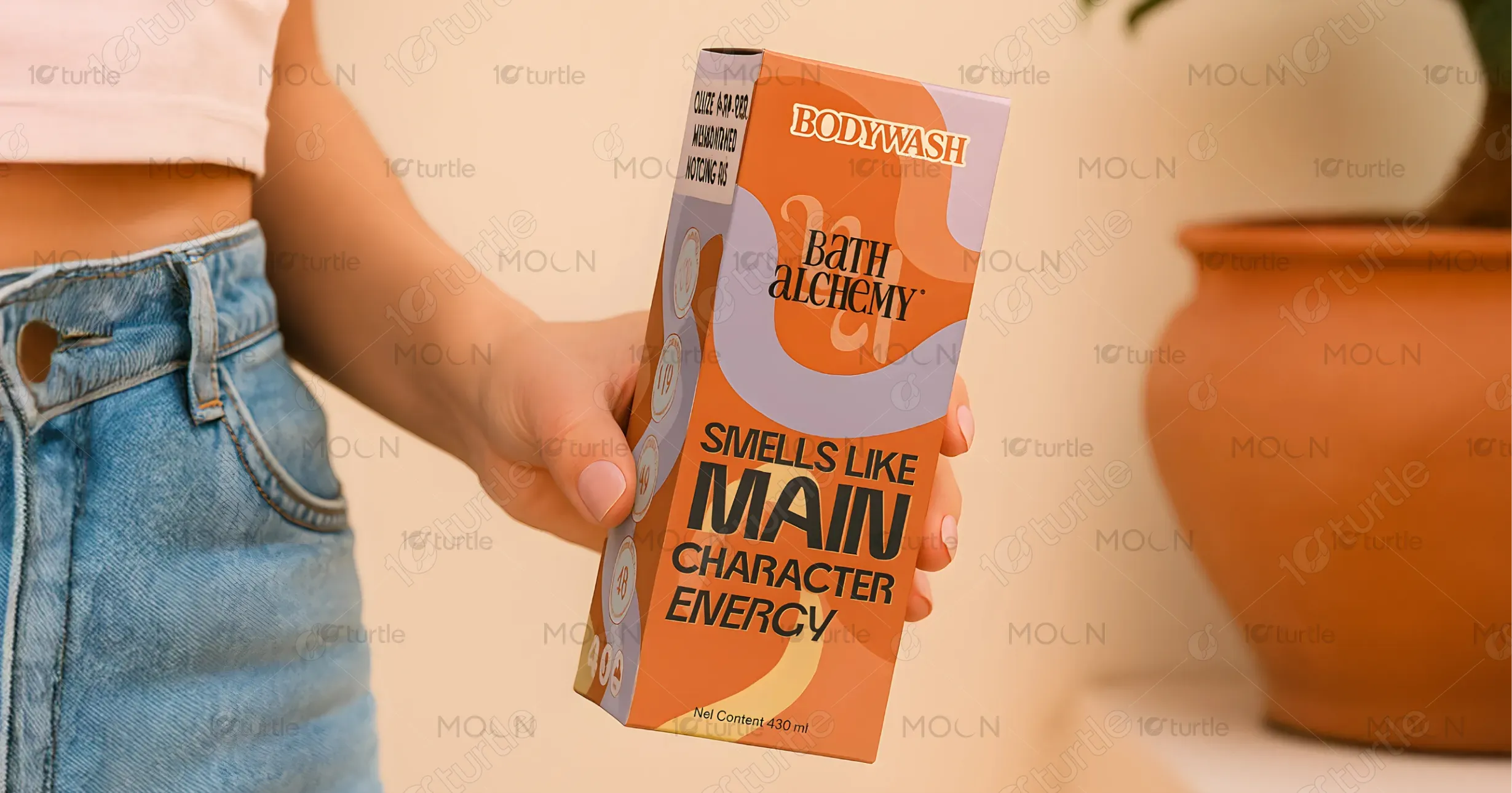
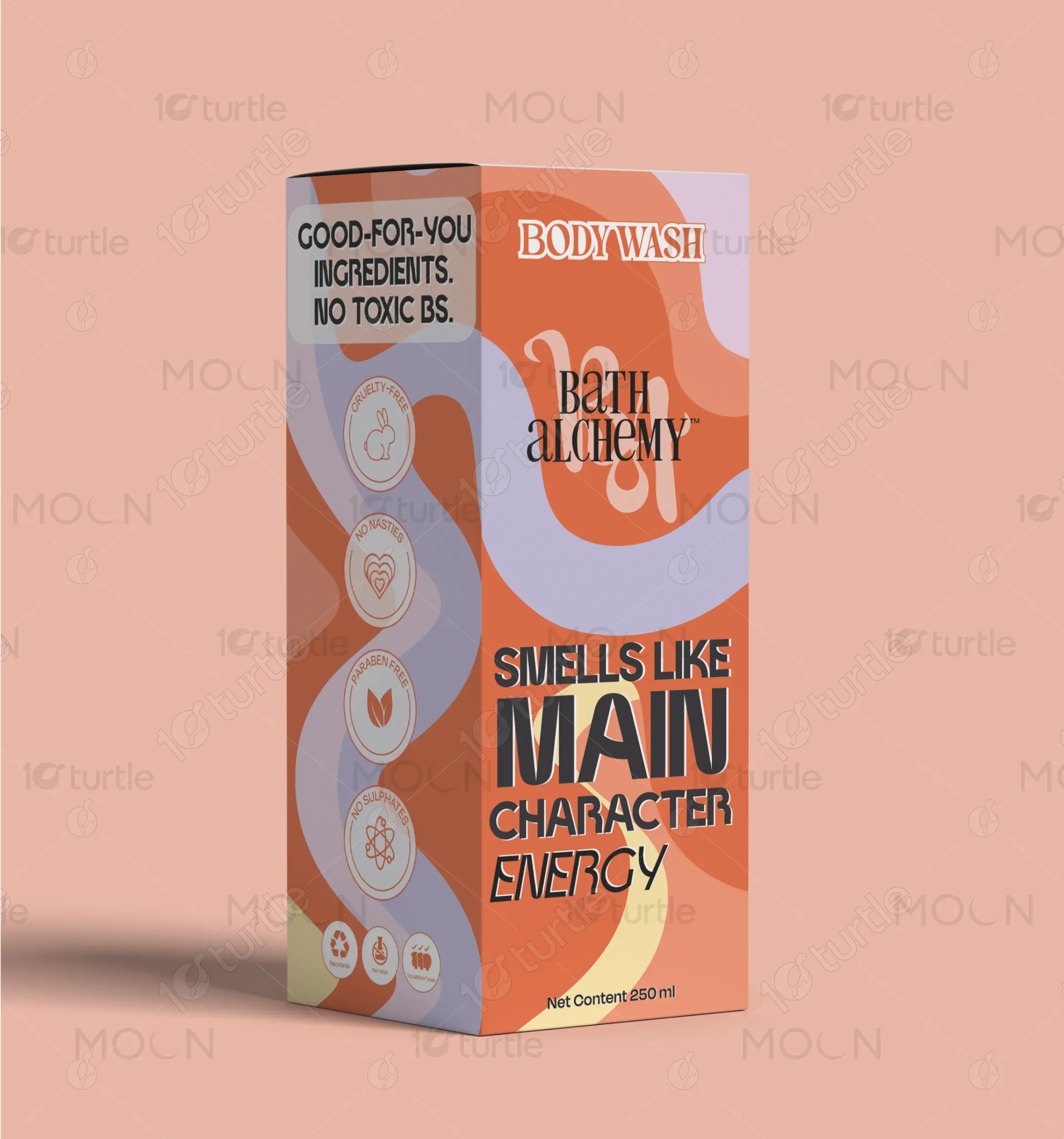
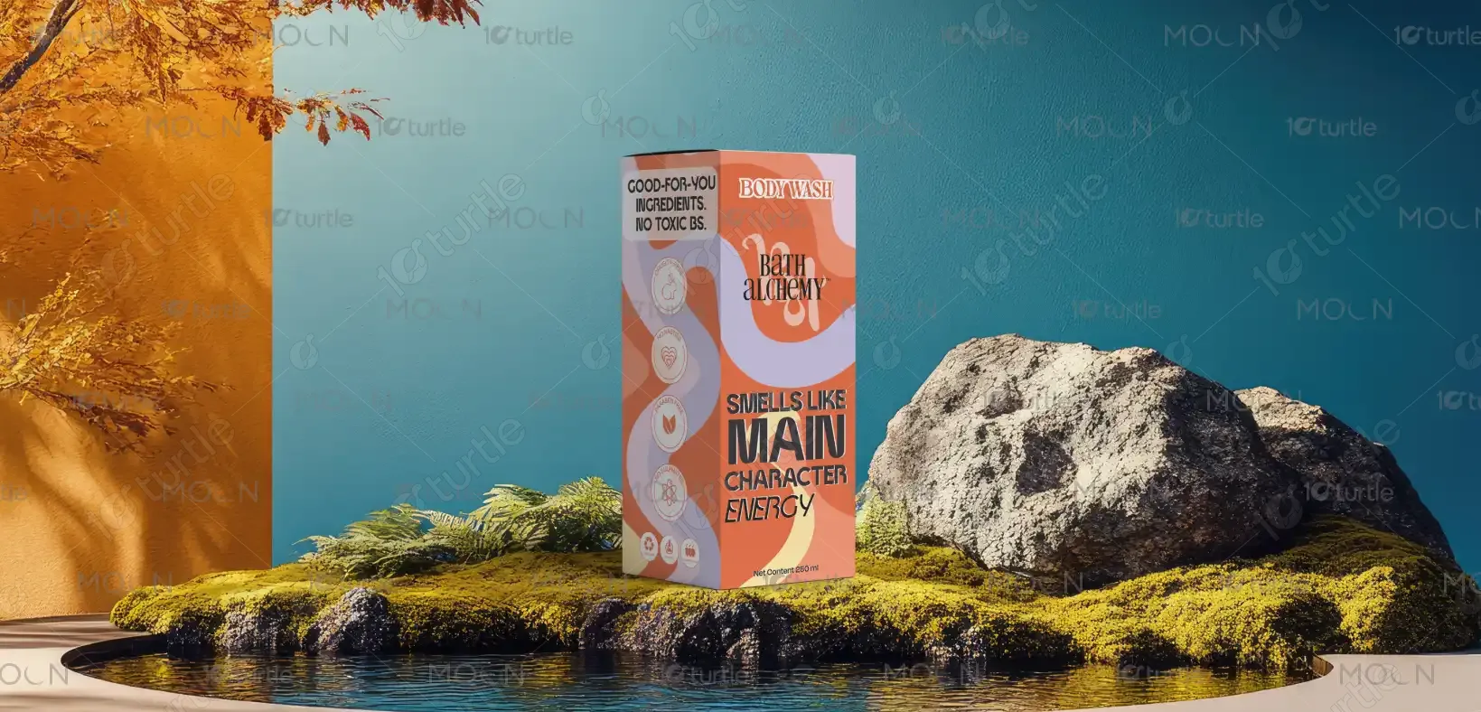
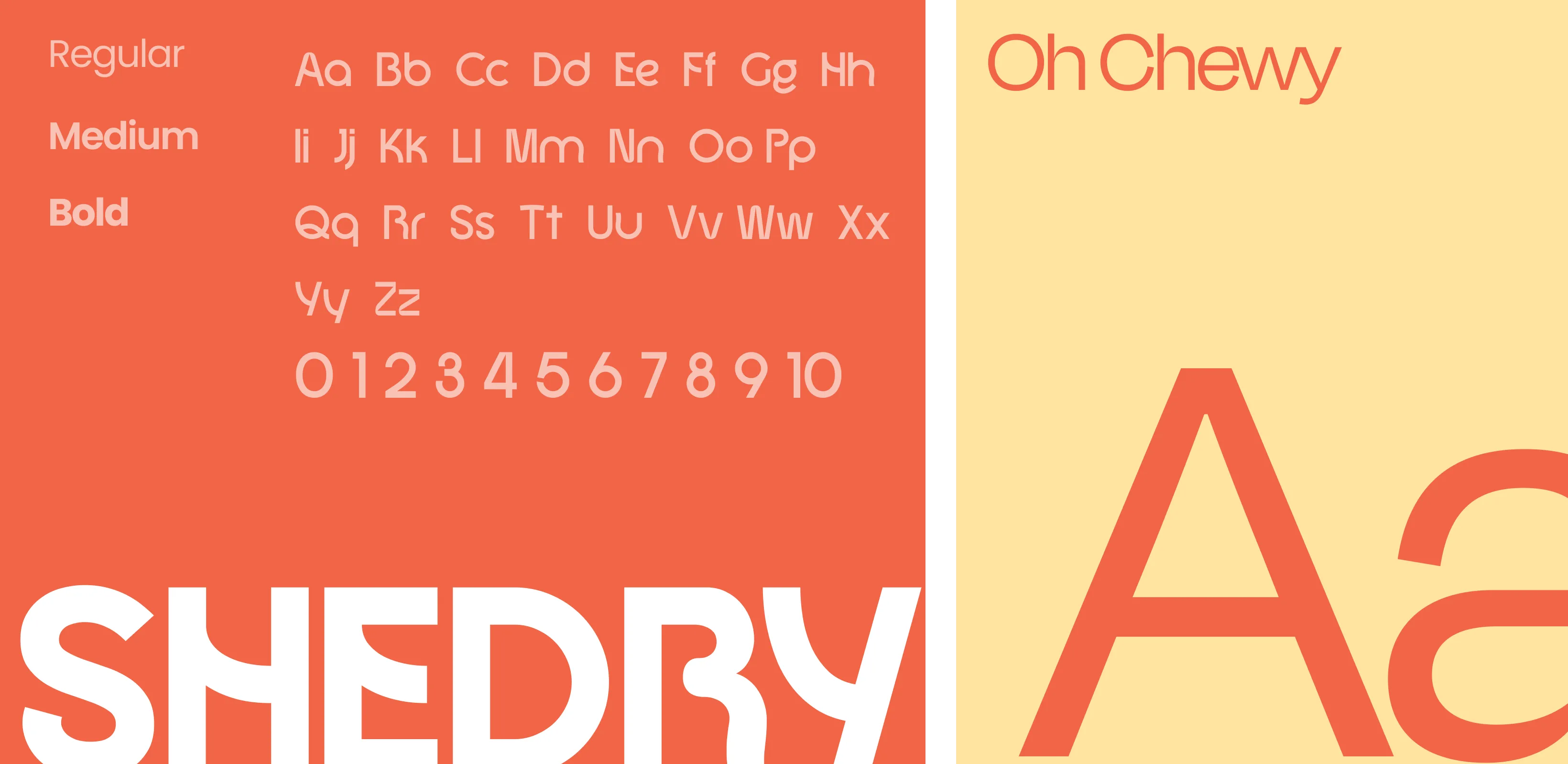
The Bath Alchemy packaging embraces a bold, retro-inspired aesthetic with vibrant orange, lilac, and cream hues. Its playful typography and energetic tagline, “Smells Like Main Character Energy,” speak directly to youthful, self-expressive consumers. The curved shapes and color waves create a dynamic, modern appeal while ensuring the design feels approachable and fun. Minimalist icons highlight its eco-conscious, cruelty-free values, making the overall design visually striking yet responsible, aligning beauty with self-confidence and sustainability in a crowded personal care market.
Packaging Design
Graphic Design
visual Design
Industry
Fashion, Beauty & Lifestyle
Tools we used


Project Completion
2025
Key Market
Global
Bath Alchemy Body Wash is a clean-label personal care product designed to elevate daily routines into empowering rituals. With non-toxic, cruelty-free, and eco-conscious ingredients, it appeals to modern consumers who value both wellness and style. Its unique selling point lies in its bold brand voice—positioning the body wash as not just cleansing but also confidence-boosting. The packaging complements this with striking colors and a statement tagline, making it as much a lifestyle choice as a personal care product.
Industry
Fashion, Beauty & LifestyleWhat we did
Packaging DesignGraphic Designvisual DesignPlatform
-In the personal care industry, many products either overemphasize clinical purity with sterile packaging or lean too heavily on luxury minimalism, leaving a gap for expressive, fun-yet-clean branding. Consumers—especially Gen Z and millennials—seek transparency in ingredients but also want products that reflect individuality and self-expression. Most competitors fail to merge safety and wellness claims with bold personality-driven branding, often creating disconnects between functional benefits and emotional appeal.
Bath Alchemy bridges this gap by combining transparent, non-toxic ingredient promises with a vibrant, personality-packed design. The tagline “Smells Like Main Character Energy” transforms body wash from a mundane necessity into a confidence ritual. The eco-icons and bold, wavy visuals communicate trustworthiness and creativity simultaneously. This balance appeals to consumers who want both safe, eco-friendly products and packaging that feels fun, empowering, and worthy of a social media shelfie moment.

Bath Alchemy envisions becoming a go-to self-care brand that blends wellness with empowerment. The long-term goal is to expand into a full lifestyle range, from bath essentials to skincare, all championing clean beauty with bold personality. By consistently promoting confidence, inclusivity, and sustainability, the brand aims to set new standards in personal care—proving that wellness can be as vibrant and expressive as it is safe and eco-conscious.
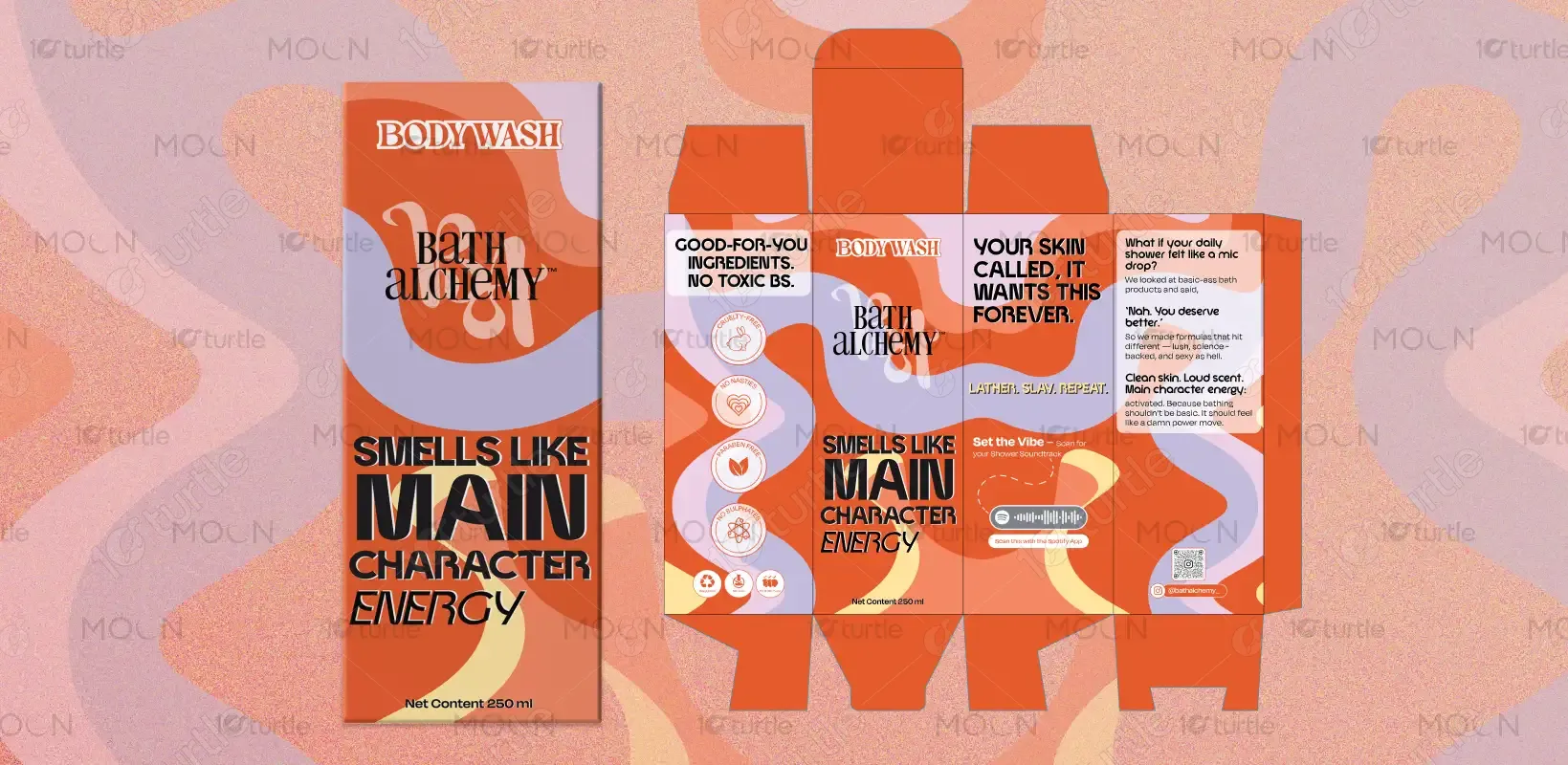

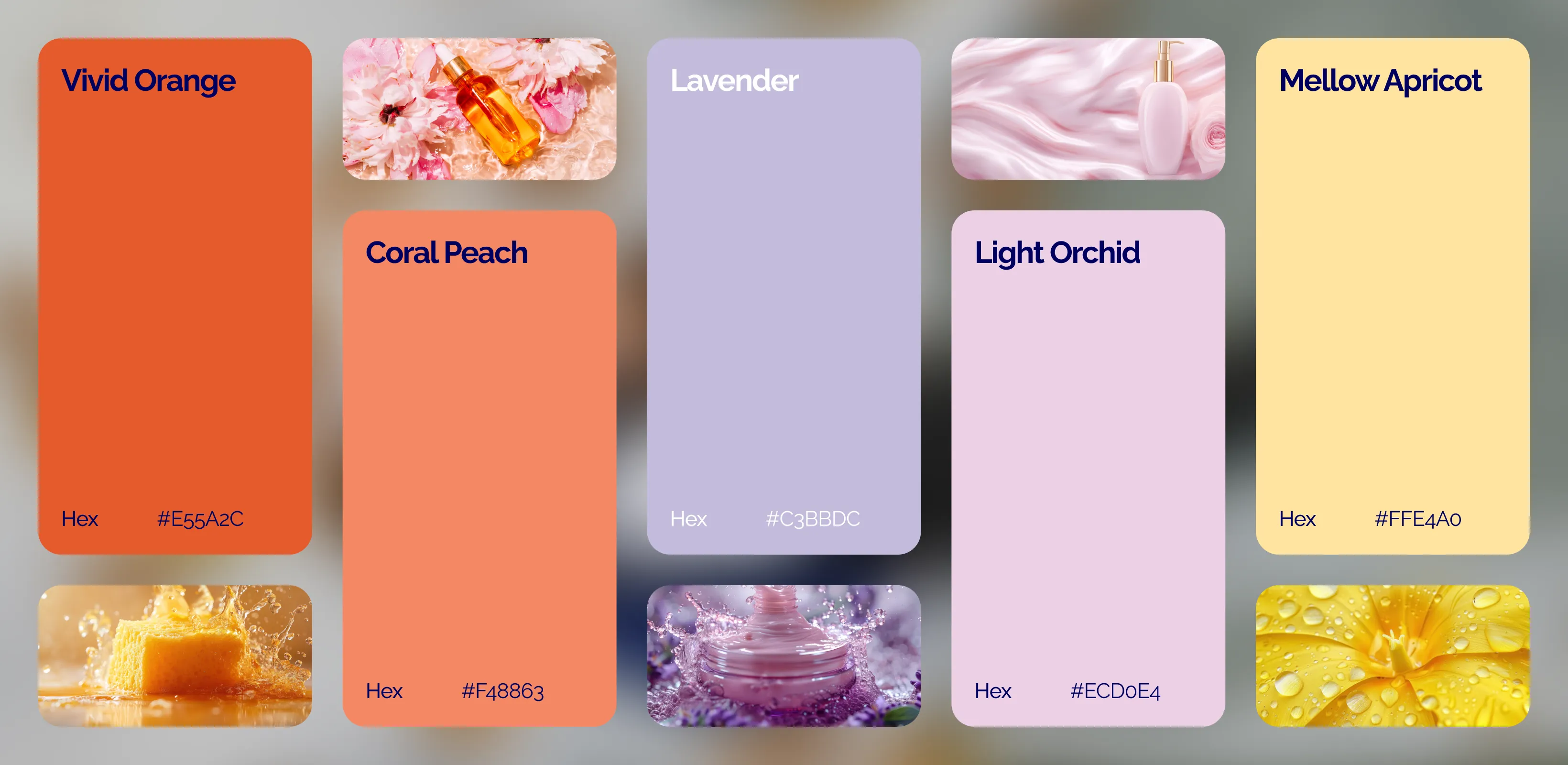
The palette features burnt orange, muted lavender, and creamy beige, with accents of bold black typography. Orange conveys energy, warmth, and confidence; lavender adds calmness and modernity; beige grounds the palette in simplicity and wellness. The contrast ensures legibility while creating a retro-modern vibe that resonates with expressive, youthful audiences. Together, the colors symbolize balance—invigorating yet soothing—mirroring the brand’s philosophy of fun, clean, and empowering care.
