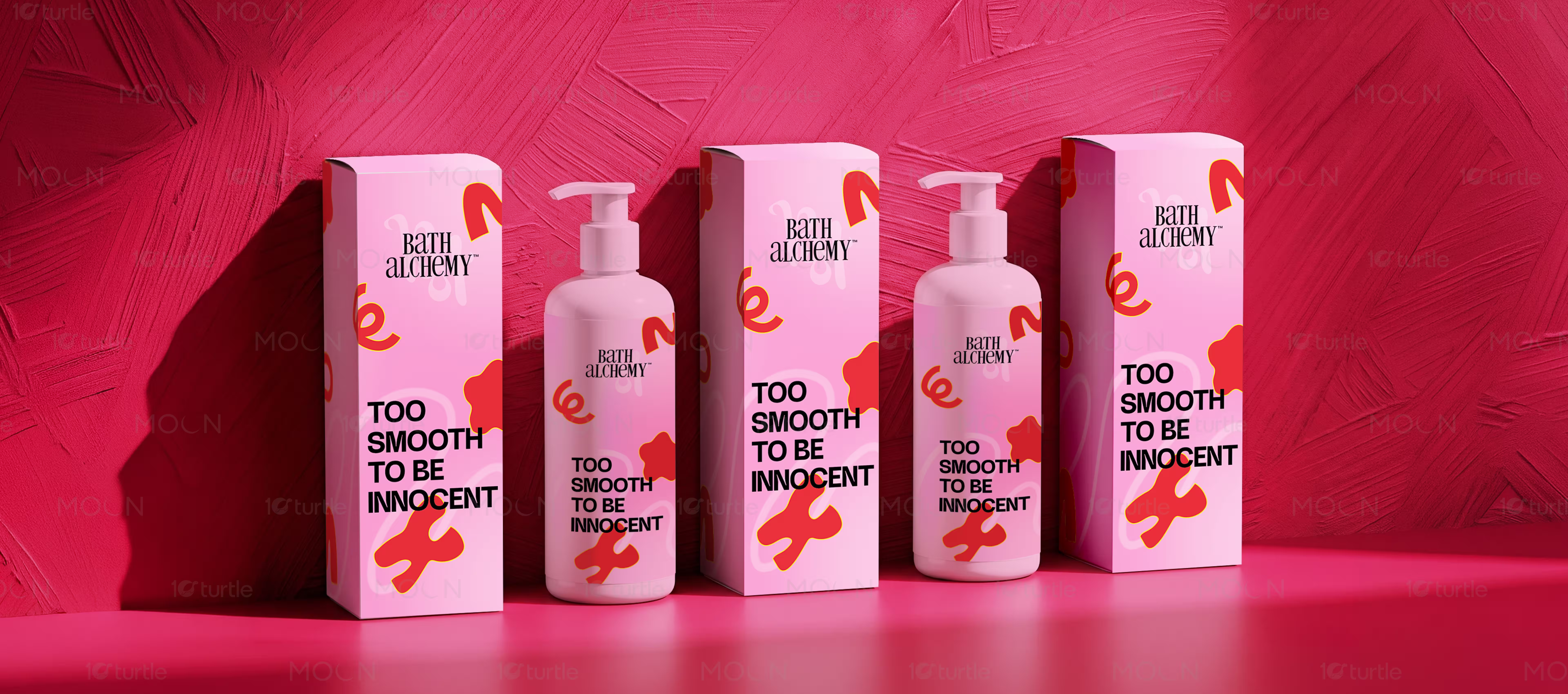
Bath Alchemy is a pink bath and body care packaging system for modern beauty shoppers seeking playful, polished self-care products. The design uses glossy pump bottles, tall cartons, coral-red abstract graphics, bold black typography, and a hot pink studio setting to position the product as youthful, expressive, and shelf-ready today.
Package Design
Visual Identity
Industry
beauty
Tools we used


Project Completion
2025
Key Market
Global
Industry
beautyWhat we did
Platform
-Personal care packaging often looks either too clinical or too decorative, making it difficult for new bath brands to stand out on crowded beauty shelves. The category needs packaging that communicates softness and self-care while still feeling bold enough for digital campaigns. Shoppers are drawn to products that look good in bathrooms, on shelves, and in social content. The challenge was to make the product feel playful, smooth, and premium without losing clarity.
The design uses a strong pink color system across the bottle, carton, background, and reflective surface to create instant recognition. Coral-red abstract shapes add movement and a fun beauty-led personality, while the black stacked “TOO SMOOTH TO BE INNOCENT” typography creates a confident focal point. The refined serif Bath Alchemy logo balances the playful graphics with a more polished brand tone. Product mockups show both retail packaging and lifestyle usage, making the brand feel shelf-ready and campaign-ready.