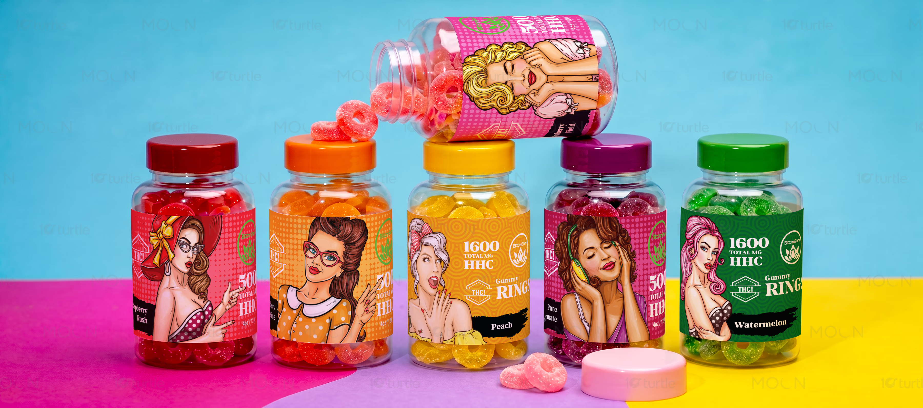
A vibrant label design system for Bloomstem hemp gummies, combining pop-art characters, flavor-coded colors, and clear supplement information to make each bottle expressive, collectible, and retail-ready across multiple flavor variants.
Label Design • Packaging Design • Supplement Packaging • Product Label System • Retail Packaging
Industry
Healthcare
Tools we used


Project Completion
2025
Key Market
Global
Industry
HealthcareWhat we did
Platform
-Hemp gummy and supplement brands need to feel exciting without losing trust, especially when product labels must carry dosage, flavor, ingredients, nutrition facts, and brand identity in limited space. Poor label design can make variants look disconnected, confuse the buyer, or make the product feel less credible. In a crowded lifestyle supplement market, unclear hierarchy also weakens shelf visibility and makes flavors harder to recognize quickly. The challenge was to make Bloomstem feel bold, collectible, and energetic while still keeping the label system organized.
The collection solves this through a strong color-coded label system where each flavor has its own visual identity while staying connected through consistent brand placement, circular seal graphics, and structured information zones. Pop-art inspired character illustrations add personality, making the bottles feel lifestyle-driven rather than clinical. Transparent packaging and vivid gummy colors were used as part of the visual experience, allowing the product itself to support the design. The layout balances playful illustration with practical label clarity, creating a packaging family that works across multiple flavors.