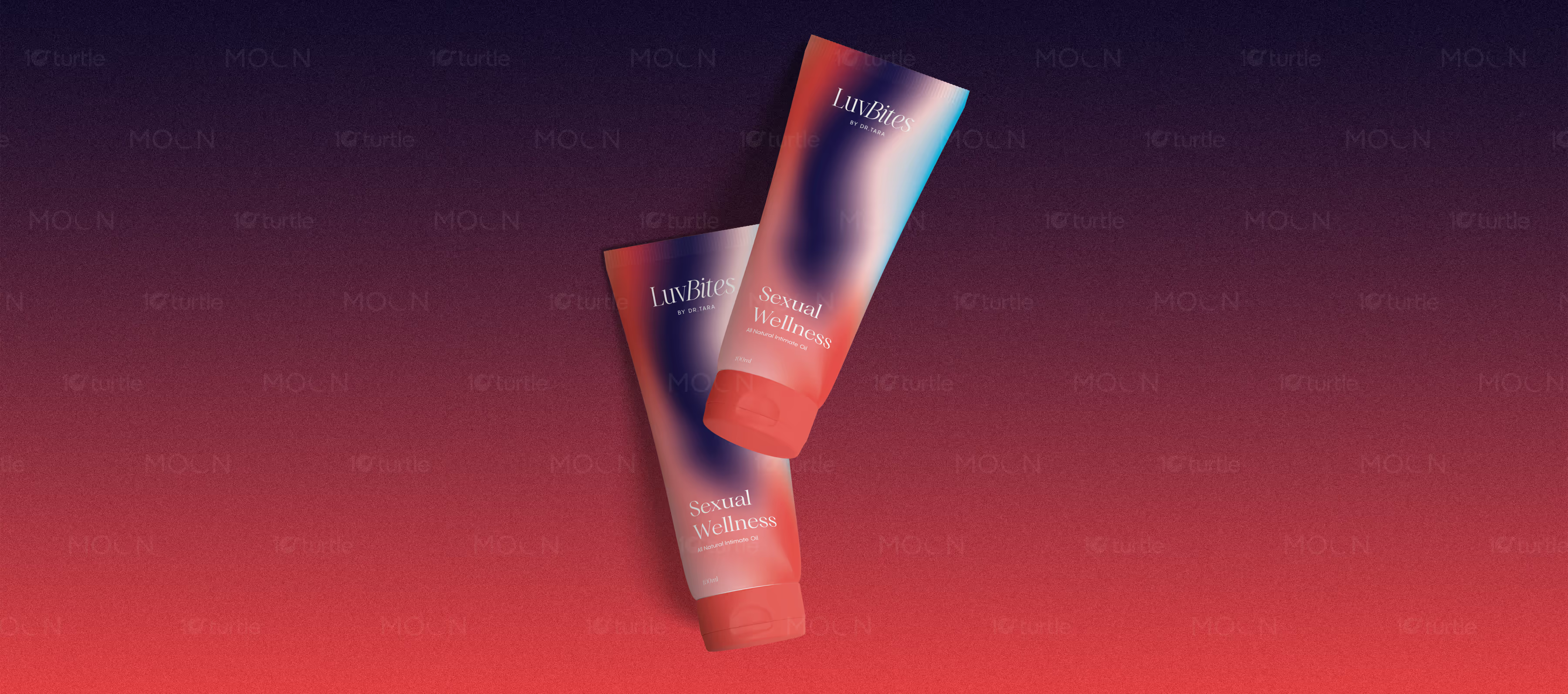
A three-design tube label collection for intimate wellness products, combining soft gradients, minimal cream packaging, warm red tones, refined typography, and discreet visual language for modern personal care branding.
Tube Label Design • Wellness Packaging Design • Personal Care Packaging • Product Label Design
Industry
Healthcare & Wellness
Tools we used


Project Completion
2025
Key Market
Global
Industry
Healthcare & WellnessWhat we did
Platform
-Healthcare and wellness packaging for intimate products must feel trustworthy, discreet, and emotionally approachable at the same time. Poor design can make the product feel either too clinical, too loud, or uncomfortable for the target audience. Intimate wellness products especially need clear labeling, confident brand presence, and a premium tone without becoming overly explicit. The challenge is to balance sensitivity, beauty, and shelf appeal within a small tube format.
This collection solves that through three complementary label directions that keep the brand elegant and easy to recognize. The gradient tube uses red, navy, blush, and cyan tones to create a modern sexual wellness mood with soft movement. The cream tube uses minimal black typography, a warm brown cap, and large gold LB initials for a clean premium look. The red tube uses tonal patterning, white product text, and fine line-art figures to create warmth, intimacy, and visual distinction.