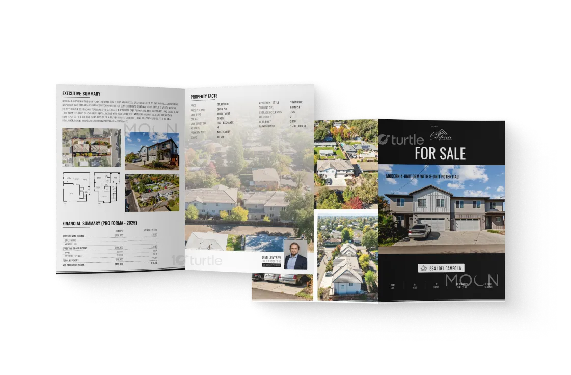
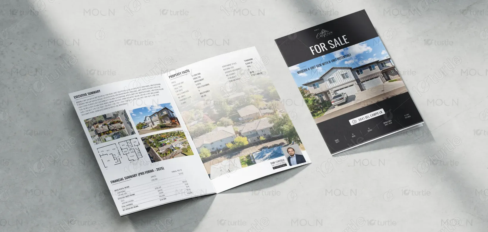
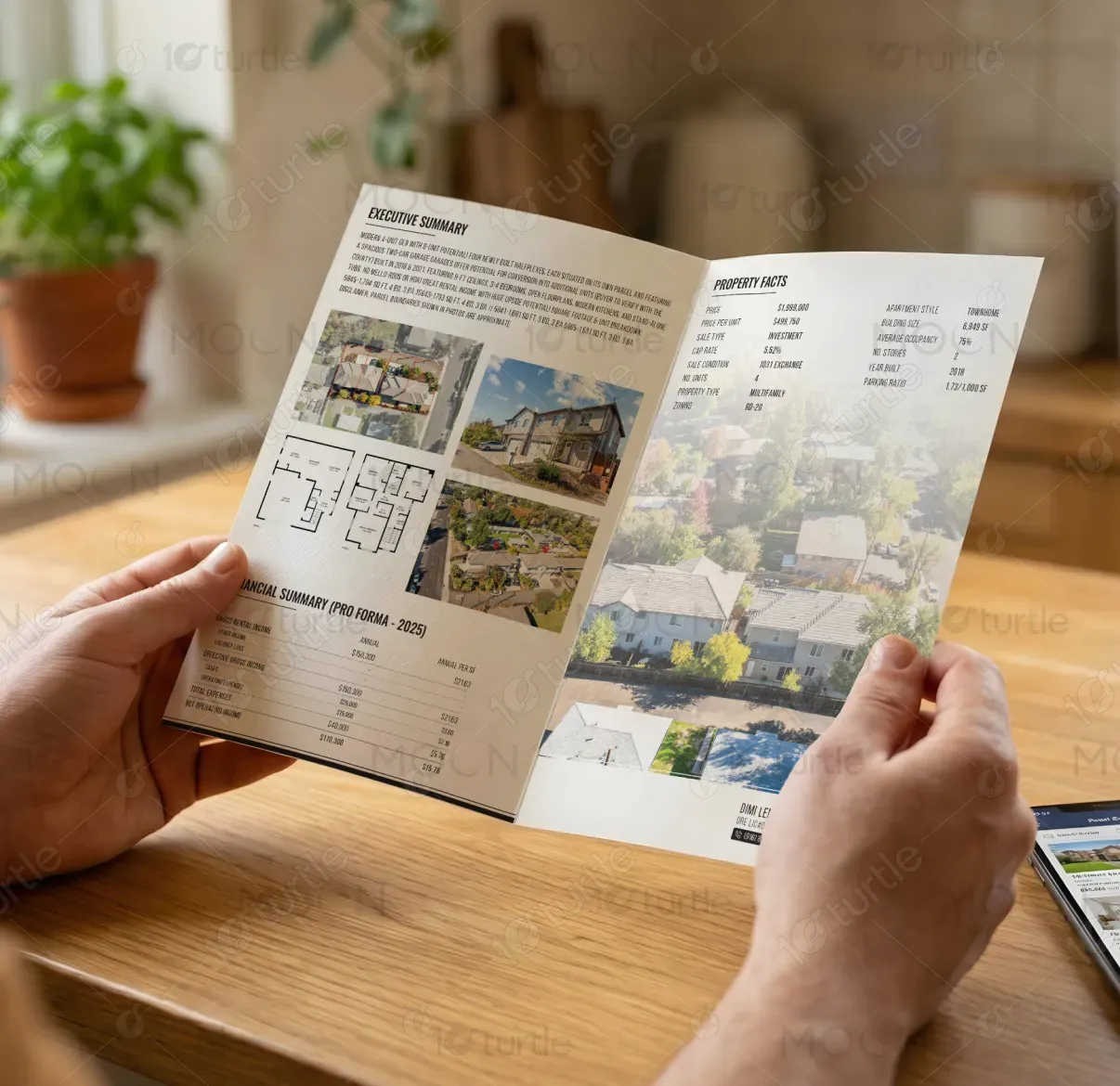
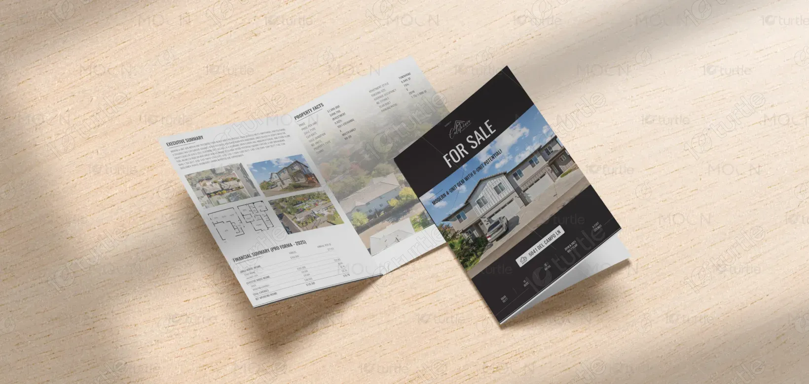
The design utilizes a modern, clean layout, focusing on clear hierarchy and readability. The use of high-quality images of the property and surrounding areas highlights the key features, ensuring clarity. The typography combines bold headings with subtle details to enhance readability, while the color scheme complements the professionalism of the investment opportunity. This approach maintains a balance between elegance and practicality, allowing the property’s value to shine through effortlessly.
Bi-Fold Design
Graphic Design
Industry
Property, Construction & Real Estate
Tools we used


Project Completion
2025
Key Market
Global
This brochure represents a premier real estate investment opportunity: a modern 4-unit property with the potential to expand into 8 units. Located in a desirable area, the property’s spacious design and high ceilings make it an attractive option for both investors and future residents. The design emphasizes its investment potential, showcasing key features such as the spacious garages and modern interiors. This marketing material speaks directly to those looking for rental income and long-term value.

Industry
Property, Construction & Real EstateWhat we did
Bi-Fold DesignGraphic DesignPlatform
-In a competitive market, potential buyers often struggle to see the true investment potential of properties. Many listings lack clear visual or financial clarity, leaving investors uncertain about the value of a property. Without clear communication of rental income and future growth potential, the appeal of the investment may be overlooked, especially for properties that require some vision to see the upside potential.
This brochure’s layout solves this issue by providing an easy-to-read financial summary (Pro Forma) and an executive summary detailing the property’s features and potential. The design’s clean, structured layout ensures that key selling points—like rental income, potential for unit expansion, and modern features—are easily digestible. The use of clear financial data alongside high-quality visuals reinforces the investment opportunity in a way that is both engaging and informative.

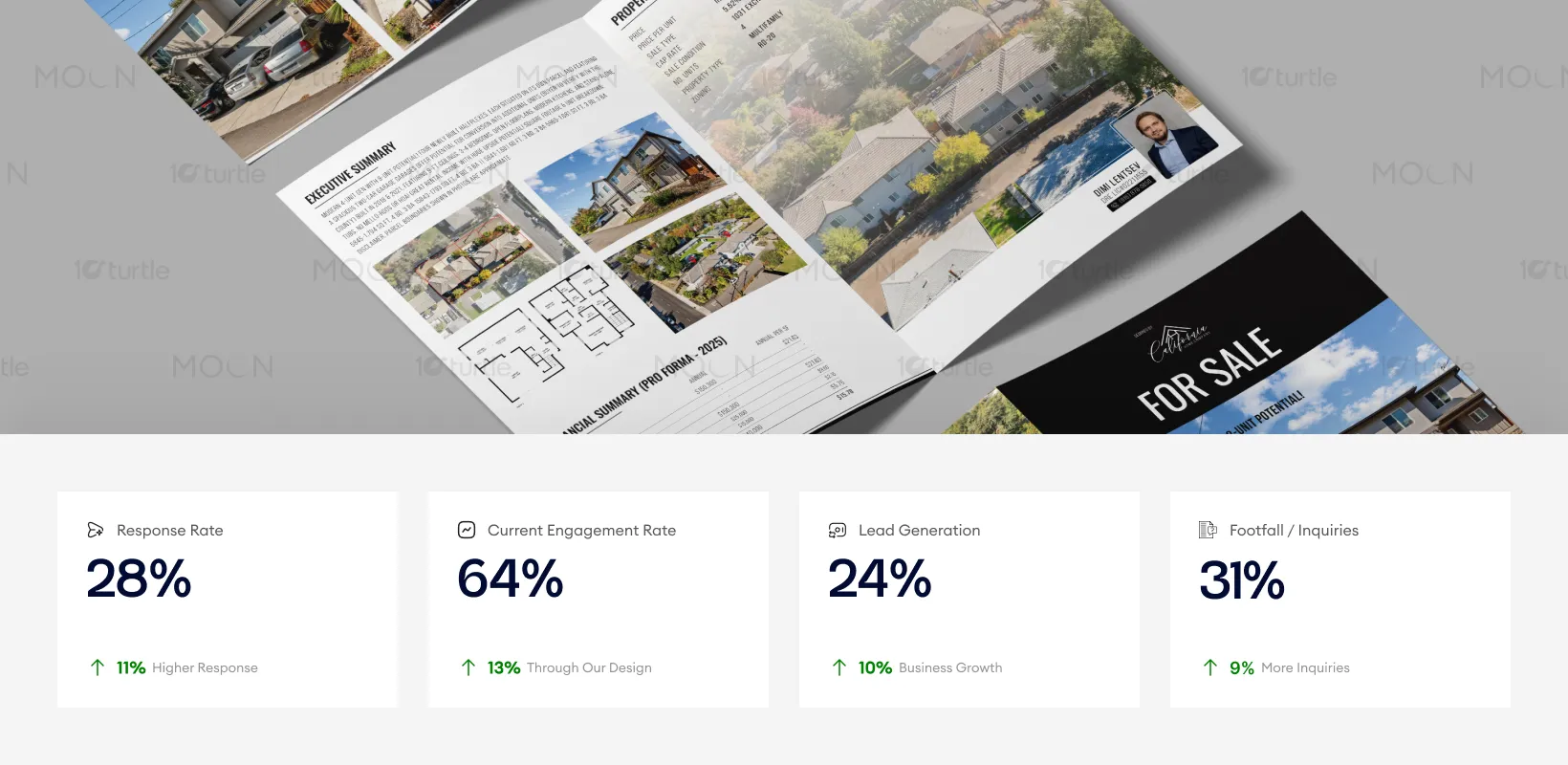
In real-world sales environments, the brochure strengthens buyer confidence by presenting property facts, financials, and visuals in a structured, professional format. Clear hierarchy and strong imagery support deeper engagement during showings, contributing to higher inquiry quality, improved showing-to-offer conversion, and measurable uplift in investor follow-ups.
The design positions California Home Company as a forward-thinking real estate brand that values clarity and investor empowerment. Over time, this brochure not only serves to sell properties but also builds the brand's reputation as a trusted provider of high-potential real estate opportunities. The minimalist design reflects the brand’s commitment to providing quality and simplicity in every project, making it adaptable to future marketing materials and evolving customer needs.

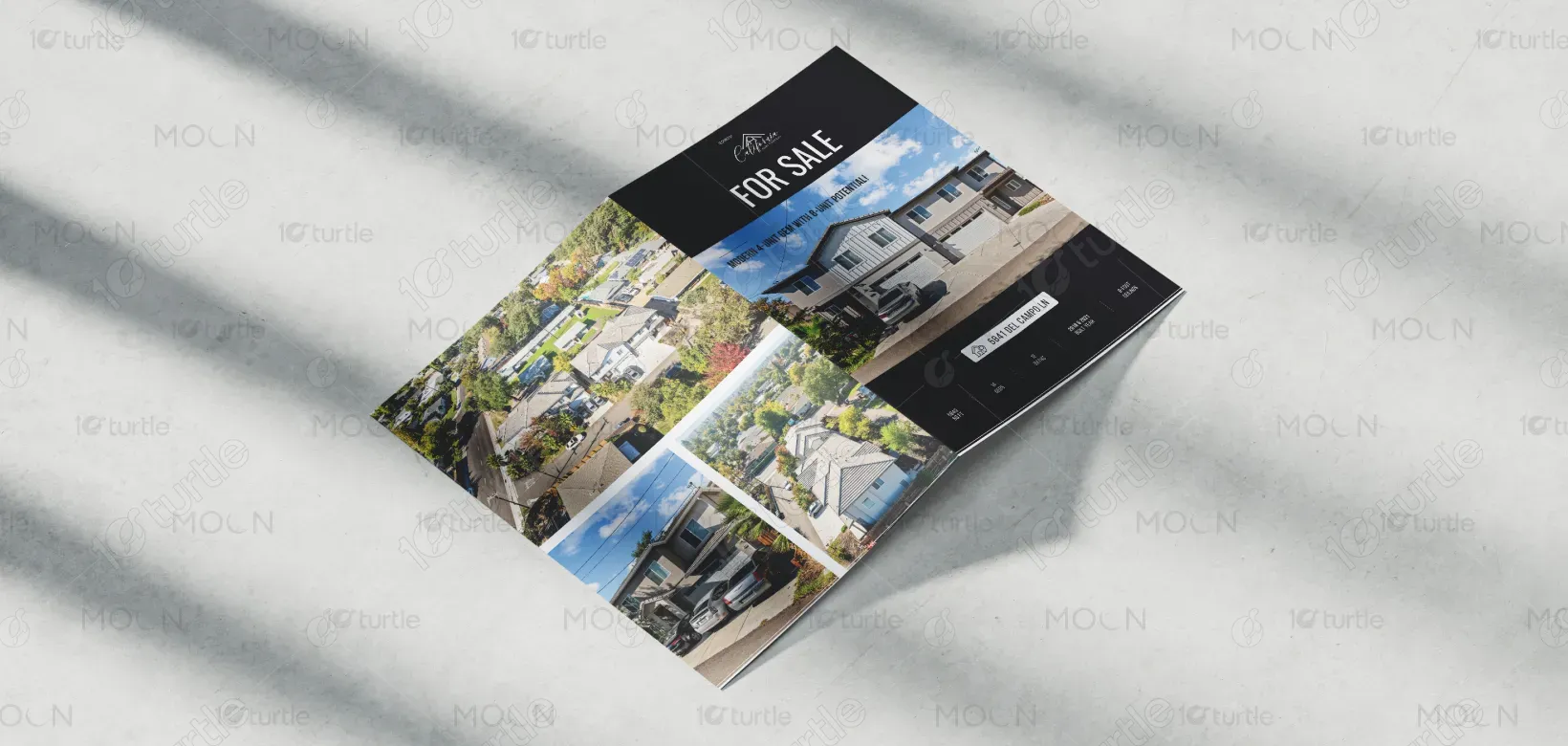
The color palette is a refined mix of dark, neutral tones with accents of subtle brightness, creating an inviting yet professional atmosphere. The dark background contrasts with the bright, crisp visuals of the property, helping them stand out. This scheme complements the brand’s personality—modern, sophisticated, and investment-focused. The typography supports this by using clean, contemporary fonts, ensuring the information is not only legible but also aligned with the brand’s premium identity. The visual language, coupled with high-quality imagery, elevates the overall presentation of the investment opportunity.