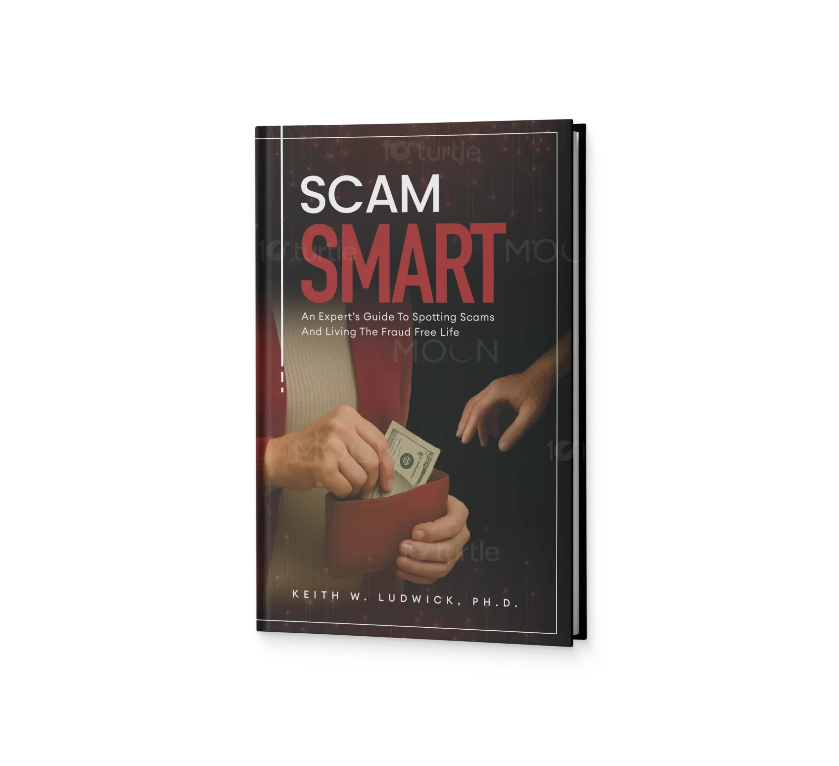
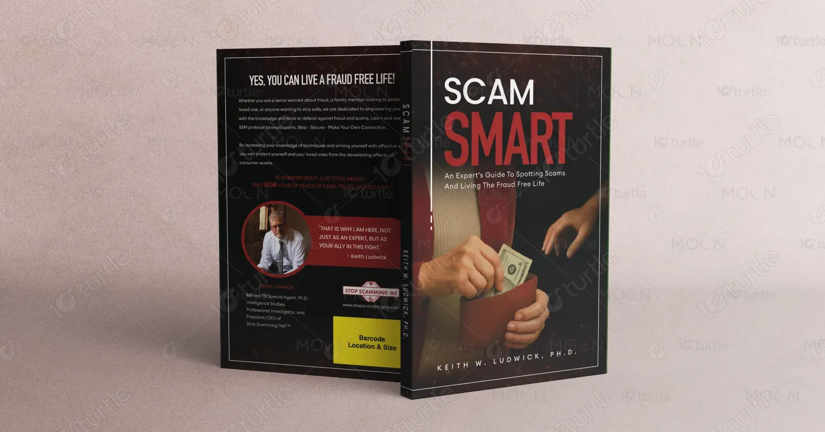
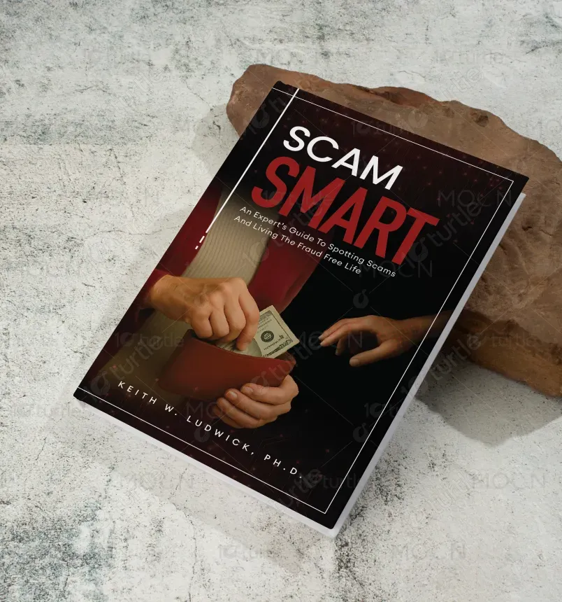
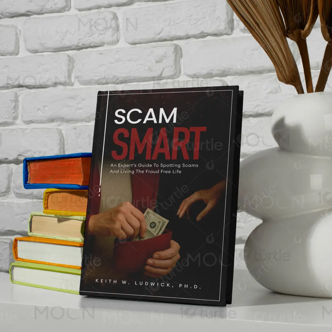
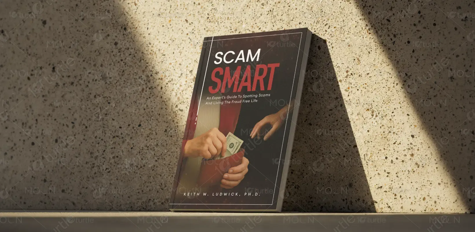
The design uses a bold typographic layout with "SCAM SMART" vertically aligned to emphasize clarity and urgency. The strong red and black palette conveys caution and authority—ideal for a fraud-awareness theme. The layout balances visual impact with readability, using contrast and structured alignment to reflect security and professionalism. The author’s credentials and quote lend credibility, while the barcode placement and logo branding are positioned for clean, commercial appeal. Overall, the design feels modern, direct, and trustworthy—just like the book’s content.
Book Cover Design
Graphic Design
Industry
Technology, SaaS & Startups
Tools we used


Project Completion
2025
Key Market
Global
SCAM SMART is an expert-led guidebook designed to help individuals detect, avoid, and overcome modern-day scams. Authored by retired FBI agent Dr. Keith Ludwick, it empowers readers through a structured method (SSM Protocol: Stop, Secure, Make Your Own Connection). Targeted at seniors, caretakers, and everyday consumers, the book is both an educational tool and a safety companion. With credible insights and a clear call to action, it fills a critical niche in personal security literature.

Industry
Technology, SaaS & StartupsWhat we did
Book Cover DesignGraphic DesignPlatform
-Fraud education materials often lack emotional impact or visual clarity, leading to disengagement—especially among vulnerable demographics like seniors. Most covers in the security or scam-prevention genre are either too academic or cluttered with alarming imagery. This creates a gap where trust, clarity, and immediate comprehension are missing, reducing the chances of readers picking up such life-saving content.
This book cover tackles the problem with clean visual hierarchy and trustworthy aesthetics. The bold title placement and “SCAM SMART” acronym catch attention while maintaining professional restraint. The use of expert endorsement and the reassuring tagline build trust immediately. The design avoids fear tactics and instead instills confidence, aligning with the empowering tone of the content. The SSM protocol is visually introduced in a simple, actionable way, making it memorable and accessible.

The long-term vision for SCAM SMART is to become the go-to resource for scam awareness globally. By leveraging Dr. Ludwick’s expertise and integrating educational outreach, the brand aims to expand into training programs, companion tools, and community-based initiatives. The ultimate goal is to make scam resistance a standard life skill—equipping every household with practical fraud defense strategies and restoring peace of mind.
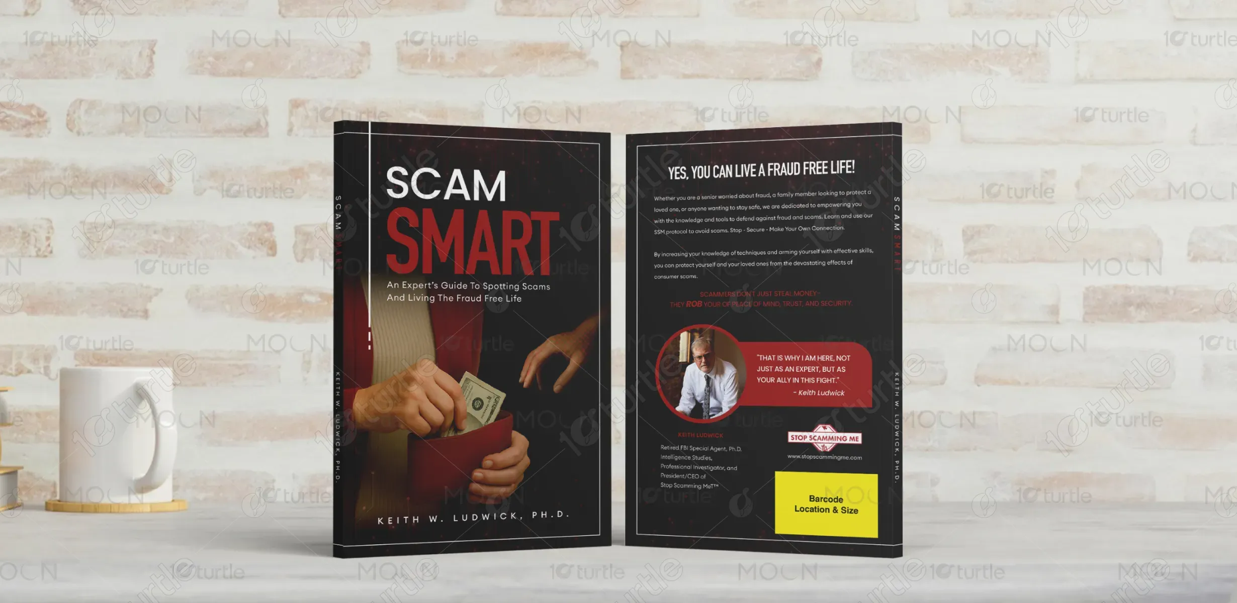

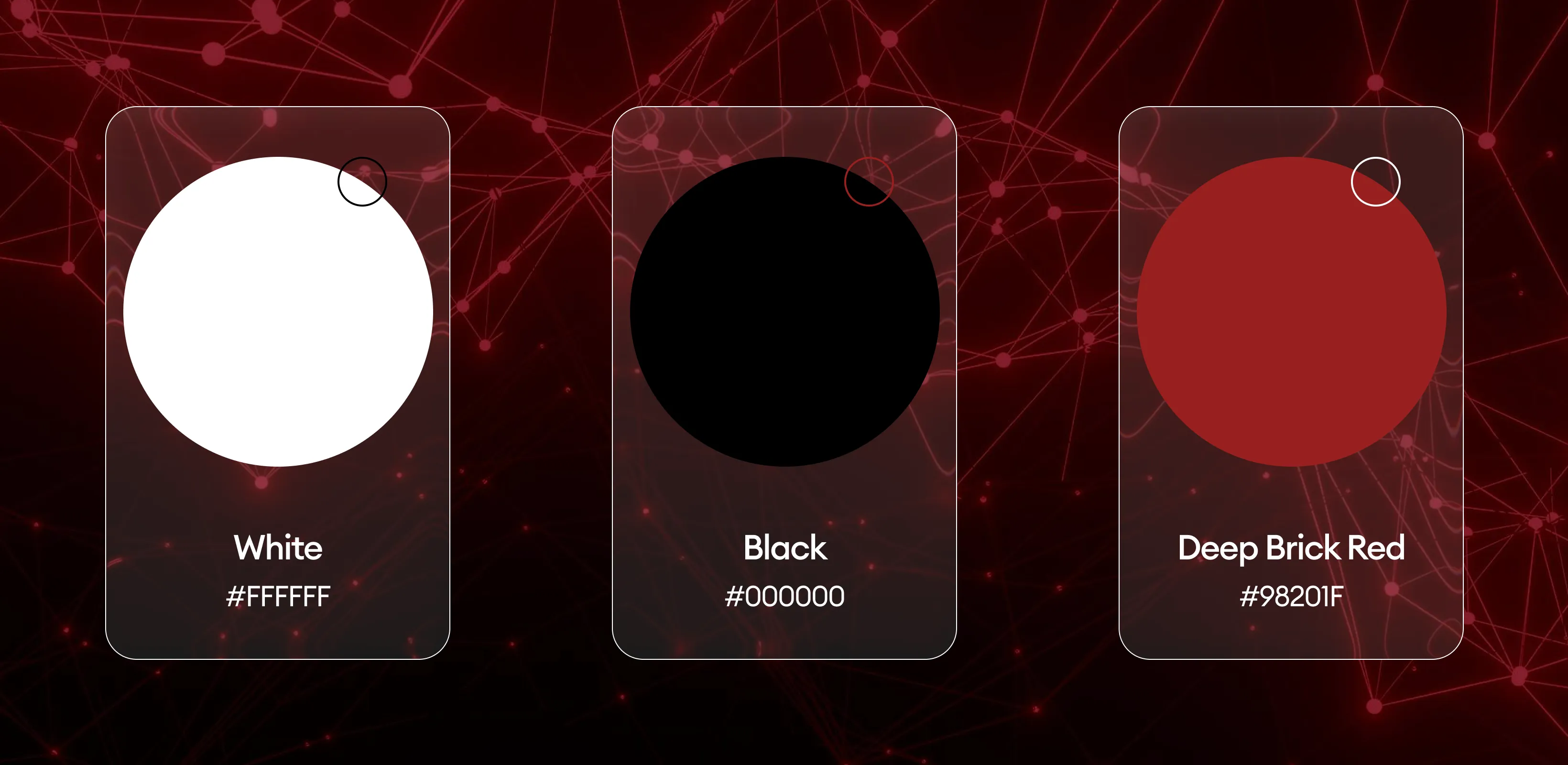
The design uses a high-contrast palette of red, black, and white. Red symbolizes warning and urgency—key emotional triggers when dealing with scams. Black adds authority and seriousness, reinforcing the expert tone. White ensures clean readability and mental clarity. Together, these colors deliver a visual message of caution balanced with hope and control. The palette reinforces the brand’s identity: alert, professional, and empowering.