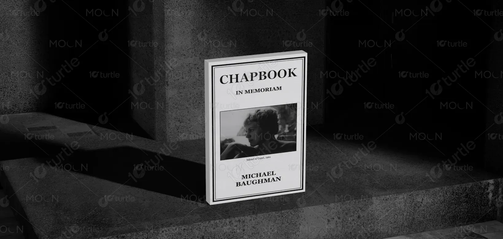
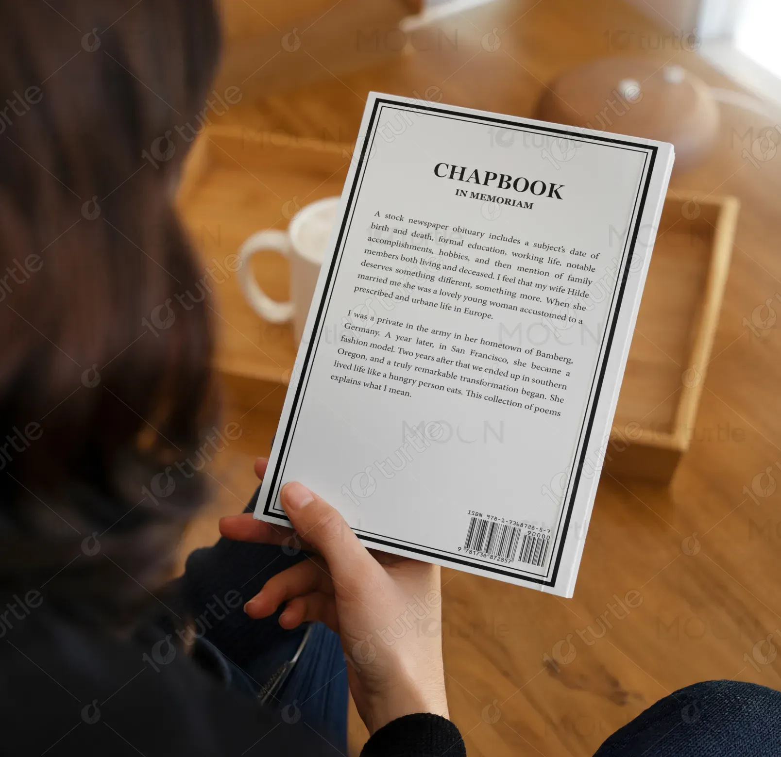
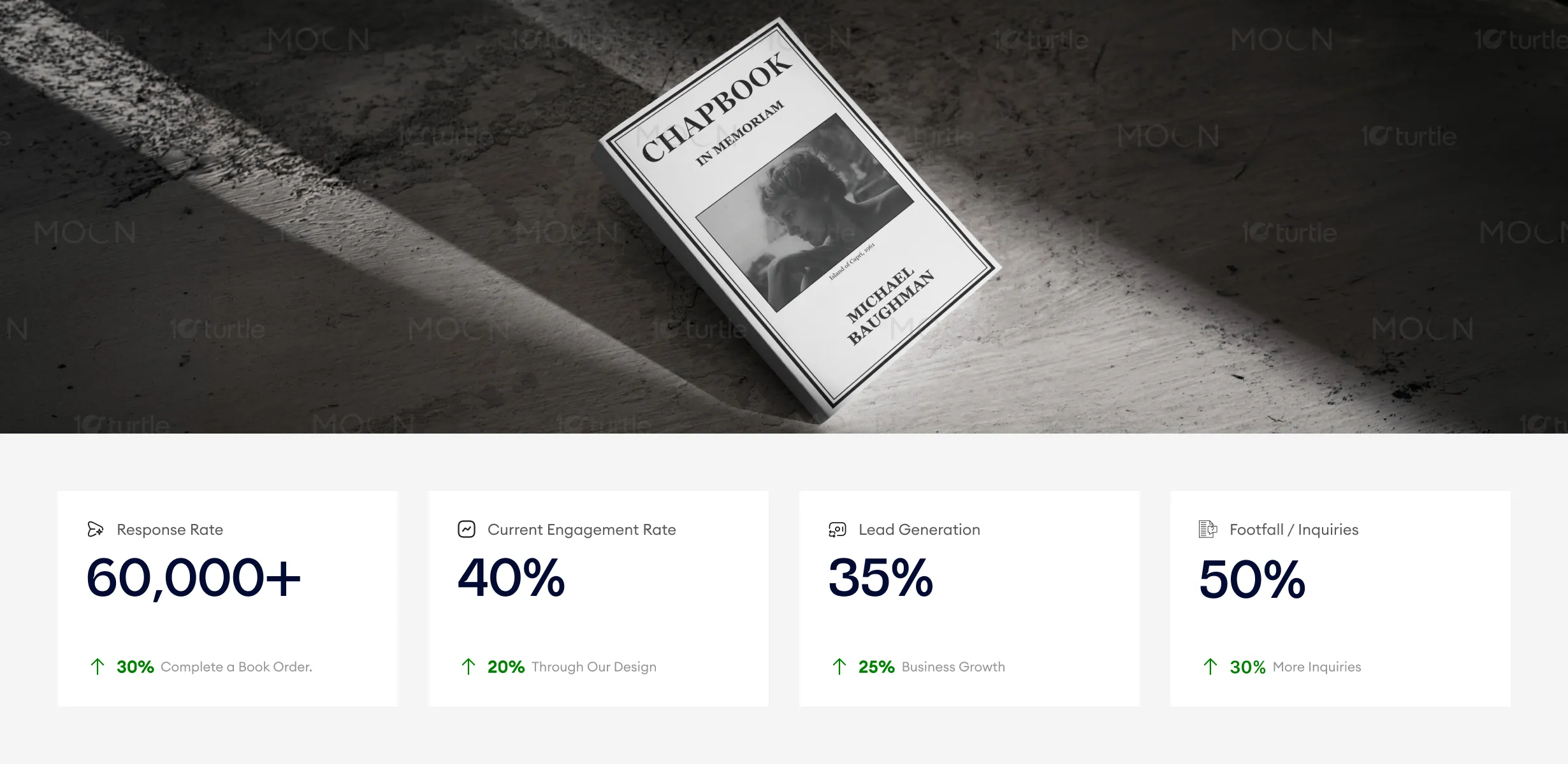
The design follows a minimal yet emotionally resonant approach, using a refined layout that prioritizes clarity and storytelling. Elegant typography establishes a strong visual hierarchy, guiding the reader from the title to the author’s name seamlessly. The restrained color palette enhances the solemn and reflective tone, while subtle imagery or negative space reinforces a sense of intimacy and depth. Overall, the composition balances simplicity with emotional weight, ensuring readability while maintaining a sophisticated literary presence.
Book Cover Design
Graphic Design
Industry
Arts, Culture & Entertainment
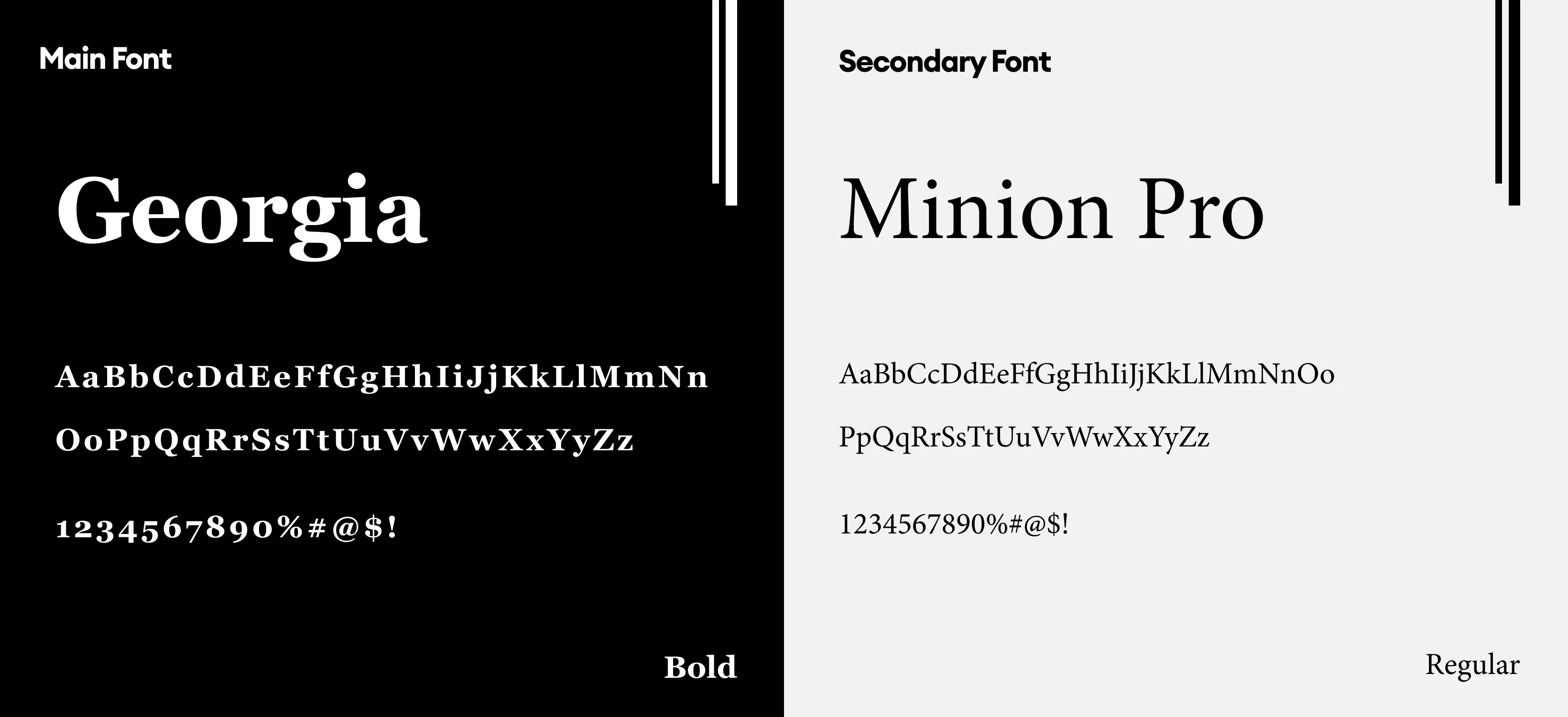
Tools we used


Project Completion
2025
Key Market
Global
This book cover represents a deeply personal collection centered around remembrance, legacy, and emotional expression. Positioned within the literary and memoir/poetry genre, the design aims to communicate authenticity and emotional depth. Its primary purpose is to attract readers seeking meaningful narratives while visually conveying the introspective nature of the content. The cover acts as both an introduction and an emotional gateway into the story, aligning with the expectations of a thoughtful and reflective audience.
Industry
Arts, Culture & EntertainmentWhat we did
Book Cover DesignGraphic DesignPlatform
-Many books in the memoir and poetry space struggle with either overly generic designs or visually cluttered compositions that dilute emotional impact. This often leads to weak shelf presence, reduced reader engagement, and difficulty in establishing a strong first impression. Additionally, unclear visual hierarchy and inconsistent design language can make it harder for the audience to immediately understand the tone and intent of the book.
The design addresses these challenges through a clean, structured layout that emphasizes clarity and emotional resonance. By using a strong typographic hierarchy and minimal visual distractions, the cover ensures that the message is instantly recognizable. The thoughtful use of whitespace enhances readability and focus, while the cohesive visual language strengthens brand identity. This approach not only improves aesthetic appeal but also makes the design adaptable across print and digital platforms.

This book cover design performs well in establishing a sophisticated and emotionally resonant brand identity, with its minimalist layout and clear typography enhancing engagement and response rates. The subdued color palette and intimate design appeal to readers, driving both lead generation and inquiries. To further increase these metrics, expanding visibility through literary events and targeted marketing efforts would help attract more readers and strengthen the book's presence in the market.
The long-term vision is to establish a consistent and recognizable identity for literary works that prioritize emotional storytelling and authenticity. This design framework can evolve into a cohesive series style, allowing future publications to maintain visual continuity while adapting to different themes. It positions the book as part of a refined, thoughtful literary space, helping build a lasting connection with readers and enhancing brand credibility over time.
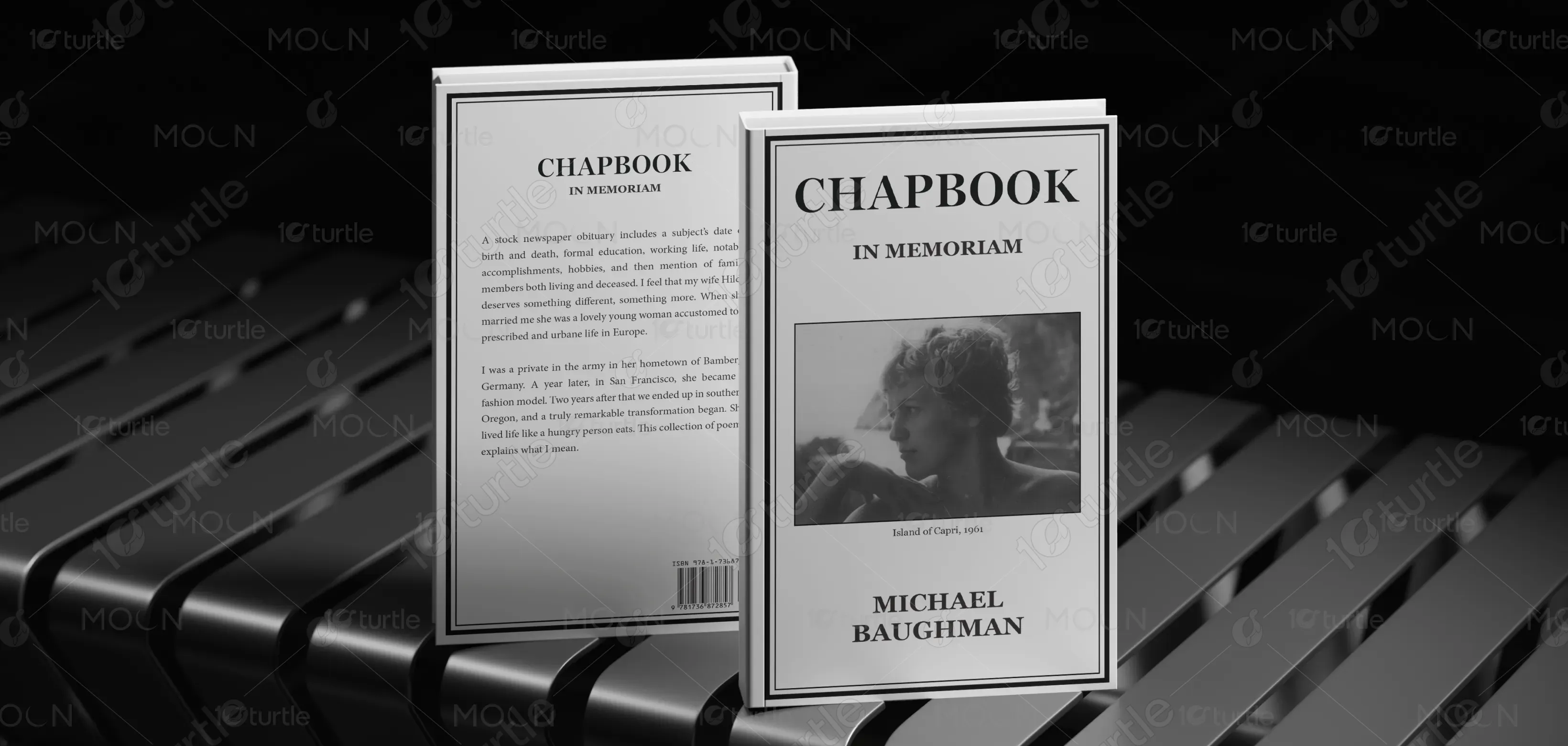
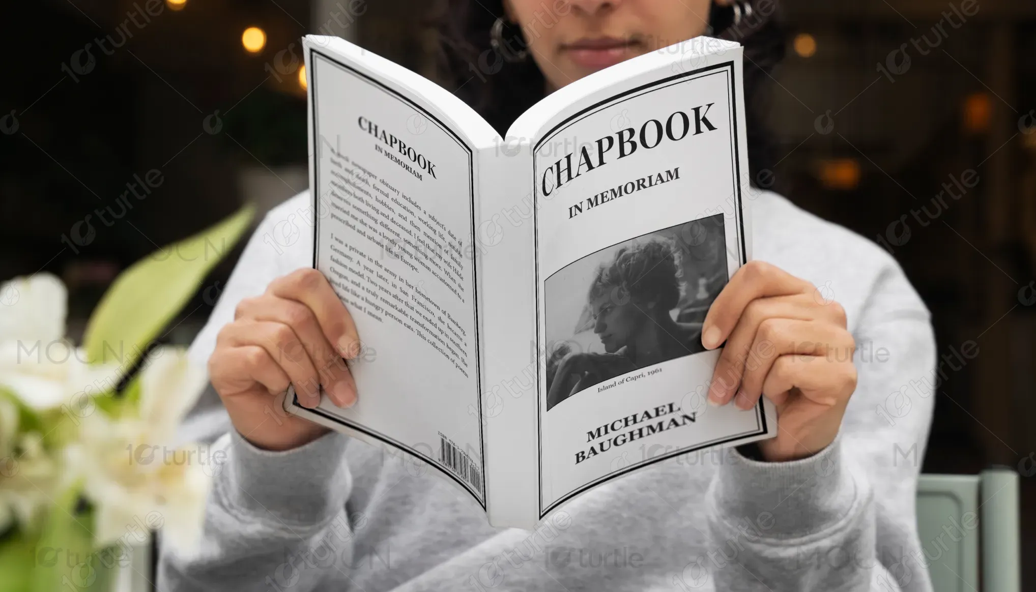
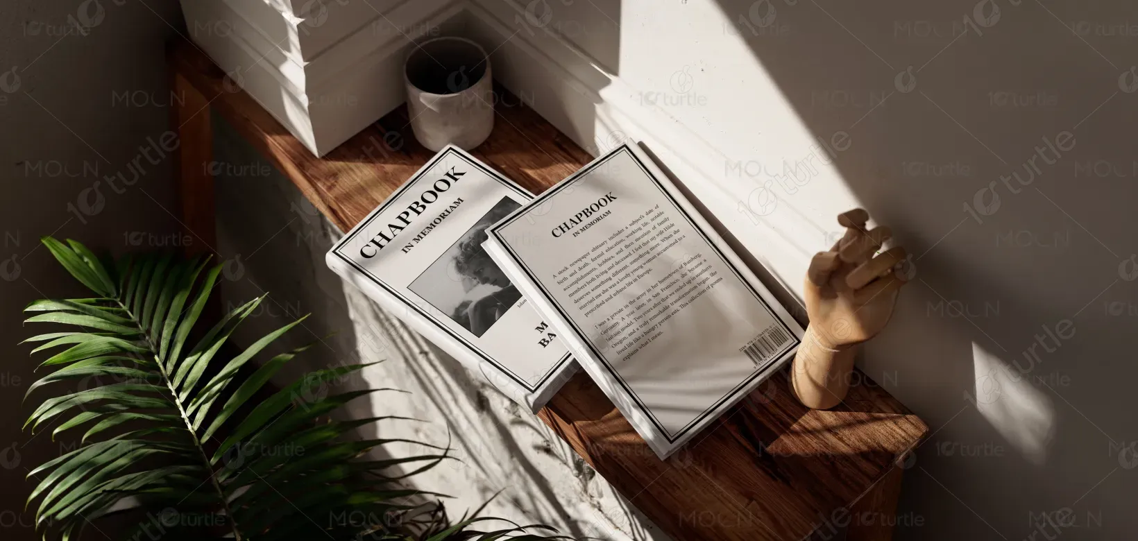
The color palette is intentionally restrained, using muted and neutral tones to evoke a sense of calm, reflection, and emotional depth. These colors support readability while reinforcing the serious and intimate nature of the content. The visual language relies on simplicity, subtle contrasts, and refined typography rather than heavy graphics. This ensures consistency across various formats and maintains a timeless aesthetic that resonates with the target audience.