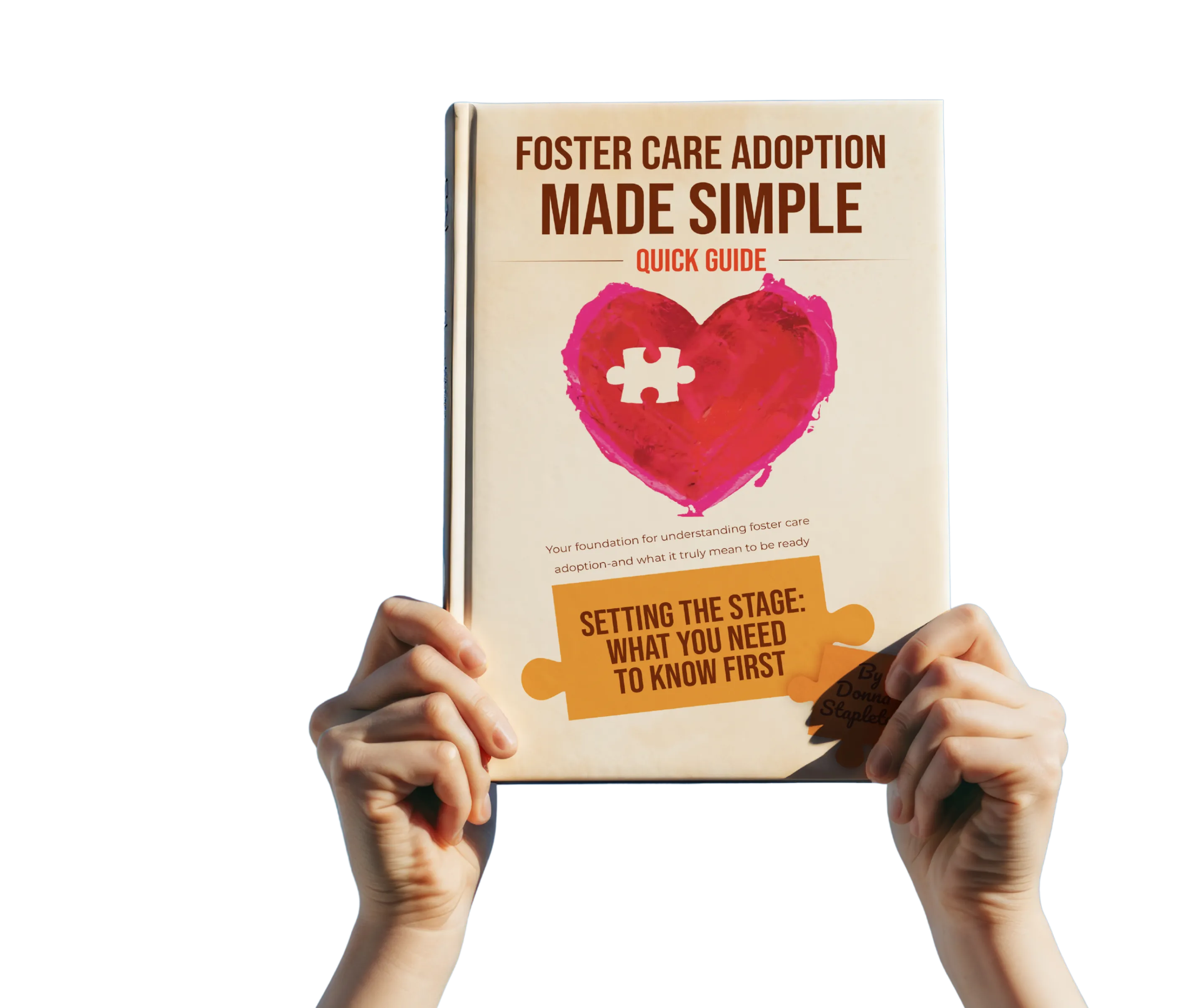
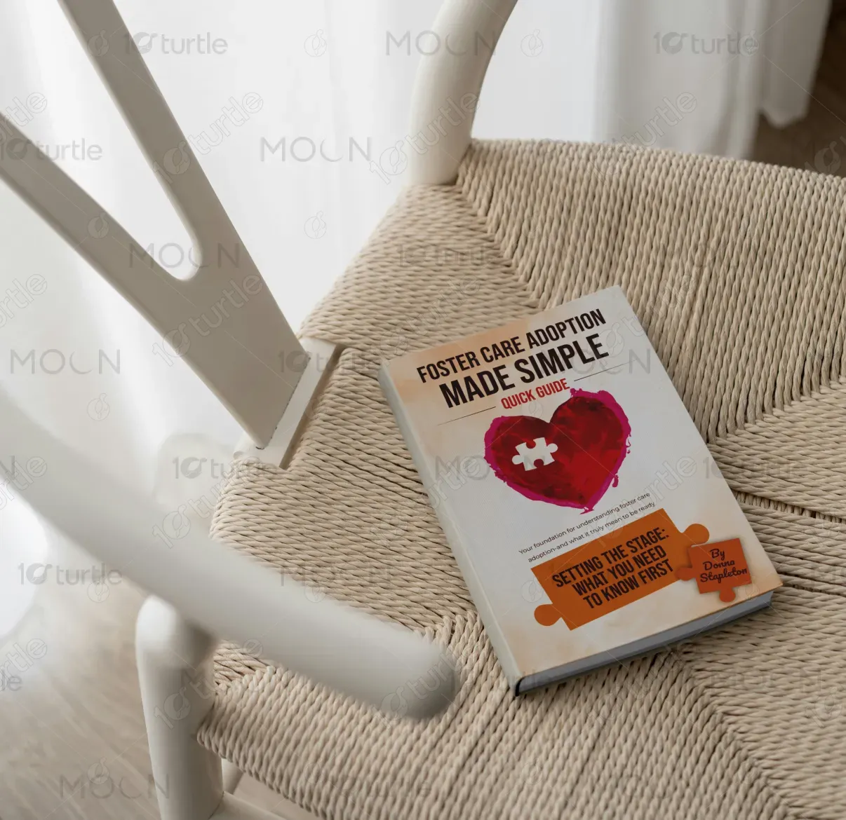
The design takes a warm, approachable direction with a clean layout, simple typography, and a heart-centered graphic. The puzzle piece within the heart symbolizes the missing connection that foster care adoption fulfills, resonating with the book’s theme of family and belonging. Neutral tones balance the bold pink heart, creating an inviting aesthetic that is both professional and heartfelt. The use of puzzle elements in the title box and author’s name reinforces the concept of completion and understanding, making the design visually symbolic and emotionally engaging.
Book Cover Design
Graphic Design

Industry
Civic, Government & Nonprofits
Tools we used


Project Completion
2025
Key Market
Global
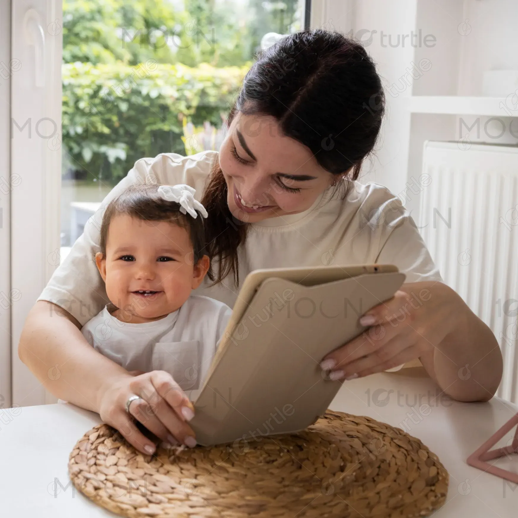
Foster Care Adoption Made Simple: Quick Guide is a practical handbook designed to simplify the complexities of foster care adoption. It provides foundational knowledge for prospective adoptive parents, breaking down the process into manageable steps. The book stands out for its clear, compassionate tone and approachable guidance, making it a trusted resource for individuals seeking clarity in an overwhelming system. Its unique selling point lies in merging expert insights with accessible language, packaged in a visually comforting design that reflects care, guidance, and hope.

Industry
Civic, Government & NonprofitsWhat we did
Book Cover DesignGraphic DesignPlatform
-Adoption resources are often dense, overly technical, or emotionally overwhelming, leaving families feeling more confused than supported. The lack of accessible, visually engaging materials means that many people shy away from exploring foster care adoption due to fear of the unknown. Traditional guidebooks often fail to balance warmth and professionalism, creating a gap for those seeking clarity, empathy, and encouragement. This challenge exists because most resources focus heavily on policy and legal aspects rather than the emotional journey and practical readiness of new adoptive parents.
This book bridges the gap by offering a concise, user-friendly, and emotionally supportive guide. The design uses warm, symbolic visuals like the heart and puzzle piece to immediately connect with readers on an emotional level. Its straightforward structure and emphasis on "what you need to know first" makes the adoption journey less intimidating. By simplifying complex legal, emotional, and logistical aspects into digestible sections, it ensures readers feel informed, prepared, and encouraged—making adoption seem more achievable, rather than daunting.

The long-term vision is to position Foster Care Adoption Made Simple as the go-to resource for adoptive families nationwide. Beyond this quick guide, the brand could expand into a series of comprehensive guides, digital workshops, and supportive communities that empower families through every stage of adoption. The ultimate aspiration is to normalize and simplify the foster care adoption process, ensuring that every child finds a nurturing home and every adoptive parent feels confident, supported, and guided throughout their journey.
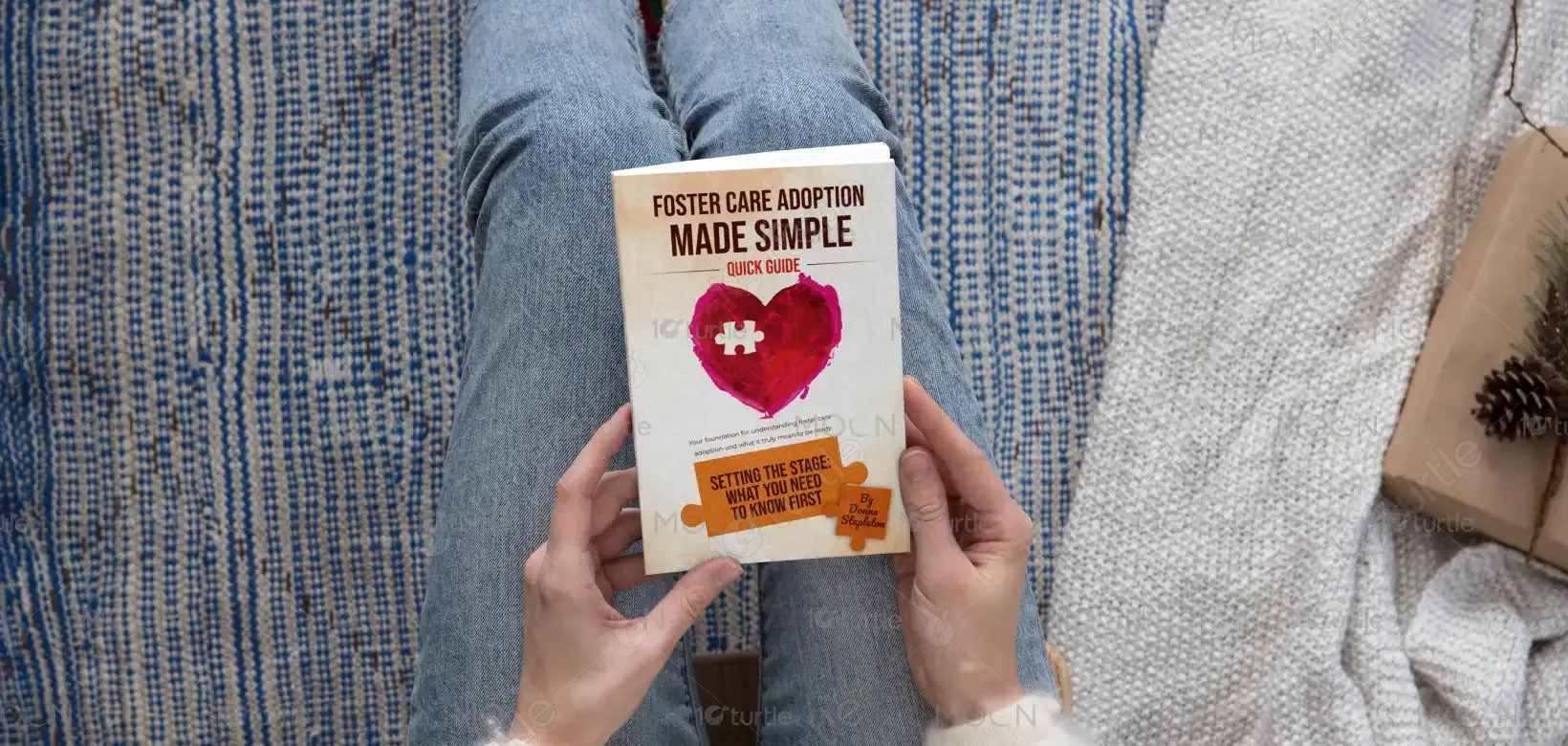

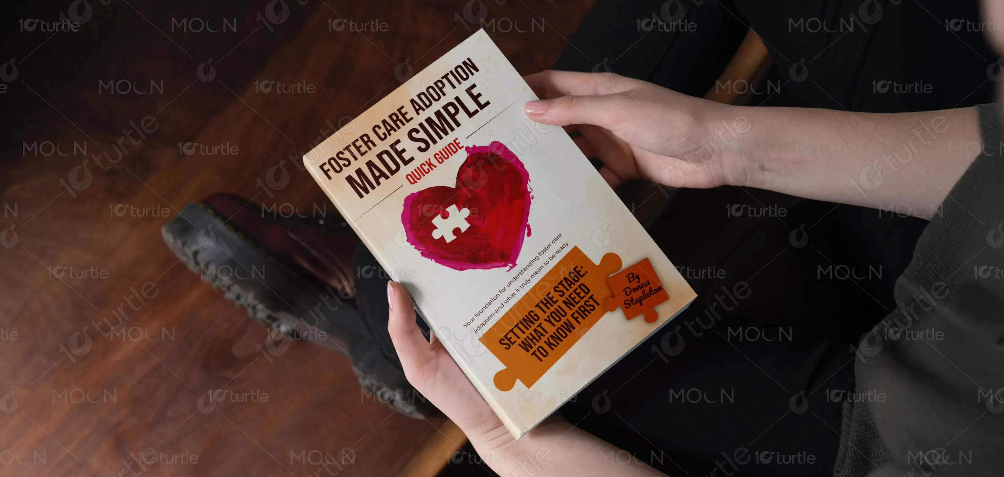
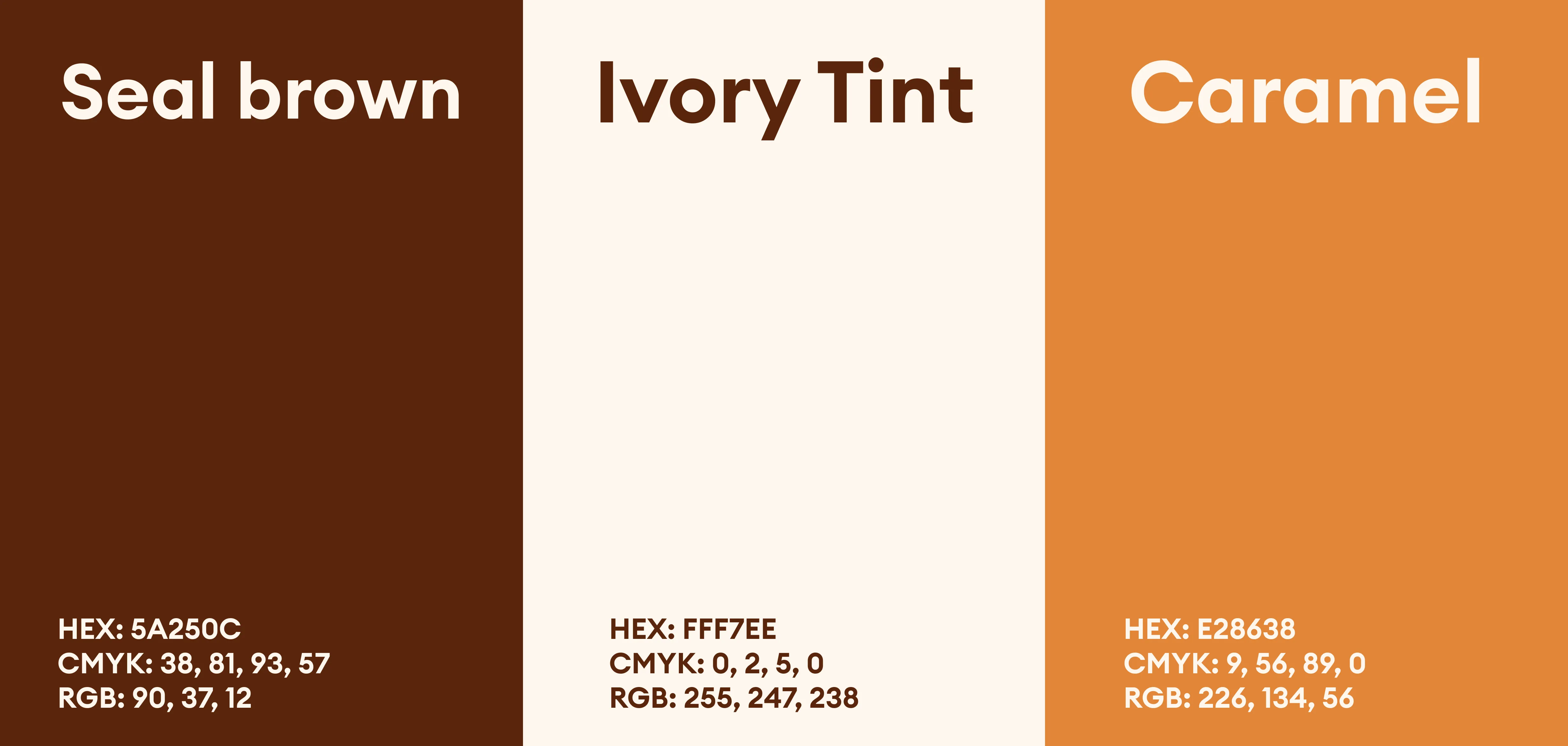
The color palette blends neutral beige and soft cream tones with a bold, warm pink heart and earthy orange puzzle pieces. The neutrals symbolize stability, calm, and trustworthiness, while the vibrant pink evokes love, care, and compassion central to adoption. The orange accents highlight important information, adding energy and optimism. Together, the colors create a balanced aesthetic—professional yet heartfelt—that reflects the brand’s mission to make adoption approachable, warm, and empowering for families.