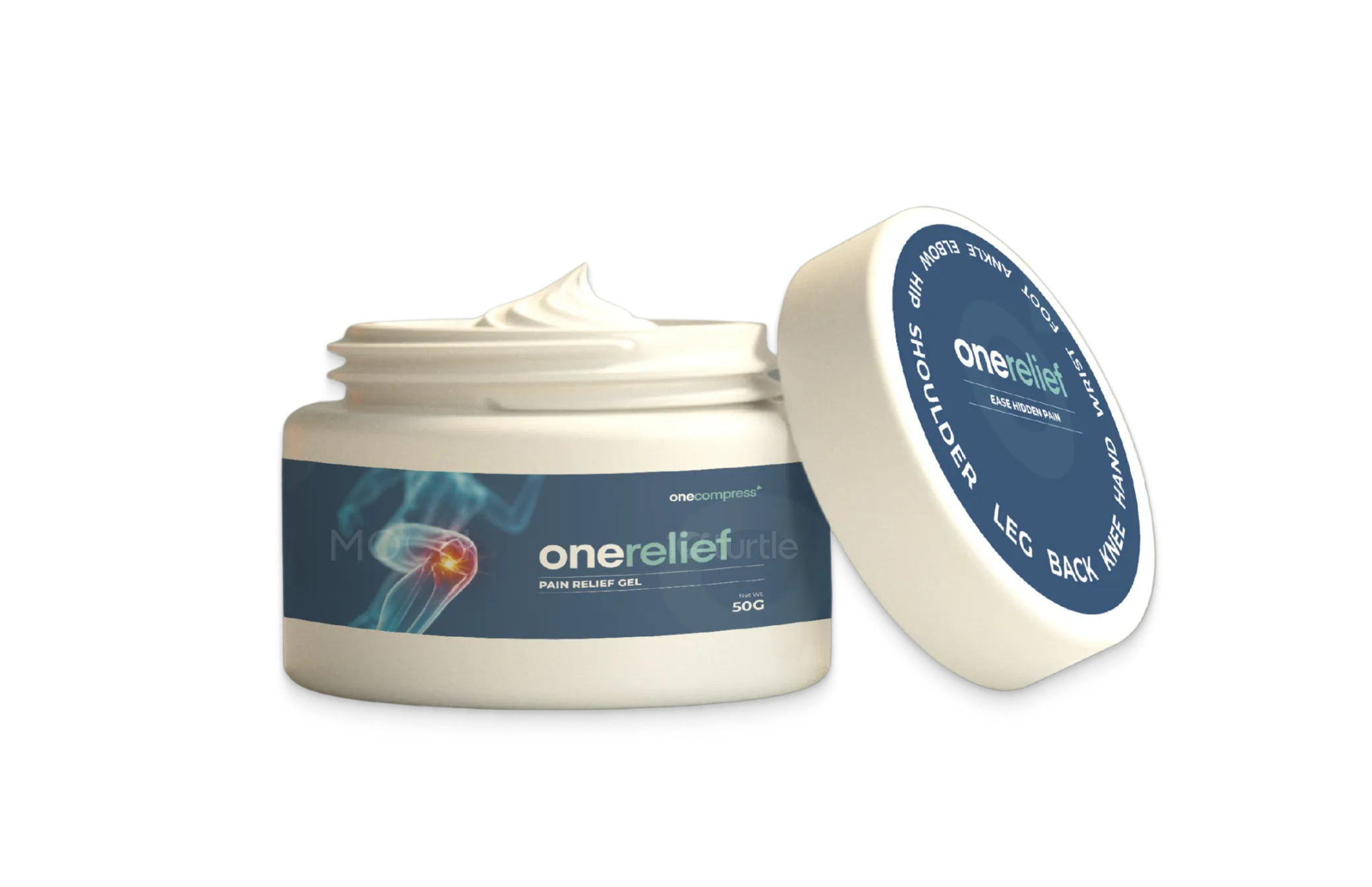
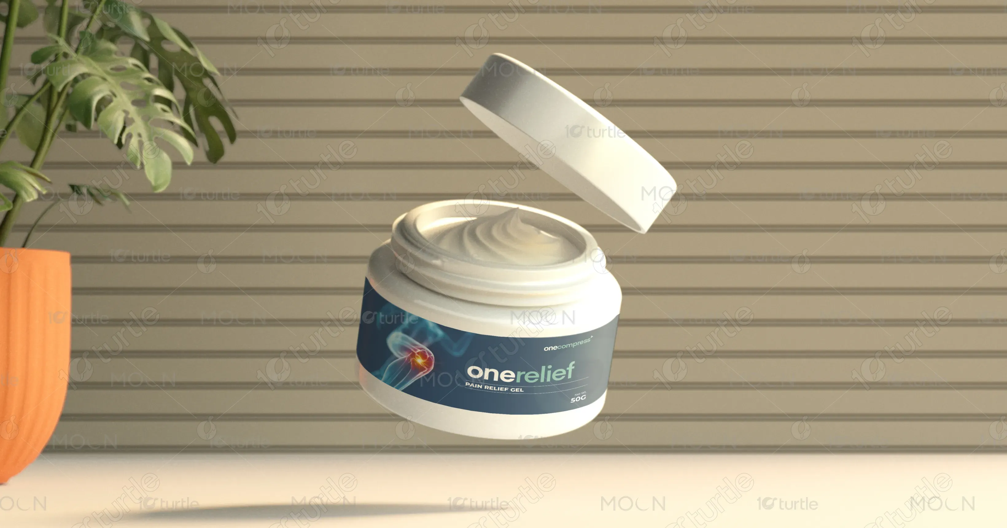
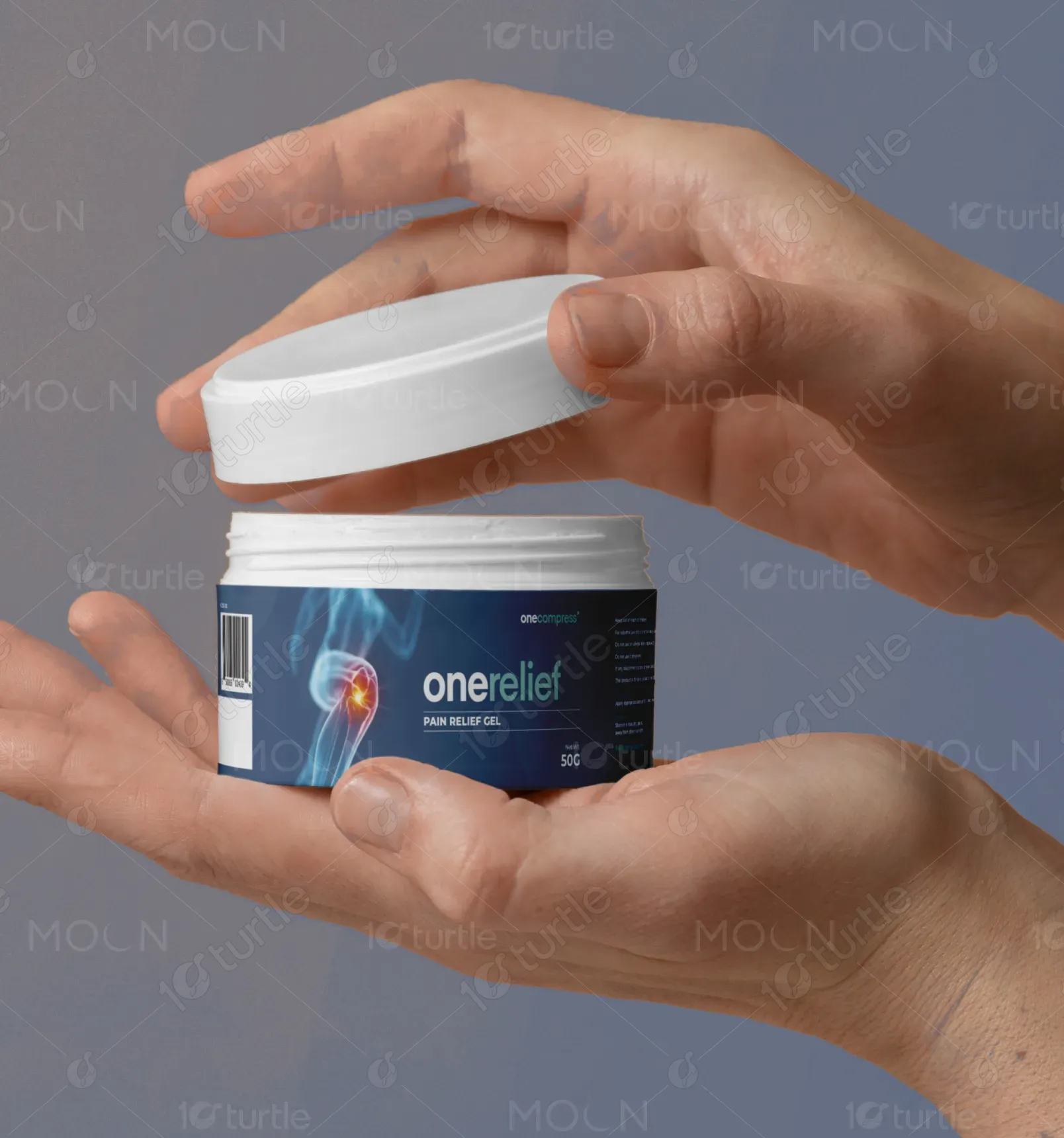
The onereleif packaging design follows a clean, medical-grade aesthetic with a minimal yet effective blue-based color scheme, emphasizing trust, calmness, and reliability. The use of anatomical imagery subtly communicates the product’s pain relief focus without overwhelming the viewer. Typography is clear and modern, reinforcing a professional and approachable tone. The design balances clinical credibility with consumer-friendly appeal, suitable for both pharmacy shelves and home use. The layout supports easy readability while creating a strong visual hierarchy for brand and usage areas.
Label Design
Packaging Design
Graphic Design
Industry
Healthcare & Wellness
Tools we used


Project Completion
2025
Key Market
Global
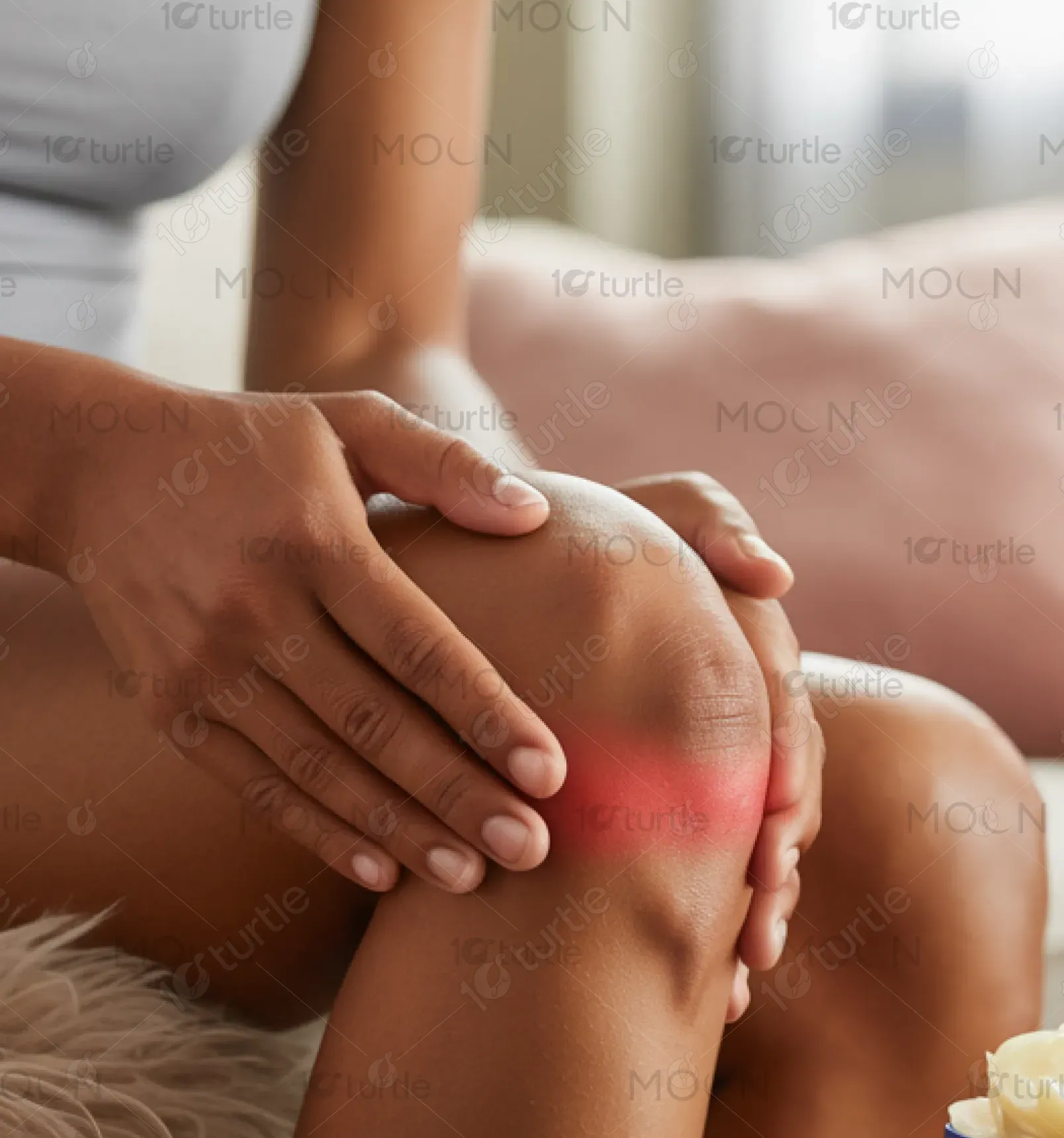
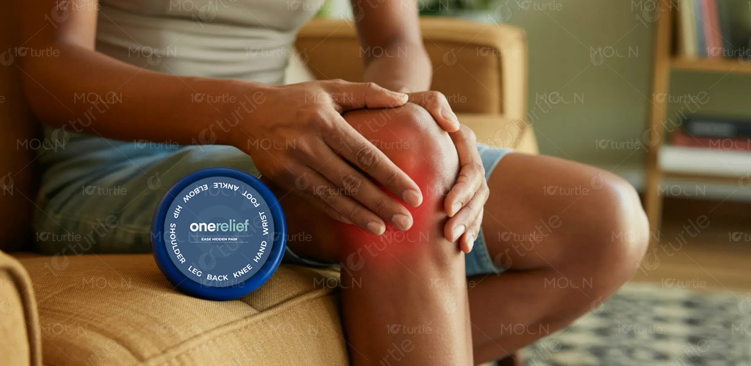
onereleif is a targeted pain relief gel designed for everyday joint and muscle pain across areas like the back, knees, hands, and shoulders. With a fast-absorbing formula, it caters to active individuals, elderly users, and those with chronic conditions. Its unique selling point lies in its multi-joint application and clean, no-residue finish. The packaging ensures clarity, trust, and shelf appeal, making it a standout in both medical and wellness retail environments.
Industry
Healthcare & WellnessWhat we did
Label DesignPackaging DesignGraphic DesignPlatform
-Many pain relief products suffer from generic packaging, often cluttered with excessive claims or unclear usage instructions. This creates confusion and reduces trust—especially for users seeking targeted, effective relief without side effects. Furthermore, most designs lack emotional or human connection, missing an opportunity to build loyalty and comfort in the consumer experience.
onereleif addresses these gaps by combining clinical visuals (e.g., x-ray-style joint illustrations) with a modern, minimal layout that clearly highlights body parts it relieves. Its user-first design avoids overcrowded text, and the top-view label includes anatomical zones for fast recognition. The human-touch mockup reinforces user relatability and builds trust. The clear segmentation, professional font, and premium container ensure both visual and practical appeal.
The long-term vision of onereleif is to become a go-to solution for holistic pain management. By integrating quality, trust, and design-led thinking, the brand aims to expand into a line of therapeutic products across creams, roll-ons, and patches—empowering consumers to self-manage pain with confidence. Its mission is to be present in every household medicine cabinet, from athletes to aging adults, leaving a lasting impact in the wellness industry.
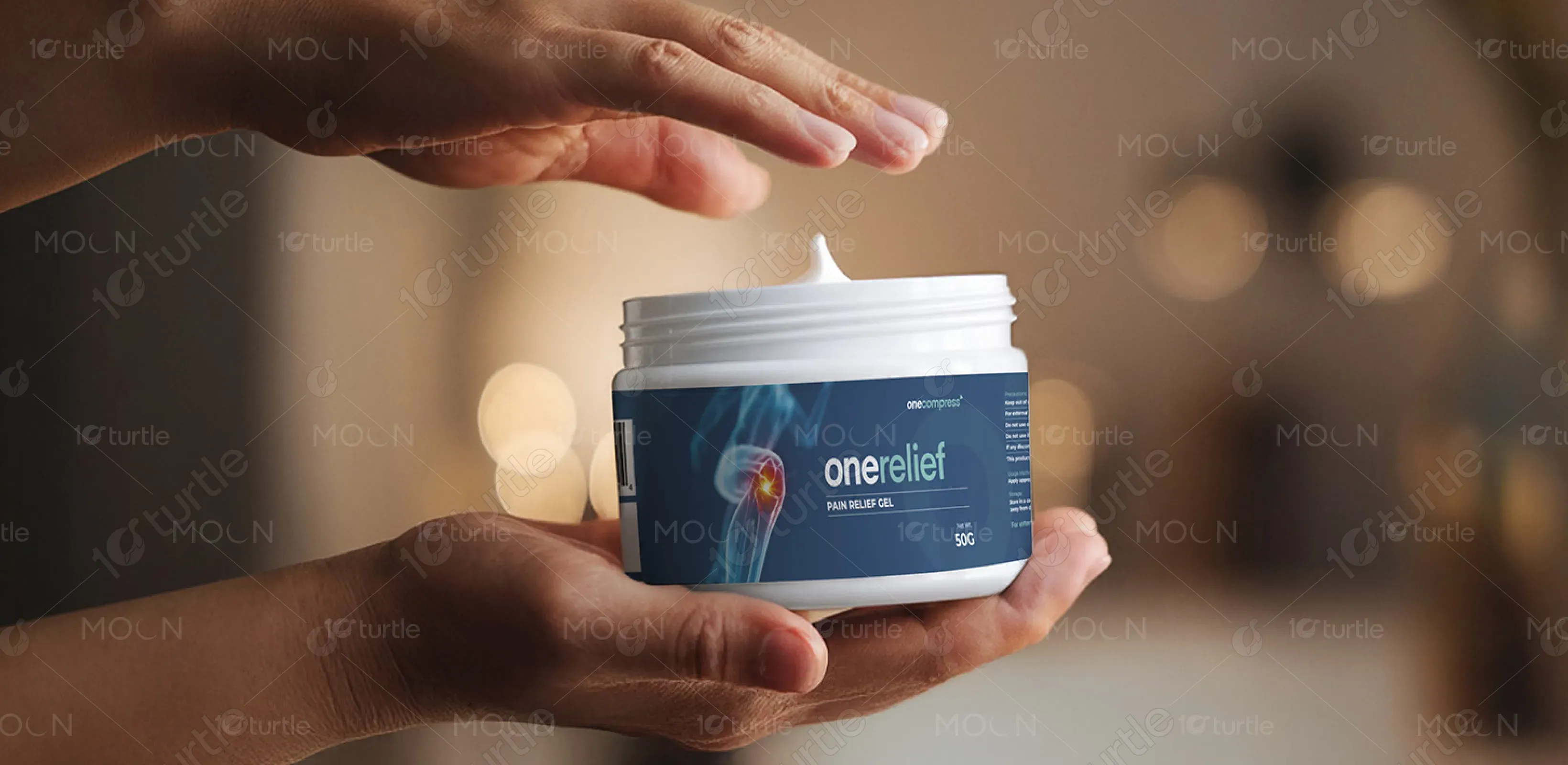
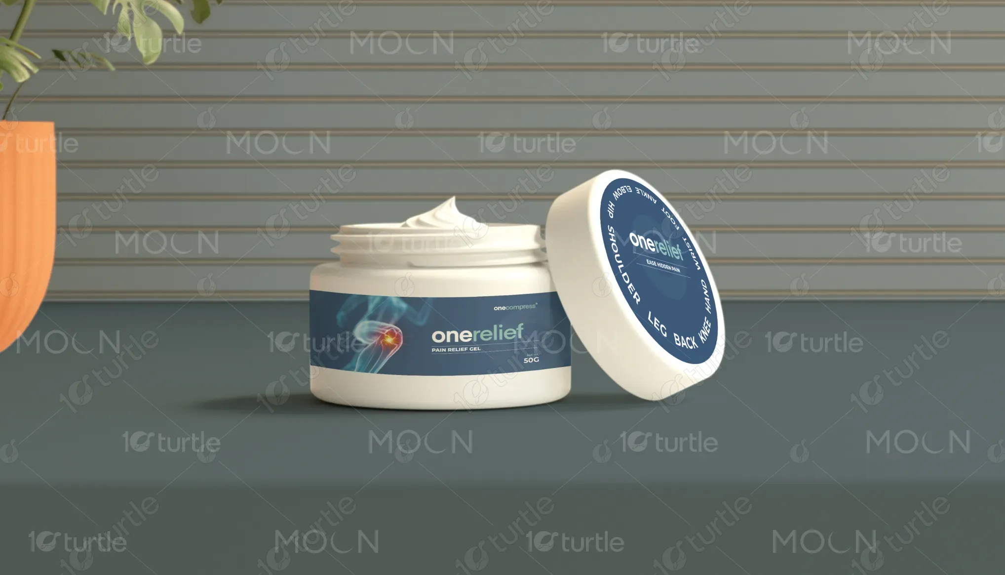
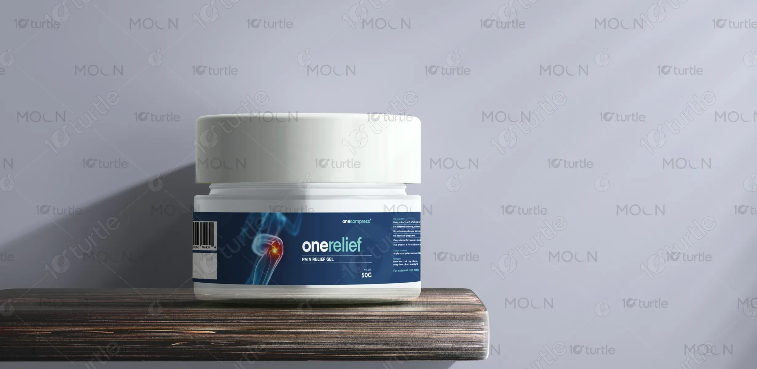
The palette is led by deep navy blue and cool cyan tones, evoking a clinical and calming presence. Blue signifies trust, healing, and reliability—core to the healthcare domain. The touch of light gray-white adds a clean, hygienic feel, while the red-orange highlight on the pain point visual adds urgency and draws attention to problem-solving areas. Overall, the palette balances science with serenity, making the product feel both credible and comforting.