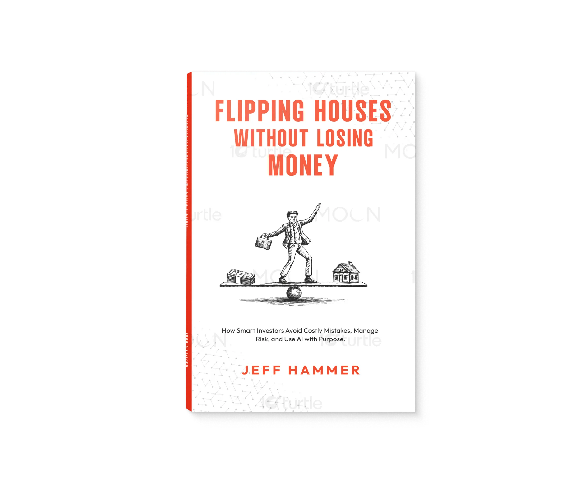
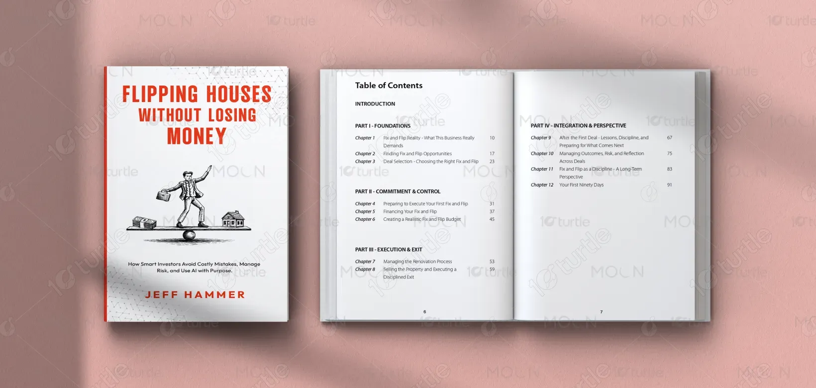
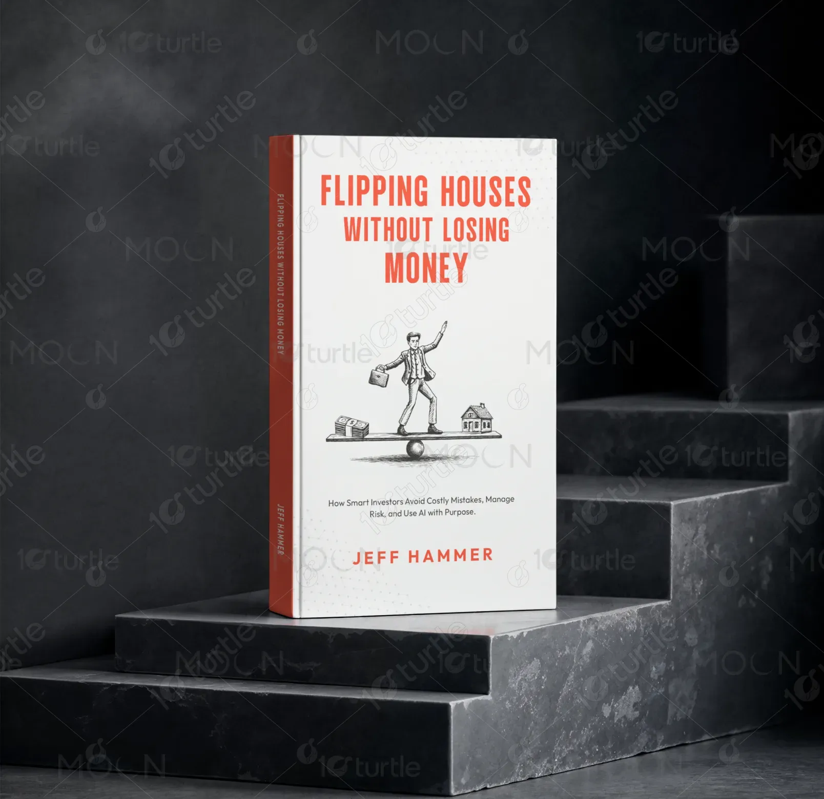
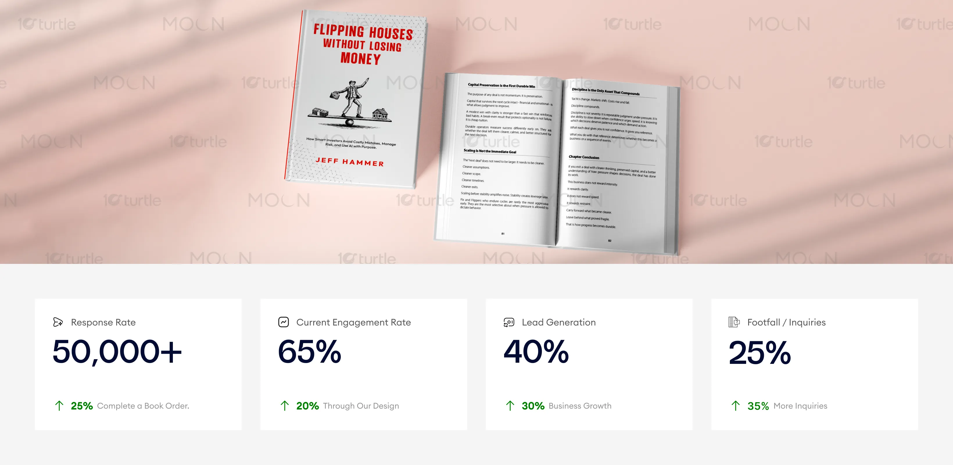
The design uses a minimal, high-contrast editorial style that reflects a serious and disciplined tone. Strong typography ensures immediate title visibility, while a clean, structured layout guides the reader effortlessly. Subtle color accents and a focused illustration enhance clarity and professionalism. Overall, the balanced composition communicates control, stability, and credibility. Every element is intentionally simplified to reinforce trust and ensure the message is understood instantly, even at a glance.
Book Design
Graphic Design
Industry
Property, Construction & Real Estate
Tools we used


Project Completion
2025
Key Market
Global
This design represents a practical, no-nonsense guide to fix-and-flip real estate investing, focused on minimizing risk rather than chasing profit. Unlike typical investment books, it emphasizes disciplined decision-making, structured execution, and long-term sustainability. The design positions the book within the real estate and financial education space, appealing to both new and experienced investors. It visually communicates reliability, expertise, and clarity-making it suitable for serious readers seeking actionable insights rather than motivational content.

Industry
Property, Construction & Real EstateWhat we did
Book DesignGraphic DesignPlatform
-Most real estate investment content focuses heavily on profits, speed, and success stories, while overlooking the realities of risk, mistakes, and financial loss. This creates unrealistic expectations and leads to poor decision-making among investors. Additionally, many book designs in this category lack clarity and differentiation, resulting in weak shelf impact and reduced credibility. The challenge was to create a design that stands apart from hype-driven content, communicates trust instantly, and clearly conveys a more disciplined, risk-aware approach.
The design solves this problem through a clarity-first and credibility-driven approach. A strong typographic hierarchy ensures immediate readability, while the minimalist layout removes unnecessary visual noise. The controlled use of color highlights key elements without overwhelming the composition. The illustration adds conceptual depth—visually representing balance, risk, and decision-making. By aligning the visual tone with the book’s message, the design builds trust and positions the content as structured, practical, and reliable. This approach improves both visual impact and audience perception.

The design’s professional, minimalistic approach positions the book as a trustworthy resource, with its clarity and structured layout making it easy to understand. The growth in inquiries and orders can be attributed to its ability to immediately communicate credibility, drawing in users who value stability and clarity in financial advice.
The long-term vision is to establish the book as a trusted authority in disciplined real estate investing. The design system is scalable, allowing consistency across future editions, marketing materials, and digital platforms. It supports brand growth by maintaining a clear and recognizable visual identity rooted in professionalism and clarity. Over time, the design helps position the book—and potentially the author—as a credible voice in risk-focused investment education, appealing to serious investors seeking sustainable success.
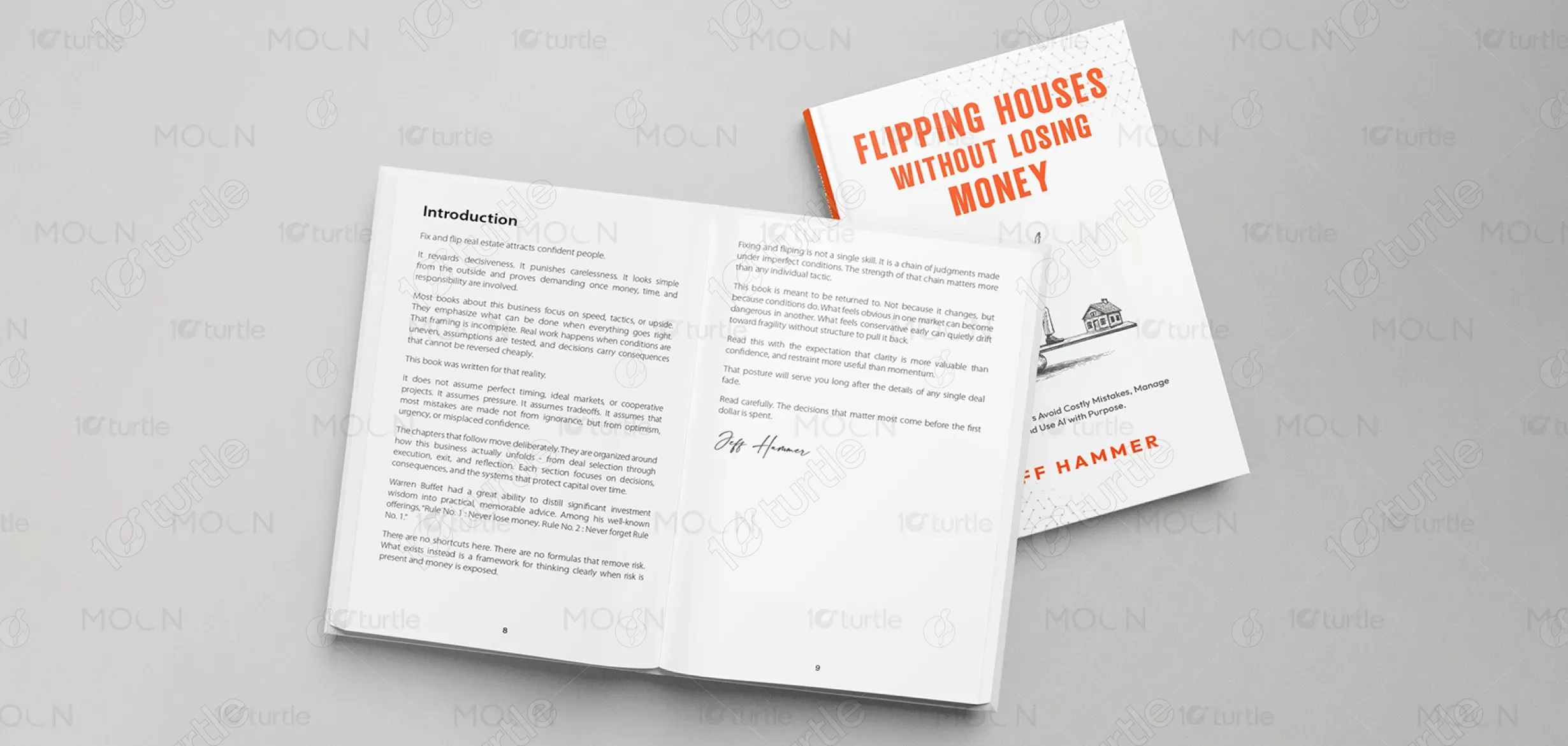


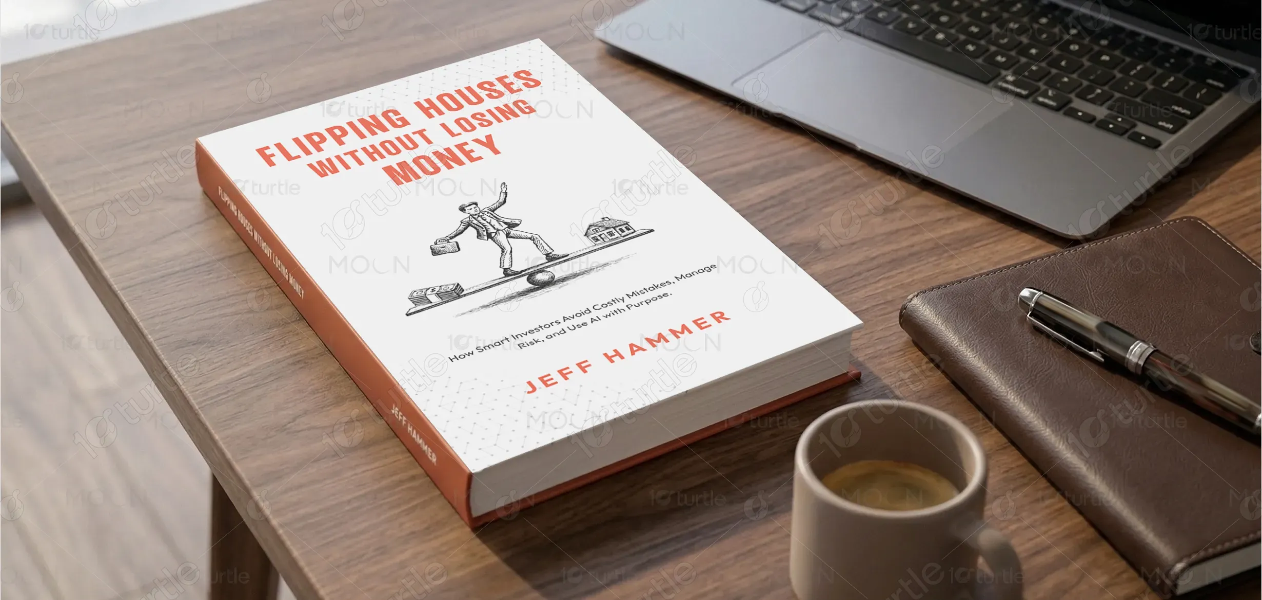
The color palette is built around neutral tones with strong accent highlights, creating a balance between professionalism and visibility. The use of bold accent color (such as red/orange tones) draws attention to key elements like the title, reinforcing urgency and importance. Neutral backgrounds maintain readability and reduce visual fatigue, while subtle textures or patterns add depth without distraction. The overall visual language is clean, structured, and modern—designed to evoke trust, clarity, and control, aligning perfectly with the book’s core message of disciplined investing.