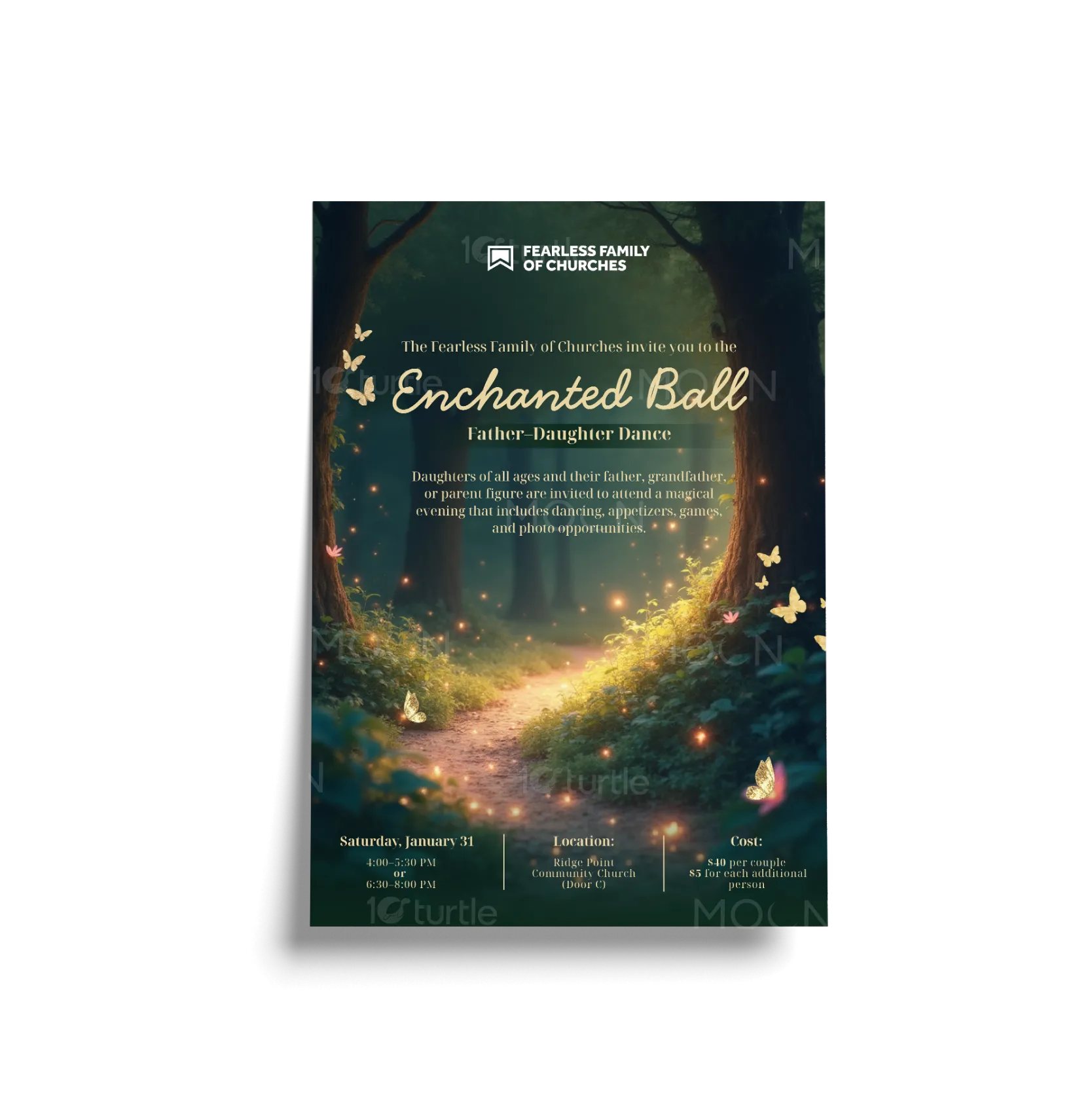
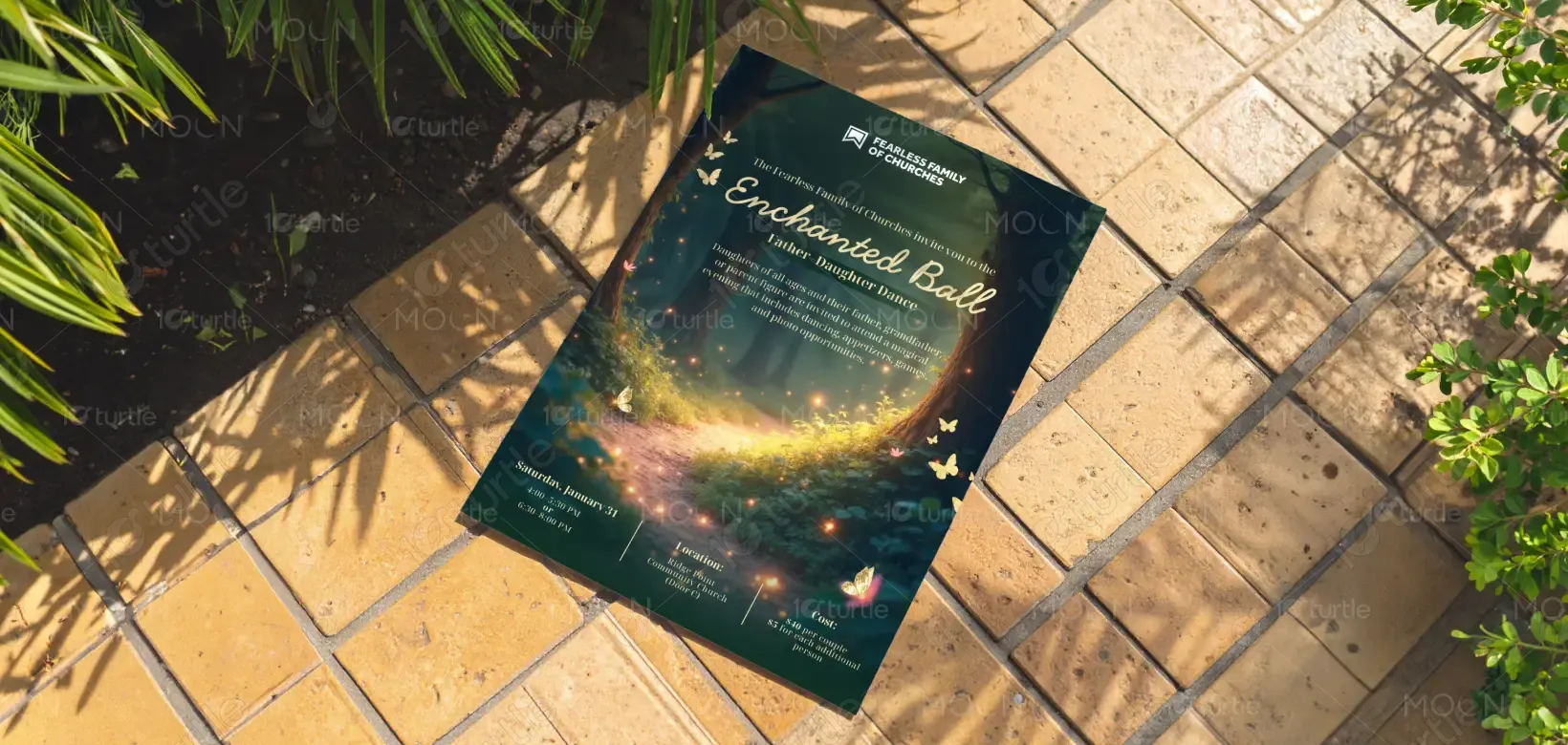
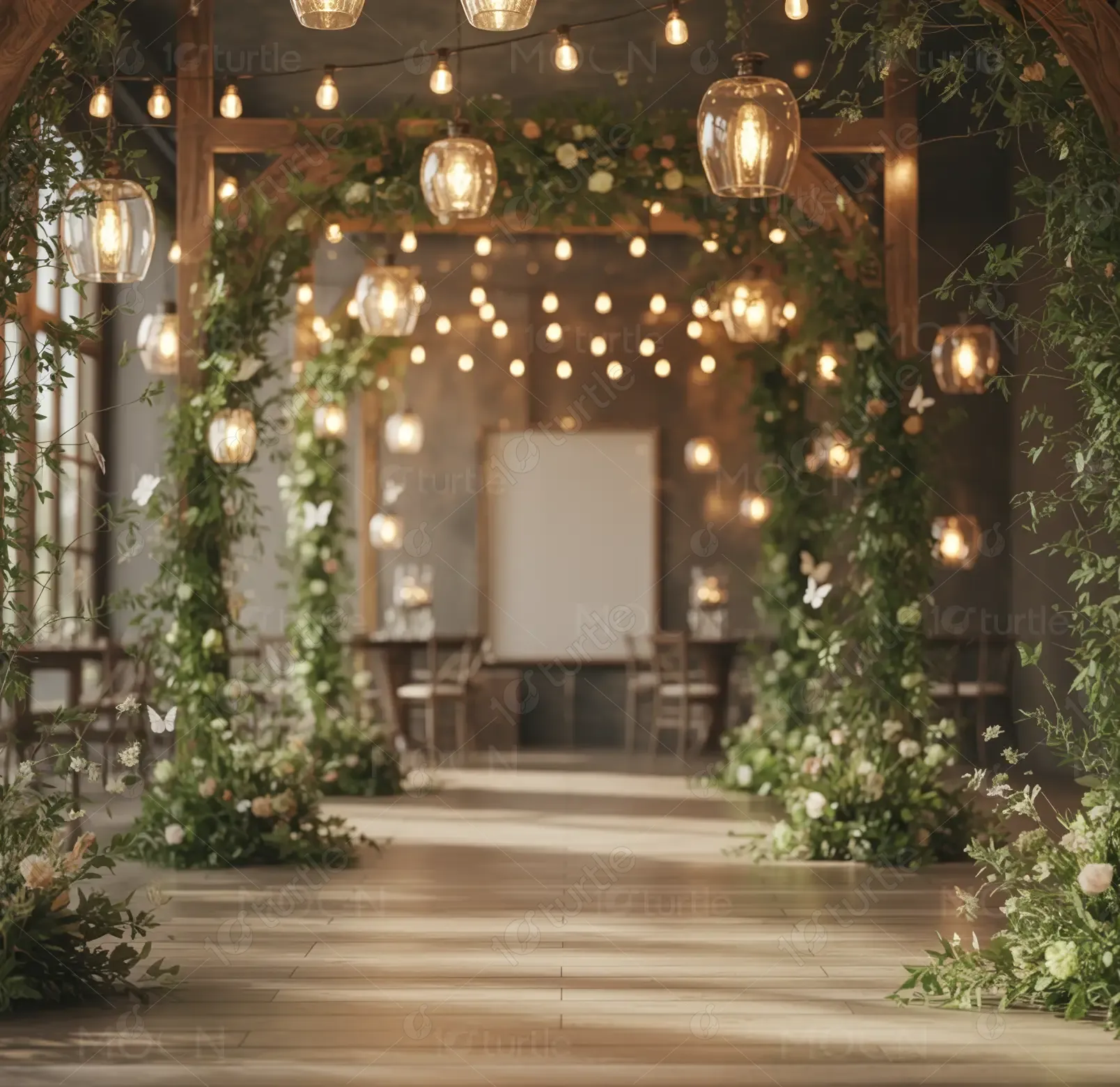
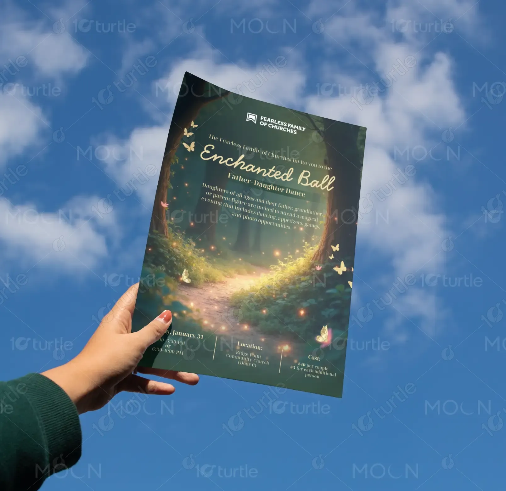
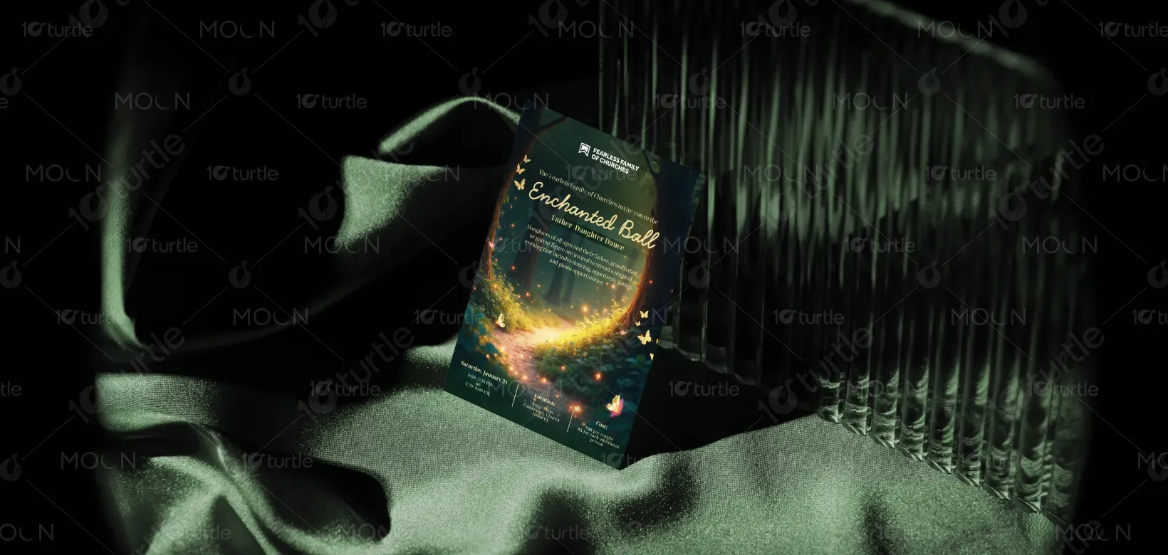
The design follows a warm, enchanting visual narrative inspired by a magical forest setting. Soft glowing lights, natural elements, and a dreamy pathway guide the viewer’s eye toward the central message, creating emotional engagement. Elegant script typography for “Enchanted Ball” contrasts with clean, readable supporting text to balance beauty and clarity. The layout is structured with a strong visual hierarchy—headline first, supporting description second, and event details clearly placed at the bottom—ensuring effortless readability while maintaining a premium, immersive aesthetic.
Flyer Design
Graphic Design
Industry
Arts, Culture & Entertainment
Tools we used


Project Completion
2025
Key Market
Global
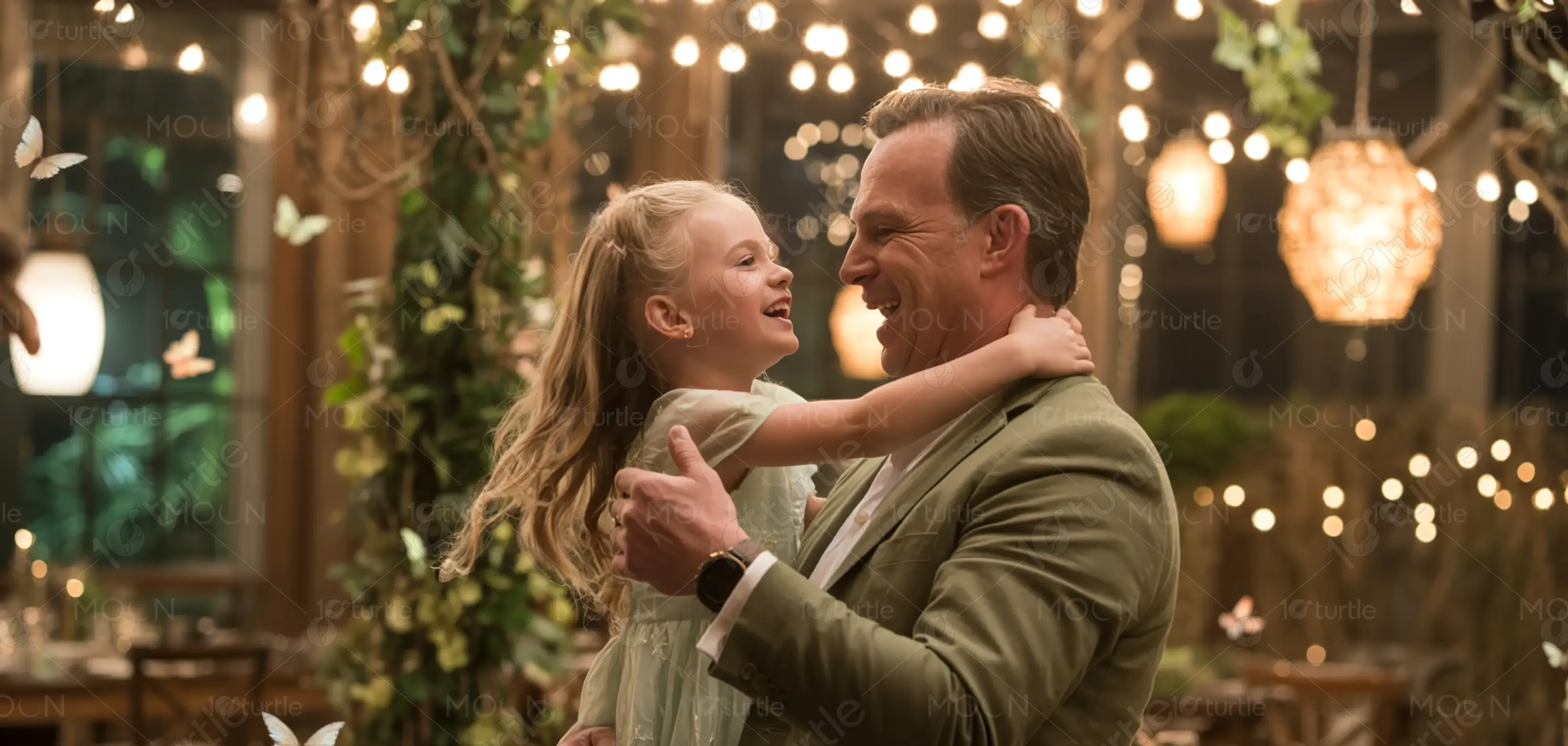
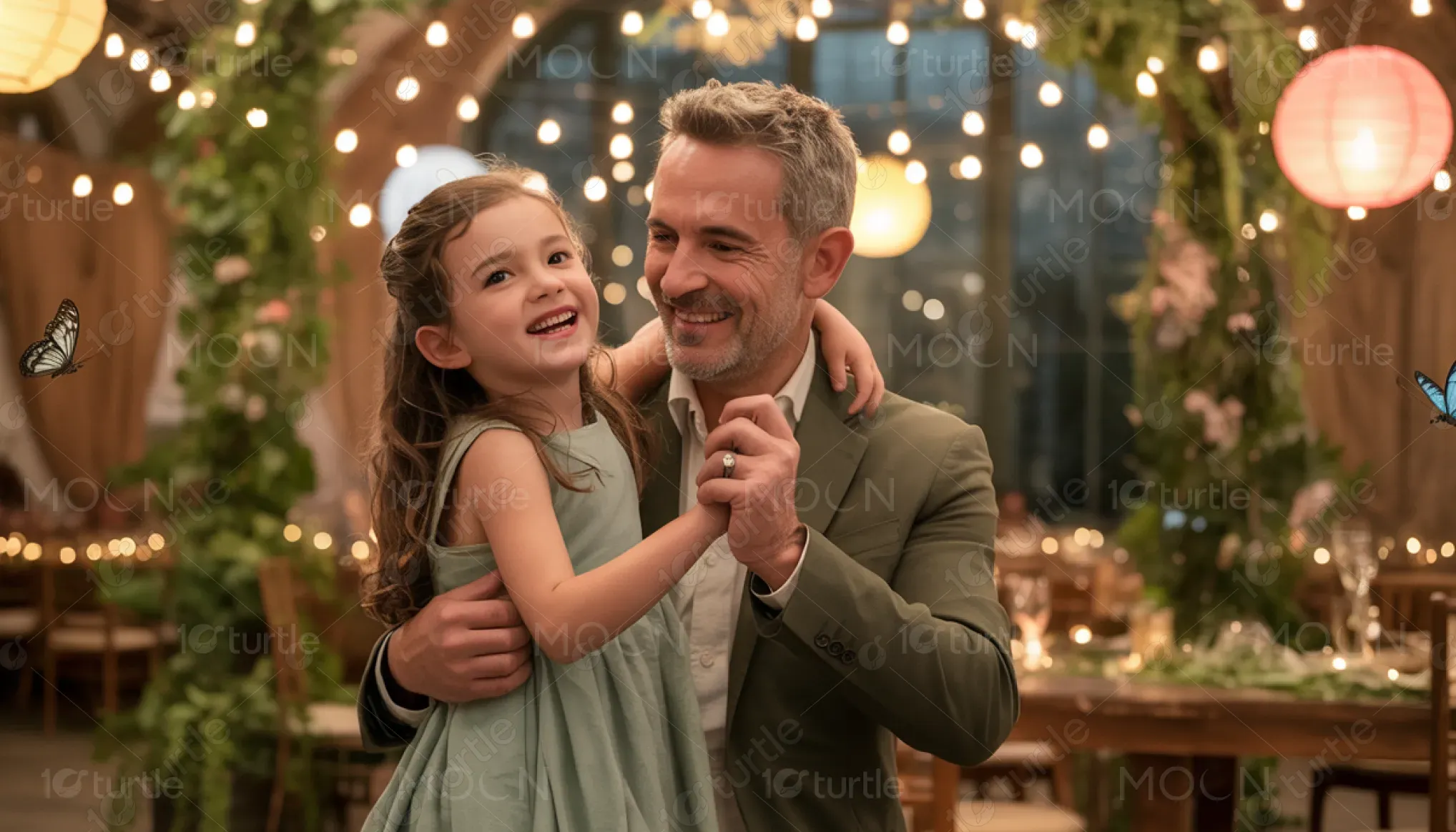
This design promotes a Father-Daughter Dance event hosted by the Fearless Family of Churches, aimed at creating a memorable bonding experience for families. It communicates event details such as date, time slots, location, and pricing while emphasizing the emotional value of participation. Positioned within community and family-centered events, the flyer blends informative content with a visually engaging theme to attract attendees and encourage participation.
Industry
Arts, Culture & EntertainmentWhat we did
Flyer DesignGraphic DesignPlatform
-Many community events struggle with low engagement due to generic visuals, unclear messaging, or lack of emotional appeal. Traditional event promotions often fail to communicate the deeper value of attendance, making it difficult to capture attention or inspire action. This results in missed opportunities for community connection and reduced participation from the target audience.
The design addresses these challenges by combining emotional storytelling with clear communication. A visually immersive background creates instant attraction, while a structured layout ensures key information is easy to find and understand. The use of elegant typography enhances perceived value, and concise content highlights the experience rather than just the logistics. This approach improves engagement by making the event feel special, accessible, and worth attending.
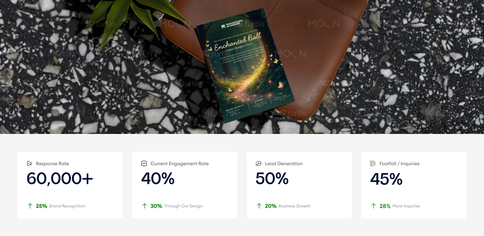
The flyer’s enchanting design, with its dreamy visuals and elegant typography, creates a strong emotional connection with the audience, leading to higher response rates and engagement. The layout ensures that the event details are clear, driving increased lead generation and footfall. To further increase these metrics, leveraging digital versions of the design for wider distribution and incorporating interactive elements could boost inquiries and overall attendance.
The design supports a long-term vision of positioning the event as a premium, meaningful community experience rather than a standard gathering. It establishes a consistent visual identity that can be extended across future events, building recognition and trust over time. By focusing on emotional connection and high-quality presentation, the brand is positioned as one that values relationships, experiences, and community impact.
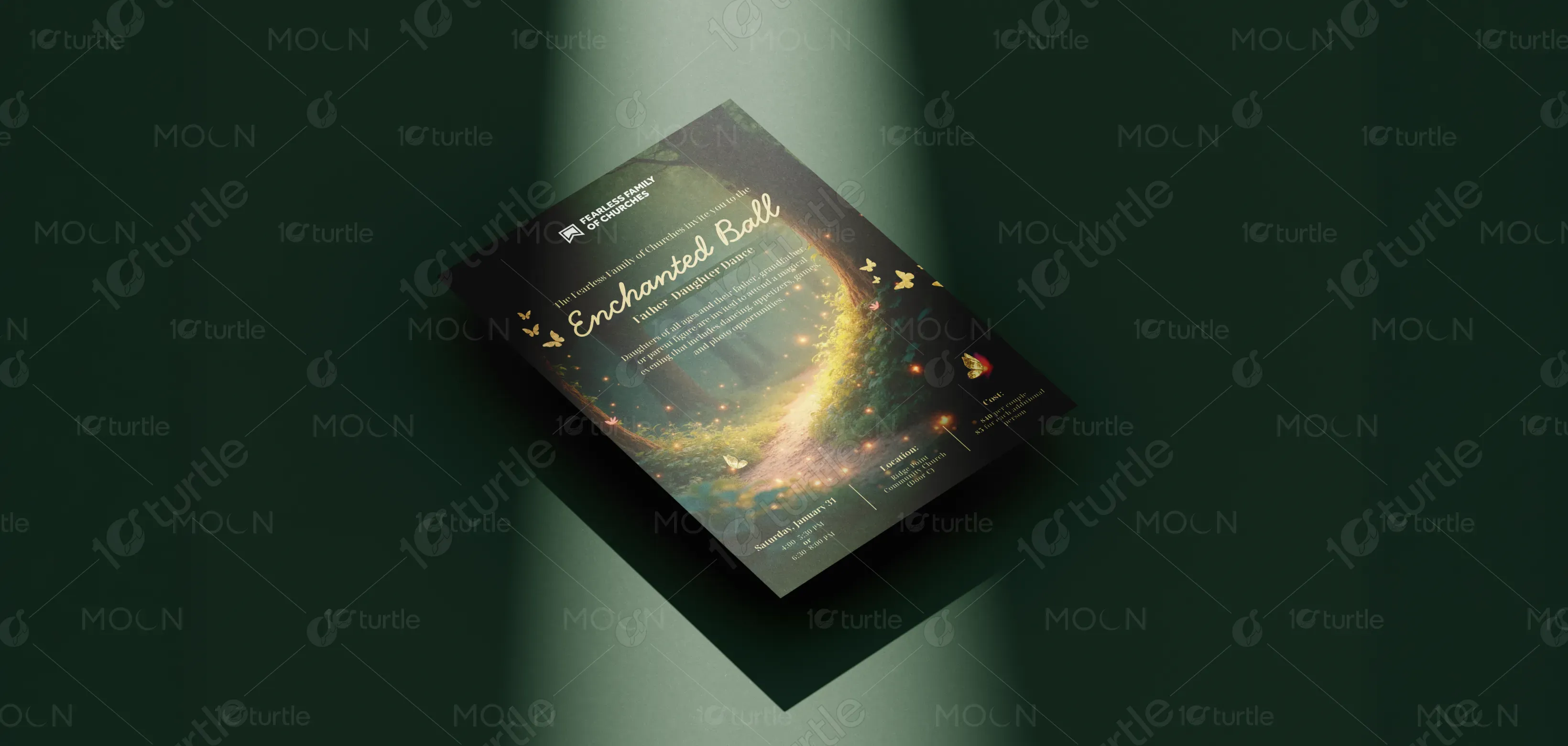
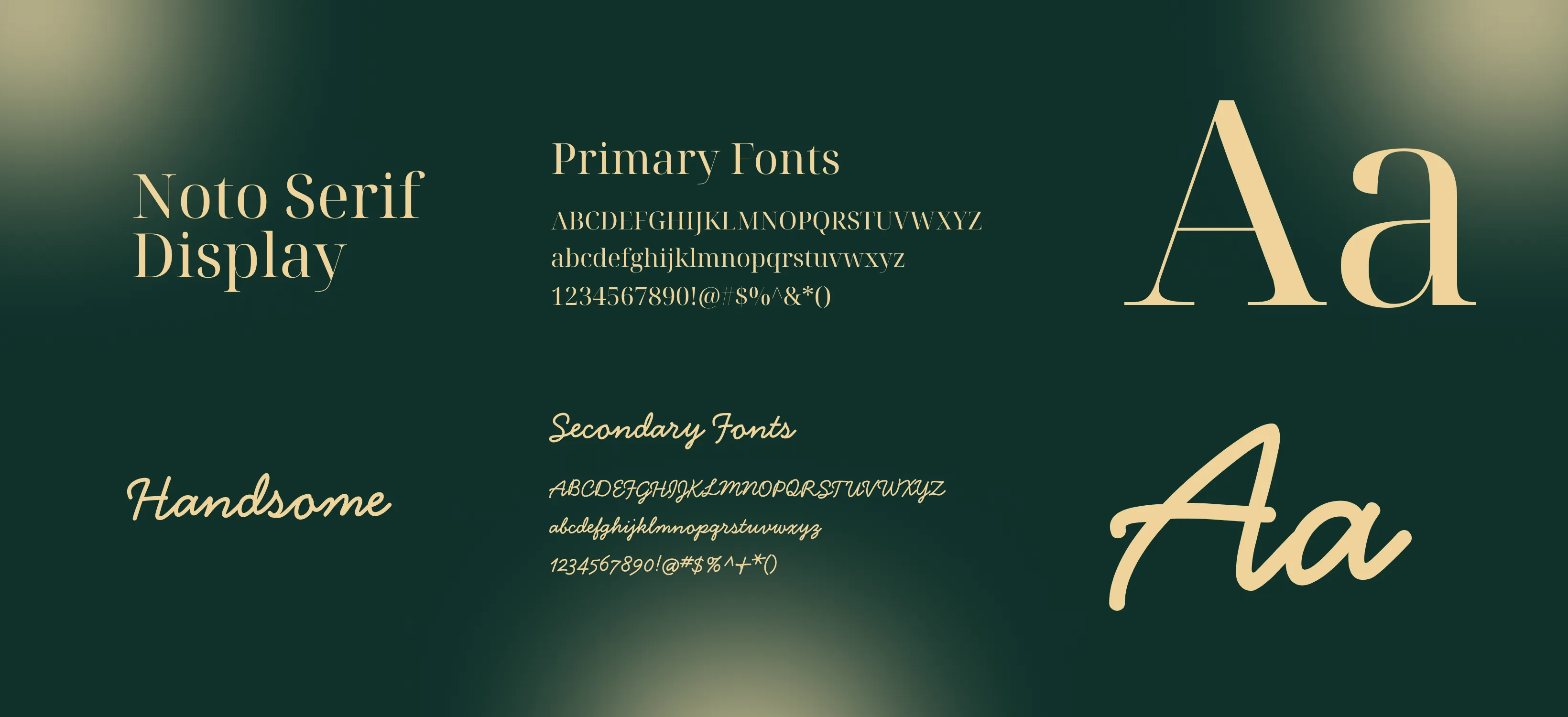
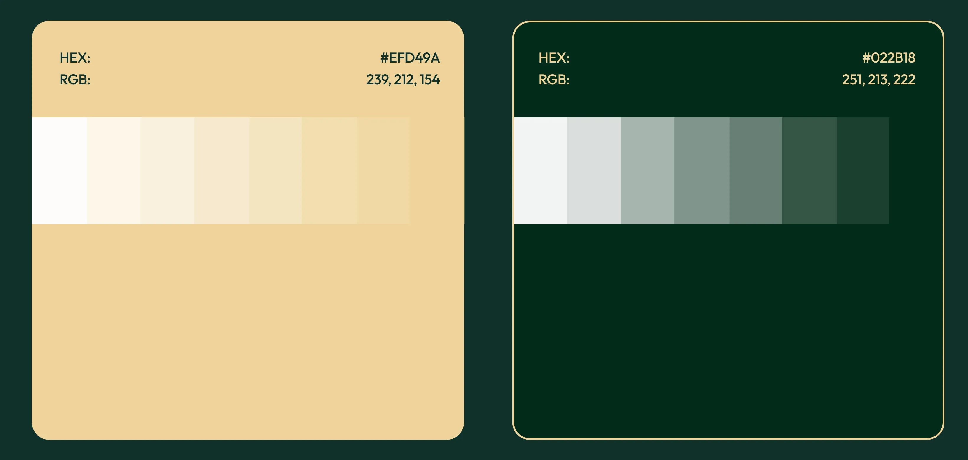
The color palette is built around deep greens, warm golden highlights, and soft natural tones, evoking a magical and calming atmosphere. These colors reinforce themes of warmth, connection, and enchantment while maintaining strong contrast for readability. The visual language includes glowing light effects, natural textures, and subtle motion cues that guide attention. Together, these elements create a cohesive and emotionally resonant design that stands out while remaining elegant and accessible.