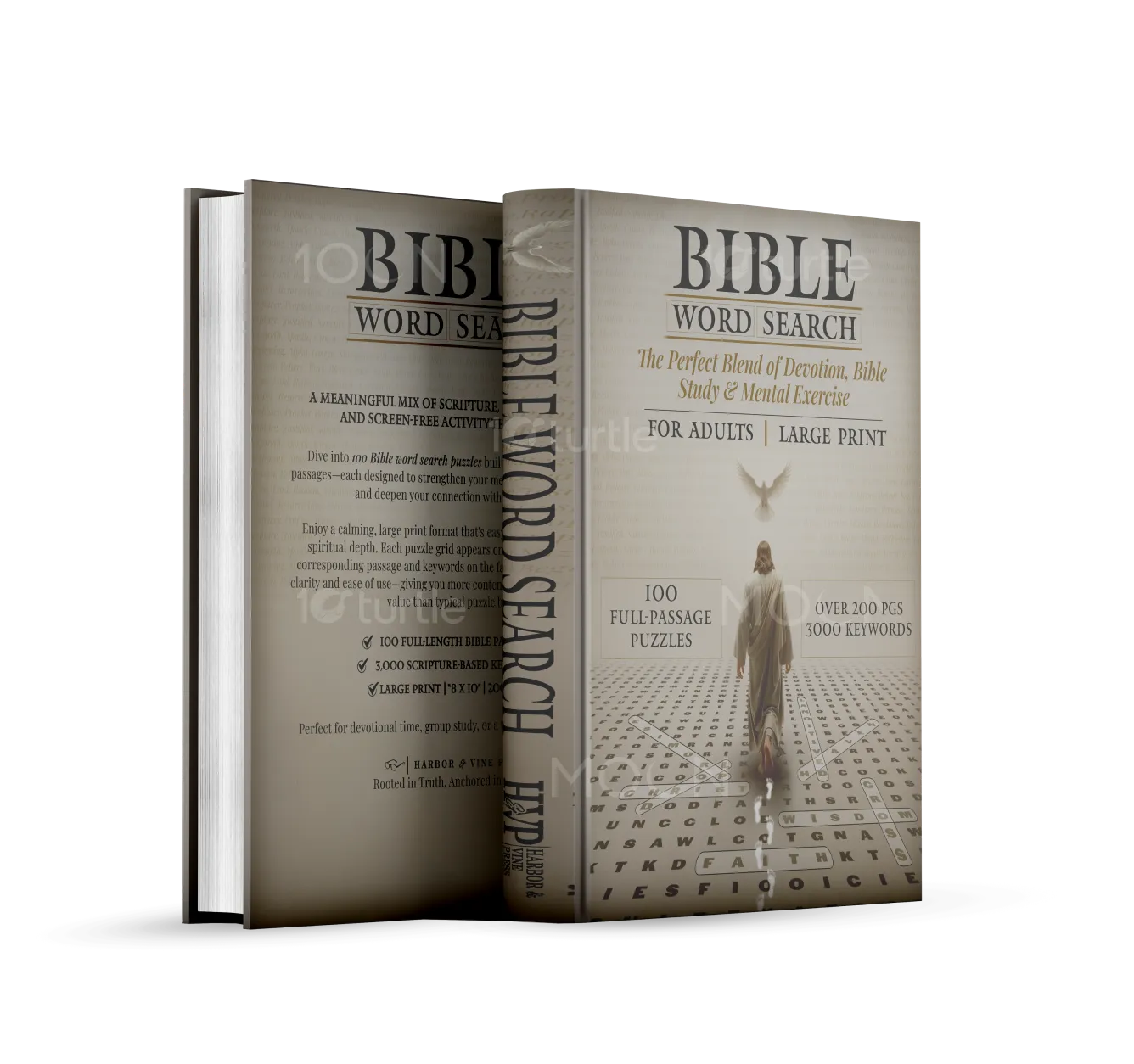
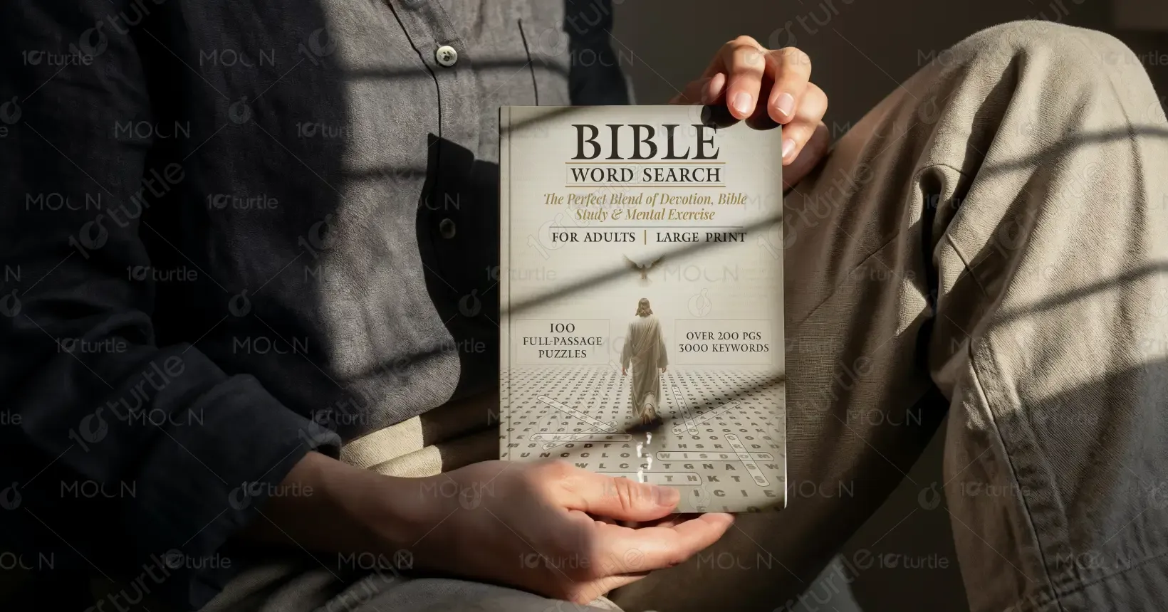
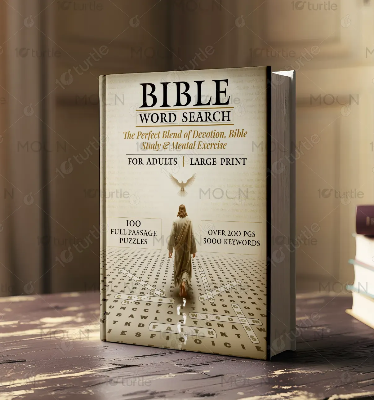
The cover design merges spiritual symbolism with an inviting puzzle aesthetic to create a serene yet intellectually engaging visual. A divine figure walks through a word search grid, symbolizing a guided journey through scripture and thought. The light gradient background, soft focus on sacred elements (like the dove), and high-contrast typography support readability and depth. This composition appeals to adults seeking meditative mental stimulation through scripture-focused activities, aligning perfectly with both devotional and puzzle-book aesthetics.
Book Cover Design
Graphic Design
Industry
Arts, Culture & Entertainment
Tools we used

Project Completion
2025
Key Market
Global
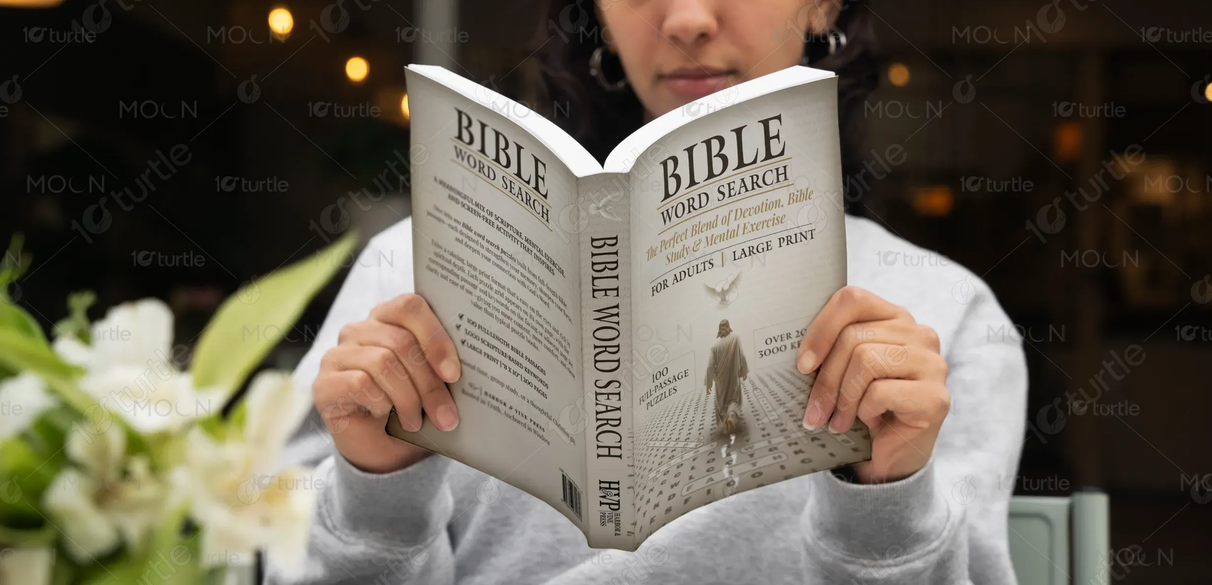
This Bible Word Search book is designed for adults seeking a meditative yet mentally stimulating way to engage with scripture. Featuring over 200 pages, 100 full-passage puzzles, and 3000 keywords, it uniquely combines devotion, Bible study, and mental exercise in large-print format. It’s ideal for seniors, faith-based learners, or anyone pursuing quiet, spiritually enriching activities. Its elegant design, soft color scheme, and clear layout make it stand out in the devotional and activity book market.

Industry
Arts, Culture & EntertainmentWhat we did
Book Cover DesignGraphic DesignPlatform
-Many faith-based activity books either compromise readability with dense layouts or lack a strong spiritual tone. Most word search books also tend to use random, disconnected words, offering little depth or continuity. This creates a gap for adults—especially seniors or spiritual seekers—who desire meaningful mental engagement rooted in scripture, but need accessible, large-print formats and a calm, reverent presentation. The challenge was blending legibility, faith symbolism, and activity in one cohesive visual identity.
The cover addresses these issues through a large-print promise, full-passage puzzles for depth, and a layout that places biblical relevance front and center. The central figure walking on the puzzle grid visually reflects the act of journeying through scripture. The use of minimal but meaningful imagery (dove, light path, robe) evokes peace and divinity without visual clutter. Typography is carefully chosen for clarity and emotional resonance, ensuring the design is both accessible and spiritually grounding.
The long-term vision is to establish MindfulPages™ as a trusted name in devotional activity publishing, offering scripture-based mental enrichment tools. Future volumes may include themed puzzle collections (e.g., Psalms, Proverbs, Parables), multilingual editions, and companion devotionals. The goal is to foster deeper Bible engagement through mindful formats and become a staple in churches, gifting, and personal study circles—making spirituality interactive, accessible, and thoughtfully designed.

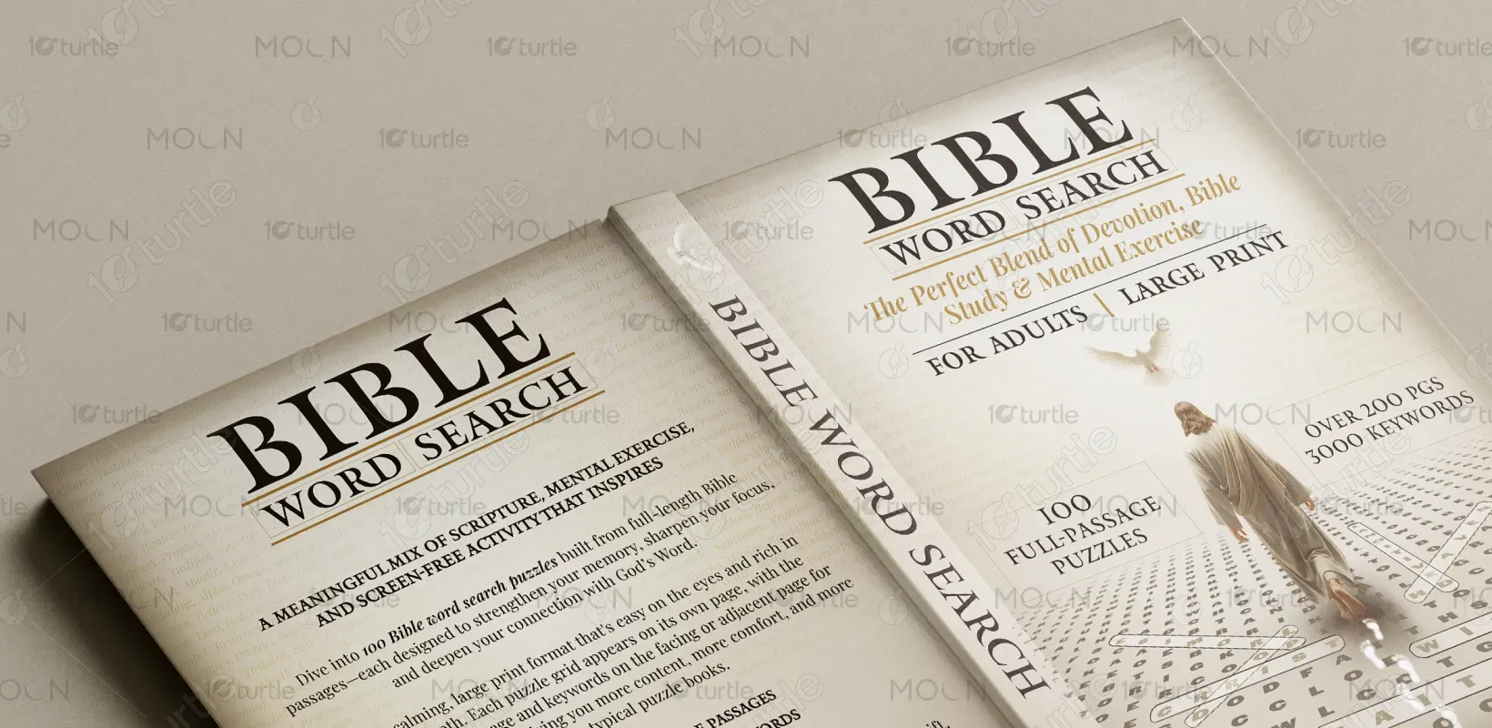
The palette is composed of warm neutrals—beige, parchment cream, and soft sepia—reflecting tradition, calm, and spiritual warmth. Accents of gold and shadowed text lend a sense of divine illumination and timeless elegance. These hues are chosen to soothe the eyes while evoking a sense of wisdom and reverence, aligning with the sacred nature of the content. This scheme supports large-print legibility while reinforcing the brand's faith-forward, thoughtful identity.