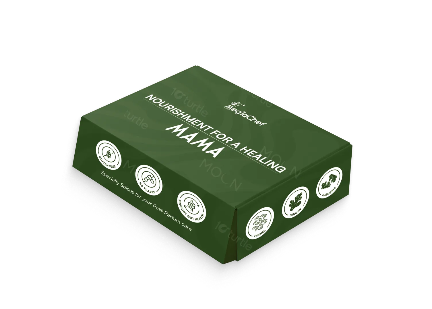
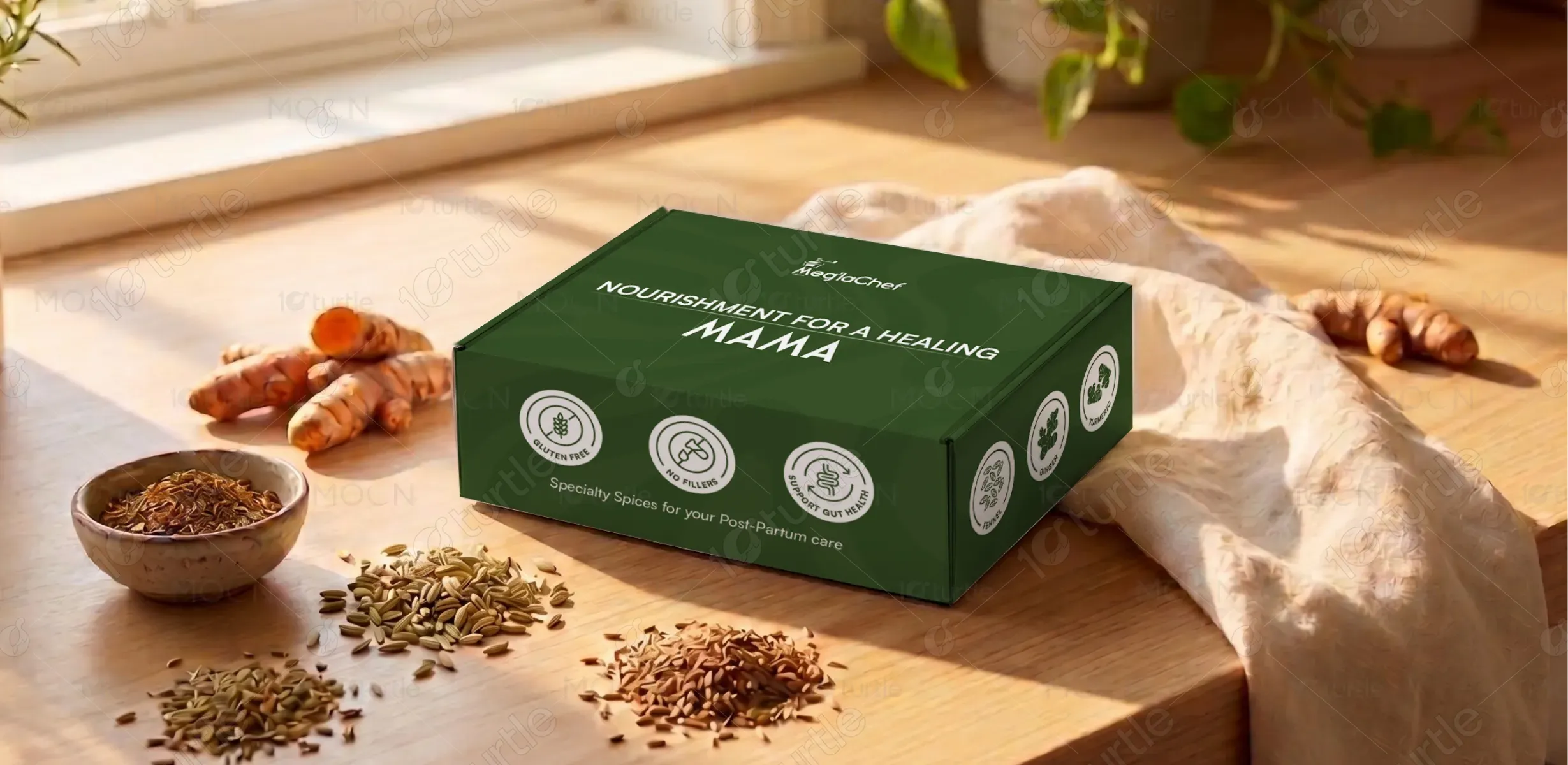
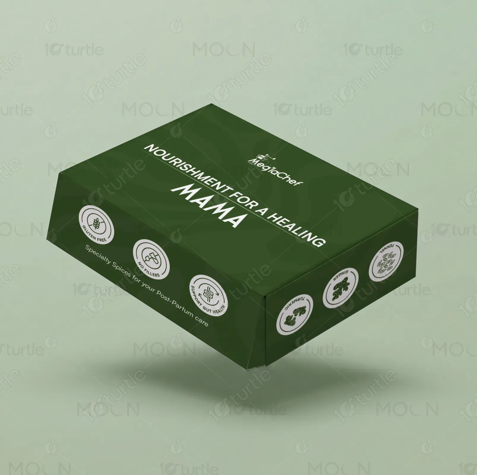
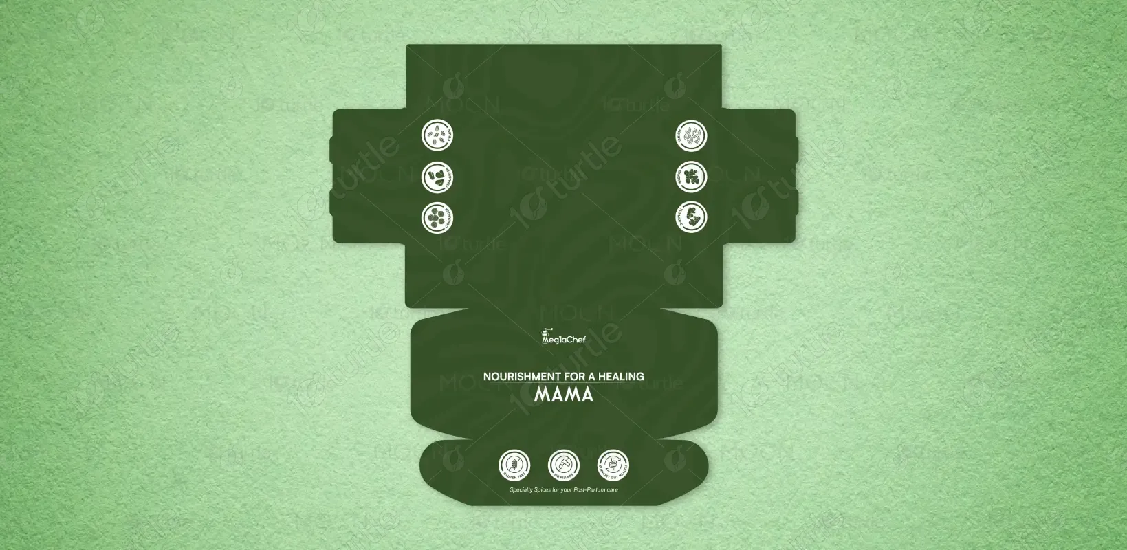
The design embraces a calming, nature-inspired aesthetic to reflect care, nourishment, and healing. A deep green palette symbolizes purity, wellness, and organic origins, while subtle wave patterns add softness and emotional warmth. Clean typography ensures clarity and trust, with “MAMA” emphasized to connect emotionally with the target audience. Minimal icons communicate key benefits like gut health and natural ingredients. The structured yet gentle layout creates a premium, reassuring feel, aligning the product with modern wellness brands focused on simplicity, authenticity, and maternal care.
Box Packaging Design
Graphic Design
Industry
Healthcare & Wellness
Tools we used


Project Completion
2025
Key Market
Global
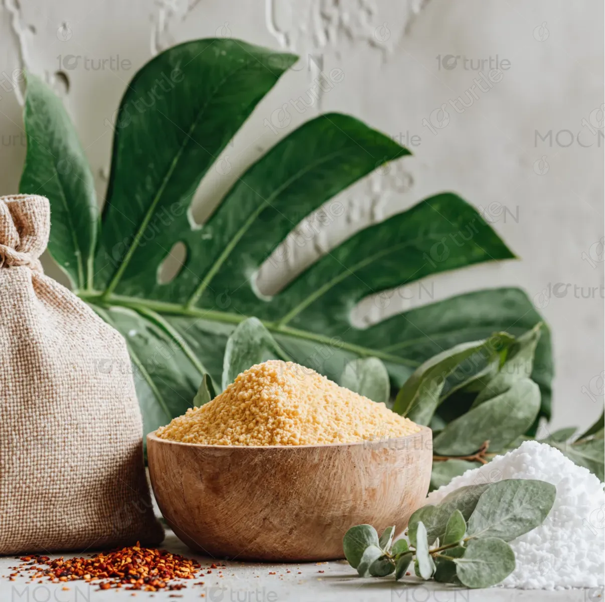
This product is a thoughtfully curated spice blend designed specifically for postpartum mothers, supporting recovery, digestion, and overall wellness. Positioned within the growing maternal health and organic nutrition market, it combines traditional wisdom with modern packaging appeal. Its key selling points include natural ingredients, targeted health benefits, and a comforting brand voice. The design reflects warmth and trust, making it suitable for both personal use and gifting, while standing out as a premium yet approachable wellness product.
Industry
Healthcare & WellnessWhat we did
Box Packaging DesignGraphic DesignPlatform
-Postpartum care products often lack emotional connection and modern visual appeal, appearing either too clinical or overly traditional. Many new mothers struggle to find products that feel both trustworthy and comforting. Additionally, packaging in this category is frequently cluttered, making it hard to quickly understand benefits. This disconnect reduces engagement and trust. In real-world scenarios, mothers prefer products that feel nurturing and aesthetically pleasing, especially during a sensitive recovery phase where emotional reassurance is as important as functionality.
This design bridges the gap by combining emotional warmth with clean, modern packaging. The calming green tones and soft patterns create a sense of comfort, while minimal icons clearly communicate product benefits at a glance. The bold “MAMA” typography builds an instant emotional connection. The structured layout avoids clutter, improving readability and user trust. Additionally, the premium finish elevates perceived value, making it suitable for gifting. Overall, the design balances functionality, emotional appeal, and modern aesthetics effectively.
The vision is to become a trusted companion for maternal wellness, offering products that nurture both body and mind. The brand aims to expand into a holistic range of postpartum care solutions rooted in natural ingredients and traditional knowledge. Over time, it seeks to build a strong emotional connection with mothers globally, redefining postpartum care as a premium, comforting experience. By blending authenticity with modern design, the brand aspires to lead in the wellness space with empathy, trust, and innovation.
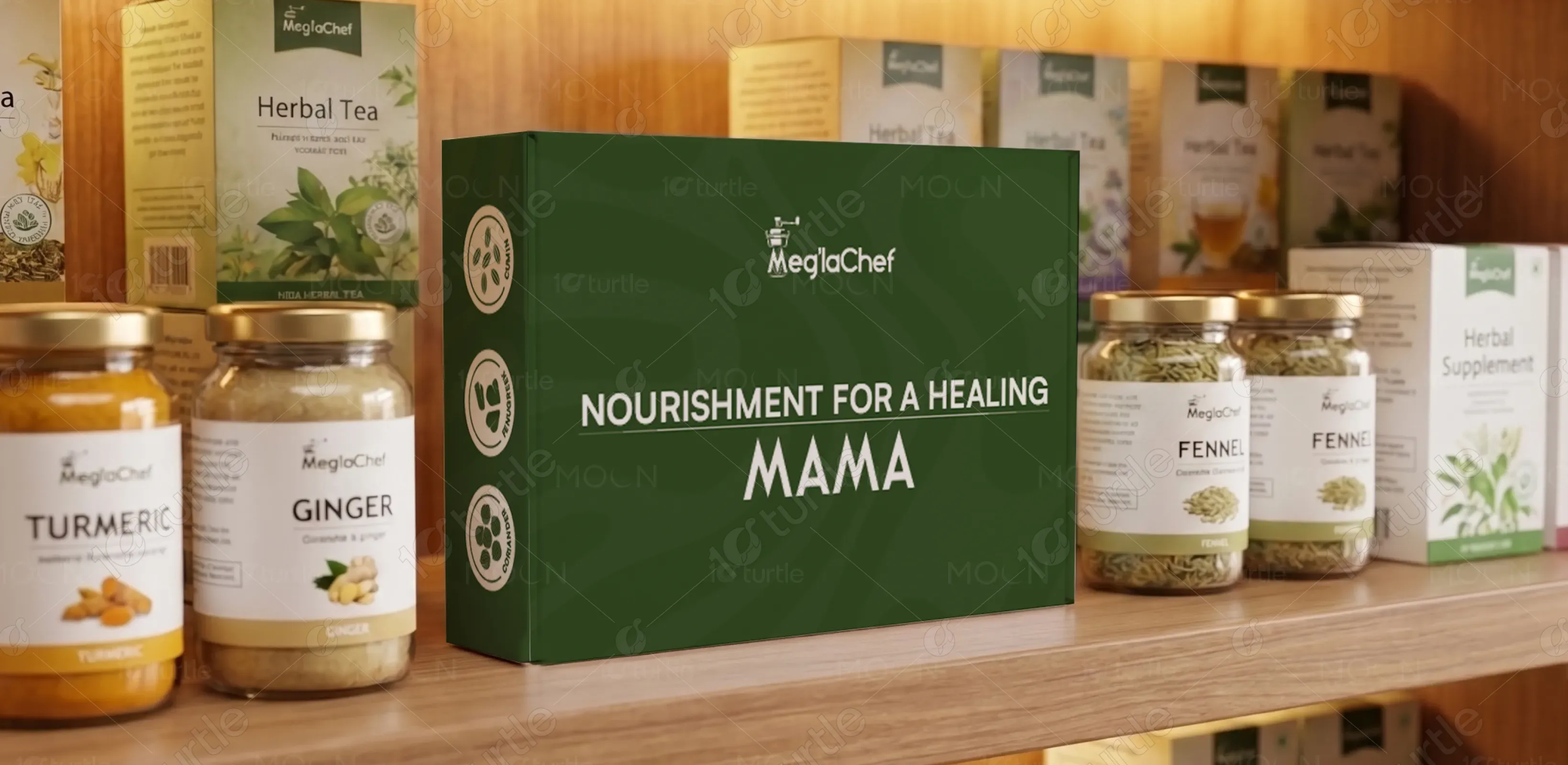
The design uses a rich green palette as its core, symbolizing nature, healing, and balance. Dark green conveys trust, stability, and premium quality, while lighter green gradients introduce softness and calmness. White elements are used for icons and typography to enhance clarity and cleanliness. This combination creates a fresh, organic feel that aligns with health-focused products. The palette not only strengthens brand identity but also evokes reassurance, comfort, and purity—key emotions for the postpartum care audience.