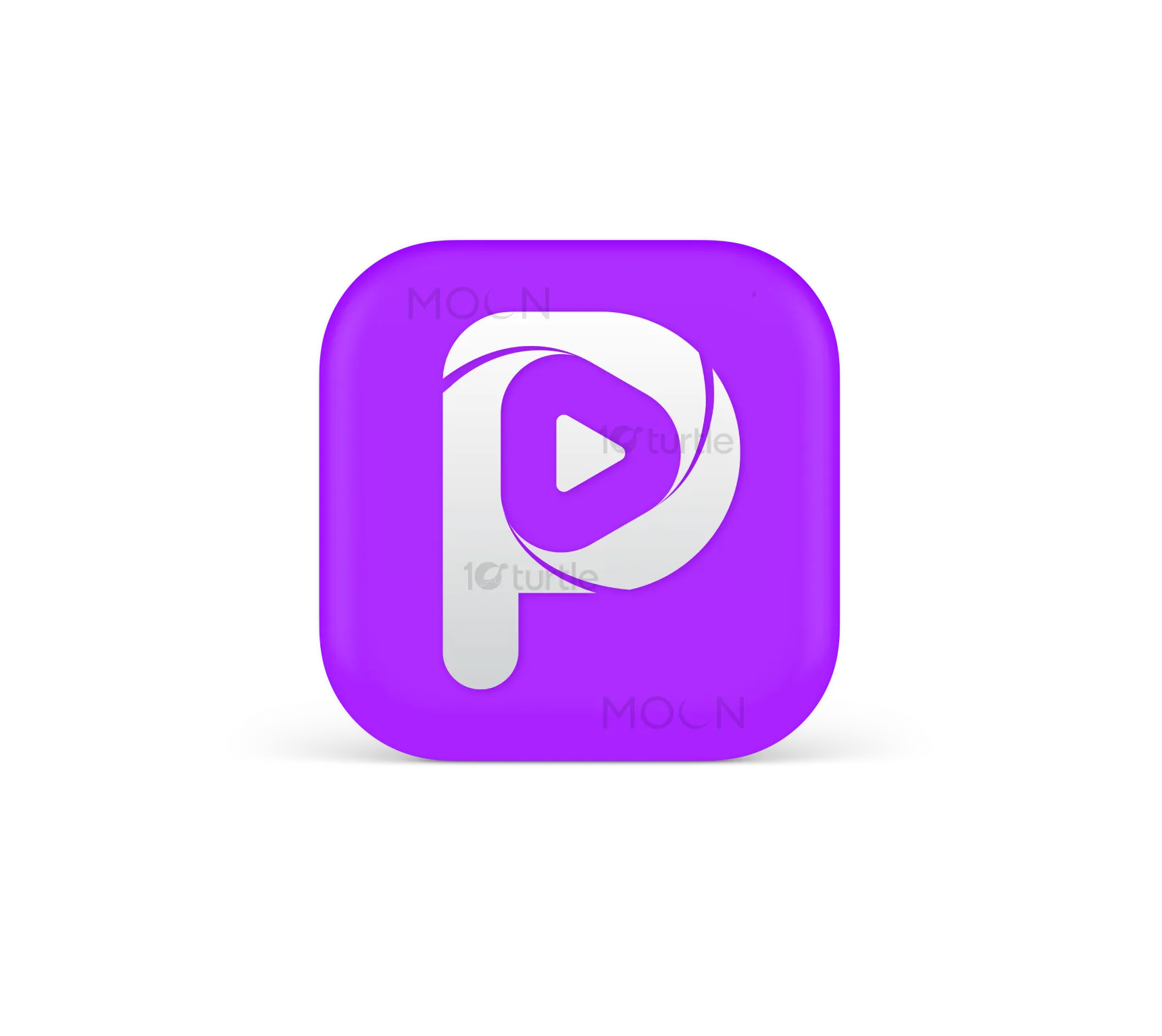
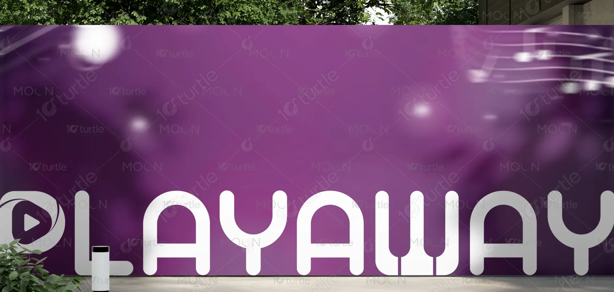
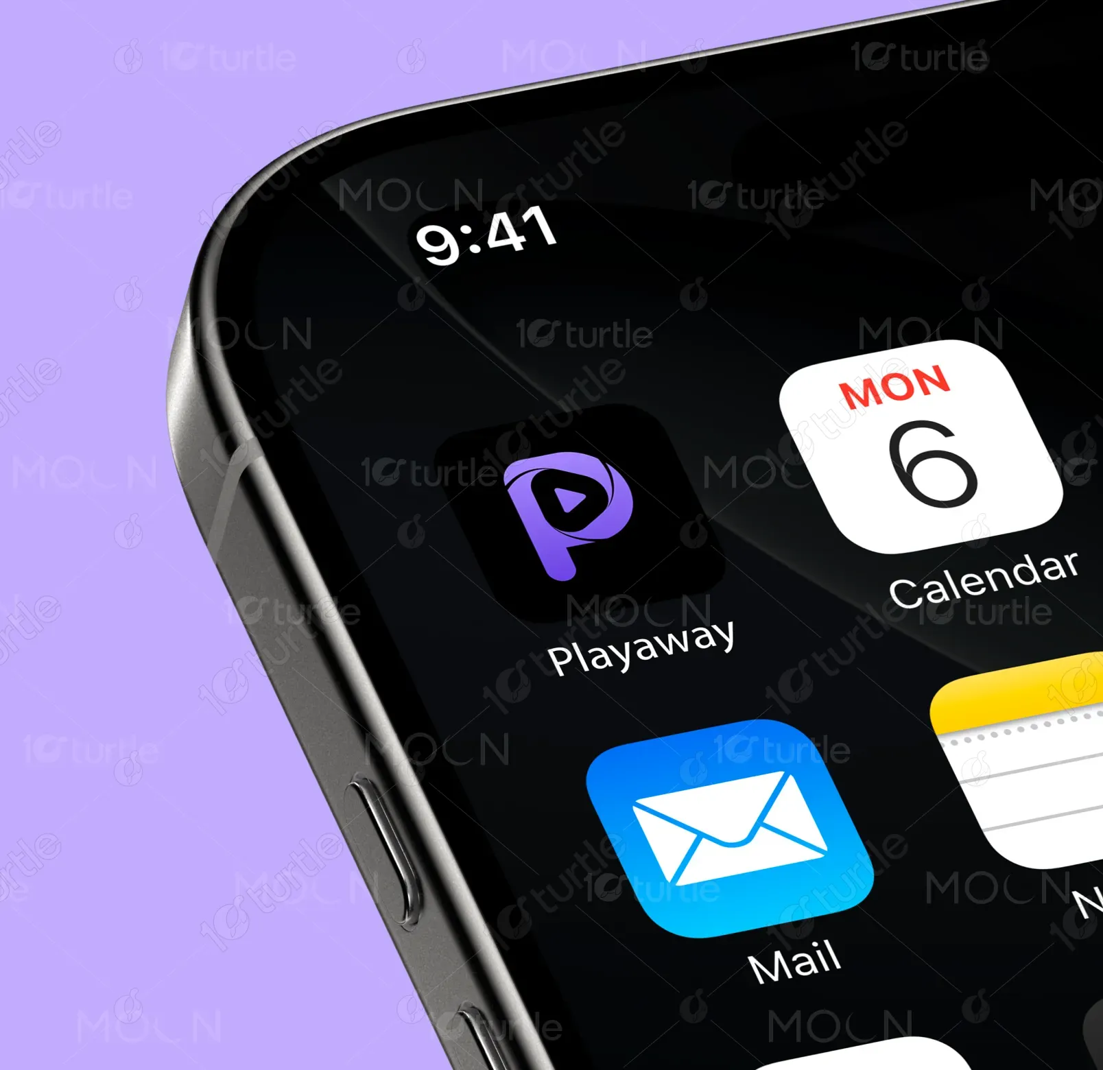
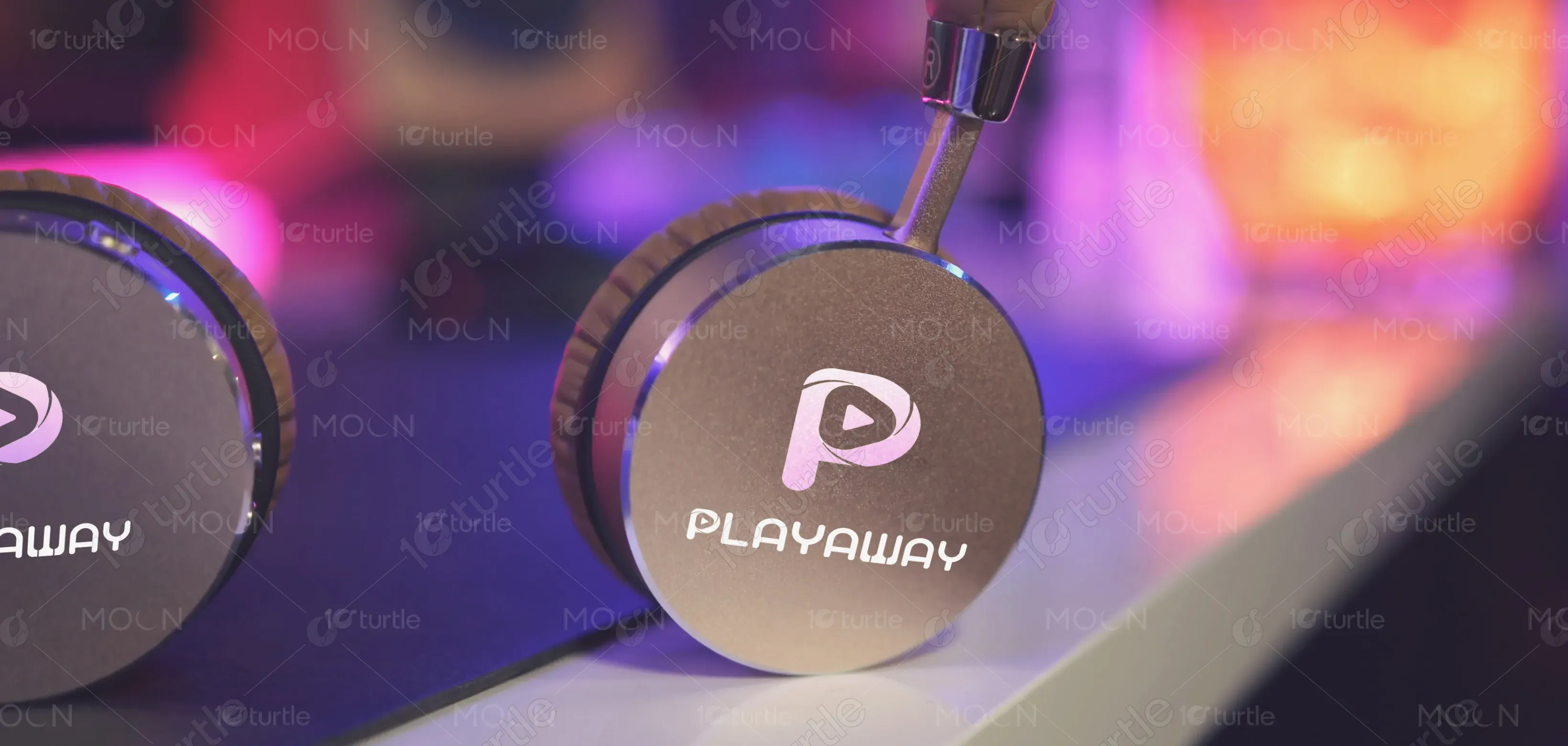
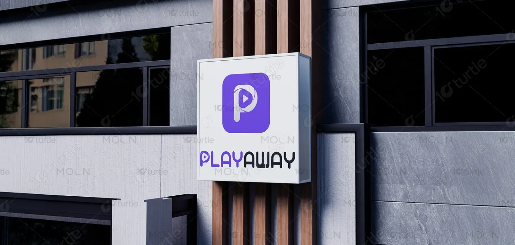
The Playaway logo merges bold modern typography with an engaging, playful aesthetic. The stylized "P" as a play button encapsulates the essence of entertainment and media, while the contrasting purple and black color scheme creates a dynamic visual impact. The playful font paired with a sleek design ensures that the brand conveys both fun and professionalism, appealing to a wide range of users in the entertainment industry.
Logo Design
Graphic Design
Industry
Arts, Culture & Entertainment
Tools we used

Project Completion
2025
Key Market
Global
Playaway is a digital entertainment platform designed for users to discover, enjoy, and share content across various forms of media. Its core purpose is to provide easy access to engaging content and create a vibrant community for entertainment lovers. The brand stands out with its bold visual identity, offering a fun yet reliable platform. Playaway is set to capture the attention of consumers with its clean, user-centric design and strong brand presence in the entertainment sector.
Industry
Arts, Culture & EntertainmentWhat we did
Logo DesignGraphic DesignPlatform
-The entertainment industry often struggles with creating a brand identity that is both fun and professional. Many platforms either lean too heavily on one side or fail to create a lasting impact. As entertainment options grow, consumers need a brand that feels modern, accessible, and exciting, yet still trustworthy. The challenge lies in breaking the mold of generic entertainment logos and crafting something that speaks directly to the target audience with both vibrancy and clarity.
The Playaway logo addresses this challenge by balancing the playful nature of entertainment with a sleek, professional look. The stylized play button within the "P" emphasizes the core function of the platform—providing entertainment. The strong font and unique color scheme provide a distinct and recognizable visual identity, helping Playaway stand out in a crowded marketplace. This logo appeals to both casual users and those seeking a more polished and user-friendly entertainment experience.
Playaway's long-term vision is to become a leading name in digital entertainment, continually expanding its user base while innovating within the media space. The brand aims to set trends in entertainment consumption, offering users a seamless and engaging experience. Playaway's goal is to be a go-to platform for all types of entertainment, from casual viewing to immersive experiences, fostering a sense of community and fun that will remain top of mind for users in the long run.

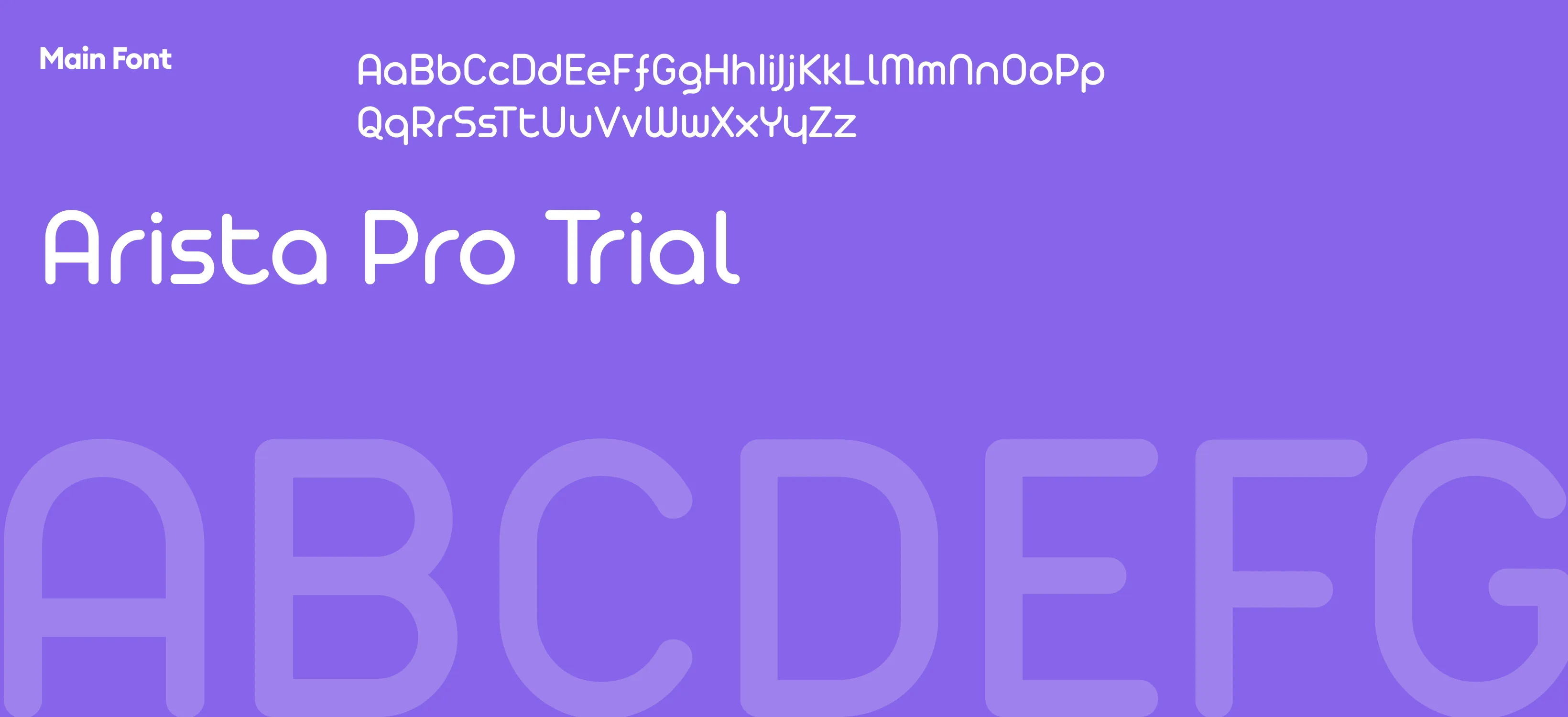
The logo for Playaway combines modern typography with a playful design. The icon features a stylized "P" in the shape of a play button, symbolizing entertainment, media, and fun. The bold font and color contrast give it a contemporary, dynamic feel, perfect for an entertainment brand that aims to connect with users in a lively and approachable way.
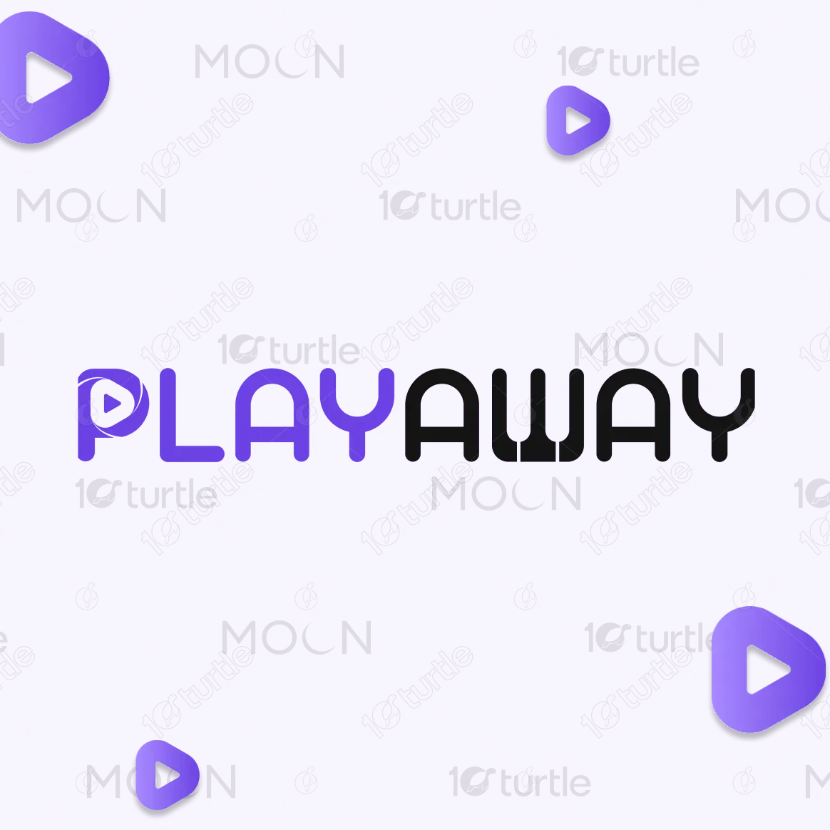

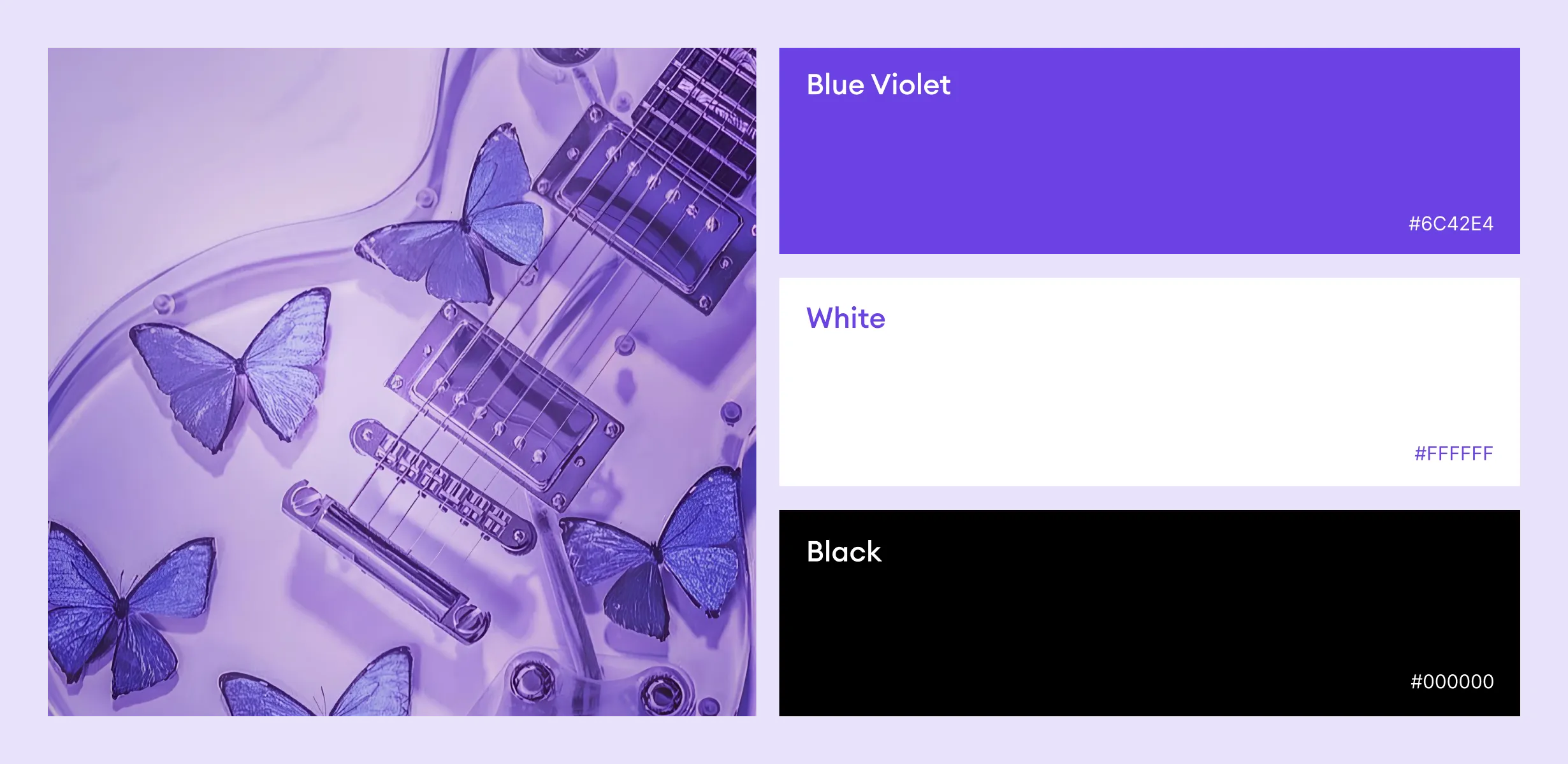
The color palette consists of purple and black, chosen for their ability to evoke creativity, energy, and professionalism. Purple is often associated with creativity and innovation, while black adds sophistication and clarity. This combination aligns perfectly with the Playaway brand's mission to offer dynamic entertainment options in a sleek, professional format. The contrasting colors also ensure high visibility and recognition, making the logo stand out in both digital and physical spaces.
