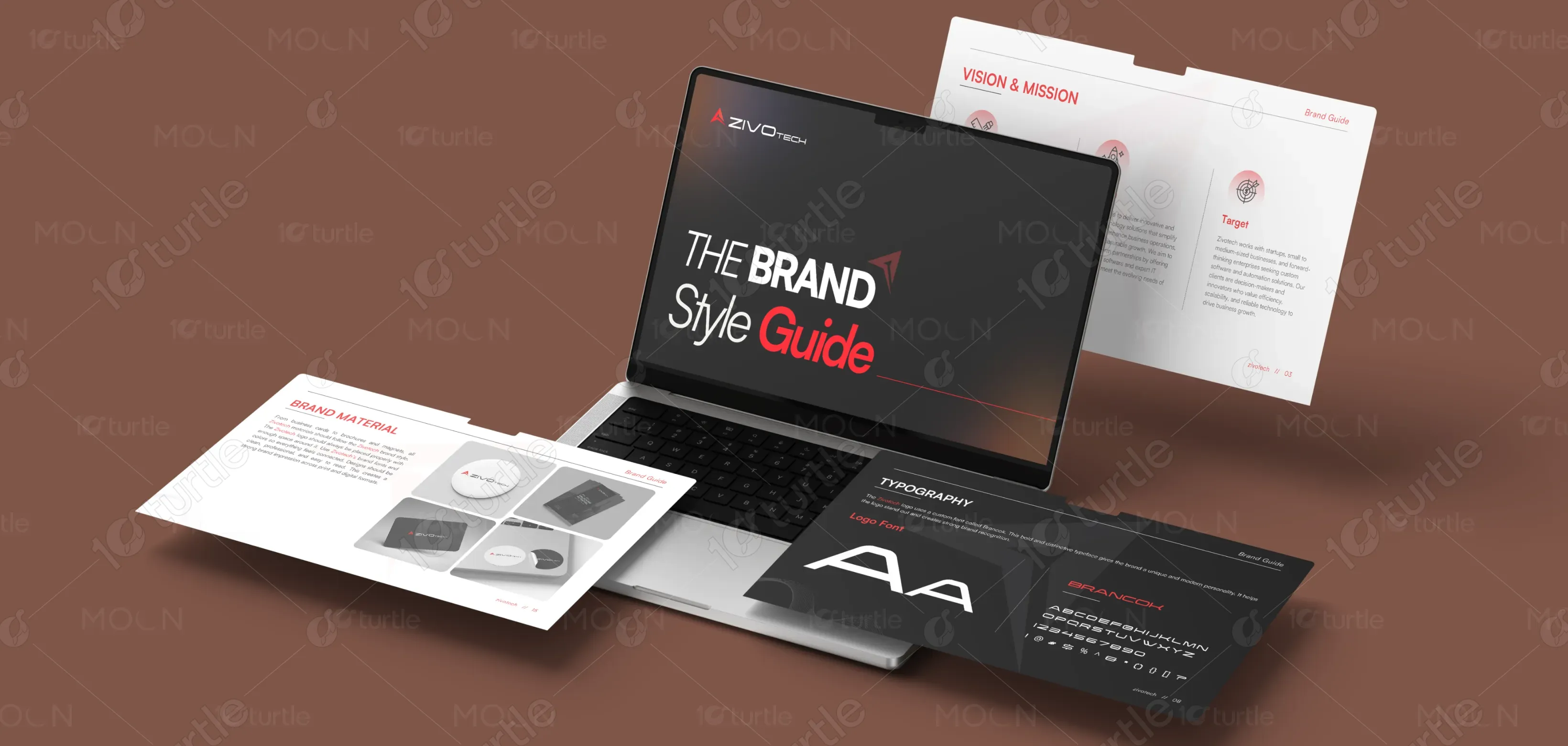
The Zivotech Brand Book design embodies a modern, technology-driven aesthetic that reflects innovation, precision, and reliability. The clean layout, structured grid, and bold typography convey professionalism and technical strength. A balanced mix of red, gray, and teal tones adds energy and trust, while geometric design elements emphasize logic and innovation. The overall visual approach combines clarity with confidence—ensuring Zivotech’s brand identity remains consistent, impactful, and adaptable across all digital and print touchpoints.
Brand Book Design
Graphic Design
Industry
Technology, SaaS & Startups
Tools we used


Project Completion
2025
Key Market
Global
Zivotech is a forward-thinking technology partner specializing in digital transformation, automation, and software solutions. The Brand Book defines its visual identity, ensuring cohesive communication across platforms. Built to represent innovation and reliability, the design system includes refined typography, a bold logo, and a modern color palette. By merging technical sophistication with creative minimalism, it positions Zivotech as a trusted, future-ready brand in the competitive technology landscape.
Industry
Technology, SaaS & StartupsWhat we did
Brand Book DesignGraphic DesignPlatform
-In a saturated tech market, many brands struggle to visually differentiate themselves, often appearing generic or overly complex. Zivotech faced the challenge of creating a brand identity that balances innovation with accessibility—avoiding the cold, corporate aesthetic that dominates the industry. The gap was the lack of a cohesive design language that communicated both technical expertise and human-centered thinking, making the brand relatable and distinct in a fast-evolving digital environment.
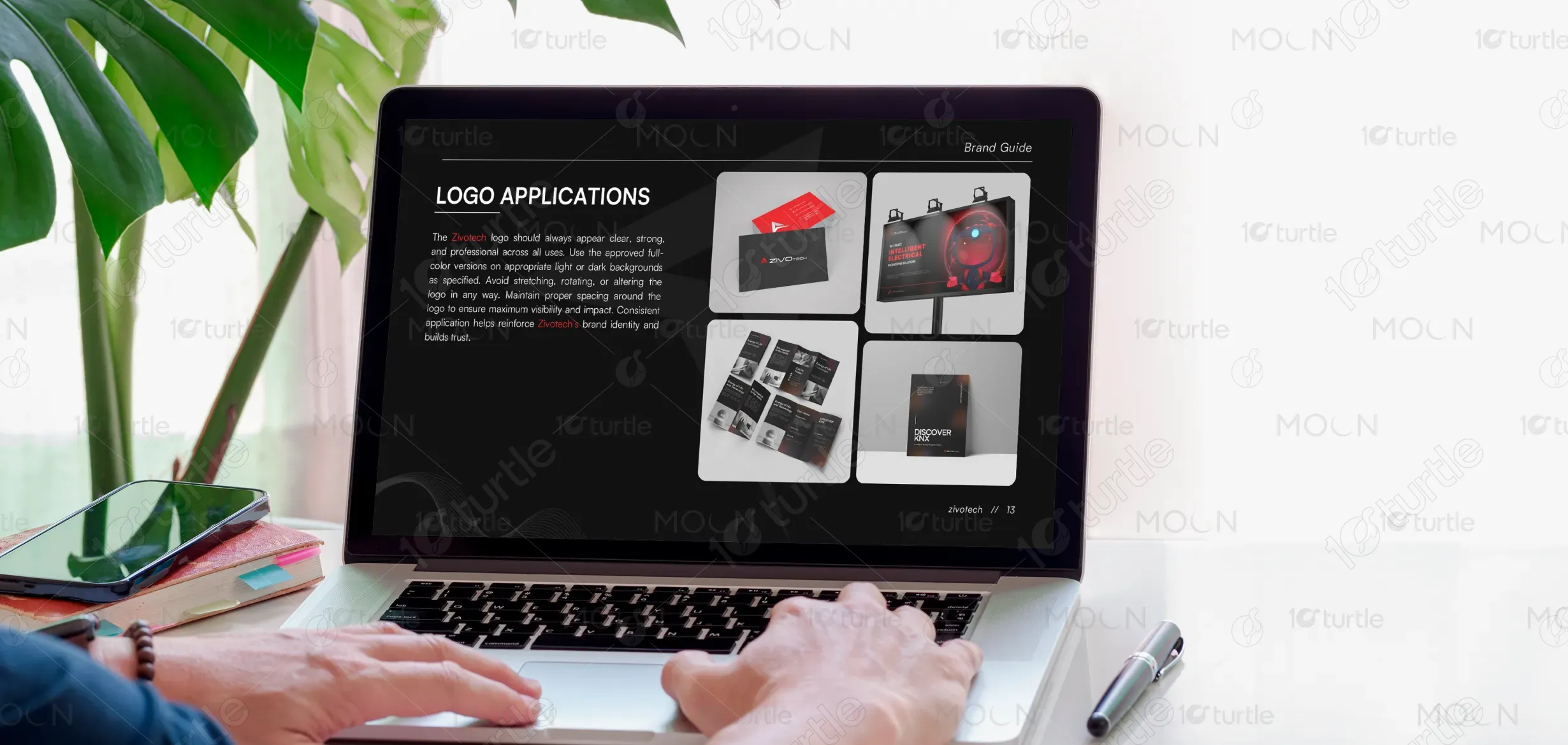
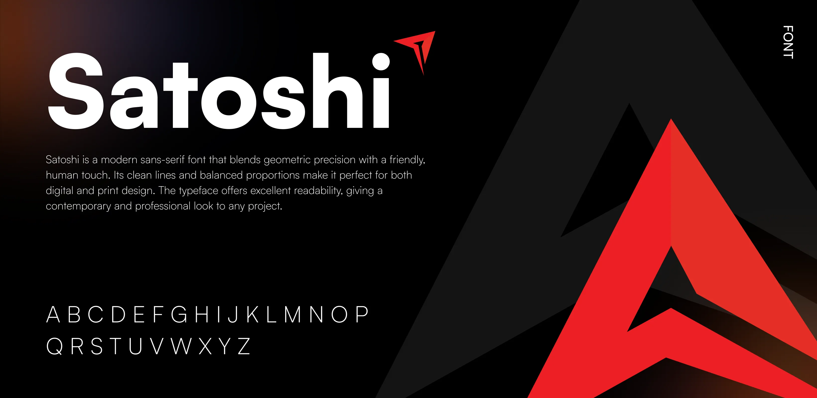
The Zivotech Brand Book resolves this challenge through a design system grounded in clarity, consistency, and adaptability. The logo’s geometric structure symbolizes precision and progress, while the color palette injects warmth and trust. Modern typography enhances readability and brand recall. Each visual element—from digital applications to print collateral—was thoughtfully aligned to reflect Zivotech’s core values: innovation, functionality, and partnership. The result is a strong, scalable identity that connects with audiences on both technical and emotional levels.

Zivotech aims to become a global leader in digital innovation, recognized for merging creativity with technology to empower businesses worldwide. The long-term vision is to create an ecosystem of intelligent solutions that simplify operations and drive growth. The brand aspires to set a benchmark in reliability, design excellence, and user experience—establishing lasting trust and meaningful impact in the technology and automation industries.
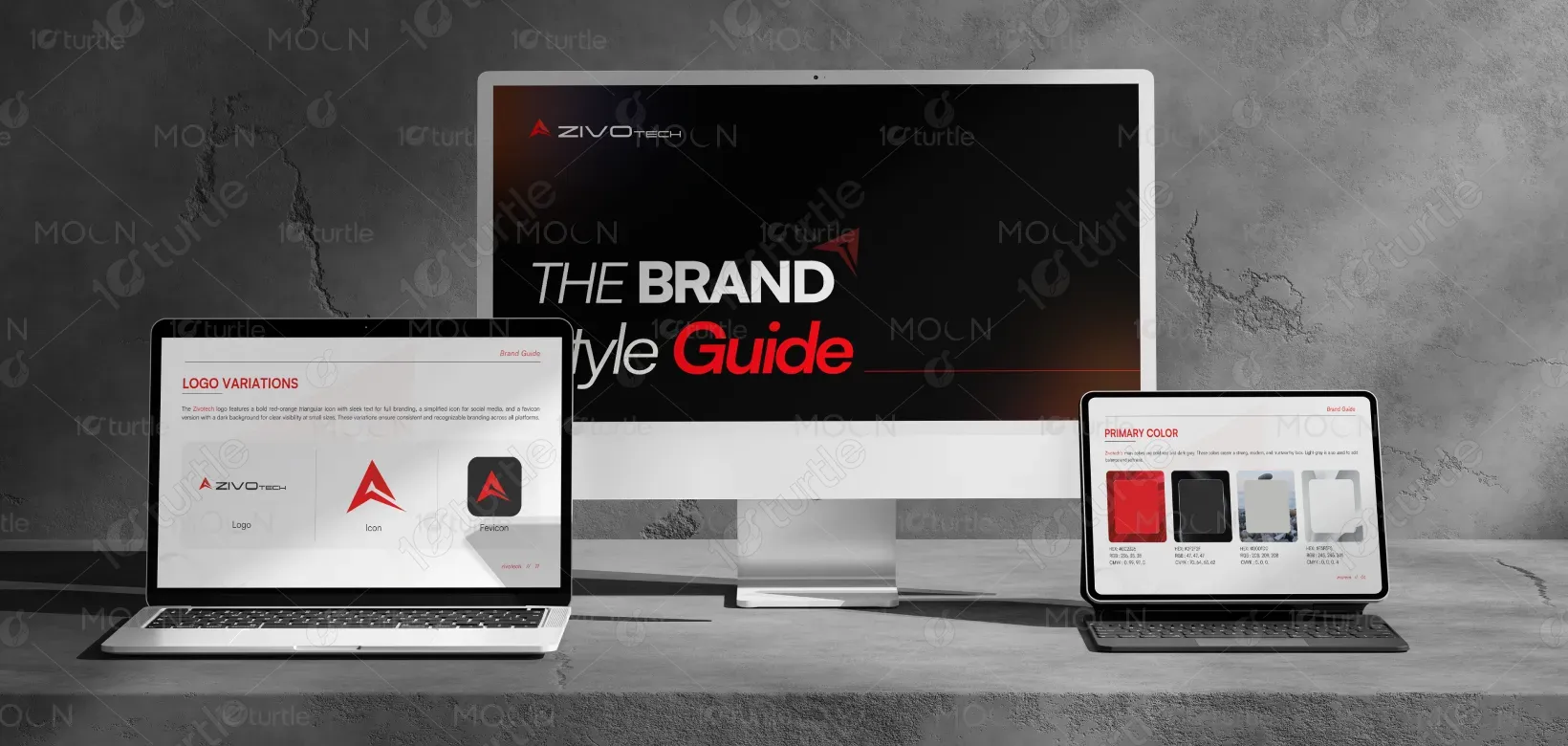

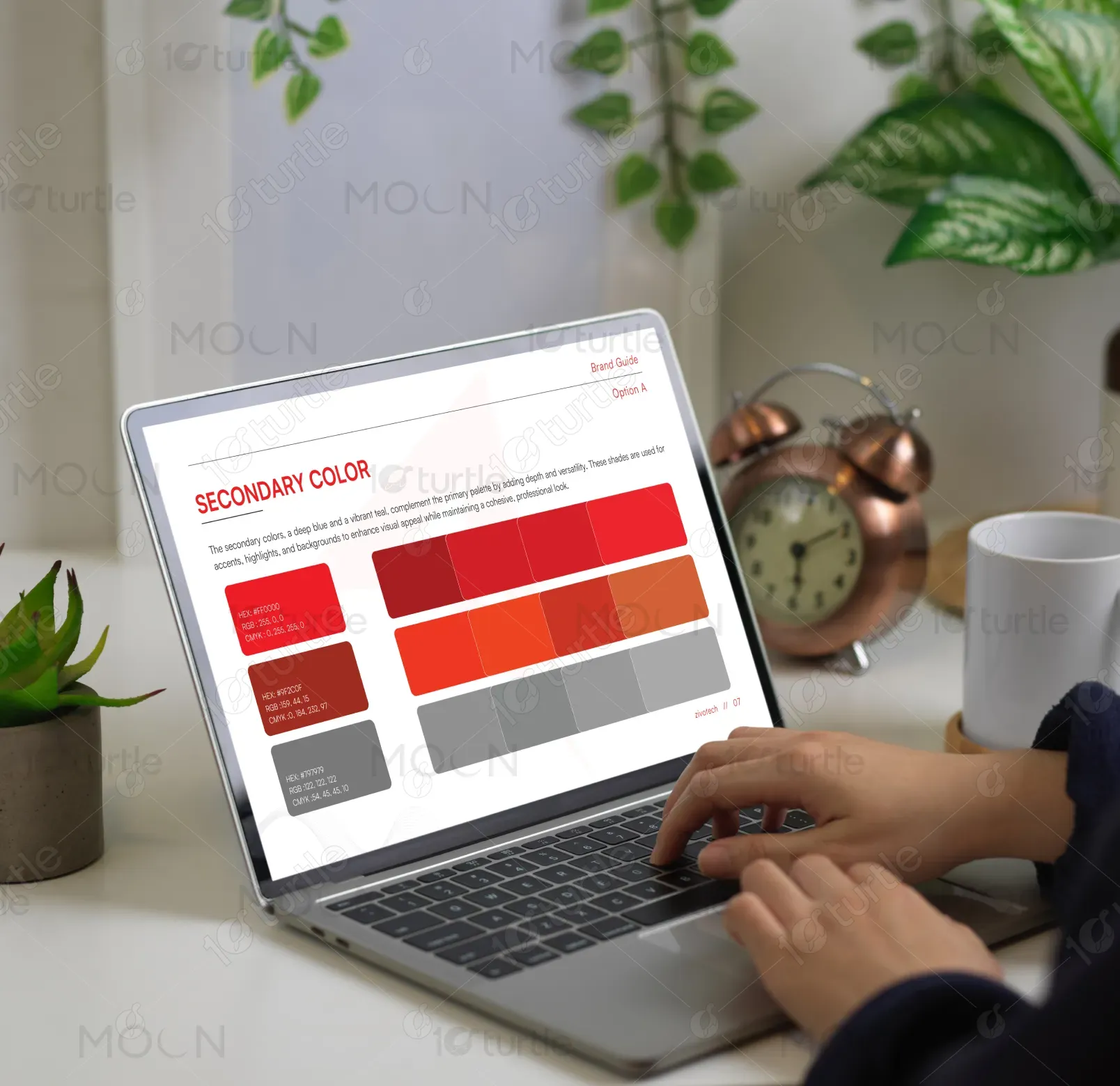
Zivotech’s primary color palette features bold red (#EC2326) and dark gray (#2F2F2F), representing strength, innovation, and reliability. The red conveys energy, passion, and forward momentum—symbolizing the brand’s drive for technological excellence. The dark gray adds balance, professionalism, and sophistication, grounding the brand’s energetic tone. Supporting hues like light gray (#D0D1D0) and off-white (#F5F5F5) provide clarity and contrast, ensuring a clean, modern, and cohesive visual identity that reflects confidence and trustworthiness.