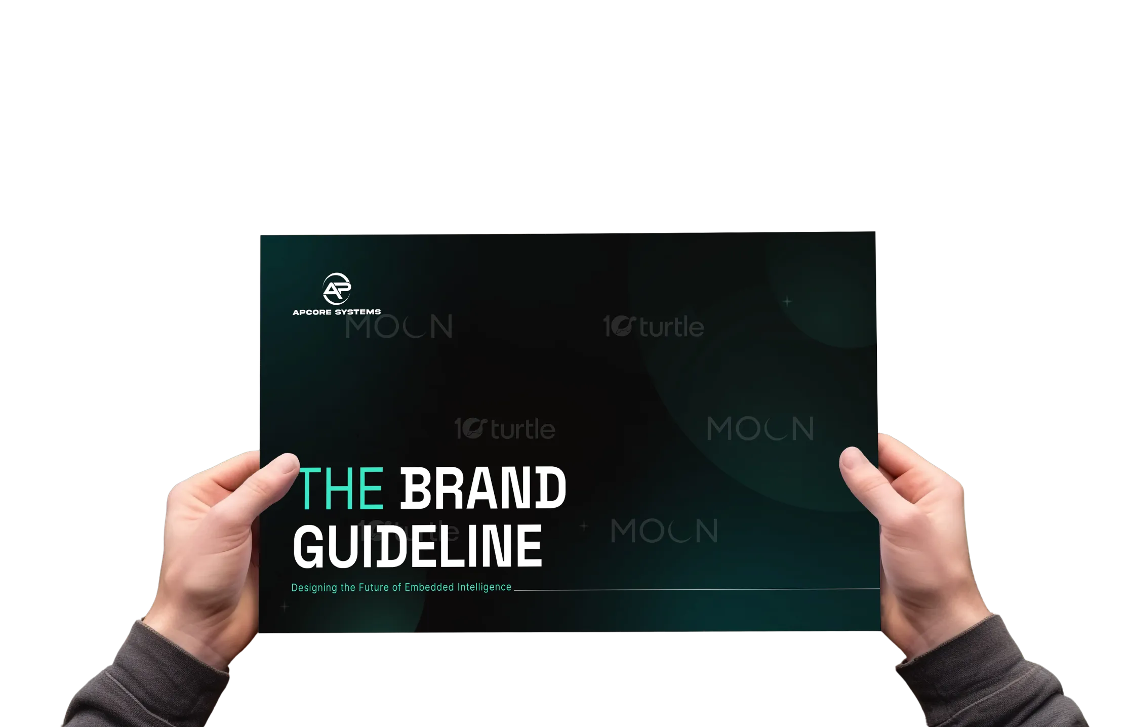
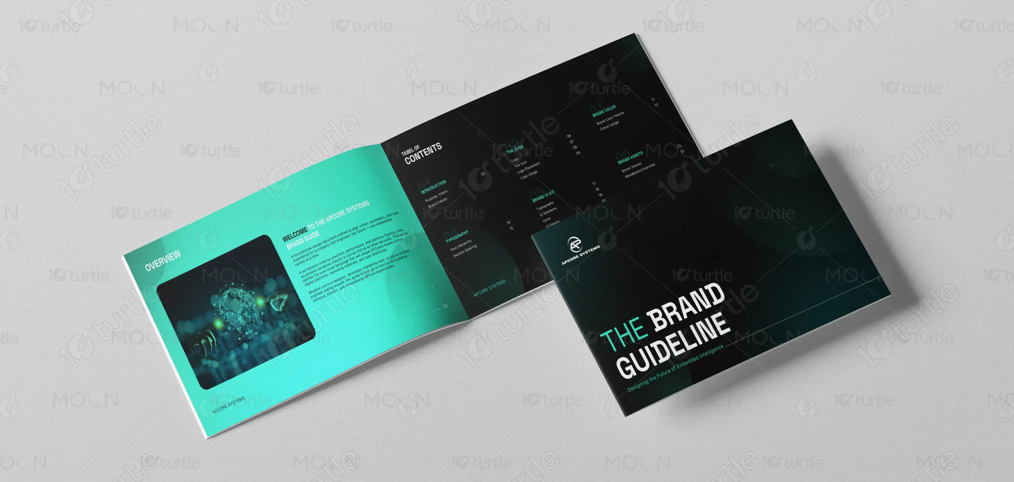
The APCore Systems brand guide embodies a clean, futuristic, and precision-driven design approach. The aesthetic emphasizes minimalism with bold geometric elements, spacious layouts, and a balanced visual hierarchy. A modern, high-contrast color palette — Ocean Boat Blue, Maastricht Blue, and Turquoise — supports clarity and innovation. Typography choices, Space Grotesk and Inter, establish technical sophistication and readability. Together, these elements create a cohesive visual identity that communicates trust, performance, and forward-thinking innovation across digital platforms, marketing materials, and user interfaces.
Brand Guide Design
Graphic Design
Industry
Technology, SaaS & Startups
Tools we used


Project Completion
2025
Key Market
Global
The APCore Systems Brand Guide is a comprehensive design framework that defines the visual identity for a company specializing in high-performance embedded systems. It establishes consistent branding across interfaces, marketing, and communication touchpoints. With a strong focus on precision and innovation, the guide leverages modern typography, an intelligent color system, and structured layouts to maintain brand coherence. Its unique selling points include a tech-forward aesthetic, scalability for digital platforms, and a user-centric design language that aligns with APCore’s goal of becoming a trusted leader in embedded technology.
Industry
Technology, SaaS & StartupsWhat we did
Brand Guide DesignGraphic DesignPlatform
-In the embedded systems industry, brands often struggle with fragmented visual identities due to inconsistent typography, outdated color schemes, and unclear UI patterns. This inconsistency creates confusion for users and weakens brand recognition. Furthermore, most companies in this sector prioritize technical performance over brand experience, leaving a gap between product innovation and visual communication. For example, tech companies often have strong products but lack a cohesive visual strategy that connects with customers, investors, and end users across digital platforms and print media.
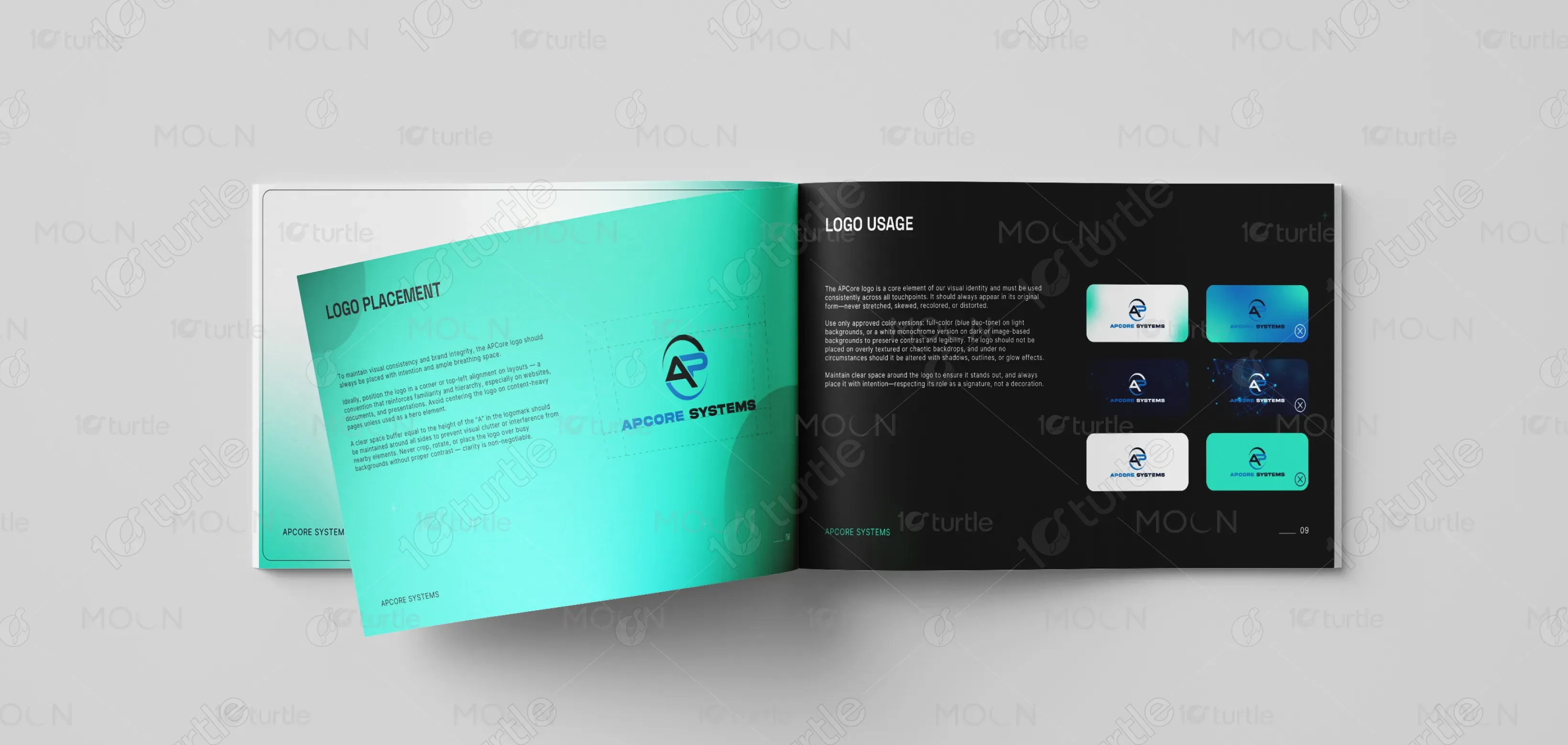
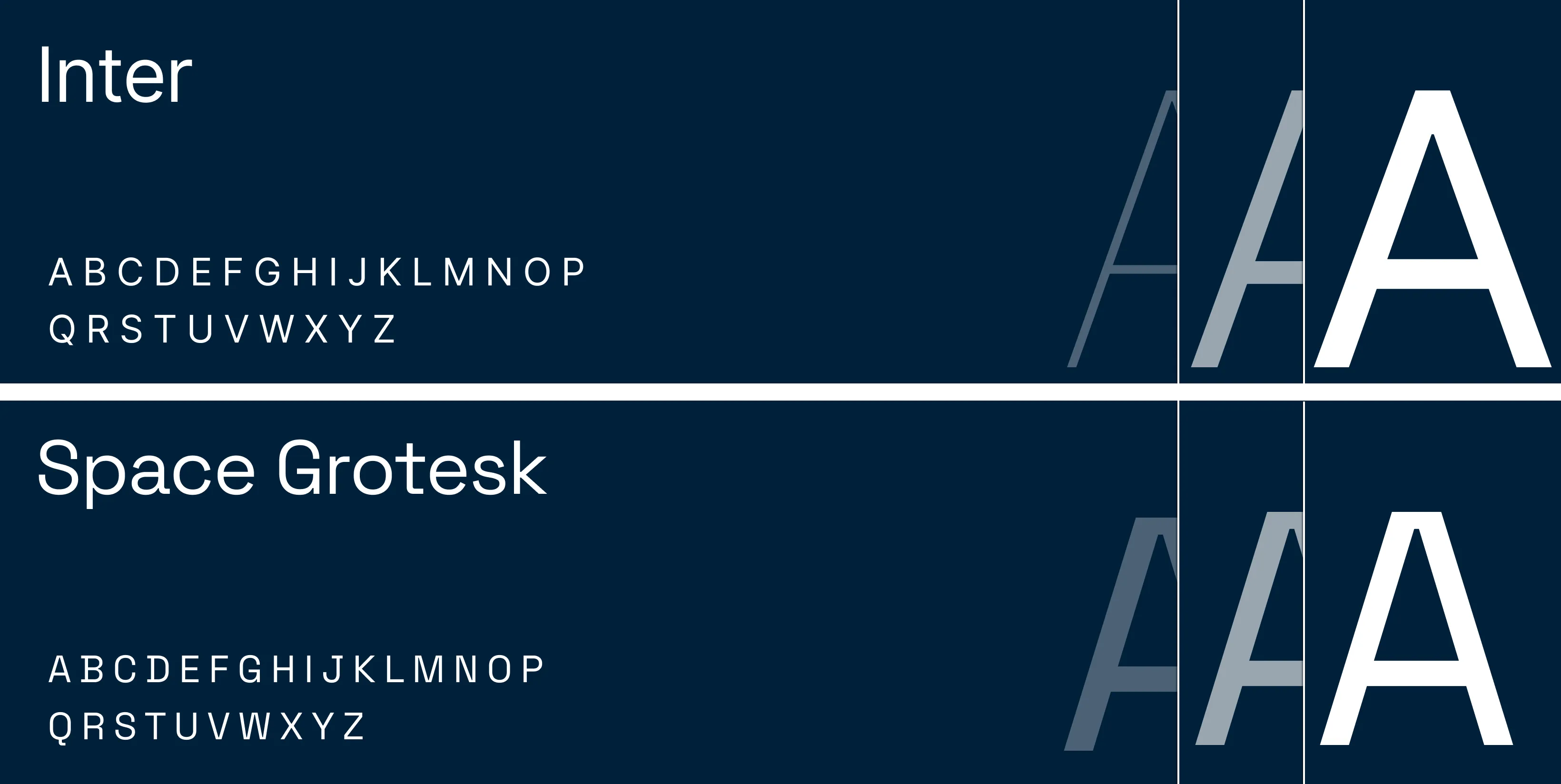
The APCore Systems Brand Guide bridges the gap between technical excellence and visual communication. It introduces a streamlined, modern design system built around a cohesive color palette, typographic hierarchy, and UI components. By combining Space Grotesk for structure with Inter for readability, the typography ensures clarity across multiple platforms. The Ocean Boat Blue and Turquoise accents create instant brand recognition, while UI kits, icon sets, and gradient systems provide designers and developers with standardized tools to maintain visual consistency. This user-centric, innovation-driven approach enhances APCore’s digital presence and competitive positioning.
The long-term vision of the APCore Systems brand design is to set a new benchmark for embedded systems branding by combining technical precision with modern aesthetics. As the company expands into industrial, networking, and system-level platforms, the brand identity will evolve to remain future-proof, adaptive, and scalable. The goal is to create a lasting impression that builds trust, strengthens customer loyalty, and positions APCore as a global leader in embedded intelligence, where every interaction — from interfaces to marketing materials — reflects innovation, reliability, and forward-thinking design.


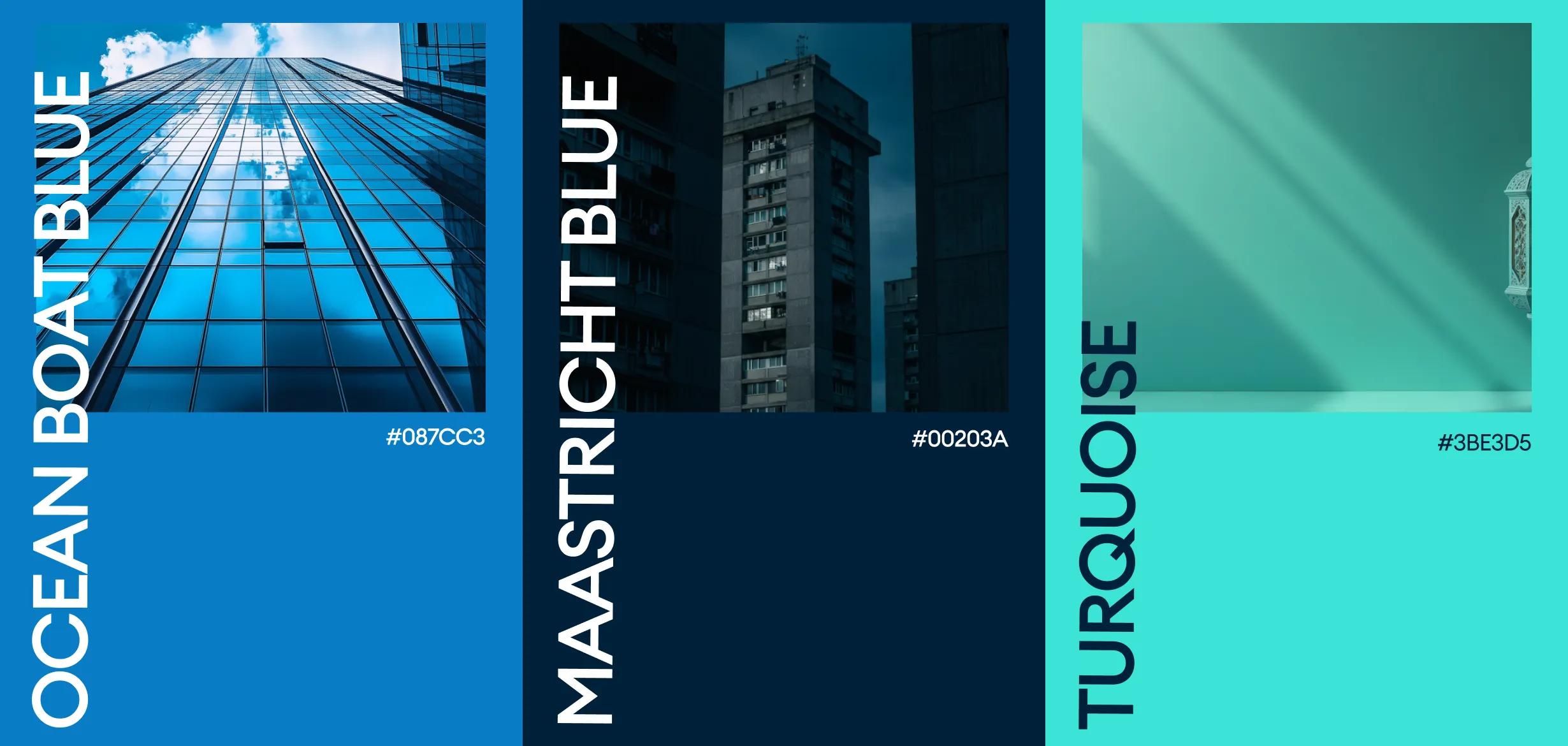
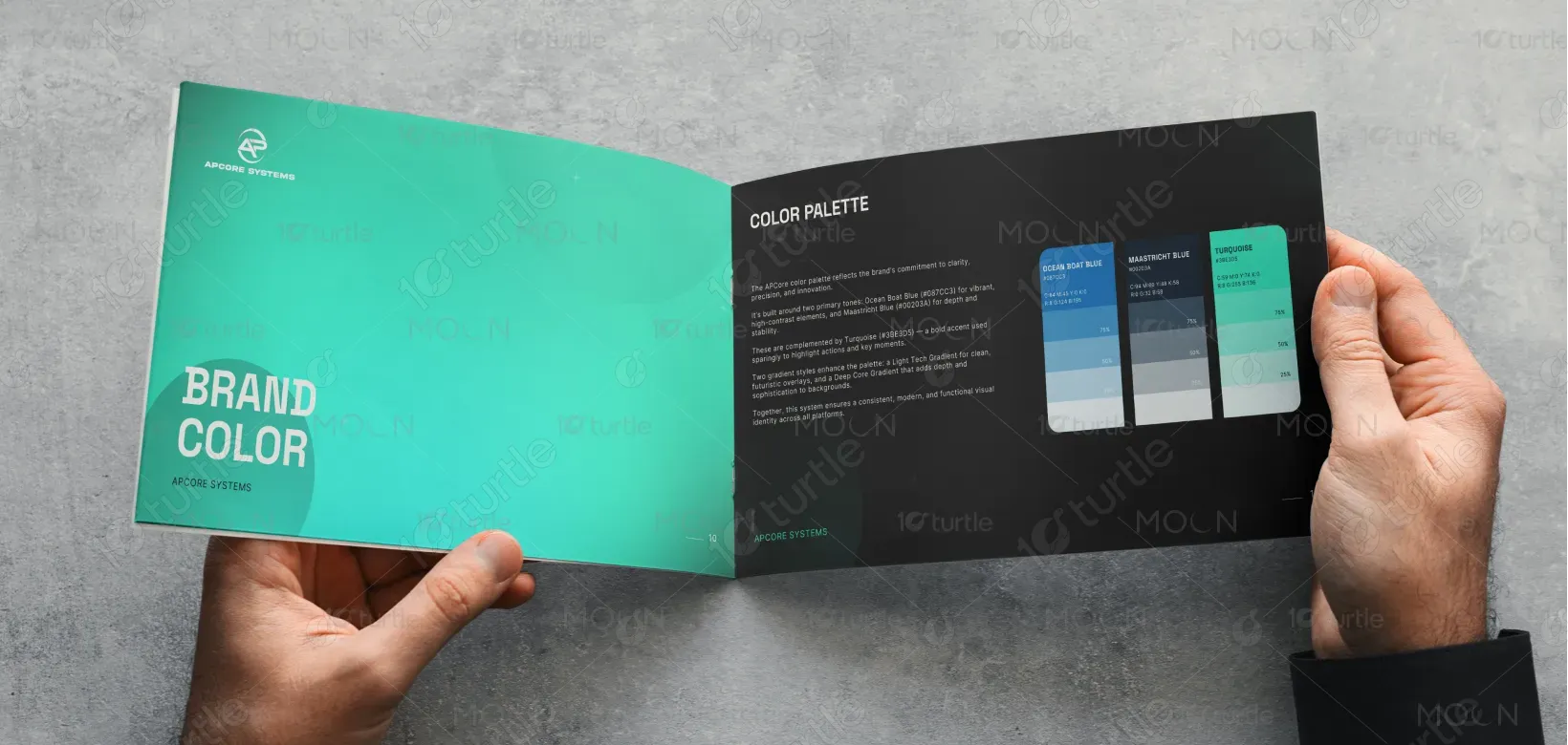
The APCore Systems color palette symbolizes clarity, innovation, and trust, forming the foundation of its visual identity. The Ocean Boat Blue (#087CC3) represents intelligence and stability, making it ideal for primary actions and navigation elements. Maastricht Blue (#00203A) adds depth and professionalism, serving as the perfect choice for backgrounds and structured layouts. Complementing these is Turquoise (#3BE3D5), a vibrant accent that introduces energy and modernity, strategically used to highlight key actions and moments. Additionally, two gradient styles — Light Tech and Deep Core — enhance the overall aesthetic, adding a futuristic and dynamic appeal. Together, these colors create a consistent, tech-forward identity that perfectly reflects APCore’s innovative ethos.