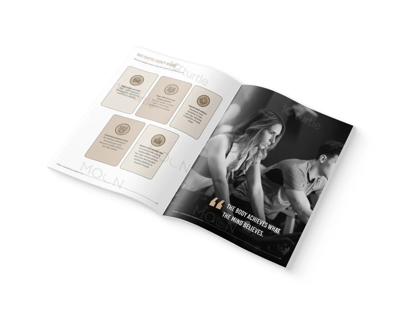
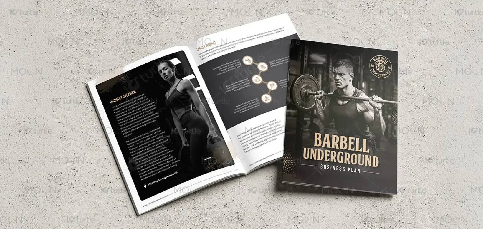
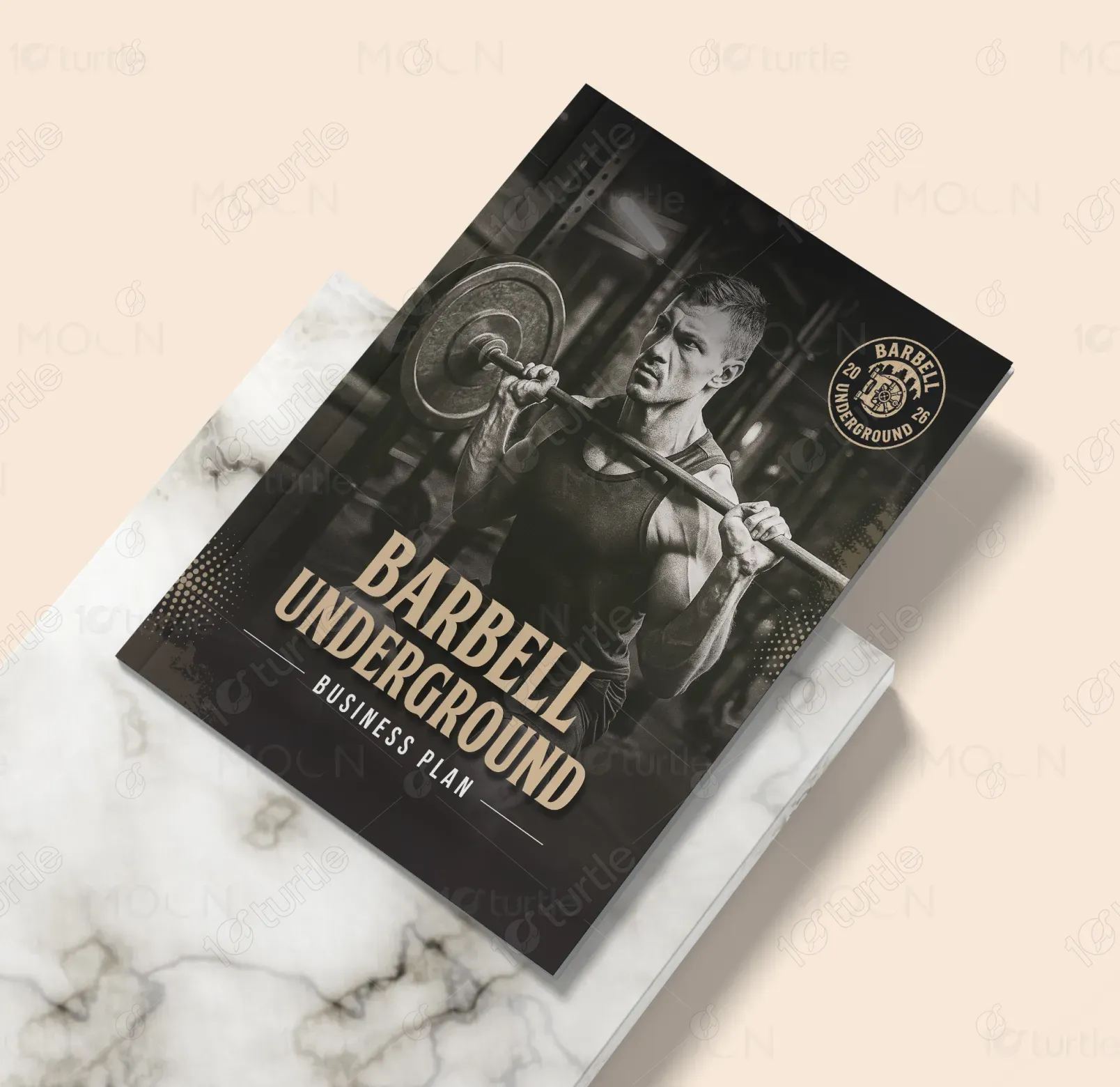
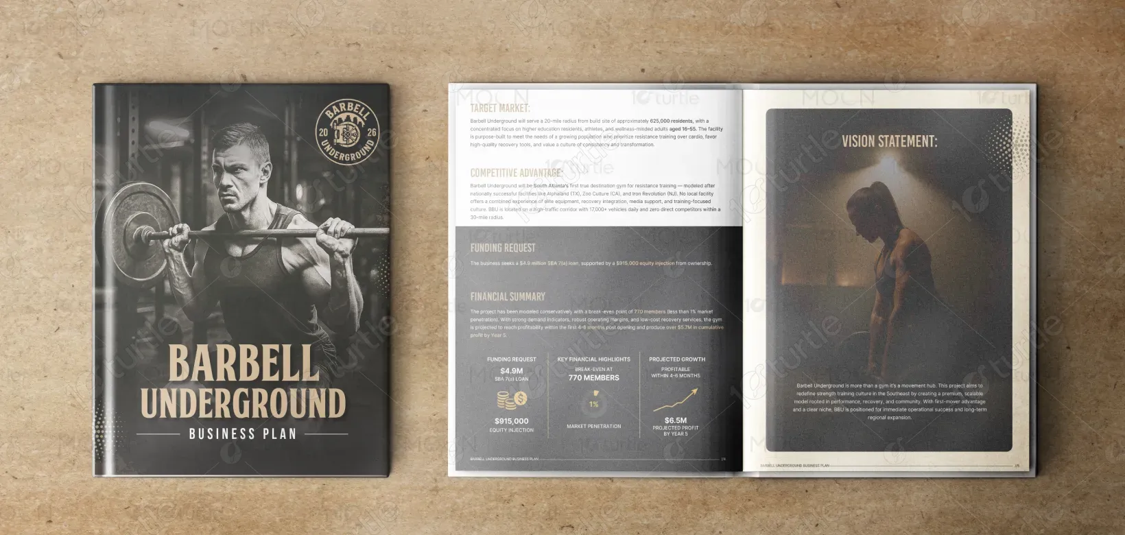
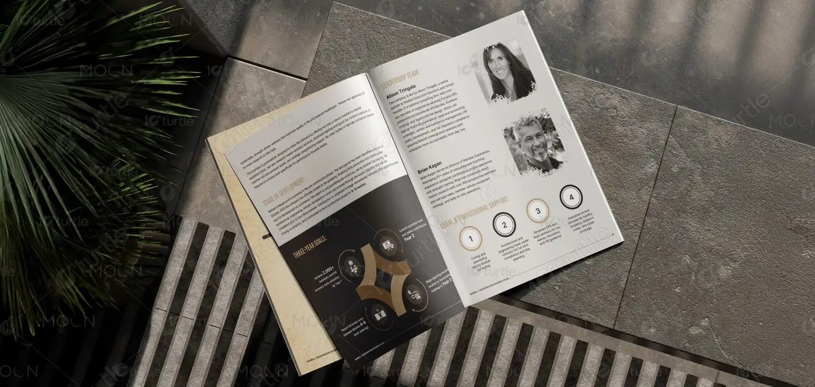
This brochure design blends a bold industrial aesthetic with premium fitness visuals to reflect the raw energy of strength training. Dark tones, gritty textures, and metallic accents emphasize power and discipline, while clean layouts ensure clarity and professionalism. Strong photographic imagery highlights human endurance and technique, balancing inspiration with authenticity. The design pairs modern typography with vintage badge-style elements to communicate heritage, trust, and grit—positioning Barbell Underground as a serious, high-performance fitness brand.
Brochure Design
Graphic Design
Industry
Healthcare & Wellness
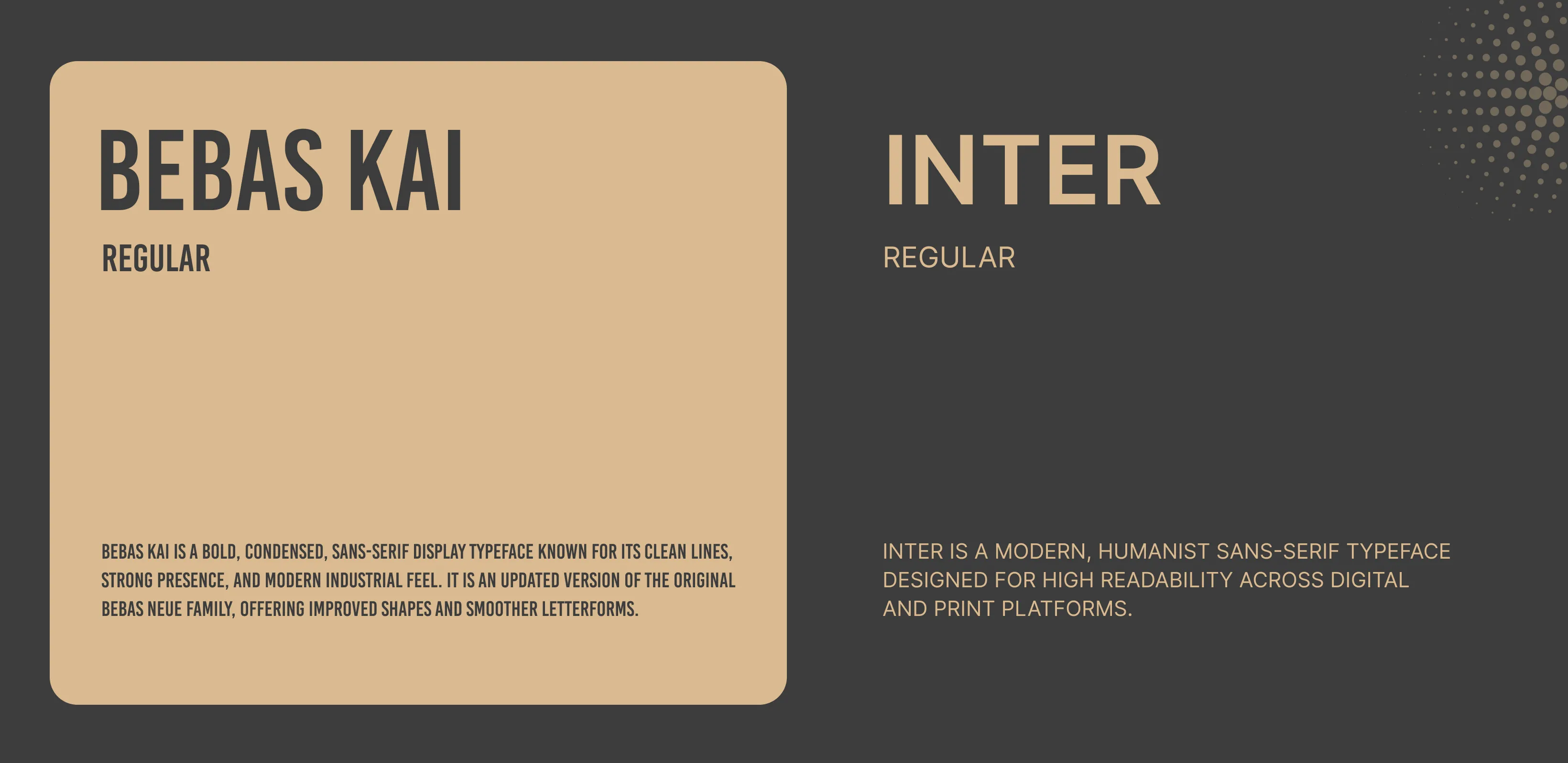
Tools we used


Project Completion
2025
Key Market
Global
Barbell Underground is a specialized strength-training fitness brand designed to serve athletes, lifters, and fitness enthusiasts seeking serious performance results. The brochure outlines its premium training environment, expert-coaching model, and advanced workout facilities. Positioned in a rapidly growing strength-training market, the brand offers a unique combination of community-driven culture, high-intensity training, and recovery-focused services. Its aesthetic—rooted in grit, power, and dedication—sets it apart as a modern yet authentic destination for disciplined fitness lovers.
Industry
Healthcare & WellnessWhat we did
Brochure DesignGraphic DesignPlatform
-Traditional fitness centers often lack identity, consistency, and emotional connection; many appear generic and fail to convey the intensity serious athletes seek. Competitors rely on overly commercial visuals that do not resonate with strength-focused users. This creates a gap where gyms struggle to visually communicate their true value and mission. As a result, potential members often feel uncertain about the gym’s authenticity, training style, or community culture—leading to lower engagement and brand differentiation.
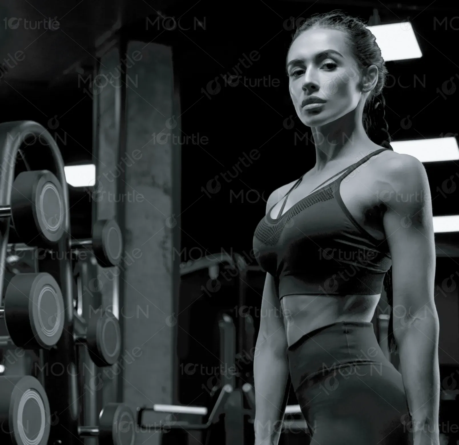
Barbell Underground solves this issue through a visually powerful, story-driven design that reflects the brand’s core philosophy. Strong monochrome imagery, a rugged layout, and gold-accented branding create instant recognition and emotional impact. Each page reinforces strength, discipline, and professionalism, ensuring the audience understands exactly what the brand stands for. This strategic visual identity builds trust, attracts the right target audience, and elevates the brand above generic fitness competitors.

The long-term vision of Barbell Underground is to become a benchmark destination for strength training and athletic development. The brand aims to expand across regions, build a community of serious lifters, and integrate advanced fitness technologies for smarter, data-driven performance. It aspires to influence the industry by setting new standards for authenticity, coaching excellence, and member experience—ultimately becoming a globally recognized symbol of discipline, strength, and transformation.
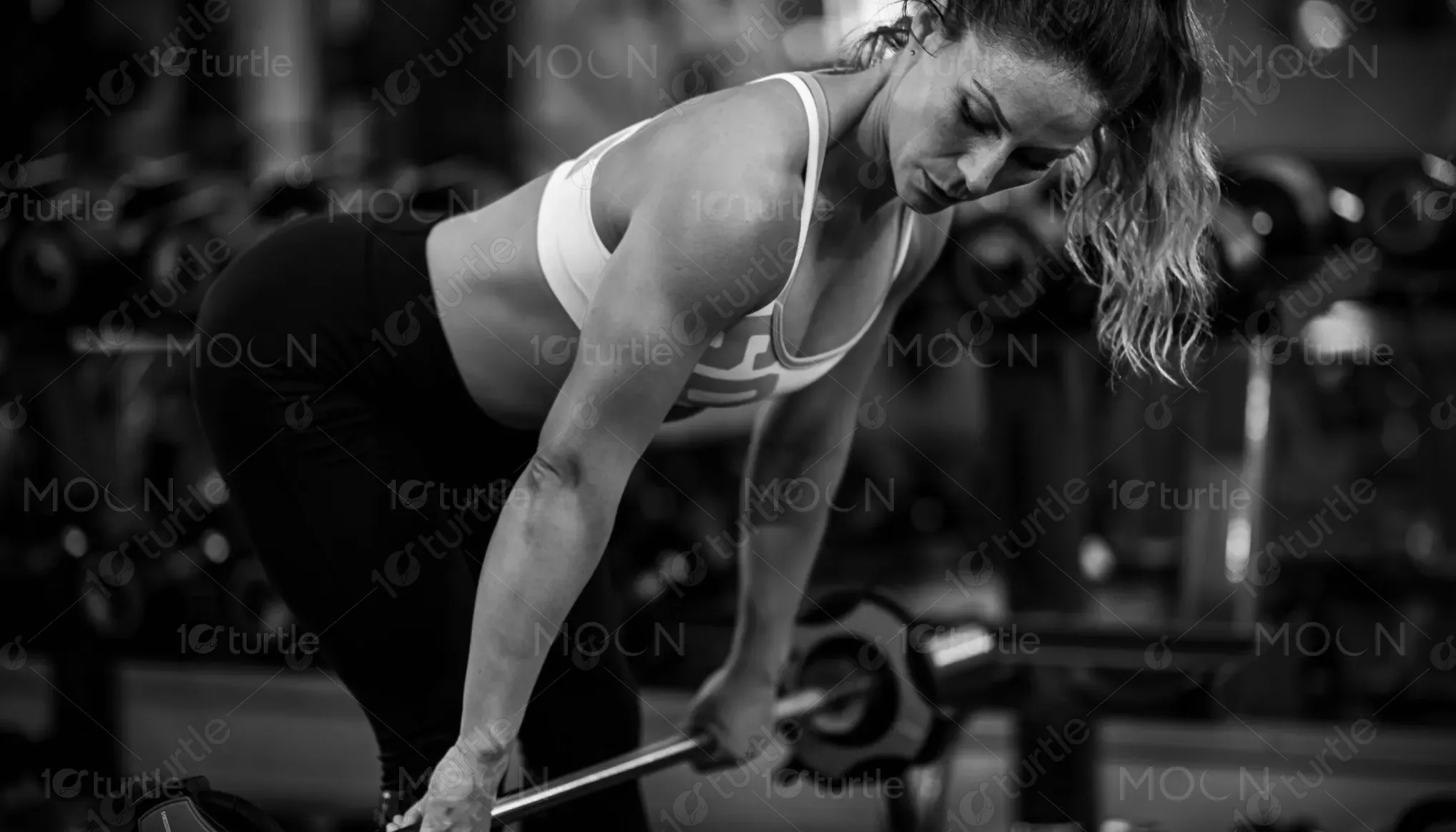
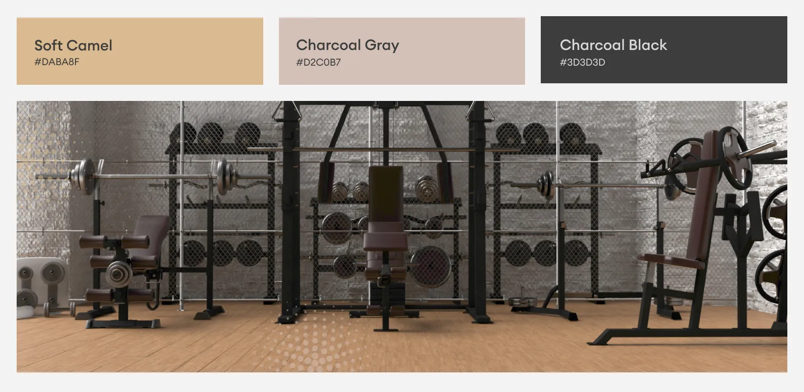
The color palette blends black, charcoal grey, warm beige, and metallic gold to create a powerful and aspirational visual identity. Black and charcoal convey strength, discipline, and intensity—the core pillars of the brand—while warm beige textures add depth and warmth, grounding the design with a premium, vintage-lift aesthetic. Metallic gold accents represent achievement, excellence, and victory, reinforcing the mindset and ambitions of high-performing athletes and completing a bold, masculine visual tone.