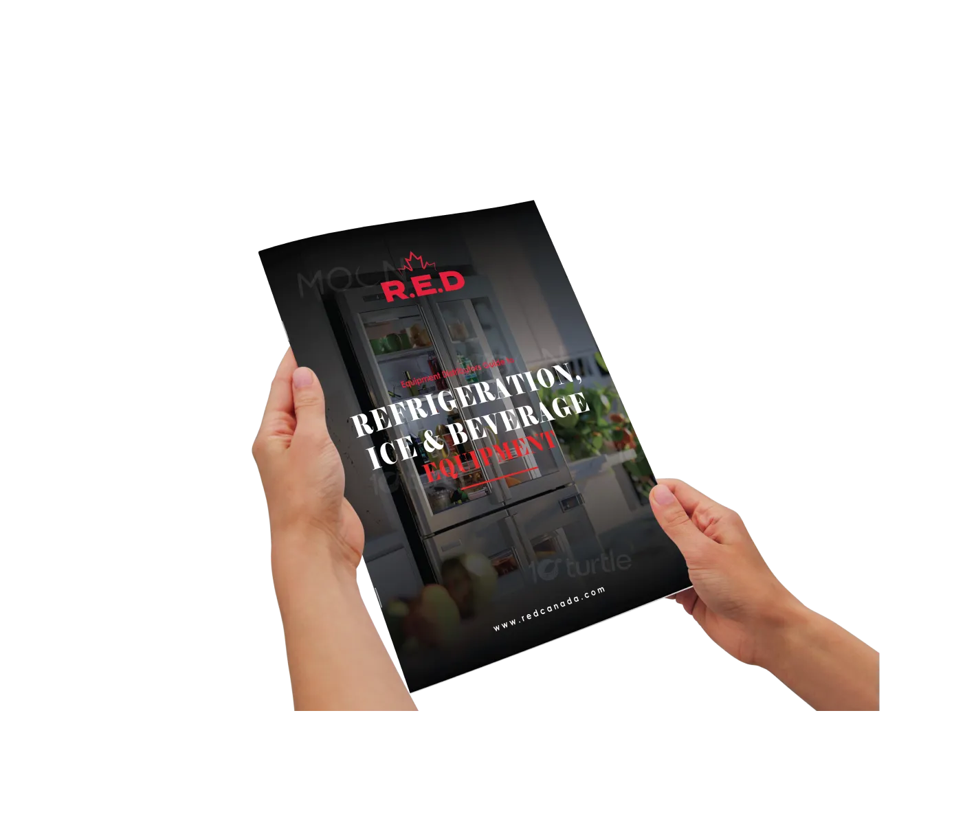
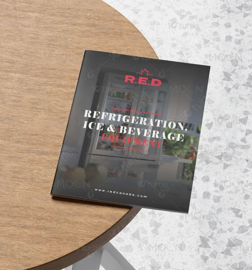
The design concept revolves around modern simplicity with a professional and clean aesthetic. The brochure uses bold typography, clear layouts, and strategically placed visuals to highlight product features. A minimalistic approach is balanced with red accents to convey energy and confidence, aligning with the brand's identity. The content is structured for easy navigation, ensuring customers can quickly find the information they need while keeping a focus on the product's strengths and technical details. This design speaks directly to a market focused on efficiency and sophistication.
Guide Design
Graphic Design

Industry
Consumer Goods & Retail
Tools we used


Project Completion
2025
Key Market
Global
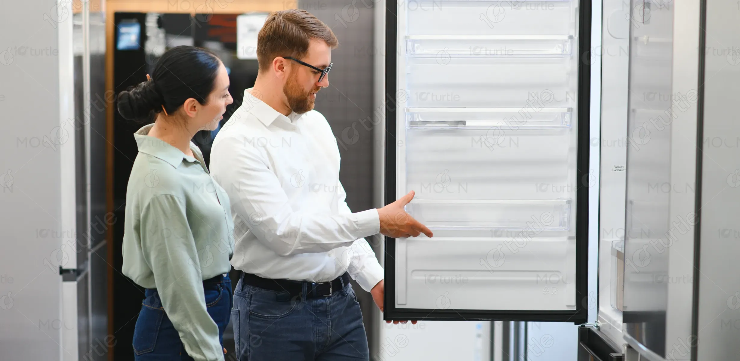
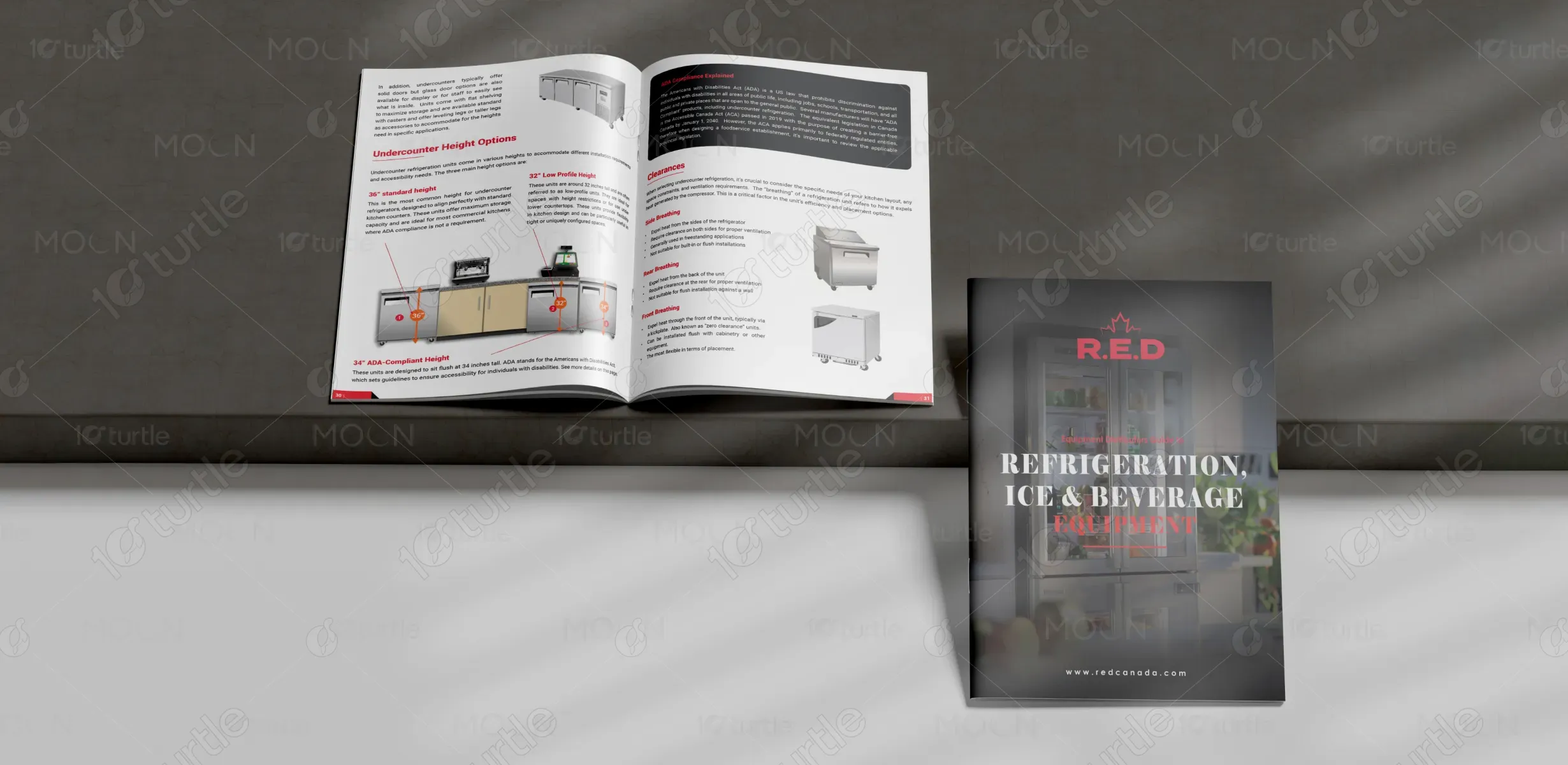
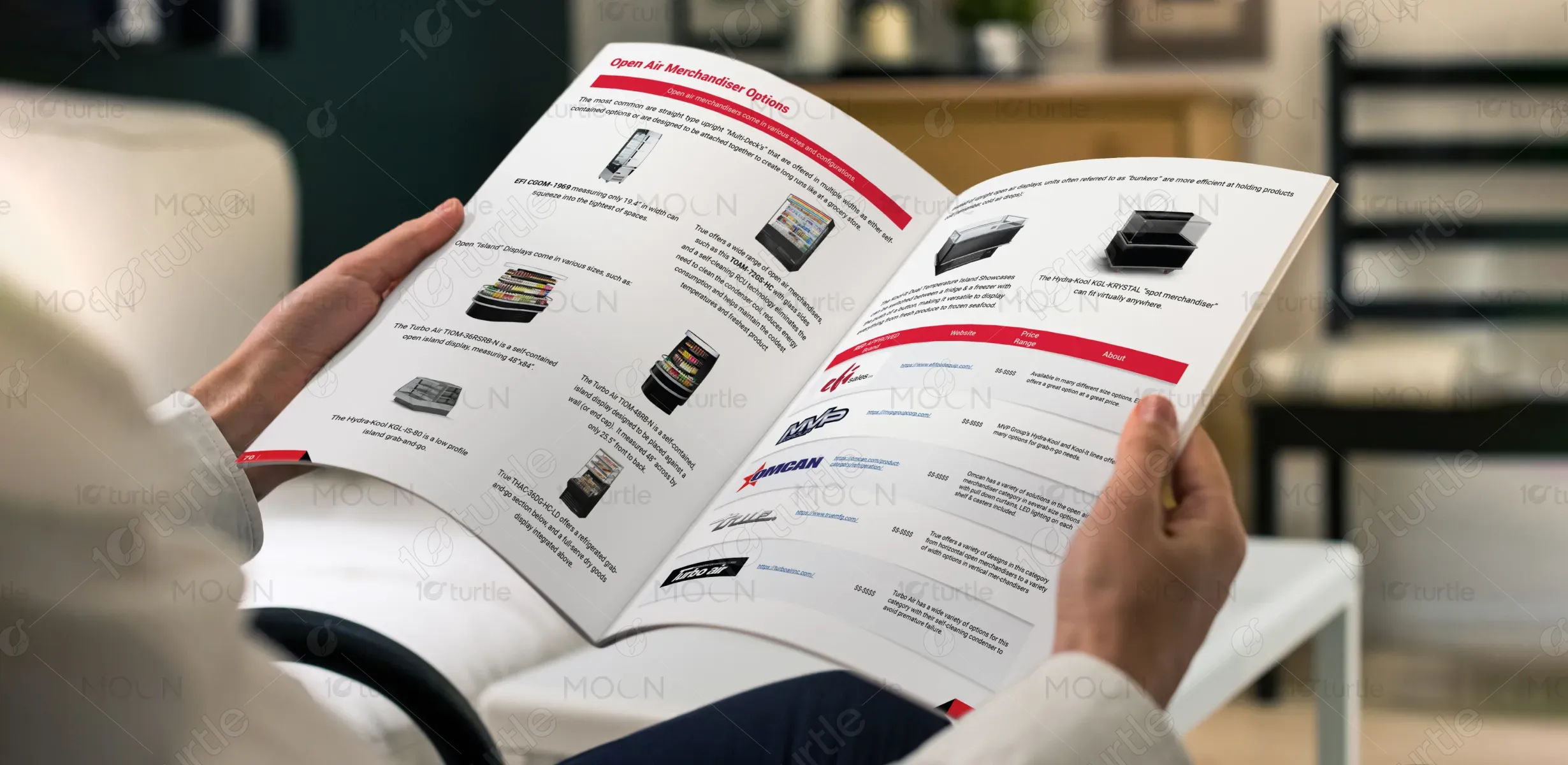
The R.E.D catalog showcases a comprehensive range of refrigeration and beverage solutions tailored for the commercial market. Offering everything from open-air merchandisers to advanced refrigeration systems, this catalog aims to provide customers with high-quality, energy-efficient equipment. Designed for both function and style, the product range ensures businesses can enhance their product displays while keeping items at optimal temperatures. The catalog stands out with its user-friendly design, catering to industries such as hospitality, retail, and foodservice, combining practicality with modern design aesthetics.

Industry
Consumer Goods & RetailWhat we did
Guide DesignGraphic DesignPlatform
-The challenge in designing this brochure was ensuring that it addressed the specific needs of diverse industries while maintaining clarity and accessibility. Many commercial refrigeration catalogs are either too technical, overwhelming the user with jargon, or overly simplistic, missing crucial details. The gap in the market lies in creating a resource that balances technical specifications with real-world application, offering a clear, concise way for businesses to evaluate their refrigeration options without feeling lost in excessive detail or confusing layouts.
This design solves the problem by presenting clear, digestible information about the products, pairing technical details with visual aids and simple language. The layout of the catalog was designed with the user in mind, featuring easy navigation, quick-reference sections, and a professional aesthetic. The product descriptions focus on highlighting key features such as energy efficiency, versatility, and cost-effectiveness, making it easier for businesses to make informed decisions. The catalog provides all the necessary information without overwhelming the reader, bridging the gap between technicality and accessibility.
The long-term vision for this design is to create a lasting brand identity for R.E.D in the refrigeration and beverage sector. As the company expands, the design will evolve to reflect emerging trends in energy-efficient technology and sustainability. The catalog is intended to be an evolving tool for customers, continually adapting to provide the most up-to-date information, maintaining a balance between being a functional resource and a marketing tool. It aims to elevate R.E.D as a leader in providing innovative solutions for businesses globally.

The color palette for this design is centered around a bold red and black combination, with accents of white and gray. Red is synonymous with energy, passion, and power, aligning with the company's innovative approach to refrigeration solutions. Black is used for sophistication and professionalism, while white offers balance and clarity, making the content easy to read. This combination not only reinforces the brand's identity but also evokes trust, urgency, and reliability, which are key emotions when investing in commercial refrigeration equipment.