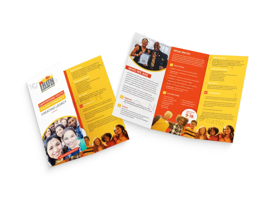
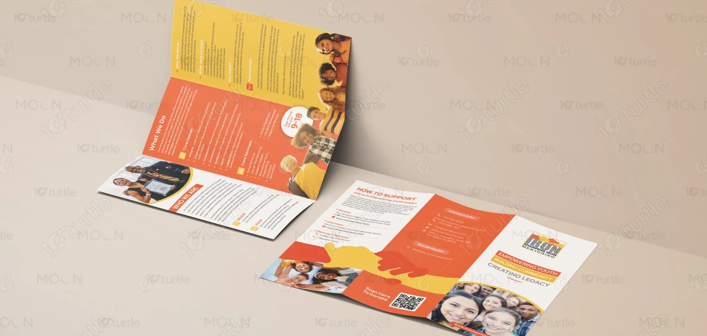
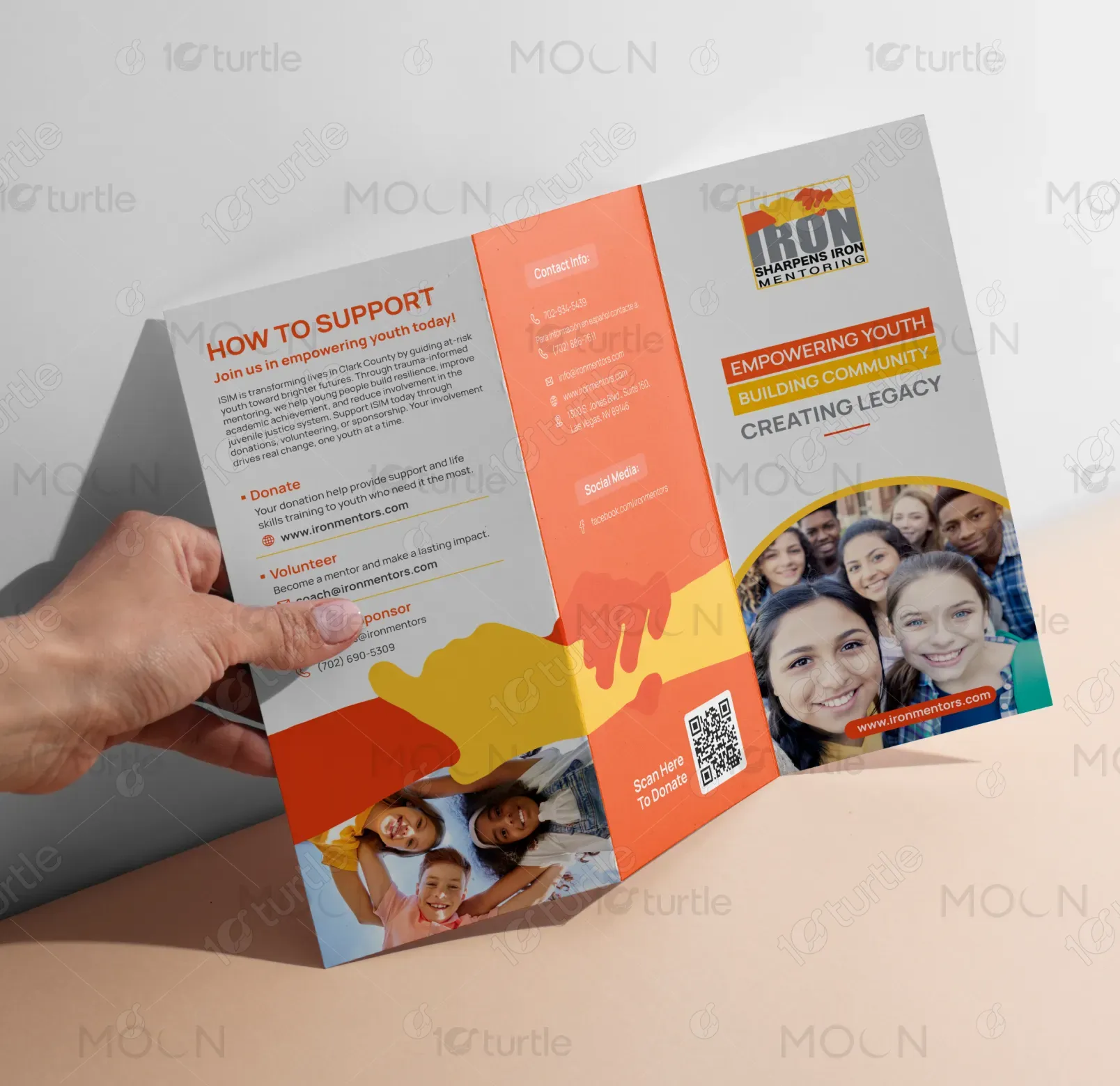
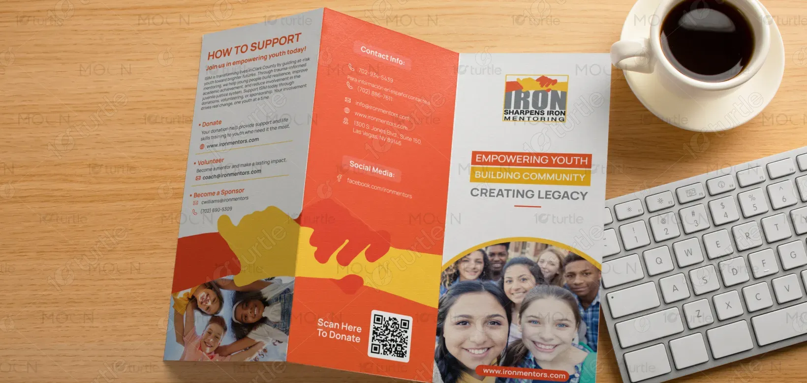
The design is centered around the idea of human connection and mentorship, visually represented through the interaction of two hands. A structured trifold layout ensures clear information flow, guiding the reader seamlessly across sections. Clean typography using Manrope enhances readability while maintaining a modern and approachable tone. The use of warm, expressive colors combined with minimal visual clutter creates a balance between emotional storytelling and informational clarity, making the design both engaging and functional.
Trifold Design
Graphic Design
Industry
Civic, Government & Nonprofits
Tools we used


Project Completion
2025
Key Market
Global
This trifold brochure is designed for Sharpens Iron Mentoring, a youth-focused mentoring organization. The primary purpose of the design is to communicate program offerings, values, and impact in a concise and accessible format. It serves as an outreach tool aimed at parents, mentors, and community members, helping them understand the organization’s mission and encouraging participation. The design bridges information and emotion, making the message both clear and relatable.

Industry
Civic, Government & NonprofitsWhat we did
Trifold DesignGraphic DesignPlatform
-Many nonprofit and mentoring organizations face challenges in communicating their value clearly and engagingly. Information is often either too dense or too vague, leading to reduced audience engagement and understanding. Additionally, a lack of strong visual identity can make it difficult to build trust and stand out within the community. This results in missed opportunities to connect with potential participants, supporters, and stakeholders.
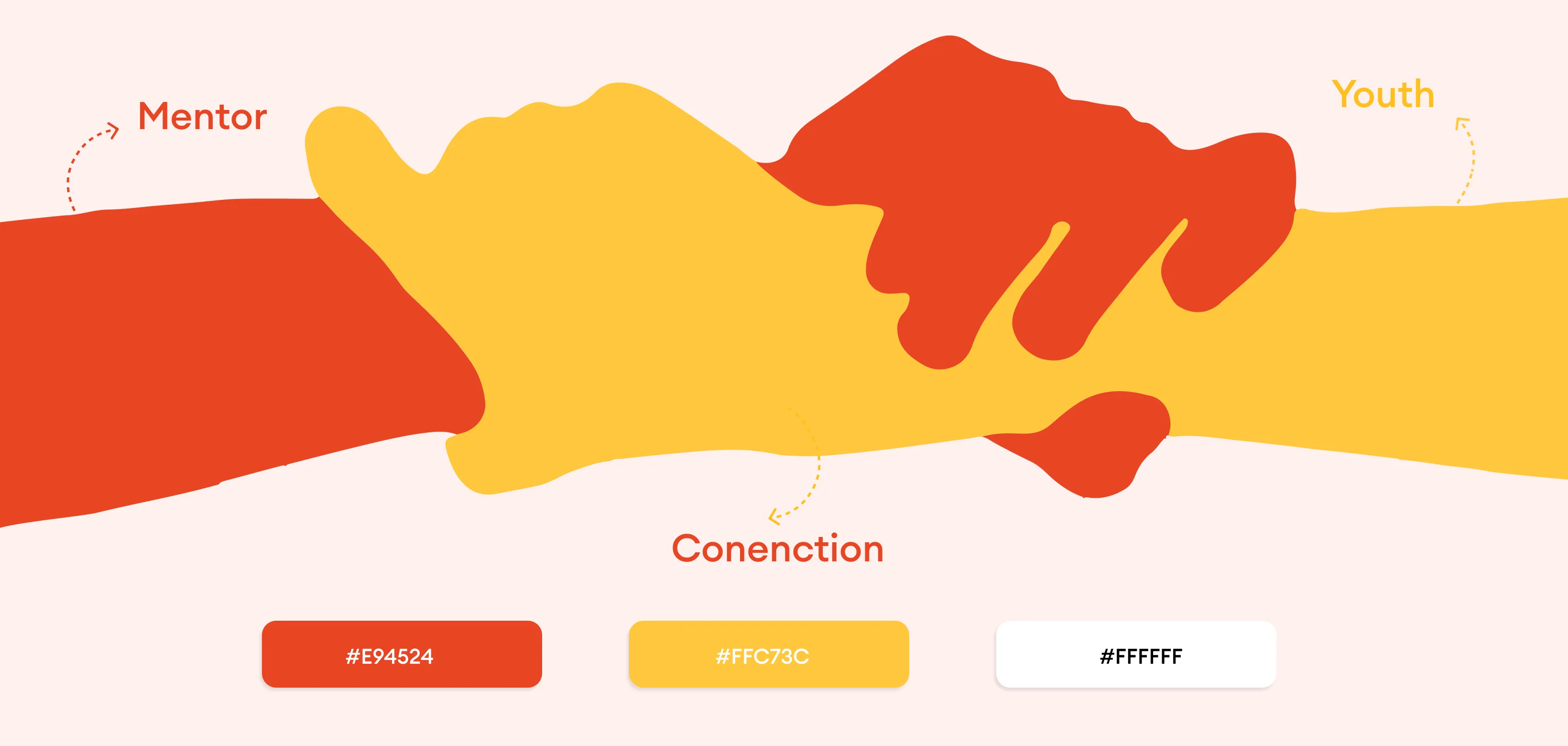
The design addresses these challenges through a user-focused and structured approach. Content is organized into clearly defined sections, allowing readers to quickly navigate key information. Visual hierarchy is established using typography, spacing, and color to highlight important messages. The use of symbolic imagery—particularly the concept of connected hands—reinforces the theme of mentorship and trust. Consistent visual language and simplified content presentation ensure accessibility while maintaining a strong emotional connection with the audience.
This trifold design effectively balances storytelling with clear, structured information, making it an ideal tool for driving engagement and generating leads. The warm colors, clear typography, and human-centered visuals connect emotionally with the audience, leading to a higher response rate and increased inquiries. To further improve these metrics, optimizing distribution channels and adding a stronger call-to-action could increase footfall even more.
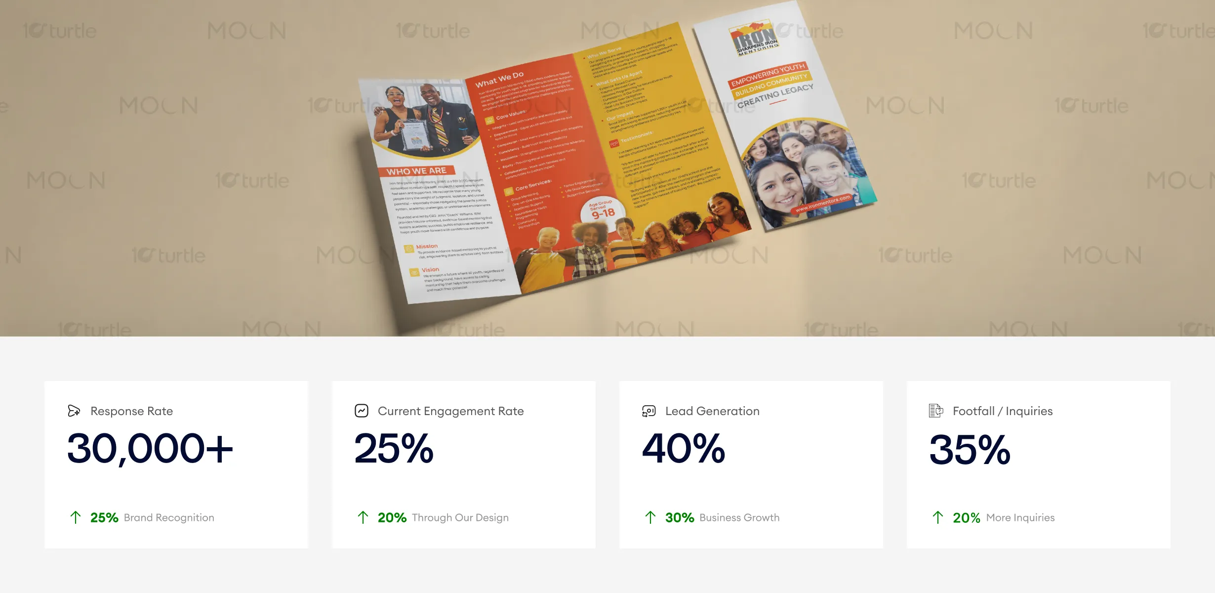
The design supports a long-term vision of building a recognizable and trustworthy brand identity. It establishes a visual system that can be extended across future materials, including digital platforms, print campaigns, and community outreach initiatives. By combining clarity with emotional resonance, the design positions the organization as approachable, impactful, and community-driven, enabling it to grow its reach and strengthen relationships over time.
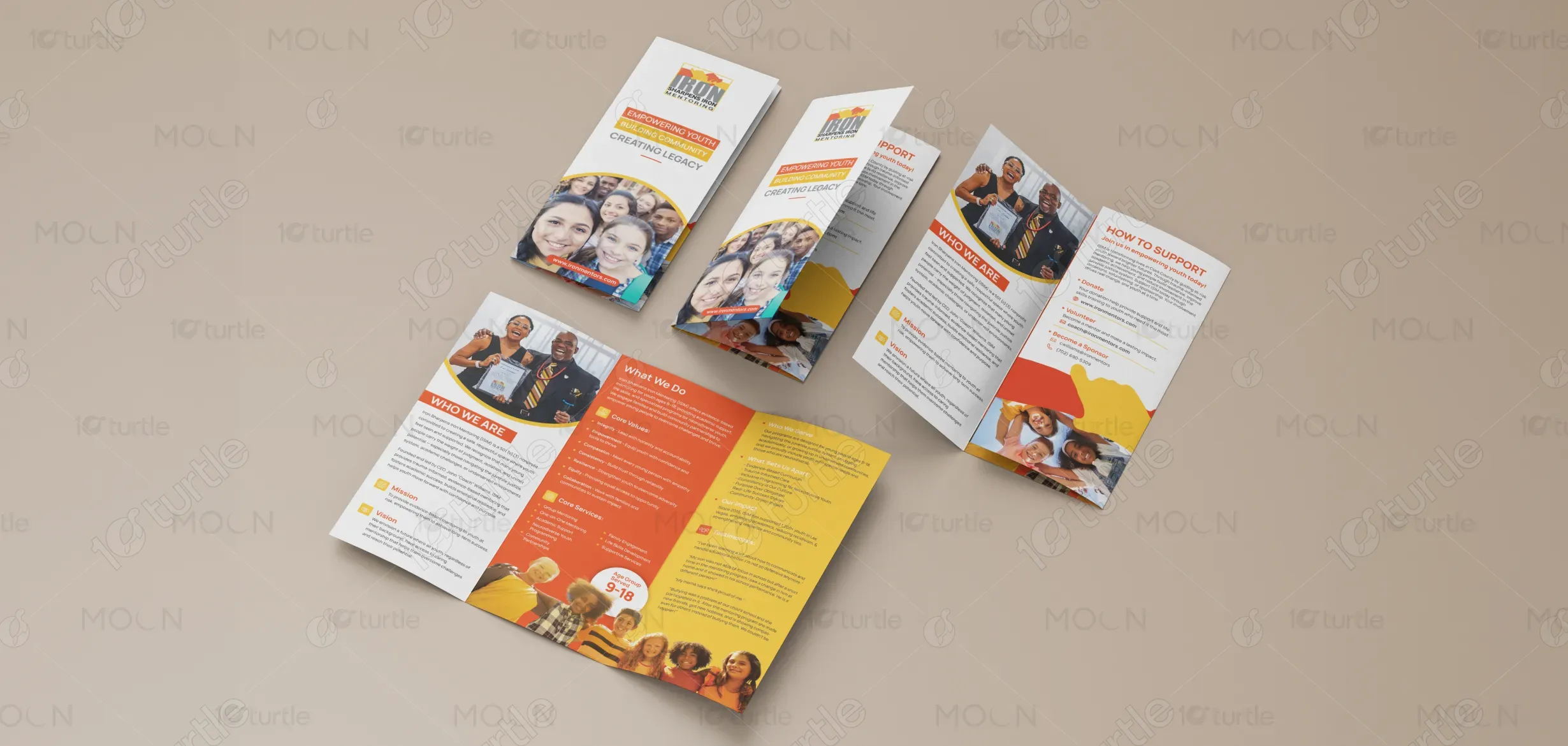
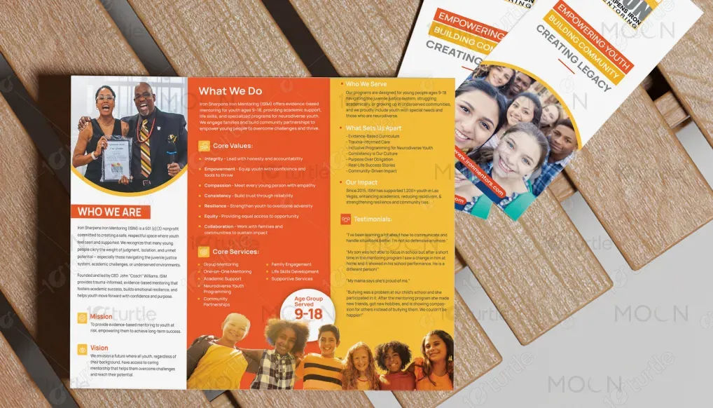
The color palette is inspired by the concept of human interaction and connection, derived from the overlapping forms of two hands. Warm tones such as red and yellow represent guidance, energy, and growth, while their intersection creates a blended hue symbolizing collaboration and transformation. Neutral tones provide balance and ensure readability across different formats. This visual language reinforces the emotional core of mentorship while maintaining clarity and consistency, making the design adaptable across both print and digital environments.