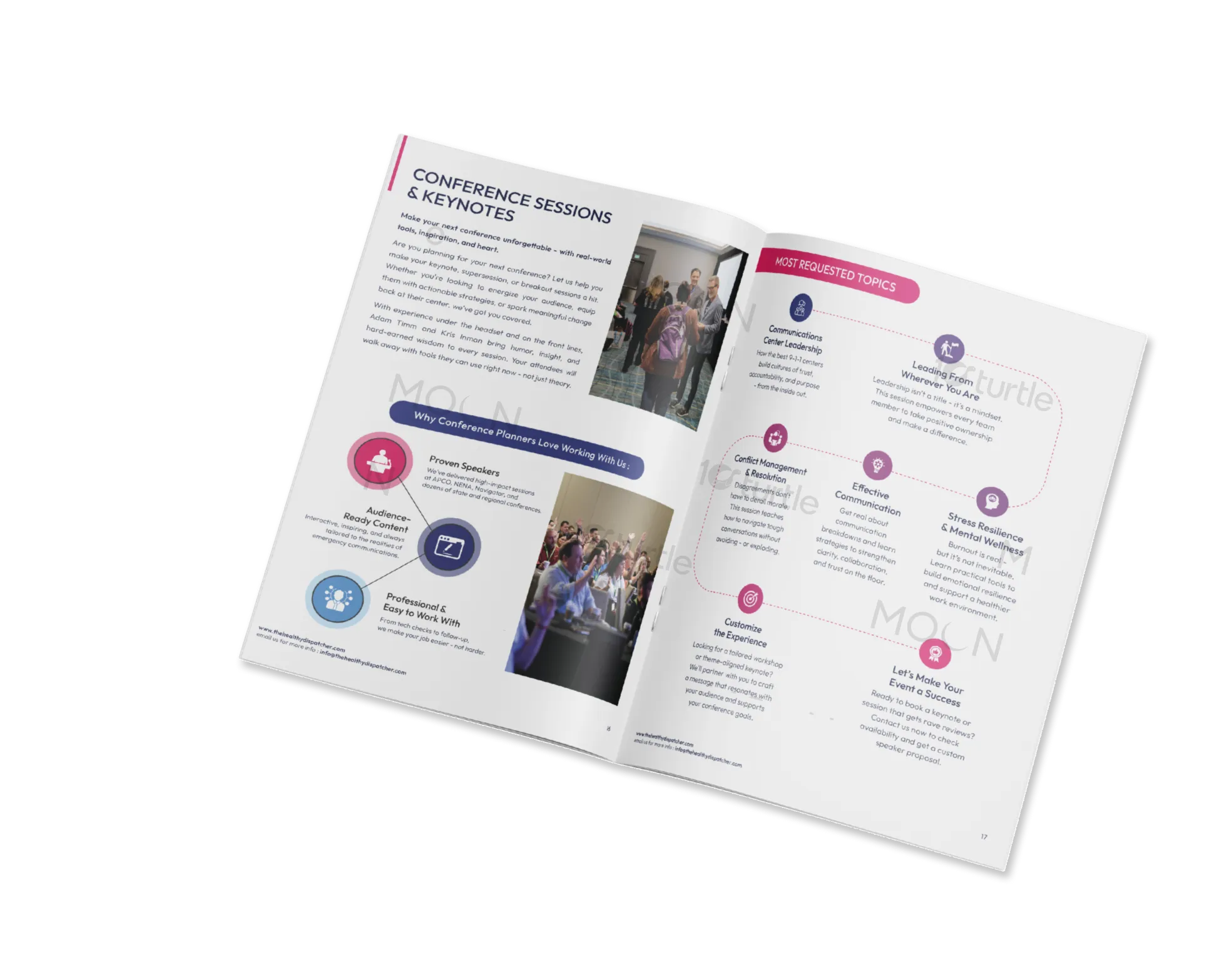
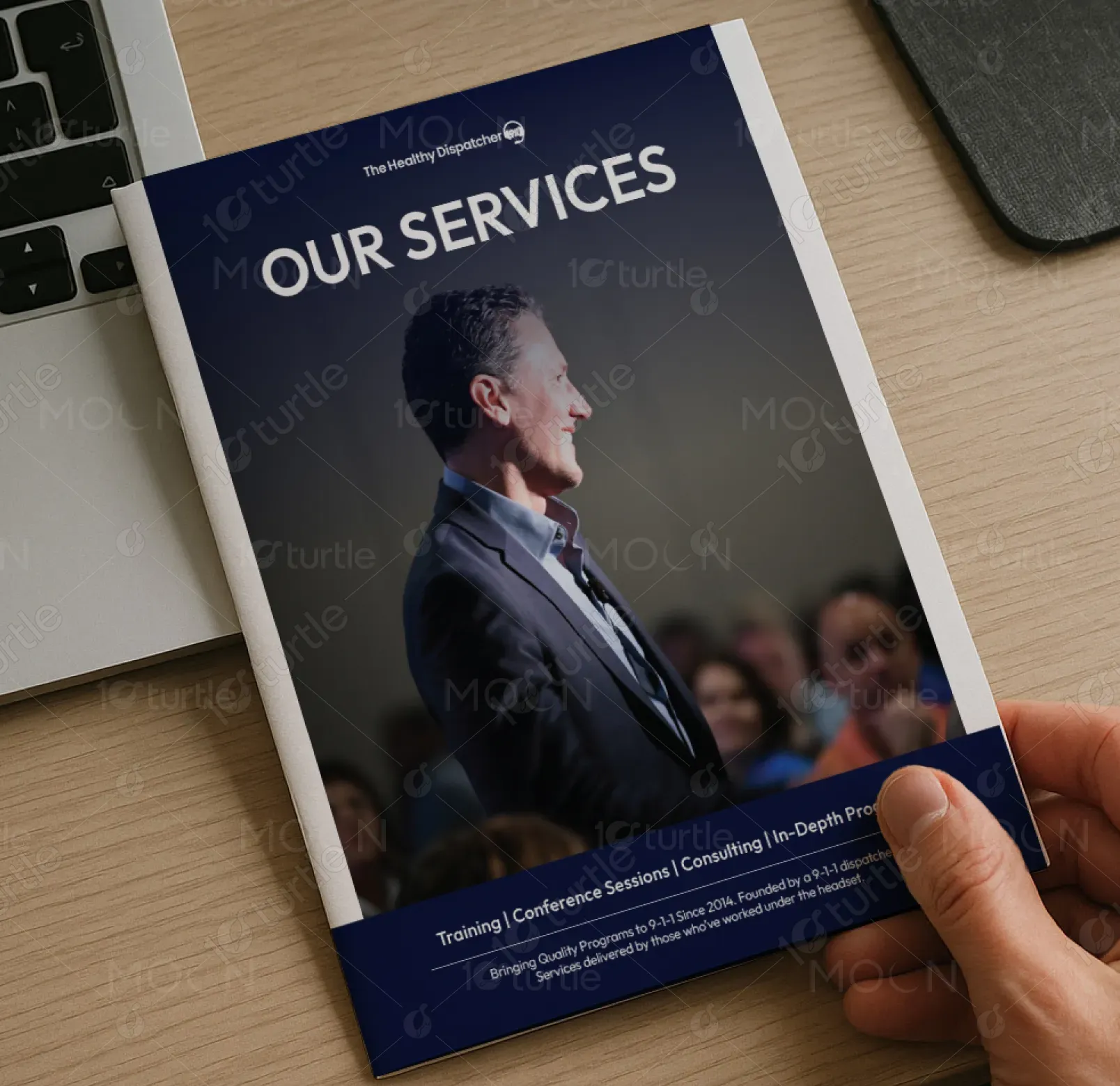
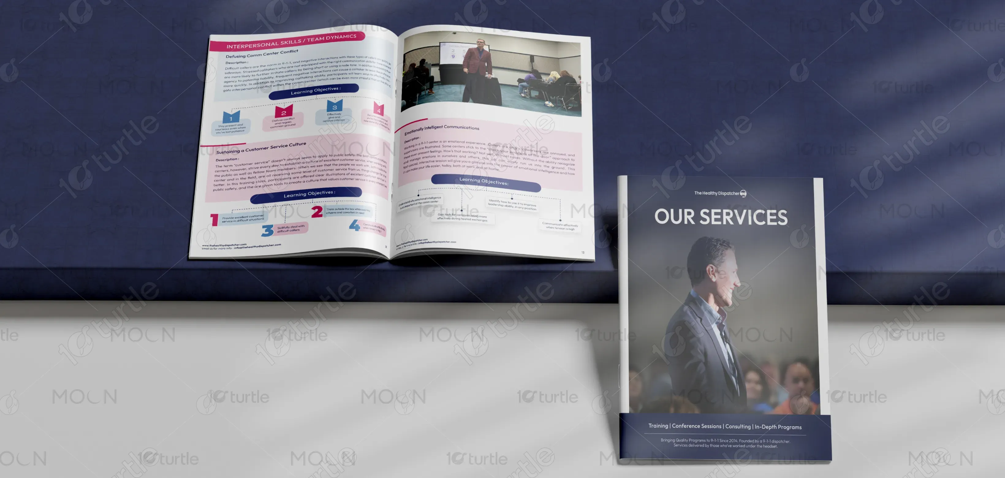
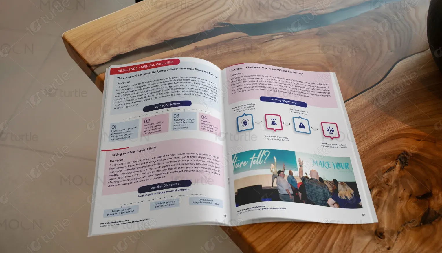
The brochure design embraces a modern, professional, and approachable aesthetic tailored for the public safety and emergency services industry. Bold imagery of real training sessions and conferences instills trust and credibility, while the structured layout emphasizes clarity and engagement. The design uses clean typography, highlighted sections, and iconography to simplify complex content, making it easily digestible. A blend of dark blue tones conveys authority and reliability, while vibrant accent colors bring energy, reinforcing the brand’s commitment to leadership, teamwork, and growth.
Brochure Design
Graphic Design

Industry
Civic, Government & Nonprofits
Tools we used


Project Completion
2025
Key Market
Global
This brochure presents The Healthy Dispatcher’s services, offering specialized training, consulting, and leadership programs for 9-1-1 professionals. It highlights practical solutions for improving communication, morale, and teamwork in emergency call centers. The brochure’s purpose is to position the brand as a trusted partner for dispatch centers seeking sustainable performance improvements. Its unique selling point lies in being created by former dispatchers who deeply understand the challenges of the role, offering authentic, experience-driven programs that blend leadership principles with industry-specific expertise.
Industry
Civic, Government & NonprofitsWhat we did
Brochure DesignGraphic DesignPlatform
-Emergency communication centers often struggle with high-stress environments, burnout, and leadership gaps that hinder long-term success. Traditional training materials are either too generic or overly technical, failing to address the human side of leadership and communication. This disconnect leaves dispatchers underprepared for real challenges, impacting morale, efficiency, and overall culture. Many centers lack access to tailored, relatable programs designed specifically for 9-1-1 professionals, leading to inconsistent performance and difficulty retaining skilled team members.
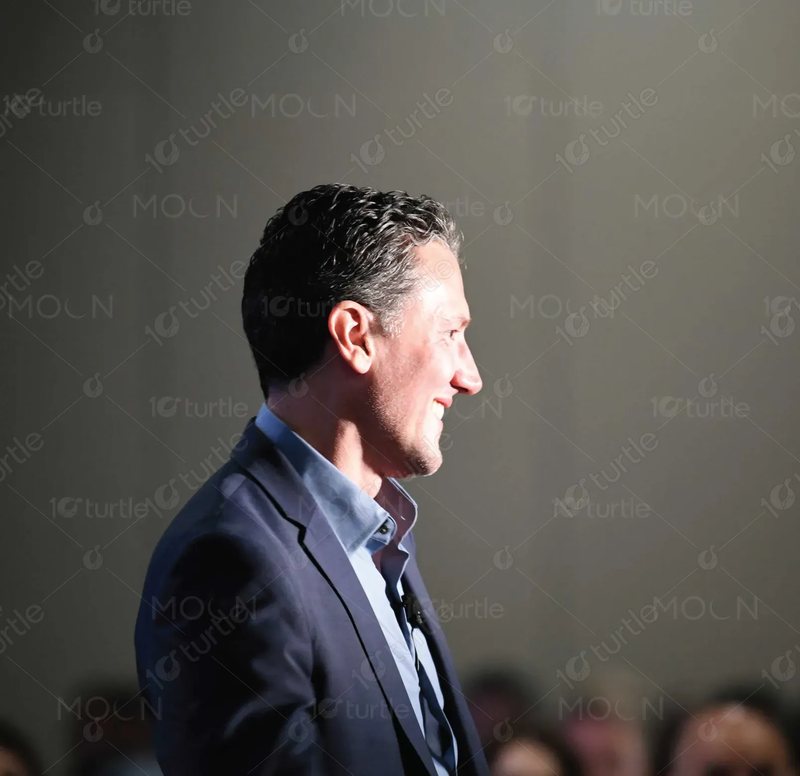
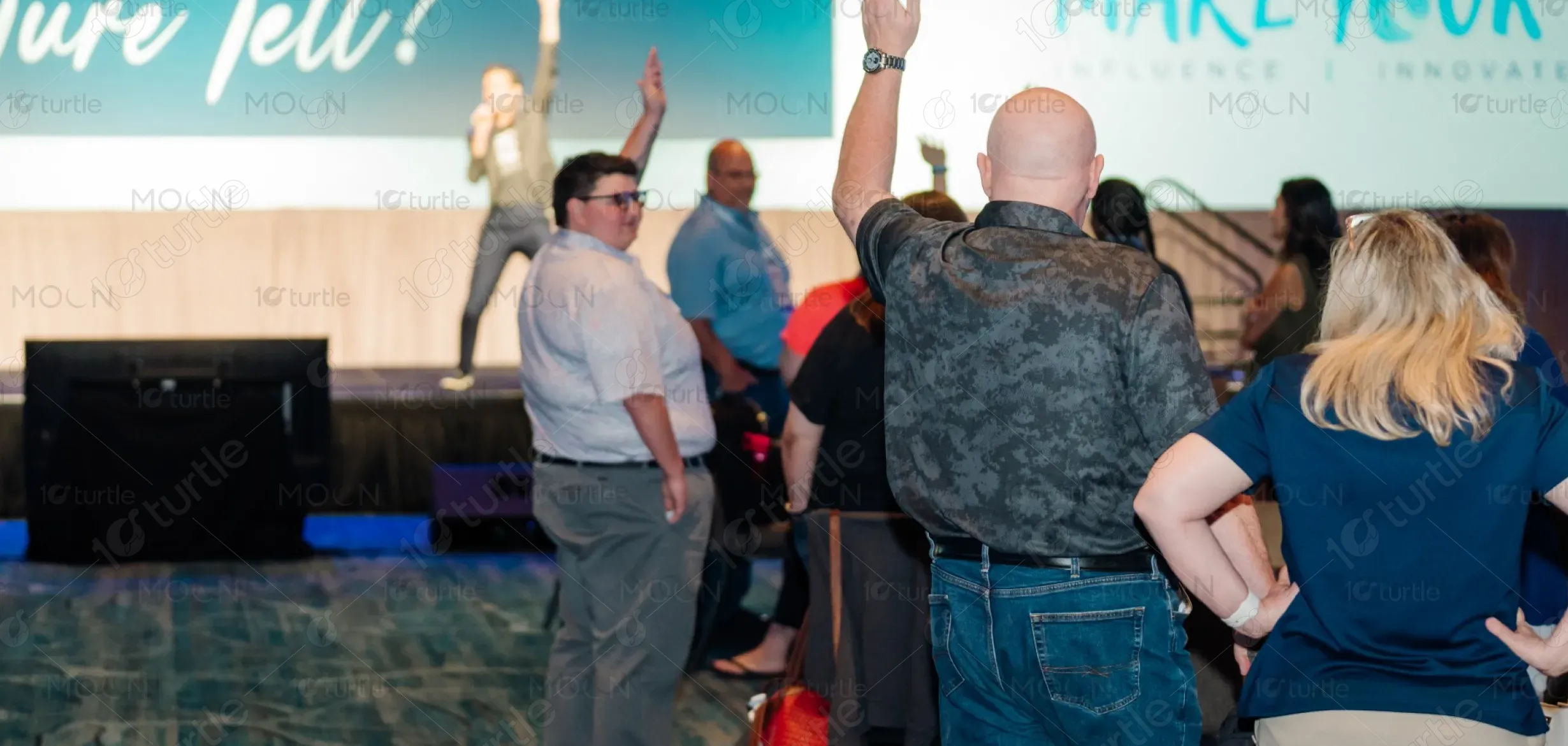
The Healthy Dispatcher’s design addresses this gap by providing highly focused, people-driven leadership and training programs. Through engaging workshops, clear communication tools, and practical strategies, the brochure itself models the clarity and focus participants can expect. With visuals of real trainers and sessions, it builds authenticity and trust. The structured design simplifies complex ideas into digestible learning objectives, ensuring centers can easily see the benefits. The programs empower leaders to build morale, foster teamwork, and create a sustainable culture of excellence.
The long-term vision of The Healthy Dispatcher is to redefine training and leadership development within the public safety industry. By prioritizing people-first leadership, the brand aims to reduce turnover, elevate morale, and create healthier, more resilient communication centers. Its aspiration is to be the leading provider of specialized training for 9-1-1 professionals across the nation, fostering a culture where dispatchers feel valued, supported, and equipped to excel. Ultimately, it seeks to make every center a model of teamwork and effective leadership.

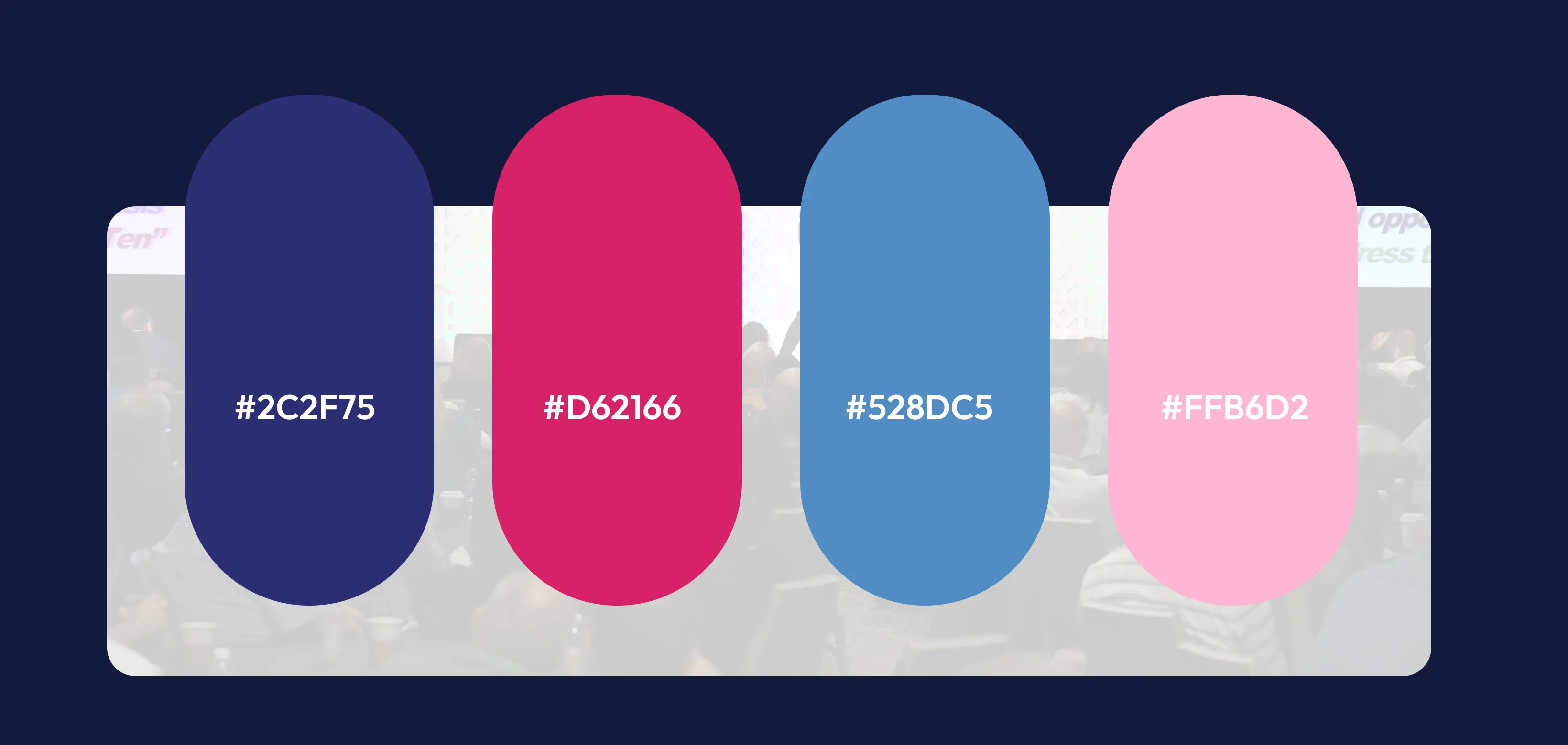
Navy Blue – Symbolizes trust, professionalism, and authority, aligning with the seriousness of emergency services. Magenta/Deep Pink Accents – Represents energy, empowerment, and leadership, making key highlights stand out. Light Gray & White – Provide clarity, neutrality, and readability, ensuring a clean, approachable design. Sky Blue Elements – Evoke calmness, reliability, and open communication, reinforcing the supportive nature of the brand.