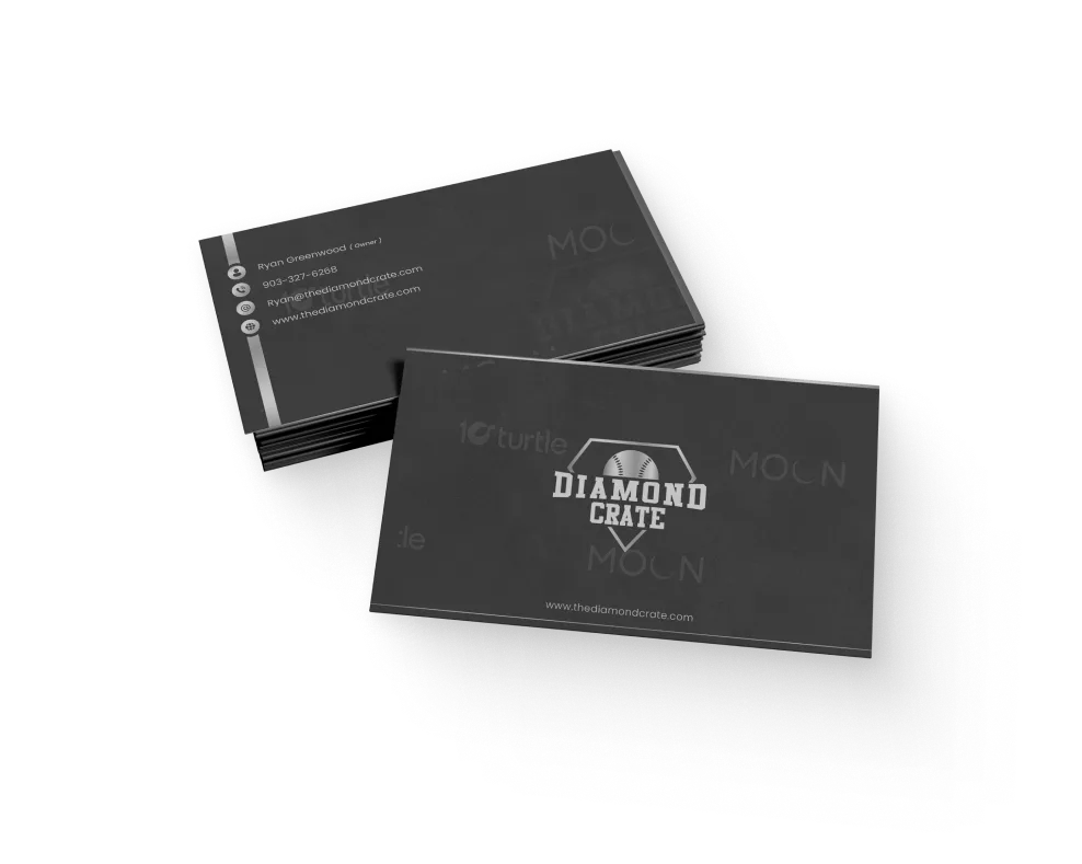
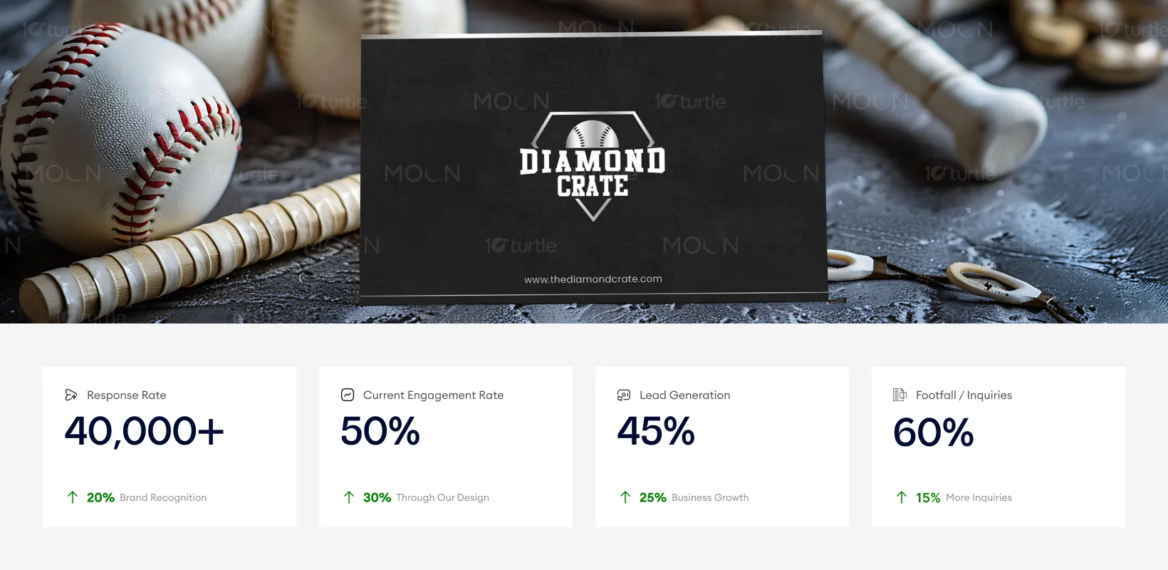
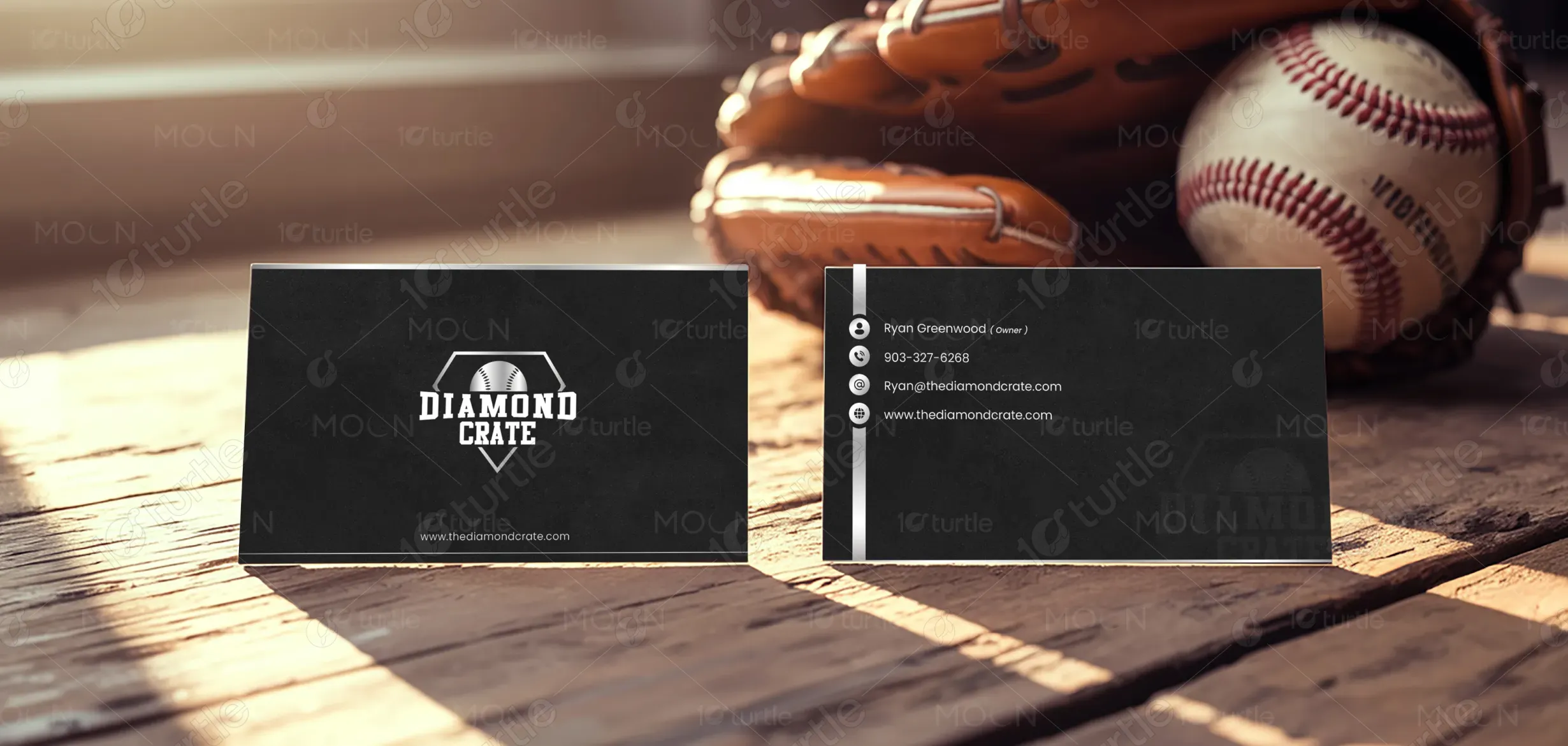
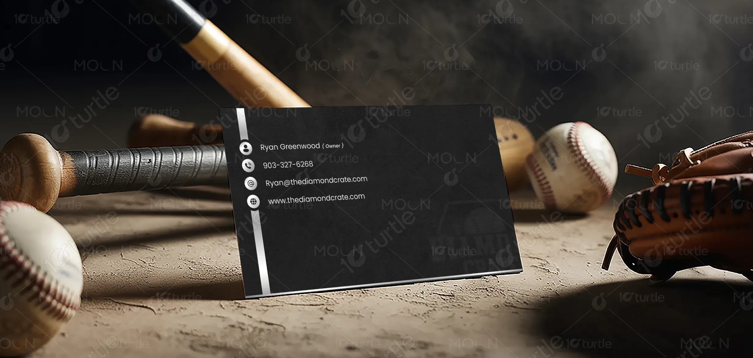
The design follows a minimal, bold, and performance-driven approach inspired by the raw energy of baseball culture. A matte black base establishes a strong and premium foundation, while clean white typography ensures high contrast and effortless readability. The front side focuses on brand recall with a centered logo that commands attention, while the back side introduces a structured and vertically aligned information layout for quick scanning. Subtle line elements add rhythm and visual direction without creating clutter, maintaining a balance between sports aesthetics and modern professionalism. The overall hierarchy guides the viewer naturally from brand identity to contact details, making the design both visually impactful and highly functional.
Business Card Design
Graphic Design
Industry
Consumer Goods & Retail
Tools we used


Project Completion
2025
Key Market
Global
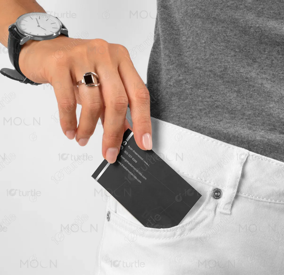
This business card represents Diamond Crate, a brand rooted in baseball culture and performance-driven identity. It serves as a physical extension of the brand, designed to leave a strong and lasting impression across both casual and professional interactions. The card communicates clarity, credibility, and niche relevance, positioning the brand confidently within the sports and lifestyle space. Beyond its functional role of sharing contact details, it acts as a tangible brand asset that reinforces quality, precision, and authenticity.

Industry
Consumer Goods & RetailWhat we did
Business Card DesignGraphic DesignPlatform
-In the sports and lifestyle industry, many business cards lack distinct identity and memorability, often resulting in poor brand recall. Overcrowded layouts reduce readability, while generic visual styles fail to reflect the brand’s personality or connect with its target audience. This disconnect leads to weak differentiation in a competitive market, ultimately affecting engagement and limiting the effectiveness of a simple yet important brand touchpoint.
The design addresses these challenges through a focused and intentional execution that prioritizes clarity and impact. A minimal layout removes unnecessary distractions, allowing the brand identity to stand out immediately. A strong visual hierarchy ensures that the most important elements—logo and contact details—are easily understood at a glance. The high-contrast color palette enhances visibility across different lighting conditions, while the sport-inspired aesthetic aligns directly with the brand’s niche. Carefully balanced white space improves readability and contributes to a refined, premium feel, ensuring the card remains both practical and memorable.

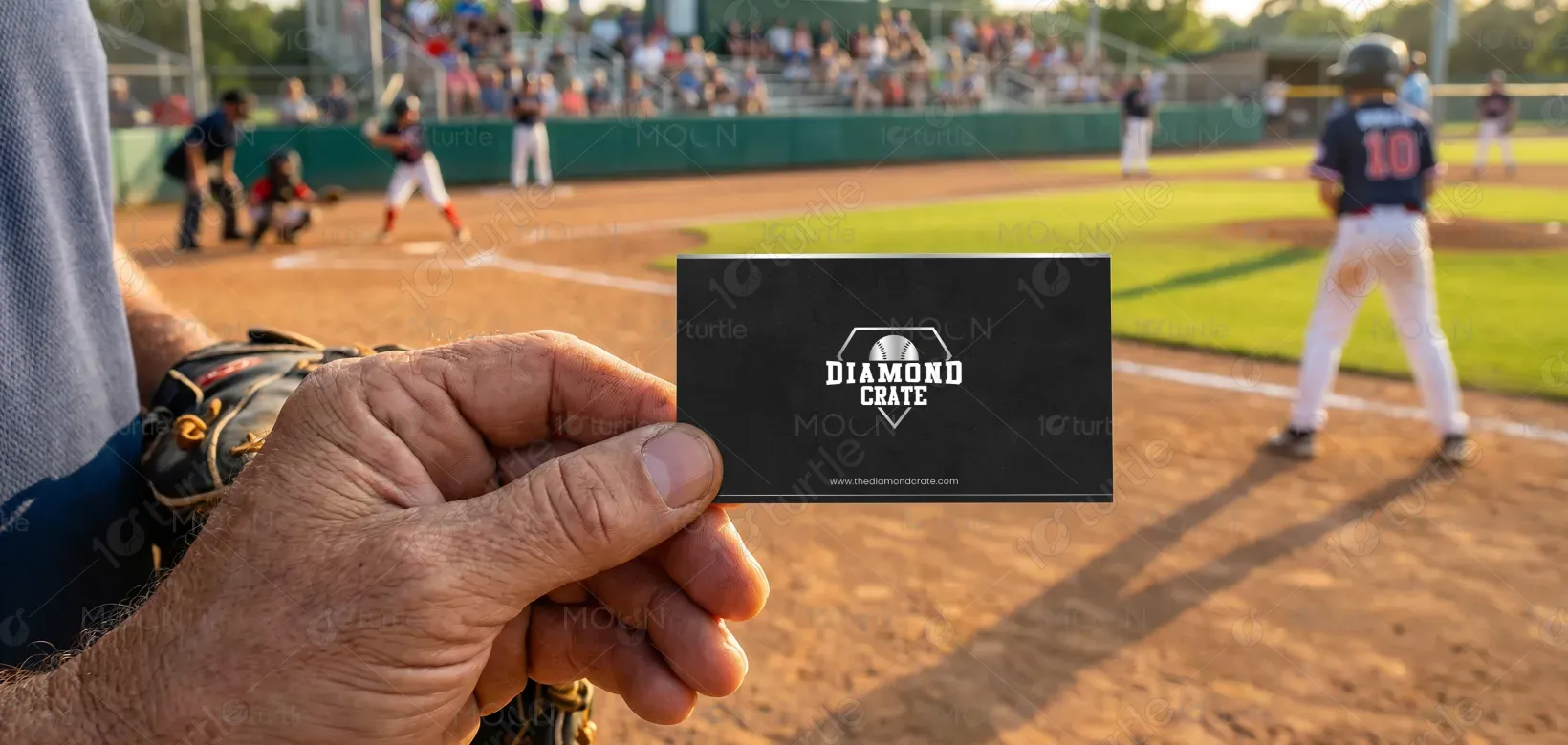
The design's bold, minimal approach is highly effective in capturing attention and driving brand recall. The clarity and structured layout directly contribute to an increase in lead generation and conversions, as the high contrast between the logo and the background ensures immediate visibility. The use of sports culture aesthetics helps connect emotionally with the target market, which in turn improves footfall and inquiries.
The design supports a long-term vision of establishing Diamond Crate as a recognizable and trusted name within the baseball and sports lifestyle space. It is created with scalability in mind, allowing the visual identity to extend seamlessly across future touch points such as packaging, merchandise, and digital platforms. The goal is to build a brand presence that feels authentic, confident, and deeply connected to its audience, fostering long-term recognition and emotional connection.

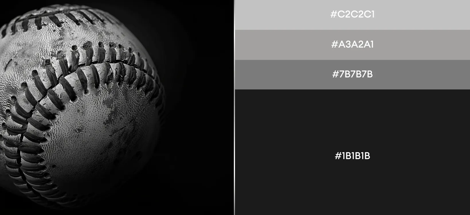
The color palette is intentionally minimal, using black and white to create a timeless and powerful visual identity. The matte black conveys strength, authority, and a premium feel, while crisp white typography ensures clarity and precision. Supporting visual elements such as thin divider lines and subtle iconography add structure without overwhelming the design. This restrained visual language reflects a balance between the grit of sports culture and modern minimalism, ensuring consistency, adaptability, and strong brand recognition across different mediums.