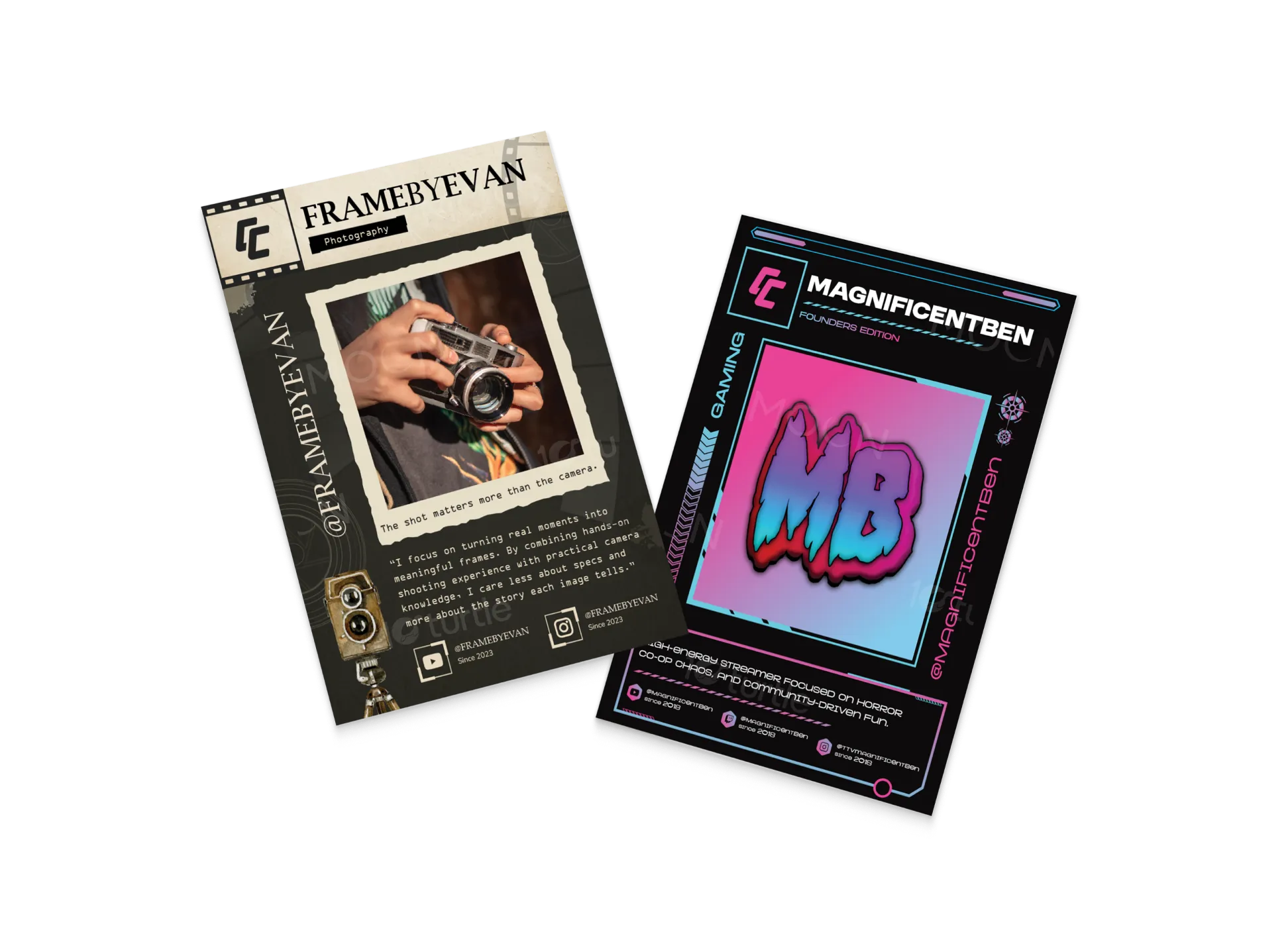
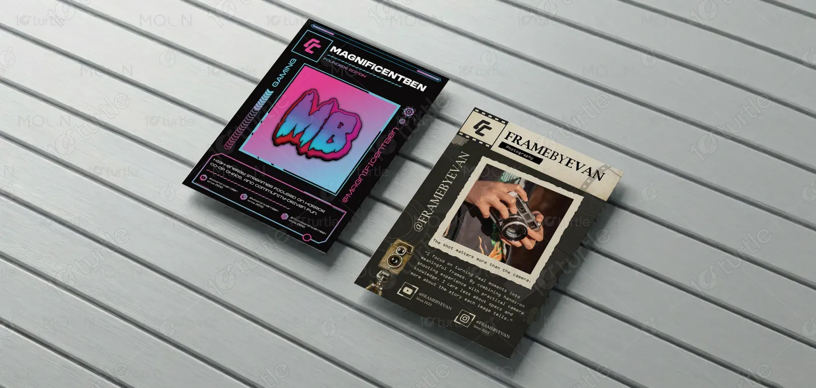
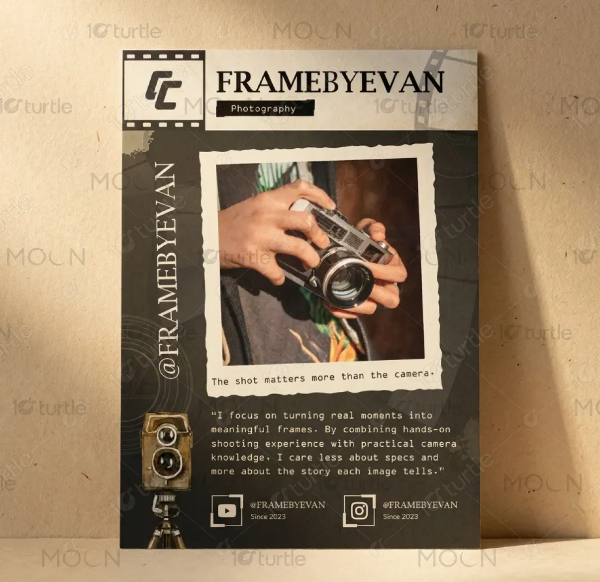
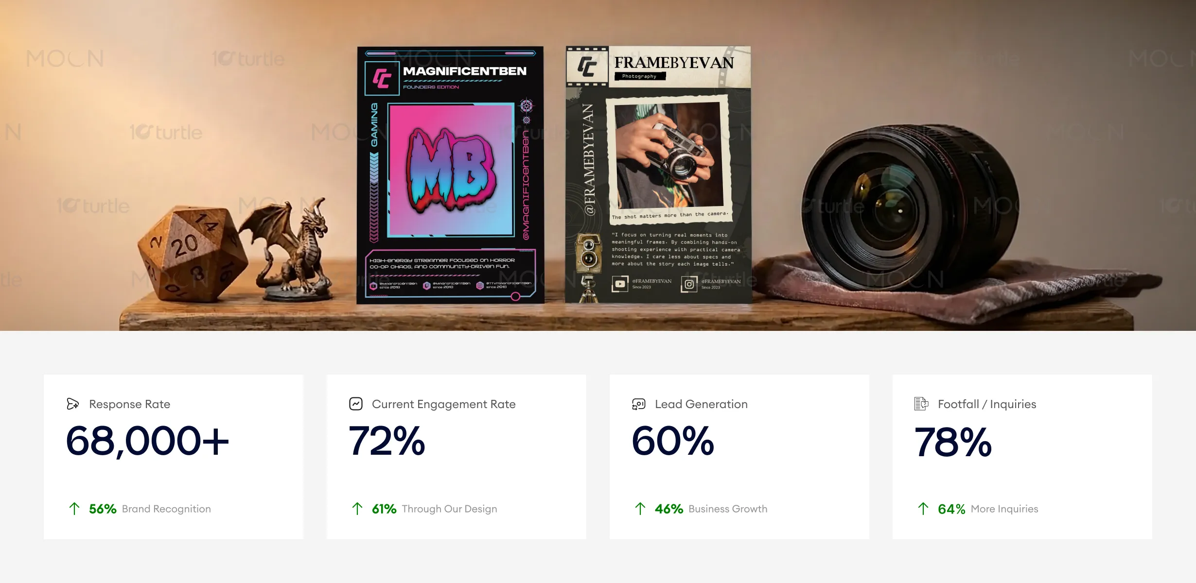
The design system is built on a structured yet adaptive framework, enabling each card to reflect a creator’s unique identity while maintaining a cohesive product language. The gaming card leverages high-contrast neon gradients, UI-inspired detailing, and assertive typography to mirror the intensity and immediacy of streaming culture. In contrast, the photography card adopts a restrained, editorial approach, incorporating film textures, muted tones, and image-led composition to emphasize narrative depth. Across both executions, the system establishes a clear hierarchy—anchoring attention through a dominant focal element, supported by structured metadata and controlled visual rhythm—ensuring clarity without compromising expressiveness.
Card Design
Graphic Design
Industry
Arts, Culture & Entertainment
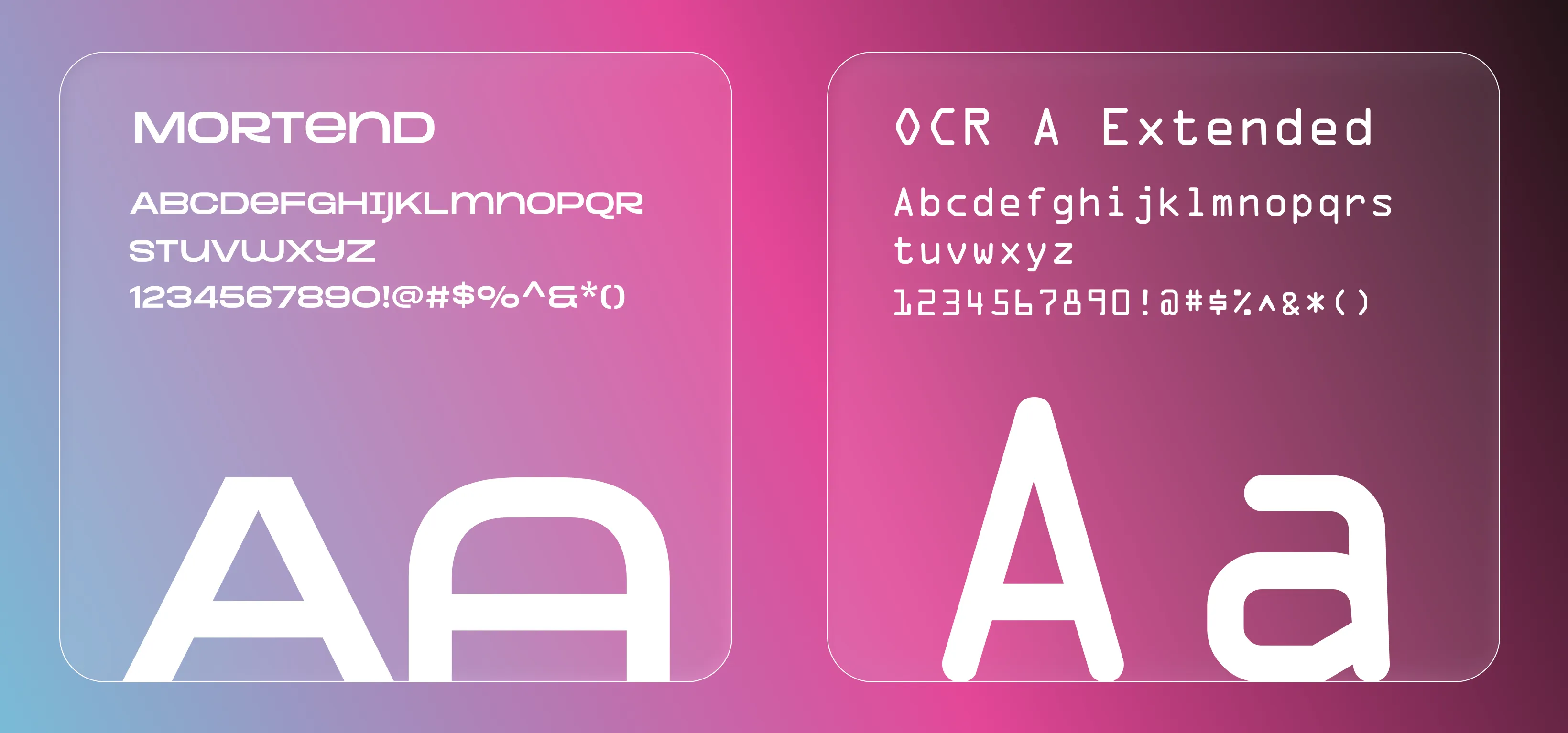
Tools we used


Project Completion
2026
Key Market
Global
Creator Cards reframe the traditional trading card format into a contemporary identity medium for digital creators. Each card operates as both a collectible artifact and a branding surface, encapsulating a creator’s persona, content niche, and platform presence. The system moves beyond conventional TCG constraints by prioritizing storytelling, recognizability, and adaptability across both physical and digital environments. As such, the product sits at the intersection of collectible culture, creator branding, and digital media ecosystems.

Industry
Arts, Culture & EntertainmentWhat we did
Card DesignGraphic DesignPlatform
-Within the creator economy, visual representation is often fragmented and inconsistent, relying on generic templates that fail to establish distinct identity or memorability. Existing formats—such as profile banners or social cards—lack hierarchy, emotional engagement, and scalability. Simultaneously, traditional trading card systems are inherently rigid, designed for static character archetypes rather than evolving personal brands. This disconnect results in a lack of standardized yet expressive formats capable of supporting both individuality and system-wide cohesion.
The solution introduces a modular design architecture that balances consistency with creative flexibility. Core structural elements—such as identity placement, metadata zones, and category labeling—remain fixed to ensure scalability and recognition. Within this framework, visual expression is driven by category-specific art direction, allowing each card to authentically represent its content niche. A deliberate information hierarchy guides user attention from identity to visual narrative, followed by contextual data. This approach ensures clarity, reduces cognitive load, and enables efficient expansion across multiple creators and future applications, including packaging and digital interfaces.

The design system balances individuality with consistency, allowing each creator profile to stand out while maintaining a unified structure. Clear hierarchy, bold focal elements, and tailored visual styles improve scanability and user interaction, leading to stronger engagement and higher click-through rates. These improvements directly influence conversion actions and brand recall in real-world digital environments.
The long-term vision is to establish Creator Cards as a definitive collectible system within the creator economy, capable of scaling across a diverse and growing network of creators. The design language is intentionally future-facing, allowing seamless extension into packaging systems, digital platforms, and interactive formats. Over time, the framework supports the introduction of tiered editions, rarity systems, and motion-based adaptations, positioning the product as more than a static asset—evolving into a dynamic, multi-platform brand ecosystem.
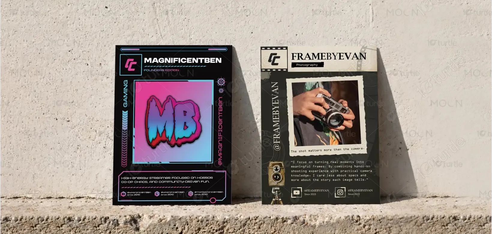
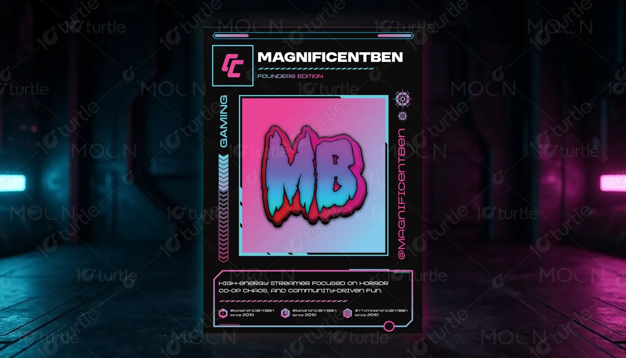
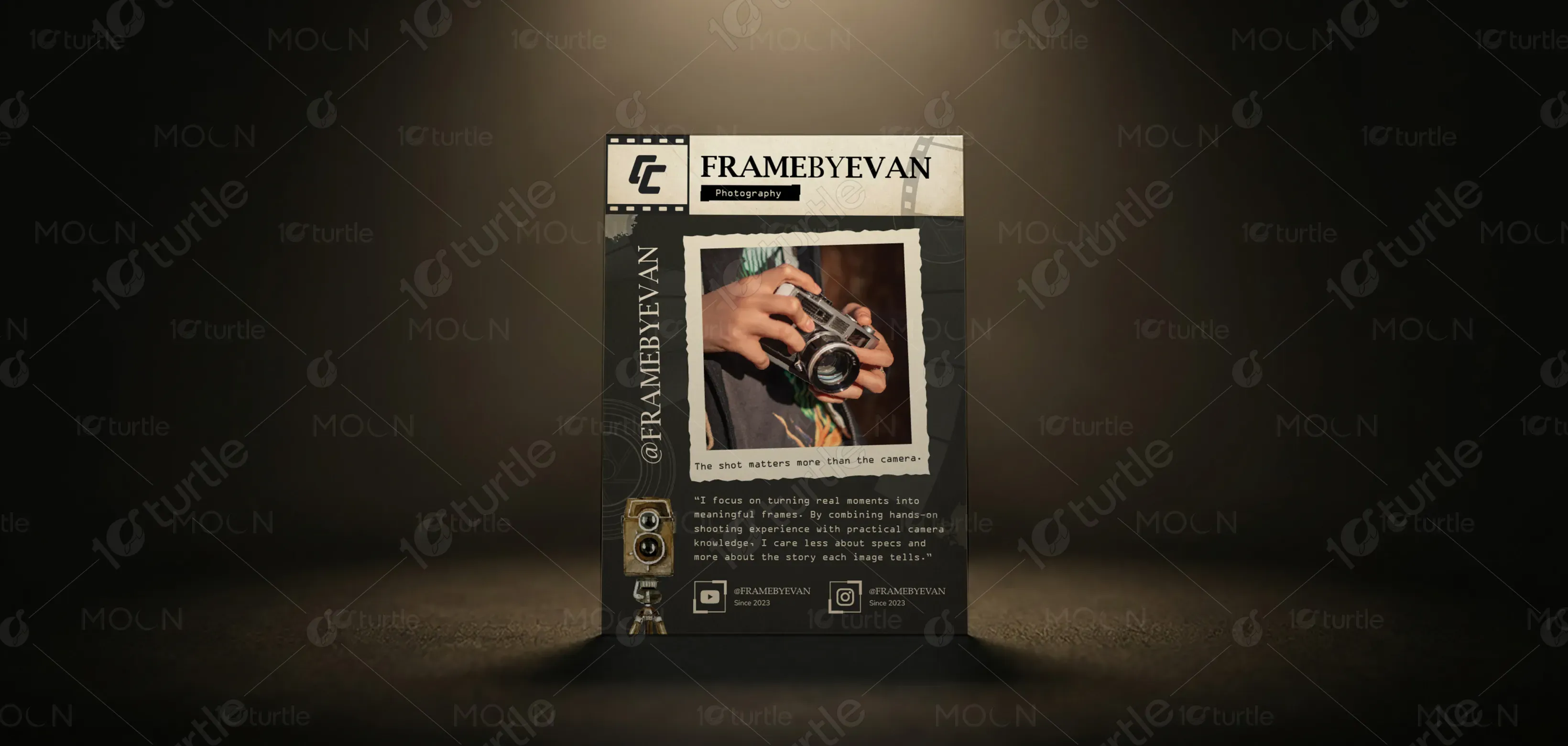
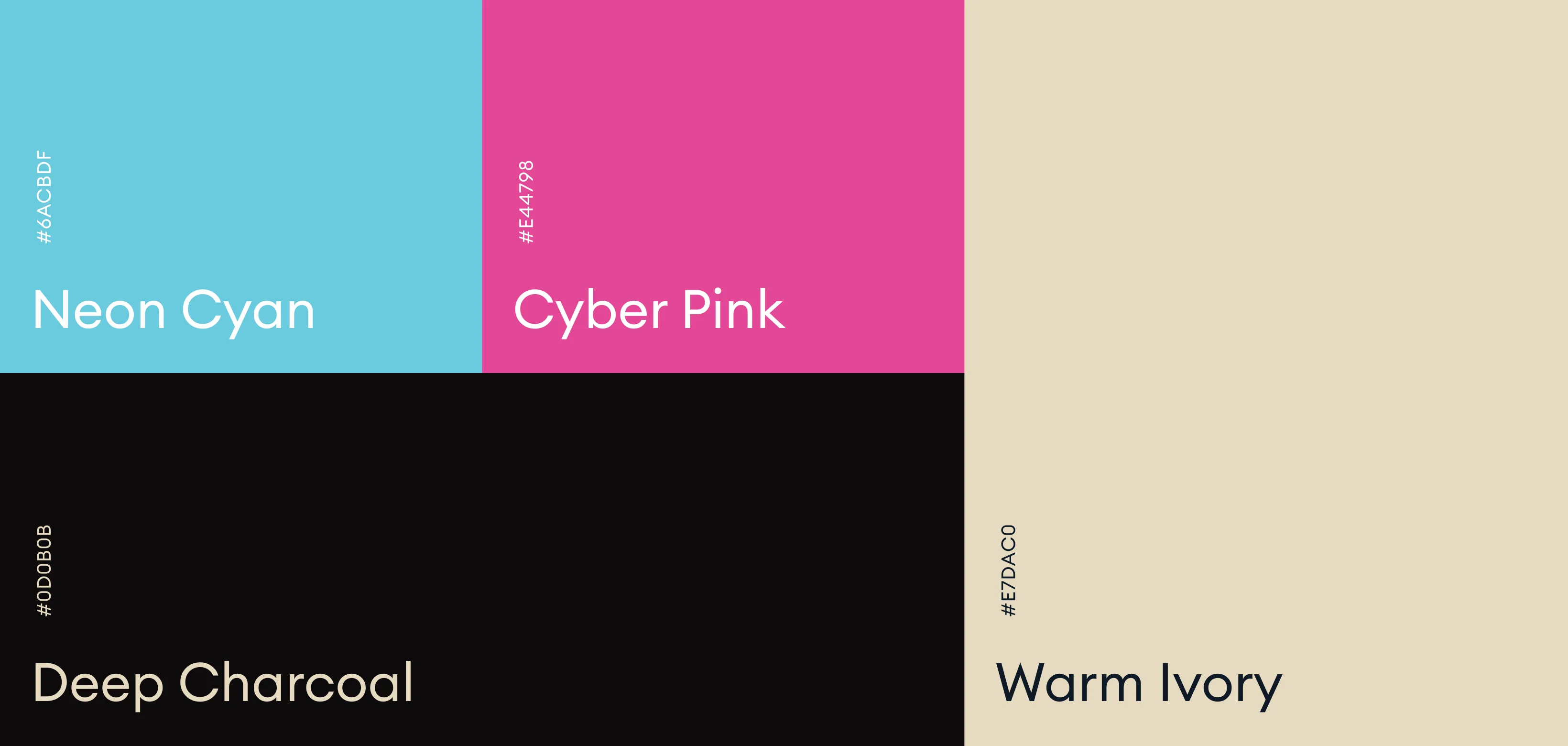
The visual language is defined by a category-responsive color strategy, ensuring both cohesion and distinction across the system. The gaming card employs neon blue and pink against a dark base to evoke energy, intensity, and digital immersion. In contrast, the photography card utilizes warm, desaturated tones and textured overlays to communicate authenticity and narrative depth. Across the system, dark foundational tones provide consistency, while accent palettes shift based on content genre. Supporting elements—such as UI frameworks for tech-driven categories and tactile textures for editorial styles—reinforce the overall visual identity, enabling adaptability without compromising brand integrity.