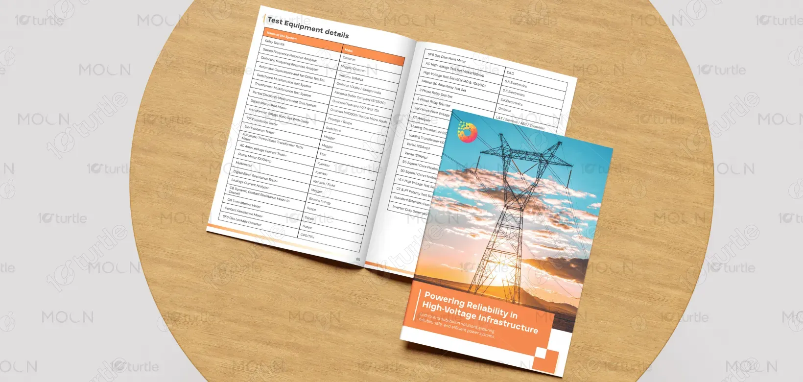
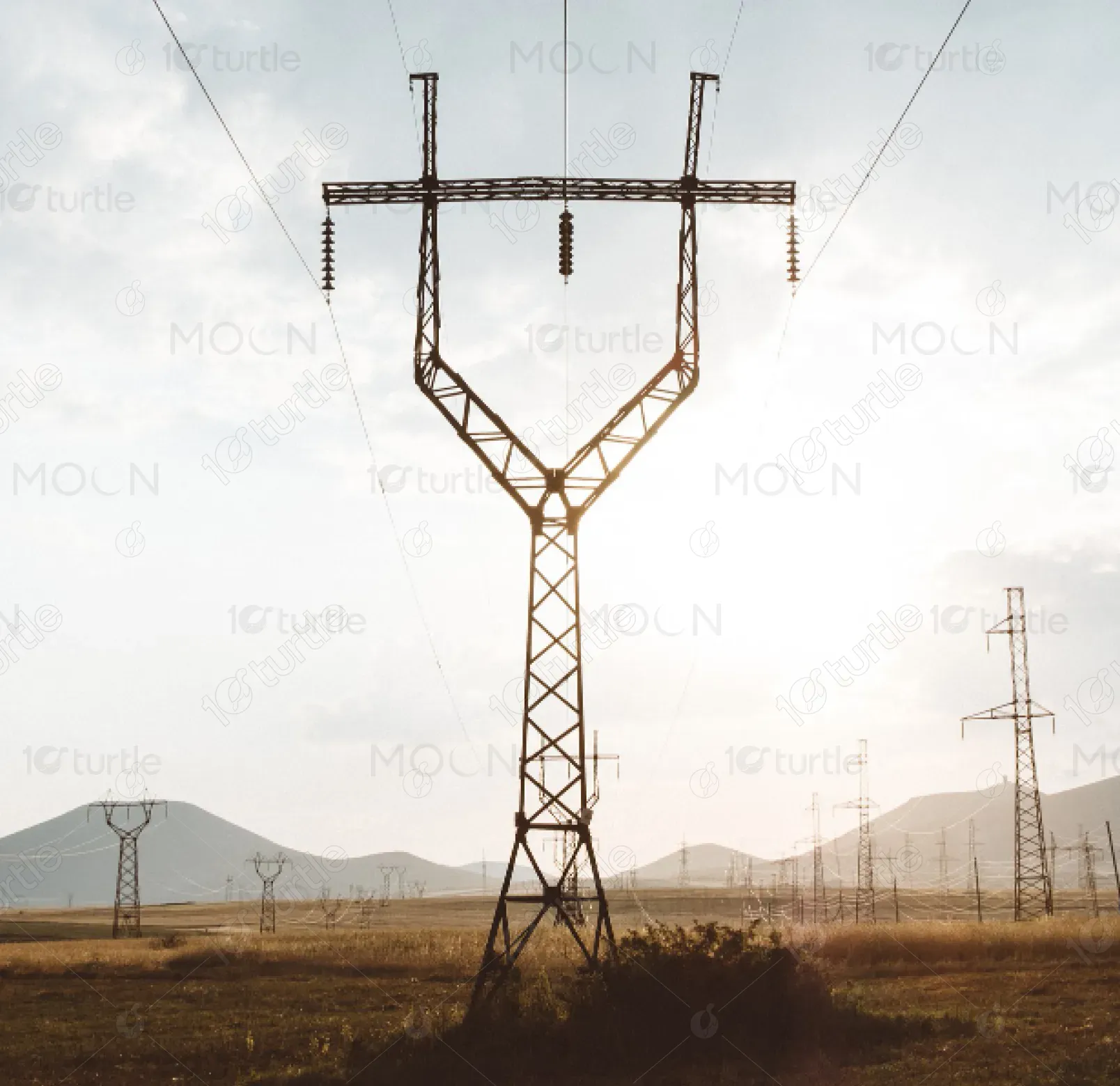
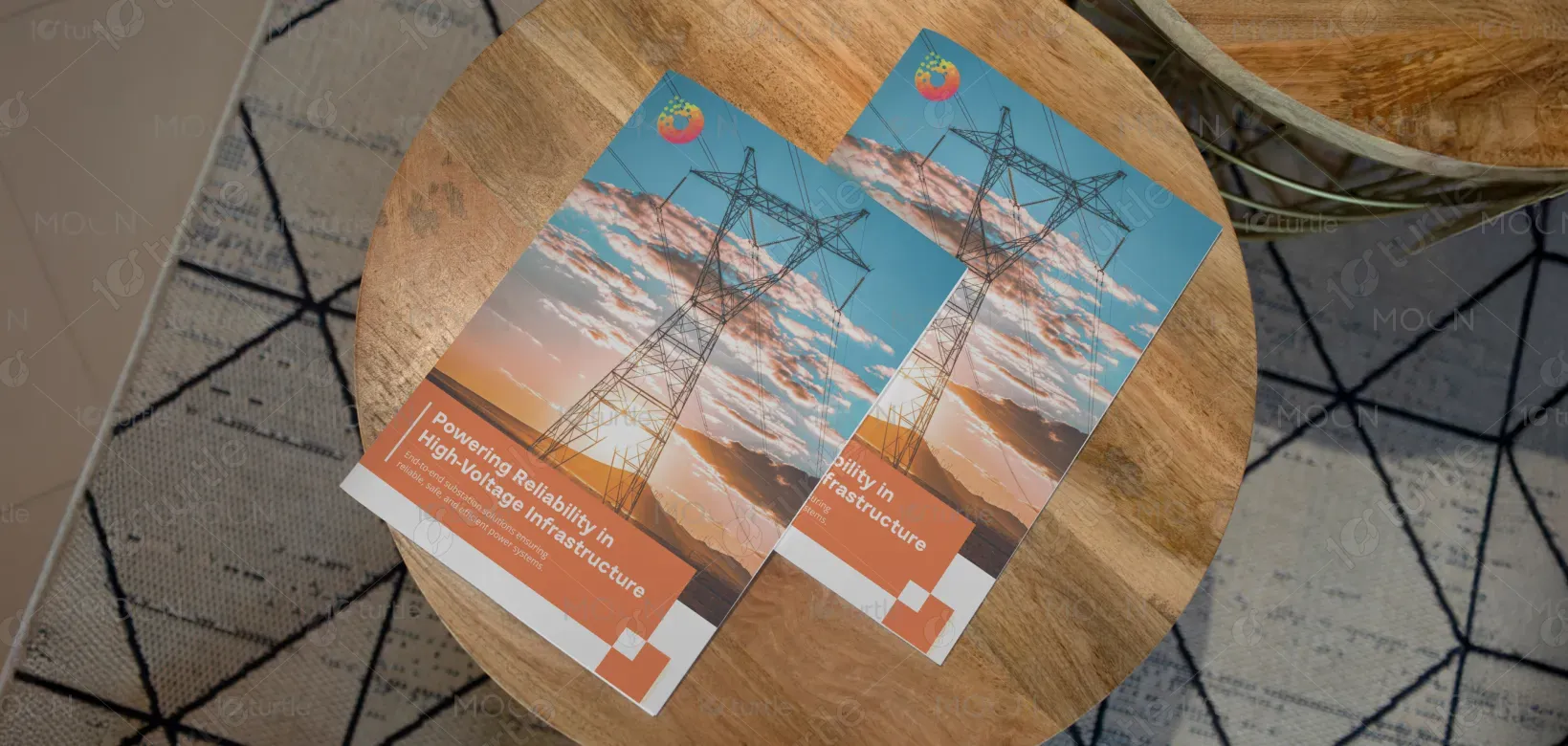
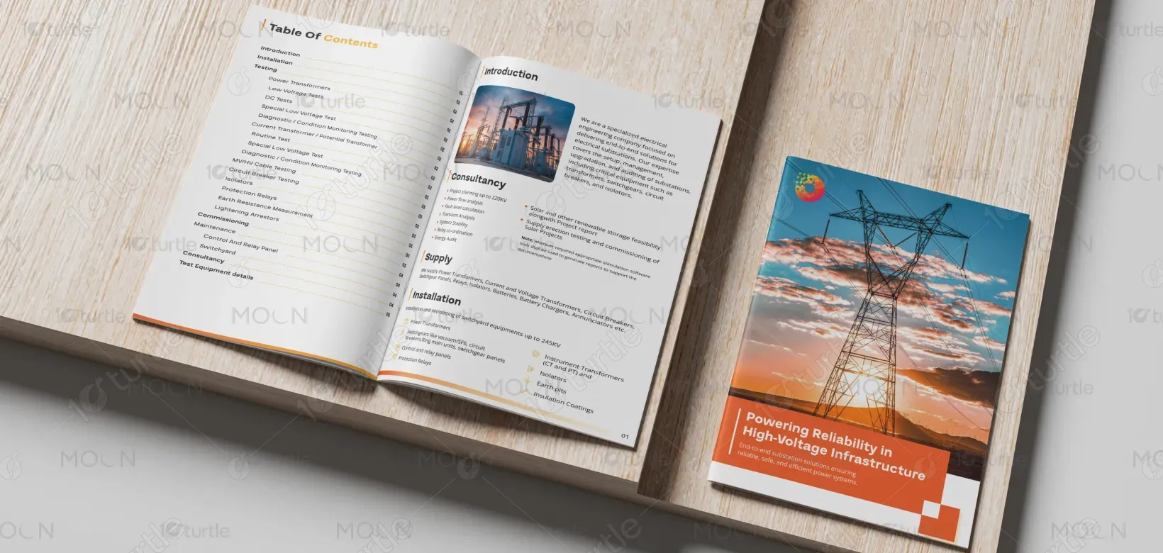
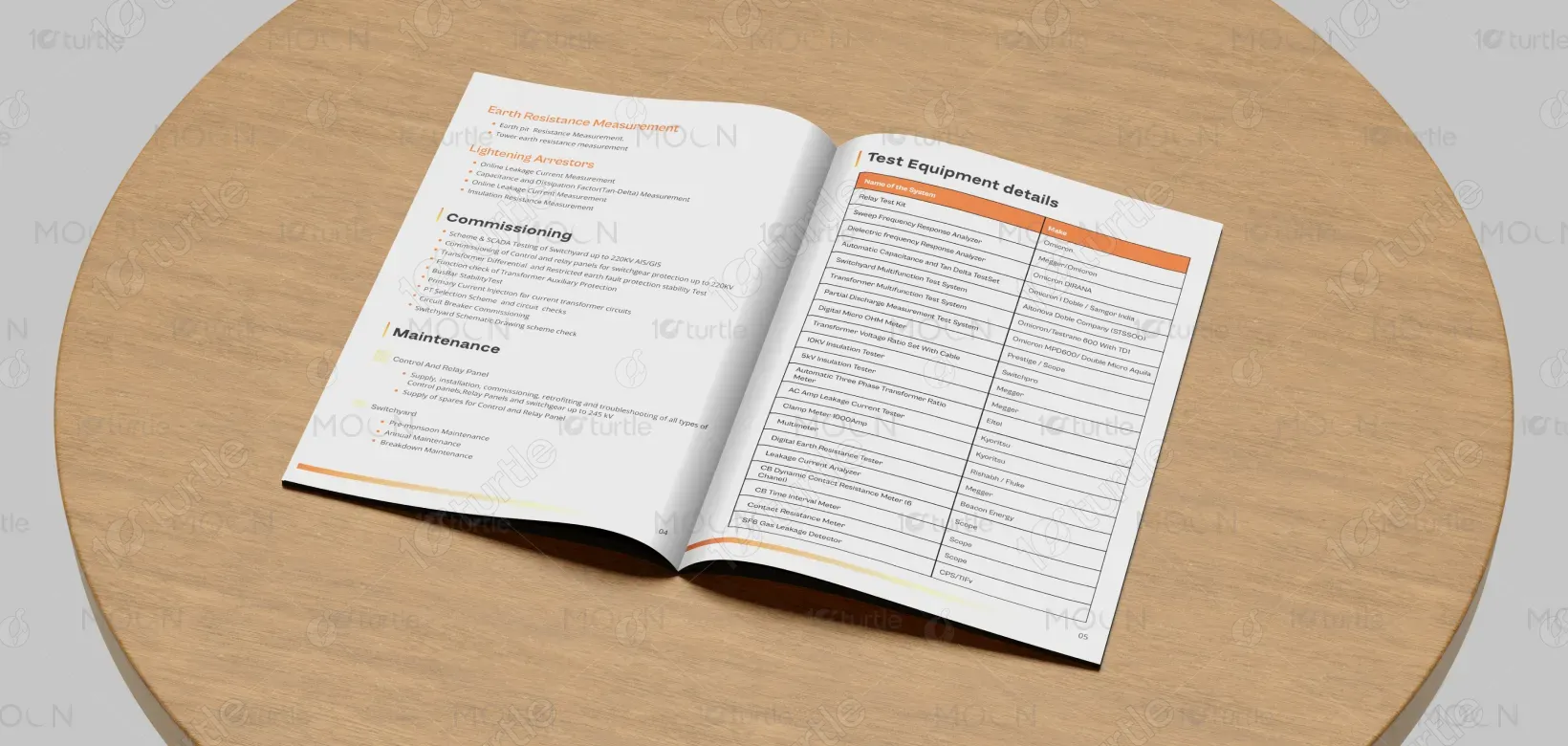
The catalog design adopts a clean, structured, and industrial aesthetic to reflect reliability and precision in high-voltage infrastructure. A grid-based layout ensures clarity and easy navigation, while strong imagery of power transmission systems reinforces the brand’s engineering expertise. Bold section headers and well-organized tables prioritize usability for technical audiences. The balance between white space and vibrant accent colors creates a modern, professional look that communicates trust, efficiency, and technological leadership.
catalog Design
Graphic Design
Industry
Technology, SaaS & Startups
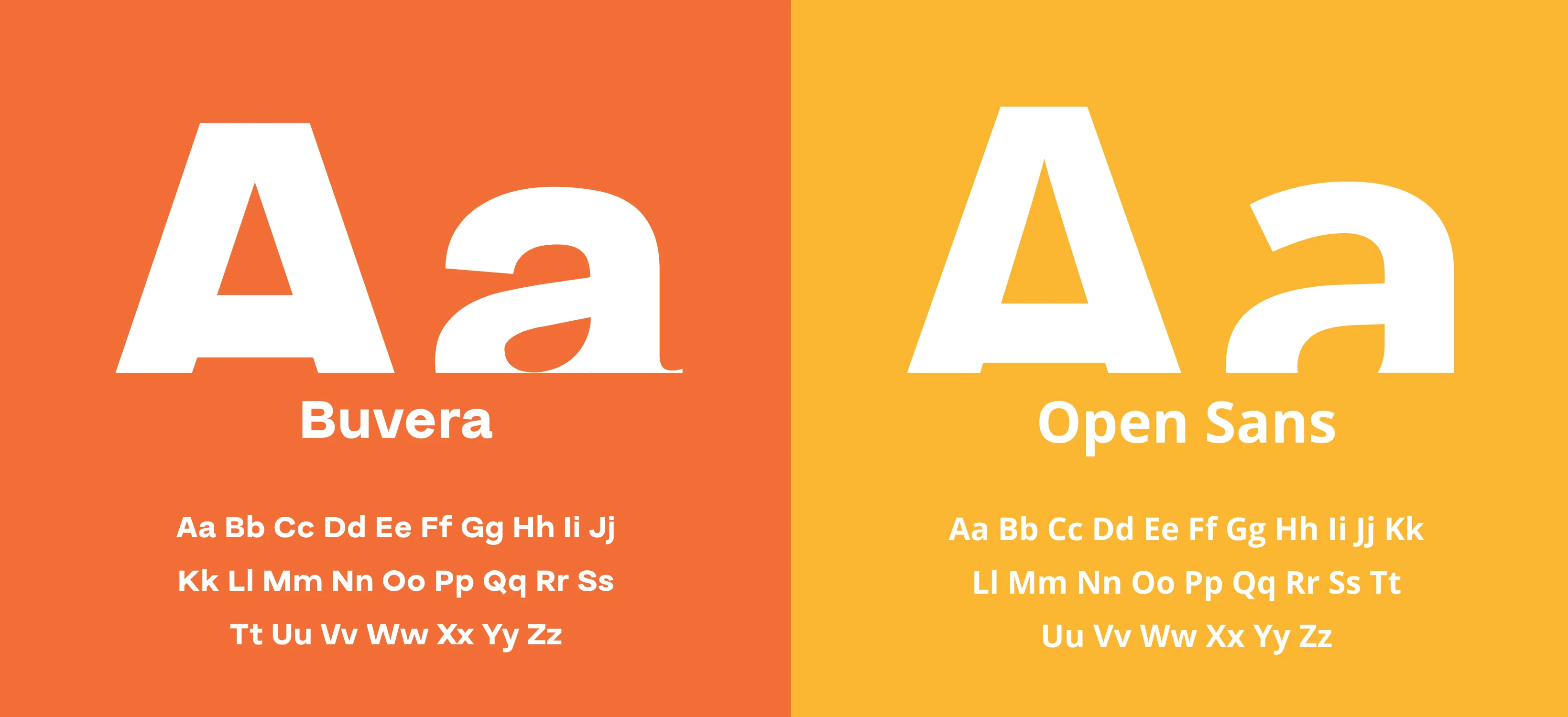
Tools we used


Project Completion
2025
Key Market
Global
This catalog presents a comprehensive overview of test equipment and solutions designed for high-voltage and power infrastructure applications. It serves as a technical reference for engineers, utilities, and energy professionals who require accurate, dependable data. Positioned within the power and electrical testing market, the catalog emphasizes reliability, compliance, and performance. Its key strength lies in combining detailed technical specifications with a clear, visually accessible format that supports informed decision-making.

Industry
Technology, SaaS & StartupsWhat we did
catalog DesignGraphic DesignPlatform
-The primary challenge was addressing information overload common in technical catalogs. Power and testing industries often rely on dense documentation that is difficult to navigate, leading to inefficiencies and misinterpretation of critical data. Engineers frequently need to cross-reference multiple sources to find specifications, slowing workflows and increasing error risk. The lack of visual hierarchy and inconsistent layouts in existing materials makes complex equipment appear more intimidating than necessary.
The design solves this challenge through structured layouts, clear typographic hierarchy, and intuitive content grouping. Technical tables are simplified for quick scanning, while consistent visual markers guide readers through sections effortlessly. High-quality imagery contextualizes the equipment within real-world power infrastructure environments. This user-centric approach transforms complex data into an accessible, professional reference tool that supports faster understanding and confident usage.
The long-term vision is to establish a scalable, modular catalog system that evolves alongside advancements in power infrastructure technology. As products expand and standards change, the design can easily adapt without losing clarity or consistency. Ultimately, the catalog aims to become a trusted industry benchmark—reinforcing brand authority, supporting global technical audiences, and strengthening the connection between innovation, safety, and performance.

The color palette combines clean whites with strong orange accents and neutral grays. White enhances readability and precision, while gray tones convey technical reliability and professionalism. The orange accent introduces energy, visibility, and innovation—symbolizing power, efficiency, and momentum. Together, these colors align with the brand’s identity, evoke confidence, and create a dynamic yet controlled visual presence suitable for the energy and infrastructure sector.