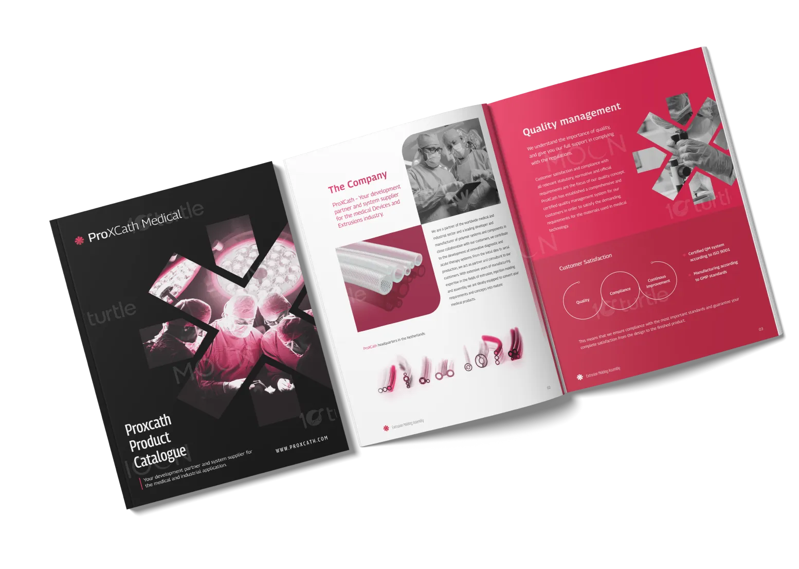
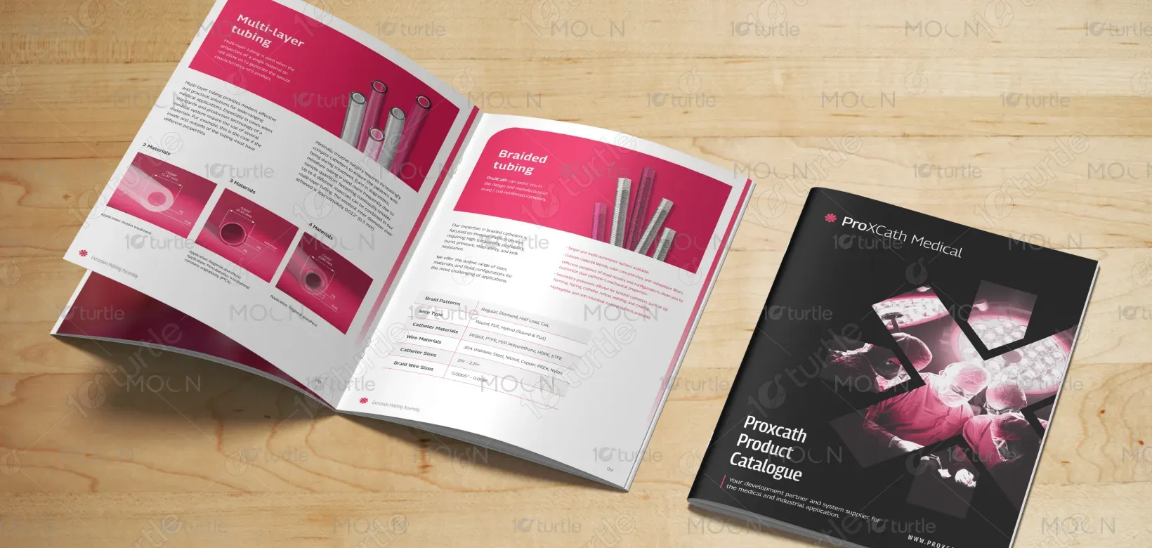
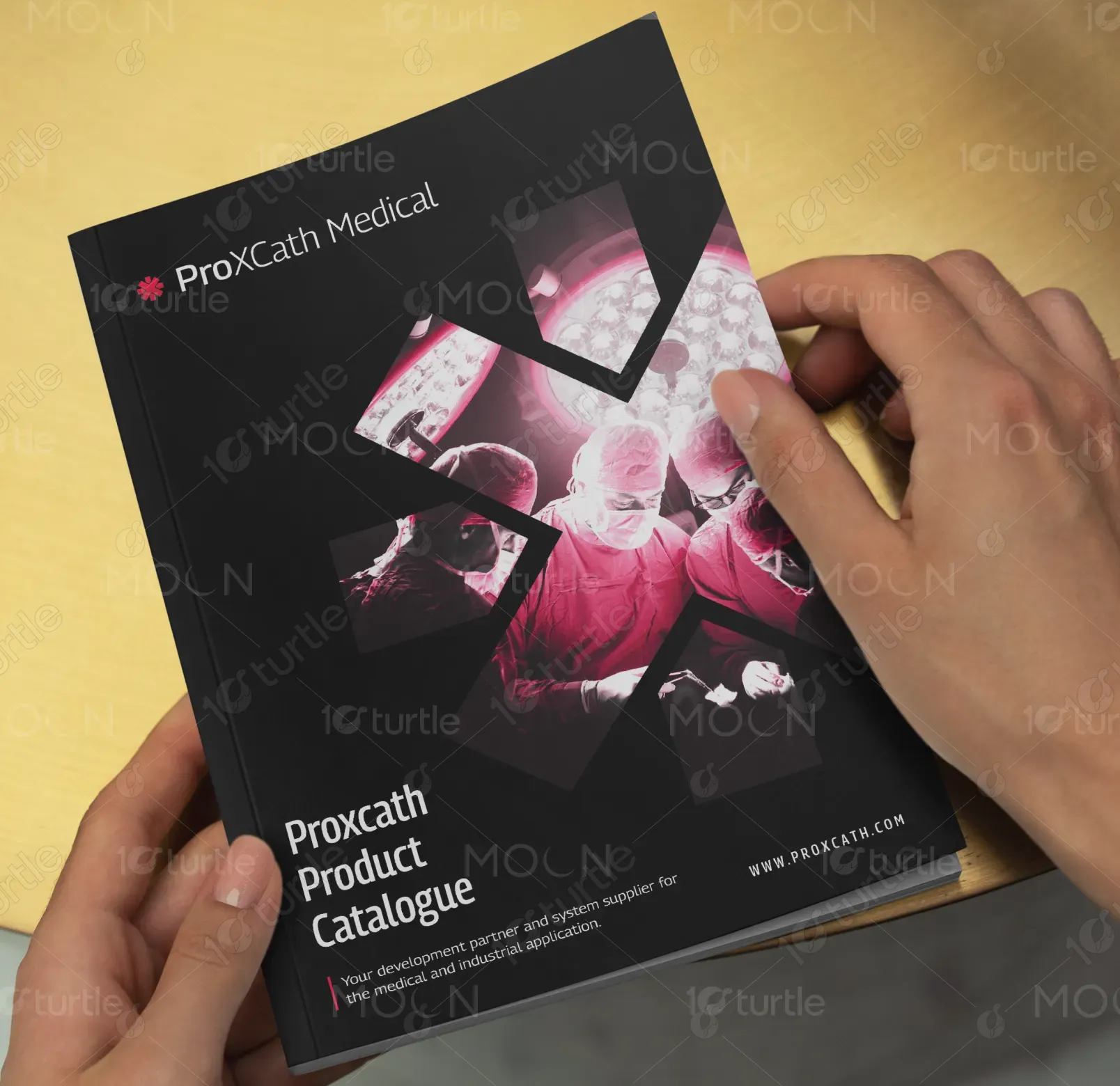
The design takes a modern, professional approach with a clean black base contrasted by vivid medical pink accents, symbolizing both innovation and trust. The use of geometric shapes and imagery integrated into a cross-inspired motif reflects precision, care, and medical expertise. A balance between bold typography and clean layouts ensures readability while maintaining a premium aesthetic. The catalogue layout flows seamlessly, combining technical data with strong visuals, creating a design that communicates reliability, quality, and innovation at every glance.
Catalog Design
Graphic Design
Industry
Healthcare & Wellness
Tools we used


Project Completion
2025
Key Market
Global
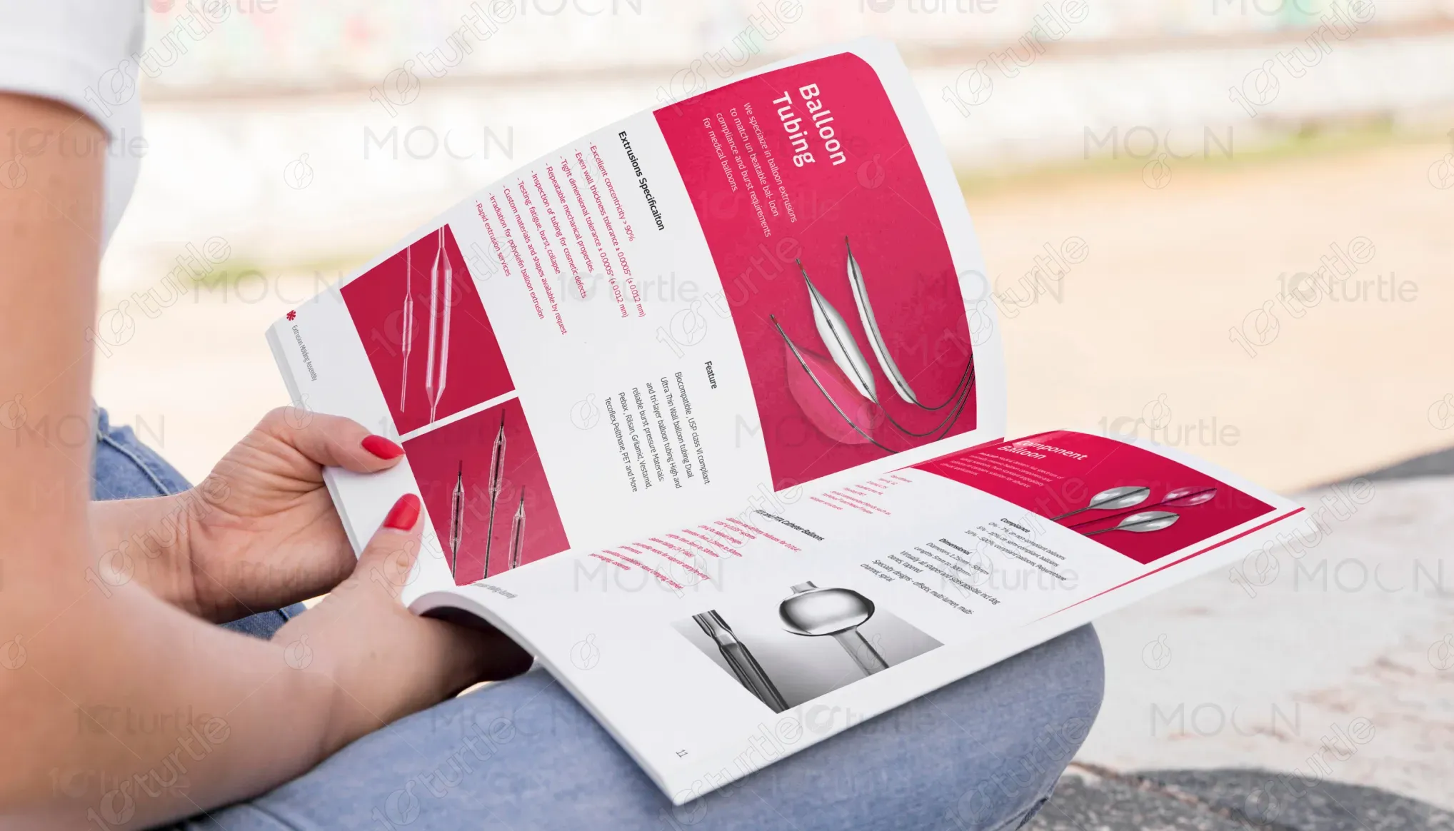
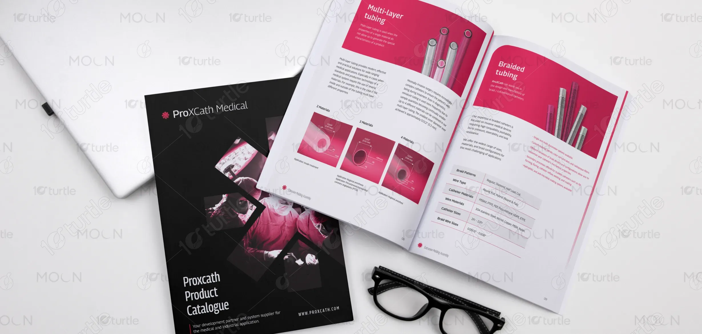
The ProXCath Medical Product Catalogue is a comprehensive resource that showcases advanced medical tubing and catheter solutions. Designed for healthcare professionals and industry partners, it emphasizes precision engineering, quality compliance, and product innovation. The catalog is not only informative but also visually engaging, highlighting unique selling points such as customized tubing solutions, cutting-edge materials, and certified manufacturing standards. With a sleek design and strategic information flow, it effectively bridges technical depth with brand storytelling, positioning ProXCath as a leader in the medical devices industry.
Industry
Healthcare & WellnessWhat we did
Catalog DesignGraphic DesignPlatform
-The medical device industry often struggles with catalogues that are either overly technical or visually uninspiring, leading to disengagement from healthcare professionals. Many product brochures fail to balance scientific accuracy with accessible design, making it difficult for users to navigate complex information. Additionally, a lack of visual consistency across product lines can dilute brand identity. This gap not only reduces user trust but also diminishes the perceived value of the brand’s innovation and commitment to healthcare excellence.
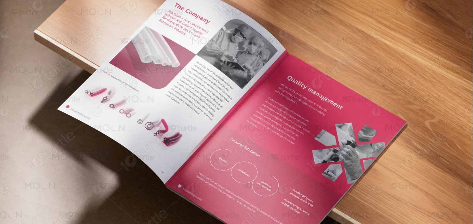
The ProXCath catalogue solves this issue by merging clean, modern design with intuitive information hierarchy. The use of bold infographics, cross-inspired geometric visuals, and clear typographic systems enhances navigation and readability. Vibrant pink highlights draw attention to key sections without overwhelming the technical content. By integrating imagery of real-world applications alongside product details, the design connects emotional trust with clinical precision. This ensures healthcare professionals can quickly absorb critical data while experiencing the brand’s identity as innovative, reliable, and patient-focused.
The long-term vision of ProXCath Medical is to set new standards in medical innovation, providing reliable and customizable solutions for minimally invasive treatments worldwide. Beyond being a product supplier, the brand aims to become a trusted global partner in healthcare transformation. The catalog reflects this forward-looking mission by presenting ProXCath as a pioneer dedicated to advancing medical technology, supporting professionals, and ultimately improving patient outcomes. The goal is to create a lasting impression of excellence, trust, and innovation in every interaction.
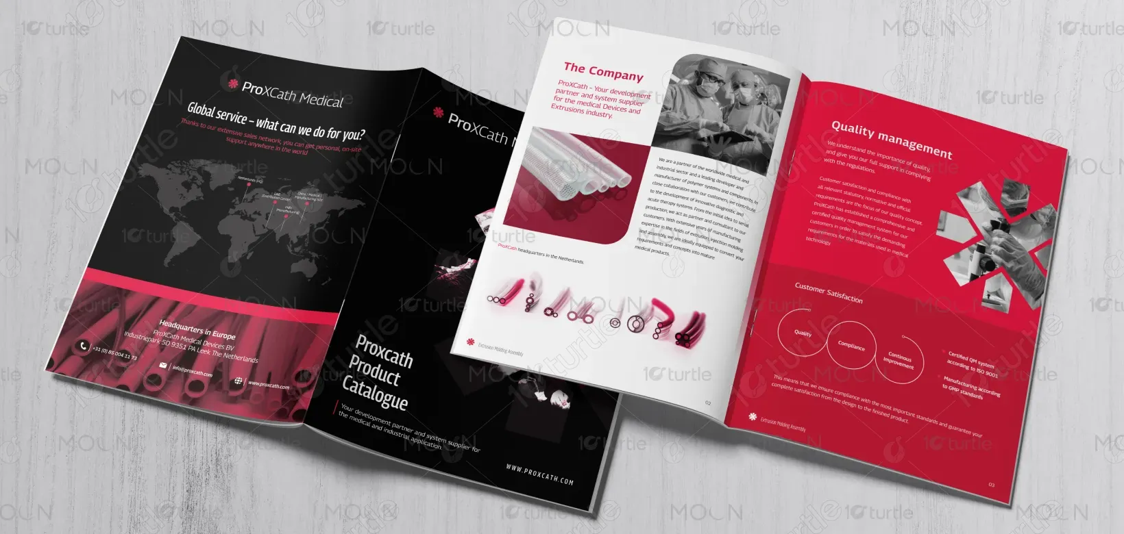
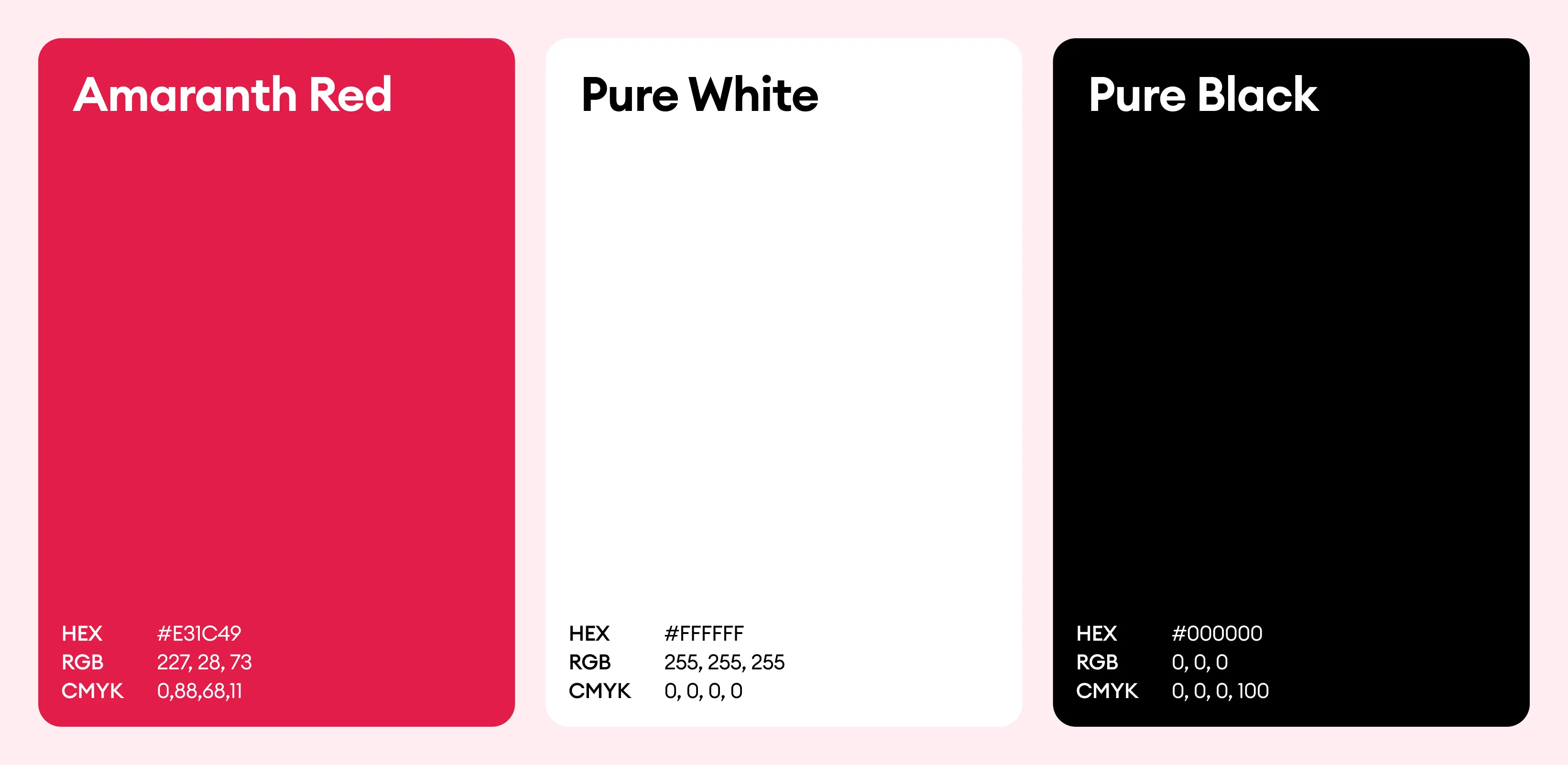
The color palette combines black, representing precision, authority, and professionalism, with medical pink/fuchsia, which highlights innovation, vitality, and care while making technical details more approachable. Balanced with white and gray to enhance clarity, readability, and structure, this combination reflects the brand’s dual focus on technical excellence and human-centered healthcare, resulting in a catalogue design that feels modern, professional, and empathetic.