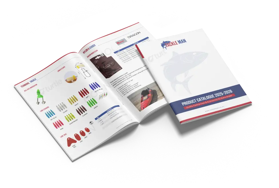
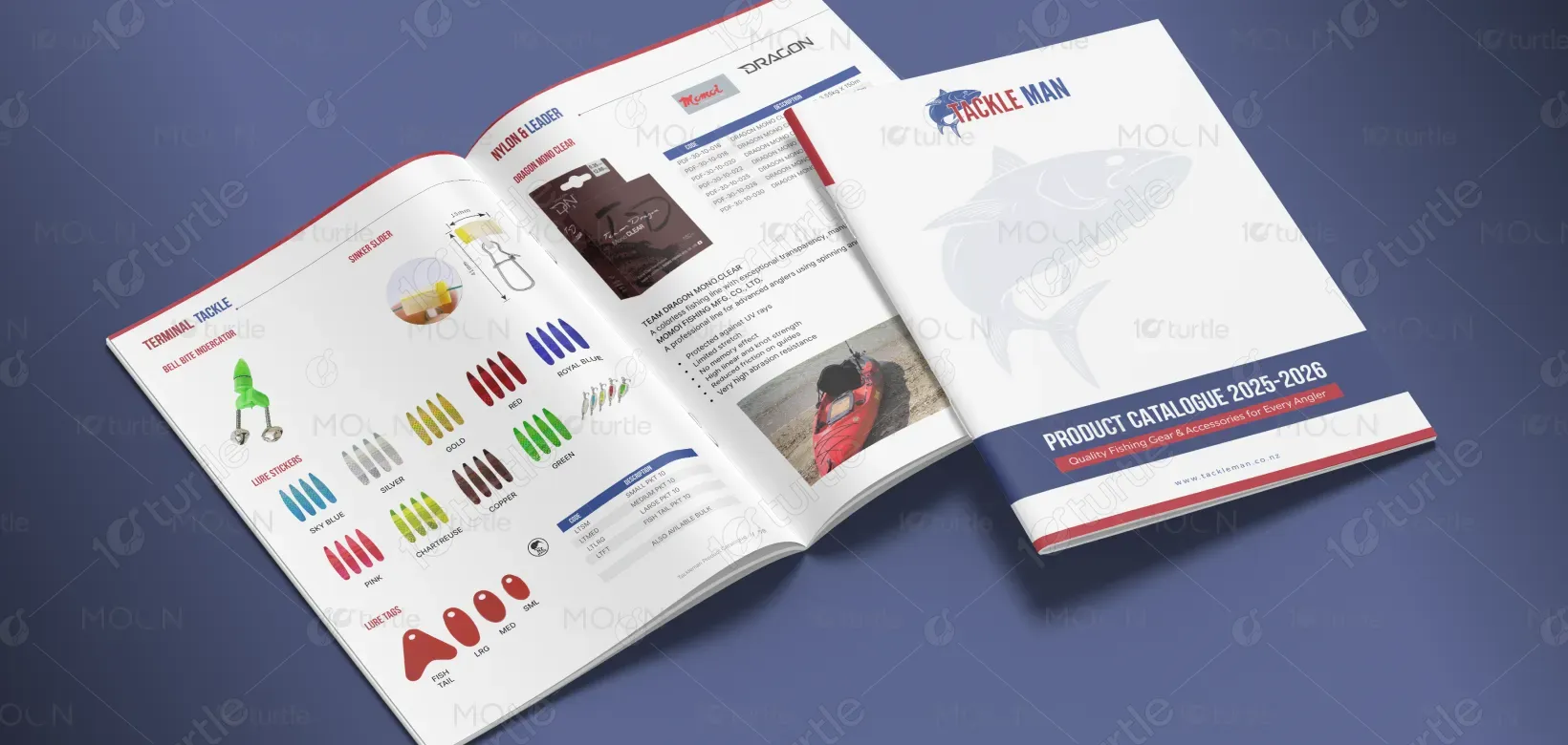
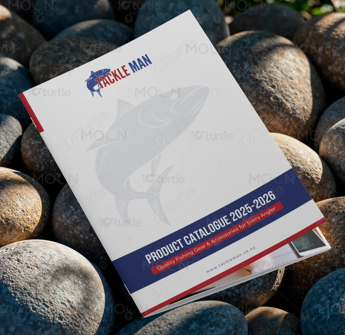
The Tackleman Product Catalogue 2025–2026 features a clean, functional design that mirrors the brand’s professional yet adventurous spirit. A minimalist grid layout, clear product categorization, and vibrant imagery reflect the precision and durability of Tackleman’s fishing products. The use of crisp typography, structured tables, and authentic lifestyle photography balances utility with visual appeal, ensuring easy navigation. The overall creative direction highlights a modern, trustworthy, and experience-driven brand aesthetic tailored for fishing enthusiasts and retailers alike.
Catalogue Design
Graphic Design
Industry
Industrial, Manufacturing & Agriculture
Tools we used


Project Completion
2025
Key Market
Global
The Tackleman Product Catalogue is a comprehensive visual guide showcasing premium fishing gear and accessories for all types of anglers. It’s designed to make product discovery effortless for wholesalers, retailers, and professionals in the fishing industry. With detailed specifications, product codes, and visuals, the catalogue simplifies purchasing decisions while maintaining brand consistency. Its appeal lies in clarity, strong visual hierarchy, and immersive photography that connects the reader to the outdoor fishing lifestyle.

Industry
Industrial, Manufacturing & AgricultureWhat we did
Catalogue DesignGraphic DesignPlatform
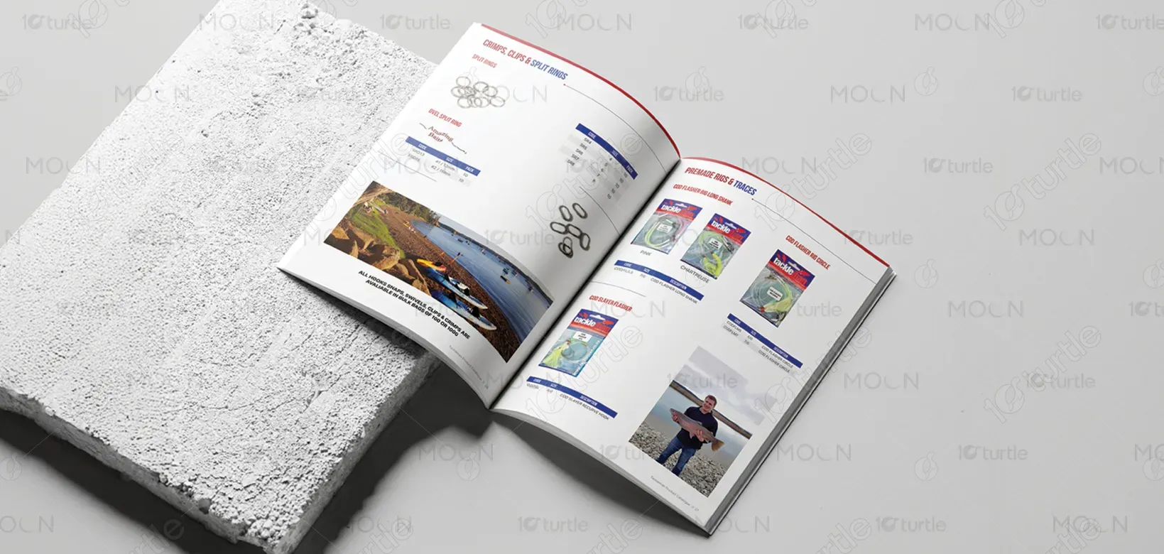
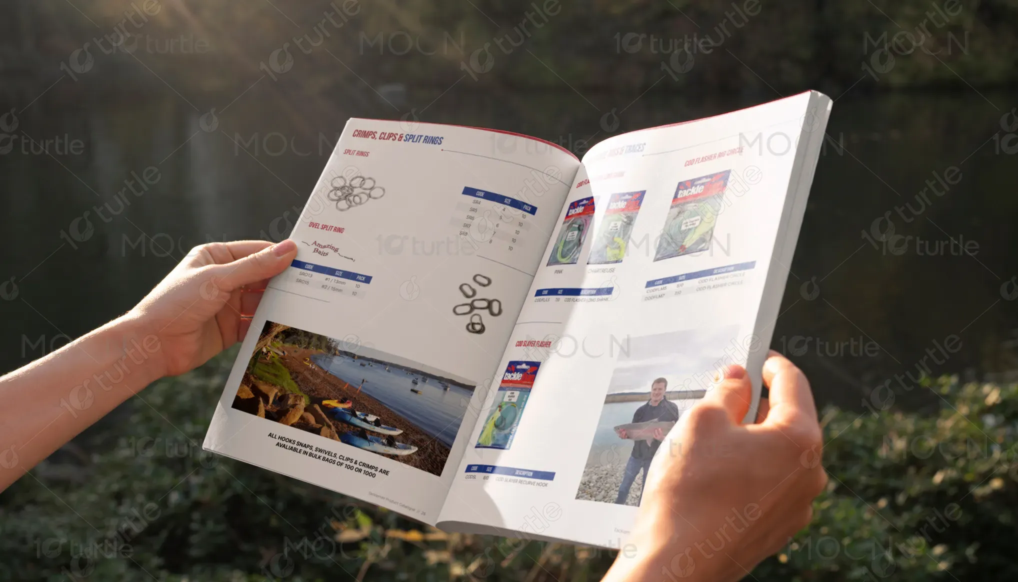
-Fishing equipment catalogues often suffer from cluttered layouts, poor product organization, and technical overload that make browsing difficult. Users struggle to find specific items quickly or compare variations due to inconsistent design and lack of visual rhythm. The challenge was to create a layout that could handle extensive product information—over multiple categories—while staying engaging and easy to read, particularly for distributors and anglers who rely on precision and efficiency.
The catalogue adopts a modular grid system with consistent spacing, intuitive categorization, and product visuals placed alongside clear data tables. Strong color accents guide the eye through sections, while professional photography contextualizes each product in real-world settings. The balance between imagery and technical detail ensures the catalogue feels informative yet visually dynamic. Additionally, a B2B ordering portal integration is highlighted, bridging print and digital for seamless business transactions.
Tackleman’s vision is to establish itself as the most trusted fishing equipment brand in the Southern Hemisphere by blending quality, innovation, and accessibility. The catalogue serves as both a brand ambassador and a sales tool—positioning Tackleman as a leader that values craftsmanship and customer experience. The long-term goal is to expand its presence globally, leveraging this design style to maintain a professional, consistent identity across both digital and print channels.
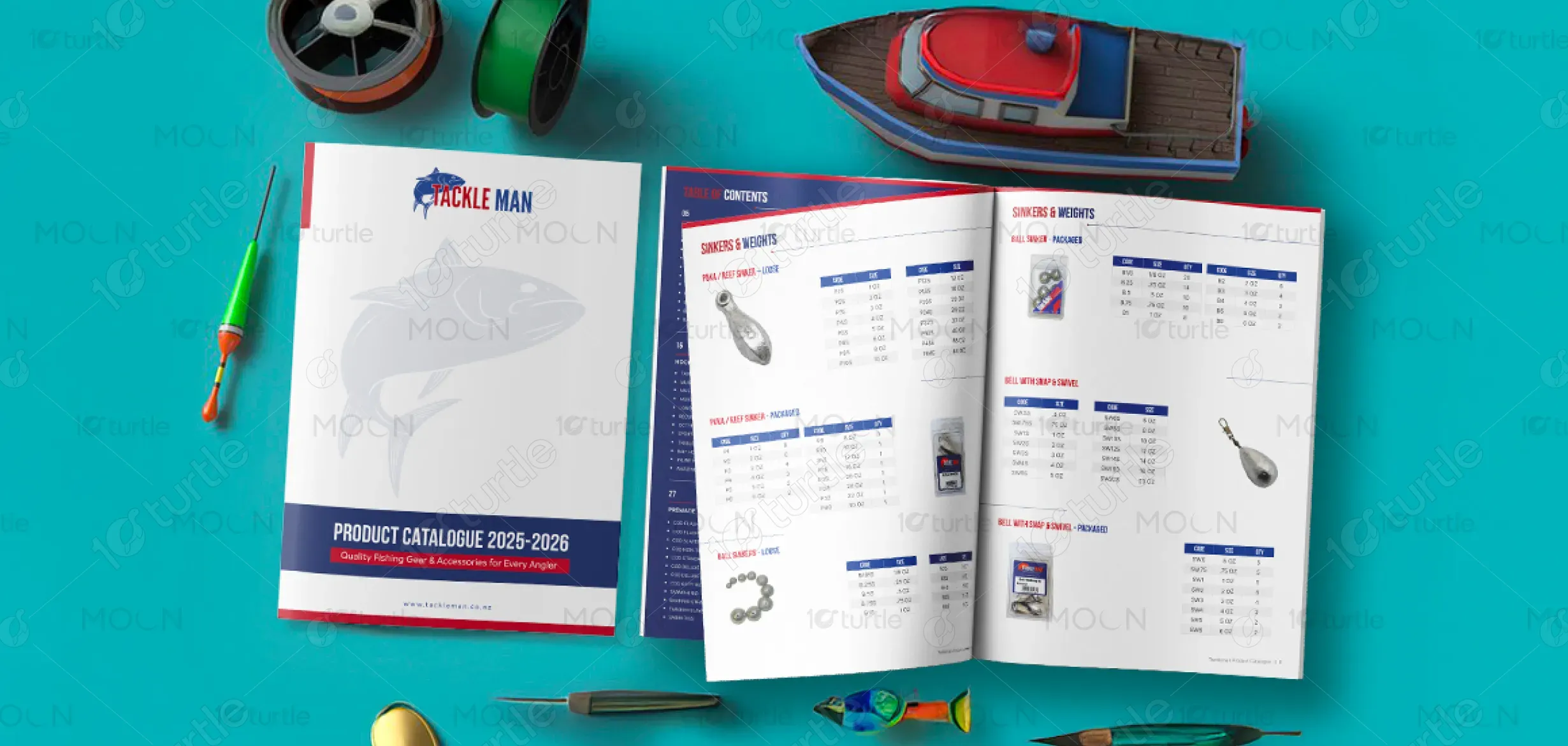

The catalogue’s color scheme combines navy blue, bright red, and clean white—drawing inspiration from nautical themes and maritime reliability. Navy blue conveys trust, professionalism, and depth; red adds energy, excitement, and highlights key headers; while white maintains balance, readability, and freshness. Together, these colors reinforce brand recognition, evoke a sense of adventure, and create a clean, modern aesthetic that reflects Tackleman’s strong, dependable identity.