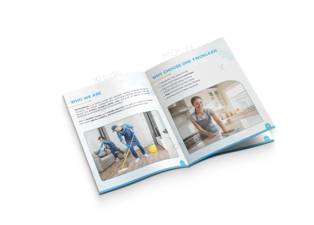
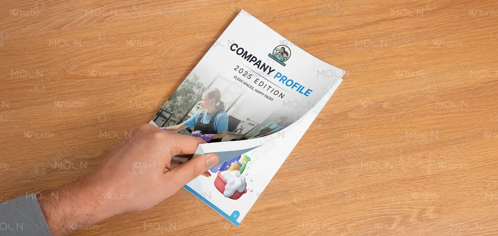
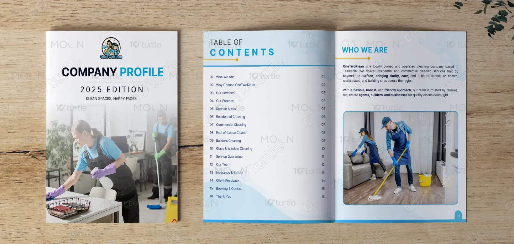
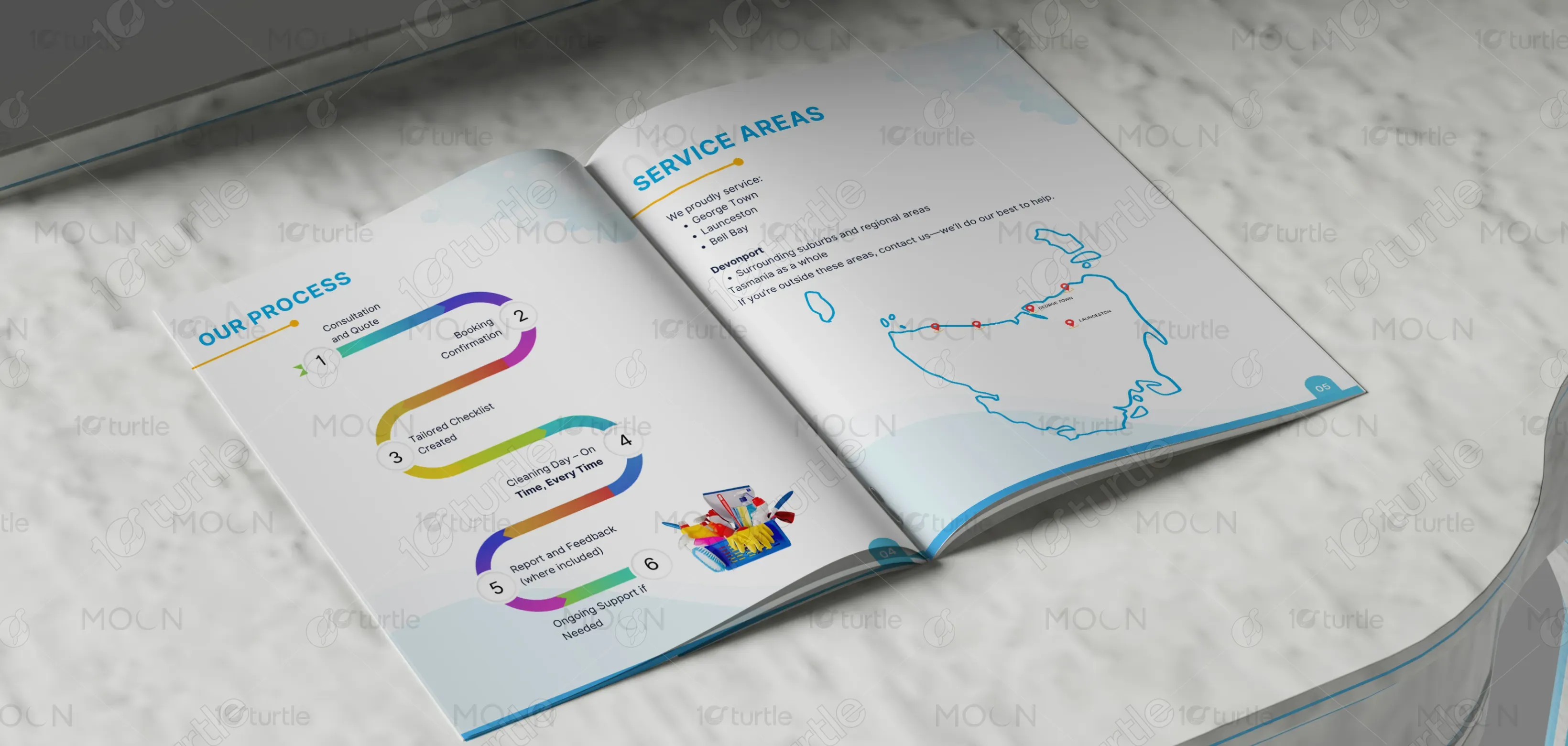
The brochure design follows a modern, clean, and professional approach that reflects the essence of the cleaning industry. A balanced combination of visuals and infographics ensures clarity and engagement. The cover page emphasizes professionalism with strong typography, while the interior layout uses icons, process flows, and maps to enhance readability. The use of blue tones conveys trust, freshness, and hygiene, while supporting graphics create an approachable and user-friendly aesthetic, perfectly suited to the brand’s commitment to spotless results.
brochure Design
Graphic Design
Industry
Professional & B2B Services
Tools we used

Project Completion
2025
Key Market
Global
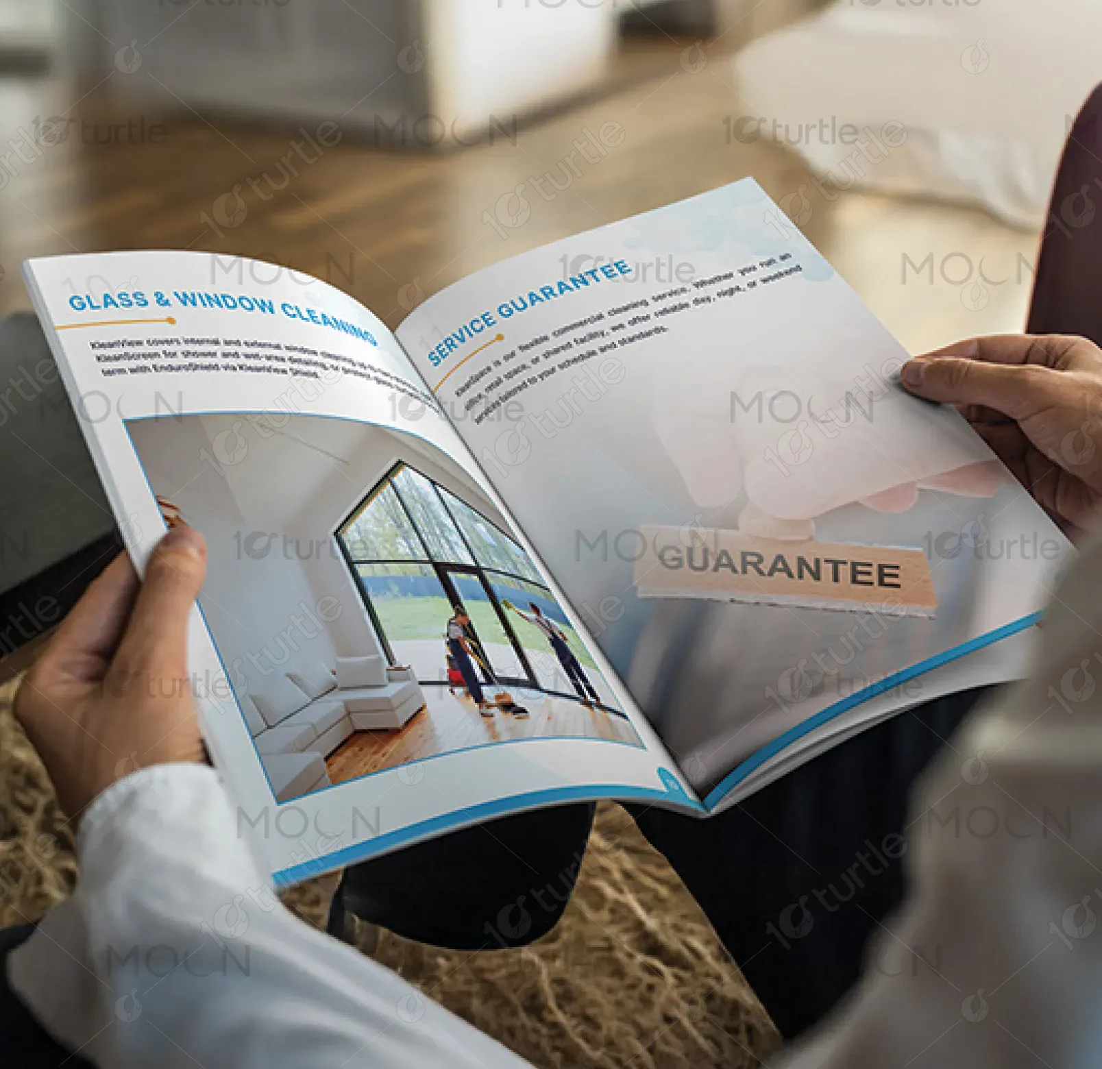
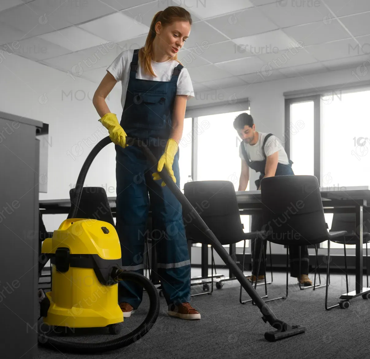
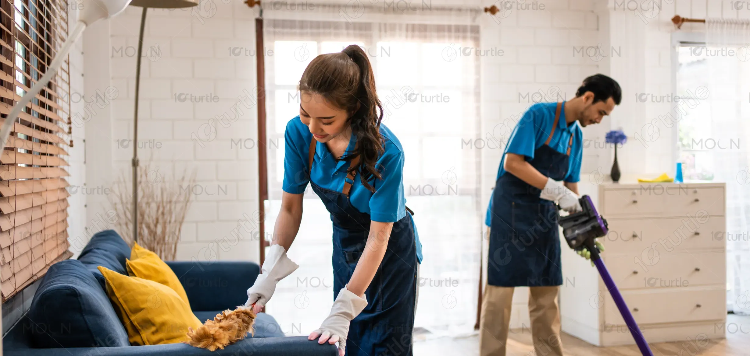
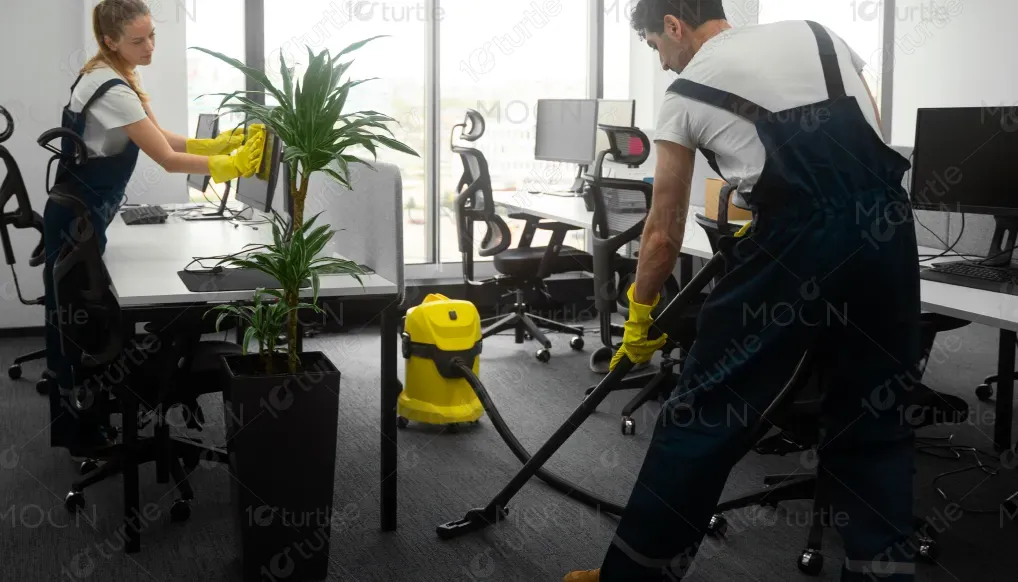
This brochure serves as a company profile for a professional cleaning service provider. Its purpose is to introduce the company, outline services, and highlight operational areas. By combining process illustrations, a service map, and relatable imagery, the design communicates transparency, efficiency, and trustworthiness. Unique selling points include a structured workflow, timely delivery, and customer-focused solutions. The brochure’s layout ensures easy navigation, while the clean, bright aesthetic resonates with the brand’s promise of hygiene and reliability.
Industry
Professional & B2B ServicesWhat we did
brochure DesignGraphic DesignPlatform
-In the cleaning services industry, companies often struggle with presenting professionalism and trust to potential clients. Many existing brochures look cluttered, outdated, or overly generic, failing to connect with audiences seeking reliability and transparency. Clients may hesitate to commit without a clear understanding of services, processes, and coverage areas. For example, businesses or homeowners often face uncertainty about service timelines, quality standards, and accountability—issues that undermine trust and reduce customer conversion rates.
This brochure bridges the gap by offering a clear, structured, and visually appealing presentation of services. It highlights a step-by-step cleaning process, reinforcing reliability and professionalism. The service map provides transparency about coverage, while consistent branding builds trust. By integrating visuals, icons, and colors associated with cleanliness, the brochure reassures customers of credibility. Its design simplicity ensures easy comprehension, making it an effective marketing tool that positions the brand as both approachable and dependable.
The long-term vision of the brand is to become a leading name in professional cleaning and facility management services by consistently delivering quality, reliability, and customer satisfaction. Beyond current offerings, the company aims to expand geographically, introduce eco-friendly cleaning solutions, and adopt smart cleaning technologies. By building a reputation rooted in trust and transparency, the brand seeks to redefine cleanliness standards while creating lasting relationships with both residential and commercial clients.
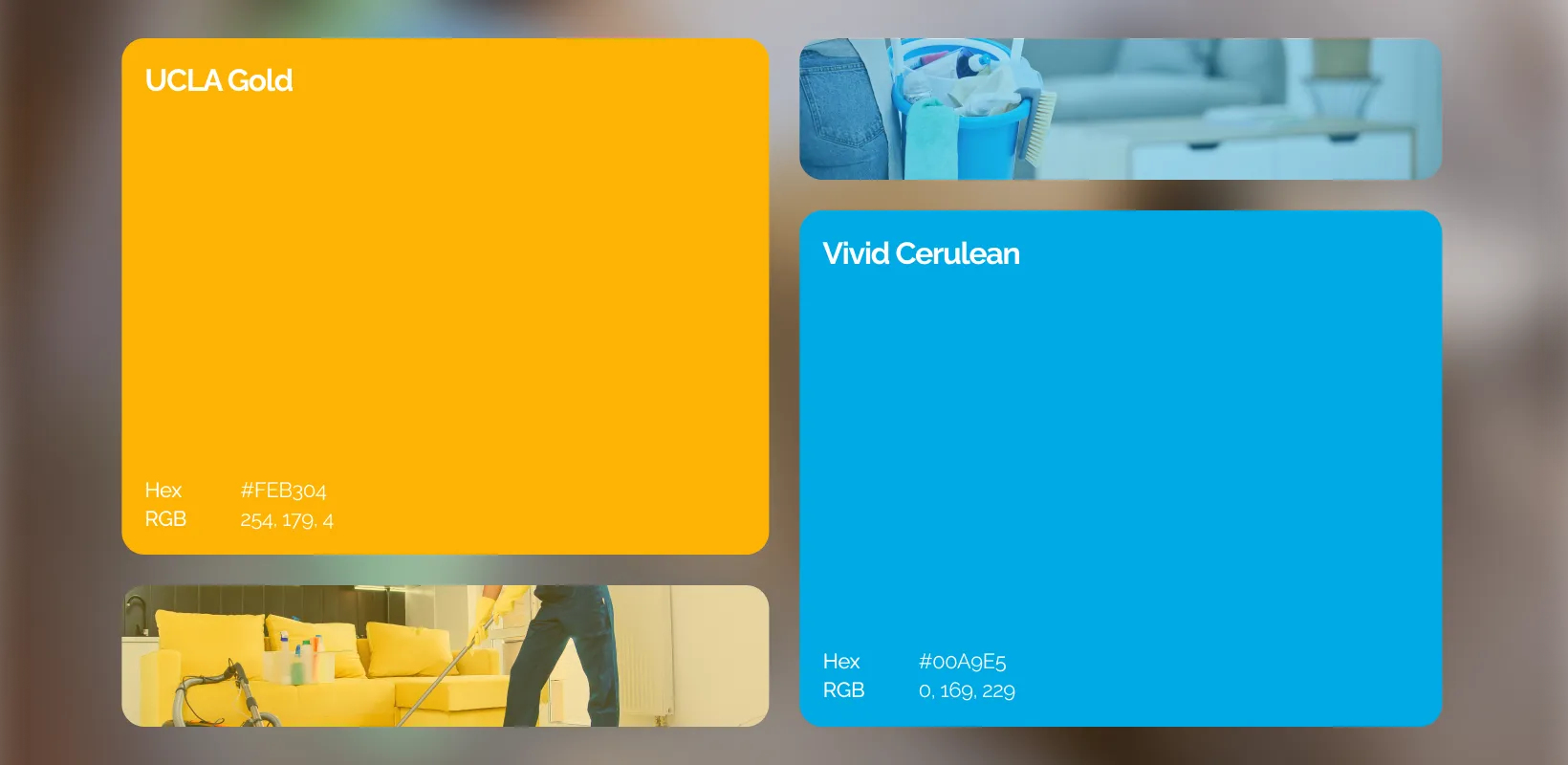
The color palette blends cool blues, whites, and greys with a touch of yellow for a clean and modern look. Blue represents trust and professionalism, while white symbolizes purity and clarity. The hint of yellow adds warmth and positivity, reflecting the brand’s friendly, reliable identity.