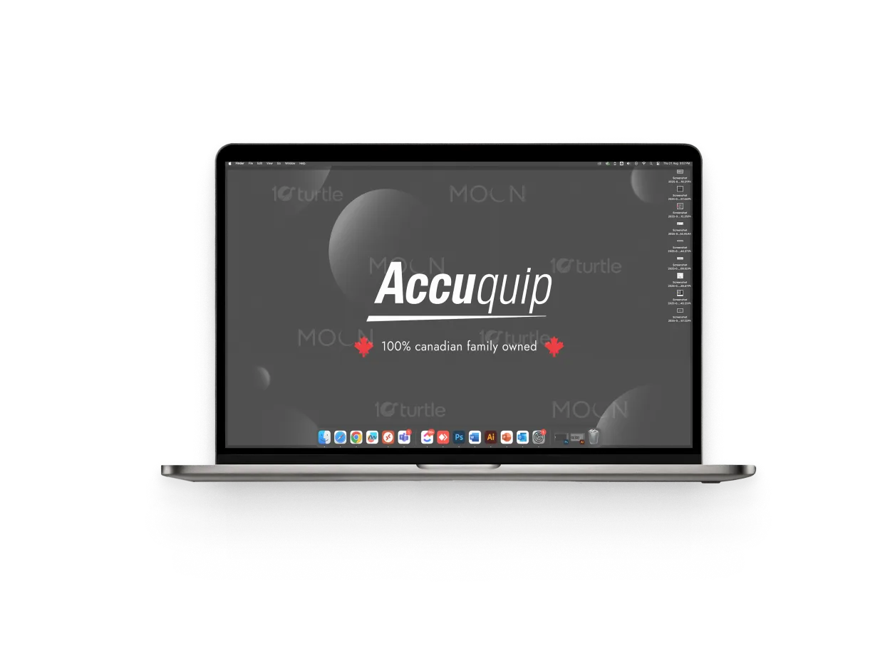
The design uses a bold red-and-black palette to project confidence, precision, and professionalism. Black provides a sleek, modern background that conveys strength and sophistication, while red introduces energy, urgency, and the trusted symbol of Canadian ownership. The flowing wave pattern adds depth, subtly representing precision and care in dentistry. Clean typography ensures clarity and memorability. Overall, the concept balances minimalism with impact, positioning Accuquip as a premium dental healthcare brand that embodies innovation, reliability, and national pride.
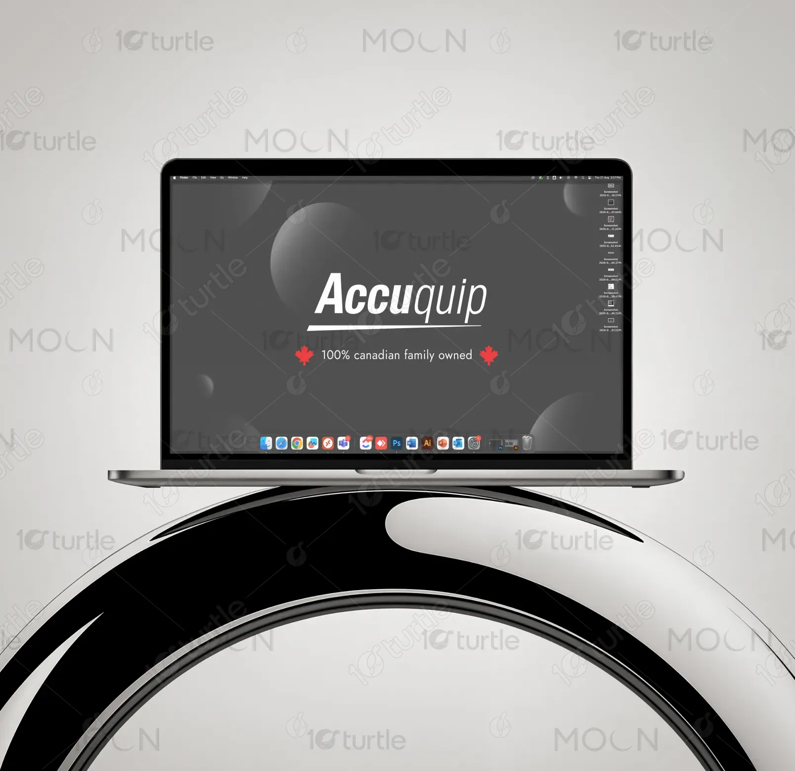
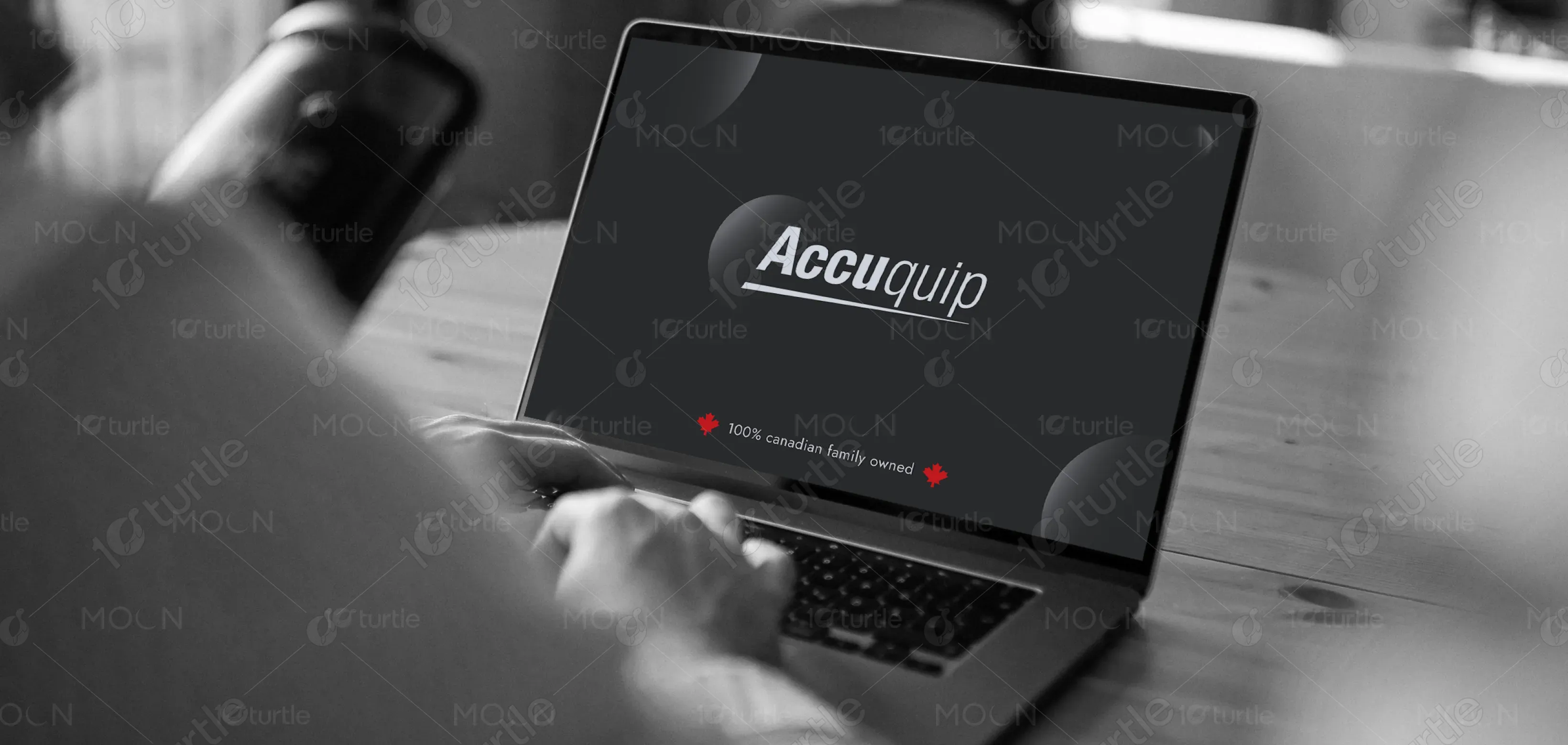
Desktop Wallpaper Design
Graphic Design

Industry
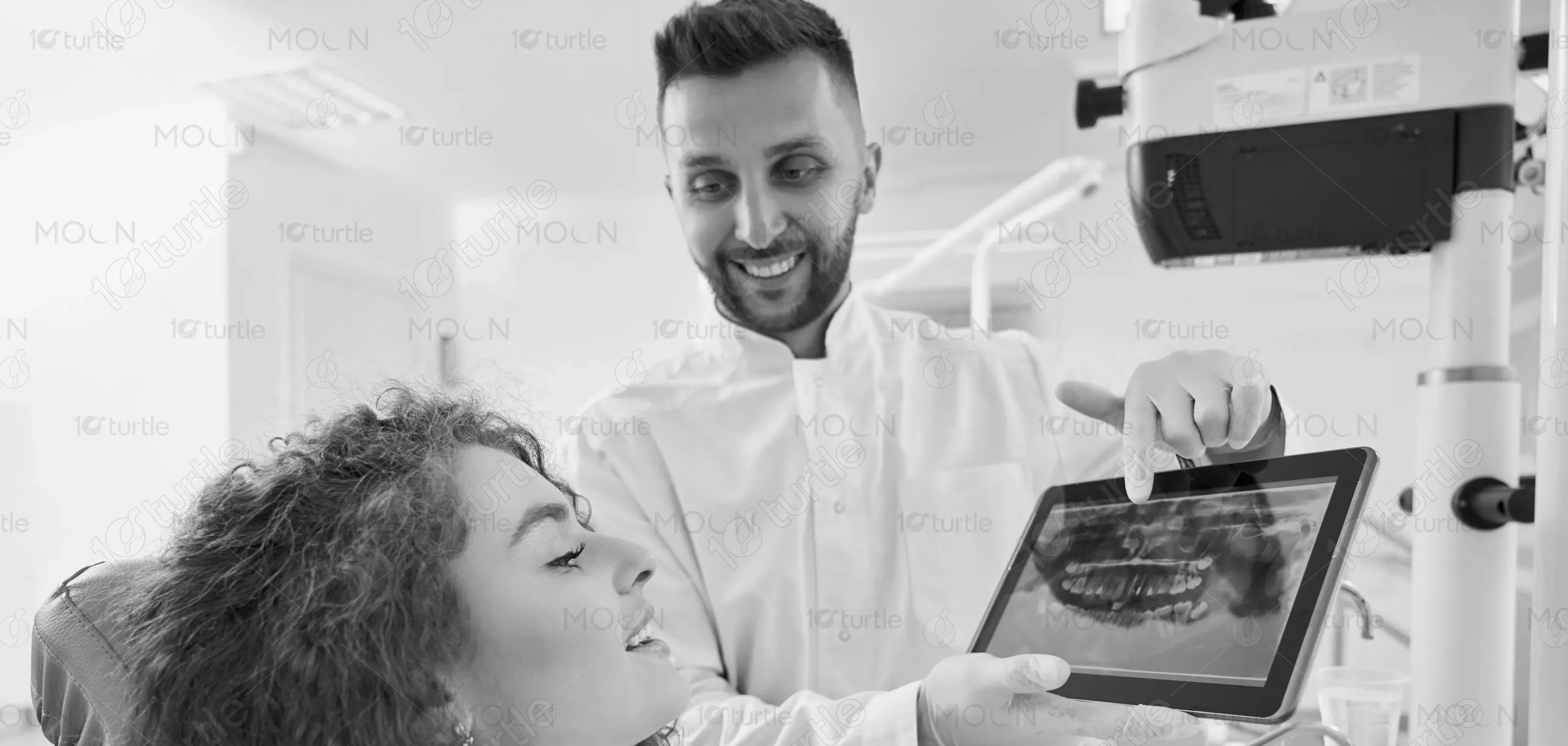
Healthcare & Wellness
Tools we used


Project Completion
2025
Key Market
Global
Accuquip is a Canadian-owned healthcare brand specializing in advanced dental equipment designed for accuracy and efficiency. The visual identity is bold and professional, using only red and black to emphasize strength, innovation, and clarity. This minimalist approach allows the brand to stand apart from competitors cluttered with overcomplicated design. By highlighting Canadian ownership and reliability, Accuquip appeals directly to dental professionals seeking trustworthy, high-quality tools that improve both clinical performance and patient outcomes.

Industry
Healthcare & WellnessWhat we did
Desktop Wallpaper DesignGraphic DesignPlatform
-The dental equipment market is crowded with brands that often lack distinct visual identities. Many designs lean heavily on clinical whites and blues, which blend together and fail to communicate uniqueness. For Canadian brands, another challenge is being overshadowed by global corporations, reducing visibility and trust. This creates a gap: professionals struggle to identify brands that combine modern innovation with strong local credibility, leaving a missed opportunity to stand out while reinforcing confidence in quality care.
Accuquip solves this problem by embracing a bold, two-tone identity that is clean, striking, and instantly recognizable. The exclusive use of red and black conveys precision, authority, and Canadian pride. Red signals vitality and urgency—essential in healthcare—while black underscores professionalism and durability. This visual strategy avoids clichés of the healthcare industry while maintaining trust and seriousness. Combined with user-focused, reliable equipment, Accuquip sets a new standard for clarity, confidence, and innovation in dental healthcare branding.

The long-term vision is to establish Accuquip as a leading name synonymous with Canadian precision, trust, and innovation. The design aspires to evolve into a recognizable visual language across all platforms—digital, print, and physical branding. By consistently reflecting reliability and sophistication, Accuquip aims to build lasting consumer loyalty and stand as a global ambassador of Canadian excellence. Ultimately, the design strives to make the brand iconic, creating an enduring impression in the minds of professionals and industries worldwide.
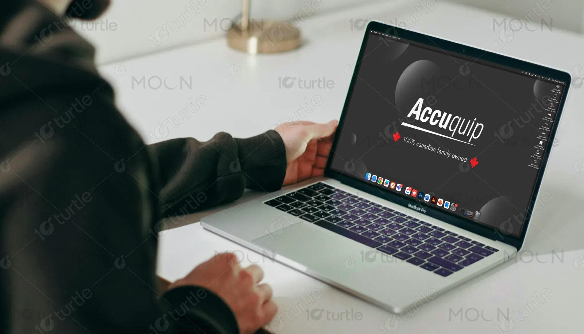
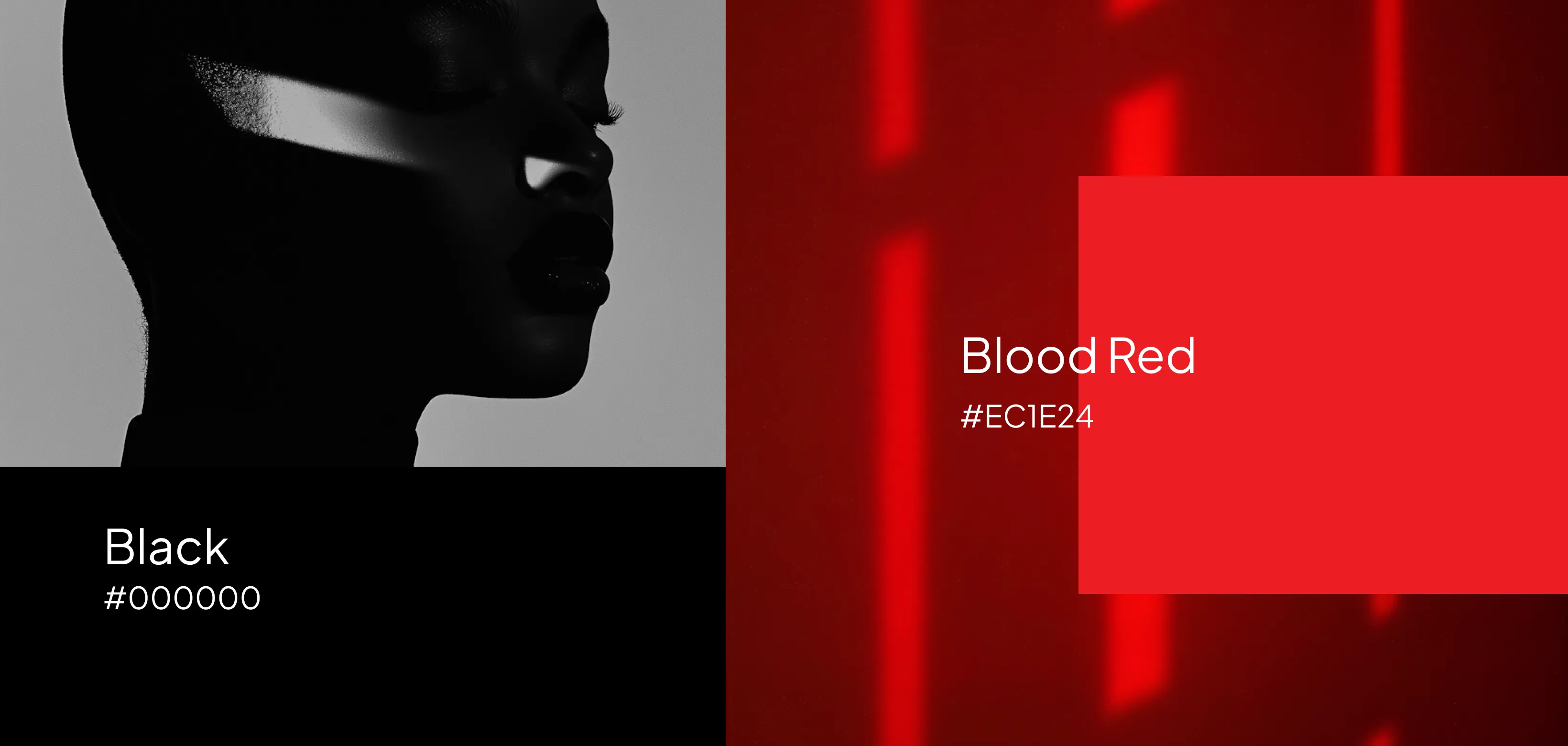
The palette relies exclusively on red and black. Black: Represents strength, precision, and professionalism—qualities essential in the healthcare and dental industry. Red: Symbolizes energy, urgency, vitality, and Canadian identity through the maple leaf. Together, these colors deliver a striking, minimalist identity that is both modern and memorable. The palette avoids industry clichés, ensuring Accuquip projects confidence, trust, and bold Canadian ownership in every interaction.