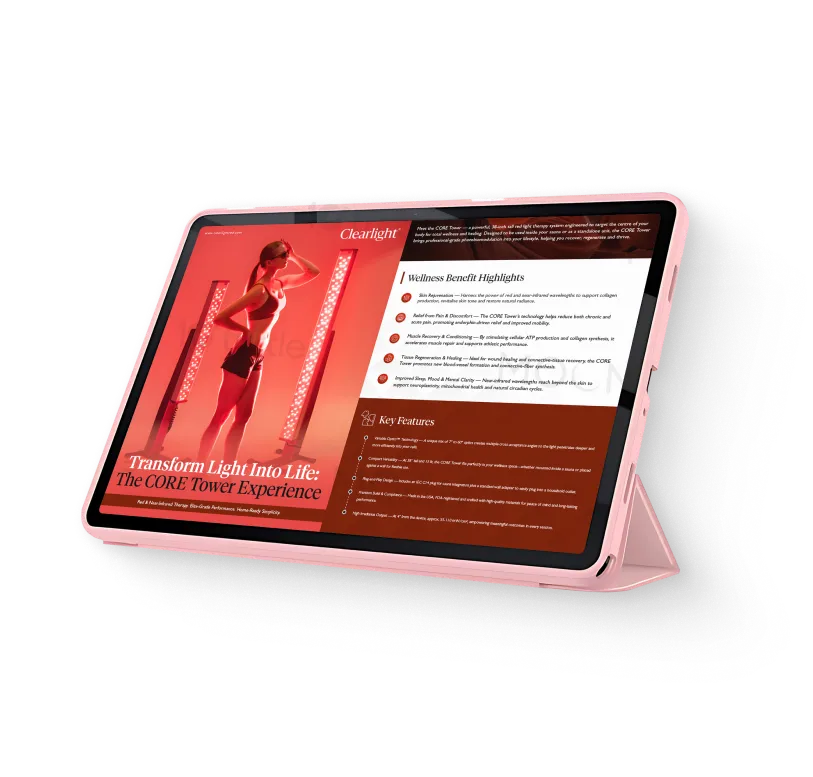
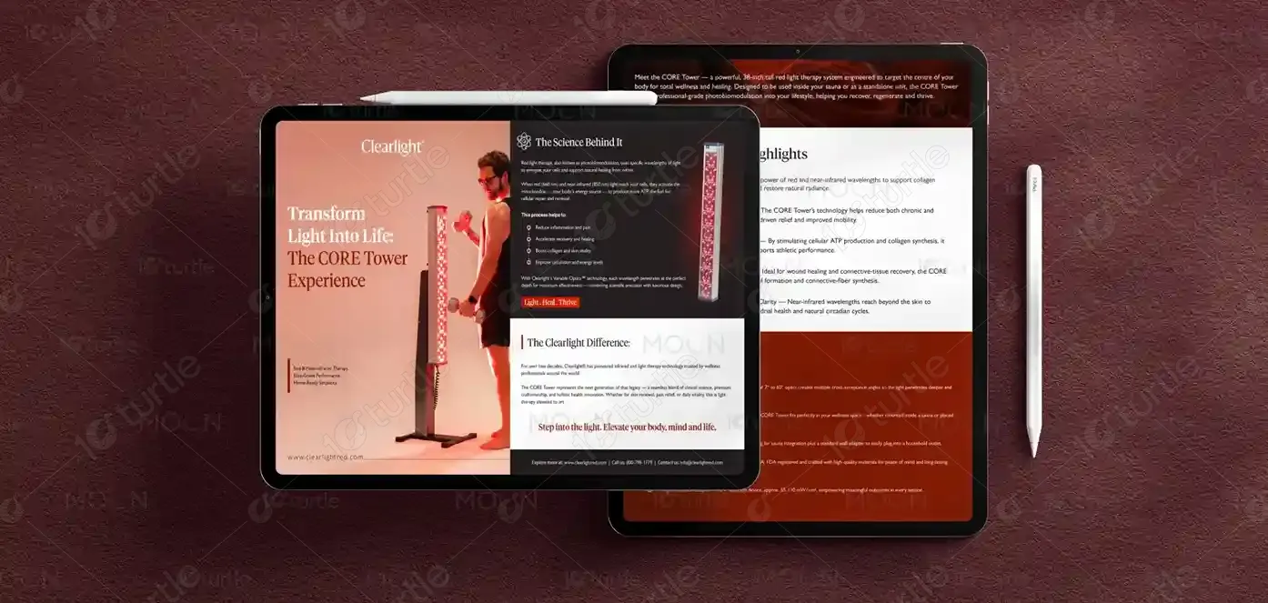
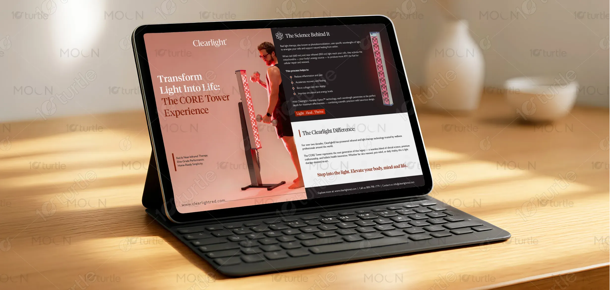
The design adopts a clean, premium wellness aesthetic that reflects the advanced technology and therapeutic benefits of the CORE Tower. The layout is structured to guide the viewer through a logical visual journey, beginning with a powerful hero statement and progressing into product benefits, technology explanations, and brand credibility. A balanced hierarchy is created using bold headlines, structured sections, and concise bullet points to ensure complex scientific information remains easy to understand.
Digital Brochure Design
Graphic Design
Industry
Healthcare & Wellness
Tools we used


Project Completion
2025
Key Market
Global
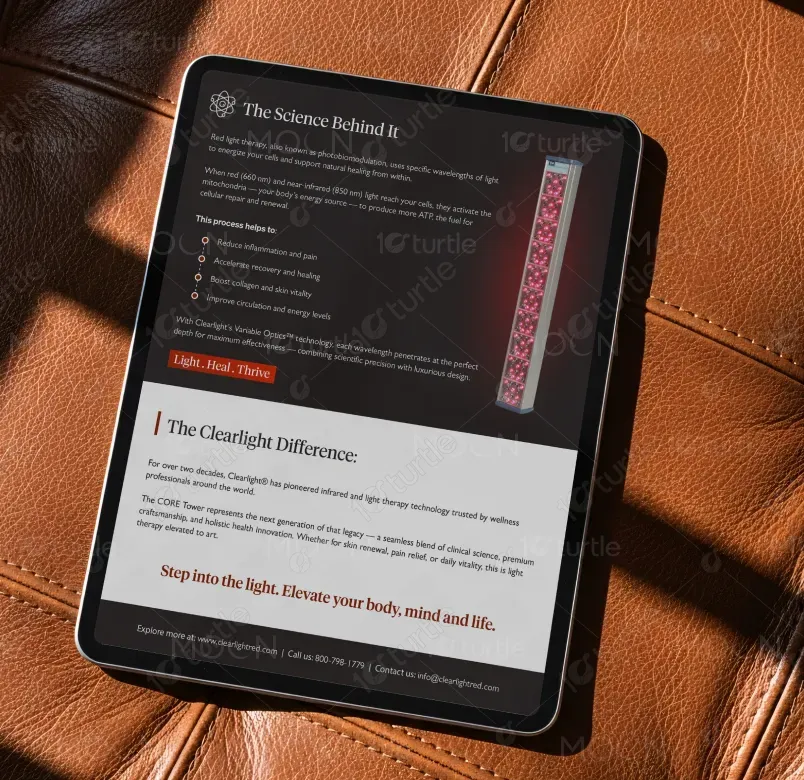
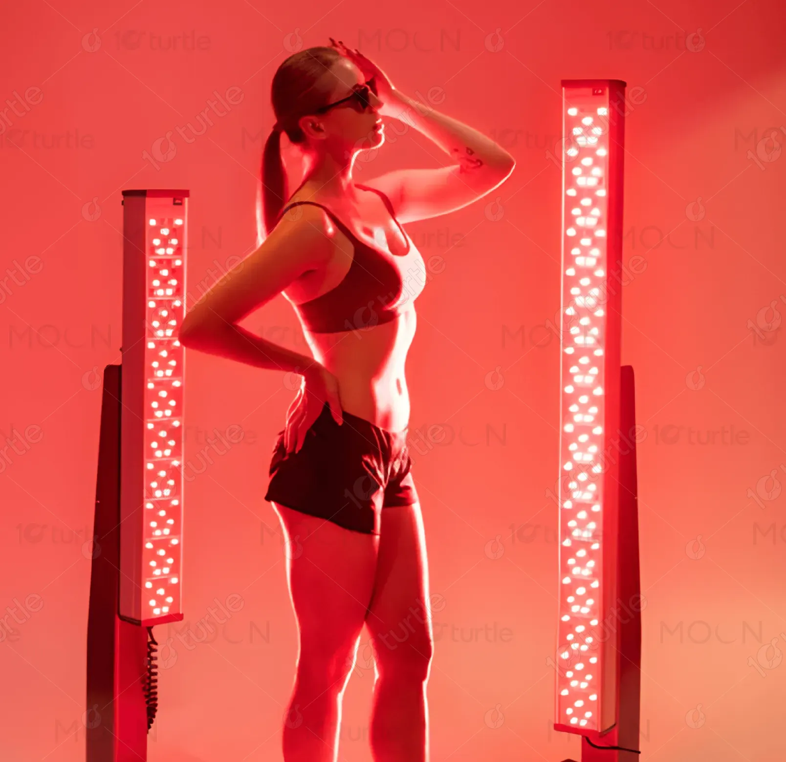
This brochure introduces the CORE Tower, a 38-inch red and near-infrared therapy system designed to support total body wellness through advanced photobiomodulation technology. The design communicates the product’s core benefits—skin rejuvenation, pain relief, muscle recovery, improved sleep, and cellular regeneration—while positioning it as a professional-grade therapy solution adapted for home use.
Industry
Healthcare & WellnessWhat we did
Digital Brochure DesignGraphic DesignPlatform
-In the wellness technology industry, many consumers struggle to understand the science and practical benefits of red light therapy devices. Products are often presented with overly technical explanations or generic marketing claims that fail to clearly communicate real benefits. This lack of clarity leads to low trust, reduced engagement, and hesitation among potential buyers.
The design addresses these challenges through a structured, education-focused layout that transforms technical information into clear, digestible content. Key benefits are presented in concise sections with supportive explanations, ensuring users quickly understand the product’s value. Strategic use of visual hierarchy, spacing, and sectioning allows readers to easily navigate between wellness benefits, product features, and the underlying science.
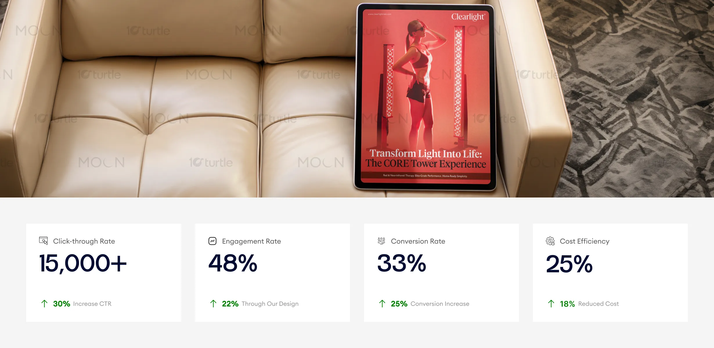
The clean and premium design, paired with a well-organized layout, ensures that complex product information is easy to understand, driving both engagement and conversions. The clarity and compelling narrative lead users through the journey seamlessly, resulting in higher click-through rates and more efficient cost management, ultimately boosting business outcomes.
The CORE Tower represents a broader vision of making advanced wellness technology accessible for everyday life. The design supports this vision by presenting the product not only as a therapeutic device but as a long-term investment in personal health and vitality. Through consistent branding and clear communication, the design establishes a foundation that can scale across future touchpoints such as digital marketing, product packaging, retail displays, and educational materials. Over time, this visual and messaging framework helps position the brand as a leader in high-performance light therapy and holistic wellness innovation.
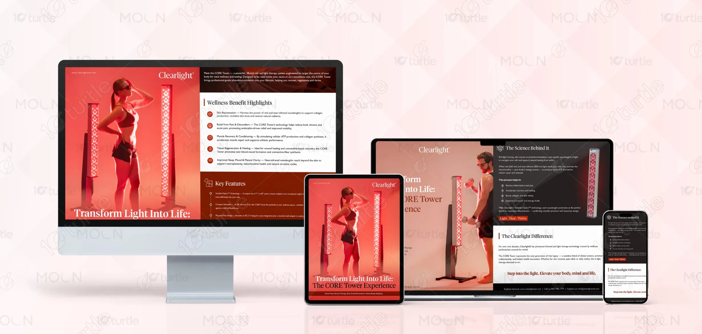
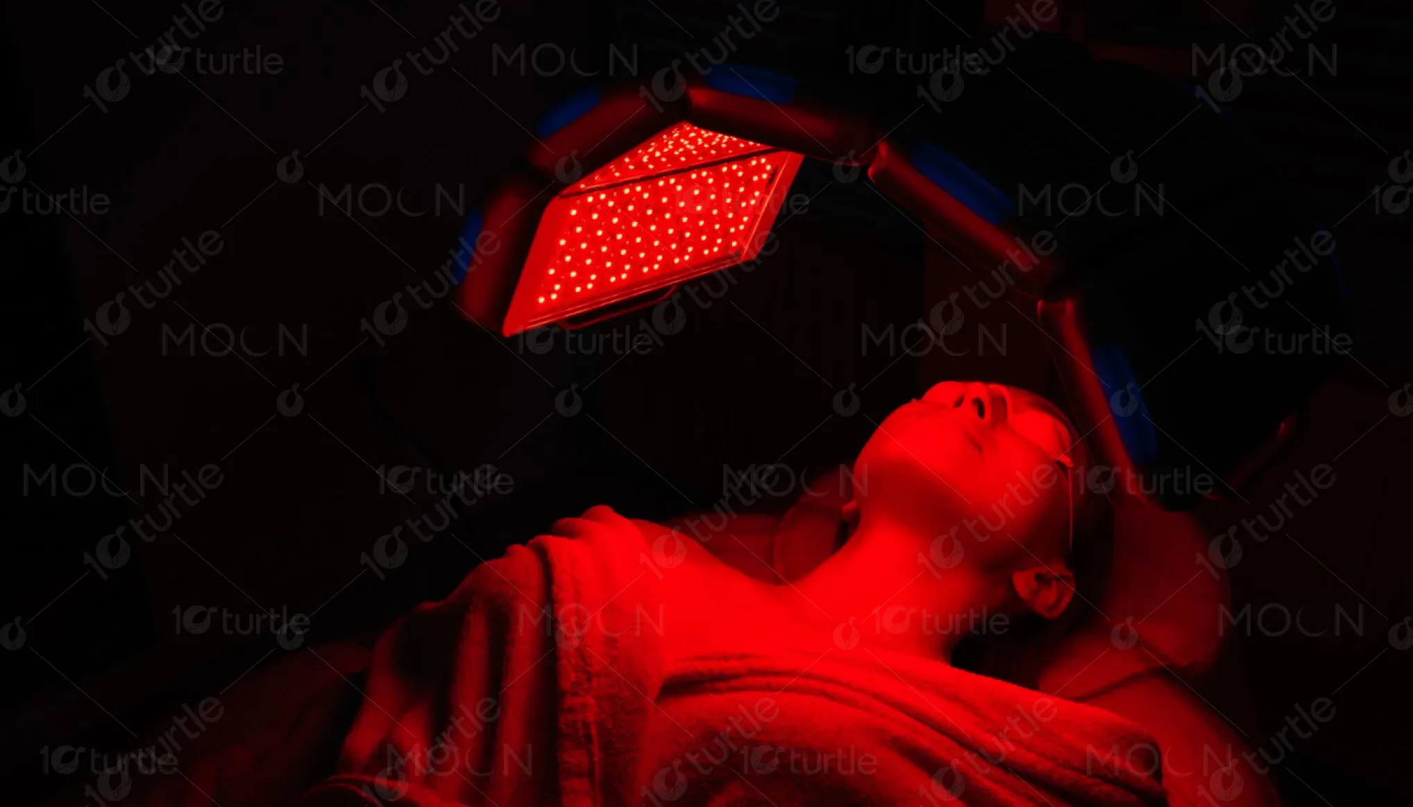
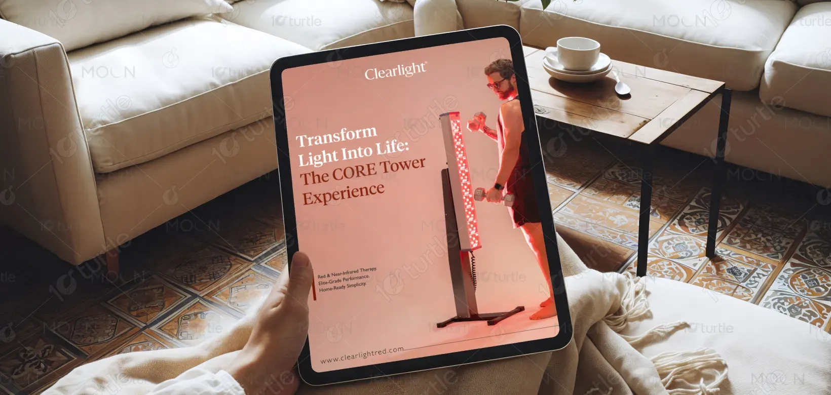
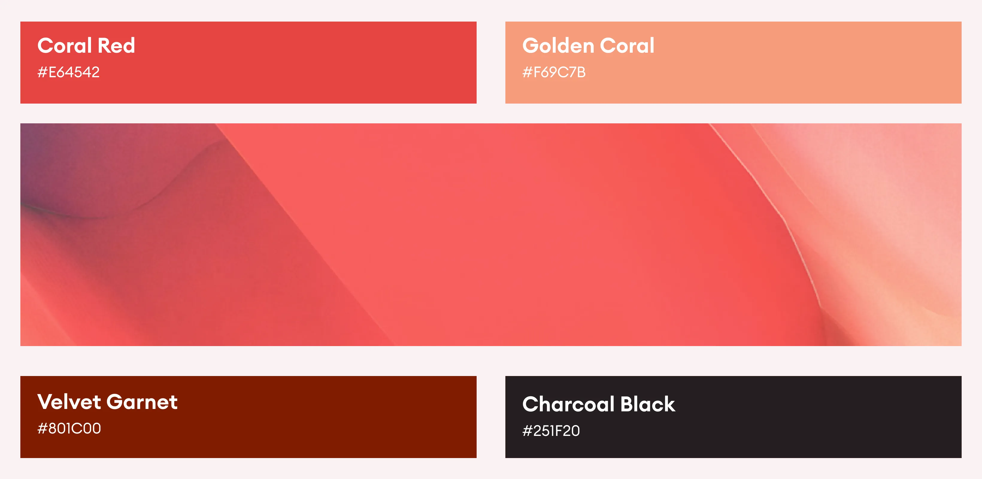
The color palette is built around deep, warm reds and neutral tones, reflecting the core concept of red and near-infrared light therapy. These colors visually reinforce the therapeutic technology while also creating a sense of energy, warmth, and vitality associated with healing and rejuvenation. Supporting neutral tones and clean white space ensure that the content remains readable, balanced, and professional, preventing visual overload while highlighting key information. The visual language is further supported by minimalist layouts, structured typography, and precise spacing, which collectively communicate the product’s premium quality and scientific reliability.