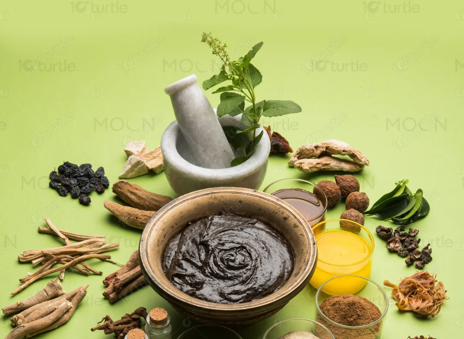
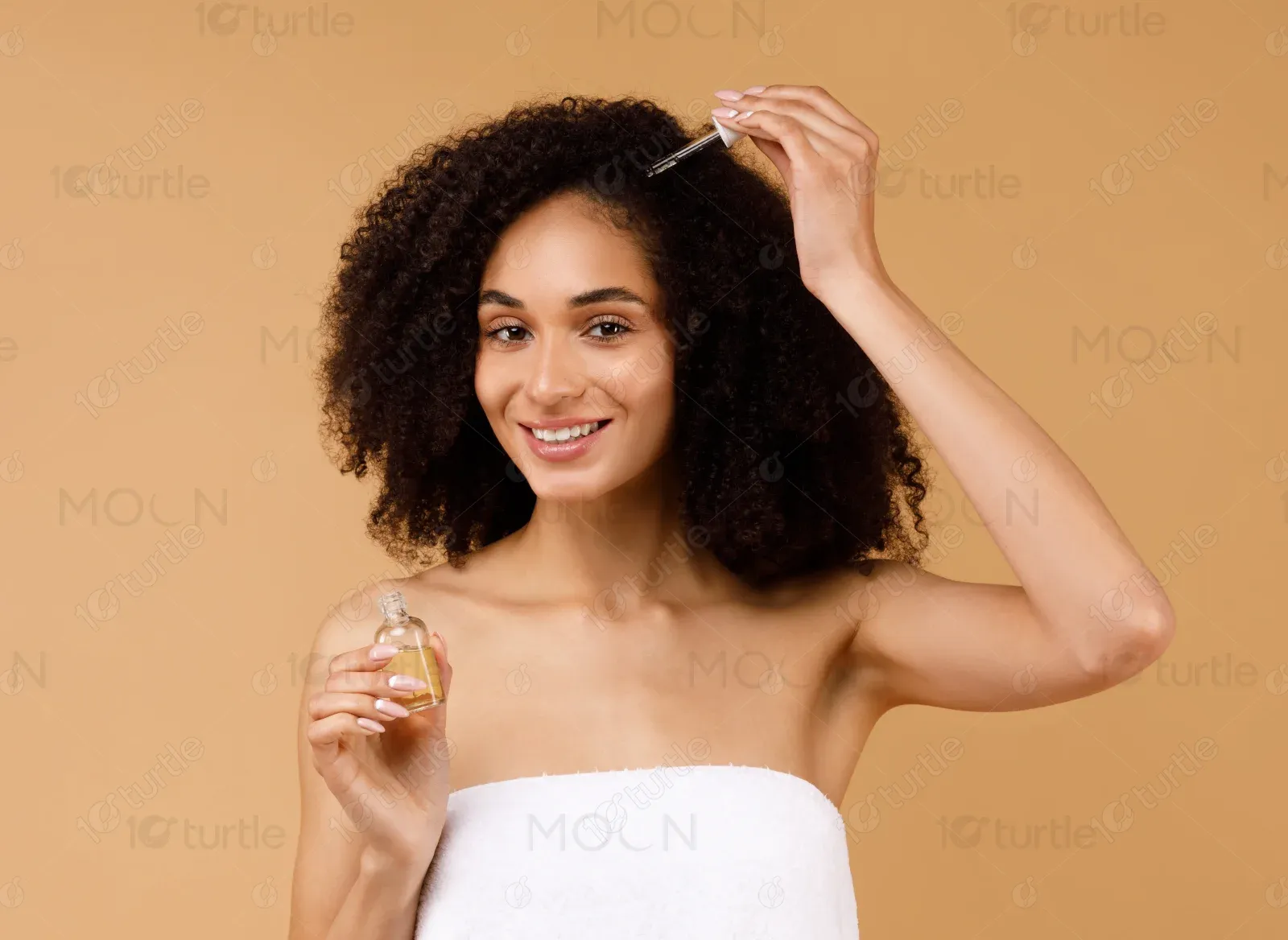
Rood Organics is a natural haircare brand rooted in Ayurvedic and Chinese herbal traditions. Blending e-commerce with wellness, it offers handmade products that promote healthy afro hair through non-toxic, plant-based routines. The brand embraces a grounded, holistic aesthetic that reflects the care and heritage behind every formula.
UX Design
UI Design
Research
Websites Design
Industry
E-Commerce
Tools we used


Project Completion
2024
Key Market
Beauty
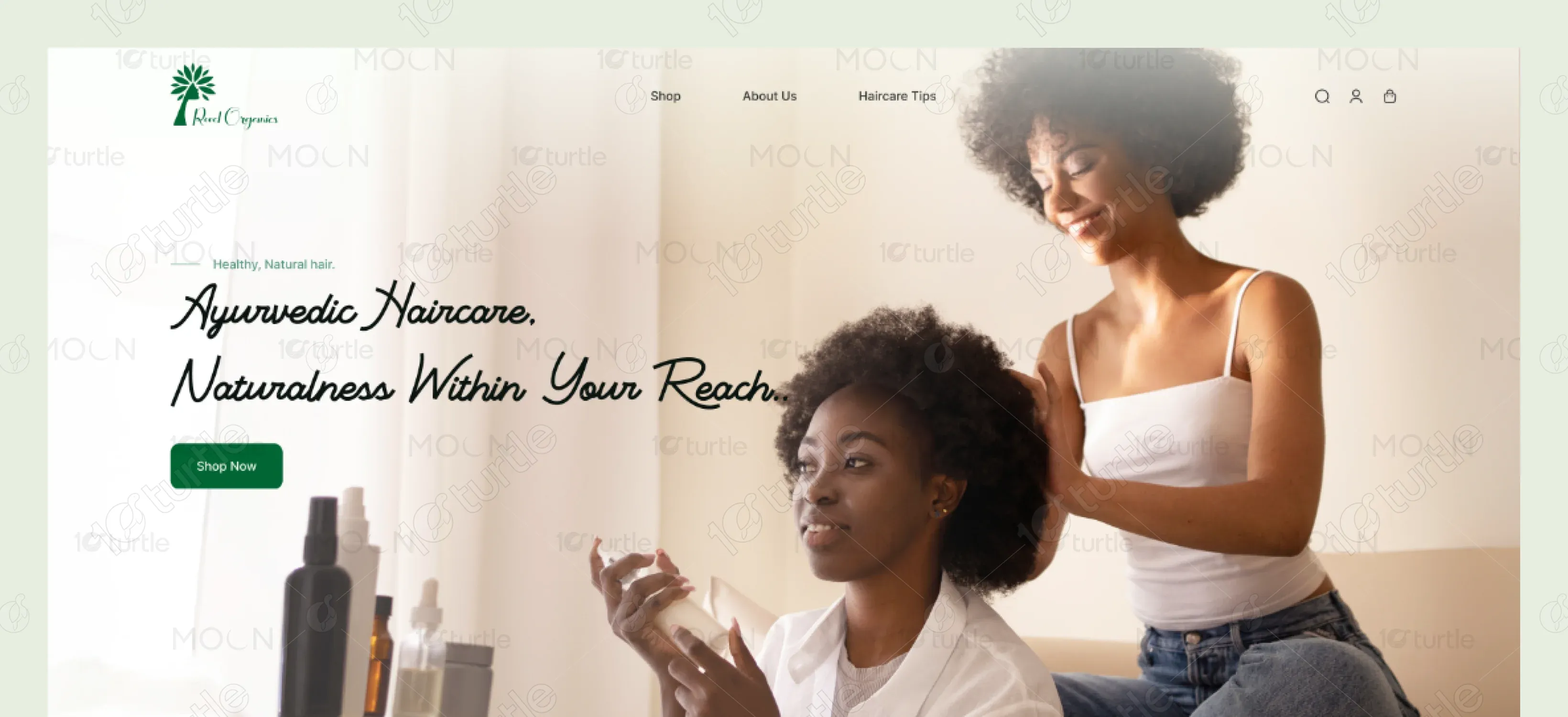
The goal was to design a calm, trustworthy eCommerce experience that reflects Rood Organics’ natural roots and wellness-driven mission. I created a clear, earthy layout system that showcases products while reinforcing the brand’s handmade, holistic identity.
Industry
E-CommerceWhat we did
User ResearchUI/UX DesigningPlatform
-Rood Organics needed a website that felt both personal and professional—an online store that reflected the brand’s roots in Ayurvedic care. The challenge was to design a clean, modern interface that communicated trust while making the buying process effortless.
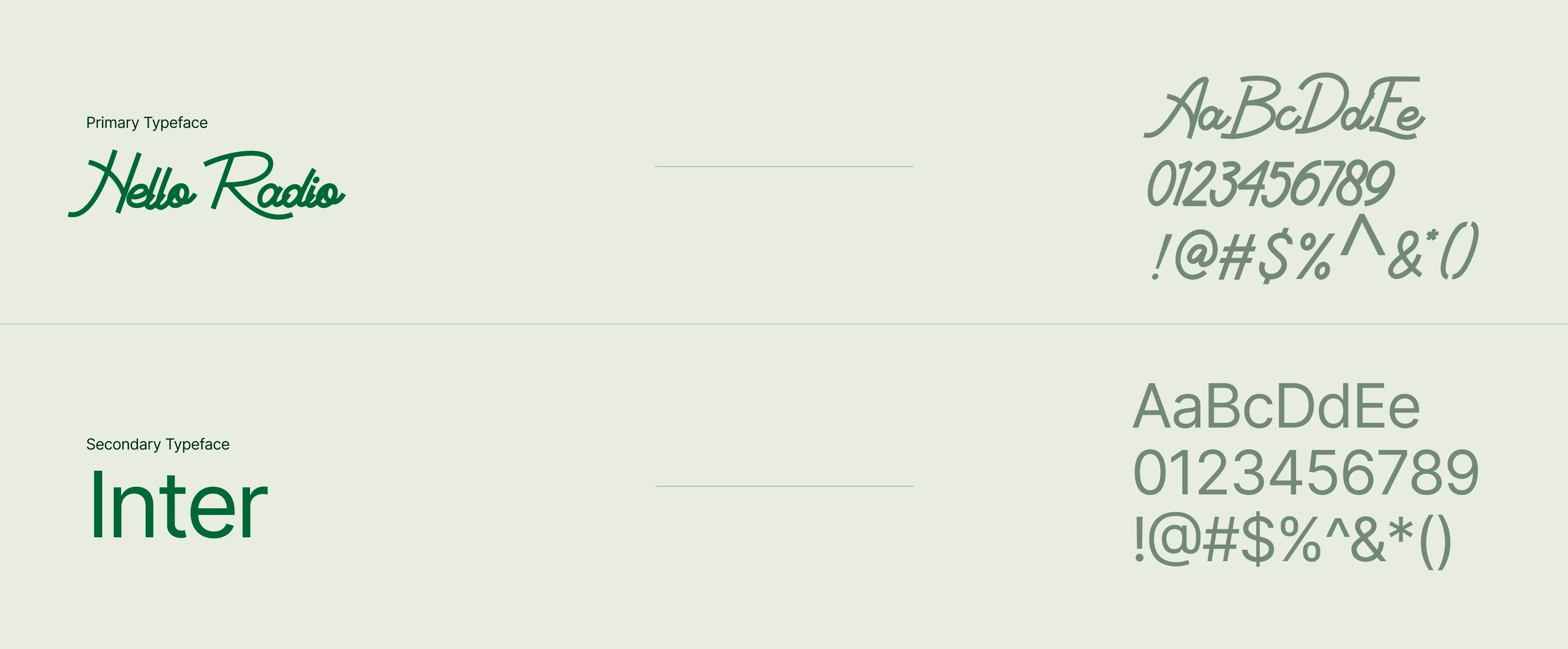
The website was designed as a warm, minimal digital space that reflects the brand’s natural and handmade ethos. Earthy tones, clean typography, and spacious layouts create a calming flow, while subtle textures and organic shapes reinforce the Ayurvedic, wellness-focused identity.
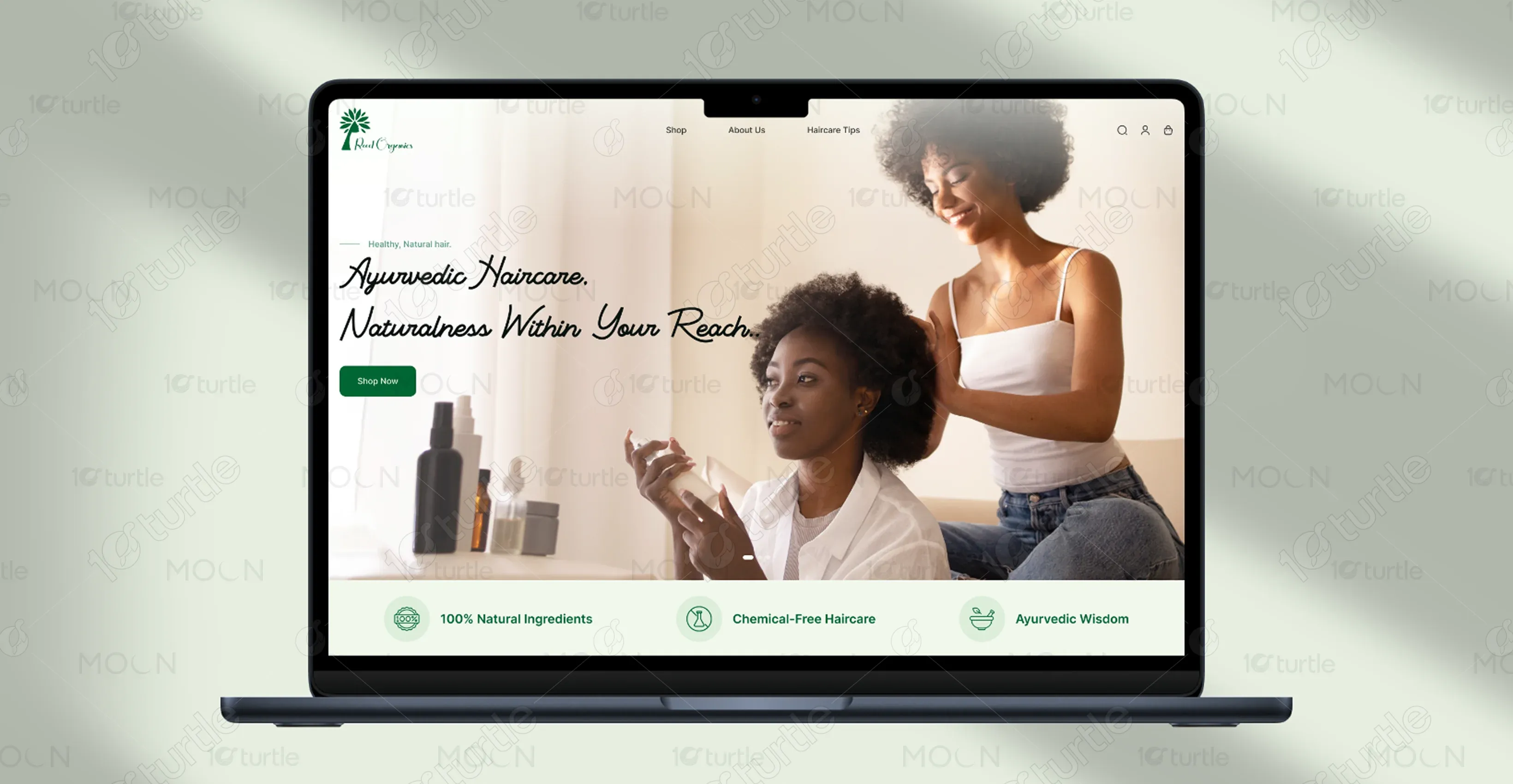
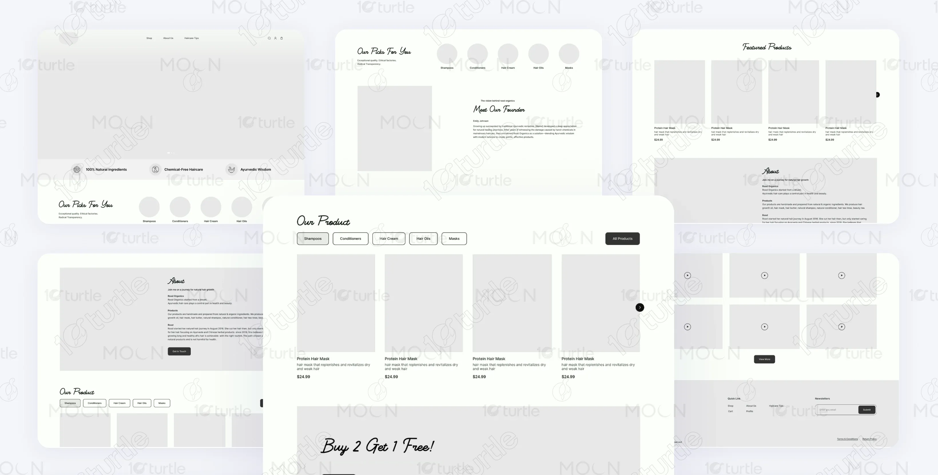
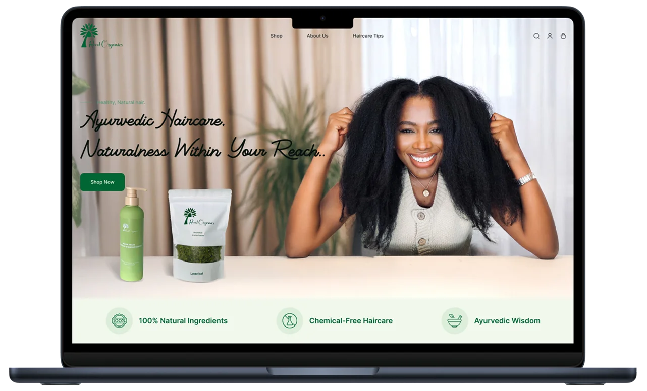
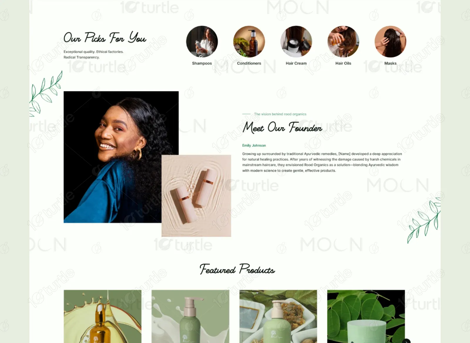
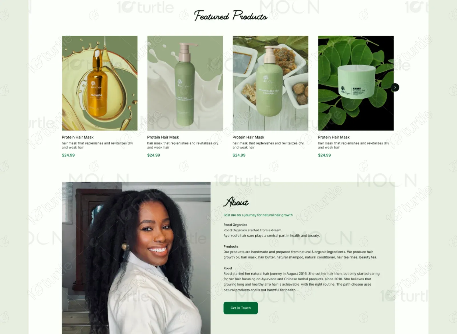
The homepage introduces Rood Organics with a warm, natural hero image and clean, inviting typography. Visual icons highlight the brand’s core values, while rounded product categories encourage quick exploration. The founder’s story adds a personal touch, and featured products are presented with earthy tones and minimal layouts. Haircare tips and a special offer drive engagement toward the end.
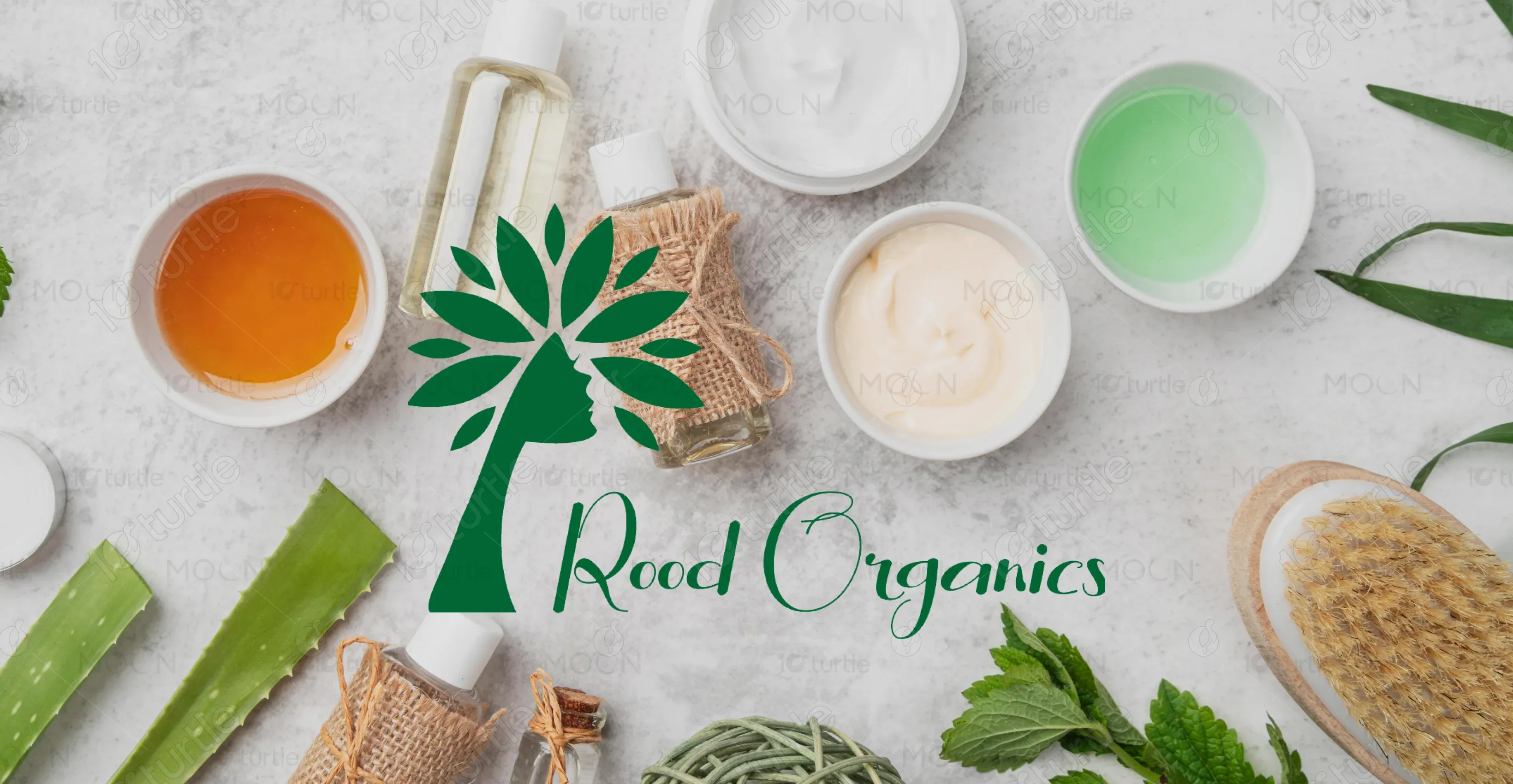
The Rood Organics logo reflects the brand’s natural, feminine identity. The silhouette of a woman merging with a tree symbolizes growth, wellness, and rooted traditions. The deep green palette reinforces its Ayurvedic foundations and commitment to plant-based care.
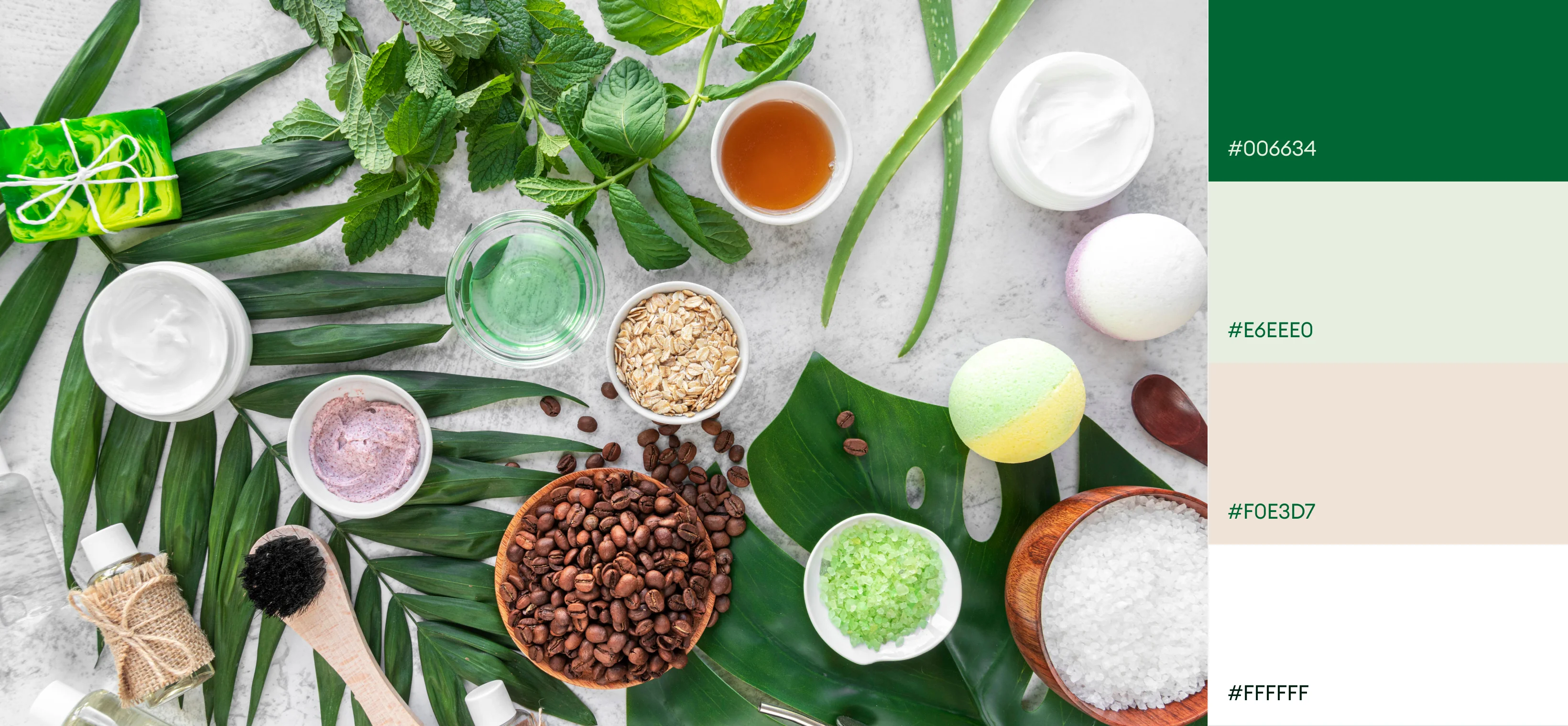
The website’s colors reflect the brand’s earthy, holistic spirit—using soft greens for calm and balance, beige for warmth and approachability, and deep green for trust and tradition. White space keeps the layout clean, while subtle neutrals support a grounded, natural feel.
The wireframe was designed to create a calm, product-focused experience with clarity and ease of use at its core. Each section was structured to highlight the brand story, product discovery, and clean navigation. The layout emphasizes flow and spacing, guiding users naturally from browsing to purchase.