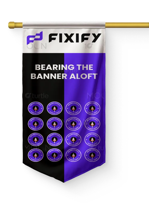
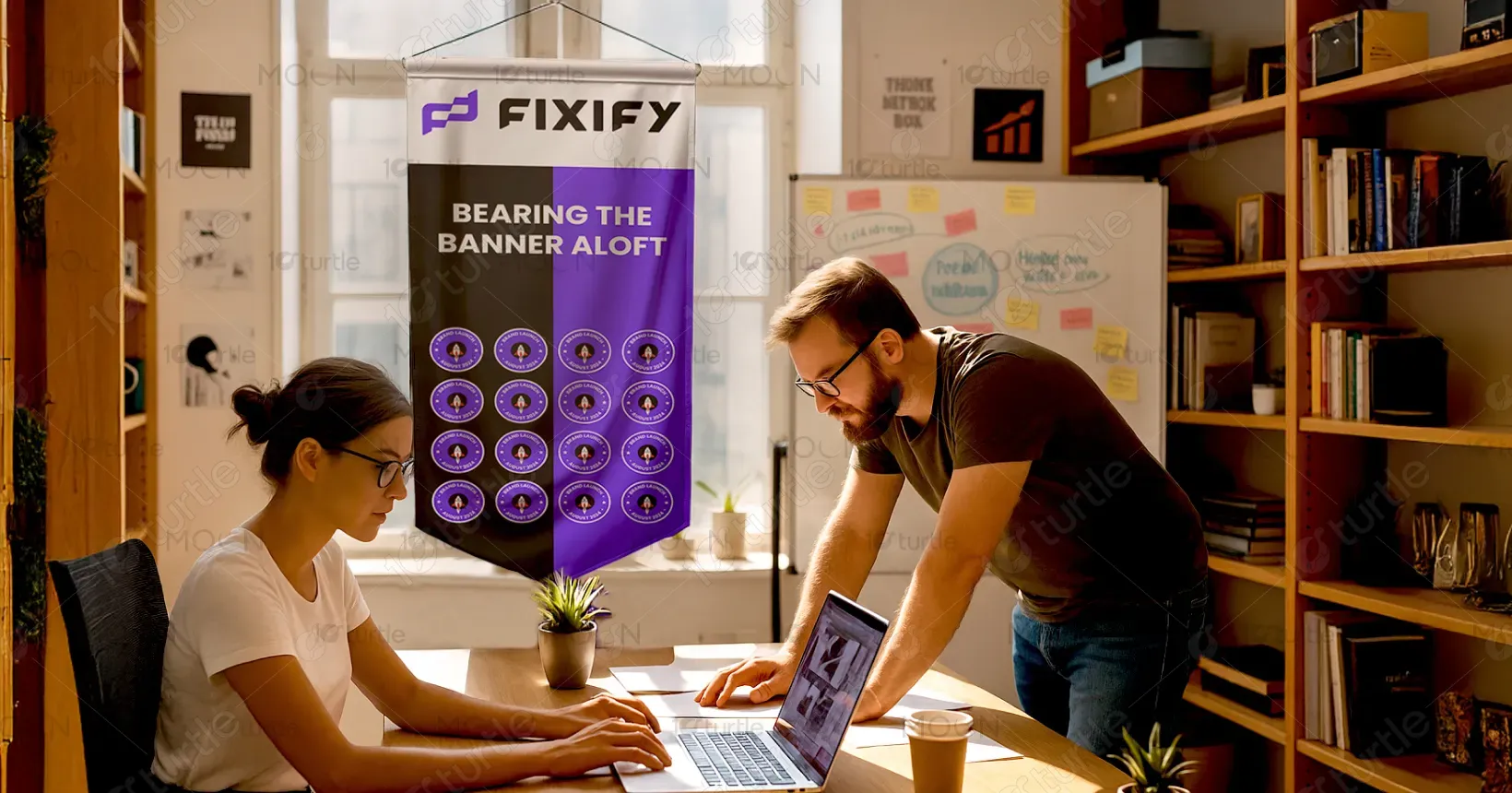
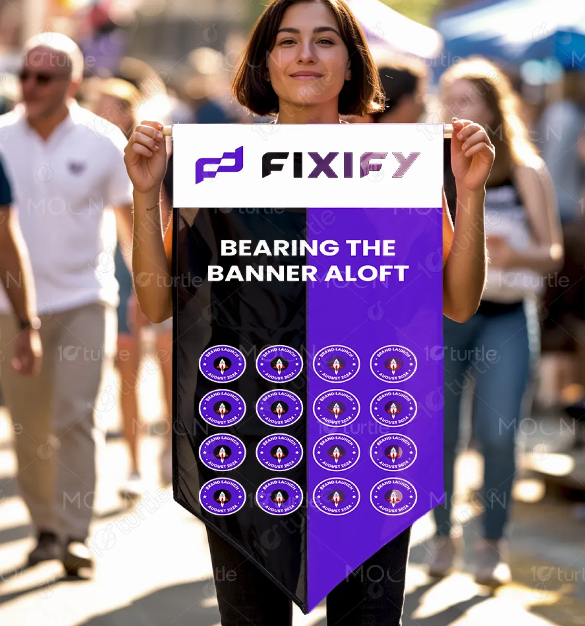
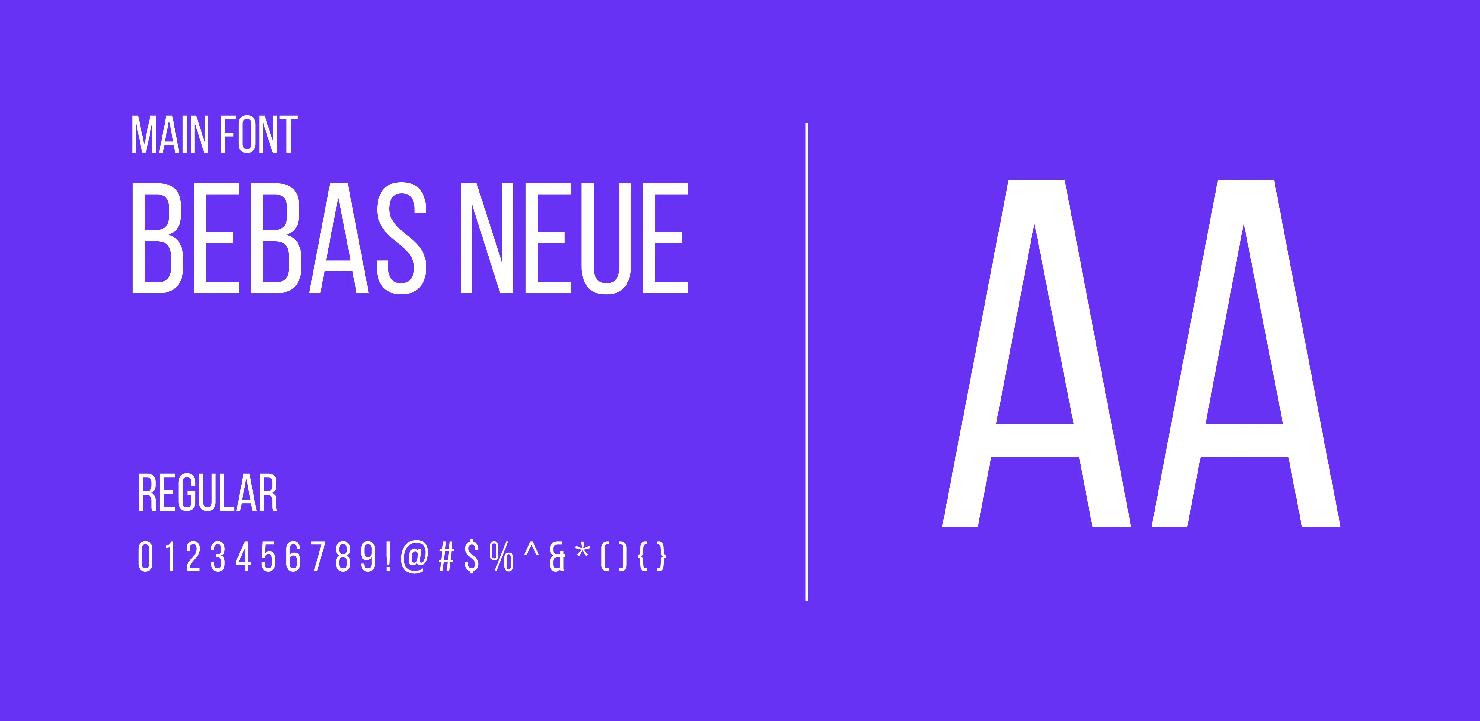
The Fixify flag design boldly merges branding with celebration. A striking split background of black and electric purple symbolizes balance between innovation and strength. The phrase “BEARING THE BANNER ALOFT” sits confidently at the center, emphasizing the brand’s uplifting vision. Repeating badge-style emblems featuring a rocket icon and “Brand Launch – August 2024” reinforce excitement and motion. Clean typography and minimalistic repetition ensure modern appeal while creating a visually rhythmic identity piece meant for events, launches, or recognition.
Flag Design
Graphic Design
Industry
Technology, SaaS & Startups
Tools we used


Project Completion
2025
Key Market
Global
This flag is a commemorative brand identity piece created for Fixify’s official launch in August 2024. Designed to symbolize momentum and bold entry into the market, it acts as both a promotional and ceremonial artifact. The combination of a vibrant visual palette, futuristic iconography, and unified repetition sets the tone for a tech-forward, energetic brand. Its core appeal lies in its ability to function as both marketing collateral and symbolic representation of company pride and vision.

Industry
Technology, SaaS & StartupsWhat we did
Flag DesignGraphic DesignPlatform
-Creating launch visuals that are both memorable and functional often leads to over-complication or lack of cohesion. Many brands struggle to visually express energy and innovation without cluttering the message. The challenge here was to represent excitement and professionalism simultaneously — especially for a tech-forward brand — while ensuring visual consistency across different brand collateral. Additionally, designing for a vertical flag format adds difficulty in maintaining symmetry and readability.
The design employs symmetry, bold color blocking, and icon repetition to maintain structure and clarity. The rocket badge visually symbolizes launch momentum, and its repeating pattern reinforces the celebratory nature of the design. The central slogan grounds the message with a unifying brand mantra. The layout respects the vertical flow of the flag, drawing the viewer’s eye downward naturally. This solution blends simplicity with symbolism to create maximum visual impact without compromising on branding.
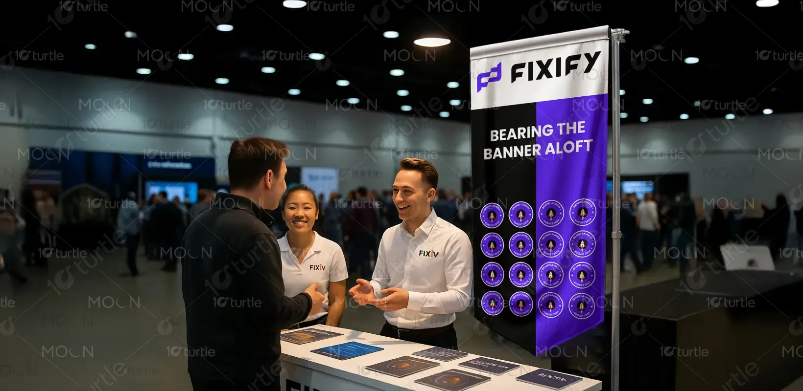
The long-term aspiration for this flag design is to become a hallmark of Fixify’s identity—used in launches, team celebrations, office spaces, or community events. As the brand grows, this visual can evolve into a motif that carries forward company milestones and future achievements. It serves not just as a one-time launch piece, but as a timeless visual expression of mission and momentum. The design is scalable, adaptable, and memorable—key ingredients for brand legacy.
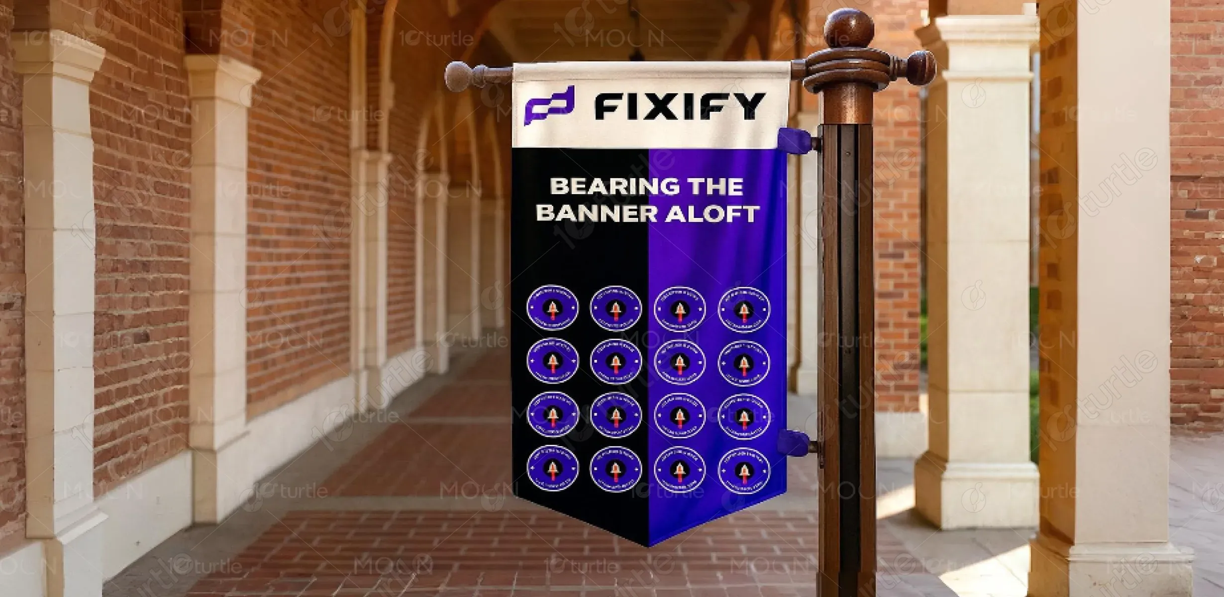

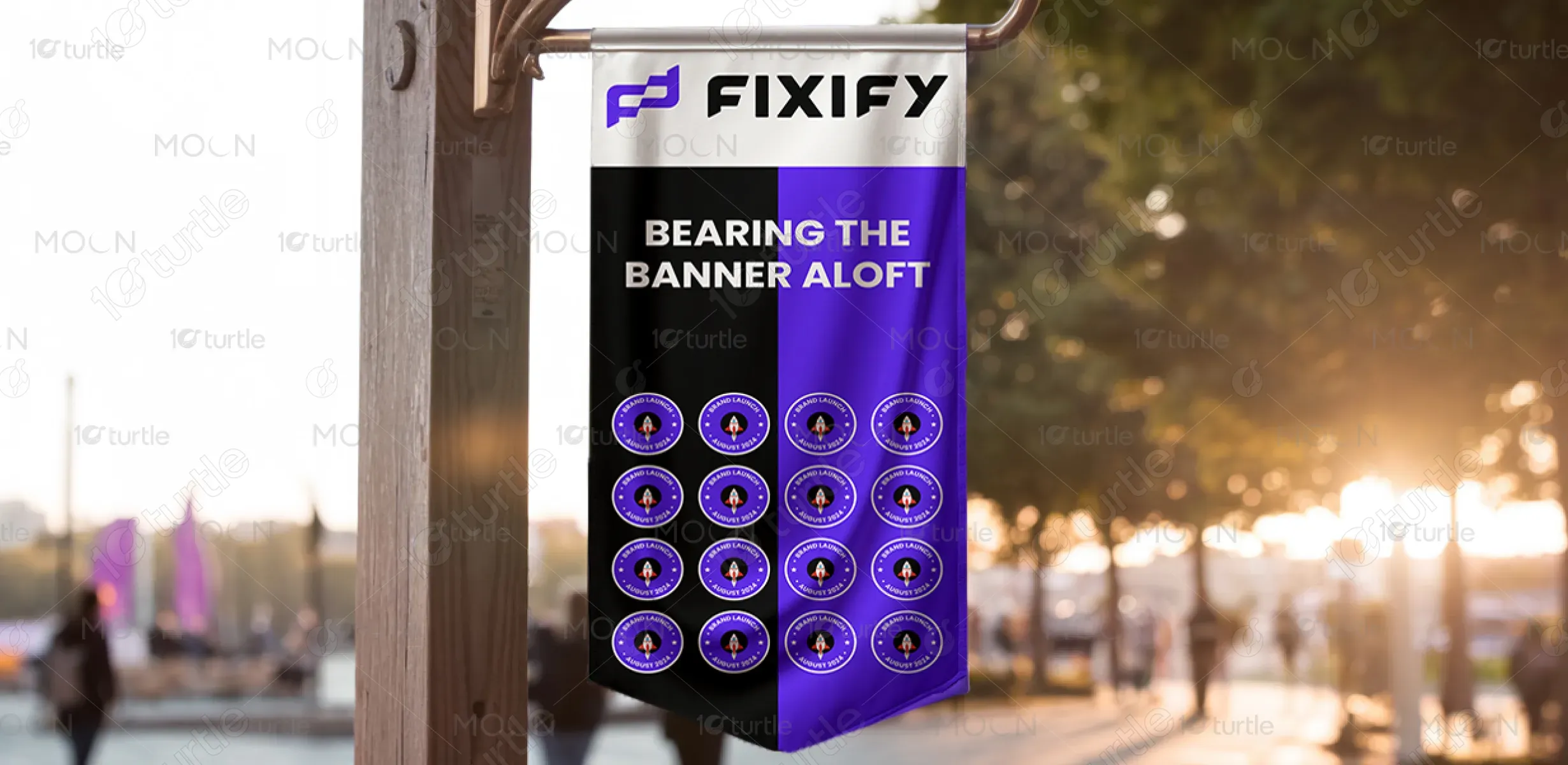
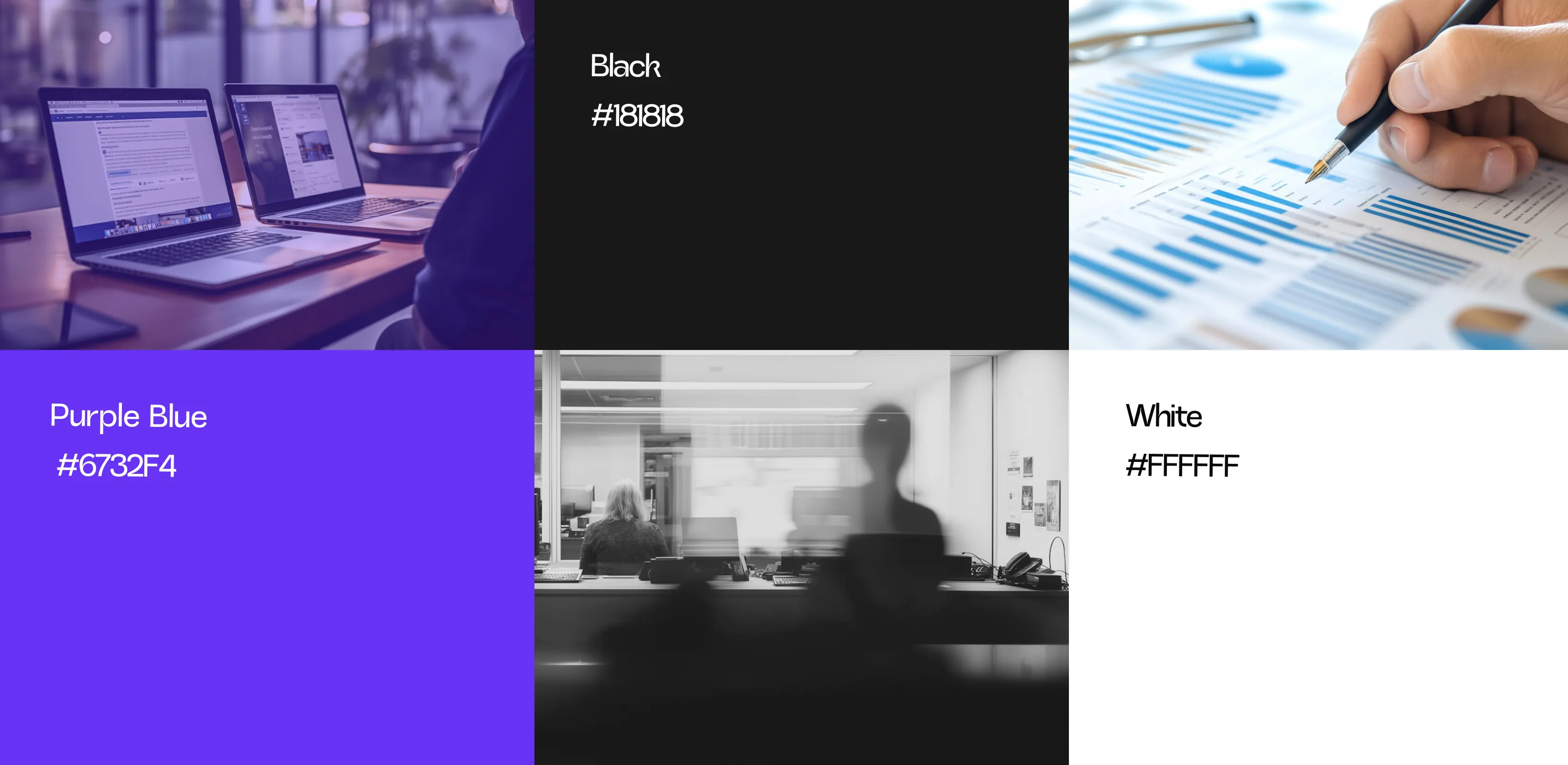
The dominant color scheme features electric purple, black, and silver-white. Purple conveys creativity, tech-savviness, and ambition, while black adds authority and elegance. The silver-white upper section offers contrast, enhancing logo visibility and creating a premium look. These colors collectively position Fixify as bold, confident, and future-focused—an identity well-aligned with disruptive innovation and market entry. The palette also supports both digital and physical applications with strong visual coherence.
