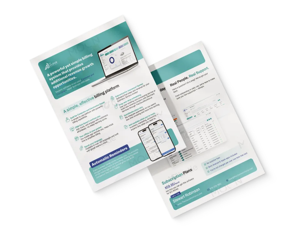
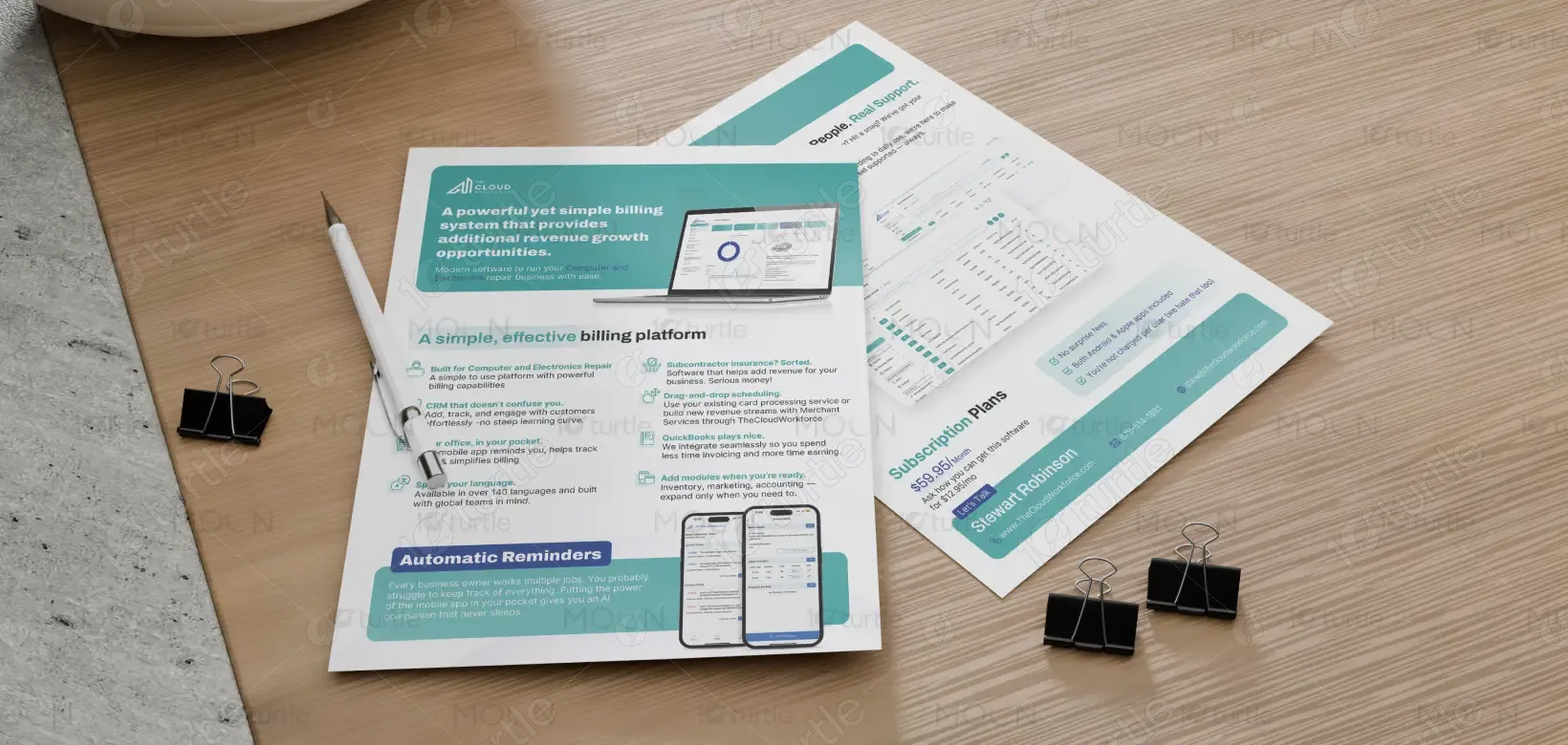
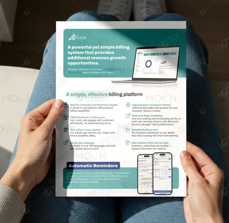
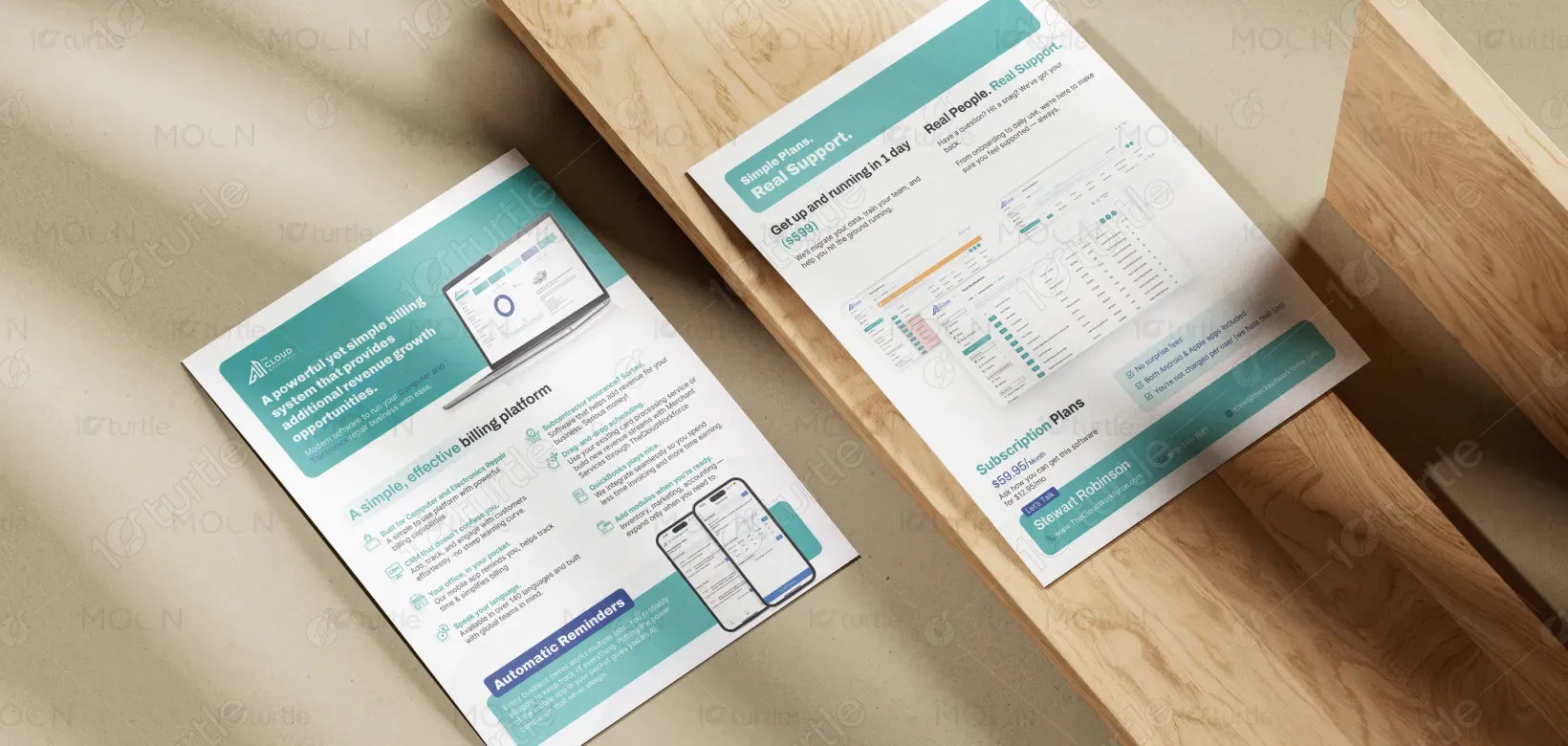
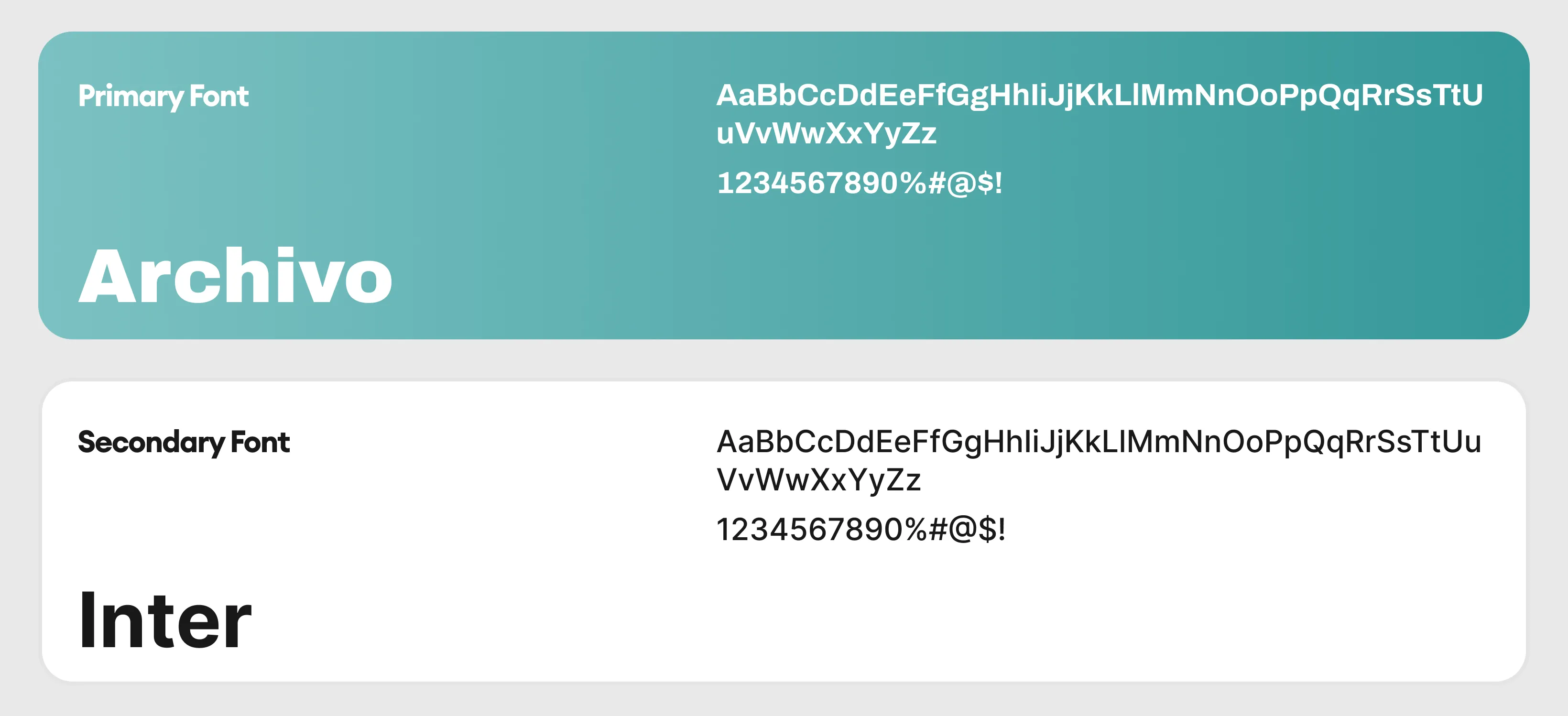
The flyer uses a clean, modular layout paired with modern typography and a calm, professional color palette to communicate clarity and trust. Strong headline hierarchy draws attention to the core value proposition, while supporting sections break down features into easily scannable blocks. Product UI imagery reinforces credibility and functionality, showing the platform in real use rather than abstract visuals. Consistent spacing, iconography, and alignment ensure the content feels structured, approachable, and business-focused—ideal for a professional services audience.
Flyer Design
Graphic Design
Industry
Technology, SaaS & Startups
Tools we used


Project Completion
2025
Key Market
Global
This design represents a billing and business management platform tailored specifically for computer and electronics repair businesses. Its primary purpose is to clearly communicate how the software simplifies billing, improves operations, and creates new revenue opportunities. Positioned within the service-software market, the flyer highlights ease of use, fast onboarding, and real human support as key differentiators, while visually supporting the product’s reliability and day-to-day practicality.

Industry
Technology, SaaS & StartupsWhat we did
Flyer DesignGraphic DesignPlatform
-Many repair businesses struggle with fragmented tools, complex billing systems, confusing CRMs, and time-consuming manual processes. These challenges lead to lost revenue, inefficient workflows, delayed payments, and frustration for both owners and staff. Additionally, overly technical or cluttered software interfaces reduce adoption and trust, making it difficult for teams to fully utilize digital tools.
The design addresses these issues through a clear, user-centric information hierarchy that emphasizes simplicity and relevance. Each section highlights a specific benefit—billing, CRM, scheduling, integrations, and support—using concise copy and visual cues. The layout prioritizes readability and quick comprehension, while real product screenshots demonstrate transparency and usability. Strategic callouts such as pricing, onboarding time, and support reassure users and reduce decision friction.
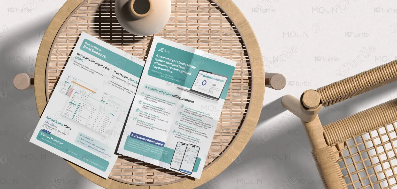
The design supports a long-term vision of positioning the brand as a dependable, scalable partner for service-based businesses. It is structured to adapt easily across future marketing materials, digital touch points, and campaigns without losing consistency. By focusing on clarity, trust, and practicality, the design helps establish the brand as a stable, industry-focused solution that grows alongside its customers.
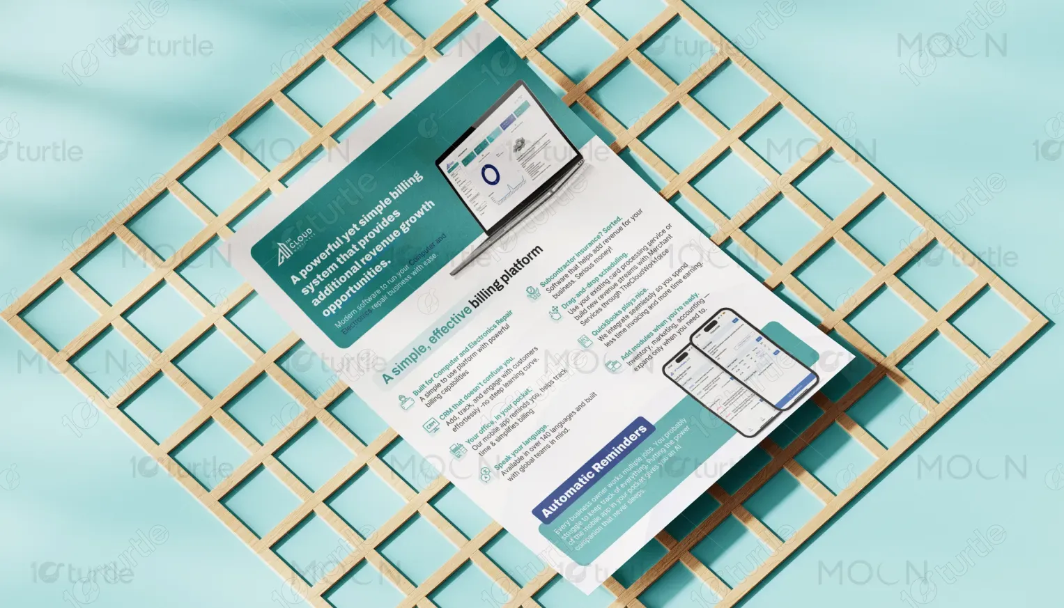
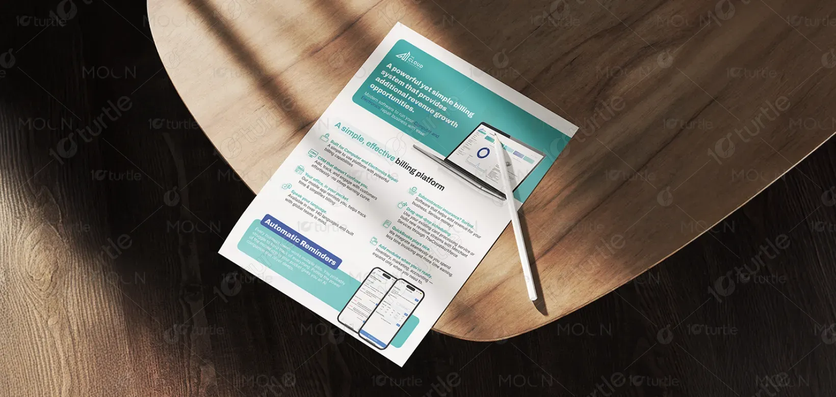
The teal and blue-green palette conveys trust, stability, and modern professionalism while remaining approachable. White space enhances readability and reduces cognitive load, making the information easier to absorb. Supporting icons and UI visuals maintain consistency and reinforce the software-driven nature of the product. Overall, the visual language balances warmth and reliability, aligning with the brand’s promise of simplicity, support, and efficiency across all formats.