The design focuses on clarity, hierarchy, and simplicity to communicate complex technical content effectively. A structured layout leads the viewer from headline to process, supported by minimal icons and accent highlights. Clean typography and balanced spacing create a professional tone, while the use of brand blues and subtle gradients adds depth and modernity. Each visual choice reinforces trust, innovation, and precision — qualities central to Tropos’ identity as a data-driven, technology-focused brand.
Flyer Design
Graphic Design
Industry
Technology, SaaS & Startups
Tools we used


Project Completion
2025
Key Market
Global
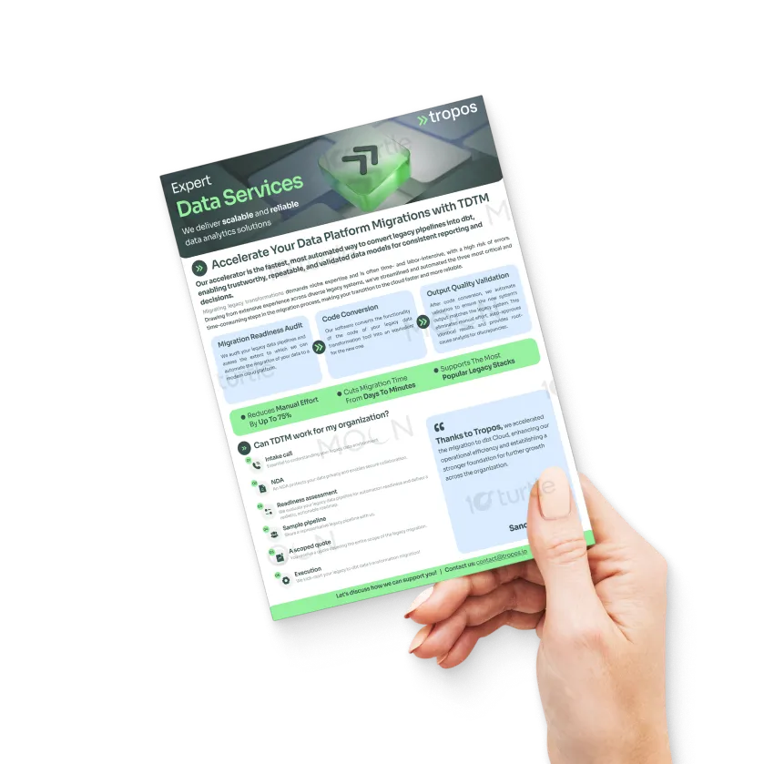
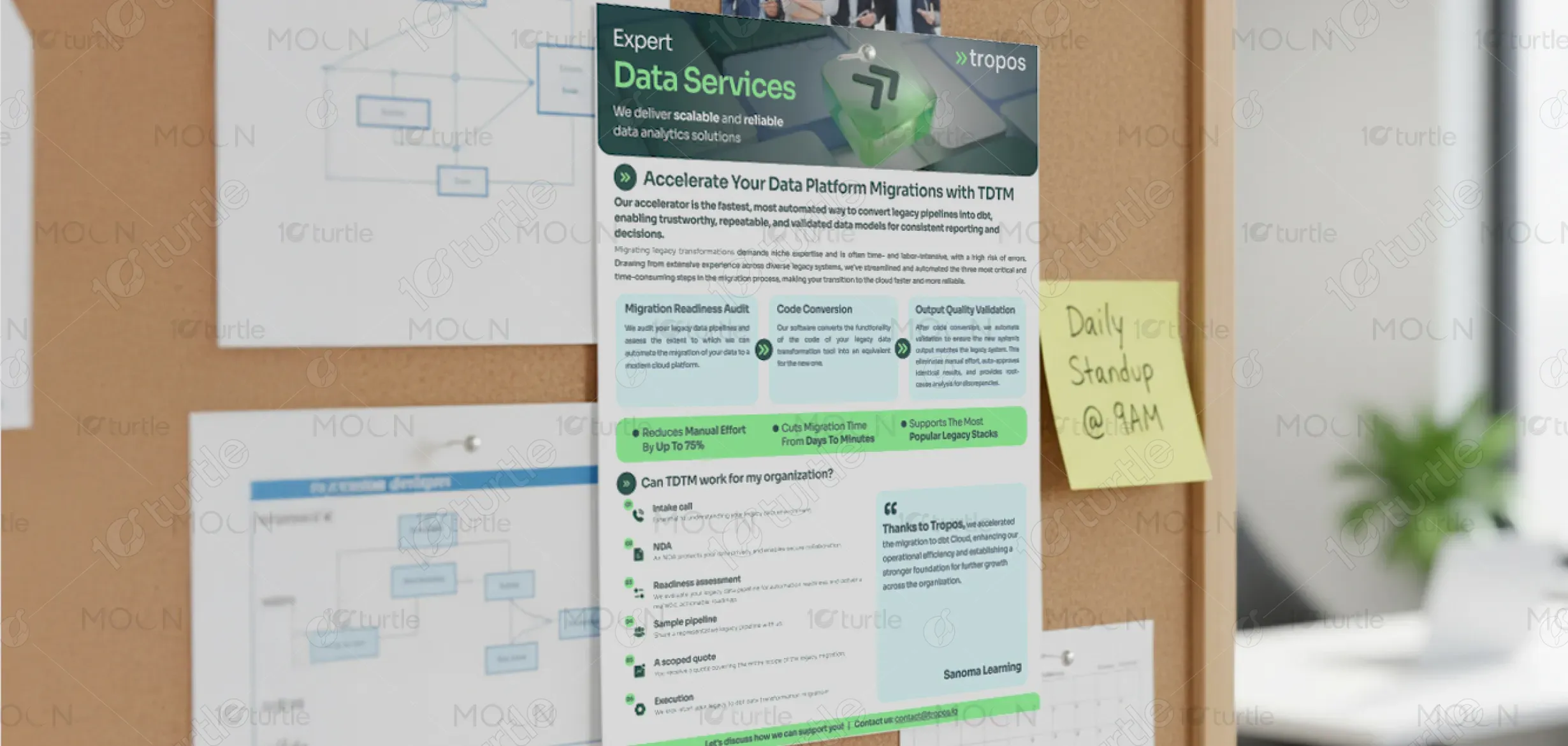
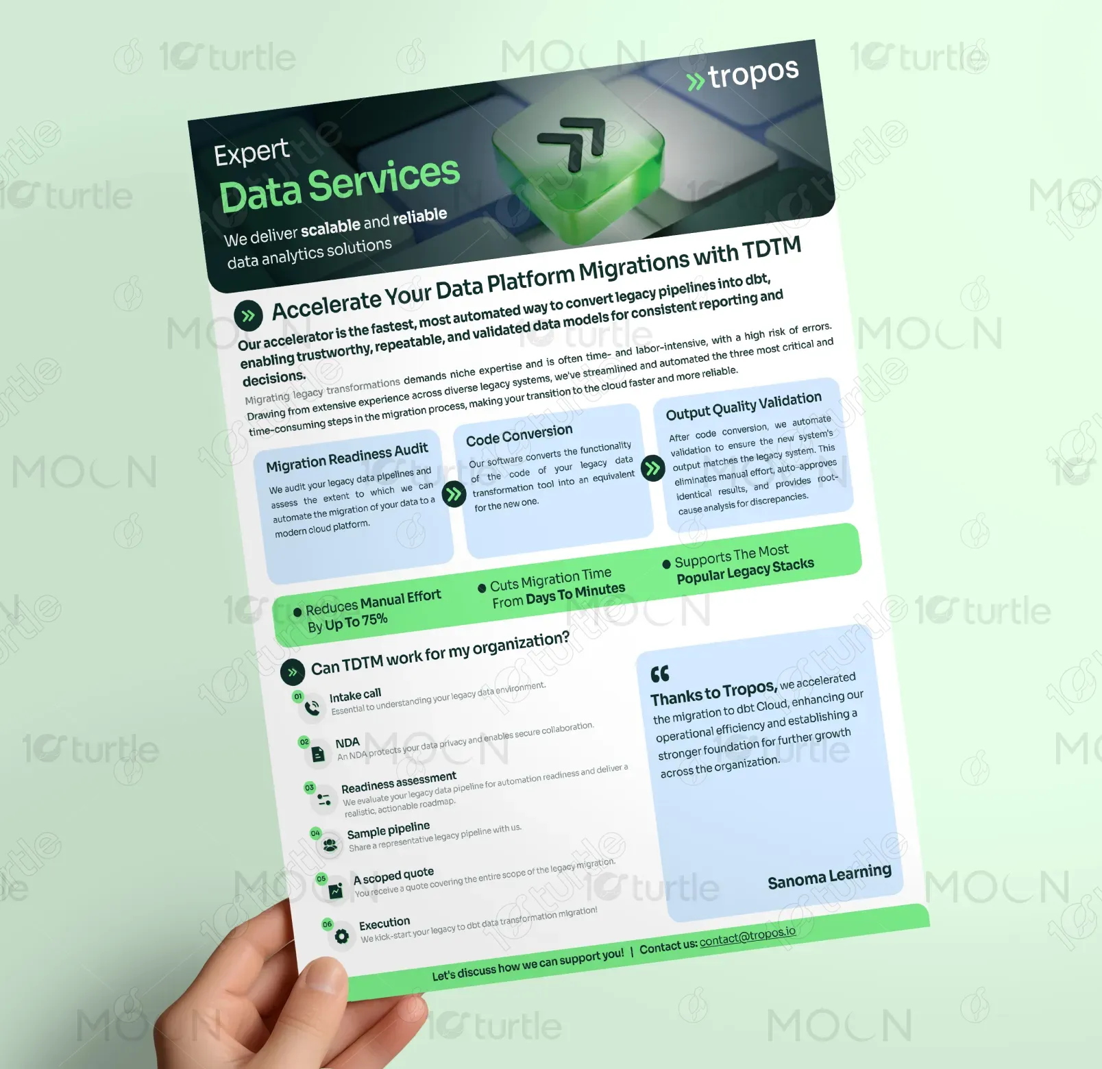
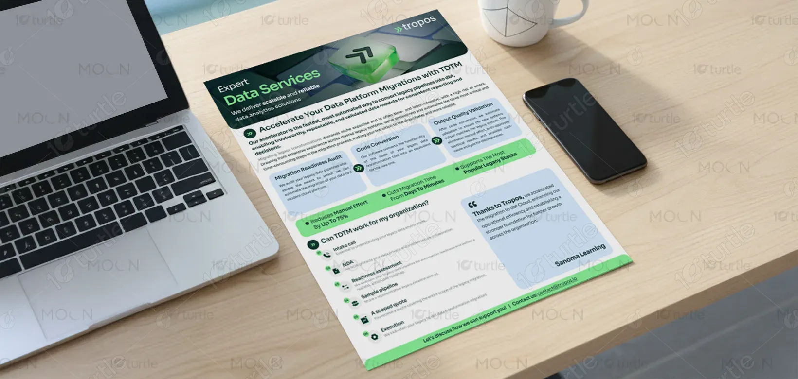
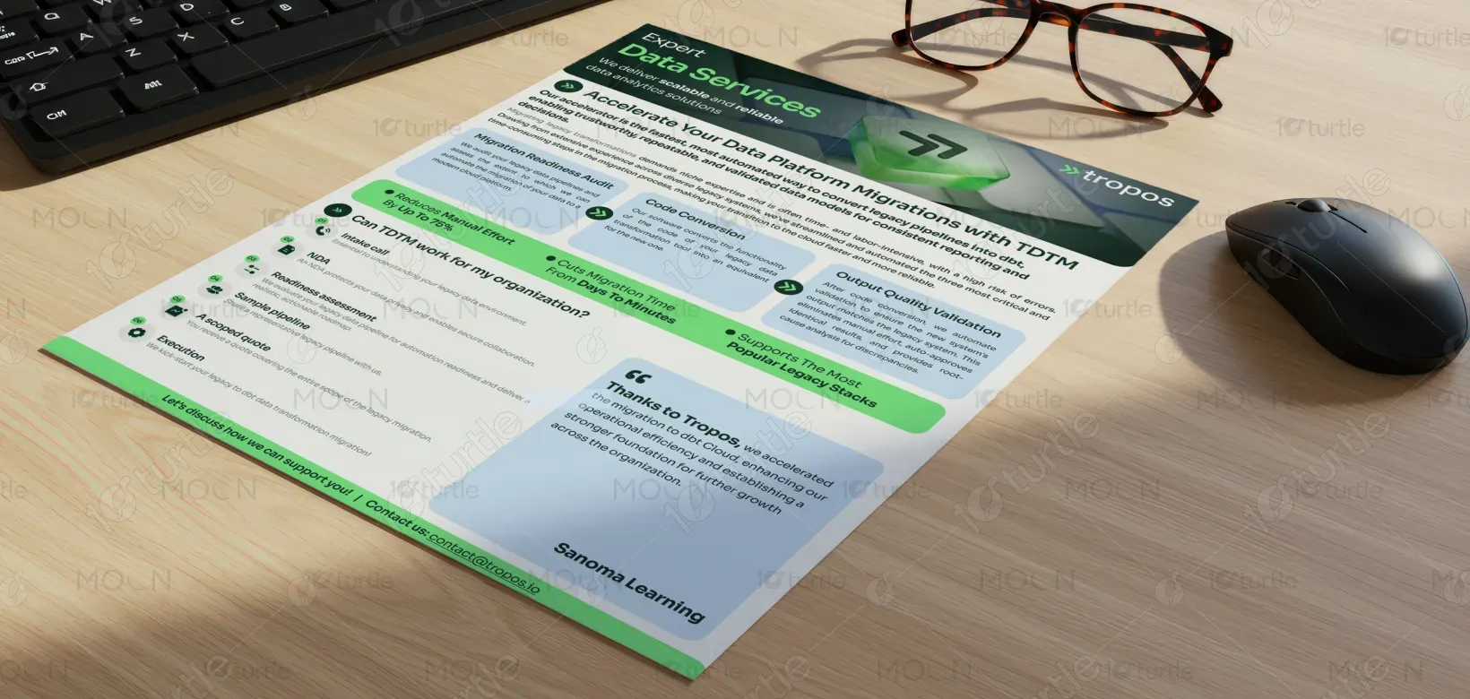
The project involved designing a one-page product sheet for Tropos, showcasing their TDTM (Tropos Data Transformation Migrator) — a software accelerator that automates the migration of legacy data pipelines into modern frameworks like dbt Cloud. The flyer’s purpose was to simplify a highly technical process for business decision-makers. Its unique selling points include automation, reduced manual effort, and faster cloud transition. The design merges technical sophistication with a clean, corporate aesthetic for quick comprehension and visual appeal.

Industry
Technology, SaaS & StartupsWhat we did
Flyer DesignGraphic DesignPlatform
-The main challenge was presenting complex data engineering processes in a way that feels approachable and easy to grasp. Data migration is a technical niche, and most flyers in this space are overloaded with jargon or dense visuals. This makes potential clients disengage quickly. The task was to balance technical credibility with visual simplicity, ensuring even non-technical readers could understand TDTM’s value proposition without losing the depth of its innovation.
The design breaks down TDTM’s process into three clear stages — Audit, Code Conversion, and Validation — supported by custom icons and a left-to-right visual flow. Key benefits like “Cuts migration time from days to minutes” are highlighted in colored boxes to capture attention instantly. The flyer integrates testimonial and contact sections for credibility and action. Every element — from layout to typography — was built for readability and brand alignment, turning complex data messaging into an engaging visual story.

The long-term vision is to establish a visual communication system that makes Tropos’ data products instantly recognizable and trusted. As the company expands its suite of automation tools, this design sets a foundation for consistent, scalable marketing materials. The goal is to position Tropos as a leader in simplifying data transformation — not just through technology, but also through clear, thoughtful design that bridges the gap between engineers and executives.

The color scheme revolves around shades of blue, complemented by white and light gray tones. Blue symbolizes trust, intelligence, and stability, aligning perfectly with Tropos’ technical and reliable brand persona. White spaces ensure clarity and focus, while subtle gray accents maintain professionalism. Occasional bright blue highlights emphasize key benefits and actions, adding energy and contrast. Together, the palette conveys a modern, confident, and data-driven identity consistent with Tropos’ brand values.