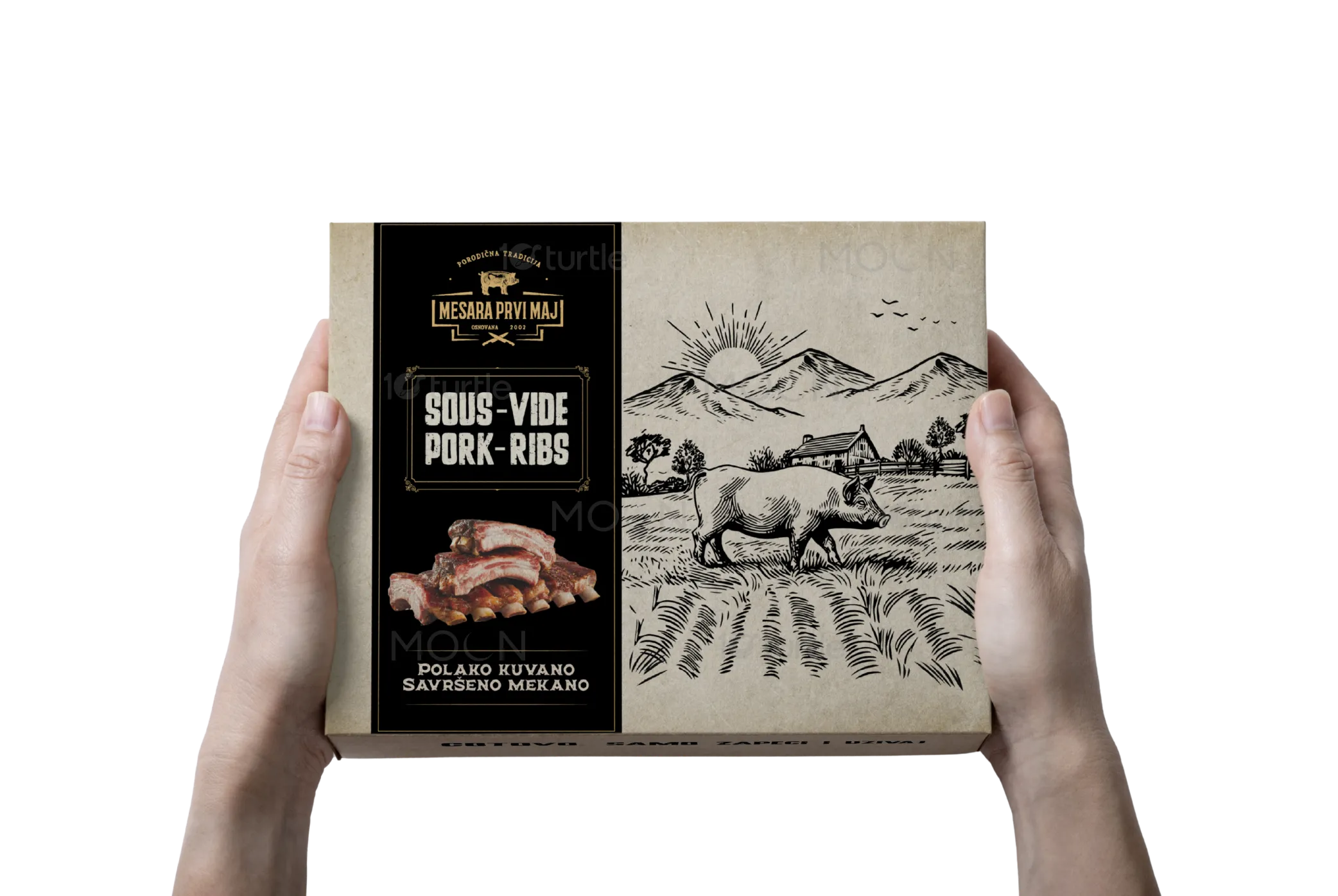
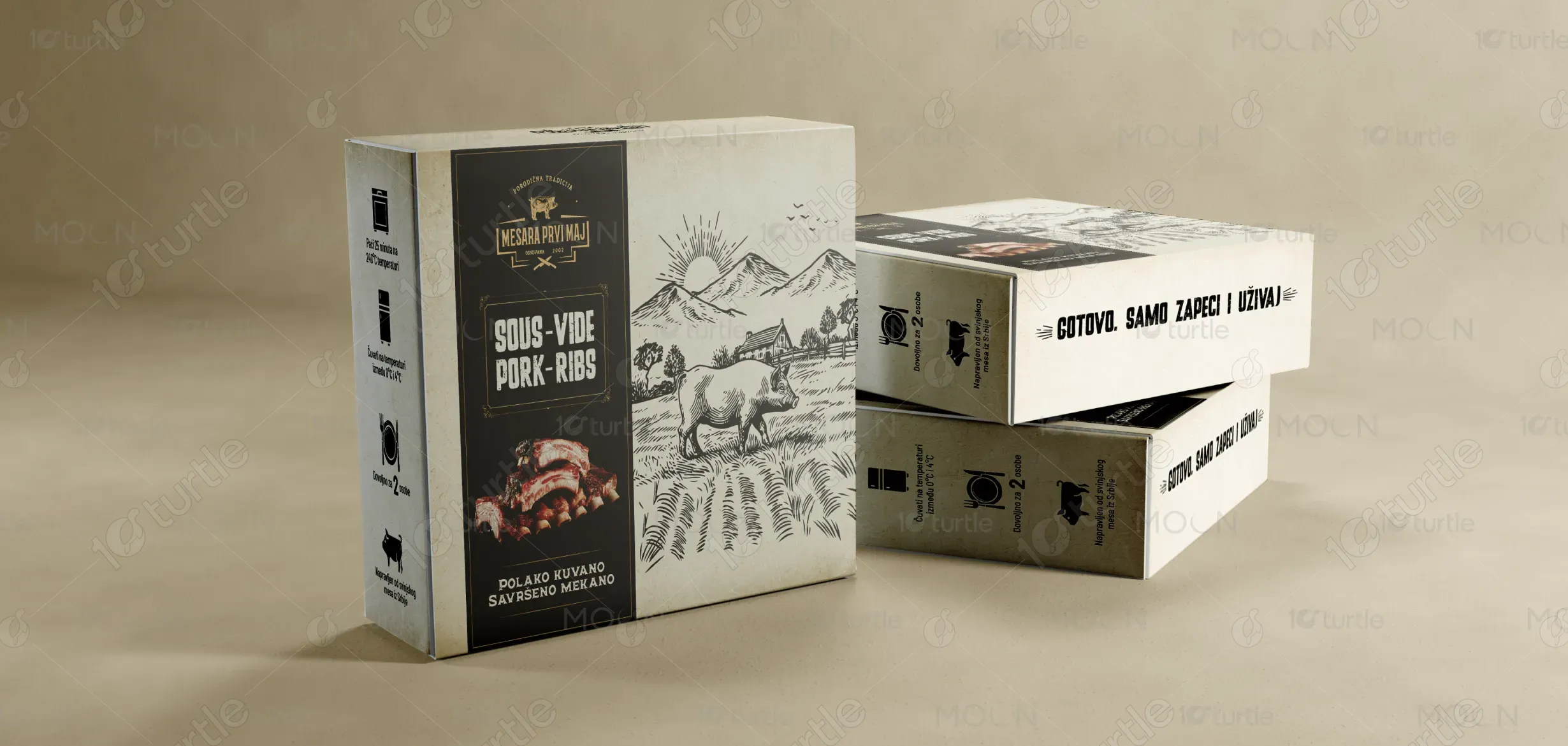
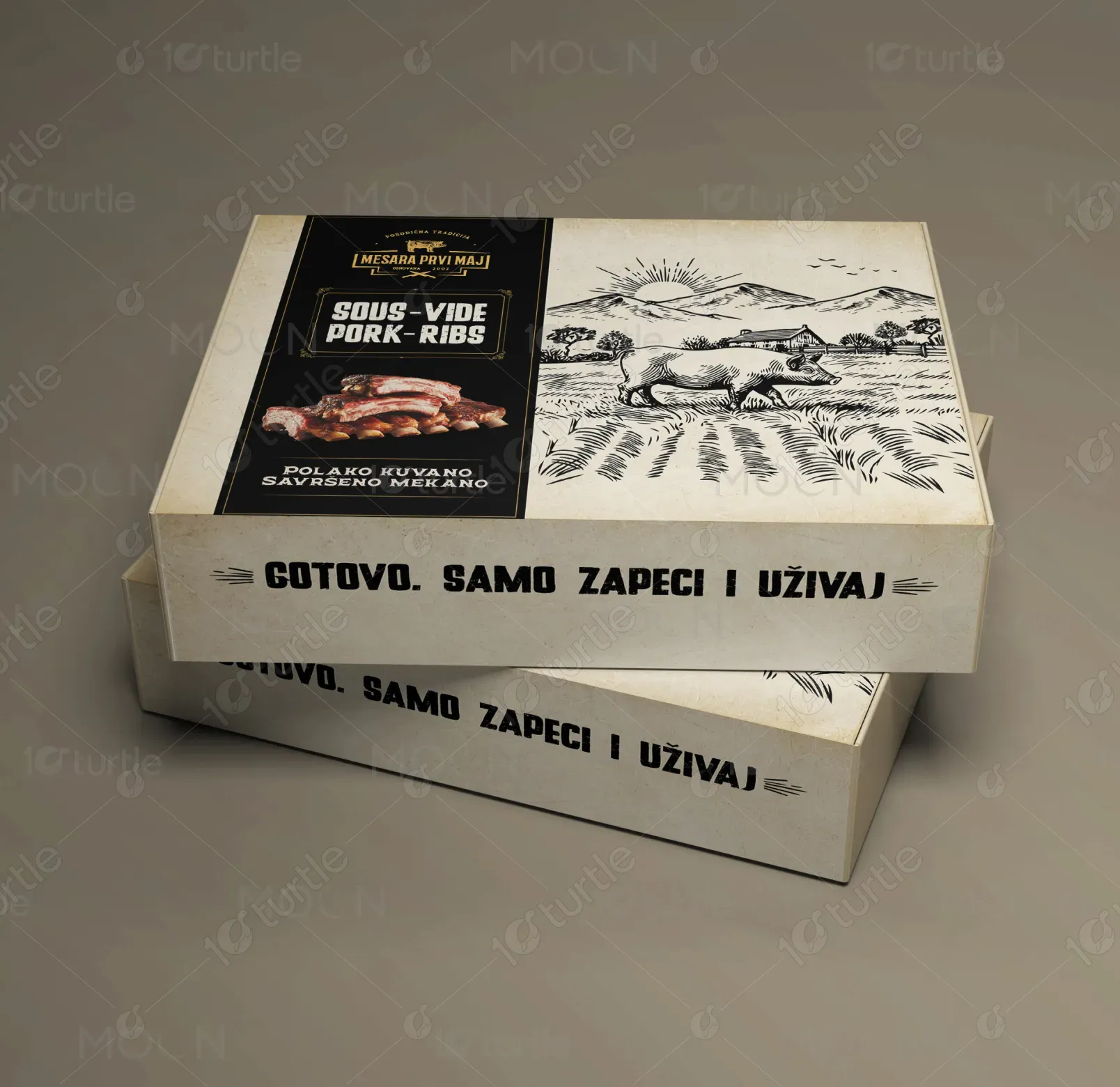
The design leverages a vintage and premium aesthetic, combining a black base with beige-gold accents to evoke a sense of timeless quality and sophistication. The choice of typography reflects an old-school, crafted feel while ensuring clarity and readability. The imagery, featuring an illustration of a pig and a rustic landscape, reinforces the product’s authentic roots and artisanal craftsmanship. The clear information hierarchy and strategic use of space guide the customer’s attention to key elements: the product name, the tagline, and the call-to-action. The design uses a clean layout, avoiding clutter and ensuring each detail complements the overall message.
Packaging Design
Graphic Design
Industry
Food, Beverage & Hospitality
Tools we used


Project Completion
2025
Key Market
Global
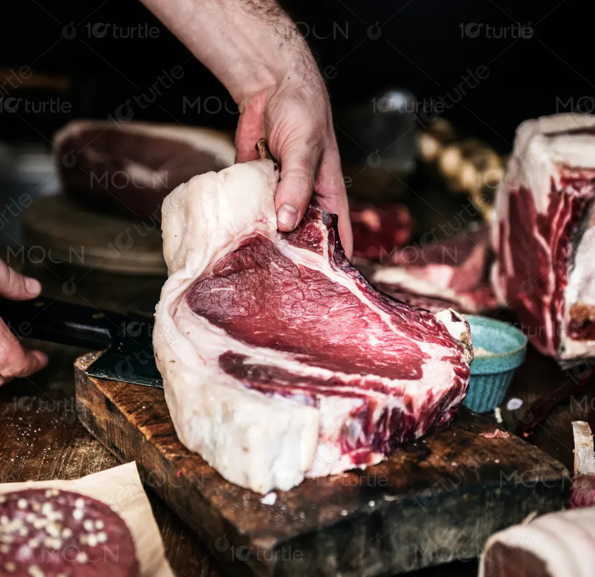
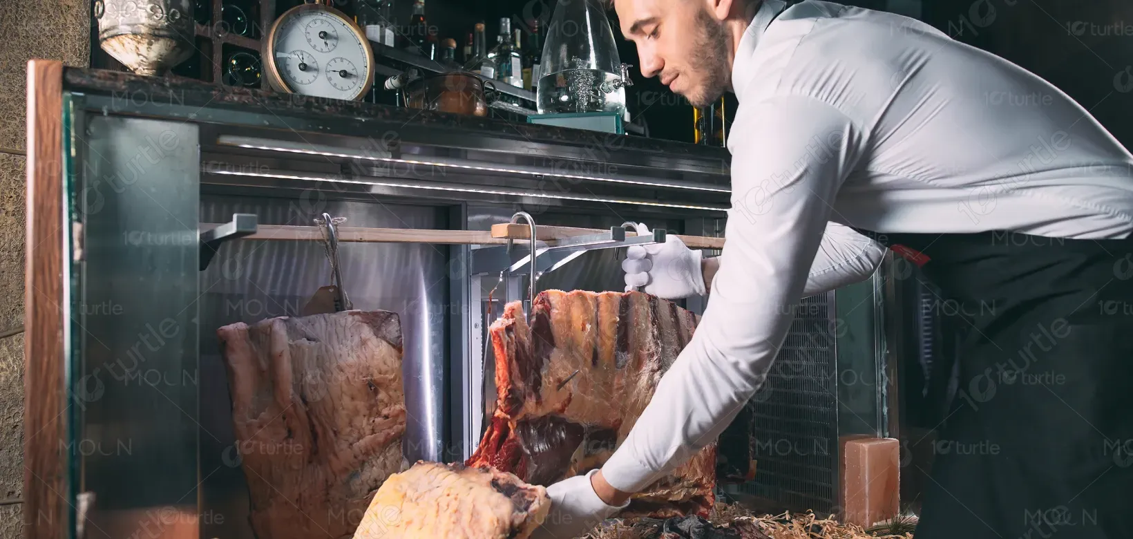
This design represents a high-quality, Sous-Vide cooked pork rib product that promises tenderness and flavor with minimal preparation. The primary goal is to convey the ease and premium nature of the product—ready to eat with just a quick heating step. The design fits within the food industry, particularly targeting consumers seeking high-quality, time-saving meal solutions. Key value propositions include authenticity, quality ingredients, and convenience, with a focus on a premium, hand-crafted experience.
Industry
Food, Beverage & HospitalityWhat we did
Packaging DesignGraphic DesignPlatform
-The food industry is crowded with mass-produced, uninspired packaging designs that fail to stand out on shelves. Consumers are often overwhelmed by a lack of differentiation, leading to weak brand recognition and low product engagement. Many products fail to communicate their quality or ease of use effectively, which can affect trust and purchasing decisions. The core challenge of this design is to overcome these obstacles by creating packaging that is visually striking and communicates the product’s premium quality in a clear, compelling manner.
The design addresses these issues by combining a premium, minimalistic look with bold visuals and clear messaging. The color scheme and typography align with the brand's heritage while appealing to modern tastes. The prominent use of a pig illustration and rustic backdrop not only enhances visual appeal but also reinforces the authenticity of the product. The layout ensures that key information—such as product name, tagline, and preparation instructions—is easily accessible, while maintaining visual harmony and consistency. The solution is user-centric, focused on clarity, ease of use, and creating an immediate, positive emotional connection with the consumer.
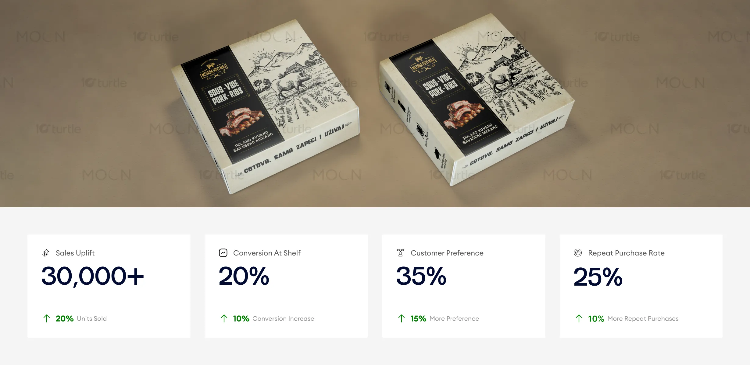
The packaging design elevates the product's perceived value with a vintage yet premium visual identity that resonates with consumers seeking authenticity and craftsmanship. The strong imagery and clear hierarchy drive consumer engagement at the shelf, leading to increased conversions. To further boost business outcomes, continued emphasis on maintaining consistency in branding and highlighting key product benefits can encourage higher repeat purchase rates and customer loyalty.
The design’s long-term vision is to establish the brand as a leader in premium, ready-to-eat food products. It is intended to grow the brand’s recognition and appeal to a wide demographic, from busy professionals to food enthusiasts who value quality, convenience, and taste. By positioning the brand as both authentic and modern, this design ensures its adaptability across different market segments, helping it remain relevant across future product lines and packaging formats. The clean, timeless design is built to resonate with evolving consumer preferences while reinforcing the brand's core values of quality and tradition.
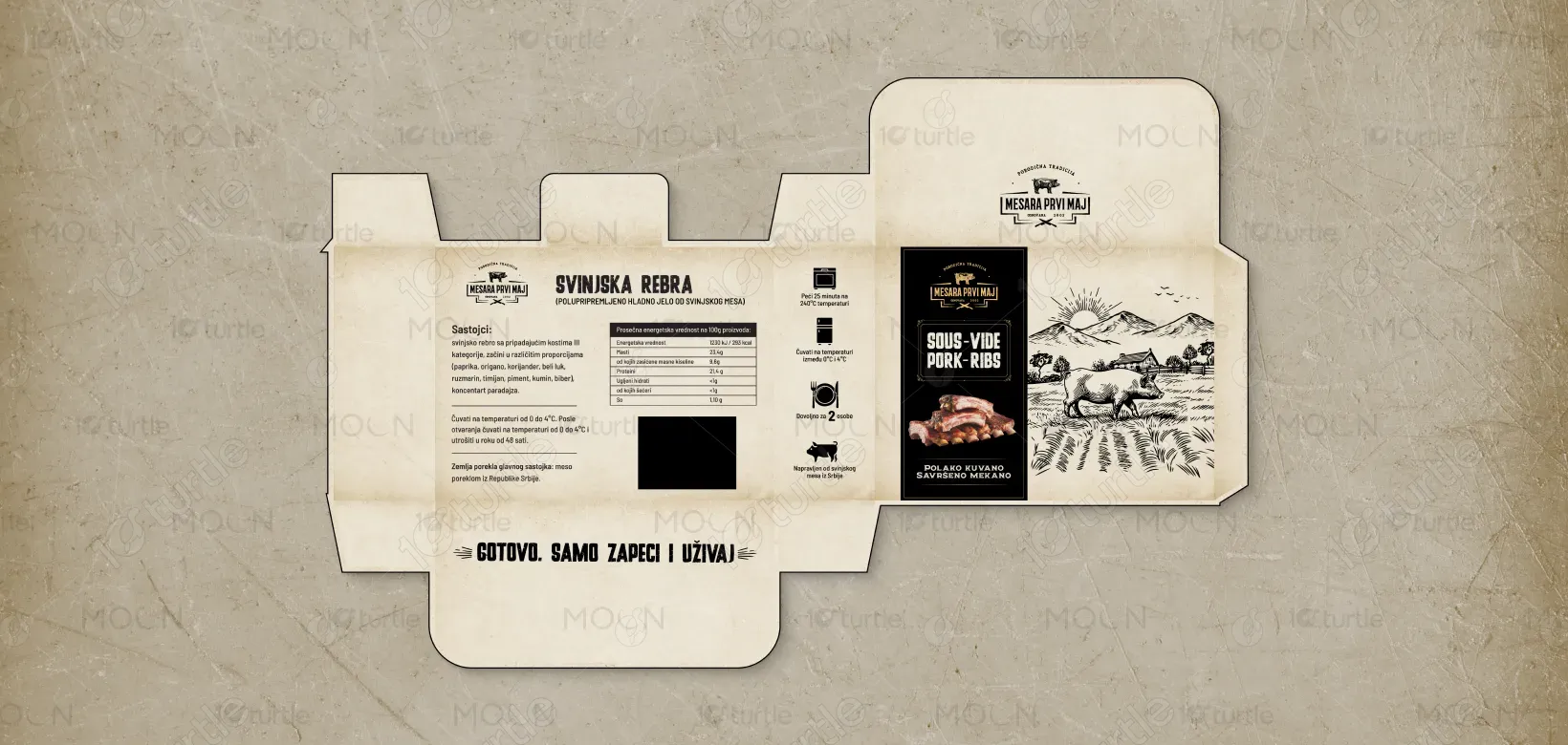
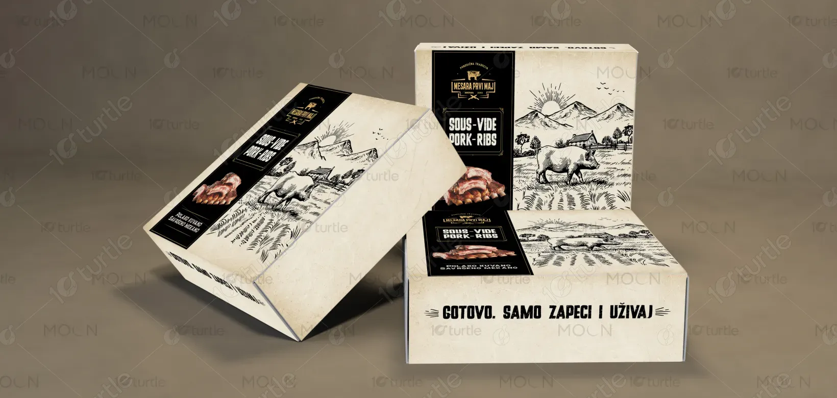
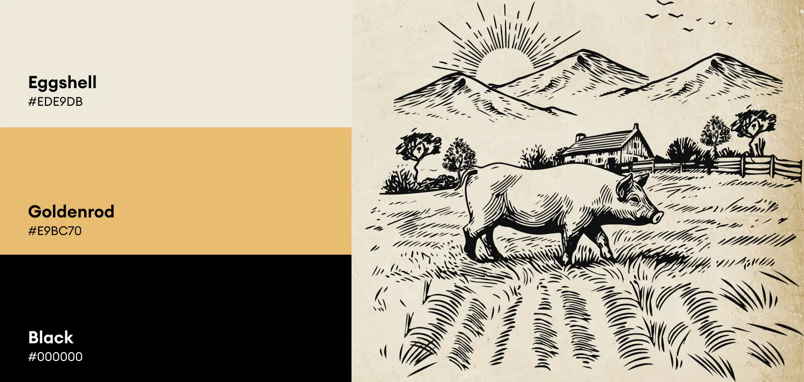
The color palette consists of a rich black base paired with Eggshell accents, exuding sophistication and premium quality. The dark background creates a striking contrast with the Goldenrod tones, highlighting the product's luxury nature while maintaining readability. The beige tones evoke a rustic, natural feel, aligning with the authenticity of the product. The black and Goldenrod combination enhances brand recognition across different environments and ensures the product stands out on the shelf. This balanced and refined visual language reflects the brand's high standards and appeals to consumers seeking premium, effortless dining experiences.