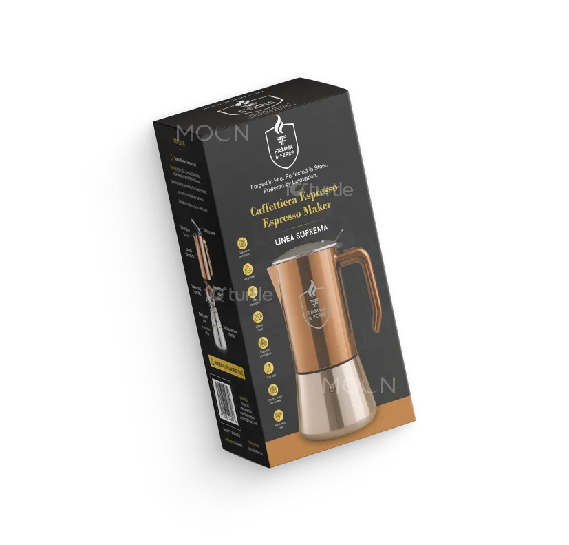
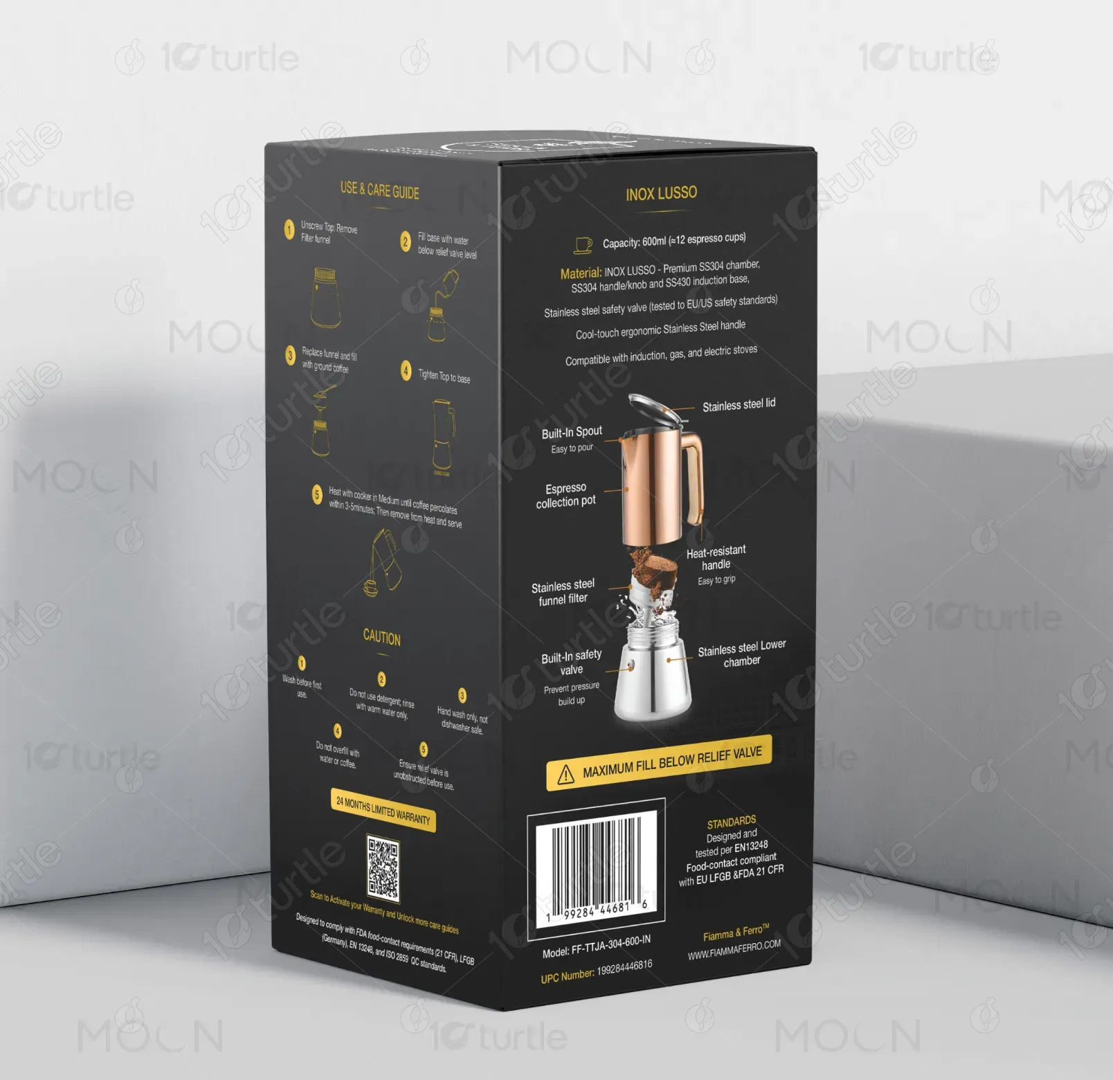
The packaging design follows a premium, modern, and minimal aesthetic with a strong focus on product clarity and usability. A matte black base enhances contrast while gold accents communicate sophistication and quality. Clean typography and structured layouts ensure readability, while technical illustrations provide functional understanding. The side panels balance instructional content with visual simplicity. The overall design merges elegance with practicality, ensuring the product stands out on shelves while clearly communicating its features, usage, and premium positioning.
Packaging Design
Graphic Design
Industry
Industrial, Manufacturing & Agriculture
Tools we used


Project Completion
2025
Key Market
Global
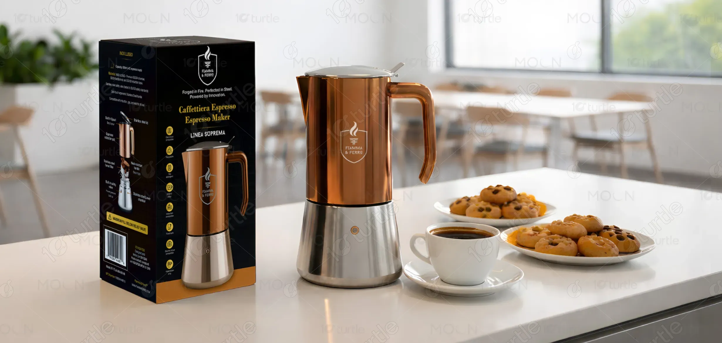
This is a premium stovetop espresso maker designed for modern households that value both aesthetics and functionality. The product combines stainless steel durability with a sleek copper finish, making it visually appealing and long-lasting. Its packaging highlights key features, usage instructions, and safety guidelines in a clear and structured way. Positioned in the premium segment, it stands out through its refined design, ergonomic build, and compatibility with multiple heat sources.

Industry
Industrial, Manufacturing & AgricultureWhat we did
Packaging DesignGraphic DesignPlatform
-Many espresso makers in the market lack clear communication on packaging, leading to confusion about usage, safety, and product features. Overly cluttered or generic designs fail to highlight premium quality, making it difficult for consumers to differentiate between budget and high-end products. Additionally, poor visual hierarchy often results in users overlooking important instructions, which can affect usability and safety, especially for first-time buyers.
This packaging solves these issues through a structured and user-focused design approach. Clear visual hierarchy ensures that key information like features, usage steps, and safety instructions are easy to locate and understand. Minimal yet impactful graphics improve readability while maintaining a premium feel. The use of icons and illustrations simplifies complex instructions, enhancing user experience. The refined color palette and layout elevate perceived product value, helping it stand out in a competitive retail environment.
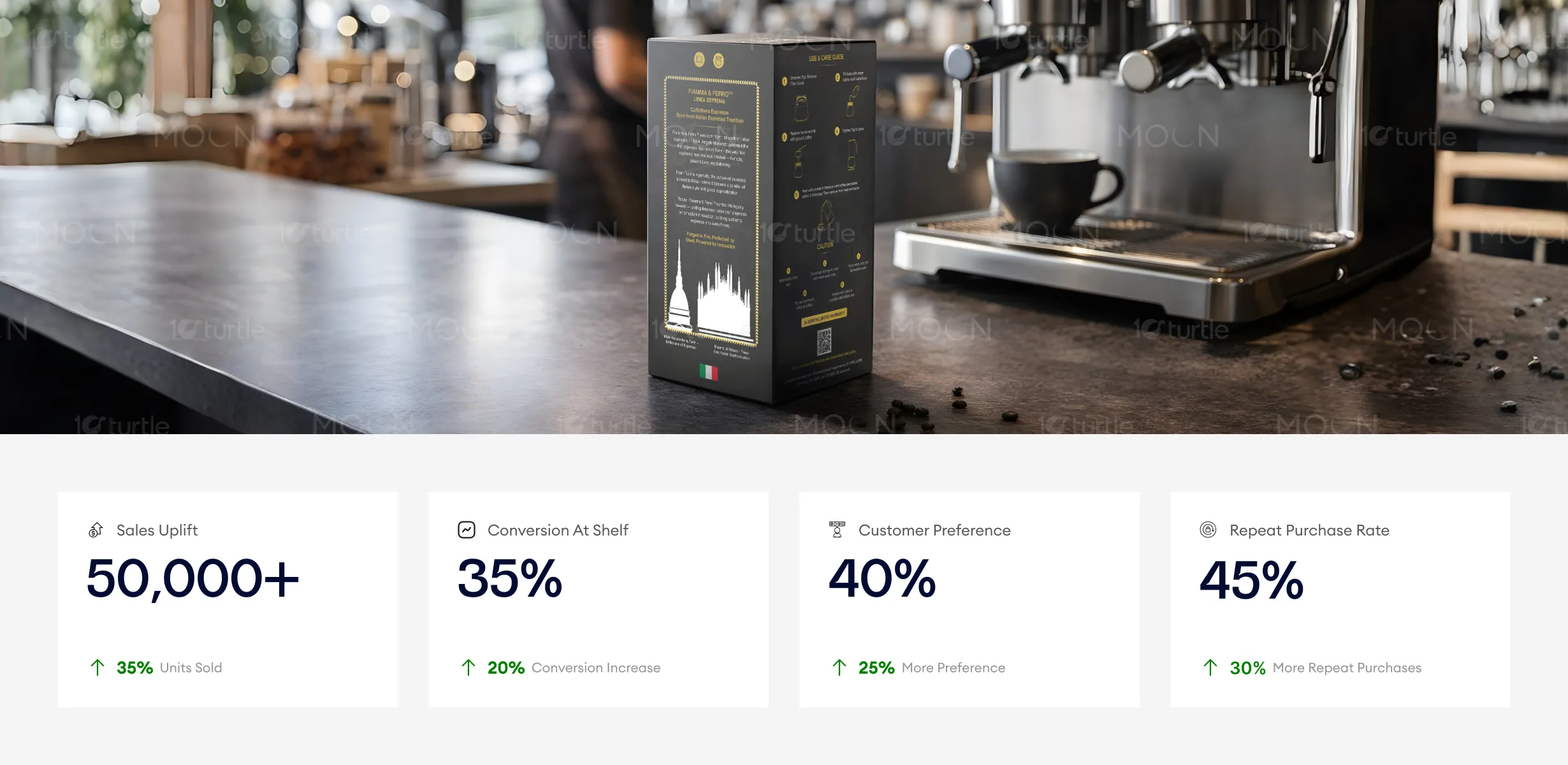
This packaging design performs well in communicating premium quality while maintaining usability and clarity. The contrast of matte black with gold accents attracts attention and communicates sophistication, leading to higher sales and conversion. To further increase these metrics, adding interactive elements (like QR codes for product information) or extending branding across other product lines could boost repeat purchases and overall engagement.
The vision is to establish Fiamma & Ferro as a trusted name in premium coffee equipment, blending traditional craftsmanship with modern design. The brand aims to expand its product range while maintaining a strong focus on quality, usability, and aesthetic appeal. Long-term, it seeks to become a lifestyle brand associated with refined coffee experiences, inspiring consumers to enjoy café-quality beverages at home.
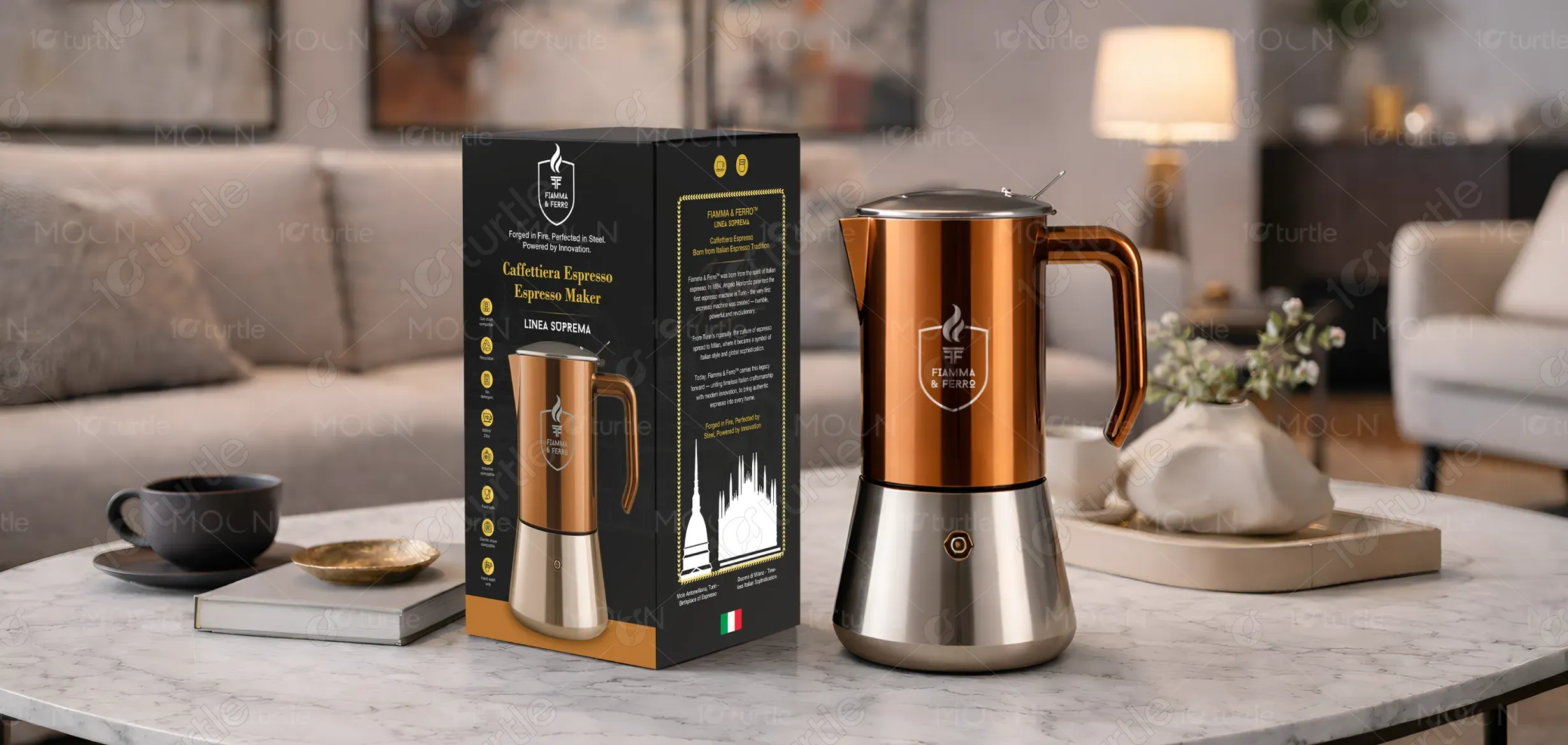

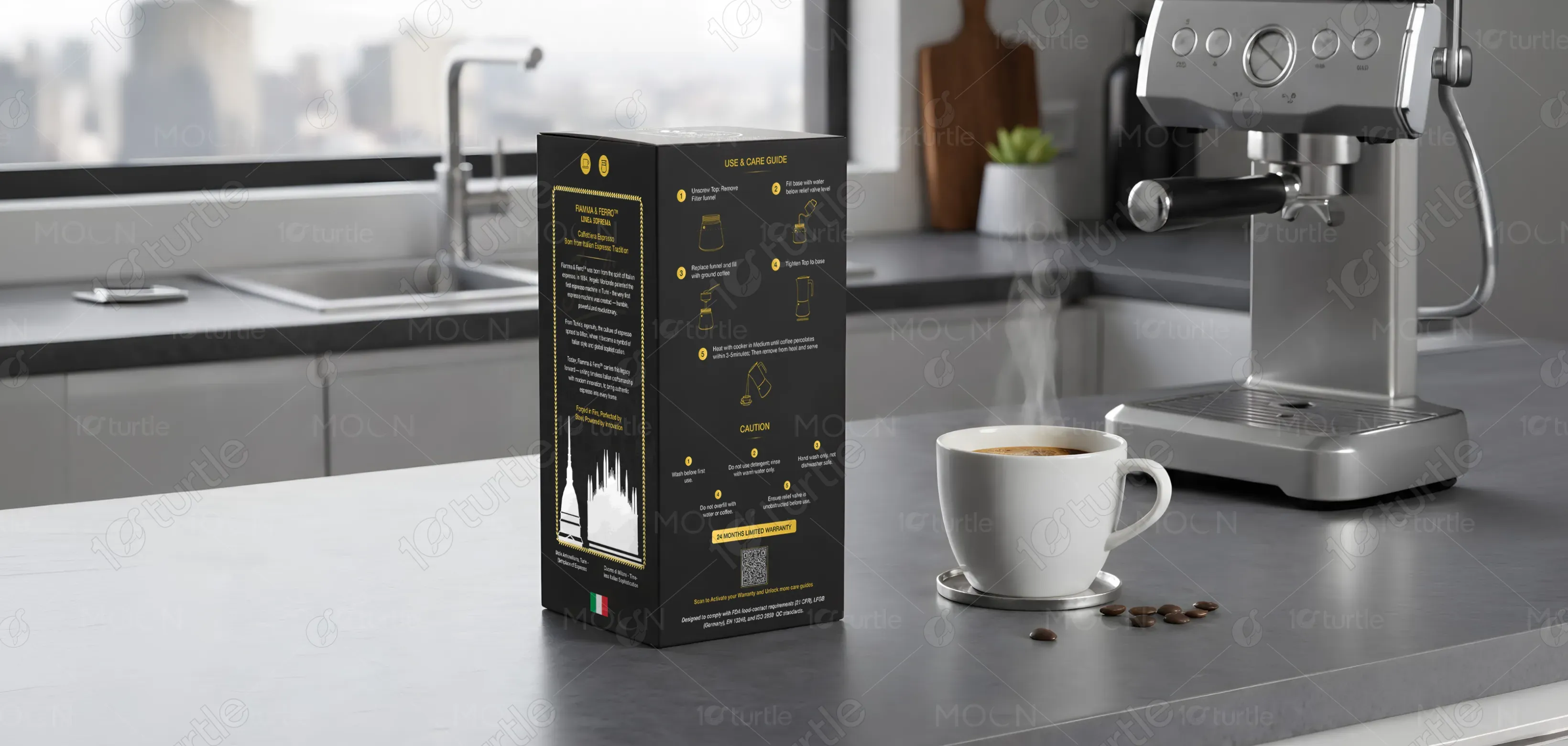
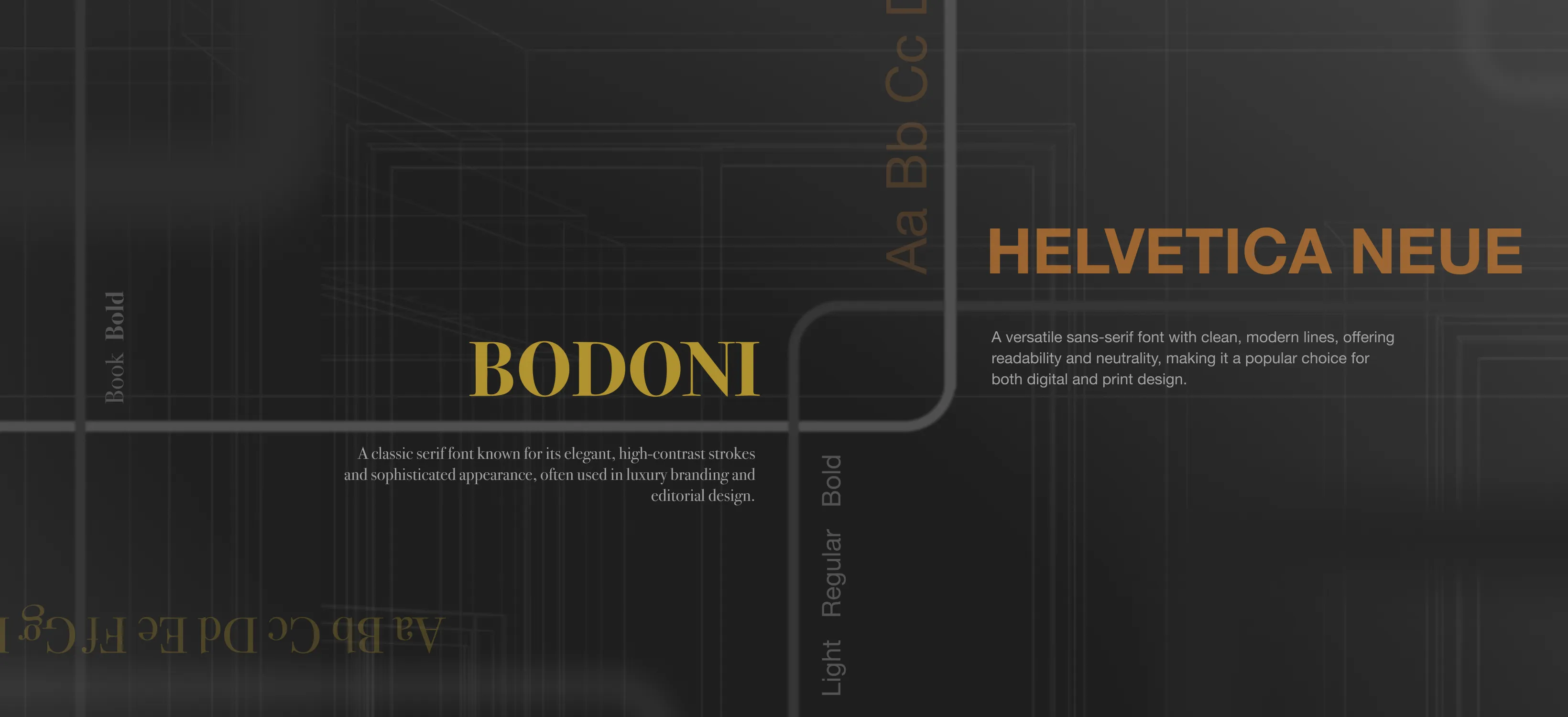
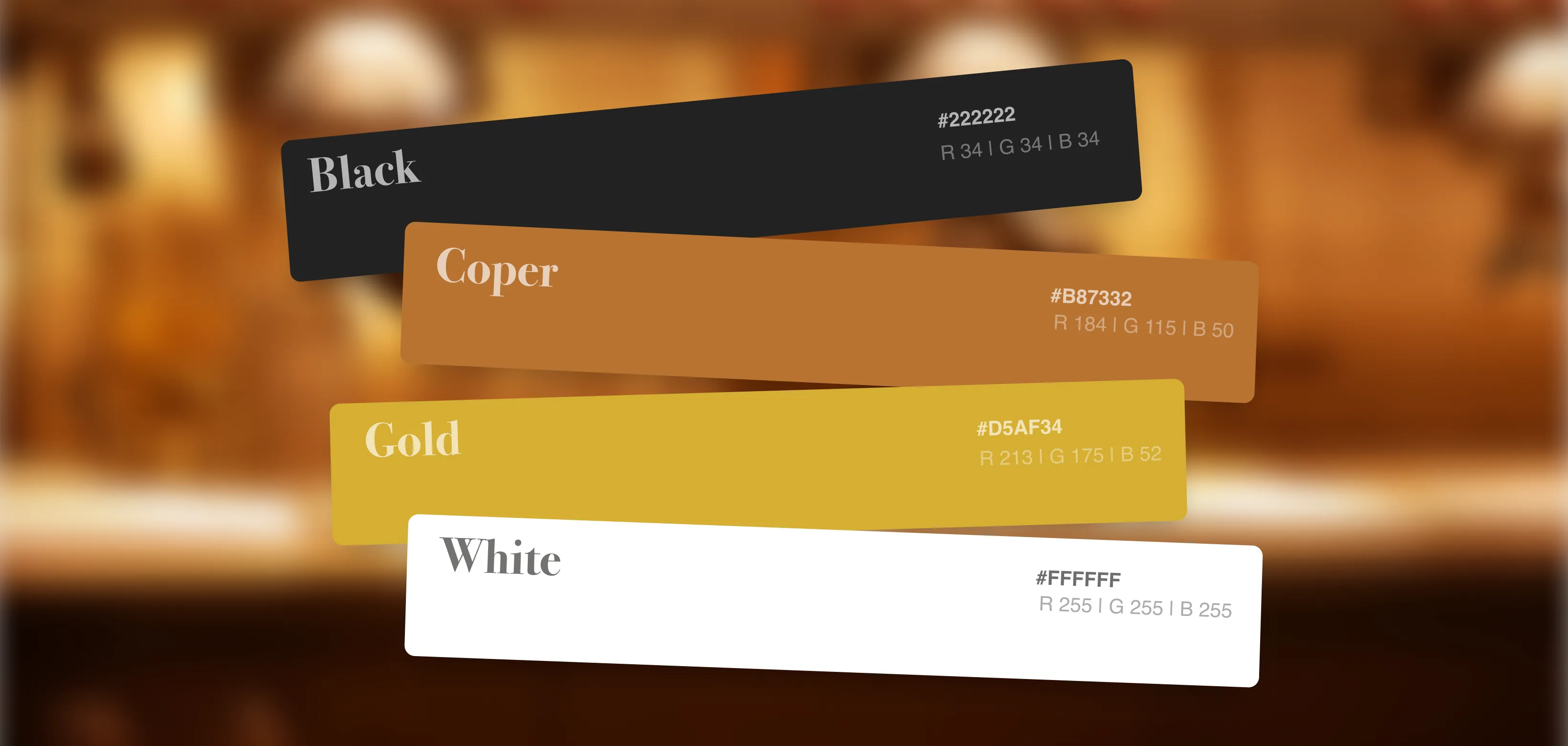
The color palette is built around matte black, metallic copper, and gold accents. Black represents sophistication, strength, and modernity, forming a premium base. Copper reflects the product finish, creating a direct visual connection between packaging and product. Gold highlights add a sense of luxury and draw attention to key information. Together, these colors create a high-end, elegant look that appeals to design-conscious and quality-driven consumers.