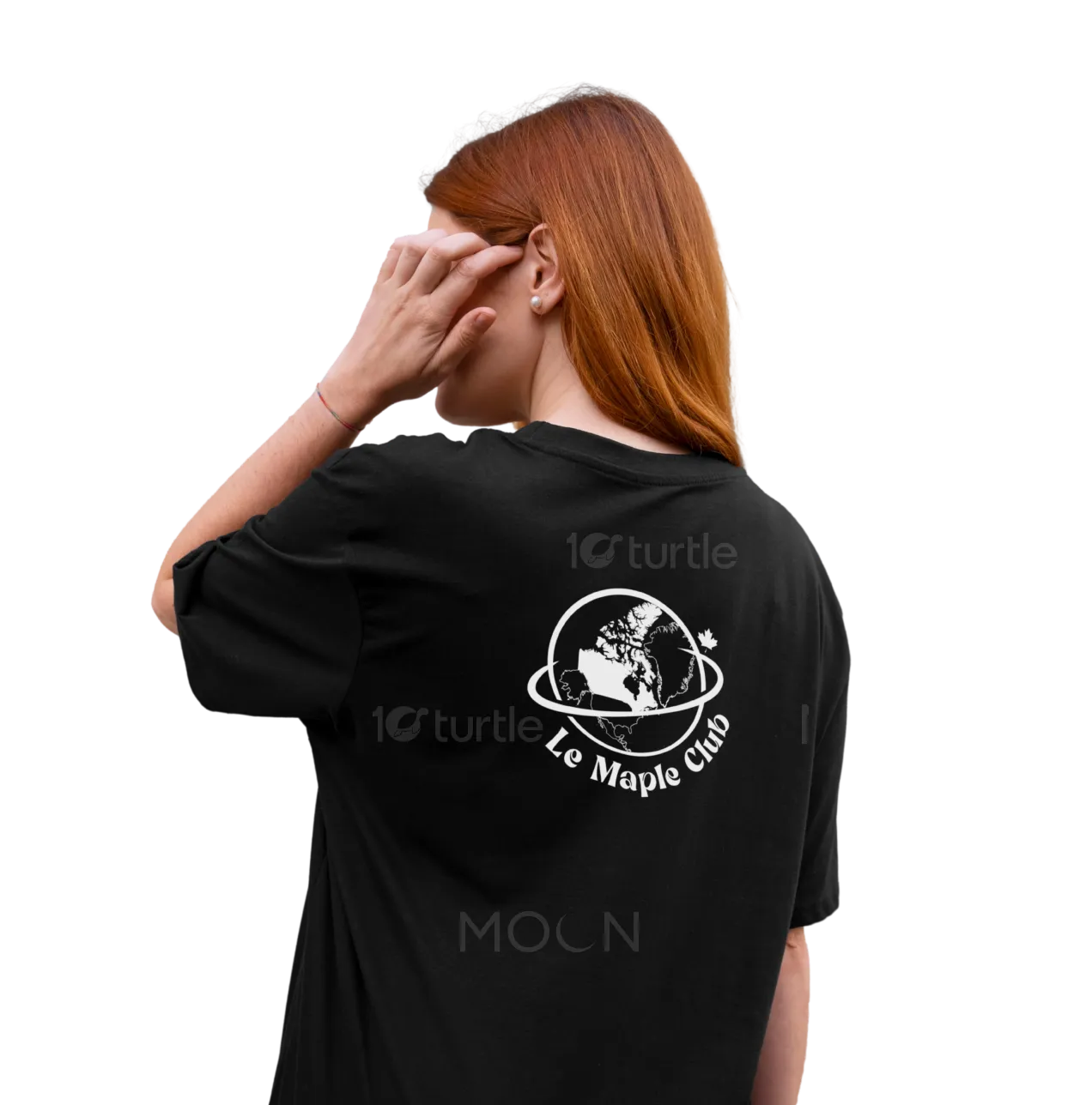
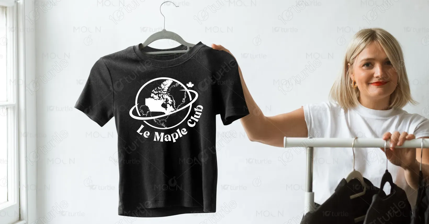
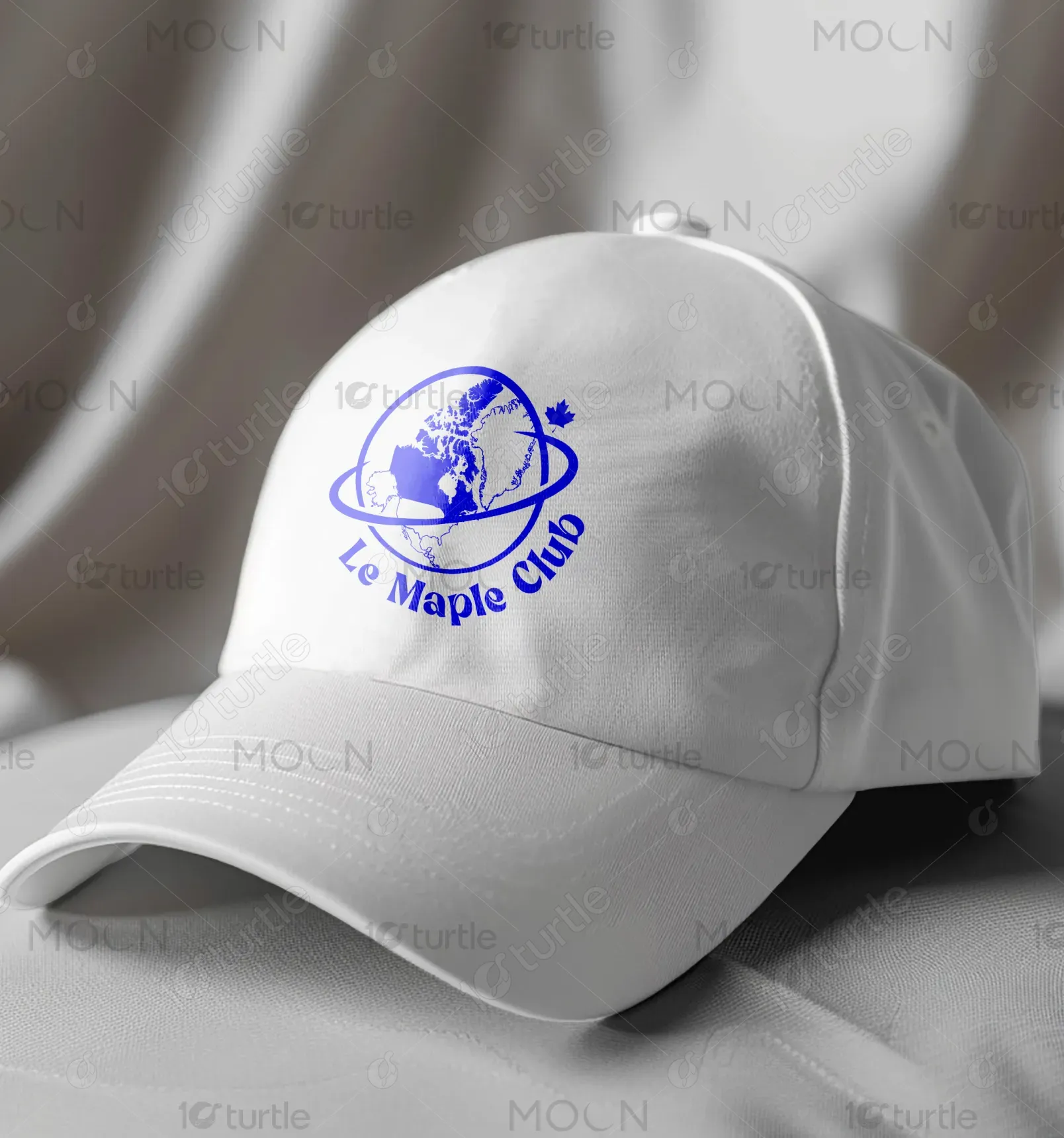
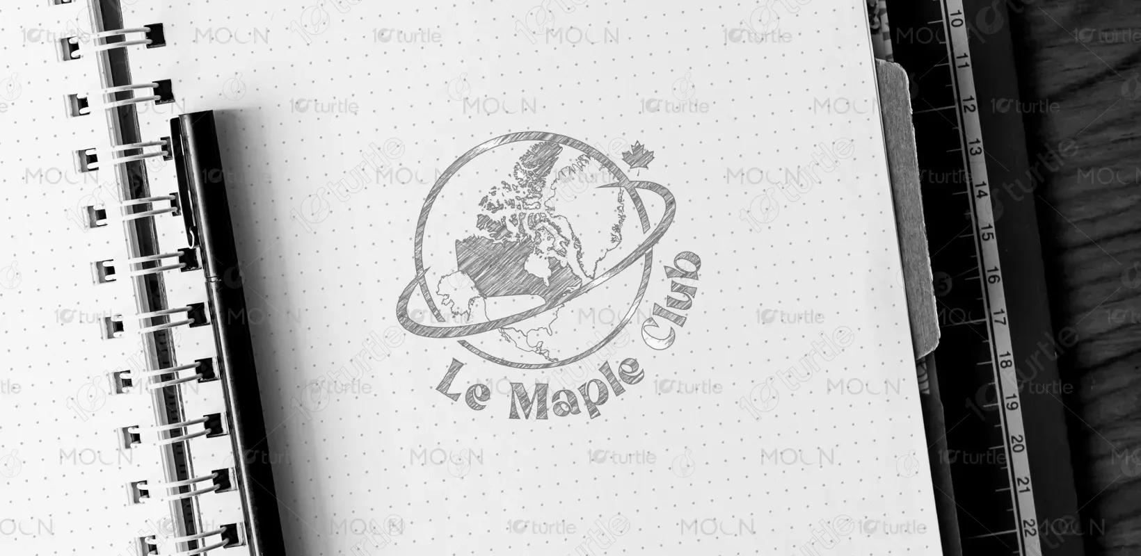
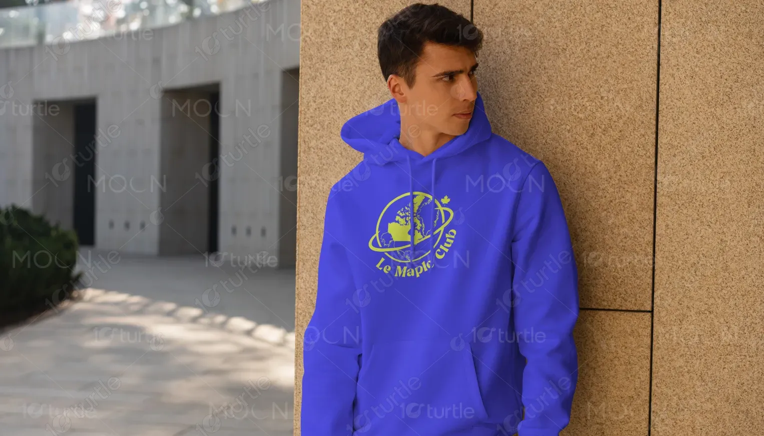
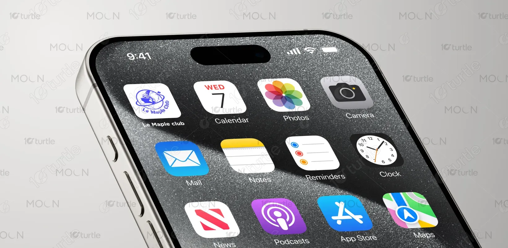
The design combines a global perspective with a distinctly Canadian identity. Using clean vector art, the globe highlights Canada’s geographic presence while the orbit adds a futuristic, dynamic vibe. The blue and white versions create strong contrast, suitable for both light and dark T-shirts. The maple leaf acts as an iconic Canadian signature, enhancing the brand’s cultural roots. Overall, the design merges simplicity with statement-making aesthetics—ideal for streetwear or casual fashion that resonates with both local and global communities.
Logo Design
Graphic Design
Industry
Fashion, Beauty & Lifestyle
Tools we used


Project Completion
2025
Key Market
Global
“Le Maple Club” is a clothing line that celebrates Canadian identity with a global twist. This T-shirt design is aimed at modern, expressive individuals who value both style and cultural roots. The logo stands out with its clever fusion of geography and minimalism. Its unique selling point lies in representing national pride without being overly traditional—making it suitable for youth, tourists, and global fans of Canadian lifestyle aesthetics. The product is trendy, versatile, and designed for wide appeal.
Industry
Fashion, Beauty & LifestyleWhat we did
Logo DesignGraphic DesignPlatform
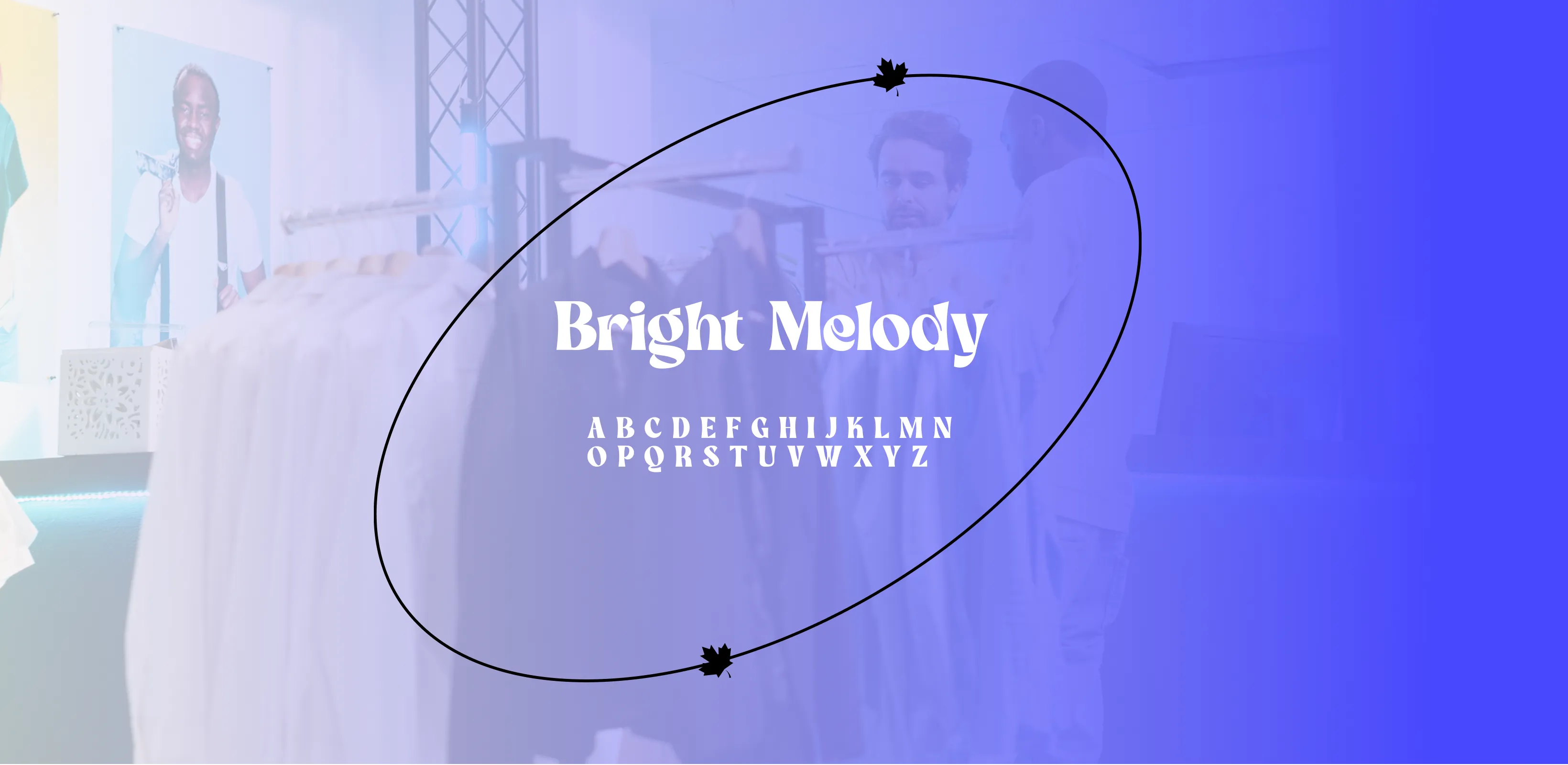
-Many national or culturally inspired apparel brands often rely on clichés—such as overused flag prints or dated typefaces—that fail to attract a modern audience. This creates a gap for fashion-forward designs that still celebrate identity. In Canada's case, there’s a lack of minimalist yet meaningful graphics that resonate with global aesthetics. Young consumers especially demand stylish yet subtle representations of their heritage, which are hard to find in mainstream souvenir or culture-based merchandise.
“Le Maple Club” fills this gap by offering a visually clean, modern, and meaningful design. The globe positions Canada at the center—giving visual context and pride—while the orbit adds a universal, future-facing element. The maple leaf is used sparingly to maintain elegance. The use of contrasting color options ensures flexibility in styling. This logo doesn’t scream “tourist tee,” but rather feels like a fashion statement, making it highly wearable and relatable for a broader audience.
Le Maple Club envisions becoming a globally recognized name in lifestyle apparel rooted in Canadian values. The long-term goal is to expand the brand beyond T-shirts—into accessories, seasonal wear, and collaborations with Canadian artists. By merging fashion with cultural storytelling, the brand aims to inspire pride in identity while appealing to the aesthetics of global youth culture. Its lasting impression will be one of inclusivity, modernity, and timeless national pride.
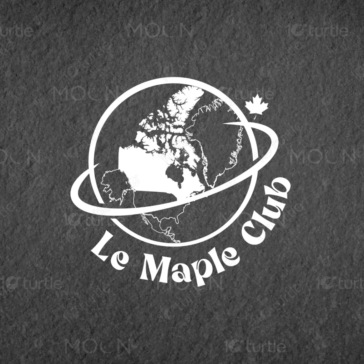
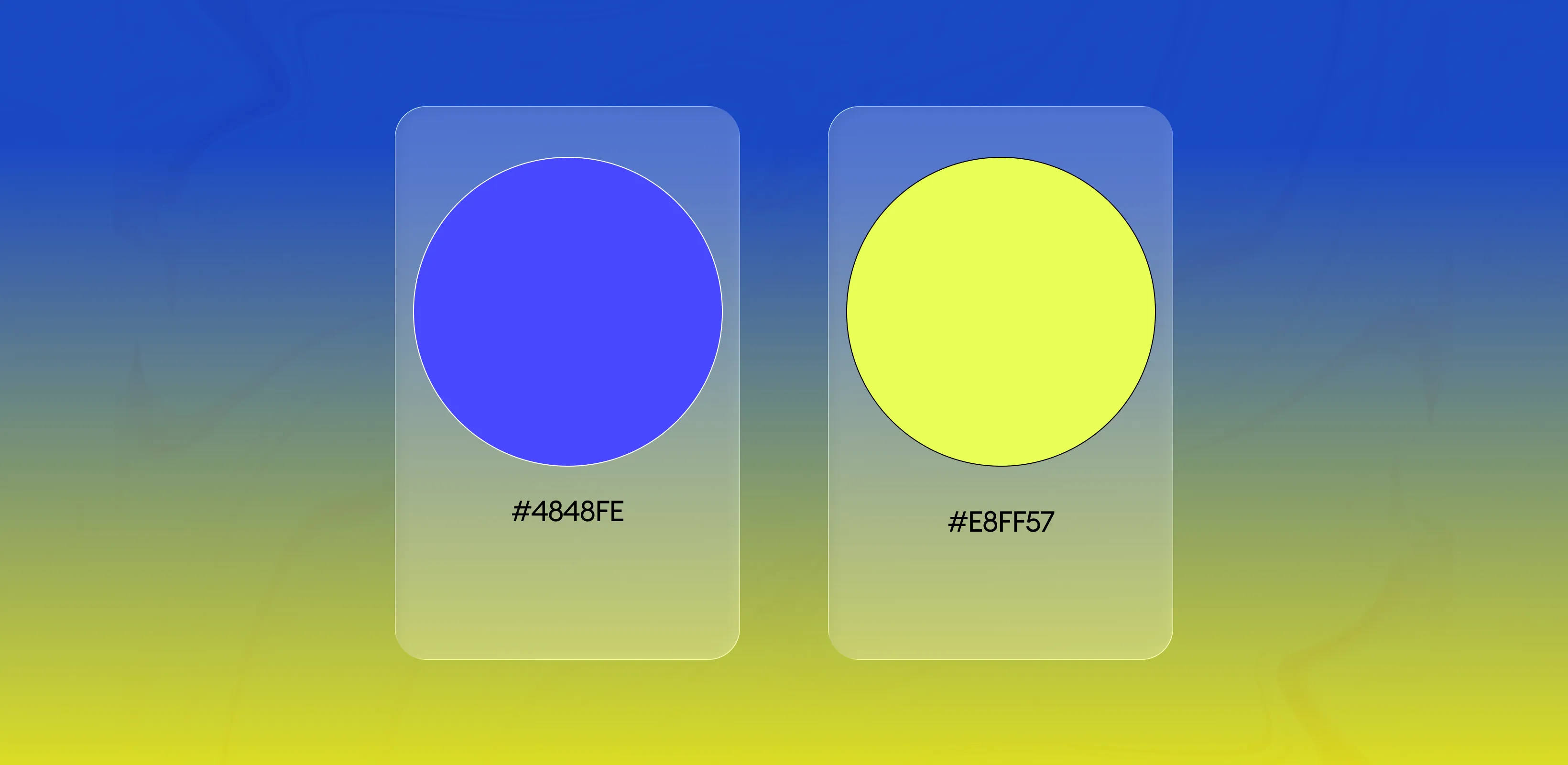
Royal Blue (#1E3DD0) – Represents trust, loyalty, and the depth of Canadian culture. It's bold yet classy—perfect for standout prints. White (#FFFFFF) – Clean, neutral base that emphasizes simplicity and clarity. It allows the design to shine with minimal distraction. Jet Black (#000000) – Adds contrast and modern edge, perfect for streetwear and casual styles. It evokes sophistication and confidence.
