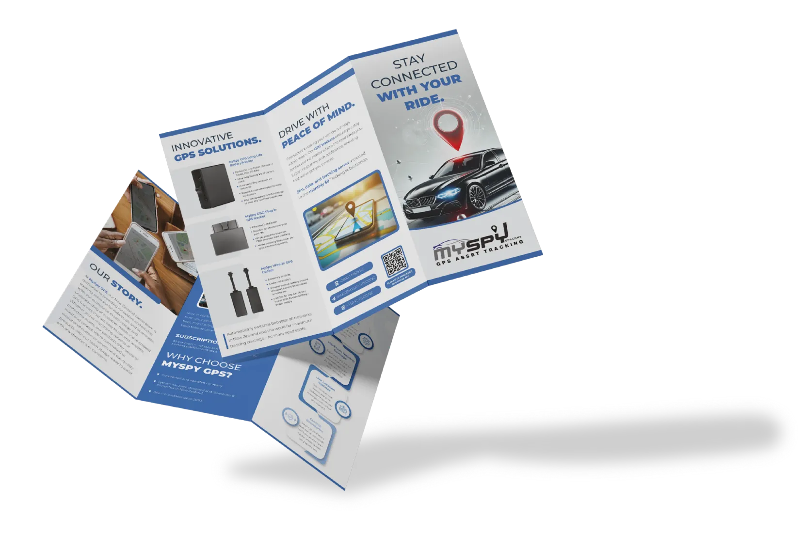
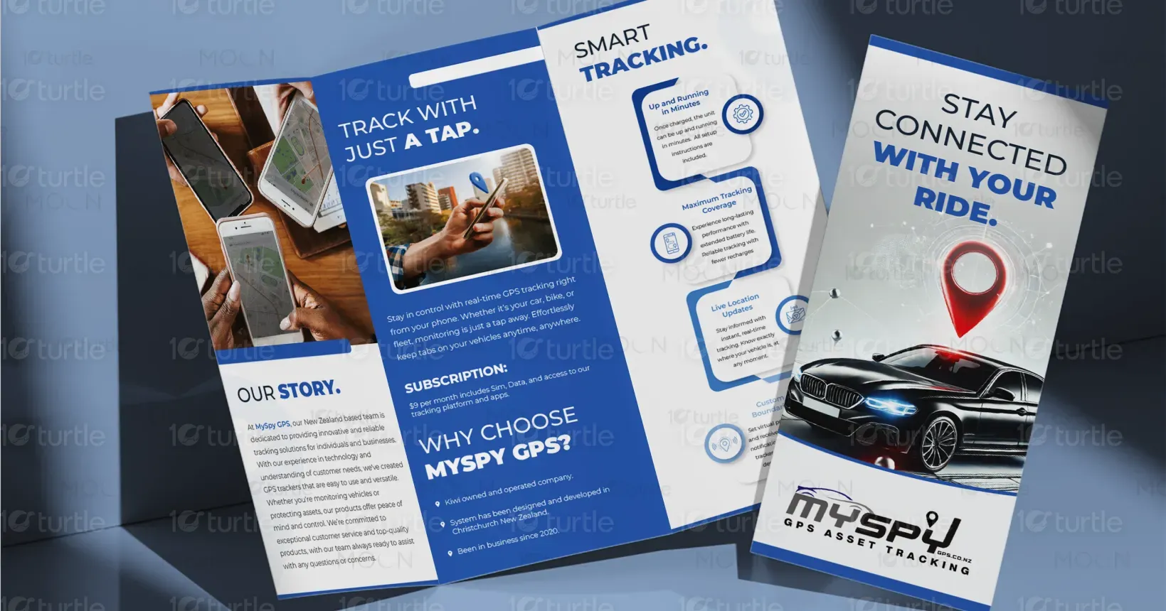
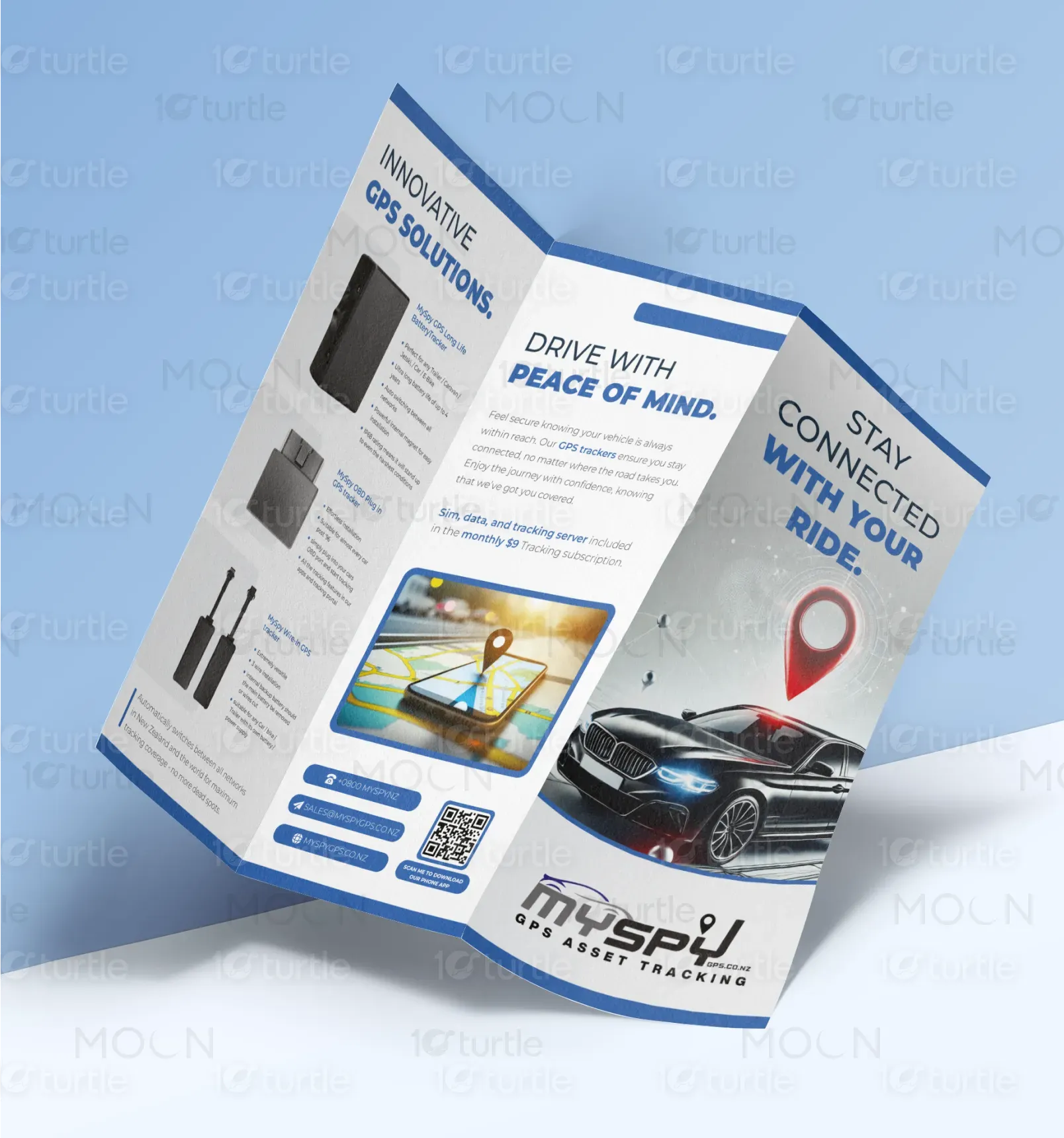
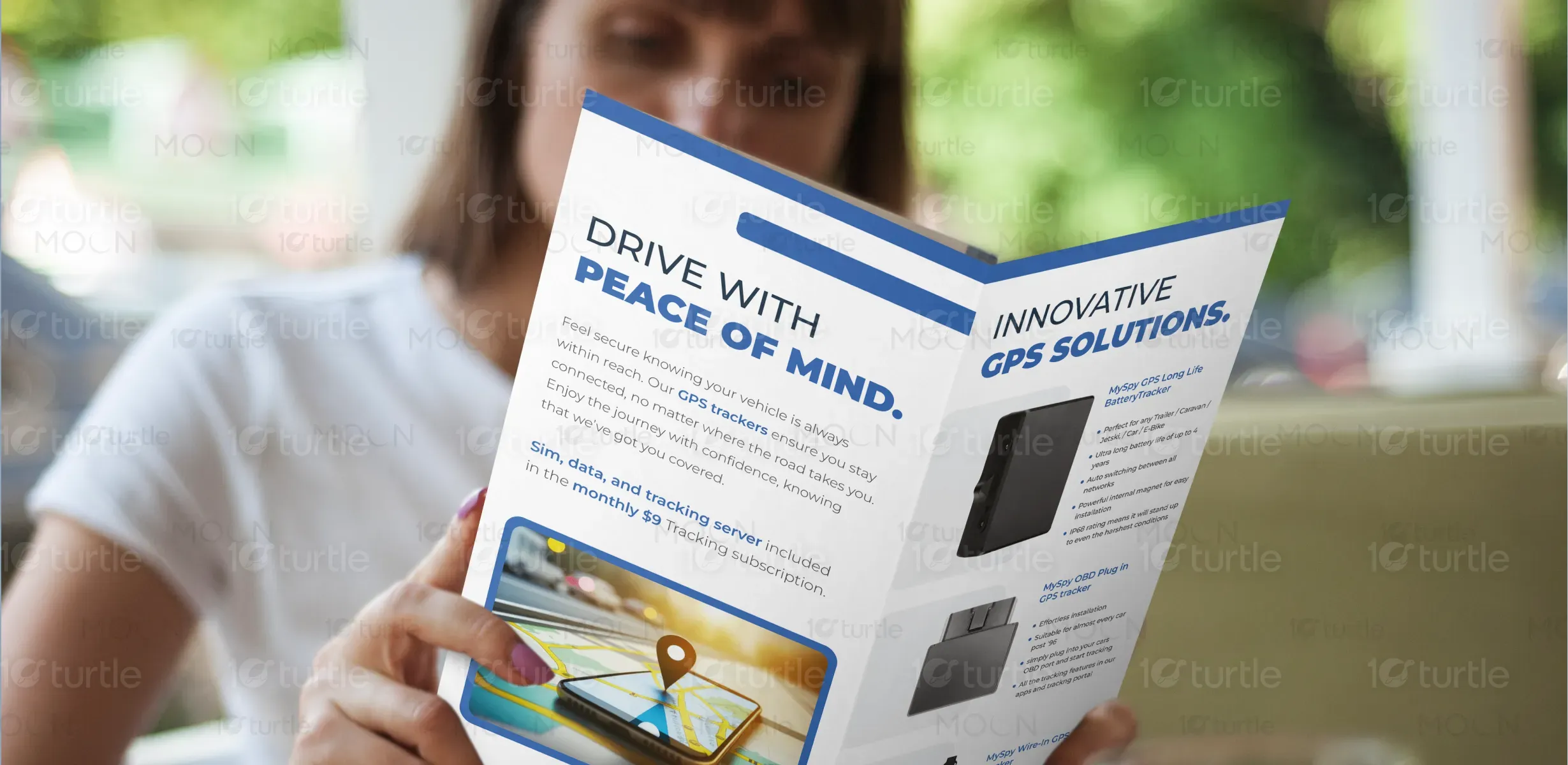
The MySpy GPS tri-fold brochure embraces a clean, modern design with a strong emphasis on usability and visual clarity. Bold blue and white contrasts create a trustworthy, tech-forward aesthetic, while red highlights draw attention to key actions and icons. The layout uses structured sections, intuitive iconography, and dynamic imagery of real-time GPS tracking to engage users instantly. This design balances information and visuals effectively, guiding the reader’s eye naturally through the features, benefits, and story of the brand.
Tri - Fold Design
Brochure Design
Graphic Design
Industry
Technology
Tools we used


Project Completion
2025
Key Market
Global
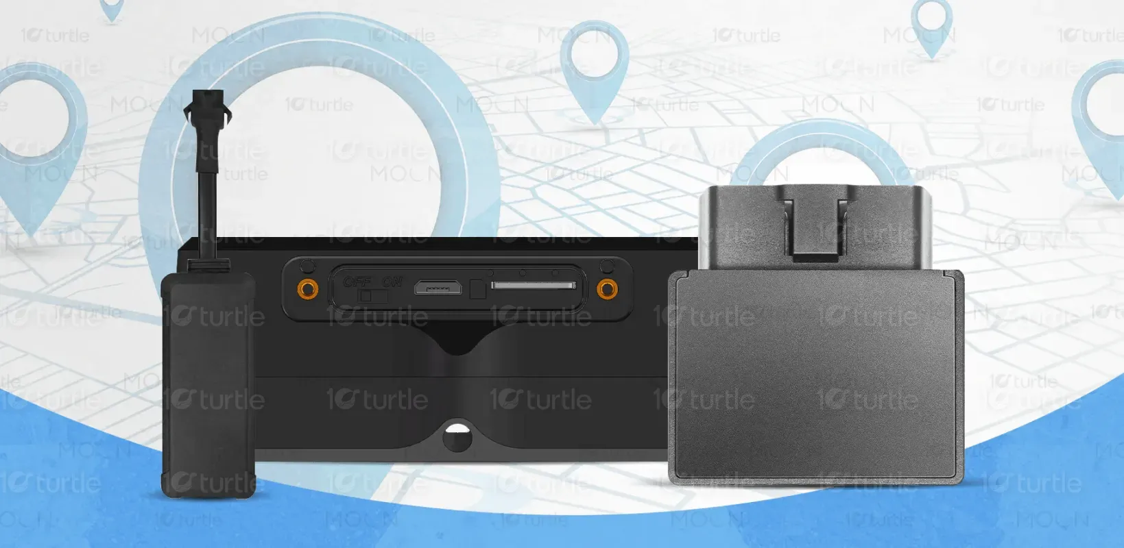
MySpy GPS is a real-time vehicle and asset tracking solution that allows users to monitor their ride from anywhere using a simple tap on their smartphones. Designed for consumers and enterprises alike, it ensures safety, transparency, and ease of use. The subscription-based model offers constant data access, user-friendly interfaces, and customizable alerts. With fast setup and a reliable network, MySpy GPS positions itself as a powerful player in the asset tracking market, combining security and innovation in one sleek platform.

Industry
TechnologyWhat we did
Tri - Fold DesignBrochure DesignGraphic DesignPlatform
-A primary challenge in the GPS tracking market is the complexity of user interfaces and overly technical language that deters non-tech-savvy users. Many tracking solutions fail to communicate functionality in a visually engaging, digestible manner. The market needed a simplified, yet professional visual language that conveys high-tech capabilities without overwhelming the user. This gap, often seen in fleet services or personal tracking apps, limits adoption among everyday users who seek both sophistication and simplicity.
MySpy GPS bridges this gap with a design focused on intuitive interaction and immediate understanding. Clear visual hierarchies, easily recognizable icons, and concise messaging guide users from awareness to action. The “Track with Just a Tap” section reinforces ease of use, while the infographics outline benefits in seconds. The design smartly integrates lifestyle imagery and a mobile-first approach, helping users visualize the technology in their daily lives, increasing both usability and emotional connection.
The long-term vision for MySpy GPS’s design is to become the visual standard for accessible tracking technology. It aims to evolve into a cross-platform interface with consistent branding across apps, brochures, and dashboards. By simplifying access to real-time data and promoting a visually engaging experience, MySpy GPS hopes to democratize advanced tracking tools for everyday consumers while maintaining enterprise-grade reliability. The brand seeks to become synonymous with smart, dependable mobility solutions.
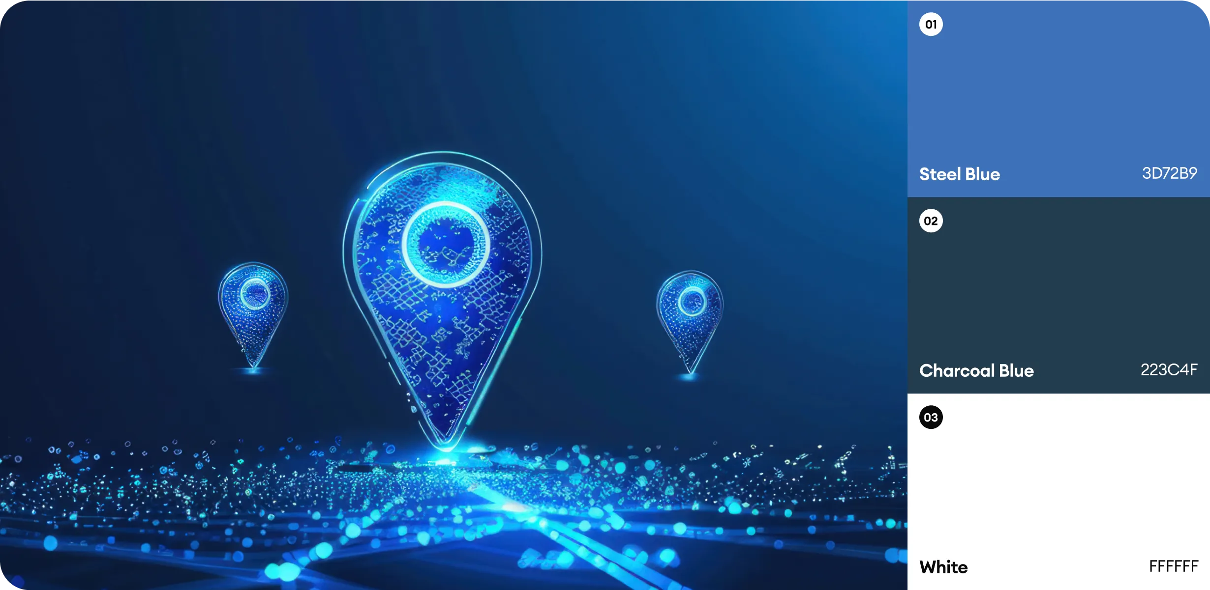
The brochure uses a bold color palette of deep blue, crisp white, and vibrant red accents. Blue conveys trust, reliability, and technology – key pillars of the GPS industry. White space ensures readability and a clean, organized look, while red highlights draw the eye to important action points like location pins and callouts. This color scheme not only aligns with the brand’s identity but also fosters confidence and clarity, supporting both functional and emotional engagement.