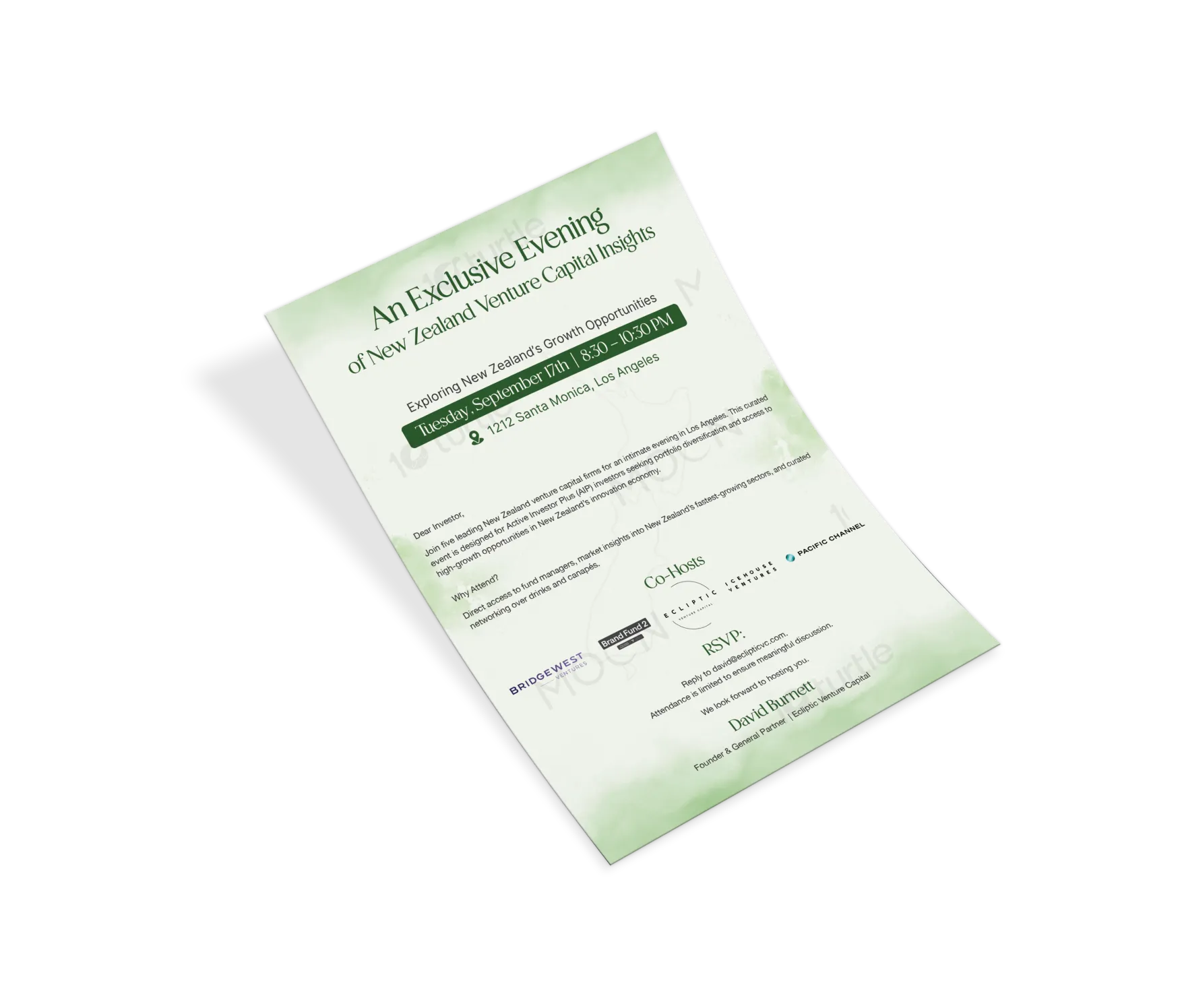
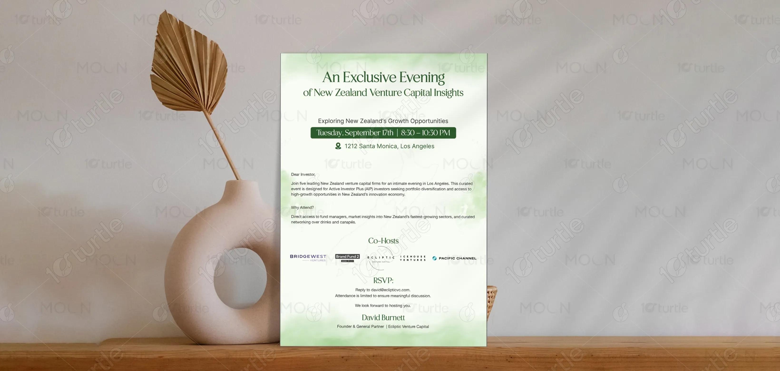
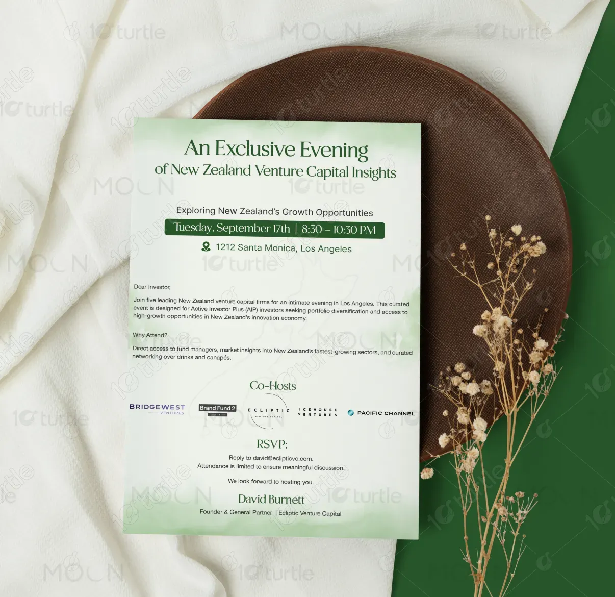
The design embraces a calm, editorial-led approach that prioritizes clarity and sophistication. Minimal typography, generous white space, and a muted green palette create a refined visual rhythm. Abstract sculptural elements introduce depth and tactile interest, balancing softness with structure. The overall direction feels modern yet timeless, designed to communicate trust, intelligence, and exclusivity. Every element is intentionally restrained, allowing content to breathe while reinforcing a premium, thoughtful brand presence.
Invitation Design
Graphic Design
Industry
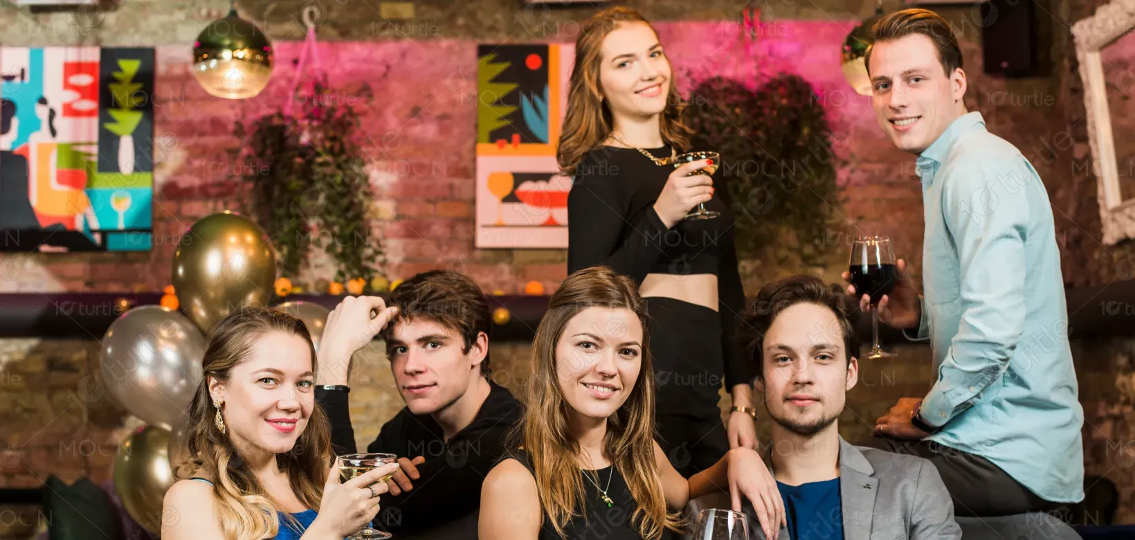
Arts, Culture & Entertainment
Tools we used


Project Completion
2025
Key Market
Global
This guide book is a premium editorial piece designed to communicate insight, perspective, and value-driven thinking. It serves as both an informational and brand-building tool, positioned for discerning audiences who value clarity over clutter. The clean layout, refined typography, and abstract visuals differentiate it from conventional guides, offering a sophisticated reading experience that aligns with modern, design-conscious markets.
Industry
Arts, Culture & EntertainmentWhat we did
Invitation DesignGraphic DesignPlatform
-Many guidebooks and informational materials suffer from visual overload—dense layouts, excessive colors, and unclear hierarchy. This often leads to reader fatigue and diluted messaging, especially in premium or knowledge-based industries. In competitive markets, poorly designed guides fail to build trust or convey authority, making it difficult for brands to stand out or be taken seriously.
This design solves the problem through restraint and intentionality. A strong typographic hierarchy improves readability, while minimal layouts guide the reader effortlessly through content. Abstract forms replace literal imagery, adding depth without distraction. The cohesive color palette and editorial structure ensure the guide feels focused, credible, and easy to engage with—enhancing both comprehension and brand perception.

The long-term vision is to establish the brand as a benchmark for premium, insight-led design communication. The guide book is intended to evolve into a recognisable visual system that can scale across publications, reports, and digital platforms. By consistently prioritizing clarity, elegance, and thoughtful design, the brand aims to build lasting trust and authority within its industry.
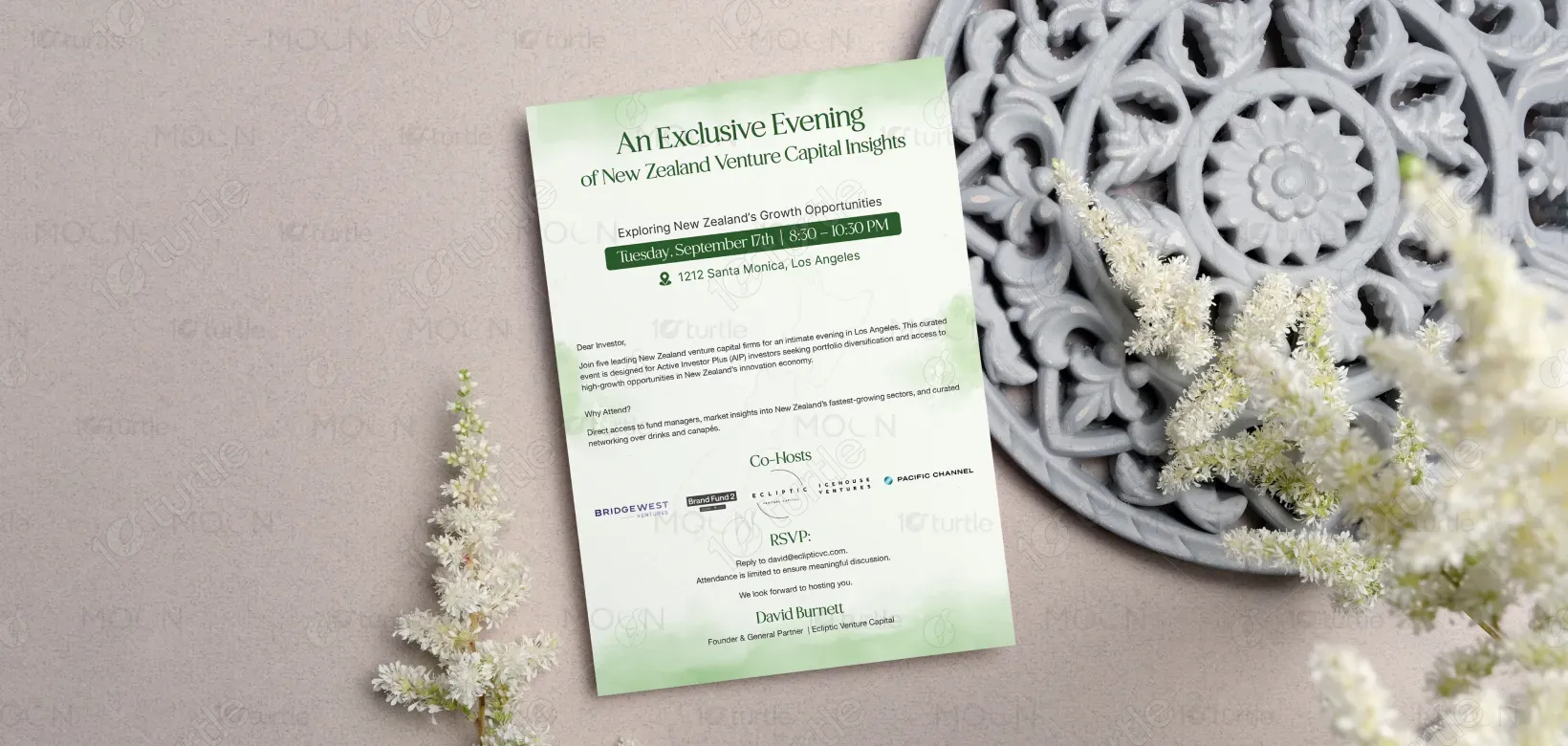
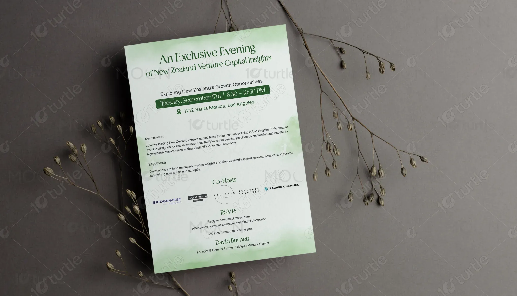
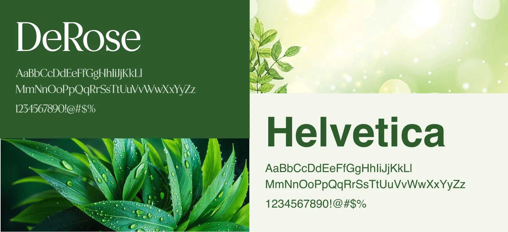
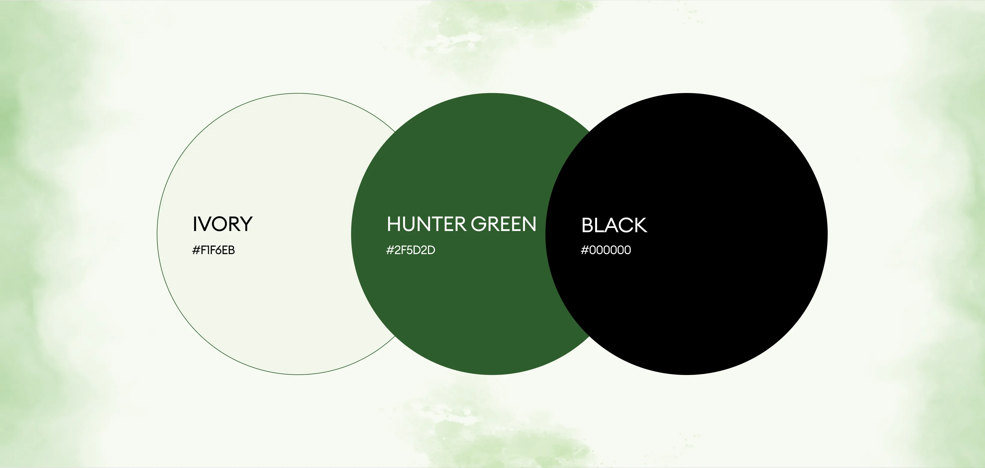
The palette centers around deep, muted greens paired with soft neutral tones. Green symbolizes growth, stability, and intelligence, reinforcing trust and calm confidence. The neutral shades add warmth and balance, allowing content to remain the focus. Together, the colors create a sophisticated, grounded aesthetic that feels premium, modern, and timeless—perfectly aligned with the brand’s refined identity.