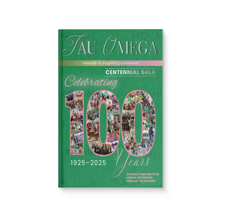
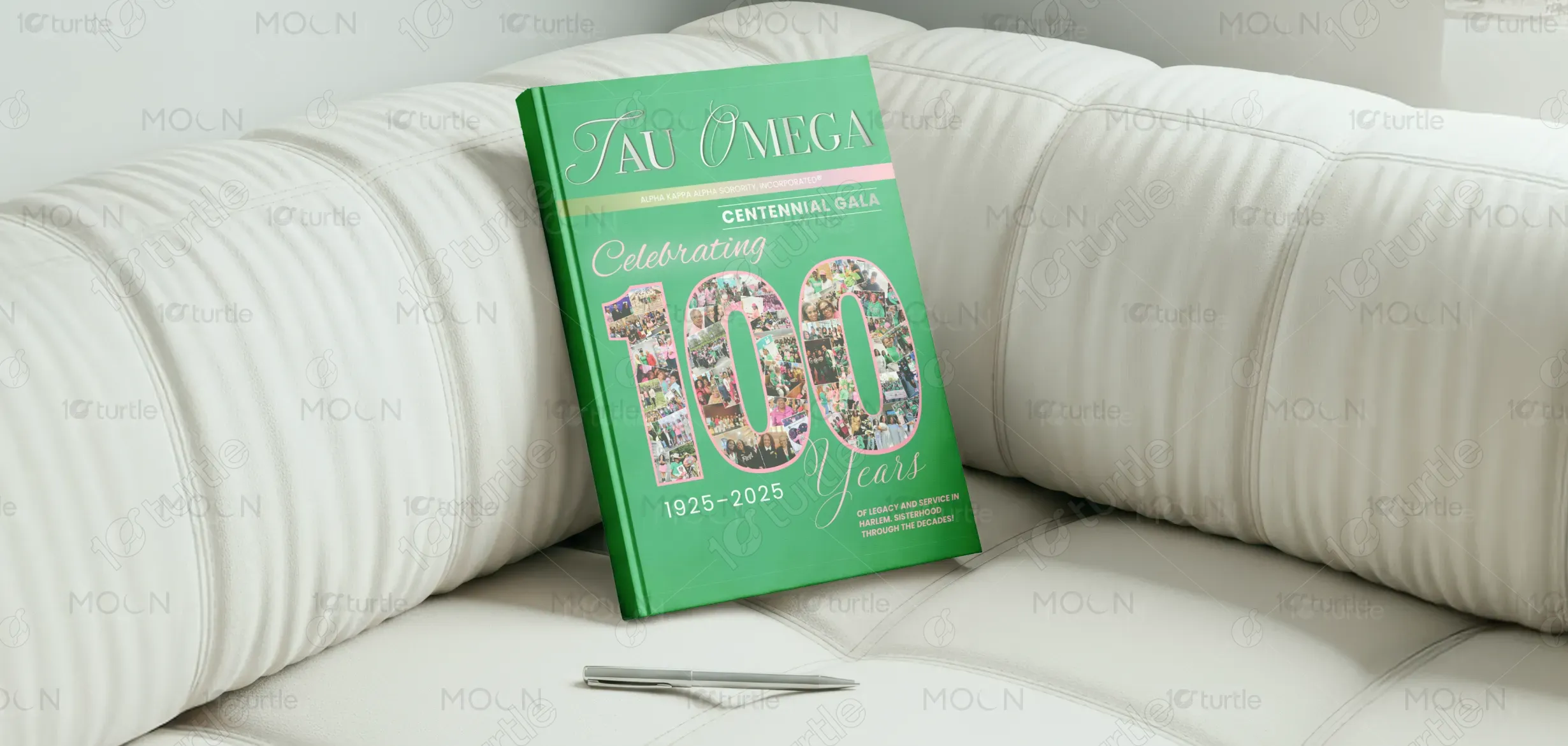
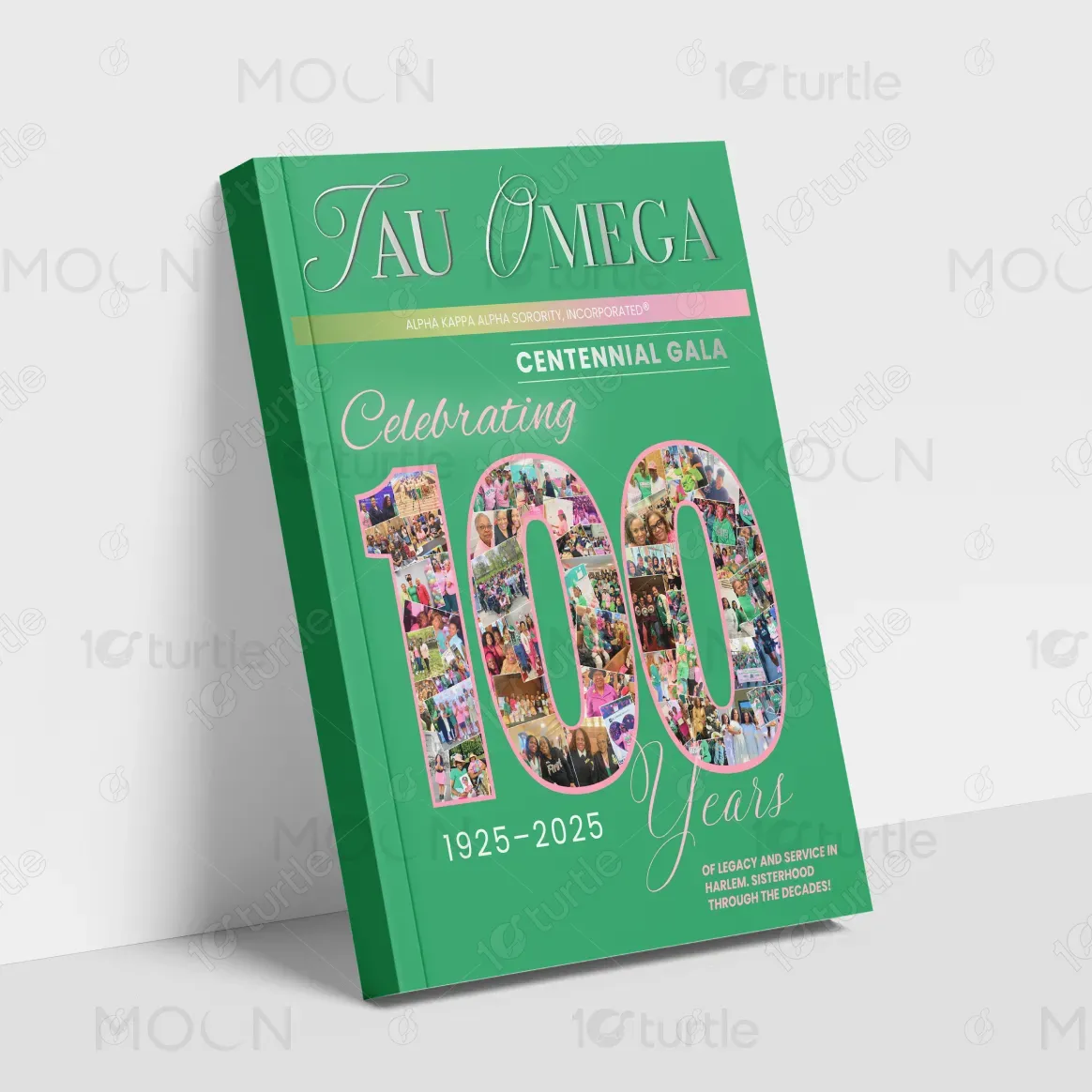
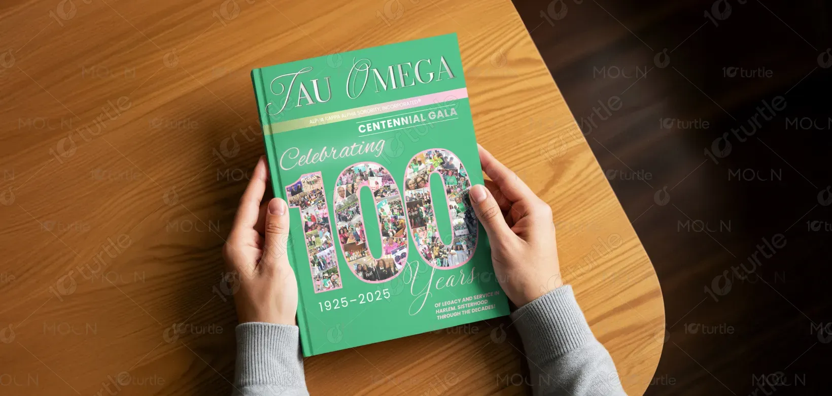
The design embraces a heritage-driven, celebratory visual language that balances tradition with contemporary clarity. A strong typographic hierarchy anchors the composition, with the bold “100” serving as the visual focal point, filled with a curated photo collage that brings lived experiences to the forefront. The structured layout, refined script accents, and disciplined alignment ensure readability while conveying elegance. A rich green base establishes brand continuity, while soft pink highlights add warmth and ceremonial refinement. Every element—from typography to imagery—works cohesively to communicate pride, history, and community in a clear, dignified manner.
Cover Design
Graphic Design
Industry
Civic, Government & Nonprofits
Tools we used


Project Completion
2025
Key Market
Global
This journal cover represents the Centennial Gala celebration of Tau Omega, commemorating 100 years of Alpha Kappa Alpha Sorority, Incorporated® legacy and service (1925–2025). The primary purpose of the design is to serve as a keepsake publication, documenting milestones, memories, and collective achievements. Positioned within the cultural and nonprofit space, the design functions both as a historical artifact and a premium event piece that reflects prestige, unity, and long-standing community impact.
Industry
Civic, Government & NonprofitsWhat we did
Cover DesignGraphic DesignPlatform
-Many commemorative publications struggle with overcrowded visuals, weak hierarchy, or generic aesthetics that fail to convey the importance of major milestones. The challenge was to present a century-long legacy without visual clutter, unclear messaging, or loss of brand identity, while still engaging readers emotionally and maintaining a premium, trustworthy presence.
The solution emphasizes clarity through hierarchy and storytelling through imagery. A user-centric layout guides attention from brand identity to event context, while the photo-filled “100” creates immediate emotional engagement. Consistent typography, disciplined spacing, and restrained color usage ensure accessibility, scalability, and ease of understanding, making the design effective across both print and promotional applications.
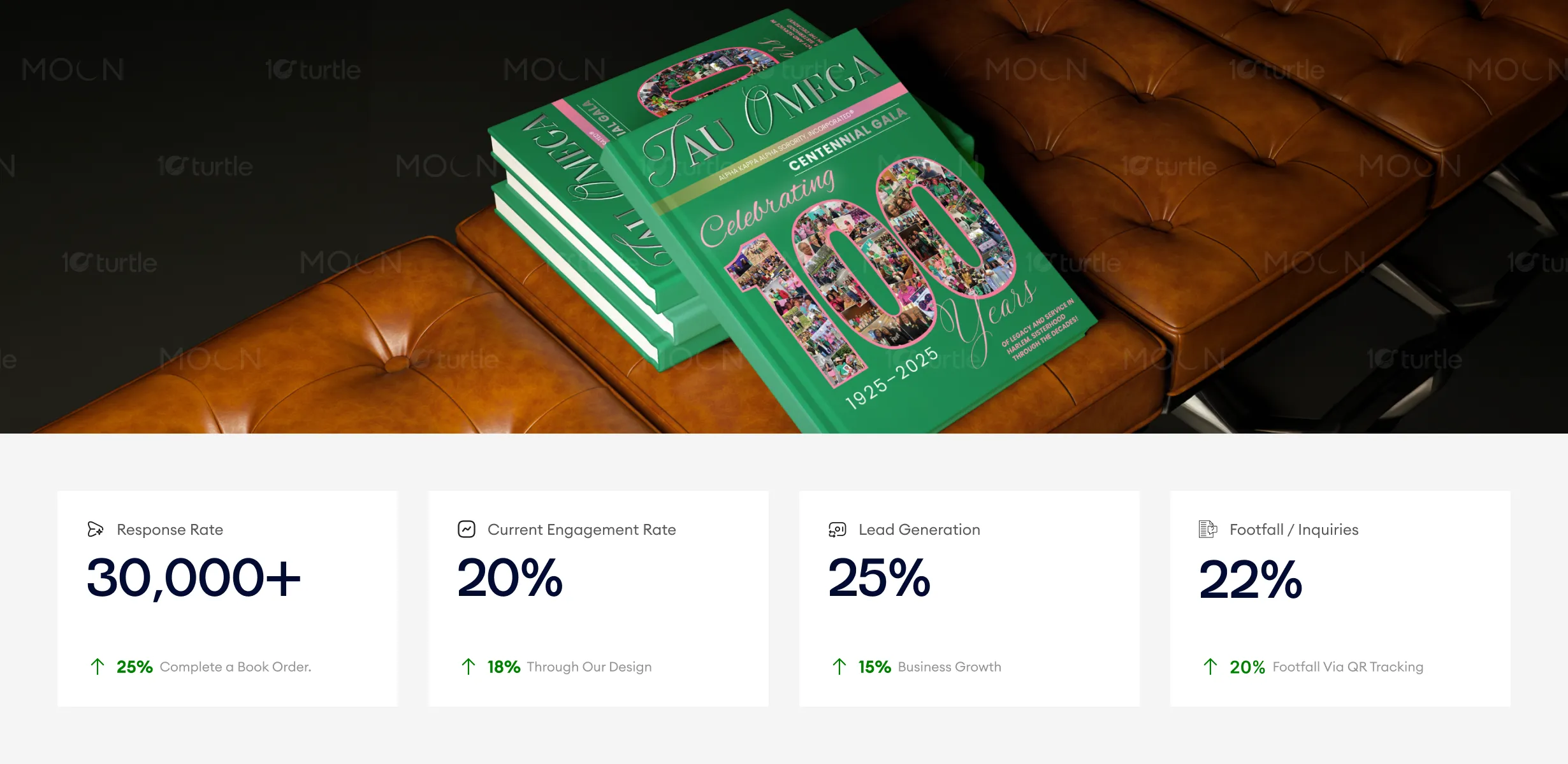
The design’s celebration of history and community through elegant typography, imagery, and color reinforces a strong connection with the target audience. The clean and refined layout drives engagement, encourages response, and enhances lead generation. By focusing on clarity, pride, and elegance, the design successfully fosters increased interaction, inquiries, and long-term interest in the brand's centennial celebration.
The design supports a long-term vision of timeless brand storytelling that can extend beyond the centennial moment. Its adaptable visual system allows for future commemorative editions, archival materials, and event branding, positioning Tau Omega as an organization rooted in legacy while remaining visually relevant and forward-looking.
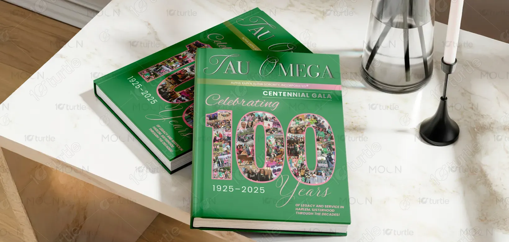

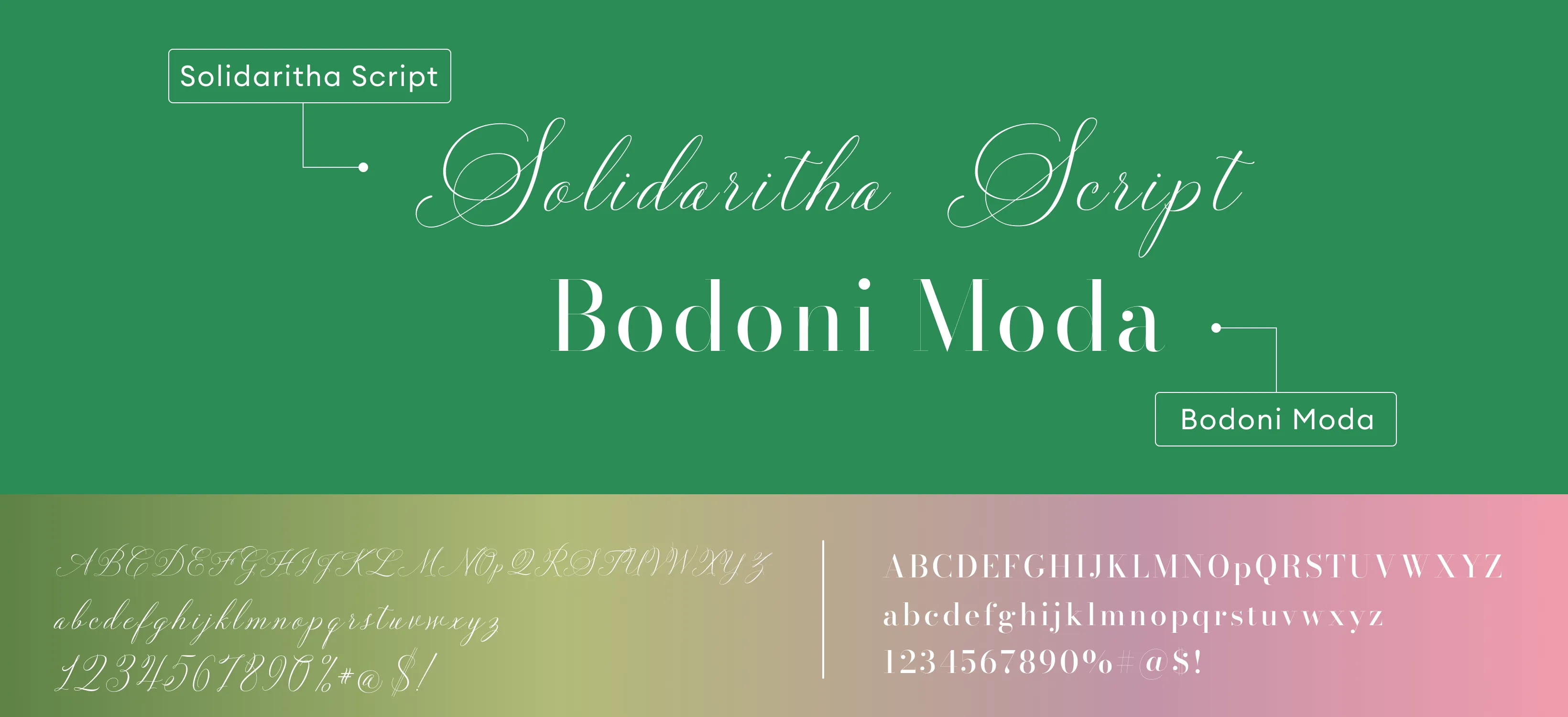
A rich green forms the foundation of the palette, symbolizing growth, heritage, and continuity, while soft pink accents introduce warmth, celebration, and femininity. Neutral tones support balance and readability. Together with classic typography and modern layout discipline, the visual language ensures strong recognition, emotional resonance, and consistency across different environments and viewing contexts.